Tag: jobs

  • Seattle’s Minimum Wage Killing Jobs Per City Funded Study

    A report by University of Washington economists has concluded that the most recent minimum wage increase in the city of Seattle is costing jobs. The Seattle Times reported:

    “The team concluded that the second jump had a far greater impact, boosting pay in low-wage jobs by about 3 percent since 2014 but also resulting in a 9 percent reduction in hours worked in such jobs. That resulted in a 6 percent drop in what employers collectively pay — and what workers earn — for those low-wage jobs.”

    According to the Times, this translates into a pay reduction of $125 per month for a low wage earner. This can be a lot of money, according to a study author, Mark Long, who noted that “It can be the difference between being able to pay your rent and not being able to pay your rent.”

    The study also indicated that there were 5,000 fewer low-wage jobs in the city as a result of the minimum wage increase. This is more than one percent of the approximately 440,000 private sector jobs in the city of Seattle in 2015, according to the American Community Survey. It is likely that most of the job losses occurred in the private sector, as opposed to government.

    The study was partially funded by the City of Seattle, which enacted the minimum wage increase.
  • Detroit Bankruptcy: Missing the Point

    Nobel Laureate Paul Krugman tells us that “sprawl killed Detroit” in his The New York Times column.
    The evidence is characterized as “job sprawl” – that a smaller share of metropolitan area jobs are located within 10 miles of downtown Detroit than in the same radius from downtown Pittsburgh (see Note on Decentralization and “Job Sprawl”). It is suggested that this kept the city of Pittsburgh out of bankruptcy.

    Not so. The subject is not urban form; it is rather financial management that was not up to par. State intervention may have been the only thing that saved the city of Pittsburgh from sharing Detroit’s fate.

    Detroit and Pittsburgh: Birds of a Financial Feather

    The city of Pittsburgh had been teetering on bankruptcy for some time. In 2004, the city’s financial affairs were placed under Act 47 administration (the Financially Distressed Municipalities Act“) by the state of Pennsylvania. One of Act 47’s purposes is to assist municipalities in avoiding bankruptcy. A 2004 state ordered recovery plan summarized the situation:

    The City of Pittsburgh, already in fiscal distress, now stands on the precipice of full-blown crisis. In August 2003, the City laid off 446 employees, including nearly 100 police officers. City recreation centers and public swimming pools were closed, and services from police mounted patrol to salt boxes were eliminated. In October and November 2003, the City’s credit ratings were downgraded repeatedly, leaving Pittsburgh as the nation’s only major city to hold below-investment-grade “junk bond” ratings. With the City’s most recent independent audit questioning the City’s ability to continue as a going concern, a looming cash shortfall now threatens pension payments and payroll later this year. (emphasis added)

    The good news is that Act 47 has worked so well that the city could soon be released from state control. It may have helped that all of this was overseen by former Democratic Governor Ed Rendell, whose tough administration saved another abysmally-managed municipality when he was mayor of Philadelphia more than a decade before.

    Not everyone, however, is willing to grant that Pittsburgh has solved all its problems. Democratic candidate for mayor of Pittsburgh, Bill Peduto, recently urged Harrisburg to not release the city from Act 47 control. According to Peduto, “the city is not out of the financial woods,” and “we’re still in the middle of it, and in fact we have an opportunity in the next five years to build a sustainable budget for at least a decade.” Given the strong Democratic majority in the city, Peduto will probably be the next mayor.

    The Key: Strong Management

    In Detroit’s case, the state dithered for years, jumping in only when it was too late. Maybe the “tough love” of a Michigan-style Act 47 could have saved Detroit.

    Meanwhile, best of luck to the Detroit bankruptcy court and Pittsburgh’s next mayor. Both were dealt a bad hand by predecessors who said yes to spending interests too often, to the detriment of residents and taxpayers.

    ——–

    Note on Decentralization and “Job Sprawl”

    The dispersed American metropolitan area has performed better than its mono-centric (downtown oriented) urban form of the past. American metropolitan areas are the most affluent in the world, and they are also the most decentralized. Decentralization of employment facilitates mobility, as economists Peter Gordon and Harry W. Richardson found 15 years ago. Work trip travel times are shorter and traffic congestion is less intense in US metropolitan areas than in similar sized metropolitan areas in Western Europe, Japan, Canada and Australia. At the same time, metropolitan areas around the world are themselves becoming more decentralized. The bottom line is that better mobility facilitates greater economic growth, which also reduces poverty.

    Comparing the “job sprawl” of Detroit and Pittsburgh not only misses the point; it also glosses over differences that render any comparison virtually meaningless.

    Detroit is Larger: The Detroit metropolitan area has nearly 60 percent more jobs than the Pittsburgh metropolitan area. Other things being equal, this would mean that Detroit would cover more area than Pittsburgh. As a result, even if the employment densities were equal, a smaller percentage of the jobs would be within 10 miles of downtown Detroit and within 10 miles of downtown Pittsburgh.

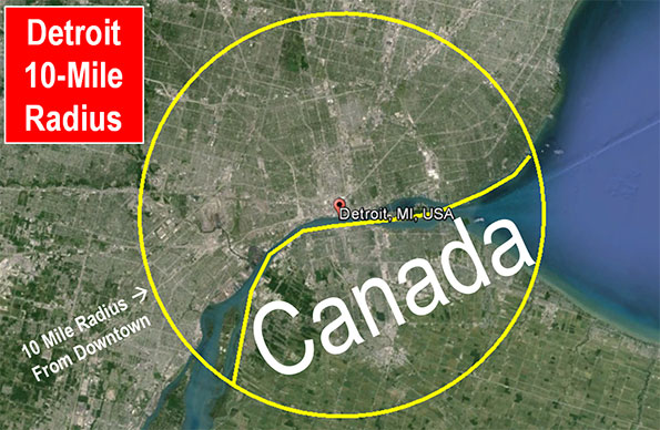
    Nearly Half of Detroit’s 10 Mile Radius is in Canada and a Lake:But other things are not equal. Approximately 40 percent of the area within 10 miles of downtown Detroit is in Canada or in Lake St. Clair. Canadian jobs are appropriately excluded from the Detroit “job sprawl” numbers developed by the Brookings Institution (Figure), and no 10 mile radius comparison can thus be made to Pittsburgh.  None of the 10 mile radius from downtown Pittsburgh is in Canada and none of it is in a large lake.

    See Also: Peter Gordon’s Blog: Detroit

  • Infographic: Growth of All Occupations by Industry & Education, 2001-2011

    We recently partnered with Catherine Mulbrandon at VisualizingEconomics.com to create a series of treemaps that illustrate important aspects of the labor market. In this post we provide a sneak peek at two of the graphics she created. The remainder will be posted in An Illustrated Guide to Income in the United States, a booklet from Catherine set to be released this summer.

    These two graphics are based on EMSI’s labor market database, which is a combination of over 80 public and private data sources. More specifically, the first table shows job change for all occupations by industry (based on 2-digit supersectors, as defined by the North America Industry Classification System) and the second shows occupation change by education level. The data is from 2001-2011.

    Red indicates decline and blue indicates growth.

    Each square on the graphic indicates a specific 5-digit occupation classified by the Standard Occupational Classification system. There are over 800 unique squares present on the charts. Large squares, like the ones on the upper right and in the retail trade sector, indicate a lot of jobs for the specific occupation code. Smaller squares indicate occupations with less jobs.

    In the graphic above we have pulled together occupation data related to all 20 NAICS supersectors. Government, health care, and retail trade have the largest employment. Utilities, mining, and management of companies have the fewest jobs. Also note the size of the squares within each industry sector. Here are a few observations:

    • Broad momentum. It is interesting to note how each broad industry sector tended to either be dominated by growth or decline. For instance, with very few exceptions, almost every occupation within the manufacturing sector declined from 2001-2011. The same holds true for construction, information, agriculture, and, to a certain extent, retail trade. Conversely, sectors like health care, educational services, professional/scientific/technical services, accommodation and even arts tended to show occupational growth.
    • Mixed sectors. Other industry sectors like finance, administrative, real estate, wholesale trade, and government were much more mixed.

    The graphic above shows the distribution of jobs across all levels of educational attainment. We use the same 5-digit SOC codes and group them according to what their typical educational attainment is. Where possible, occupation titles are included so you can get a sense of where certain jobs fall. Here are a few quick observations:

    • The OJT sectors (on-the-job training) are huge. This includes short-term OJT (lower right), moderate-term OJT (upper left), long-term OJT (middle right), and work experience in a related field (center). Also notice how the occupations in these sectors are less stable than the others. This is consistent with what was observed in the latest recession — jobs with higher education levels tend to perform better in tough economic times.
    • Advanced degrees showed growth. Over the past 10 years, every occupation associated with a more advanced degree (master’s, doctoral, professional) showed some sort of growth.
    • The other sectors have mixed results. Bachelor’s degrees showed more stability over the past 10 years, but there are a handful of occupations that declined since 2001. The same holds true for associate’s, postsecondary vocational awards, and degrees plus work experience.
  • Metro Job Recovery in 2011

    The latest BLS release for metro area unemployment has full year averages for 2011 available, so we can see which cities added the most jobs last year. On the whole, it was a much better year for metros than we’ve seen in the recent past. The national economy added jobs, and all but two large metros did as well. New York City added the most jobs of any region, but given that it is far and away the biggest city in America, it should do so. NYC ranked only the middle of the pack on a percentage growth basis. On that measure, Austin, Texas was number one.

    The top percentage gainer in the Midwest region? Detroit, Michigan. Perhaps this shouldn’t be surprising either, as manufacturing is pro-cyclical.

    Here is the performance of the metro areas in the United States with more than one million people, ranked by percentage change. The data is also available in spreadsheet form.

    Rank Metro Area 2010 2011 Total Change Pct Change
    1 Austin-Round Rock-San Marcos, TX 769.5 791.4 21.9 2.85%
    2 San Jose-Sunnyvale-Santa Clara, CA 855.2 878.2 23.0 2.69%
    3 Houston-Sugar Land-Baytown, TX 2528.1 2593.1 65.0 2.57%
    4 Charlotte-Gastonia-Rock Hill, NC-SC 807.5 826.7 19.2 2.38%
    5 Nashville-Davidson–Murfreesboro–Franklin, TN 734.3 751.7 17.4 2.37%
    6 Salt Lake City, UT 608.1 622.0 13.9 2.29%
    7 Detroit-Warren-Livonia, MI 1737.1 1775.3 38.2 2.20%
    8 Dallas-Fort Worth-Arlington, TX 2860.9 2921.7 60.8 2.13%
    9 Raleigh-Cary, NC 498.1 508.6 10.5 2.11%
    10 Pittsburgh, PA 1125.3 1148.6 23.3 2.07%
    11 Oklahoma City, OK 558.5 569.6 11.1 1.99%
    12 Tampa-St. Petersburg-Clearwater, FL 1112.0 1132.3 20.3 1.83%
    13 Portland-Vancouver-Hillsboro, OR-WA 968.8 986.1 17.3 1.79%
    14 Minneapolis-St. Paul-Bloomington, MN-WI 1697.1 1727.1 30.0 1.77%
    15 Baltimore-Towson, MD 1274.0 1293.5 19.5 1.53%
    16 Seattle-Tacoma-Bellevue, WA 1641.2 1666.1 24.9 1.52%
    17 Denver-Aurora-Broomfield, CO 1193.5 1211.6 18.1 1.52%
    18 Columbus, OH 903.3 916.9 13.6 1.51%
    19 Miami-Fort Lauderdale-Pompano Beach, FL 2185.6 2218.3 32.7 1.50%
    20 Phoenix-Mesa-Glendale, AZ 1688.9 1712.8 23.9 1.42%
    21 Atlanta-Sandy Springs-Marietta, GA 2272.6 2302.9 30.3 1.33%
    22 New Orleans-Metairie-Kenner, LA 519.1 526.0 6.9 1.33%
    23 San Antonio-New Braunfels, TX 843.0 853.2 10.2 1.21%
    24 Richmond, VA 602.4 609.5 7.1 1.18%
    25 New York-Northern New Jersey-Long Island, NY-NJ-PA 8306.8 8403.9 97.1 1.17%
    26 Indianapolis-Carmel, IN 871.1 881.2 10.1 1.16%
    27 Jacksonville, FL 583.1 589.6 6.5 1.11%
    28 Rochester, NY 503.1 508.7 5.6 1.11%
    29 Washington-Arlington-Alexandria, DC-VA-MD-WV 2962.9 2995.5 32.6 1.10%
    30 Hartford-West Hartford-East Hartford, CT – Metro 533.2 538.9 5.7 1.07%
    31 Chicago-Joliet-Naperville, IL-IN-WI 4246.6 4291.4 44.8 1.05%
    32 Milwaukee-Waukesha-West Allis, WI 805.8 814.1 8.3 1.03%
    33 Louisville/Jefferson County, KY-IN 592.9 599.0 6.1 1.03%
    34 Kansas City, MO-KS 971.6 981.4 9.8 1.01%
    35 Orlando-Kissimmee-Sanford, FL 1001.1 1011.0 9.9 0.99%
    36 Memphis, TN-MS-AR 589.8 595.4 5.6 0.95%
    37 Cincinnati-Middletown, OH-KY-IN 980.8 989.4 8.6 0.88%
    38 Buffalo-Niagara Falls, NY 538.2 542.7 4.5 0.84%
    39 San Francisco-Oakland-Fremont, CA 1880.2 1894.3 14.1 0.75%
    40 Boston-Cambridge-Quincy, MA-NH – Metro 2426.5 2443.3 16.8 0.69%
    41 Los Angeles-Long Beach-Santa Ana, CA 5126.8 5162.2 35.4 0.69%
    42 San Diego-Carlsbad-San Marcos, CA 1222.8 1231.2 8.4 0.69%
    43 St. Louis, MO-IL 1286.9 1295.4 8.5 0.66%
    44 Las Vegas-Paradise, NV 803.6 808.3 4.7 0.58%
    45 Riverside-San Bernardino-Ontario, CA 1125.9 1129.7 3.8 0.34%
    46 Philadelphia-Camden-Wilmington, PA-NJ-DE-MD 2697.0 2705.9 8.9 0.33%
    47 Providence-Fall River-Warwick, RI-MA – Metro 541.3 542.8 1.5 0.28%
    48 Virginia Beach-Norfolk-Newport News, VA-NC 735.2 736.8 1.6 0.22%
    49 Cleveland-Elyria-Mentor, OH 991.1 992.7 1.6 0.16%
    50 Birmingham-Hoover, AL 489.5 488.6 -0.9 -0.18%
    51 Sacramento–Arden-Arcade–Roseville, CA 809.9 802.0 -7.9 -0.98%

    This first appeared at Aaron’s blog, Urbanophile.com.

  • Interactive Graphic: Ranking States By Competitiveness

    In a previous post we looked at which states have been most competitive in terms of job creation since the recession.

    In this post we teamed up with our friends at Tableau Software to produce the following interactive graphic, which details individual industries that are driving states to be more (or less) competitive. The graphic breaks down the performance of the 20 major sectors in every state in the contiguous US (plus Hawaii and Alaska) in terms of expected and actual job change from 2007-2011. Further explanation of the analysis is below.

    Rundown on the data

    We used shift share, a standard economic analysis method that reveals if overall job growth is explained primarily by national economic trends and industry growth or unique regional factors. Shift share analysis, which can also be referred to as “regional competitiveness analysis,” helps us distinguish between growth that is primarily based on big national forces (the proverbial “rising tide lifts all boats” analogy) vs. local competitive advantages.

    To generate our ranking, we summed the overall competitive effect for each broad 2-digit industry sector by state (e.g., agriculture, manufacturing, health care, construction, etc.) and added them together to yield a single statewide number that indicates the overall competitiveness of the economy as compared to total economy. We calculate the competitive effect by subtracting the expected jobs (the number of jobs expected for each state based on national economic trends) from the total jobs. The difference between the total and expected is the competitive effect. If the competitive effect is positive, then the industries within the state have exceeded expectations and created more jobs than national trends would have suggested. Those industries are therefore gaining a greater share of the total jobs being created. If the competitive effect is negative, then the industries are not gaining jobs as fast as what we would expect given national trends. In this case the state is losing a greater share of the total jobs being created.

    Observations On Most Competitive

    The big thing that stands out is that most of the competitive states tend to be in the middle of the country. This is tied to the growth in the oil and gas sector, yes, but in most cases better-than-expected performance in construction, government, and other miscellany sectors. In Alaska, North Dakota, and Nebraska, smaller states in terms of population and jobs, manufacturing, transportation, and construction are some of the most competitive industries. Louisiana also fares quite well in healthcare and accommodation & food services.

    Observations On Least Competitive

    For states that rank toward the bottom, the housing bust and subsequent construction downturn is the biggest culprit. For instance, in Nevada, which is last on the list, construction is nearly 50,000 jobs below what would be expected given national and industry trends. Florida, a much more populous state, is more than 130,000 jobs below what would be expected. For states like Michigan, Ohio, and Indiana, the poor performance in manufacturing and government weighed heavily in our ranking.

    Here is the original graphic that show the comparison between states.

    Please check out the graphic and let us know if you have any questions. Email Rob Sentz (rob@economicmodeling.com) or hit us via Twitter @DesktopEcon. Data and analysis comes from Analyst, EMSI’s web-based labor market analysis tool.

  • The Hardest Job To Fill In 2012? A Look At The Supply of Web Developers

    Keith Cline at Inc.com has a fresh look at one of the enduring, and perplexing, stories of 2011 — the skills shortage. Even with 13.3 million Americans unemployed, and millions more underemployed, there are industries severely lacking in skilled talent.

    Cline provided five loose job titles/duties that employers will have a hard time filling as 2012 starts. Chief among them: software engineers and web developers.

    Writes Cline, “The demand for top-tier engineering talent sharply outweighs the supply in almost every market especially in San Francisco, New York, and Boston.  This is a major, major pain point and problem that almost every company is facing, regardless of the technology ‘stack’ their engineers are working on.”

    Exacerbating the apparent problem is that the four other job areas that Cline mentions are often related to high-tech industries and web development — creative design/user experience, product management (particularly of the consumer web/e-commerce/mobile variety), web-savvy marketing, and analytics.

    But is there really a skill shortage in these areas across the US, or is it a matter of firms not wanting to budge on wages? As Brian Kelsey recently pointed out, “A talent shortage, and a talent shortage at the wages you are willing to pay, are usually two separate issues.”

    Let’s focus on web developers, and see what job and wage trends show. Working with EMSI’s occupation data, which is based on classifications from the Bureau of Labor Statistics, there are three primary job codes for developers: 1) computer programmers; 2) software developers, applications; and 3) software developers, systems software.

    According to EMSI’s most recent figures, software developers have performed better in the job market than computer programmers. Software developer jobs have been steadily growing nationally in recent years — after a dip in 2008 — while computer programmer jobs (the blue line in the chart below) have been stagnant or in decline since the economic downturn.

    On average nationally, these jobs pay between $33 per hour (for programmers) and $44 per hour (for systems software developers). The top 10 percent of workers in these fields make on average $51 to $64 per hour. Among the largest 100 metro areas in the US, San Jose ($55.48), Bridgeport, Conn. ($49.48), and Boston ($46.58) pay the highest median earnings for developers.

    These are solid baseline figures. But what about the supply issue?

    One way to determine labor shortages is by analyzing historic wages, coupled with employment trends, for an occupation; if wages are increasing over time, that’s a good sign of unmet demand in the market and hence, a shortage. The reason: demand from employers for additional workers would be so great that it would push up wages.

    We looked at median earnings for programmers and computer software engineers from 2000-2010 using the BLS’ Current Population Survey (CPS) dataset, a monthly survey of US households. Adjusted for inflation, CPS data* shows programmers’ wages have essentially been flat (2% growth) since 2000. It’s a different story for software engineers; their wages increased 13% from 2000 to 2010.

    But for both programmers and software engineers, real wages have declined since 2004. This make sense given the stagnant employment picture for programmers. Yet for software engineers, employment has increased more than 6% since 2009 while wages have held steady in recent years.

    If there is indeed the major undersupply that Cline and others have argued, wages would not be stagnant but continuing to rise (and probably rising sharply). That appeared to happen in the early 2000s — but not recently.

    * Note: Current Population Survey wage estimates are different than the above-mentioned hourly earnings that EMSI reports in its complete employment dataset. EMSI’s figures, which include proprietors, come from the BLS’ Occupational Employment Statistics dataset and the Census’ American Community Survey.

  • Avent on Cities: Understanding Part of the Equation

    Ryan Avent hits a home run, strikes out and earns a "yes, but," all in the same article ("One Path to Better Jobs: More Density in Cities") in The New York Times.

    A Home Run on Housing Regulation: Avent rightly notes that the land-use and housing regulations of metropolitan areas like San Francisco have not only driven housing prices higher, but also negatively impacted economic growth. Studies in the UK, the US and the Netherlands have demonstrated that significant restrictions on land use (called smart growth or urban containment) lead to reduced employment and economic growth in metropolitan areas. His comparison to OPEC is "right on" – that metropolitan areas like San Francisco have squeezed the supply of housing, which, of course, drives up house prices, just as restricting the supply of any good or service in demand will tend to do. Avent is also right in noting that high housing prices have driven huge numbers of people out of the San Francisco Bay Area to places like Phoenix. According to the Census Bureau, nearly 2,100,000 people moved from Los Angeles, San Francisco, San Diego and San Jose between 2000 and 2009 to other parts of the country.

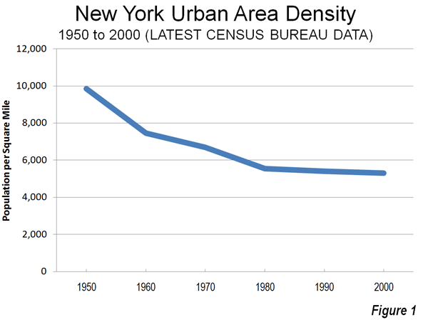
    Striking Out on Density: The strikeout results from assumptions that are patently wrong. Cities (urban areas) do not get more dense as they add population. They actually become less dense. For example, the New York urban area has added 50 percent to its population since 1950, yet its population density has dropped by 45 percent (Figure 1). Between 2000 and 2010, most metropolitan population growth, whether in San Francisco, New York, Phoenix, Portland or Houston, was in the lower density suburbs (see: http://www.city-journal.org/2011/eon0406jkwc.html ). The same dispersion is occurring virtually around the world (see: http://www.demographia.com/db-evolveix.htm), from Seoul, to Shanghai, Manila and Mumbai. Rapid urban growth would mean even further dispersion and lower densities, not the higher density neighborhoods Avent imagines. Nonetheless, allowing the more affordable detached housing that people prefer would likely lead to stronger economic growth and more affluent residents in the San Francisco and other over-regulated metropolitan areas.

    A "Yes, But" on Productivity: Any comparison of incomes between metropolitan areas needs to take into consideration the cost of living. For example, the San Francisco Bay Area (San Francisco/San Jose) is one of the most expensive places to live in the country. The median house price is more than 2.5 times that of Phoenix, after accounting for income differentials. Avent does not control for the difference in the cost of living, which is largely driven by the higher cost of housing. The lower cost of living neutralizes much of the impact of lower incomes (such as in Houston) in metropolitan areas like Houston, Dallas-Fort Worth, Indianapolis, etc., where the OPEC model has not been applied to land use regulation.

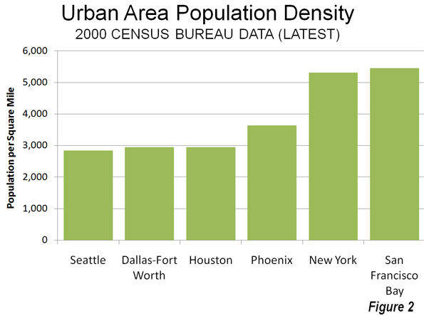
    Finally, even controlling for the cost of living, there are substantial exceptions to any density-productivity thesis. For example, some of the greatest productivity gains information technology have come out of the Seattle area, which is the least dense major urban area in the 13 Western states, less dense than Houston, Dallas-Fort Worth and Phoenix. Even more impressively, Seattle’s urban density is barely one-half that of New York or San Francisco (Figure 2), yet its gross domestic product per capita is higher than New York and within 2 percent of San Francisco/San Jose. Seattle’s substantial contribution to the nation’s productivity has occurred while its population density was declining nearly 15 percent (since 1980).  

    Avent, like many analysts before appears to presume that population growth means higher densities. In fact, urban areas grow by dispersing, not densifying.

  • Interactive Graphic: Job Growth by Sector for all Counties in the Nation

    The fully interactive map below indicates job growth and decline for all US counties from 2006 to 2011. These show up as hot or cold spots; red for growth, blue for decline. You can select a state to zoom in on and find a county that way, or simply click on a county to drill in. Once you’ve chosen a county, the table under the map will show you job numbers by industry category.

    The data for this graphic comes from EMSI’s Complete 2011.3 dataset, based on data from the Bureau of Labor Statistics and many other sources. Many thanks to Tableau for putting this together. If you have questions or comments about the graphic or the data behind it, please email EMSI’s Josh Stevenson.

  • Why the Green Jobs Movement Failed

    "Federal and state efforts to stimulate creation of green jobs have largely failed," the New York Times reported last week, drawing similar conclusions to the ones we drew in our essay for The New Republic last October. Silicon Valley, home to the green jobs movement, actually saw the number of green jobs decline from 2003 – 2010.

    The signature green jobs program was retrofitting homes and buildings to become more energy efficient, which boosters thought would create "millions" of jobs in the inner-city. In 2009 the Center for American Progress claimed that $5 billion in stimulus funding for weatherization and a price on carbon would lead to the retrofitting of every building in America in ten years, generating 900,000 jobs. In reality, we noted in TNR, the weatherization program had created just 13,000 jobs. "Two years after it was awarded $186 million in federal stimulus money to weatherize drafty homes," the Times reported, "California has spent only a little over half that sum and has so far created the equivalent of just 538 full-time jobs in the last quarter… the program never really caught on as homeowners balked at the upfront costs."

    Most of the approximately $70 billion in green stimulus money went to retrofitting or stimulating the old economy and just one-third went to building a new one. Notably, even those modest investments in manufacturing and technology had a salutary effect, saving the American renewables industry, which was in free fall after the 2008 financial crisis, and giving a boost to U.S. manufacturers of electric car batteries. 

    Obama could have focused on winning a long-term commitment to public investment in green innovation and manufacturing. Instead, he threw his political capital behind cap-and-trade, a pollution control program that was never imagined by the economists who invented it to be a means for creating vibrant new industries.

  • The Spread of Proprietors/Independent Contractors In the US

    A few weeks ago EMSI looked at the states with the largest share of 1099 workers — that is, proprietors/independent contractors, farm workers, and others not covered by unemployment insurance. We found that since 2006 every state (as well as D.C.) has seen growth in noncovered workers.

    Simply put, the number of workers outside traditional employment rolls is on the rise.

    We have since mapped out job growth among 1099 workers in every U.S. county from 2006-2011 to see where this increase in nontraditional employment is most evident. And the data makes the trend even clearer: The majority of counties across the nation have seen at least a small increase in noncovered workers, and some have seen huge increases. This is especially the case in the western and southwestern portions of the U.S.

    It should be emphasized that not all 1099 workers captured in the EMSI Complete dataset are proprietors/independent contractors. However, if we use growth in the 1099 economy as a loose proxy for entrepreneurial behavior (i.e., a backbone for economic growth and business development), it’s very apparent which areas are progressing in that arena and which areas are falling behind.

    The counties with the most 1099 job growth are mostly in fairly isolated areas:

    1, Loving County, Texas, 114% (the least populous county in the US)
    2, Todd County, South Dakota, 81%
    3, Calhoun County, West Virginia, 63%
    4 (tie), Roane County, West Virginia, 57%
    4 (tie), Reagan County, Texas, 57%
    4 (tie), Union County, Florida, 57%
    7 (tie), Wayne County, Utah, 54%
    7 (tie), Shackleford County, Texas, 54%
    9, Ochiltree County, Texas, 53%
    10, Kenedy County, Texas, 52%

    Seven of the top 12 counties, in fact, are in Texas, including Midland County. Oil and gas extraction, the fastest-rising sector for 1099 workers in the US, is driving most of this growth in workers outside the unemployment insurance (UI) system.

    In contrast, the counties showing the biggest job loss in 1099 employment have a more diverse population base:

    1, Ziebach County, South Dakota, -23%
    2 (tie), St. Louis City, Missouri, -15%
    2 (tie), Roanoke County, Virginia, -15%
    4, Ohio County, West Virginia, -14%
    5, Sully County, West Virginia, -13%
    6, Oliver County, North Dakota, -12%
    7 (tie), Marshall County, South Dakota, -11%
    7 (tie), Forsyth County, Georgia, -11%
    9, Pennington County, South Dakota, -10%
    10, Decatur County, Iowa, -9%