Tag: Los Angeles

  • Political Footballs: L.A.’s Misguided Plans For A Downtown Stadium

    Over the past decade Los Angeles has steadily declined. It currently has one of the the highest unemployment rates (roughly 12.5%) in the U.S, and there’s little sign of a sustained recovery. The city and county have become a kind of purgatory for all but the most politically connected businesses, while job creation and population growth lag not only the vibrant Texas cities but even aged competitors such as New York.

    Rather than address general business conditions, which sorely need fixing, L.A. Mayor Mayor Antonio Villaraigosa and the other ruling elites have instead focused on revitalizing the city’s urban core, which has done little to boost the region’s overall economy in generations. The most recent example of such foolishness is a $1.5 billion plan to build a football stadium, named Farmers Field, downtown,unanimously approved by the city’s City Council and backed by the city’s “progressive” state delegation.

    Like most of  the dominant political class, California Senator and former City Council member  Alex Padilla cites the sad state of the local economy as justification for approving the plan. But, in reality, it’s hard to find something more profoundly irrelevant than a football stadium.

    Indeed years of independent investigations have discovered that urban vanity projects like sports teams and convention centers add little to permanent employment or overall regional economic well-being. As a Minneapolis Fed study revealed, consumers simply shift their expenditures from other activities to the new stadium. Certainly mega-stadiums have done little to boost sad-sack, depopulating cities such as St. Louis, Baltimore or Cleveland.

    Commitments to mega-projects tend to further drive urban areas into debt, largely by issuing more bonds that taxpayers are obligated to pay back. One particularly gruesome case can be found in Harrisburg, Pa., whose underwriting of a minor league baseball team helped push the city into bankruptcy. To get the stadium deal, Los Angeles, already over-indebted and suffering a poor credit rating, will issue another $275 million.

    Such projects often obscure the real and more complex challenge of nurturing broad-based economic growth. This would require substantive change in a city or regional political culture. Instead the football stadium services two basic political constituencies: large unions and big-time speculators, particularly in the downtown area. The fact that the stadium will be built with union labor, for example, all but guaranteed its approval by the city’s trade union-dominated council.

    Downtown developers and “rent-seeking” speculators, the other group behind the project, have siphoned hundreds of millions in tax breaks and public infrastructure in the past decade. They have done so – subsidizing companies from other parts of Los Angeles, entertainment venues and hotels — in the name of a long-held, impossible dream of turning downtown Los Angeles into a mini-Manhattan. Perhaps no company has pushed this more effectively than the stadium developer Anschutz Entertainment Group, a mass developer of generic entertainment districts around the world. AEG has expanded its influence by doling out substantial financial donations to Mayor Villaraigosa and others in the city’s economically clueless political class.

    This explains how the stadium was exempted from the state’s draconian anti-greenhouse gas legislation. The city promises that the stadium will be the “most transit-friendly” football stadium in the nation, which strikes locals as absurd. Football crowds tend to be drawn largely from  affluent types who don’t live anywhere close to downtown and rarely take public transit to their jobs, much less over the weekend. D.J. Waldie, a leading Los Angeles writer, described the entire project as “cloaked in green snake oil.

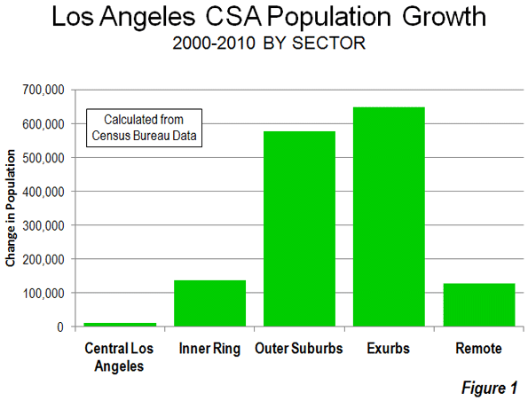
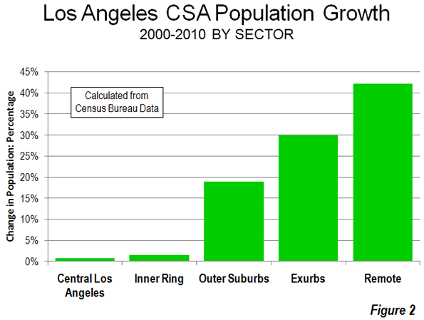
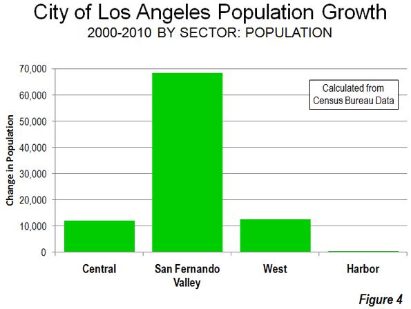
    An even more nebulous claim is that downtown needs the investment in order to drive regional growth. To be sure, recent years have seen the growth of a central city restaurant scene, and some 30,000 residents now live in the area compared to closer than 20,000 a decade ago. Yet just outside the immediate, highly-subsidized core, population growth in the surrounding parts of central city over the past decade stood at a mere 0.7%, the lowest rate since the 1950s. The vast majority of the region’s population growth took place in the far-flung regions of the San Fernando Valley.

    As an economic engine, downtown LA simply does not warrant the attention, nor the special treatment,  that the city’s ruling elites give it. For one thing, it represents a far smaller part of the city’s economy when you compare it to the urban cores of Washington, D.C., or New York City. Indeed, in New York and D.C. roughly 20% of all employment is in the central core; in Los Angeles it’s barely 2.5%.

    And, despite all the hype, fewer people now work in downtown L.A than in the 1980s and 1990s, when the area was populated by corporations and small businesses, many in manufacturing and trade, instead of hip hangouts. A more recent analysis shows that, despite all the hype, the downtown area has created virtually no new net jobs over the past decade.

    LA’s leaders should therefore focus on the systematic causes for the region’s ailing economy. One source of the problem lies in tough environmental rules that, although lifted on behalf of football, clamp on growth of virtually every other industry, including the city’s port and manufacturing sector. Powerful green interests, for example, make any plan to modernize the port all but impossible. This could prove catastrophic when the widening of the Panama Canal will allow aggressive, cheaper posts in the Gulf or Southeast U.S. to compete with the Pacific Asian trade that has driven LA’s port economy for decades.

    Los Angeles’ huge industrial sector has also been a victim of the regulatory tsunami. Manufacturers have lost roughly one-third of their jobs over the past decade as firms head out to more congenial regions with less onerous regulatory burdens. Sadly, Los Angeles has benefited little from the recent upsurge in manufacturing nationwide when compared with metropolitan areas such as Detroit, Salt Lake City and San Antonio.

    Even Hollywood, an industry less affected by green regulations, has begun to lose steam. Film production has dropped by more than half over the past 15 years. LA’s share of film and television production has eroded as well, with much  of the new work headed to Toronto, New Mexico, New Orleans, New York and Atlanta. All these cities offer richer incentives to attract productions than the world’s self-proclaimed “entertainment capital.”

    Faced with these serious regional challenges, officials should place less emphasis on football and creating another generic downtown and more on the city’s uniquely vibrant and heavily immigrant-driven small-business sector, which has been stifled by the state’s regulatory excess as well as the city’s legendary bureaucracy. Business consultant Larry Kosmont notes that the system is particularly tough on smaller, less politically connected firms. “It usually takes two to three times more to process anything in L.A., compared even to surrounding cities,” Kosmont told the Wall Street Journal. “It makes a big difference if you are a major Korean airline or AEG or if you are an independent entrepreneur.”

    Yet to date these entrepreneurs  receive little respect from City Hall. They  are unlikely to be granted the sort of papal dispensations from green legislation so readily given to the football stadium and other downtown projects. Until the disconnect of the leaders from the city’s real economic essence ends, Los Angeles, a city uniquely blessed by its population, climate and location, will continue to flounder, a perpetual underperformer among America’s great urban areas.

    This piece originally appeared at Forbes.com.

    Joel Kotkin is executive editor of NewGeography.com and is a distinguished presidential fellow in urban futures at Chapman University, and an adjunct fellow of the Legatum Institute in London. He is author of The City: A Global History. His newest book is The Next Hundred Million: America in 2050, released in February, 2010.

    Photo "LA Night Lights" by flickr user Steve Jurvetson

  • More Americans Move to Detached Houses

    In defiance of the conventional wisdom in the national media and among most planning professionals, Americans continue not only to prefer, but to move into single family detached houses. Data from the 2010 American Community Survey indicates that such housing attracted 79.2% of the new households in the 51 major metropolitan areas (over 1,000,000 population) over the past decade.

    In contrast households in multi-unit buildings (apartments and condominiums) represented 11.8% of the new housing, while two-unit attached housing represented 11.3% of the increase. There was a 2.3% decline in the "other" category of new housing, which includes mobile homes and boats. A total of 4 million net new occupied detached houses were added in the largest metropolitan areas, while there were 590,000 additional apartments and condominiums and 570,000 attached houses (Figure 1).

    Detached Vacancy Rate Rises Less than Multi-Unit: Another conventional assumption is that single family homes have been disproportionately abandoned by their occupants, particularly since the collapse of the housing bubble. This is also not true. In 2010 detached housing enjoyed a 92.4% occupancy rate in 2010 which is higher than the 89.4% occupancy rate in attached housing and 84.2% occupancy rate in multi-unit buildings. Because a more of the multi-unit housing is rental, it is to be expected that the vacancies would be the highest in this category. However, at the national level, overall vacancy rates rose the most in multi-unit housing, with an increase of 61%, from 10.7% in 2000 to 17.1% in 2010. The vacancy rate in detached housing rose at a slower rate, from 7.3% in 2000 to 10.7% in 2010, an increase of 48%. Attached housing – such as townshouses – have the slowest rise in vacancy rate, from 8.4% in 2000 to 11.0% in 2010, an increase of 32% (Figure 2).

    Detached and Attached Up in Most Markets, Apartments and Condominiums Down in Most: The move to detached housing was pervasive at the major metropolitan area level. Among the 51 largest metropolitan areas, the share of detached housing rose in 44 and declined in seven. The share of attached housing rose in 32 of the metropolitan areas, while declining in 19. Multi-unit housing experienced an increase in its market share in only three markets, while declining in 48.

    Largest Metropolitan Areas: Detached housing also increased more than attached housing and multi-unit housing in each of the nation’s five largest metropolitan areas.

    • In the largest metropolitan area, New York, 51.9% of the new housing was detached. This is considerably more than the 36.9% detached market share in 2000. Multi-unit housing accounted for 24.1% of the increase in the market. This is a far smaller share than the 55.7% that multi-unit housing represented in 2000. Attached housing was 19.9% of the increase, nearly 3 times its 2000 share of 6.7%. This movement of New Yorkers to less dense housing forms is particularly significant, in view of the fact that New York has historically had the lowest share of lower density housing (detached and attached) and the highest share of multi-unit houses.
    • In the second largest metropolitan area, Los Angeles, 96.0% of the new housing was detached. This is nearly double the 49.7% that detached housing represented of the market in 2000. The balance of the new housing was split between a share of 18.6% for multi-unit housing and a loss of 11.8% in the attached housing. The share of new units represented by multi-unit houses was less one-half than its percentage of the market in 2000 (39.0%).
    • In the third largest metropolitan area, Chicago, 95.9% of the new housing was detached, well above the 52.5% share in 2000. There was a huge loss in apartment and condominium share, at 31% of the market, while attached housing captured 40.4% of the market.
    • In the fourth largest metropolitan area, Dallas Fort Worth, 84.3% of the new housing was detached, well above the 62.0% share in 2000. Multi-unit housing accounted for 13.5% of the increase, approximately one-half the 2000 market share. Attached housing represented 3.2% of the increase.
    • In the fifth largest metropolitan area, Philadelphia, 77.6% of new housing was detached, well above the 45.3% market share for detached housing in 2000. Apartments and condominiums accounted for 27.7% of the increase between 2000 and 2010, slightly more than the 2000 market share 23.7%. Attached housing represented a minus 4.3% of the new housing.

    Despite being only the fourth largest metropolitan area, Dallas-Fort Worth accounted for 46% of the new housing in the five largest metropolitan areas (Figure 3).

    The three largest metropolitan markets where there was an increase in multi-unit housing share were San Jose, New Orleans and Denver. In San Jose, 55.5% of new housing was multi-unit, while only 10.3 percent was detached. New Orleans had a similar 10.5% detached new housing share, while 65.8% of the new housing was multi unit. In Denver, 31.3% of the new housing was multi-unit, while 60.2% was detached.

    The share of detached housing also declined between 2000 and 2010 in Boston, Kansas City, Minneapolis-St. Paul and Portland. In each of these metropolitan areas, the share of attached housing increased, while the share of multi-unit housing decreased. Nonetheless, detached housing continued to attract a majority of new housing in Kansas City (70.8 percent) and Portland (56.6 percent). Despite Portland’s strong planning emphasis on high density housing, its share of multi-unit housing, and 26.8% between 2000 and 2010 was less than its 2000 market share of 27.5%, with a strong 20.6 percent share in attached housing. Attached housing also accounted for a comparatively large share of new housing in Boston (45.7 percent), Minneapolis-St. Paul (39.7 percent) and Kansas City (25.8 percent). The stronger densification policies that existed in Minneapolis-St. Paul until the middle of the decade may have artificially raised the share of attached new housing.

    Share by housing type data is provided for the major metropolitan areas in Tables 1 and 2.

    Table 1
    Occupied Housing by Major Metropolitan Area: 2000
    Metropolitan Area Detached Attached Multi-Unit Other
    Atlanta, GA 66.6% 3.5% 25.5% 4.4%
    Austin, TX 57.7% 3.7% 32.1% 6.6%
    Baltimore, MD 46.0% 28.5% 24.2% 1.3%
    Birmingham, AL 68.3% 2.6% 17.9% 11.2%
    Boston, MA-NH 48.9% 4.4% 45.4% 1.3%
    Buffalo, NY 60.0% 2.8% 35.1% 2.1%
    Charlotte, NC-SC 67.5% 3.4% 21.8% 7.3%
    Chicago, IL-IN-WI 52.5% 6.3% 40.1% 1.1%
    Cincinnati, OH-KY-IN 64.7% 3.6% 27.8% 3.9%
    Cleveland, OH 65.7% 5.5% 27.7% 1.2%
    Columbus, OH 62.8% 5.5% 29.1% 2.6%
    Dallas-Fort Worth, TX 62.0% 3.1% 30.3% 4.6%
    Denver, CO 60.9% 7.8% 29.0% 2.3%
    Detroit,  MI 70.5% 5.5% 20.7% 3.3%
    Hartford, CT 60.0% 5.2% 34.1% 0.8%
    Houston, TX 61.4% 3.6% 29.1% 6.0%
    Indianapolis. IN 68.4% 5.2% 23.2% 3.3%
    Jacksonville, FL 63.5% 3.9% 22.3% 10.3%
    Kansas City, MO-KS 71.3% 4.6% 21.4% 2.6%
    Las Vegas, NV 53.4% 6.0% 34.7% 5.9%
    Los Angeles, CA 49.7% 8.6% 39.6% 2.0%
    Louisville, KY-IN 70.7% 2.1% 22.2% 5.0%
    Memphis, TN-MS-AR 69.1% 3.8% 22.8% 4.2%
    Miami, FL 45.4% 9.9% 42.1% 2.6%
    Milwaukee,WI 55.7% 5.3% 38.3% 0.7%
    Minneapolis-St. Paul, MN-WI 62.8% 7.7% 27.4% 2.0%
    Nashville, TN 64.9% 4.4% 24.4% 6.2%
    New Orleans. LA 59.9% 7.7% 28.5% 3.9%
    New York, NY-NJ-PA 36.9% 6.5% 56.3% 0.4%
    Oklahoma City, OK 71.6% 3.1% 19.2% 6.0%
    Orlando, FL 61.5% 4.5% 25.1% 8.9%
    Philadelphia, PA-NJ-DE-MD 45.3% 29.8% 23.5% 1.4%
    Phoenix, AZ 61.6% 6.1% 24.9% 7.4%
    Pittsburgh, PA 68.8% 6.5% 20.4% 4.4%
    Portland, OR-WA 63.8% 3.3% 27.5% 5.5%
    Providence, RI-MA 54.3% 2.9% 41.6% 1.2%
    Raleigh, NC 63.6% 5.2% 21.5% 9.8%
    Richmond, VA 71.3% 4.9% 20.4% 3.4%
    Riverside-San Bernardino, CA 67.0% 5.1% 18.6% 9.3%
    Rochester, NY 65.7% 4.3% 26.5% 3.5%
    Sacramento, CA 66.1% 6.0% 24.0% 3.9%
    Salt Lake City, UT 67.0% 4.8% 25.4% 2.8%
    San Antonio, TX 67.4% 2.9% 22.2% 7.5%
    San Diego, CA 51.7% 9.4% 34.5% 4.4%
    San Francisco-Oakland, CA 50.3% 9.3% 39.1% 1.3%
    San Jose, CA 57.0% 9.1% 30.5% 3.4%
    Seattle, WA 60.2% 3.5% 31.6% 4.8%
    St. Louis,, MO-IL 70.2% 3.1% 21.9% 4.8%
    Tampa-St. Petersburg, FL 58.4% 4.6% 25.7% 11.4%
    Virginia Beach-Norfolk, VA-NC 61.4% 10.4% 25.2% 3.0%
    Washington, DC-VA-MD-WV 47.6% 19.4% 32.1% 0.8%
    Average (Weighted) 55.9% 7.5% 33.3% 3.3%
    Data from 2000 Census
    Metropolitan areas over 1,000,000 population as defined in 2010


    Table 2
    Occupied Housing by Major Metropolitan Area: 2010
    Metropolitan Area Detached Attached Multi-Unit Other
    Atlanta, GA 69.2% 5.3% 22.7% 2.7%
    Austin, TX 60.4% 2.6% 31.8% 5.1%
    Baltimore, MD 47.4% 27.3% 24.2% 1.1%
    Birmingham, AL 70.8% 2.4% 16.8% 10.0%
    Boston, MA-NH 48.7% 5.9% 44.2% 1.2%
    Buffalo, NY 62.3% 2.9% 33.0% 1.8%
    Charlotte, NC-SC 68.9% 5.1% 20.4% 5.6%
    Chicago, IL-IN-WI 54.2% 7.6% 37.1% 1.1%
    Cincinnati, OH-KY-IN 68.9% 4.8% 23.2% 3.1%
    Cleveland, OH 68.7% 5.1% 25.1% 1.1%
    Columbus, OH 64.1% 7.3% 26.6% 2.1%
    Dallas-Fort Worth, TX 65.9% 3.1% 27.4% 3.6%
    Denver, CO 60.8% 7.9% 29.4% 1.9%
    Detroit,  MI 71.6% 6.3% 19.1% 2.9%
    Hartford, CT 60.9% 5.3% 33.1% 0.7%
    Houston, TX 65.1% 3.5% 26.0% 5.3%
    Indianapolis. IN 71.3% 5.0% 21.1% 2.6%
    Jacksonville, FL 66.3% 4.8% 21.3% 7.6%
    Kansas City, MO-KS 71.3% 6.4% 20.1% 2.2%
    Las Vegas, NV 60.9% 5.4% 29.9% 3.8%
    Los Angeles, CA 51.0% 8.0% 39.0% 1.9%
    Louisville, KY-IN 71.6% 3.6% 20.9% 4.0%
    Memphis, TN-MS-AR 72.5% 3.3% 20.4% 3.7%
    Miami, FL 47.0% 10.8% 40.0% 2.1%
    Milwaukee,WI 56.2% 6.5% 36.5% 0.8%
    Minneapolis-St. Paul, MN-WI 61.5% 11.0% 25.9% 1.6%
    Nashville, TN 67.2% 5.6% 22.3% 4.9%
    New Orleans. LA 65.1% 6.1% 24.6% 4.2%
    New York, NY-NJ-PA 37.2% 6.7% 55.7% 0.4%
    Oklahoma City, OK 74.3% 3.0% 17.1% 5.6%
    Orlando, FL 64.1% 5.5% 23.4% 6.9%
    Philadelphia, PA-NJ-DE-MD 46.6% 28.5% 23.7% 1.3%
    Phoenix, AZ 67.2% 4.8% 22.2% 5.8%
    Pittsburgh, PA 69.4% 7.5% 19.1% 4.0%
    Portland, OR-WA 62.8% 5.5% 27.4% 4.3%
    Providence, RI-MA 55.7% 3.7% 39.6% 1.0%
    Raleigh, NC 65.4% 8.0% 20.5% 6.2%
    Richmond, VA 73.2% 4.9% 19.0% 3.0%
    Riverside-San Bernardino, CA 70.7% 4.3% 17.1% 7.9%
    Rochester, NY 66.9% 4.8% 25.3% 2.9%
    Sacramento, CA 68.8% 5.6% 22.6% 3.0%
    Salt Lake City, UT 67.8% 6.1% 23.9% 2.2%
    San Antonio, TX 70.8% 2.2% 21.1% 5.9%
    San Diego, CA 53.0% 9.0% 34.5% 3.5%
    San Francisco-Oakland, CA 50.7% 9.4% 38.8% 1.1%
    San Jose, CA 54.3% 10.7% 32.0% 3.0%
    Seattle, WA 60.5% 4.2% 31.5% 3.8%
    St. Louis,, MO-IL 70.8% 4.2% 21.1% 3.9%
    Tampa-St. Petersburg, FL 59.6% 5.6% 24.7% 10.1%
    Virginia Beach-Norfolk, VA-NC 62.5% 11.1% 24.0% 2.5%
    Washington, DC-VA-MD-WV 48.1% 19.6% 31.7% 0.7%
    Average (Weighted) 57.8% 7.9% 31.5% 2.8%
    Data from 2010 American Community Survey
    Metropolitan areas over 1,000,000 population as defined in 2010


    In Housing, Preference Trumps Policy: The trend of the last decade is evidence of a continued preference of American households for detached housing. The results are remarkable for at least two reasons:

    • The first is that there have been unprecedented policy initiatives to discourage, if not to prohibit the building of new detached houses. It seems likely that the miniscule new detached housing share in San Jose, for example, is a direct result of that metropolitan area’s virtual prohibition of new detached housing, rather than any evidence that households have begun to prefer higher density housing. A small detached housing share in the face of a strong public policy bias toward higher density housing says nothing about preferences.
    • Second; the media and wishful advocates of denser settlement patterns have continuously referred to detached housing as having been severely overbuilt during the housing bubble, while suggesting an imperative for households to move into multiunit, often rented housing. The new data, with the larger increase in multi-unit vacancy rates, indicates that there was at least as much overbuilding in more dense housing types as there was in detached housing.

    Despite the expressed preferences of planners, academics and even many builders, American households continue to make their own decisions about housing.

    Wendell Cox is a Visiting Professor, Conservatoire National des Arts et Metiers, Paris and the author of “War on the Dream: How Anti-Sprawl Policy Threatens the Quality of Life

    Lead photo: Houses in Los Angeles. Photograph by author.

  • Major Metropolitan Commuting Trends: 2000-2010

    As we indicated in the last article, solo automobile commuting reached an all time record in the United States in 2010, increasing by 7.8 million commuters. At the same time, huge losses were sustained by carpooling, while the largest gain was in working at home, which includes telecommuting. Transit and bicycling also added commuters.  This continues many of the basic trends toward more personalized employment access that we have seen since 1960.

    Solo Automobile Commuting: Among the nation’s 51 metropolitan areas with more than 1 million population, 38 experienced increases in solo automobile commuting between 2000 and 2010. More than 80% of commuting is by solo automobile in 25 of the 51 largest metropolitan areas, with the highest rates being in Birmingham, Detroit, Cincinnati, Indianapolis and Kansas City. Another 28 metropolitan areas have single automobile commute shares of between 70% and 80%, with Boston, Washington and San Francisco between 60% and 70%. As would be expected, the lowest solo automobile commute share was in New York at 51%.

    Car Pools: The national data also showed a nearly 2.4 million loss in carpool use. The losses were pervasive, occurring in all 51 metropolitan areas. Riverside-San Bernardino had the highest carpool market share at just under 15%, while all other major metropolitan areas were below 12%. Car pools have been losing market share for decades.

    Work at Home (Includes Telecommuting): In what we have previously labeled as The Decade of the Telecommute, the nation experienced a 1.7 million increase in working at home over the past decade. The market share gains in working at home were as pervasive as the losses in carpooling, with all 51 metropolitan areas registering increases. Austin had the strongest work-at-home market share, at 7.3%, followed by Portland at 6.5%, San Francisco and Denver at 6.2%, Phoenix at 6.0%, with San Diego, Raleigh and Atlanta above 5.5%. Overall, working at home exceeded transit commuting in 37 major metropolitan areas out of 51 in 2010, up from 27 in 2000. Three metropolitan areas had work at home market shares of less than 3%, including Memphis, New Orleans and last place Buffalo.

    Transit: As noted before, transit enjoyed its first 10 year gain since journey to work data was first collected by the Census Bureau 50 years ago. Overall, transit added 900,000 daily commuters, roughly half that for telecommuters. Transit’s market share increased in 25 of the top 51 metropolitan areas. It is also notable that in a number of the metropolitan areas with the largest expenditures for new rail systems, there were either losses or commuting gains were concentrated in the more flexible bus services.

    New York: As so often has been the case, transit was largely a "New York story." More than one half of the new transit commuters were in the New York metropolitan area, more than 450,000 of the 900,000 increase. New York boasts by far the most extensive transit system in the nation, which serves the second largest central business district in the world and by far the nation’s most important. In 2000, New York had a transit work trip market share of 27.4%. By 2010, New York’s transit work trip market share had risen to 30.7%, more than double that of any other metropolitan area. More than 70% of the new transit commuters in the New York area were on its subway (Metro), suburban rail and light rail systems.

    San Francisco: San Francisco retained its position as the second strongest transit metropolitan area, with a 14.6% work trip market share in 2010. This is up from 13.8% in 2000.

    Washington: Washington was the third strongest transit commuting market, with a 14.0% work trip market share in 2010. This modest increase from 13.4% nonetheless produced the second largest ridership increase in the nation, at more than 130,000. This reflects the strength of Washington’s job market over the decade. Rail ridership accounted for 53% of this increase, while buses accounted for the other 47%.

    Boston and Chicago: Boston passed Chicago to become the fourth strongest transit market, at 11.8% in 2010. This is an increase from 11.2% in 2000. Chicago ranked fifth at 11.2%, a small reduction from the 11.3% in 2000.

    Los Angeles: Los Angeles had the third largest increase in transit commuting, adding 60,000 daily transit commuters. Approximately 75% of these new commuters were attracted by the region’s extensive bus system as opposed to its very expensive but limited rail system. This increase placed Los Angeles in a virtual tie with Portland, with a work trip market share of 6.2%.

    Portland: Portland continued to experience its now 30 year transit market share erosion, despite having added three new light rail lines between 2000 and 2010. Portland’s transit work trip market share fell to 6.2% from 6.3% and now trails the work at home and telecommute market share of 6.5%.

    Seattle:Seattle added 29,000 new transit commuters for the fourth strongest growth in the nation. Approximately 75% of the new commuters were on the metropolitan area’s bus system.

    Atlanta: Atlanta, which is home to the third largest postwar Metro system in the nation (MARTA) gained nearly 9000 new transit commuters, all of them on the bus, while losing more than 3000 rail commuters.

    Miami:Miami added 16,000 new transit commuters, though more than 90% were attracted to the bus system, rather than the rail services.

    Rail and Bus in Texas: Other metropolitan areas with new and expanded rail systems did not fare as well. In Dallas-Fort Worth, the light rail system was more than doubled in length, yet there was a reduction of more than 3000 daily transit commuters. The transit work trip market share in Dallas-Fort Worth dropped from 1.8% to 1.4%, approximately one quarter lower than that of any other major metropolitan area with a new light rail or Metro system. Houston, which built its first light rail line during the period, lost nearly 3000 daily transit commuters, with its transit work trip market share dropping by nearly one-third, from 3.2% to 2.3%. By contrast, the third largest metropolitan area in Texas, San Antonio, lost no commuters from its bus only transit system.

    Other New Rail Metropolitan Areas: Other metropolitan areas with new rail systems experienced modest ridership increases, with 60 to 70 percent of the increase on the bus systems in Charlotte, Minneapolis-St. Paul and Phoenix. Salt Lake City experienced a small decline in transit commuting.

    Below 1 Percent: Four metropolitan areas had transit work trip market shares of less than 1%, including Indianapolis, Raleigh, Birmingham and last place Oklahoma City, with a market share of 0.4%.

    Bicycles: It was also a good decade for bicycle commuting, with the national increase of nearly 250,000. The bicycle commuting market share rose in 45 of the 51 largest metropolitan areas. Portland had the highest bicycle market share at 2.2%, with three other metropolitan areas at 1.5% or above, Sacramento, San Francisco and San Jose. The lowest bicycle commuting market shares were in San Antonio, Cincinnati, Birmingham and Memphis, all at 0.1 percent.

    Walking: There was little change in walking among the nations major metropolitan areas. The largest shares were in New York (5.9%) and Boston (5.4%), with the smallest shares in Raleigh (1.1%), Orlando (1.1%) and Birmingham (1.0%).

    Drifting Away from Shared Commuting: In some ways, the 2000s were different than previous decades, especially with the reversals in bicycle commuting and transit. However, overall, shared ride commuting (transit and car pools) lost share due to the precipitous decline in car pooling. Longer term share increase trends also continued in single-occupant automobile commuting and working at home. The bottom line: personal employment access (personal mobility plus working at home) continues to carve away at the smallish share still held by shared commuting.

    ————-

    Data: The 2000 and 2010 commuting market shares by mode are shown in Tables 1 and 2 (2010 metropolitan area boundaries).

    ————

    Table 1
    Work Trip Market Share: 2000
    Metropolitan Areas Over 1,000,000 Population in 2010
    Metropolitan Area Car, Truck or Van: Alone Car/Van Pool Transit Bicycle Walk Other Work at Home (Includes Telecommute)
    Atlanta 77.0% 13.7% 3.4% 0.1% 1.3% 1.1% 3.5%
    Austin 76.5% 13.7% 2.5% 0.6% 2.1% 1.1% 3.6%
    Baltimore 75.5% 11.5% 5.9% 0.2% 2.9% 0.9% 3.2%
    Birmingham 83.3% 12.0% 0.7% 0.1% 1.2% 0.7% 2.1%
    Boston 71.1% 8.6% 11.2% 0.5% 4.6% 0.8% 3.3%
    Buffalo 81.7% 9.4% 3.3% 0.2% 2.7% 0.5% 2.1%
    Charlotte 80.7% 12.8% 1.4% 0.1% 1.2% 0.8% 2.9%
    Chicago 70.4% 11.0% 11.3% 0.3% 3.1% 1.0% 2.9%
    Cincinnati 81.3% 10.1% 2.8% 0.1% 2.3% 0.6% 2.7%
    Cleveland 81.3% 8.8% 4.1% 0.2% 2.2% 0.6% 2.7%
    Columbus 82.1% 9.7% 2.1% 0.2% 2.3% 0.6% 3.0%
    Dallas-Fort Worth 78.7% 13.9% 1.8% 0.1% 1.5% 1.0% 3.0%
    Denver 76.0% 11.7% 4.4% 0.4% 2.1% 0.8% 4.6%
    Detroit 84.7% 9.2% 1.7% 0.1% 1.4% 0.6% 2.2%
    Hartford 82.6% 8.7% 2.8% 0.2% 2.5% 0.6% 2.6%
    Houston 77.0% 14.3% 3.2% 0.3% 1.6% 1.1% 2.5%
    Indianapolis 82.8% 10.4% 1.3% 0.2% 1.7% 0.7% 3.0%
    Jacksonville 80.3% 12.6% 1.3% 0.5% 1.7% 1.4% 2.3%
    Kansas City 82.6% 10.6% 1.2% 0.1% 1.4% 0.7% 3.5%
    Las Vegas 74.6% 14.7% 4.4% 0.5% 2.3% 1.3% 2.3%
    Los Angeles 71.9% 14.6% 5.6% 0.7% 2.7% 1.0% 3.5%
    Louisville 81.8% 11.2% 2.0% 0.2% 1.7% 0.7% 2.5%
    Memphis 80.7% 13.3% 1.6% 0.1% 1.3% 0.9% 2.2%
    Miami-West Palm Beach 77.3% 13.1% 3.2% 0.5% 1.7% 1.2% 3.1%
    Milwaukee 79.7% 9.9% 4.2% 0.2% 2.9% 0.6% 2.6%
    Minneapolis-St. Paul 78.3% 10.0% 4.4% 0.4% 2.4% 0.6% 3.8%
    Nashville 80.5% 13.1% 0.8% 0.1% 1.5% 0.8% 3.2%
    New Orleans 72.9% 14.6% 5.4% 0.6% 2.7% 1.3% 2.4%
    New York 52.7% 9.3% 27.4% 0.3% 6.0% 1.5% 2.9%
    Oklahoma City 81.6% 12.1% 0.5% 0.2% 1.7% 1.0% 2.9%
    Orlando 80.6% 12.1% 1.6% 0.4% 1.3% 1.1% 2.9%
    Philadelphia 73.1% 10.2% 8.9% 0.3% 3.9% 0.7% 2.9%
    Phoenix 74.6% 15.3% 1.9% 0.9% 2.1% 1.4% 3.7%
    Pittsburgh 77.5% 9.8% 5.9% 0.1% 3.6% 0.6% 2.5%
    Portland 73.1% 11.5% 6.3% 0.8% 2.9% 0.8% 4.6%
    Providence 80.7% 10.5% 2.4% 0.2% 3.3% 0.8% 2.2%
    Raleigh 80.8% 12.1% 0.9% 0.2% 1.6% 1.0% 3.5%
    Richmond 81.7% 10.9% 1.9% 0.2% 1.8% 0.8% 2.7%
    Riverside-San Bernardino 73.5% 17.6% 1.6% 0.5% 2.2% 1.2% 3.5%
    Rochester 81.7% 9.1% 2.0% 0.2% 3.5% 0.6% 2.9%
    Sacramento 75.3% 13.5% 2.7% 1.4% 2.2% 0.9% 4.0%
    Salt Lake City 76.0% 13.4% 3.3% 0.5% 2.1% 0.7% 4.0%
    San Antonio 76.2% 14.9% 2.7% 0.1% 2.4% 1.2% 2.6%
    San Diego 73.9% 13.0% 3.3% 0.6% 3.4% 1.4% 4.4%
    San Francisco-Oakland 62.8% 12.7% 13.8% 1.1% 3.9% 1.3% 4.3%
    San Jose 77.2% 12.4% 3.4% 1.2% 1.8% 0.9% 3.1%
    Seattle 71.6% 12.7% 7.0% 0.6% 3.1% 0.8% 4.2%
    St. Louis 82.5% 10.0% 2.2% 0.1% 1.7% 0.6% 2.9%
    Tampa-St. Petersburg 79.7% 12.4% 1.3% 0.6% 1.7% 1.2% 3.1%
    Virginia Beach-Norfolk 78.8% 12.1% 1.7% 0.3% 2.7% 1.6% 2.7%
    Washington 67.5% 13.4% 11.2% 0.3% 3.0% 0.9% 3.7%
    Top 51 Metropolitan Areas 73.2% 11.8% 7.5% 0.4% 2.9% 1.0% 3.2%
    Calculated from Census Bureau data
    Metropolitan areas as defined in 2010
    Table 2
    Work Trip Market Share: 2010
    Metropolitan Areas Over 1,000,000 Population in 2010
    Car, Truck or Van: Alone Car/Van Pool Transit Bicycle Walk Other Work at Home (Includes Telecommute)
    Atlanta 77.6% 10.3% 3.4% 0.2% 1.3% 1.5% 5.8%
    Austin 75.6% 10.5% 2.3% 0.6% 1.9% 1.8% 7.3%
    Baltimore 76.5% 9.6% 6.0% 0.2% 2.6% 1.0% 4.1%
    Birmingham 84.8% 10.0% 0.6% 0.1% 1.0% 0.5% 3.1%
    Boston 69.5% 7.5% 11.8% 0.7% 5.4% 0.8% 4.4%
    Buffalo 82.0% 7.5% 3.8% 0.3% 3.0% 1.1% 2.3%
    Charlotte 80.6% 10.0% 2.0% 0.2% 1.5% 0.6% 5.1%
    Chicago 71.0% 8.5% 11.2% 0.6% 3.1% 1.0% 4.5%
    Cincinnati 84.1% 7.9% 2.1% 0.1% 2.0% 0.4% 3.4%
    Cleveland 82.3% 7.2% 3.6% 0.3% 2.2% 0.7% 3.7%
    Columbus 82.4% 8.0% 1.7% 0.5% 2.3% 0.6% 4.6%
    Dallas-Fort Worth 81.3% 10.1% 1.4% 0.2% 1.2% 1.4% 4.6%
    Denver 76.3% 9.6% 4.1% 0.8% 1.9% 1.1% 6.2%
    Detroit 84.6% 8.5% 1.5% 0.2% 1.4% 0.8% 3.0%
    Hartford 81.5% 7.9% 3.1% 0.3% 3.0% 1.0% 3.2%
    Houston 79.4% 11.5% 2.3% 0.3% 1.4% 1.7% 3.4%
    Indianapolis 83.9% 8.2% 0.9% 0.3% 1.5% 0.8% 4.3%
    Jacksonville 82.5% 8.9% 1.0% 0.5% 1.4% 1.2% 4.5%
    Kansas City 83.7% 8.5% 1.2% 0.2% 1.4% 0.9% 4.1%
    Las Vegas 78.9% 10.5% 3.8% 0.6% 1.6% 1.3% 3.3%
    Los Angeles 73.5% 10.7% 6.2% 0.9% 2.6% 1.2% 5.0%
    Louisville 83.5% 9.2% 1.9% 0.2% 1.3% 0.9% 3.1%
    Memphis 83.6% 10.3% 1.0% 0.1% 1.5% 0.9% 2.7%
    Miami-West Palm Beach 78.8% 9.4% 3.5% 0.6% 2.0% 1.4% 4.4%
    Milwaukee 80.1% 9.3% 3.4% 0.5% 2.6% 0.7% 3.4%
    Minneapolis-St. Paul 78.3% 7.9% 4.8% 0.7% 2.4% 0.9% 4.9%
    Nashville 81.3% 10.7% 1.0% 0.2% 1.2% 1.0% 4.6%
    New Orleans 78.1% 11.0% 3.2% 0.7% 2.6% 1.9% 2.5%
    New York 50.5% 6.8% 30.7% 0.5% 5.9% 1.6% 3.9%
    Oklahoma City 82.7% 10.6% 0.5% 0.3% 1.6% 1.0% 3.4%
    Orlando 82.1% 9.2% 1.6% 0.3% 1.1% 1.4% 4.4%
    Philadelphia 73.9% 8.0% 9.6% 0.5% 3.5% 0.8% 3.8%
    Phoenix 76.7% 11.8% 2.0% 0.6% 1.5% 1.5% 6.0%
    Pittsburgh 77.0% 8.9% 5.6% 0.3% 3.7% 0.9% 3.5%
    Portland 72.1% 8.8% 6.2% 2.2% 3.3% 0.9% 6.5%
    Providence 81.3% 8.3% 2.6% 0.5% 3.2% 0.9% 3.2%
    Raleigh 82.0% 8.7% 0.9% 0.3% 1.1% 1.1% 5.9%
    Richmond 81.2% 10.1% 1.8% 0.4% 1.2% 0.7% 4.6%
    Riverside-San Bernardino 76.1% 14.8% 1.7% 0.4% 1.8% 1.4% 3.8%
    Rochester 82.6% 7.1% 1.8% 0.4% 3.9% 0.7% 3.6%
    Sacramento 75.6% 11.2% 2.9% 1.7% 1.9% 1.1% 5.5%
    Salt Lake City 77.7% 11.3% 2.9% 0.8% 2.3% 1.0% 4.0%
    San Antonio 79.5% 11.5% 2.1% 0.1% 2.0% 1.4% 3.3%
    San Diego 76.2% 10.1% 3.3% 0.8% 2.8% 1.0% 5.9%
    San Francisco-Oakland 61.5% 10.6% 14.6% 1.7% 4.2% 1.2% 6.2%
    San Jose 77.5% 10.3% 2.9% 1.6% 1.8% 0.9% 5.1%
    Seattle 70.5% 10.2% 8.2% 1.1% 3.5% 1.0% 5.5%
    St. Louis 83.0% 7.7% 2.6% 0.2% 1.9% 0.8% 3.7%
    Tampa-St. Petersburg 80.3% 9.5% 1.6% 0.8% 1.4% 1.4% 5.0%
    Virginia Beach-Norfolk 80.9% 9.4% 1.8% 0.5% 3.3% 0.9% 3.1%
    Washington 65.6% 10.6% 14.0% 0.5% 3.5% 1.0% 4.9%
    Top 51 Metropolitan Areas 73.7% 9.4% 7.9% 0.6% 2.8% 1.2% 4.4%
    Calculated from Census Bureau data
    Metropolitan areas as defined in 2010

    Wendell Cox is a Visiting Professor, Conservatoire National des Arts et Metiers, Paris and the author of “War on the Dream: How Anti-Sprawl Policy Threatens the Quality of Life

    Photo: Manhattan (New York), with the Woolworth Building in the distance (by author)

  • Los Angeles Downtown Stadium Cloaked in ‘Green’ Snake Oil

    AEG’s downtown stadium in Los Angeles isn’t just a playground for really big guys or just another site for really rich guys to consume conspicuously in luxury boxes. If you believe the chorus of hype, Farmers Field also grows good jobs, solves the city’s debt crisis, transforms downtown Los Angeles into a nicer version of Manhattan, and builds strong bodies eight ways. It may even cure cancer.

    But the downtown stadium – if it’s built – isn’t going to be particularly “green” in ways that matter.

    According to a report by David Futch in the L.A. Weekly:

    AEG has promised to build a “carbon-neutral” Farmers Field football stadium that will add no extra emissions to the current load in polluted downtown Los Angeles. But there’s no way to accomplish that, according to environmental lawyers, climate researchers and traffic engineers who’ve seen it all before.

    Claiming “carbon neutrality” for a massive construction project that will have a usable life measured in decades is beyond the ability of good science (and common sense), but it sounds good in press briefings. “Most labels are nonsense, dreamed up by marketing departments,” Konstantin Vinnikov, a University of Maryland climatologist and atmospheric scientist, told Futch.

    In defense of green nonsense, the state Legislature has put on Governor Brown’s desk SB 292, a special bill that would permit the city of Los Angeles and AEG to declare Farmers Field a model of environmental sensitivity while shutting out critics of the project, whose ability to force a real review of the stadium’s environmental impact would be severely limited.

    Under SB 292, legal challenges would have to go directly to the state Court of Appeals, where bringing suit is much more expensive.

    In exchange for giving AEG a fast track to judicial review in a favorable setting, the downtown stadium would have to show zero net emissions of new greenhouse gases from automobile trips and achieve a ratio of automobile trips to attendance that is at least ten percent lower than other NFL stadiums.

    Since nearly all NFL stadiums are not in downtowns but at the suburban fringe, where tailgaters gather in massive parking lots, this last criterion is essentially meaningless.

    But AEG has another out. If cutting more automobile trips isn’t “feasible” (a very slippery term), AEG can buy carbon credits to reduce emissions somewhere else – even in another state – rather than cut the stadium’s emissions downtown.

    Certifying that AEG’s trip reduction measures have met the goal of greenhouse gas emissions (to the extent “feasible”) is the responsibility of the city – not the state agencies that currently oversee air quality. In fact, all of the mitigation measures promised by AEG are equally squishy, hedged with qualifiers that permit AEG and the city to quietly waive costly mitigations and allow others to be achieved without measurable improvements. That’s just standard operating procedure at city hall, which explains why state regulators are cut out of the process.

    Santa Monica environmental attorney Doug Carstens reminded Futch, “When developers (like AEG) start shedding mitigation like crazy, then instead of revoking approval, public agencies tend to forgive and forget.”

    SB 292 is almost certain to be signed into law. And it’s so perfect a model of environmental duplicity that other developers demanded and a got a companion bill – SB 900 – that gives every big project in California generally the same benefits. SB 900 is sure to be signed into law, too.

    Farmers Field won’t be environmentally neutral in the context of downtown’s crowded streets and neighborhoods and, say many experts, can’t possibly be “carbon neutral” overall. As one traffic engineer asked, “Do they include the carbon dioxide emitted by all of the additional motor vehicles, buses and trains serving fans going to and from the games? Do they count the carbon dioxide emitted by the power plants supplying the electricity for the billboards?”

    Actually, AEG doesn’t have to count anything, except the profits it intends to make. And the only green that will wrap Farmers Field will shine from its gigantic LED billboards.

    This piece originally appeared at KCET.org.

    D. J. Waldie is a contributing editor at the Los Angeles Times and a contributing writer for Los Angeles magazine. He is the author most recently of California Romantica with Diane Keaton. He blogs for KCET TV at http://www.kcet.org/user/profile/djwaldie.

    Photo by Pete Prodoehl

  • The Golden State Is Crumbling

    The recent announcement that California’s unemployment again nudged up to 12 percent—second worst in the nation behind its evil twin, Nevada—should have come as a surprise but frankly did not. From the beginning of the recession, the Golden State has been stuck bringing up a humbled nation’s rear and seems mired in that less-than-illustrious position.

    What has happened to my adopted home state of over last decade is a tragedy, both for Californians and for America. For most of the past century, California has been “golden” not only in name but in every kind of superlative—a global leader in agriculture, energy, entertainment, technology, and most important of all, human aspiration.

    In its modern origins California was paean to progress in the best sense of the word. In 1872, the second president of the University of California, Daniel Coit Gilman, said science was “the mother of California.” Today, California may worship at the altar of science, but increasingly in the most regressive, hysterical, and reactionary way.

    California’s dominant ruling class—consisting of public-employee unions, green jihadis, and Democratic machine politicians—has no real use for science as Gilman saw it: as a way to create prosperity for its citizens. Instead, the prevailing credo of the state has been how to do everything possible to return to its pre-settlement condition, with little regard for what that means to the average Californian.

    Nowhere was California’s old technological ethos more pronounced than in agriculture, where great Californians such as William Mulholland, creator of the Los Angeles Aqueduct, and Pat Brown, who forged the state water project, created the greatest water-delivery system since the Roman Empire. Their effort brought water from the ice-bound Sierra Nevada mountains down to the state’s dry but fertile valleys and to the great desert metropolis of Southern California. Now, largely at the behest of greens, California agriculture is being systematically cut down by regulation. In an attempt to protect a small fish called the Delta smelt, upward of 200,000 acres of prime farmland have been idled, according to the state’s Department of Conservation. Even in the current “wet” cycle, California’s agricultural industry, which exports roughly $14 billion annually, is slowly being decimated. Unemployment in some Central Valley towns tops 30 percent, and in cases even 40 percent.

    And now, notes my friend, Salinas Mayor Dennis Donohue, green regulators are imposing new groundwater regulations that may force the shutdown of production even in areas like his that have their own ample water supplies.

    Salinas was the home town of John Steinbeck, author of The Grapes of Wrath and great chronicler of Depression-era California. Today for many in hardscrabble, majority-Latino Salinas, home to 150,000 people, The Grapes of Wrath is less lyrical than real. “California,” notes Donohue, a lifelong Democrat, “remains intent on job destruction and continued hyper-regulation.”

    California’s pain is not restricted to farming towns. The state’s regulatory vigilantes have erected a labyrinth of rules that increasingly makes doing almost anything that might contribute to increased carbon emissions—manufacturing, conventional energy, home construction—extraordinarily onerous. Not surprisingly, the state has not gained middle-skilled jobs (those requiring two years of college or more) for a decade, while the nation boosted them by 5 percent and archrival Texas by a stunning 16 percent over the same time period.

    There is little chance that the jobs lost in these fields will ever be recovered under the current regime. As decent blue-collar and midlevel jobs disappear, California has gone from a rate of inequality about the national average in 1970, to among the most unequal in terms of income. The supposed solution to this—Gov. Jerry Brown’s promise of 500,000 “green jobs”—is being shown for what it really is, the kind of fantasy you tell young children so they will go to sleep.

    Many Californians who aren’t slumbering are moving out of the state—and not only the pathetic remains of the old Reaganite majority. According to the most recent census, those leaving the state include old boomers, middle-aged families, and increasingly, many Latinos as well. Outmigration rates from places like Los Angeles and the Bay Area now rival those of such cities as Detroit. In the last decade, California’s population grew only 10 percent, about the national average, largely due to immigrants and their offspring. Population increases in the Bay Area were less than half that rate, while the City of Los Angeles gained fewer new residents—less than 100,000—than in any decade since the turn of the last century!

    Increasingly, California no longer beckons ambitious newcomers, except for a handful of the most affluent, best educated, and well connected. Through the 1980s and even through the late ’90s, the aspirational classes came to California. Now they head to other, more opportunity-friendly places like Austin, Houston, Dallas, Raleigh-Durham, even former “dust bowl” burghs like Des Moines, Omaha, and Oklahoma City. Meanwhile, Golden California, particularly its expensive, ultragreen coast, gets older and older. Marin County, the onetime home of the Grateful Dead and countless former hippies, is now one of the grayest urban counties in the country, with a median age of 44.

    Of course, the self-described “progressive” mafia that runs California will point to Silicon Valley and its impressive array of startups. But for the most part, firms like Google, Twitter, and Facebook employ only a small cadre of highly educated workers. Overall, during the past decade the state’s high-tech employment fell by almost 4 percent, while Texas’s science-based employment grew by a healthy 11 percent. The sad reality is that turning T-shirt-wearing kids like Mark Zuckerberg into multibillionaires doesn’t do much to reduce unemployment, which even in San Jose—the largely blue-collar “capital” of Silicon Valley—now hovers around 10 percent.

    Magazine cover stories and movies cannot obscure the fact that entrepreneurial growth—the state’s most critical economic asset—has now stalled. In fact, according to a study by Economic Modeling Specialists Inc., last year the Golden State ranked 50th among the states in creating new businesses.

    California remains rich in promise, home to spectacular scenery; a great Pacific location; leading firms like Apple and Disney; and a still-impressive residue of talented, diverse, entrepreneurial, and ingenious people. But the state will never return until the success of the current crop of puerile billionaires can be extended to enrich the wider citizenry. Until the current regime is toppled, California’s decline—in moral as well as economic terms—will continue, to the consternation of those of us who embraced it as our home for so many years.

    This piece originally appeared at The Daily Beast.

    Joel Kotkin is executive editor of NewGeography.com and is a distinguished presidential fellow in urban futures at Chapman University, and an adjunct fellow of the Legatum Institute in London. He is author of The City: A Global History. His newest book is The Next Hundred Million: America in 2050, released in February, 2010.

    Photo by wstera2.

  • The Evolving Urban Form: Los Angeles

    Los Angeles has grown more than any major metropolitan region in the high income world except for Tokyo since the beginning of the twentieth century, and also since 1950.  In 1900, the city (municipality, see Note) of Los Angeles had little over 100,000 people and ranked 36th in population in the nation behind Allegheny, Pennsylvania (which has since merged with Pittsburgh) and St. Joseph Missouri (which has since lost more than one quarter of its population).

    As people moved West in the intervening decades and especially after World War II, the Los Angeles area exploded in population. By 1960, the Los Angeles metropolitan area, which was then and is now composed of Los Angeles and Orange counties, had passed Chicago to become second in population only to the New York metropolitan area. It was to take considerably longer for the city of Los Angeles to pass the city of Chicago as the nation’s second largest municipality, though this occurred by the 1990 census.

    The Los Angeles combined statistical area (analogous to the former consolidated metropolitan statistical area) is made up of three metropolitan areas, Los Angeles, Riverside – San Bernardino and Oxnard (Ventura County). This combined area covers 35,000 square miles or more than 90,000 square kilometers. This is a land area nearly as large as that of Hungary and larger than Austria. The overwhelming share of the CSA is rural, with less than 10 percent of the land area developed.

    Growth from 1900: The CSA had only 250,000 people in 1900, though grew to nearly 5,000,000 in 1950. By 2010, the population was nearing 18 million, a figure not much less than that of Australia, at 22 million (Table 1). Indeed until 1990 the Los Angeles CSA population was closing in on Australia. However, since that time population growth in the Los Angeles area has slowed considerably and Australia should remain larger.

    Table 1
    Los Angeles Combined Statistical Area: Population (CSA): 1900-2010
    Year City of Los Angeles Balance: LA County  Los Angeles County   Orange County   Riverside County   San Bernardino County   Ventura County   Total 
    1900        102,479                   67,819         170,298           19,696         17,897            27,929         14,367         250,187
    1910        319,198                 184,933         504,131           34,436         34,696            56,706         18,347         648,316
    1920        576,673                 359,782         936,455           61,375         50,297            73,401         28,724     1,150,252
    1930    1,238,048                 970,444      2,208,492         118,674         81,024         133,900         54,976     2,597,066
    1940    1,504,277              1,281,366      2,785,643         130,760       105,524         161,108         69,685     3,252,720
    1950    1,970,358              2,181,329      4,151,687         216,224       170,046         281,642       114,647     4,934,246
    1960    2,479,015              3,559,756      6,038,771         703,925       306,191         503,591       199,138     7,751,616
    1970    2,816,061              4,216,014      7,032,075     1,420,386       459,074         684,072       376,430     9,972,037
    1980    2,966,850              4,510,653      7,477,503     1,932,709       663,166         895,016       529,174   11,497,568
    1990    3,485,398              5,377,766      8,863,164     2,410,556    1,170,413      1,418,380       669,016   14,531,529
    2000    3,694,820              5,824,518      9,519,338     2,846,289    1,545,387      1,709,434       753,197   16,373,645
    2010    3,792,621              6,025,984      9,818,605     3,010,232    2,189,641      2,035,210       823,318   17,877,006
    Consolidated statistical area as defined by OMB as of 2010

    The city of Los Angeles had grown 88 percent from 1950 to 2000, but over the past decade added only three percent to its population. Even more spectacular declines in growth occurred in the rest of the CSA. For example, Orange County had grown 1200 percent between 1950 and 2000 yet grew only six percent in the last decade.

    Growth: 2000 to 2010: The population growth in the Los Angeles CSA was widely dispersed and away from the core. The central area (urban core) of the city Los Angeles extends from the Santa Monica Mountains to South Los Angeles and from the boundaries of Beverly Hills, West Hollywood and Culver City to East Los Angeles grew only 0.7 percent. Uniquely, the central area densified strongly between 1960 and 2000, while other urban cores nearly all declined in population, whether in the United States or Western Europe. Much of this was due to strong immigration from Mexico, other parts of Latin America, as well as Asia.

    The inner suburban ring, which includes the balance of Los Angeles County south of the Santa Susana and San Gabriel Mountains as well as the older northwestern Orange County suburbs grew by 1.5 percent. Within this area, 32 inner suburbs (all in Los Angeles County) grew from 1.766 million to 1.767 million (0.1 percent) from 2000 to 2010 (Note 2).

    The outer suburbs, which include the balance of Orange County (including the Mission Viejo urban area) and the western portions of Riverside and San Bernardino counties (including the Riverside – San Bernardino urban area) grew 19 percent.

    The exurban areas, which include areas outside the core urban areas of Los Angeles, Riverside-San Bernardino and Mission Viejo grew 30 percent. The hot spots included Ventura County, the Santa Clarita Valley, the Antelope Valley, the Victorville-Hesperia area, the Coachella Valley (Indio-Palm Springs), the Hemet area and the Temecula-Murrieta area. An argument could be made that Temecula-Murrieta would be in the San Diego metropolitan area if metropolitan areas were defined by smaller area units, such as municipalities (as in Canada) or census tracts. The exurban areas are more attractive to residents at least in part because of considerably less expensive housing and their greater availability of detached houses than in the three core urban areas.

    More remote areas of the desert extending to the Nevada and Arizona borders added 42 percent to their population (Table 2, Figure 1 and 2).

    Table 2
    Los Angeles CSA: Population by Sector: 2000-2010
    Sector 2000 2010 Change % Change
    Central Los Angeles          1,752,024              1,763,967         11,943 0.7%
    Inner Ring          9,093,756              9,231,513       137,757 1.5%
    Outer Suburbs          3,053,615              3,630,273       576,658 18.9%
    Exurbs          2,173,459              2,822,884       649,425 29.9%
    Remote             301,331                 428,369       127,038 42.2%
    Total       16,374,185            17,877,006    1,502,821 9.2%

    City of Los Angeles: The dispersion of population was also evident in the city of Los Angeles. For decades, the city of Los Angeles has grown strongly. Approximately one-quarter of this growth since 1960 has been the densifying central area, as noted above.

    However, little noted is the fact that most of the city’s growth was greenfield suburban in nature, built at low and moderate densities and largely car-oriented. For most of the past fifty years the growth has been “over the hill” in the San Fernando Valley, a formerly rural area which was annexed by the city before 1930. Between 1950 and 2010, the population of the San Fernando Valley grew from 300,000 to 1,400,000. Thus, the Valley grew like virtually every fast-growing historical core city in the nation that has grown since 1950, by filling up empty land (Figure 3).

    Much has been written about the “Manhattanization” of the Los Angeles core. However, with only 13 towers more than 550 feet, downtown Los Angeles is no threat to Manhattan, with more than 125, or even Chicago with more than 70. Further, job growth is stagnant, with virtually no change in private sector employment over the last decade, despite substantial government subsidies.

    Between 2000 and 2010, the central area grew at its slowest rate since the 1950s, growing by only 0.7 percent to its population, growing only 12,000 (to 1,764,000) or barely 12 percent of the city’s growth. Nonetheless, and contrary to the reputation of Los Angeles, the central area is very densely populated, at approximately 14,000 people per square mile, with the highest density census tracts having more than 90,000 residents per square mile. Among the nation’s largest municipalities, only New York and San Francisco are denser than central Los Angeles.

    The big story in growth was on periphery. The San Fernando Valley captured 70 percent of the city’s growth in the 2000s, with considerable greenfield expansion in the hills north of Chatsworth and Northridge. Even so, the Valley’s growth was only five percent. The western portion of the city, which extends from the Santa Monica Mountains to Los Angeles International Airport, grew three percent and accounted for 13 percent of the city’s growth. The Harbor area added two percent to its population and accounted for five percent of the city’s growth (Figure 4).

    The Future: Growth or Stagnation? After more than a century of spectacular growth, Los Angeles demographic juggernaut is stagnating and could conceivably go in reverse due to declining immigration, an exodus of middle class and working class families.  Indeed Even the strong growth in the outer suburbs and exurbs was not sufficient to drag the regional population increase (9 percent) up to the national rate of 10 percent between 2000 and 2010.

    The immediate prognosis should be for even slower growth. The financial, regulatory and cost of living disadvantages of California are widely recognized by households and businesses alike. With stronger regulations in the offing, such as the stronger land use restrictions likely to occur as a result of Senate Bill 375, any future growth on the periphery could be dampened. Even with multi-billion support in terms of tax breaks and public investment, the central core seems unlikely to come close to making much of a real difference, at least beyond the media.  Los Angeles may not be on the road to Rust Belt stagnation, but the dynamism of the last century is no more.

    ——

    Note 1: In this article, the term "city" means municipality.

    Note 2: This includes municipalities and census designated places nearest the central area of the city of Los Angeles, from Glendale and Pasadena through Monterey Park to South Gate, Compton and Gardena and to the west of the central area.

    Note 3: Biographical Note: The author was born in the Echo Park district, near downtown Los Angeles.

    Photograph: Downtown Los Angeles from Echo Park (by author)

    Wendell Cox is a Visiting Professor, Conservatoire National des Arts et Metiers, Paris and the author of “War on the Dream: How Anti-Sprawl Policy Threatens the Quality of Life

  • The Shifting Geography of Black America

    Black population changes in various cities have been one of the few pieces of the latest Census to receive significant media coverage.  The New York Times, for example, noted that many blacks have returned to the South nationally and particularly from New York City.  The overall narrative has been one of a “reverse Great Migration.”  But while many northern cities did see anemic growth or even losses in black population, and many southern cities saw their black population surge, the real story actually extends well beyond the notion of a monolithic return to the South.

    The map below, showing total growth in Black Only population from 2000 to 2010, indeed shows that northern and west coast cities had low or even negative growth while various southern cities boomed.


    Here is a list of the top ten metro areas (among those with more than a million total people) for black population growth:


    And here are the bottom ten (among those with more than one million people):


    Of course, looking at total population numbers can mislead. Some cities grew slowly or lost people as a whole while others boomed. With Houston, Dallas, and Atlanta all adding over a million people each, it’s no surprise these regions added lots of blacks. Working and middle class African-Americans likely shared many of the same motivations to move to these cities – such as lower housing prices – as Americans of other ethnicities. In that light, a look at change in black population share (the percentage of the population that is black) provides additional perspective:


    Here we see not a single-minded return to the South, but a complex mixture of shrinking and growing regions in various parts of the country.  This includes some surprising places, like Minneapolis-St. Paul, which was one of the top ten metros in the country for total black population growth, and also saw its black population share grow strongly.  Now the Twin Cities, along with Columbus, Ohio, another strong performer, are two of the top destination for African immigrants from Somalia and elsewhere, which doubtless accounts for part of that strong growth. But anecdotal reports indicate that they are also benefitting from Chicago’s expanding black diaspora, along with places like Indianapolis and various Downstate metros.

    Atlanta, well known as America’s premier metro area for blacks, continued to dominate the charts. Not only far and away the leader in adding raw numbers of blacks, the African-American share also grew share strongly too. Charlotte is also clearly emerging as another key black population hub, ranking #6 in America for total black population growth, which is impressive for a smaller city, and adding nearly two percentage points in black population share.  It grew its black population much faster than other fast growing small cities like Raleigh or Nashville, and added share at more than three times as fast.

    By contrast, Houston, which grew total black population significantly, had a much lower share gain. Austin, one of America’s fastest growing metros, added only 28,000 blacks and actually lost black population share. And Washington, DC, despite being a traditional black population and cultural hub, also lost black population share regionally as gentrification in the District resulted in its loss of its black majority for the first time in decades, according to the Brookings Institution. 

    So even among rapidly growing metro areas in the South, the appeal to black population is selective, favoring places like Atlanta, Charlotte, Florida cities, and even slower growing cities along the length of the Mississippi River like Memphis.  Even some cities in the North are retaining their allure to blacks as well. Less favored or even out of favor are metros like DC, Dallas, and Houston as well as cities such as Charleston and Savannah along the southeast coast.

    Slow or negative black population growth is particularly concentrated in traditional tier one “global cities”, as well as those facing economic or other hardship like Detroit, Cleveland, and immediate post-Katrina New Orleans.

    The latter may be understandable – whites have been leaving these regions as well – but the former is quite troubling.  The global city model, focused on high end and creative services, is supposedly the bright and shining savior of American urbanism. Indeed, it’s hard to find a city that doesn’t have some aspect of that as a core plank in its civic strategy. Yet the cities that have been most focused at promoting this notion – such as New York, San Francisco, and Chicago – are generally those  disproportionately driving blacks away. The reasons for this aren’t clear, but the high and increasing cost of living in those places seems like one logical explanation.

    Here’s a more detailed look at the percentage growth in Black Only population in some tier one global type metros:


    New York barely broke even on black population, while Chicago, LA, and the Bay Area all actually lost black residents, a stunning reversal from their past as black magnets. However, Boston, not a traditional black population hub, grew its black population strongly on a percentage basis, as did Miami and DC, though as noted before, the share change in DC was negative.  Here is that metric for the same metros:


    With the notable exceptions of Boston and Miami – and Philadelphia, seldom ranked highly as a global city but still a traditional large northern metropolis – most global city regions appear to be increasingly inhospitable to Blacks.  Thus their model of success, whatever its appeal to some, at a basic level simply lacks inclusiveness. This shows its clear limits as an overall model for America’s urban centers as a whole.

    Aaron M. Renn is an independent writer on urban affairs based in the Midwest. His writings appear at The Urbanophile. Data analysis, maps, and charts in this piece were prepared with Telestrian.

  • The Incredible Shrinking Paper

    A crazy owner and inept management are destroying a critically important  Southern California institution.  And I’m not talking about the Dodgers. 

    Recent layoffs of veteran writers at the L.A. Times are not just symptoms of a declining newspaper business. The once-powerful daily has been run into the ground by Tribune Company’s Sam Zell, who acquired the property from the Chandlers.

    The below-standard L.A. Times online version lets civic-minded residents keep track of regional affairs, while showcasing a few top-notch local journalists. But with the firing of 39-year reporter / editor / columnist Tim Rutten and other seasoned writers, the Times has plunged deeper into the abyss. 

    When I got to town 30 years ago, the L.A. Times influence was extraordinary.  As a PR guy, I learned that getting coverage in that paper set up the whole news cycle. I watched as the Times singlehandedly tore down powerful local figures (remember former L.A. Coroner Thomas Noguchi)? 

    Now L.A. Times investigations barely matter (did anyone read the recent five-part “expose´” on the Community College District construction program)? 

    There’s talk about Tribune trying to unload the Times-Mirror Square building and of operational mergers with the Orange County Register.

    But it looks as if this century-old powerhouse – which began as a virulent anti-union, jingoistic rag and was transformed into a nationally-recognized metropolitan daily – is now suffering its worst indignity:

    Irrelevance.

    This piece first appeared at LaborLou.com.

  • How Los Angeles Lost Its Mojo

    Los Angeles today is a city in secular decline. Its current political leadership seems determined to turn the sprawling capitalist dynamo into a faux New York. But they are more likely to leave behind a dense, government-dominated, bankrupt, dysfunctional, Athens by the Pacific.

    The greatness of Los Angeles stemmed from its willingness to be different. Unlike Chicago or Denver or New York, the Los Angeles metro area was designed not around a central core but on a series of centers, connected first by railcars and later by the freeways. The result was a dispersed metropolis where most people occupied single-family houses in middle-class neighborhoods.

    Lured by the pleasant climate and a business-dominated political economy, industries and entrepreneurs flocked to the region. Initially, the growth came largely from oil and agriculture, followed by the movie industry. Defense and aerospace during World War II and the postwar era fostered a vast industrial base, and by the 1980s Los Angeles had surpassed New York as the nation’s largest port, and Chicago as the nation’s leading industrial center.

    The region hit a rough spot as the end of the Cold War led to massive federal cutbacks in aerospace. Los Angeles County lost nearly 500,000 jobs between 1990 and 1993. But it bounced back, adding nearly 400,000 jobs between 1993 and 1999. Aerospace never fully recovered, but other parts of the industrial belt—including the port and the apparel and entertainment industries—grew. An entrepreneurial class of immigrants—Middle Eastern, Korean, Chinese, Latino—launched new businesses in everything from textiles and ethnic food to computers. The pro-business mayoralty of Richard Riordan and the governorship of Pete Wilson restored confidence among the city’s beleaguered companies.

    Then progress stalled. Employment stayed relatively flat from 2001 until 2005, when Mayor Antonio Villaraigosa was elected, and then started to drop. As of this March, over the entire L.A. metropolitan area, which includes adjacent Orange County, unemployment was 11.4%—the third-highest unemployment rate of the nation’s 20 largest metro areas.

    Why has Los Angeles lost its mojo? A big reason is a decline in the power and mettle of the city’s once-vibrant business community. Between the late 1980s and the end of the millennium, many of L.A.’s largest and most influential firms—ARCO, Security Pacific, First Interstate, Union Oil, Sun America—disappeared in a host of mergers that saw their management shift to cities like London, New York and San Francisco. Meanwhile, says David Abel, a Democratic Party activist and publisher of the influential Planning Report, once-powerful groups like the Los Angeles Chamber of Commerce and the Los Angeles County Economic Development Corporation lost influence.

    The machine that now controls Los Angeles by default consists of an alliance between labor and the political leadership of the Latino community, the area’s largest ethnic population. But since politicians serve at the whim of labor interests, they seldom speak up for homeowners and small businesses.

    Mayor Villaraigosa, a former labor organizer, has little understanding of private-sector economic development beyond well-connected real-estate interests whom he has courted and which have supported him. He has been a strong backer of L.A. Live, a downtown ports and entertainment complex, and other projects that have benefited from favorable tax treatment and major public infrastructure investments. He’s currently supporting a push to build a new downtown football stadium, though L.A. has no professional football team. His biggest priority is to build the so-called subway to the sea, a $40 billion train line to connect downtown with the Pacific.

    But L.A.’s downtown employs a mere 2.5% of the region’s work force; New York’s central business districts, by contrast, employ roughly 20%. “To put the entire focus of development on downtown L.A.,” says Ali Modarres, chairman of the geography department at Cal State Los Angeles, “is to ignore the historical, cultural, economic [and] social forces that have shaped the larger geography of this metropolitan area.”

    Moreover, the mayor’s accent downtown is on housing, not manufacturing. And as Cecilia Estolano, former head of the Community Redevelopment Agency, points out, “downtown housing simply doesn’t create the jobs that small manufacturers do.”

    Meantime, business-strangling regulations proliferate, often with support from a powerful and well-heeled environmental movement, which Mr. Villaraigosa counts on for political support and media validation. There are draconian moves to control emissions at the port from ships and trucks. Also harmful are the city’s efforts to expand the unions’ presence from the docks to the entire network of trucks serving the port—essentially forcing out independent carriers, many of them Latino entrepreneurs, in favor of larger firms using Teamster drivers.

    Such policies could backfire, says economist John Husing, leading shippers to transfer their business to cheaper and less heavily regulated ports such as Charleston, Houston, Savannah and other growth-oriented southern cities. This is particularly dangerous given the planned 2014 widening of the Panama Canal, which will make Southeastern ports far more competitive for Asia-based trade. Mr. Husing notes that L.A.’s port is the largest generator of blue-collar employment in the region.

    Even some liberal Democrats are beginning to realize that the current system isn’t sustainable. Writing recently in the Los Angeles Business Journal, Roderick Wright, a Democratic state senator from south Los Angeles, compared the state and local governments with the Mafia. The “vig” that government takes from local businesses, Mr. Wright argued—both in taxes and in the cost of regulation—has undermined job creation, particularly in working-class districts like his. He also warned that renewable-energy mandates recently imposed by the state would boost the cost of energy in the region, already 53% above the national average, by an additional 20% to 25%.

    Who will challenge the machine and its ruinous economic policy? It’s not likely to be the city’s enervated business sector. But the city’s working and middle classes might, says Ron Kaye, former editor of the San Fernando Valley–based Daily News. He points to the city’s remaining middle-class homeowners, who are concentrated in the San Fernando Valley but also occupy a number of diverse neighborhoods. “These are the places that reflect the whole idea of L.A., as opposed to the Villaraigosa vision of a city of apartment dwellers,” Mr. Kaye says.

    It is uncertain if Los Angeles will experience the Sunshine Revolution it so desperately needs. What is certain is that only when the machine and its masters no longer dictate L.A.’s fate can this diverse and dynamic region resume its ascent toward greatness.

    This piece originally appeared in the Wall Street Journal and is adapted from the Summer 2011 edition of The City Journal.

    Joel Kotkin is executive editor of NewGeography.com and is a distinguished presidential fellow in urban futures at Chapman University, and an adjunct fellow of the Legatum Institute in London. He is author of The City: A Global History. His newest book is The Next Hundred Million: America in 2050, released in February, 2010.

    Photo by pinchof

  • Moving from the Coast

    For years both government and media have been advancing the notion that   America’s coastal counties are obtaining most of the population growth at the expense of interior counties. For example, the National Oceanic and Atmospheric Administration reported in the 1990s: Coastal areas are crowded and becoming more so every day. More than 139 million people–about 53% of the national total–reside along the narrow coastal fringes.

    NOAA went on to say that the population of the coastal counties is expected to increase by an average of 3600 people per day and noted further that the coastal counties were growing faster than the nation as a whole. NOAA has designated 673 counties on four coasts (Atlantic, Gulf, Pacific and Great Lakes) in the contiguous United States, Hawaii and Alaska as coastal counties.

    Population Growth: In fact, coastal counties are not growing faster than the nation as a whole and were not when NOOA issued the 1990s report. For most of the last 40 years, the nation’s interior counties have been adding more population. From 1970 to 2010, interior counties added 55.7 million new residents, compared to 49.7 million new residents in coastal counties. This is a reversal from 1940 to 1970, when two thirds of the nation’s population growth was in the coastal counties.

    The trends today actually have become more favorable for the interior than at any time in a century. From 2000 to 2010, the interior counties captured more of the nation’s growth than in any decade since 1900 (Table). From 2000 to 2010, the interior counties added 16.0 million residents, 59.6 percent of the nation’s growth compared to 11.4 million new residents in the coastal counties.

    Coastal and Interior Population: Counties
    1900-2010
    Coastal Counties Interior Counties United States
    Year Population Share Change Population Share Change Population Change
    1900         30.2 39.7%         46.0 60.3%         76.2
    1910         38.2 41.4%           8.0         54.0 58.6%           8.0         92.2         16.0
    1920         46.2 43.6%           8.0         59.8 56.4%           5.8       106.0         13.8
    1930         57.4 46.6%         11.2         65.8 53.4%           6.0       123.2         17.2
    1940         62.3 47.1%           4.9         69.8 52.9%           4.0       132.2           9.0
    1950         75.2 49.9%         12.9         75.5 50.1%           5.7       150.7         18.5
    1960         94.4 52.6%         19.2         85.0 47.4%           9.5       179.3         28.6
    1970       109.9 54.0%         15.6         93.5 46.0%           8.5       203.4         24.1
    1980       119.8 52.9%           9.9       106.7 47.1%         13.2       226.5         23.2
    1990       133.4 53.6%         13.6       115.3 46.4%           8.6       248.7         22.2
    2000       148.2 52.7%         14.9       133.2 47.3%         17.9       281.4         32.7
    2010       159.6 51.7%         11.4       149.1 48.3%         16.0       308.7         27.3
    Population in Millions
    Calculated from US Census Bureau Data
    Coastal counties designated by NOAA (673 counties)
    Totals may vary due to rounding


    As of 2010, the coastal counties have 51.7 percent of the nation’s population, having dropped from 52.7 percent in 2000 and a peak of 54.0 percent in 1970 (Figure 1). Rather than adding 3600 new people every day, coastal counties added 3100 people per day, while interior counties added 4400 per day during the 2000s. A smaller sample of 559 counties that was examined by economists Jordan Rapaport and Jeffrey Sachs in the early 2000s experienced an even more pronounced movement away from the coasts between 2000 and 2010, with more than 60 percent of the nation’s growth taking place in the interior counties.

    There may also be some concern about density in coastal counties.   Yet Malthusian fears need not grip coastal residents. With a population density of approximately 315 per square mile (120 per square kilometer), the coastal counties of the contiguous United States have only a slightly higher density than the post-enlargement 27-nation European Union. The coastal counties have a density one-half that of Germany. In contrast, the interior counties are far less dense, at 60 persons per square mile.

    There has also been significant change in coastal population trends since the middle 1990s. The largest Pacific Coast metropolitan areas, such as Los Angeles, San Francisco, San Diego, San Jose and Seattle have seen their growth slow considerably. In the 1990s, NOAA was projecting huge population increases for Los Angeles and San Diego counties. It appears likely that these 2015 projections will fall at least 600,000 short in both counties. Even Seattle, arguably the healthiest economically among the west coast metropolitan areas, is now growing more slowly than former laggards Oklahoma City, Indianapolis and Columbus in the interior.

    Regional Population Growth: There was significant variation in growth among the varied regions of the country. In the Northeast, there was much stronger growth on the coast, which added 1.6 million people, compared to a gain of less than 150,000 in the interior. In the Midwest, the coastal counties (along the Great Lakes) lost 120,000 people, while the interior counties gained 2.7 million. In the South, the interior grew more, at 8.1 million, slightly more than 6.3 million in coastal counties.  In the West, interior counties gained 5.1 million people, while the coastal counties gained 3.7 million (Figure 2). This drop in coastal growth was a principal reason why the West grew less quickly than the South, which experienced the most robust coastal growth. For this reason, the West failed to be the nation’s fastest growing region for the first time since 1900.

    Personal Income: Rappaport and Sachs noted in their early 2000s work that the density of economic activity was far greater in the coastal counties. Of course this is to be expected, due to their greater population density. However the data with respect to the distribution of personal income is less clear. Since 1969, coastal and interior counties have been alternating leadership in personal income growth per capita. During the 2000s, interior counties experienced average personal income growth slightly less than that of the coastal counties (Figure 3). However, average per capita income since 1970 has risen 81 percent, compared to a lower 75 percent in the coastal counties (adjusted for inflation).  Overall, the share of income in the interior counties has been growing modestly (Figure 4).

    Domestic Migration: The most important factor in the growth of the interior counties in the 2000s lies with net domestic migration, with more residents moving from the coastal counties to the interior counties. Between 2000 and 2009, 4.5 million people moved to the interior counties, while 4.5 million people moved away from the coastal counties, according to Census Bureau estimates (Figure 5).

    Rappaport and Sachs had theorized that the greater concentration of population and economic activity in the coastal counties could be reflective of a more attractive quality of life. The domestic migration data would suggest that, at least over the last decade, people are opting for the interior, perhaps sensing that the coastal quality of life may not be as affordable and accessible as in the past.  

    Cost of Living: The key here lies with the cost of living, which has become far higher on the coasts then in the interior. The most significant cost of living differences for households are in the cost of housing.   

    From 2000 to 2009, housing affordability deteriorated markedly in the coastal counties. Census Bureau data indicates that the Median Multiple (median house founded divided by median household income) rose from 3.6 to 5.4 in the coastal counties (population weighted). By contrast, housing affordability worsened far less in the interior counties, where the Median Multiple rose from 2.5 to 3.1. Thus, the median household saw owned housing increase 22 months worth of income in value in coastal counties, compared to seven months worth of income in interior counties (Figure 6). At the same time, these higher coastal house prices developed as demand for housing was dropping substantially, with 4.5 million people moving away from coastal counties (above).

    Many of the coastal counties have strong land use regulation (smart growth or urban containment regulation), especially in California, Oregon, Washington, Florida and the metropolitan areas of Boston, New York and Washington. A considerable body of research, both econometric and descriptive, has associated more restrictive land use regulation (called smart growth, urban consolidation or urban containment) with higher house price increases, reaching back at least to the seminal 1970s work by Sir Peter Hall and his associates in the United Kingdom. It thus seems likely that the deterioration of housing affordability in coastal counties is materially associated with their less robust growth. The quality of life on the coasts may simply have become too expensive.

    The Future? It is unclear whether the recent higher population growth rates, stronger migration trends and improved economic performance of the interior will continue into the future. The 1940 to 1970 dominance of the coastal counties surged as coastal metropolitan areas, especially in Florida and California, grew much more quickly. Now that pattern has been reversed.  More favorable trends over the past 40 years in the interior counties seem likely continue, unless coastal house prices and the cost of living begin to swing back toward the national norm.

    —-

    Note: Complete county data is at County Coastal Population (also attached to this article)

    Photograph: San Diego, which experienced greater domestic outmigration than Pittsburgh in the 2000s.