Tag: Los Angeles

  • Disney Stops Thinking About Tomorrow

    Walt Disney’s first version of Tomorrowland came to life in 1955. The attractions were geared towards the space age, and towards the future of transportation that Disney believed scientists of his time were about to create. The imaginary world was intended to “give you an opportunity to participate in adventures that are a living blueprint of our future.” When Tomorrowland opened, its showpiece was the TWA Moonliner exhibit, which contained the Rocket to The Moon; later, its Flight to the Moon gave another perspective. Once Neil Armstrong walked on the moon, these Disney attractions were no longer science fiction.

    Accommodating the reality of moon flights, the Flight to the Moon was updated to Mission to Mars. Only 14 years after the park opened, the space age that Walt Disney had imagined was becoming a reality. Before President Eisenhower had signed the Interstate Highway legislation, Autopia allowed riders to experience Disney’s interpretation of what the system would one day be like. Autopia accurately envisioned the future of America’s soon to be multilane limited-access highways.

    Another addition to Tomorrowland was the Monsanto House of the Future, added in 1957. Items such as picture phones, television remote controls and a microwave oven familiarized many visitors with these ideas for the first time. Tomorrowland continued to prove itself as an innovative predictor of the near future.

    Downfall of the Futuristic Tomorrowland – Unlike its predecessor, Mission to Mars wasn’t replaced after becoming a reality. Instead, Red Rockett’s Pizza Port, a space themed pizza parlor, took its spot in the 1998 refurbishment. Disney didn’t have enough confidence in a real mission to Mars to update or revamp the ride. Instead of updating it, Disney was essentially saying that a successful human mission to mars was not a fathomable idea.

    At the same time, Disneyland was cutting back on refurbishment in the Carousel of Progress. This attraction took viewers on a journey through the eyes of a “typical” American family exploring life through the dawn of electricity and other technological advancements. Periodic updates were necessary to keep up with the times of its audience. The first version lasted three years, the second six years, and then two years, ten years, and nine years respectively. The attraction has been periodically closed, but hasn’t been significantly modified in 18 years. This increased changeless period waves another flag of concern, as it demonstrates Disney’s view that there has been no noteworthy progress in almost two decades.

    Rather than foreshadowing, like the early Tomorrowland did, current Tomorrowland is opening attractions like Buzz Lightyear Astro Blasters, where passengers shoot targets modeled from Toy Story or a submarine voyage where passengers go “under the sea” to spend time with characters from Finding Nemo. Concentrating on movies expresses that Disneyland has no expectations to focus on the future. The most recent display of this is the sequel of the Star Wars themed motion simulator, Star Tours: The Adventures Continue. Instead of replacing the out of date ride with a new, innovative idea, the same idea from 1987 with newer graphics sufficed. While in the past a bright vision of the future both inspired and guided Disney’s early Tomorrowland, today’s innovative standstill forces the Disney company to draw the focus off the future’s possibilities and gear the theme park towards animations.

    Disney Movies – Select movies demonstrate Disney’s continual hope in the space era. The first Zenon movie was set in the year 2049 and took place in the orbiting space station where Zenon’s family resided. Even though this movie was released in 1999, much after Walt Disney’s death, his visions of a space era are directly displayed. Since Zenon, Disney has released another movie with humans residing in an orbiting space station. In 2008’s Wall-E, the humans were forced to evacuate to space in 2105 when the earth became unsafe for human life.

    While Disney is keeping their space era predictions, they are continuously projecting them further into the future. Originally, 1955’s Tomorrowland envisioned space development for 30 years in the future. 1999’s Zenon gave the orbiting space home 50 years to become reality, and 2008’s Wall-E gave nearly 100 years until humans began to live in space. This growing gap shows that although the idea of space development stays near to Disney’s heart, the company’s pessimism about the technological advancements of society certainly exists.

    Justified Pessimism? – Disney’s pessimistic attitude towards the rate of current advancement comes from a place of truth. New, revolutionary ideas were coming out on a consistent basis in the mid 1900s during Walt Disney’s generation, but near the late 1900s progress as a whole slowed down. Rather than innovating new and fresh ideas, the current generation fine-tunes the revolutionary ideas of their predecessors.

    A kitchen today won’t differ too grandly from one in 1980. Although most appliances may be higher quality, they were still there in both eras. Comparing kitchens from 1980 and 1940 shows vast differences. Not only did appliances get sleeker, but you will also not find a microwave, a food processor nor Tupperware anywhere. These are only a few of the many kitchen changes that came to life in that time period. The kitchen only represents a small sector of technology and advancement, but the trend it represents stands.

    The oldest members of today’s world lived through the invention or development of the airplane, skyscraper, suspension bridge, radio, television, antibiotics, atomic bombs, and interstate highways. The mid-life individuals went through the first moon landing, the popularization of personal computers and invention of search engines, biotechnology, and cellphones. Participants of the younger generation have seen much up- tuning of these devices, but are greatly lacking in brand new revolutionary inventions.

    Facebook and the iPhone may be classified as the monumental inventions of the past decade. While they improved the social networking and convenience of society, can they really be compared the monumentality of the first airplane or personal computer? Previous milestones are being expanded and fine-tuned. Rather than thinking of new revolutionary discoveries, the current generation attempts to fix the old ones. Technology seems to be hitting a very worrisome plateau.

    Walt Disney was justified in the optimism he displayed with 1955’s version of Tomorrowland. He belonged to the generation of innovation, and naturally expected society to continue flourishing. He didn’t foresee the technological plateau blocking Tomorrowland from becoming reality. Currently, Disneyland is trying to divert notice from the lack of change by adding more animated features to Tomorrowland. The new rides help visitors feel as if Tomorrowland is still continually changing, and that progression hasn’t slowed down.

    However, it’s only a matter of time until the whole sector becomes a Disney themed montage. If technological development continues at this rate, Tomorrowland may as well combine with Fantasyland as a childish delusion from the past. As displayed by the modern developments of both Disney movies and Disneyland, the once flourishing future that Disney envisioned for the world is coming to a rapid halt.

    Flickr photo by jnocca93:
    Entrance to Tomorrowland
    at Disneyland, California.

    Zohar Liebermensch is a sophomore studying business administration emphasizing in economics with minors in computational sciences and the university honors program at Chapman University. Born in Israel, she moved to northern California when she was a toddler and has been enjoying Orange county for the past two years. She is vice president of the Chapman chapter of the National Society of Leadership and Success as well as a member of the university’s soccer team.
  • The Dispersion of Financial Sector Jobs

    When you think of financial services, one usually looks at iconic downtowns such as New York’s Wall Street, Montgomery Street San Francisco’s or Chicago’s LaSalle Street. But since the great financial crisis of 2007-8 the banking business is on the move elsewhere. Over the last five years (2007 to 2012), even as the total number of financial jobs has declined modestly, they have been growing elsewhere.

    This is the conclusion of an analysis of data supplied by Moody’s Analytics for an article in The Wall Street Journal ("Meet Them in St. Louis: Bankers Move). This analysis adjusts the data provided by Moody’s Analytics, combining portions of metropolitan areas (called "metropolitan divisions")into their complete metropolitan areas (See Note 1).

    The financial sector tends to be comparatively concentrated. In 2007, approximately one-third of the financial sector jobs reported by Moody’s were located in the New York metropolitan area. New York is the home of one of world’s largest financial sector hubs, Manhattan.

    New York: Financial Sector Employment Losses and Dispersion

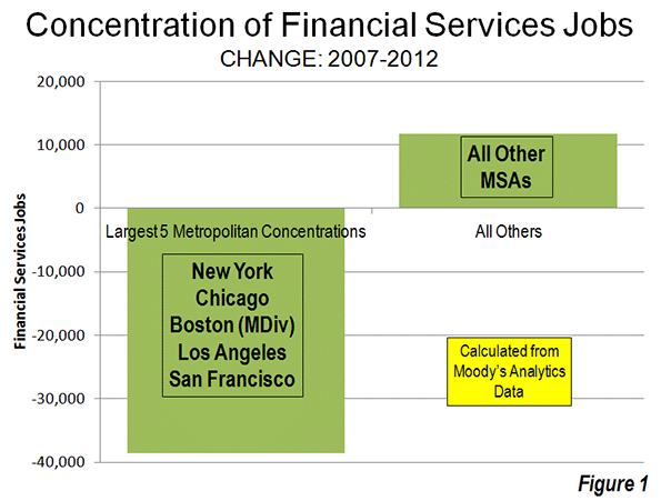
    However, the New York metropolitan area and the other four largest concentrations of financial sector jobs – New York, Chicago, Boston, Los Angeles and San Francisco – accounted all of the net job losses over the period. Between 2007 and 2012, the five largest financial sector markets, lost 39,000 jobs. Outside these five metropolitan areas, the number of financial sector jobs increased by 12,000 (Figure 1).

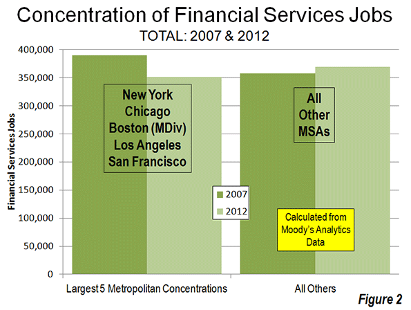
    The extent of this dispersal away from the five most concentrated markets is illustrated by the decline in their financial sector jobs compared to the other metropolitan areas. In 2007, the five most concentrated markets had 32,000 more financial sector jobs than the other metropolitan areas. By 2012, the other metropolitan areas achieved a total number of 19,000 more financial sector jobs than the five most concentrated markets (Figure 2).

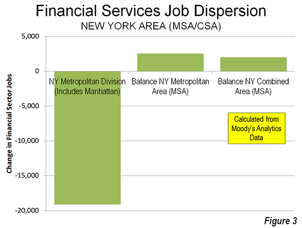
    The dispersion of financial sector jobs is evident even within the New York area itself. The central metropolitan division of the New York metropolitan area (New York-White Plains-Wayne), which includes Manhattan, lost 19,000. However, the balance of the New York metropolitan area experienced a 2500 increase in financial sector jobs, resulting in a overall loss of 16,500 jobs in the metropolitan area

    Not all of the New York metropolitan area jobs were lost to places like Dallas-Fort Worth and Des Moines. The balance of the New York combined statistical area (formerly called consolidated metropolitan statistical areas) added 2000 jobs, principally in the Bridgeport (Fairfield County, Connecticut) metropolitan area (Figure 3). Thus, while the core of the New York metropolitan area was losing 9 percent of its financial sector jobs, the more suburban balance of the combined area gained 11 percent, even as the total region lost employment.

    California: Substantial Financial Sector Employment Losses

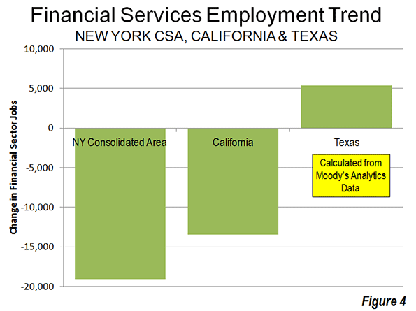
    However, New York’s percentage losses paled by comparison to those in the Los Angeles (Los Angeles and Riverside-San Bernardino) and San Francisco combined (San Francisco and San Jose) statistical areas. The losses in the Los Angeles area were 21 percent, while in the San Francisco area the losses reached 17 percent. The losses in Los Angeles and San Francisco regions exceeded that of the New York combined statistical area, which had three times as many financial sector jobs in 2007. San Diego also experienced a 5percent job loss, while Sacramento’s loss was miniscule. Overall, California lost 17 percent of its financial sector jobs between 2007 and 2012.

    Texas: Gaining Financial Sector Employment

    The large metropolitan areas of Texas and did better. Dallas-Fort Worth, Houston, San Antonio and Austin added 5400 financial sector jobs, an increase of 14 percent (Figure 4).

    Metropolitan Area Performance

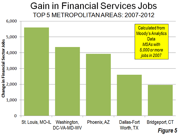
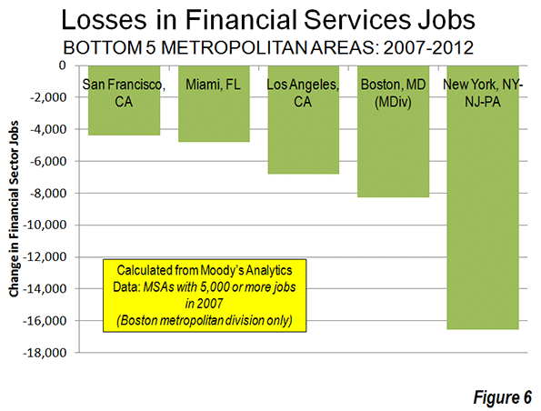
    St. Louis added 5,600 financial sector jobs, the most of any single metropolitan area (Figure 5). The Washington area added 4,400, followed by Phoenix (3,900), Dallas-Fort Worth (2,600) and Bridgeport (2,000). New York, as mentioned above, lost 16,500 financial sector jobs, the most of any individual metropolitan area (Figure 6). Boston had the second largest loss (8,300), followed by Los Angeles (6,800), Miami (4,800) and San Francisco (4,400).

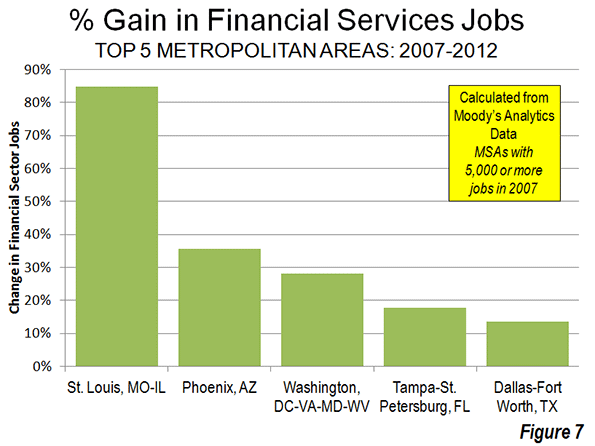
    The metropolitan areas with the largest percentage gains include net job leader St. Louis which grew 85 percent (Figure 7). Phoenix gained 36 percent, Washington 28 percent, Tampa-St. Petersburg 18 percent and Dallas-Fort Worth 14 percent. Des Moines, which had only 1,400 financial sector jobs in 2007 had the largest percentage gain, at 96 percent.

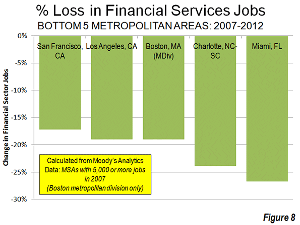
    Miami had the largest loss, at 27 percent (Figure 8). Charlotte, having risen to prominence with its large banks may have been in the wrong place at the wrong time, losing 24 percent of its financial sector jobs, followed by Boston and Los Angeles (19 percent) and San Francisco (17 percent).

    Dispersing to Lower Density Areas

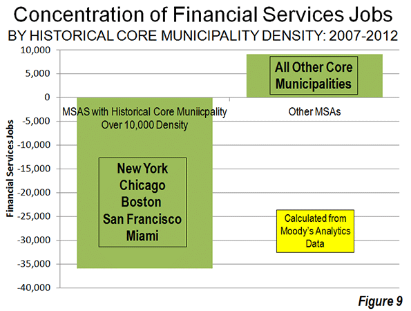
    The data is not sufficiently precise to distinguish between central business district, urban core and suburban trends. However, the metropolitan areas with high density historical core municipalities (above 10,000 persons per square mile or 4,000 per square kilometer in 2010), suffered a loss of 35,000 financial sector jobs between 2007 and 2012, more than the total national metropolitan loss of 27,000. The six high density historical core municipalities (Note 2) include New York, Chicago, Philadelphia Boston, San Francisco and Miami all suffered significant losses while the metropolitan areas with less dense cores gained 9,000 financial sector jobs (Figure 9).

    Further, the losses were concentrated in the metropolitan areas with the four most dense major urban areas, Los Angeles, San Francisco, San Jose and New York and the losses in these areas exceeded the overall industry loss. This movement away from density reinforces the often misconstrued conclusions of the Santa Fe Institute Urban Scaling research to the effect that metropolitan area size was a principal determinant of productivity, however not urban density (see: Density is Not the Issue: The Urban Scaling Research). Larger, less dense regions did far better — for example Houston, Dallas and St. Louis — than their more dense rivals.

    Dispersion to Housing Affordability

    There is also a strong trend of financial sector job gains where housing is more affordable and job losses where housing is less affordable. This is indicated by the median multiple (median house price divided by gross median household income) data from the 8th Annual Demographia International Housing Affordability Survey (Table below).


    Demographia International Housing Affordability Survey

    Housing Affordability Rating Categories

    Rating

    Median Multiple

    Severely Unaffordable

    5.1 & Over

    Seriously Unaffordable

    4.1 to 5.0

    Moderately Unaffordable

    3.1 to 4.0

    Affordable

    3.0 & Under


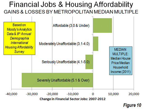
    Metropolitan areas rated as affordable (median multiple 3.0 or lower) gained 9,300 financial sector jobs between 2007 and 2012. Metropolitan areas rated moderately unaffordable (median multiple 3.1 to 4.0) gained 2,600 jobs. The metropolitan areas with the most unaffordable housing suffered a net loss in financial sector jobs. Seriously unaffordable (median multiple 4.1 to 5.0) metropolitan areas lost 3,700 jobs. Metropolitan areas rated seriously unaffordable (median multiple 5.1 or higher) lost 35,000 jobs. This is more than the overall loss reported in the data of 27,000 (Figure 10).

    Financial Sector Jobs: Reflecting Urban Dispersion

    The dispersion of financial sector jobs away from concentrated areas may come as a surprise, given the close association that the industry has with the largest central business districts. Yet, the trend mirrors the more general, but overwhelming trends of dispersion indicated over the last decade in both population and domestic migration.

    Wendell Cox is a Visiting Professor, Conservatoire National des Arts et Metiers, Paris and the author of “War on the Dream: How Anti-Sprawl Policy Threatens the Quality of Life.”

    ——

    Note 1: The data used in this analysis is limited to that provided in The Wall Street Journal article. Data was provided for only is only for a part of the Boston metropolitan area (the Boston-Quincy metropolitan division).

    Note 2: In 1940, at least 15 of the historical core municipalities had population densities exceeding 10,000 per square mile (4,000 per square kilometer)

    Photo by Flickr user IABoomerFlickr

  • California’s Poor Long-term Prognosis

    California’s current economic recovery may be uneven at best, but things certainly look better now than the pits-of-hell period in 2008. A cautiously optimistic New York Times piece proclaimed "signs of resurgence," and there was even heady talk in Sacramento of eventually sighting that rarest of birds, a state budget surplus.

    Yet such outbreaks of optimism should not blind us to the bigger issue: the long-term secular decline of the state’s economy. Whether you believe that the new higher taxes may now slow our growth, as my colleagues at Chapman University now believe, or right the fiscal ship, as is widely hoped in the blue California press, it’s more important to look more at the long-term trends, and assess where we stand compared with our domestic competitors.

    California, despite its enormous natural and human resources, is losing ground in most basic areas. Its unemployment rate, a still-horrendous 10 percent, stands as the nation’s third-highest. This is not a new development or the product of a run of bad luck. The state’s unemployment rate has been consistently above the national average for almost all of the past 20 years. Most interior counties, including the Inland Empire and the Central Valley, now suffer unemployment rates well into the double digits, with some approaching 15 percent.

    Overall, the state is still down a half-million jobs during the recession. California’s losses since its employment peak have been considerably above the national average, some 3 percent, far worse than the 2.3 percent erosion seen nationwide. Despite the modest recent uptick, the California Budget Project projects the state would need to add twice as many jobs per month to fully recover from the recession by the summer of 2015.

    Other long-term trends confirm the state’s secular decline in competitiveness. Take per capita income – a decent indicator of relative progress. In 1945, journalist John Gunther, writing his famous "Inside USA," gushingly described California "the most spectacular and most diversified American state … so ripe, golden." At the time, the state boasted the third-highest per capita income in the nation. As late as 1980, the state still ranked fourth. Today, despite Silicon Valley’s money machine, California has fallen to 12th and appears headed for further decline.

    Despite hopes in Sacramento and in the media, high-tech alone can not bail out the state. The much hoped-for windfall around the time of the Facebook IPO has failed to produce the expected fiscal bonanza for the state treasury. Silicon Valley famously gets nearly half the country’s venture capital, but its impact on the rest of the state has diminished. In the 1980s and 1990s, tech booms stretched prosperity throughout its surrounding regions and as far as Sacramento. Now it barely covers half the Bay Area; unemployment in Oakland remains at around 13 percent and one child in three lives in poverty.

    Part of this reflects the shift from an industrial high-tech focus to one fixated on software and social media. Given the extraordinary ease with which support and even research operations can be moved, once companies start to grow, they easily head to India, China or over to lower-cost locales like Utah or Texas. "Sure, we are getting half of all the venture capital investment but in the end we have relatively small research and development firms only," observes Jack Stewart, president of the California Technology and Manufacturing Association. "Once they have a product or go to scale, the firms move elsewhere. The other states end up getting most of the middle-class jobs."

    This can be seen in the long-term trends in STEM (science, technology, engineering, mathematics-related) jobs. Over the past decade, even with the current bubble, Silicon Valley’s STEM employment, according to estimates by Economic Modeling Specialists Inc., has increased by a mere 4 percent over the past decade. In contrast, science-based employment jumped 25 percent in Seattle, 20 percent in Houston and 16.8 percent in Austin, Texas.

    The tech scene in the Los Angeles Basin is doing even worse. STEM employment in the Los Angeles-Santa Ana area is still stuck below 2002 levels, partially a residue of the continued decline of the region’s once-globally dominant aerospace industry. The region, once arguably the world’s largest agglomeration of scientists and engineers, has now dipped below the national average in proportion of STEM jobs.

    Far greater problems can be seen further down the economic food chain, where many working-class and middle-class Californians traditionally have been employed. The state’s heavy industry – traditionally the source of higher-paid blue-collar employment – has missed out on the nation’s broad manufacturing resurgence. Over the past 10 years, according to an analysis by the Praxis Strategy Group, California has ranked 45th among the states in terms of heavy metal job creation, losing 126,000 jobs – more than 27 percent; San Francisco-Oakland ranked last among 51 large metropolitan areas. Both Los Angeles-Orange and San Bernardino ranked in the bottom 10.

    Despite hype about "green jobs," the immediate prospect for a big manufacturing turnaround is not bright. Because of its high energy costs and other regulatory costs, industrial investment has dried up in California. According to the California Technology and Manufacturing Association, California in 2011 did not even make the top 10 states in terms of new industrial investment, accounting for a paltry 2 percent. This was about one-third or less the share garnered by rivals such as Texas, North Carolina and rebounding "rust belt" states, like Pennsylvania.

    Construction, another pillar of higher-paid blue-collar employment, has recovered a bit but remains in worse shape than elsewhere. Overall, the state has lost almost 300,000 construction jobs from the 2007 peak, an almost 40 percent loss compared with 29 percent for the country as a whole.

    Even the trade sector, stalwart performer in producing high-wage jobs, may soon be declining. Recent labor disputes by highly paid, politically powerful California port workers – shutting down operations for eight days in Los Angeles and Long Beach – has reinforced the notion that the state’s an increasingly unreliable place to do business. After peaking around 2002, our ports are watching growth shift to the Gulf ports, such as Houston, and to the ports of the south Atlantic. The challenge will become far greater once the Panama Canal is widened in 2014 to accommodate larger ships from Asia.

    California is also squandering its chance to participate in a potential fourth source of basic employment, the massive expansion in domestic oil-and-gas production. The Golden State sits on potentially the largest gusher in the nation – the Monterey Formation is now estimated to be four times as rich in oil as North Dakota’s Bakken Formation. But our green consciousness dictates we don’t exploit our resources too much. In the past decade, Texas created some 200,000 generally high-paying energy jobs, while greener-than-thou California has generated barely one-tenth as many.

    As a result, wealthier, older, whiter, generally better-educated coastal areas can recover, but the prospects are dismal the further you head into the increasingly Latino, younger and less-educated inland areas. You have flush times for venture capitalists and celebrities, but growing poverty elsewhere. For at least two decades California’s poverty rate has remained higher than the national average. Now, notes a new Census estimate, the Golden State has a poverty rate of more than 23 percent, the highest in the country, something unthinkable a generation ago.

    Clearly, progressive policies are having socially regressive effects. Over the past few years the state, as a recent Public Policy Institute of California study demonstrates, has become ever substantially more unequal than the rest of the nation. Typical California middle-income workers have seen their median wage, adjusted for inflation, decline 4.5 percent since 2006, and now is at the lowest level since 2008. Only the highest-paid workers have avoided a decline in earnings.

    Fortunately, the elements to regain our former broad-based prosperity are still in place. The critical human assets are there: entrepreneurs, hardworking immigrants, top universities. We boast advantages from legacy industries – entertainment and fashion to technology and agriculture. And, perhaps most importantly, California retains its remarkable natural blessings of massive energy resources, fertile soil and a benign climate.

    The imperative now is to take fuller advantage of all these blessings in the coming years. Otherwise California will become poorer, more socially bifurcated and relegated by other places to the proverbial "dustbin of history."

    This piece first appeared in the Orange County Register.

    Joel Kotkin is executive editor of NewGeography.com and is a distinguished presidential fellow in urban futures at Chapman University, and contributing editor to the City Journal in New York. He is author of The City: A Global History. His newest book is The Next Hundred Million: America in 2050, released in February, 2010.

  • Big things that were never built in Los Angeles

    One of my lesser historical obsessions has been the grandiose stuff that’s been proposed for the Los Angeles area and never built. Things like the amusement park that Walt Disney proposed for Burbank before he put Anaheim on the map with Disneyland, or the assorted hotels, parks, monorails and highways that were given ink in the newspapers but either fell through or were never that real to begin with. I’ve written before about the sketch on my office wall from a 1913 Los Angeles Times front page envisioning a future downtown of skyscrapers, high-altitude auto bridges and curiously a waterfront. Imagine how different the city would be if, for instance, Valley promoters had gotten their way to plant the original LAX due west of the corner of Balboa and Roscoe. Or if the 1930 plan from Olmsted and Bartholomew for a chain of parks and playgrounds across the city had been accomplished.

    Sam Lubell, the West Coast Editor of the Architect’s Newspaper, and Greg Goldin, the architecture critic at Los Angeles Magazine, have mined the landscape and found some real gems. Lloyd Wright’s incredibly grand 1925 Civic Center for downtown (above.) Or the 1952 master plan for LAX by architects Pereira and Luckman. The plan is to use the research to mount an ambitious exhibition next spring at the A+D Architecture and Design Museum on Wilshire. They have launched a Kickstarter campaign to make it happen, and of course you can help.

    Check out their cool video:

    This piece first appeared at LA Observed.

  • A Housing Preference Sea Change? Not in California

    For some time, many in the urban planning community have been proclaiming a “sea-change” in household preferences away from suburban housing in the United States.

    Perhaps no one is more identified with the "sea-change" thesis than Arthur C. Nelson, Presidential Professor, City & Metropolitan Planning, University of Utah. Professor Nelson has provided detailed modeled market estimates for California in a paper published by the Urban Land Institute, entitled The New California Dream: How Demographic and Economic Trends May Shape the Housing Market: A Land Use Scenario for 2020 and 2035 (He had made generally similar points in a Journal of the American Planning Association article in 2006).

    Professor Nelson says that the supply of detached housing on what he defines as conventional sized lots (more than 1/8 acre) is far greater than the demand in California (Note 1). He further finds that the demand of detached housing on smaller lots is far greater than the supply. Professor Nelson’s conclusions are principally modeled from stated preference surveys, which can mislead if people act differently when they make choices in the real world.

    The Modeled Demand Estimates

    Nelson models the demand for housing types in California’s largest four planning regions (Southern California Association of Governments for the Los Angeles area, and the Bay Area Association of Governments for the San Francisco-San Jose area, the San Diego Association of Governments and the Sacramento Area Council of Governments). He estimates 2010 both supply and demand. His demand estimates rely strongly on data from three early 2000s stated preference surveys conducted by the Public Policy Institute of California (PPIC).

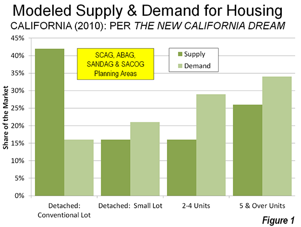
    • Nelson’s data indicates a strong preference for multi-family housing, which he places at 62% of demand in 2010, compared to the 2000 supply of 42%. Thus, the demand for multi-family housing is suggested to be one half above the supply.
    • The most stunning conclusion, however, is an over-supply of detached housing on conventional lots that Nelson estimates. Compared to a 2000 supply of 42% of the market, Nelson estimates the demand to be only 16%. This would indicate the supply of such housing to be more than 2.5 times the demand as is indicated in Figure 1.

    Nelson’s findings on conventional lot detached housing have obtained the most attention. He surmises that virtually all of the demand over the next 25 years can be met by the existing stock of conventional lot detached housing. This is music to the ears of many urban planners, who have for decades demonized  the suburbanization that has been preferred by the overwhelming majority of Californians (and Americans, and people elsewhere in the world where they can afford them).

    Actual Demand: Revealed Preferences: 2000-2008

    To perform a similar analysis, we used revealed preference data: the actual change in housing by type from the 2000 Census data to the latest American Community Survey (ACS) 2006-2010 data at the census tract level (Note 2).  

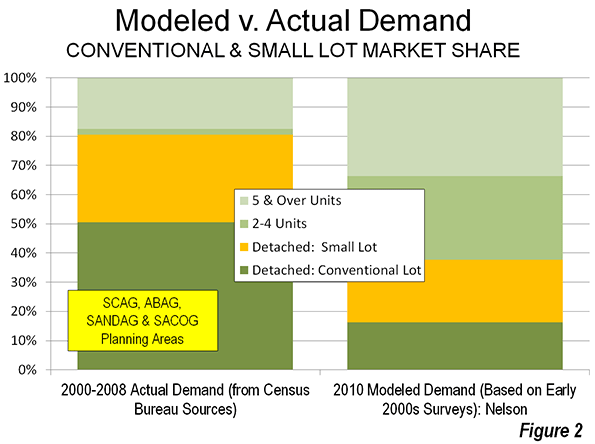
    In contrast to Professor Nelson’s estimates, the demand data indicates a strong continuing preference among Californians for detached housing on conventional lots. From 2000 to 2008 (the middle year for the 2006-2010 data), 51 percent of the new occupied housing in the four planning areas is estimated to have been detached on conventional lots (Figure 2). This is more than three times the 16% demand estimate in Professor Nelson’s data. In fact, the actual demand was higher than the 2000 supply (42%), indicating that the demand for detached houses on conventional lots has increased.

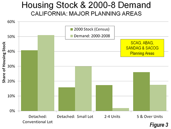
    If there is a sea change, it would appear to be in multi-family housing. In contrast with the 62% share for multi-family dwellings modeled by Nelson, the actual demand indicated in the census tract data was two-thirds less, at 19% (Figure 3), well below the supply of 43 percent in 2000. This suggests a tanking of demand for multi-family housing, even as builders, in California and elsewhere, put more product on the market.

    Why Accounts for the Difference

    Various factors appear likely to contribute to the difference between the modeled demand and the actual demand.

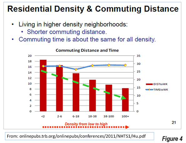
    Smaller Lots and Higher Density Do Not Mean Shorter Commutes: The PPIC survey questions implied a connection between larger lots (lower density) and longer commutes. This is the broadly shared perception, but in reality houses on smaller lots (necessarily in higher density neighborhoods) do not mean shorter commutes. This is illustrated in a chart by Southern California Association of Governments (SCAG) researchers on page 62 of The New California Dream. In the original SCAG document, the authors note that "commuting time is about the same for all density" (Figure 4).  This is not surprising, since higher densities are associated with more intense traffic congestion and with greater transit use, both of which lengthen commutes (Note 3).

    The "higher density means shorter commute" myth is rooted in the obsolete mono-centric conception of the city. Almost all US urban areas have become poly-centric with job locations highly-dispersed, as jobs have followed people to the suburbs. Gordon and Lee (Note 4) have shown that work trip travel times in the United States are shorter to dispersed employment locations than to central business districts or secondary business centers (such as "Edge Cities").  

    Invalid Perceptions of Transit Mobility: Professor Nelson also stresses stated preference responses showing that many people would prefer to live near transit service. All things being equal, who wouldn’t?

    But all things are not equal. Living near transit does not mean practical transit access to most of the urban area. In most cases, only a car can provide that. Transit systems are necessarily focused on downtown areas (central business districts), which contain, on average, only 8% of employment in the four planning regions. , Travel to other destinations is usually inconvenient, because of time-consuming transfers, or   not available at all.

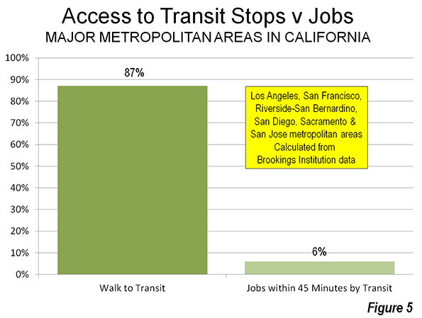
    A Brookings Institution report indicated that 87 percent of people in California’s major metropolitan areas (Los Angeles, San Francisco, Riverside-San Bernardino, San Diego and Sacramento) live within walking distance of transit. Yet, the average employee can reach only 6% of the jobs in their respective metropolitan area in 45 minutes (Figure 5). By contrast, the average work trip travel time ranges from 25 minutes to under 30 minutes in the four planning regions .

    Households thinking about a move to higher density could have been, upon more serious examination, deterred by transit’s severe mobility limitations. 

    Data Insufficiently Robust for the Modeling: There is also the potential that the PPIC surveys, with their general questions, were not of sufficient robustness to support Professor Nelson’s assertions. For example, PPIC did not define the size of small lots.

    Planning and Reality

    If households were so eager to move from detached houses on conventional lots to smaller lots, 2000 to 2008 would have been the ideal time. The mortgage industry was literally falling over itself to fund home purchases. Urban core wannabes could have flooded the market pursuing their smaller lot "stated preferences." The actual, revealed preference data says they did not, which is also indicated by the continuing strength of suburban growth relative to central city growth (Note 5).

    Thus, the modeled demand estimates in The New California Dream appear to be at substantial odds with the actual demand.This is much more than an academic issue. The conclusions of The New California Dream have achieved the status of sacred text in the canon of urban planning and are mouthed unquestioningly by organizations like the Urban Land Institute.

    Worse, demand estimates from The New California Dream are being relied upon in regional transportation plans being developed by California’s metropolitan planning organizations (MPOs). This is particularly risky because these same MPOs have been granted greater power over housing under California’s Senate Bill 375, goaded on by a sue-happy state Attorney General’s office. The attempt by MPOs to impose their housing plans and regulations on consumers could well backfire, for investors in condominium and multifamily housing.  This would not be a first time that   developers followed urban planning illusions like lemmings over a cliff, to which huge losses in the last decade attest. The more destructive effects, however, are likely to be paid by households and the economies of California’s metropolitan areas.

    ———

    Note 1: More than 70% of the detached housing stock was on conventional lots in 2000.

    Note 2: There is no census tract data on detached house lot size. We scaled the detached housing data from the 2000 census to match Professor Nelson’s distribution of detached housing supply by lot size, using population density. Nelson’s method and ours were sufficiently similar that the results should have been roughly comparable. As the text indicates, they were not.

    Note 3: In each of the three PPIC surveys, respondents are asked to choose between housing alternatives that are high in the questions to commute "lengths." From the description and survey instruments in the PPIC reports, there is no indication that respondents were given any idea what commute "length" means. There are two way to judge commute "length." One is distance or miles, while the other is time. Based upon the PPIC survey instrument, it cannot be known which definition was perceived by the respondents.

    Even so, it seems more likely that the term "commute length" was perceived by respondents in time rather than in distance by respondents. Each day, people have only so many hours and minutes available. However, distance is not so constrained, depending upon the speed of the commute. Further, the extensive research on commuting often refers to "travel budgets," which are expressed in time, not distance.

    Note 4: Reference: Gordon, P. and B. Lee (2012), "Spatial Structure and Travel: Trends in Commuting and Non-Commuting Travels in US Metropolitan Areas," draft chapter for the International Handbook on Transport and Development edited by Robin Hickman, David Bonilla, Moshe Givoni and David Banister.

    Note 5: The most recent year (2010-2011), for which the Census Bureau had issued invalid municipal population estimates, indicated a continued the trend toward suburban rather than urban core growth, as has been shown by Trulia Chief Economist Jed Kolko (see: Even After the Housing Bust, Americans Still Love the Suburbs).

    =======

    Photograph: Suburban San Diego

    Wendell Cox is a Visiting Professor, Conservatoire National des Arts et Metiers, Paris and the author of “War on the Dream: How Anti-Sprawl Policy Threatens the Quality of Life.”

  • How California Lost its Mojo

    The preferred story for California’s economy runs like this:

    In the beginning there was prosperity.  It started with gold.  Then, agriculture thrived in California’s climate.  Movies and entertainment came along in the early 20th Century.  In the 1930s there was migration from the Dust Bowl.  California became an industrial powerhouse in World War II.  Defense, aerospace, the world’s best higher education system, theme parks, entertainment, and tech combined to drive California’s post-war expansion.

    Then, in the evening of November 9th, 1989, the Berlin Wall came down.  On December 25, 1991, the Soviet Union was dissolved.  The Cold War was over.  America responded by cutting defense spending and called the savings the Peace Dividend.

    California paid that peace dividend.  A huge portion of California’s military industrial complex was destroyed.  The aerospace industry was downsized, never to come back.  Hundreds of thousands of well-paying manufacturing and engineering jobs were lost.

    The ever-resilient California bounced back though.  Tech, driven by an entrepreneurial culture and fed by California’s great universities drove California’s economy to new heights.

    Then, there was the dot.com bust.  A mild national recession was much more painful for a California dependent on its tech sector.  Eventually California recovered.  California’s tech sector and climate, aided by a housing boom, restored California’s prosperity.

    The housing boom was followed by a housing bust.  Again, California paid a high price, and unemployment skyrocketed to 30 percent above the national average.

    Today, California is recovering.  Its tech sector is once again bringing prosperity to the state.  Furthermore, California’s green legislation is providing the motivation for a brave new future of economic growth and environmental virtue.

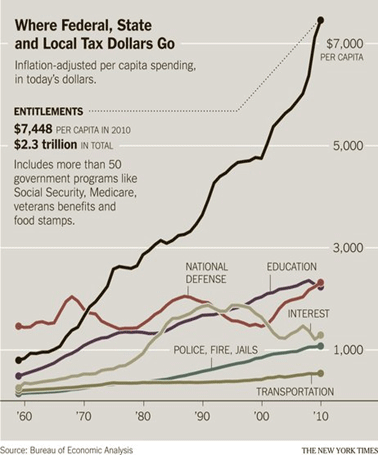
    The story is true through the Peace Dividend.  California did pay a high price for the collapse of the Soviet Union.  California’s defense sector did begin a decline, and it never recovered.  But, defense recovered in other places, as the country expanded defense spending by 21 percent in the 2000s.  The United States has constantly been engaged in wars and conflicts for over a decade.  On a real-per-person basis, the United States is spending as much on defense as it has at any time since 1960. 

    But when it comes to the present, the narrative falls down.  Defense has rebounded, but not in California.  California’s defense sector is small and declining, not because of a permanently smaller U.S. defense sector, but because of something about California.

    California’s tech sector did boom after the collapse of California’s defense sector, but that doesn’t mean that California recovered.  In fact, much of California never recovered.  It’s the aggregation problem. 

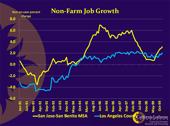
    The 1990s’ recovery was largely a Bay Area recovery.  Los Angeles hardly saw any uptick in employment.  Here is a chart comparing Los Angeles County’s jobs growth rate with the San Jose Metropolitan Statistical Area (MSA): 

    San Jose probably had California’s fastest growing job market in the 1990s.  Los Angeles was not the states slowest.  Still, the differences are striking.

    A few years ago, a couple of my graduate students looked at California data from 1990 through 1999.  They divided California into two regions, the Bay Area and everywhere else.  The Bay Area was defined as Sonoma, Marin, Napa, Solano, Contra Costa, Alameda, Santa Clara, Santa Cruz, San Mateo, and San Francisco counties.  Using seven indicators of economic growth, they performed relatively simple statistical tests to see if the two geographies experienced similar economies.  The indicators were employment, wages, home prices, bank deposits, population growth, construction permits, and household income.

    By every measure except population growth, the Bay Area outperformed the rest of the state.  The exception was probably due to commuters to the Bay Area, given that region’s exceptionally high housing prices. 

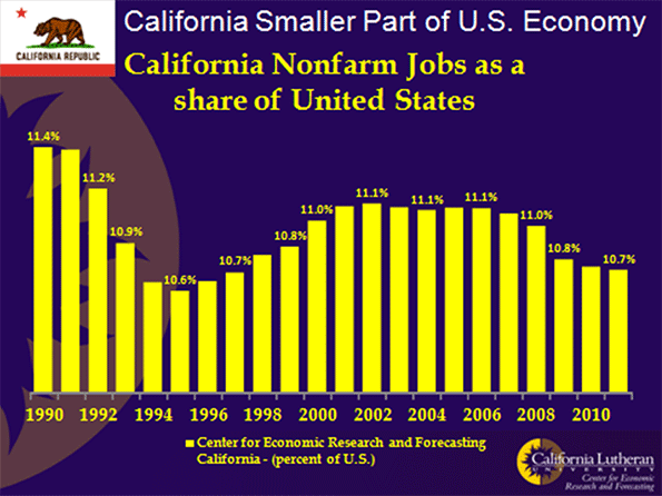
    Some economists will tell you that California saw faster-than-national job growth from the mid 1990s until the great recession.  This is another aggregation problem.  The claim is technically true, but only in the sense that California had a higher proportion of the nation’s jobs in 2007 than it did in 1995.  If you look at annual data, you will see that California’s share of the nation’s jobs only grew from 1995 through 2002.  Since then, California’s share of United States jobs resumed its decline:

    In reality, California never recovered from the dot.com bust.  California, perhaps the best place on the planet to live, couldn’t keep up in a housing boom.  Something was wrong.

    California had lost its mojo. 

    Opportunity is now greater outside California than inside California.  For almost 150 years, California was as widely known for its opportunity as it was for its sunshine.  The combination was like a drug.  George Stoneman, an army officer destined to become California’s 15th governor, spoke for millions when he said "I will embrace the first opportunity to get to California and it is altogether probable that when once there I shall never again leave it." 

    They did come to California, and they made an amazing place.  Opportunity-driven migrants are different than other people.  They take big risks to leave everything they know for an uncertain future in a new place.  They are confident, bold, and brash.   California became just as confident, bold, and brash.  The Anglo-American novelist Taylor Caldwell spoke the truth when she said "If they can’t do it in California, it can’t be done anywhere."

    That was then.  Today, California can’t even rebuild an old Hotel.

    The Miramar Hotel is a partially-demolished eyesore beside the 101 Freeway in Montecito, just south of Santa Barbara.  The Hotel’s initial structure was built in 1889.  Over the years, it was expanded to a 29 structure luxury hotel and resort.  In September 2000 it was closed for renovations which were expected to take 18 months.  That was when the fighting started.  Community groups, neighbors, and governments all had their own idea of what the Miramar should be.  Two owners later, and after millions of dollars, the future to the Miramar is still uncertain.

    The Miramar Hotel is a case study of what is wrong with post-industrial California, precisely because it should have been easy, and because it is not unique.  Everything is hard to do in California.  The state that once moved rivers of water hundreds of miles across deserts and over or through mountain ranges can’t rebuild a hotel.

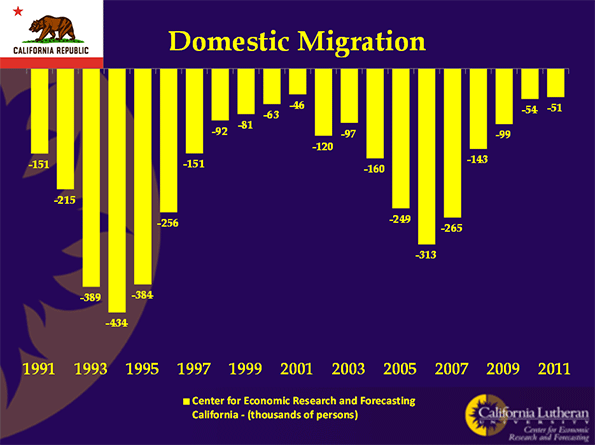
    The situation will get worse.  California has become the place people are leaving.  The following chart shows that for 20 years more people have left California for other states than came to California from other states:

    California’s population is still increasing because of births and international immigration. 

    Two decades of negative domestic migration has taken its toll.  Millions of risk-taking, confident, bold, and brash people have left California.  They took California’s mojo with them.

    That seems pretty clear when you look at some statistics:  California’s unemployment is way above the national average.  With only about 12 percent of the nation’s population, California has over 30 percent of the nation’s welfare recipients.  San Bernardino has the nation’s second highest poverty rate among cities over 200,000.

    Sometimes though, aggregated data can hide California’s weakness, and some, representing the always-present constituency for the status quo, use these data to deny that California’s future is any less golden. 

    Most recently, those representing the constituency for the status quo have used California’s aggregated jobs data to argue that all is well in California.  They argue that California’s tech sector is leading California to a new golden future.

    Year-over-year data confirm that, through August 2012, California gained jobs at a faster pace than the United States.  Once again, though, that growth is largely confined to one industry and one geography.  California’s tech sector is recovering, and amidst a generally weak recovery, it appears strong enough to generate pretty impressive aggregated results.  If we disaggregate California’s data, we will find that there is not just one California.  There is a rich and mostly coastal California, with a few smaller inland counties on the San Francisco-Lake Tahoe corridor.  Another California is very poor and mostly inland.

    Here’s a list of California’s poorest counties by poverty rate:

    County

    Poverty Rate

    Child Poverty Rate

    Rank

    Del Norte

    23.5

    30.6

    3

    Fresno

    26.8

    38.2

    1

    Imperial

    22.3

    31.8

    6

    Kern

    21.4

    30.3

    10

    Kings

    22.5

    29.7

    5

    Madera

    21.7

    31.7

    8

    Merced

    23.1

    31.4

    4

    Modoc

    21.9

    32.5

    7

    Siskiyou

    21.5

    30.7

    9

    Tulare

    33.6

    33.6

    2

    Here’s a list of California richest counties by poverty rate:

    County

    Poverty Rate

    Child Poverty Rate

    Rank

    Calaveras

    11.1

    18.3

    10

    Contra Costa

    9.3

    12.7

    4

    El Dorado

    9.4

    11.6

    5

    Marin

    9.2

    10.9

    3

    Mono

    10.8

    15

    8

    Napa

    10.7

    14.7

    7

    Placer

    9.1

    10.7

    2

    San Mateo

    7

    8.5

    1

    Santa Clara

    10.6

    13.3

    6

    Ventura

    11

    15.3

    9

    There are some big differences here.  The percentage of Fresno’s children living in poverty is four and half times the percentage of San Mateo children living in poverty.  In fact, the data for California’s poorest counties looks like third-world data.

    When disaggregated, the job-growth data shows the same story.  Through 2012’s second quarter, jobs in the San Jose MSA were up 3.6 percent on a year-over-year basis.  In Los Angeles, jobs were up only 1.1 percent, while in Sacramento they were up only 0.6 percent.  For comparison, U.S. jobs were up about 1.3 percent for the same time period.

    You can perform this analysis for all types of data.  When the data are disaggregated, the story is always the same.  It’s telling us that California needs to get its mojo back, and the current tech boom is likely not to be enough for its recovery.

    Bill Watkins is a professor at California Lutheran University and runs the Center for Economic Research and Forecasting, which can be found at clucerf.org.

    Unemployment photo by BigStockPhoto.com.

  • A Look at Commuting Using the Latest Census Data

    Continuing my exploration of the 2011 data from the American Community Survey, I want to look now at some aspects of commuting.

    Public Transit

    Public transit commuting remains overwhelmingly dominated by New York City, with a metro commute mode share for transit of 31.1%. There are an estimated 2,686,406 transit commuters in New York City. All other large metro areas (1M+ population) put together add up to 3,530,932 transit commuters. New York City metro accounts for 39% of all transit commuters in the United States.

    If one were to guess the #2 city for transit commuting, another older, pre-auto, centralized city on the lines of New York (say Chicago) might be the obvious guess. It would also be wrong. It’s actually Washington, DC that has the second highest transit commute share among large metros at 14.8%. Here’s the complete top ten:

    Rank

    Metro Area

    2011

    1

    New York-Northern New Jersey-Long Island, NY-NJ-PA

    2,686,406 (31.1%)

    2

    Washington-Arlington-Alexandria, DC-VA-MD-WV

    439,194 (14.8%)

    3

    San Francisco-Oakland-Fremont, CA

    299,204 (14.6%)

    4

    Chicago-Joliet-Naperville, IL-IN-WI

    503,535 (11.6%)

    5

    Boston-Cambridge-Quincy, MA-NH

    267,568 (11.6%)

    6

    Philadelphia-Camden-Wilmington, PA-NJ-DE-MD

    251,285 (9.3%)

    7

    Seattle-Tacoma-Bellevue, WA

    137,858 (8.1%)

    8

    Portland-Vancouver-Hillsboro, OR-WA

    66,619 (6.3%)

    9

    Los Angeles-Long Beach-Santa Ana, CA

    355,811 (6.2%)

    10

    Baltimore-Towson, MD

    80,472 (6.1%)


    Not only are New York and Washington top two cities for public transit commuting, they are also the two cities that have been dominant in increasing transit’s market share. Both cities showed material share gains since 2000, over three and a half percentage points each, for transit. Among large cities, Seattle was the only one that managed to post a share gain of even one percent.

    Rank

    Metro Area

    2000

    2011

    Change in % of Workers Age 16 and Over

    1

    New York-Northern New Jersey-Long Island, NY-NJ-PA

    2,181,093 (27.4%)

    2,686,406 (31.1%)

    3.74%

    2

    Washington-Arlington-Alexandria, DC-VA-MD-WV

    278,842 (11.2%)

    439,194 (14.8%)

    3.61%

    3

    Seattle-Tacoma-Bellevue, WA

    106,784 (7.0%)

    137,858 (8.1%)

    1.17%

    4

    Orlando-Kissimmee-Sanford, FL

    12,601 (1.6%)

    24,901 (2.5%)

    0.91%

    5

    Hartford-West Hartford-East Hartford, CT

    15,755 (2.8%)

    21,794 (3.7%)

    0.91%

    6

    Charlotte-Gastonia-Rock Hill, NC-SC

    9,532 (1.4%)

    19,227 (2.3%)

    0.91%

    7

    San Francisco-Oakland-Fremont, CA

    278,207 (13.8%)

    299,204 (14.6%)

    0.81%

    8

    Los Angeles-Long Beach-Santa Ana, CA

    287,392 (5.6%)

    355,811 (6.2%)

    0.67%

    9

    Miami-Fort Lauderdale-Pompano Beach, FL

    67,685 (3.2%)

    95,536 (3.8%)

    0.61%

    10

    Nashville-Davidson–Murfreesboro–Franklin, TN

    5,574 (0.8%)

    10,705 (1.4%)

    0.55%


    Vaunted Portland only managed to eke out a share gain of 0.07%, which could be entirely statistical noise. Its performance lagged even auto-centric cities like Charlotte and Nashville.

    Bicycling

    Every city out there seems to be vying to be the bike friendliest city in the world. Yet bicycling has yet to make much of an impact on commuting. Only 7 out of 51 large metros even post 1% mode share for cycling:

    Row

    Geography

    2011

    1

    Portland-Vancouver-Hillsboro, OR-WA

    23,941 (2.3%)

    2

    San Francisco-Oakland-Fremont, CA

    38,419 (1.9%)

    3

    San Jose-Sunnyvale-Santa Clara, CA

    16,013 (1.9%)

    4

    Sacramento–Arden-Arcade–Roseville, CA

    15,804 (1.8%)

    5

    Austin-Round Rock-San Marcos, TX

    8,847 (1.0%)

    6

    New Orleans-Metairie-Kenner, LA

    5,307 (1.0%)

    7

    Phoenix-Mesa-Glendale, AZ

    18,007 (1.0%)

    8

    Seattle-Tacoma-Bellevue, WA

    15,949 (0.9%)

    9

    Denver-Aurora-Broomfield, CO

    12,052 (0.9%)

    10

    Los Angeles-Long Beach-Santa Ana, CA

    50,080 (0.9%)


    Portland grew bicycle mode share by 1.51% Perhaps this explains its poor transit performance. Cycling is canabalizing transit growth.

    Walking

    The low level of bicycling can perhaps best be illustrated by comparing it to walking. Even in Portland more people walk to work than ride bikes.


    Rank

    Metro Area

    2011

    1

    New York-Northern New Jersey-Long Island, NY-NJ-PA

    540,733 (6.3%)

    2

    Boston-Cambridge-Quincy, MA-NH

    121,537 (5.3%)

    3

    San Francisco-Oakland-Fremont, CA

    87,409 (4.3%)

    4

    Philadelphia-Camden-Wilmington, PA-NJ-DE-MD

    101,107 (3.7%)

    5

    Seattle-Tacoma-Bellevue, WA

    62,238 (3.7%)

    6

    Pittsburgh, PA

    36,857 (3.4%)

    7

    Portland-Vancouver-Hillsboro, OR-WA

    35,242 (3.4%)

    8

    Rochester, NY

    15,573 (3.2%)

    9

    Washington-Arlington-Alexandria, DC-VA-MD-WV

    94,698 (3.2%)

    10

    Chicago-Joliet-Naperville, IL-IN-WI

    134,399 (3.1%)


    Working from Home

    Looking at telecommuting gives a much different list of top cities, this one dominated by “wired” metros like Austin and Raleigh. The share of telecommuters in these cities is bigger than walking or biking, or even transit in many cities. This is an oft-overlooked part of the green transport agenda. The most green commute possible is the one you never have to make.

    Rank

    Metro Area

    2011

    1

    Austin-Round Rock-San Marcos, TX

    62,593 (7.1%)

    2

    Raleigh-Cary, NC

    37,030 (6.6%)

    3

    Portland-Vancouver-Hillsboro, OR-WA

    67,223 (6.4%)

    4

    San Francisco-Oakland-Fremont, CA

    131,029 (6.4%)

    5

    San Diego-Carlsbad-San Marcos, CA

    89,547 (6.3%)

    6

    Denver-Aurora-Broomfield, CO

    76,025 (5.9%)

    7

    Phoenix-Mesa-Glendale, AZ

    105,570 (5.8%)

    8

    Sacramento–Arden-Arcade–Roseville, CA

    52,143 (5.8%)

    9

    Atlanta-Sandy Springs-Marietta, GA

    132,979 (5.5%)

    10

    Seattle-Tacoma-Bellevue, WA

    87,839 (5.2%)


    Commute Times

    Unsurprisingly, large cities – including New York and Washington again at the top – feature the longest average commute times. Larger cities tend to have worse congestion and feature longer commutes. As transit commutes are generally longer than driving, the high transit mode share helps to drive up commute times in those cities.

    Rank

    Metro Area

    2011

    1

    New York-Northern New Jersey-Long Island, NY-NJ-PA

    34.9

    2

    Washington-Arlington-Alexandria, DC-VA-MD-WV

    34.5

    3

    Riverside-San Bernardino-Ontario, CA

    31.0

    4

    Chicago-Joliet-Naperville, IL-IN-WI

    30.9

    5

    Atlanta-Sandy Springs-Marietta, GA

    30.6

    6

    Baltimore-Towson, MD

    30.3

    7

    Boston-Cambridge-Quincy, MA-NH

    29.2

    8

    San Francisco-Oakland-Fremont, CA

    29.2

    9

    Los Angeles-Long Beach-Santa Ana, CA

    28.6

    10

    Philadelphia-Camden-Wilmington, PA-NJ-DE-MD

    28.5


    Whether New York might prefer a more auto-oriented layout in order to reduce commute times is a different matter. There’s no precedent for such a huge region having anything less than terrible congestion and commute times. And clearly New York would not be New York with such a radical change. The same forces that drive up commute times in places like New York and Washington are some of the same forces that sustain them as centers of elite economic production.

    Note: An early version of this piece contained an incorrect version of “Working from Home” table.

    Aaron M. Renn is an independent writer on urban affairs and the creator of Telestrian, a data analysis and mapping tool. He writes at The Urbanophile.

    Light trails photo by Bigstock.

  • USC Extorted by the City of Los Angeles

    With California State Redevelopment Agency money gone, the city of Los Angeles ought to welcome new large-scale private development, and the economic stimulus and job creation it brings, with open arms. City Hall, faced with an anemic municipal budget, could also use the increased tax revenue. One such project that would help abate the city’s budget woes and create new jobs for the city is the University of Southern California’s proposed $1.1 billion “The Village at USC” project.

    Surprisingly (or perhaps not), the city’s Planning and Land Use Management Committee delayed approval of the project for the second time last week, citing a need for more time to digest data regarding the project’s gentrifying effects on the surrounding community. The city is not fooling anyone – the delay amounts to nothing short of extortion – an attempt to ensure that committee members receive their proper concessions.

    The site for “The Village at USC” is located directly north of the campus on University-owned land. Currently a dilapidated retail center, the new project calls 350,000 square feet of retail and will add up to 5,200 much needed student beds. The project would also create 12,000 new jobs for the city (8,000 permanent and 4,000 construction-related).

    Comprehending the short-sightedness of delaying the project requires an understanding of USC’s role in its surrounding neighborhood (full disclosure: this writer is a graduate of USC). The university was founded in 1880, when LA was nothing more than a far outpost of western American expansion. Situated just 2 miles south of downtown, the city grew outward around the campus. Once an upscale neighborhood, the area immediately adjacent to USC lost its luster with the development of the city’s Westside, including Hollywood and Beverly Hills. Post WWII suburban expansion and the construction of the 110 and 10 freeways further eroded the area.

    Today the area surrounding USC’s campus is racially and economically polarized. Part of LA’s notorious South Central (now more politically correct referred to as “South LA”), the area was hard hit by the riots of 1992. Yet while crime is still an issue, the area has markedly improved since the riots. Much of the improvement is thanks to a shift in the University’s relationship to its surrounding neighborhood post-1992. Rather than continuing to see itself as an island fortress in a sea of urban chaos, USC reached out to the local community, sponsoring programs for community members and supporting local businesses. The University’s extensive community outreach efforts led it to be named TIME magazine’s “University of the Year” in 2000.

    As Los Angeles developed, USC had several opportunities to relocate its campus to other parts of the city and even Orange County, but its commitment to staying in the city’s center stood the test of time. The University is the largest private employer in Los Angeles and serves as a wellspring of knowledge and talent for the city. Given these contributions to LA, it is unfortunate and even appalling that the city’s Planning and Land Use Management Committee would question the University’s intentions and delay its plans to develop on land it owns with its own money (and without any handouts from the city or state).

    Adam Nathaniel Mayer is an American architectural design professional. In addition to his job designing buildings he writes the China Urban Development Blog. Follow him on Twitter: @AdamNMayer.

  • The Road Less Understood

    The Economist confuses ends (objectives) and means in its current number examining the peaking of per capita automobile use in the West in two articles ("The http://www.economist.com/node/21563327" and "Seeing the Back of the Car"). In congratulating metropolitan areas for trying "to change the way people move around," The Economist reminds that Portland (Oregon) has developed light rail and that policy supports transit in Los Angeles. So much for the means, but what about the ends?

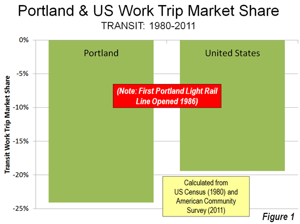
    In Portland: Transit Loses Ground and a Skeptical Public: Portland, for example, has had anything but stellar performance. Transit has not kept up with growth, having lost 25 percent of its commuting (work trip) share since before the first light rail line was opened in 1986 (Note 1). With five new light rail lines, transit in Portland not only fell short of attracting its previous bus only share of commutes, but also sustained losses greater than the national rate (Figure 1).

    The people of the Portland area may not share The Economist’s ardor. Just last week, The Oregonian headlined "Clackamas County anti-rail measure passes comfortably; effect could resonate for decades," reporting on a 60-40 vote to require referenda for future rail expenditures. As if that were not enough, a similar measure passed by a similar margin in King City, a municipality in Washington County and Tigard, one of the area’s largest municipalities, has placed the matter on the November ballot.

    But Portland does have a substantial success missed by The Economist. Working at home is growing rapidly. From 1980 to 2011, working at home (mostly telecommuting) increased by 55,000. This is more than three times the growth in rail transit commuting (17,500). During the last decade, working at home passed transit as a work access mode in Portland, and with virtually no public expenditures (as opposed to the billions for new rail lines). There has been a 375,000 increase in car use by one-way commuters since 1980, and, not surprisingly, a quadrupling of excess travel time in peak period traffic (based upon Texas Transportation Institute data). In the end, Portland built an extensive rail system and the riders have not come. Portland didn’t expand its highway system, and they came anyway (National 2010-2011 journey to work data is summarized here.).

    In Los Angeles: Long on Rail Lines, Short on Passengers: The Economist rightly points out that Los Angeles has implemented policies to get people out of cars. Indeed, Los Angeles has been the poster child for transit development. In little more than two decades, 11 metro, light rail, and suburban rail lines have been opened. Probably no metropolitan area in the world has opened more miles of new rail service in that period. Matthew Yglesias, writing in Slate was so impressed that he called Los Angeles "America’s next great mass transit city."

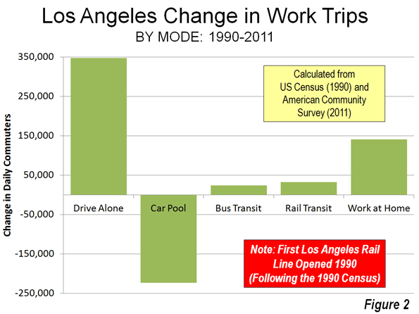
    The results are less convincing. The total daily one-way commutes on the 11 rail lines is only 32,000, smaller than the number of people carried daily on a single lane of the San Diego Freeway (I-405) where it crosses over Wilshire Boulevard. Meanwhile, working at home has risen more than four times that of rail commuting since 1990 (Figure 2). Los Angeles may be better described as “America’s next great telecommuting city." However, the auto is still king. From 1990 to 2011, solo automobile commuting increased 340,000, two percentage point gain, three times that of transit.

    Younger People: Driving More to Work and Telecommuting More

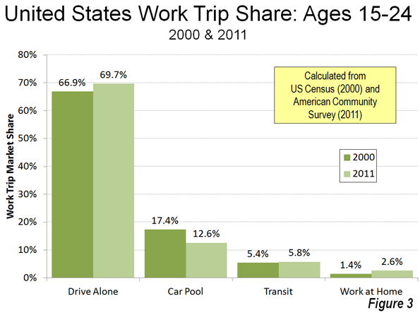
    The Economist also jumps on the "young people forsaking driving" bandwagon, a subject that has attracted the attention of others. But, young people are driving more, at least to work. Since 2000, the increase in driving alone to work by people aged 15 to 24 was nearly 260,000, compared to a 4,000 loss in transit commuting. Working at home was up almost as much as driving, at 200,000. Even so, with the declining size of the younger work force, transit’s share was up. From 2000 to 2011, the share of 15-24 year old workers rose from 5.4 percent to 5.8 percent (Figure 3), virtually the same as the overall increase in transit market share of from 4.6 percent to 5.0 percent (Note 2). As with Portland and Los Angeles, the last 11 years saw a much larger increase in working at home, from 3.3 percent to 4.3 percent.

    Further, to the extent working at home, social media and online shopping replace the need for driving among younger adults (and everyone), all the better.

    The Fantastical Claim: 50,000 Passengers Per Hour

    The Economist repeats the specious claim that rail lines can carry 50,000 passengers per hour in each direction. If your world is limited to Paris between Chatelet and Gare de Lyon and the handful of similar places, maybe so. But in most of the rest of the world, it is the stuff of fairy tales.

    The 2011 data shows the extent of the illusion.  The fantastical rail line carrying 50,000 per hour would carry the equal of all the daily rail commuters in Dallas or Miami in less than 20 minutes. It would take only about five minutes to handle the daily rail transit commuting volume in Minneapolis or Salt Lake City.

    Further, some of the new systems have been manifestly unsuccessful in attracting commuters. For example, in Charlotte, there was a strong increase in transit commuting between 2000 and 2011, with transit’s market share rising 64 percent. Yet, more than 60 percent of the new commuters were on buses, rather than on light rail, reflecting a long overdue increase in artificially low service levels. In Phoenix, 85 percent of the transit commuting increase was on buses, rather than the light rail line. The fantastical 50,000 per hour line would take only handle this load in about two minutes.

    Where Rail Works and Why

    None of this is to suggest that rail transit does not have its place. As I pointed out in a Hong Kong Apple Daily commentary, rail transit makes all the sense in the world where appropriate (see: "Hong Kong’s Rail Expansion: Avoiding Western Pitfalls"). Appropriate circumstances include huge central business districts with high employment density and radial rail transit service from throughout the metropolitan area. American Community Survey data indicates that just six municipalities (not metropolitan areas) account for 93 percent of the nation’s rail commuting destinations. The city of New York, alone is the destination of 65 percent of national rail commuters. Another 28 percent commute to the cities of Chicago, Philadelphia, Washington, Boston and San Francisco. Within these six cities, the overwhelming share of transit commuting is to the downtowns (central business districts), which, combined, cover a land area less than half the size of Orlando’s Disney World.

    Why Driving Has Peaked

    Alan Pisarski told us in 1999 "(Cars, Women and Minorities: The Democratization of Mobility in America") that the demand for driving would soon peak. Women were driving nearly as much as men and cars were becoming the dominant mode of transport for low income people. Cars already carry the overwhelming majority of low-income commuters. A "love affair with the automobile" mentality misled many who should have known better into believing that people would eventually drive 24 hours per day. In fact, the huge increase in driving to the 2000s was more about democratizing mobility and access, and as the Washington Times recently put it, prosperity (see "A world without cars:
    The internal-combustion engine has freed mankind"). If home-based access can take up the slack, it would do more for the environment and people’s lives than all the expensive, largely ineffective rail system imagined by the media and the well-financed rail lobby.

    ——

    Note 1: The data in this article is largely taken from the journey to work reports of the US Census (1980, 1990 and 2000) and the American Community Survey (one year data 2011).

    Note 2: The overall 5.0 percent transit market share figure may be high. The USDOT National Household Travel  Survey (NHTS) indicates that people who commute by transit tend to use other modes (such as automobiles) often. NHTS data indicates that, overall transit accounted for 3.7 percent of commuters and an even lower 2.7% of commuting miles in 2009.

    Photo: Harbor Freeway (I-110), Los Angeles (by author)

  • The Growing Number of Freelancers in Entertainment

    When people were preparing eulogies for the entertainment sector, Techdirt’s Mike Masnick popped out with his bold piece, “The Sky is Rising,” and poked holes in the gloomy forecast. His scrutiny of the numbers revealed that the entertainment industry is actually growing. Entertainment consumption per household increased from 2000 to 2008. Employment in the entertainment sector jumped 20% from 1998 to 2008. And the number of independent artists rose 43% over the same period.

    While the outlook for the sector might not be quite as sunny as Masnick indicates in his report (case in point: the share of household income spent on entertainment has declined every year since 2008), it’s true that entertainment employment is on the rise. Over the last decade-plus, the number of entertainment and sports-related jobs — a group of 10 occupations that includes actors, musicians, and dancers, as well as coaches and referees, etc. — has grown 30%.

    But much of this job growth, especially since the recession, is not of the traditional wage-and-salary variety. Instead, EMSI’s new class-of-worker data shows that proprietors account for 242,000-plus, or nearly 80%, of the jobs added since 2001 in the main entertainment and sports-related occupations. This includes workers whose main income comes from self-employment, and even more so those doing side gigs in addition to their day job (what EMSI labels as “extended proprietors” but might better be referred to as freelancers in this case).

    Note: EMSI’s employment estimates are a count of jobs, not a count of workers. One person can hold more than one job, and this is particularly the case with the types of worker activity tracked in our extended proprietor dataset.

    ENTERTAINMENT-RELATED JOBS (2001-2012)
    Source: EMSI 2012.2 Class of Worker
    2001 Jobs 2008 Jobs 2012 Jobs % Growth Since 2001 % Growth Since 2008 Avg. Hourly Wage
    Wage-and-Salary 492,960 549,333 556,765 13% 1% $19.32
    Self-Employed & Extended Proprietors 512,383 685,773 755,137 47% 10% $17.24
    Total 1,005,343 1,235,106 1,311,902 30% 6% $18.15


    Since 2001, employment in entertainment and sports among wage-and-salary workers (those who draw benefits and pay into the unemployment insurance program) has increased 13%. This is a solid gain, but consider that since ’08, the heart of the recession, the job gains have been minimal (1% growth, or 7,432 jobs added).

    But look at the self-employed and extended proprietors row in the above table: this part of the entertainment and sports-related workforce has mushroomed 47% since ’01, and 10% since ’08.

    The growth in proprietors makes sense when you think about the work being done in these fields — moms and dads coaching their kids (or serving as referees) in soccer, office workers moonlighting in a band that does local gigs, men and women working part-time for the local stage company as an actor or director. These are just a few examples. But it’s clear businesses that hire these types of workers require or prefer freelancers or part-timers; it’s just the nature of the work. And as families’ budgets get tighter or single people need extra (or any) income, these jobs are a welcomed option, at least in the short term.

    There are still more than a half million salaried jobs in these fields. But increasingly, freelance workers are becoming the norm in entertainment and sports.

    The Workforce Breakdown

    Overall, 58% of the “entertainers and performers, sports and related” workforce, as it’s classified by the Bureau of Labor Statistics, is made up of proprietors. That’s up from 51% in 2001 and 56% in 2008.

    The largest occupation in this sector, musicians & singers, is predominantly composed of those who do work on the side. Just over 265,000 of 440,000-plus musician jobs in the US fall under EMSI’s extended proprietor category, and there are nearly as many self-employed musicians (73,875) as traditional W-2 musicians (102,628).

    Musicians aren’t alone in this trend, of course. Of the 118,000-plus estimated actors in the US, almost half are extended proprietors and another 18,520 are self-employed. Dancers, coaches & scouts, and others have a similar labor force breakdown.

    The highest percentage growth since 2001 among these 10 occupations has come in coaches and scouts (51%). Second is actors at 42%; of the 34,706 new actors jobs in the last decade-plus, all but 2,230 have come in the self-employed and extended proprietor categories.

    SOC Code Description 2001 Jobs 2012 Jobs Change % Change Median Hourly Wage Education Level
    Source: EMSI 2012.2 Class of Worker – QCEW Employees, Non-QCEW Employees, Self-Employed, Extended Proprietors
    27-2011 Actors 83,451 118,157 34,706 42% $16.54 Long-term on-the-job training
    27-2012 Producers and Directors 126,576 124,670 -1,906 -2% $28.86 Bachelor’s or higher degree, plus work experience
    27-2021 Athletes and Sports Competitors 28,335 38,520 10,185 36% $27.30 Long-term on-the-job training
    27-2022 Coaches and Scouts 198,681 299,509 100,828 51% $13.89 Long-term on-the-job training
    27-2023 Umpires, Referees, and Other Sports Officials 25,547 34,447 8,900 35% $11.31 Long-term on-the-job training
    27-2031 Dancers 29,914 37,496 7,582 25% $14.70 Long-term on-the-job training
    27-2032 Choreographers 17,343 22,628 5,285 30% $18.30 Work experience in a related occupation
    27-2041 Music Directors and Composers 65,593 79,927 14,334 22% $19.31 Bachelor’s or higher degree, plus work experience
    27-2042 Musicians and Singers 324,934 441,882 116,948 36% $18.01 Long-term on-the-job training
    27-2099 Entertainers and Performers, Sports and Related Workers, All Other 104,970 114,665 9,695 9% $18.47 Long-term on-the-job training
    Total 1,005,343 1,311,902 306,559 30% $18.15


    Across the board, the job growth numbers look radically different if we take out proprietors. Looking just at EMSI’s QCEW dataset, which corresponds to published Quarterly Census of Employment and Wages data, only four of these occupations have had double-digit growth since ’01: coaches and scouts (39%); choreographers (32%); entertainers and performers, sports and related workers, all other (15%); and music directors and composers (13%).

    Top Metros for Entertainment

    We all know New York City and Los Angeles are major entertainment hubs. But EMSI’s data is still startling: The nation’s two largest cities account for nearly 1 out of every 5 entertainment and sports-related jobs in America. The New York City metro area has the most jobs in entertainment and sports-related fields of any MSA (with more than 116,000 estimated in 2012), followed by L.A. (112,528). These two have nearly four times the number of jobs as Chicago, which has the third-most in the US at nearly 37,000.

    Of the 50 most populous metros in the U.S., Los Angeles is also the most concentrated in entertainment and sports-related workers. With a location quotient of 2.06, L.A. is more than twice as concentrated as the national average of 1.0. Nashville, with an LQ of 2.02, is close behind, followed by San Francisco, New York, Las Vegas, and Austin, Texas.

    Since 2008, Austin has blown away every other big metro in terms of its job growth in entertainment and sports jobs (18.4%). Second is Richmond, VA (13.4%).

    ENTERTAINMENT-RELATED JOBS IN 50 LARGEST METRO AREAS
    Source: EMSI 2012.2
    MSA Name 2012 Jobs 2008-2012 Percentage Growth Median Hourly Earnings 2012 National Location Quotient
    Los Angeles-Long Beach-Santa Ana, CA 112,528 1.3% $26.22 2.06
    Nashville-Davidson–Murfreesboro–Franklin, TN 15,442 7.8% $22.12 2.02
    San Francisco-Oakland-Fremont, CA 30,667 5.6% $23.80 1.51
    New York-Northern New Jersey-Long Island, NY-NJ-PA 116,234 7.9% $23.81 1.43
    Las Vegas-Paradise, NV 10,242 5.0% $21.14 1.29
    Austin-Round Rock-San Marcos, TX 10,421 18.4% $16.51 1.27
    Orlando-Kissimmee-Sanford, FL 11,380 5.4% $17.42 1.22
    Portland-Vancouver-Hillsboro, OR-WA 11,953 6.2% $16.01 1.21
    Salt Lake City, UT 7,480 9.1% $18.46 1.20
    Boston-Cambridge-Quincy, MA-NH 26,143 5.1% $20.53 1.14
    New Orleans-Metairie-Kenner, LA 5,906 6.5% $15.85 1.13
    Seattle-Tacoma-Bellevue, WA 18,608 6.1% $19.06 1.13
    Minneapolis-St. Paul-Bloomington, MN-WI 17,912 4.0% $18.94 1.11
    Atlanta-Sandy Springs-Marietta, GA 24,329 12.9% $19.39 1.06
    Washington-Arlington-Alexandria, DC-VA-MD-WV 30,413 7.5% $19.64 1.06
    Milwaukee-Waukesha-West Allis, WI 7,385 -0.2% $16.21 1.05
    Denver-Aurora-Broomfield, CO 12,975 0.4% $18.08 1.04
    Hartford-West Hartford-East Hartford, CT 5,842 8.5% $19.33 1.02
    Indianapolis-Carmel, IN 8,184 11.3% $16.60 1.02
    Kansas City, MO-KS 9,226 10.7% $16.17 1.01
    Providence-New Bedford-Fall River, RI-MA 6,235 3.0% $16.47 1.00
    Raleigh-Cary, NC 4,897 8.7% $15.55 1.00
    Birmingham-Hoover, AL 4,713 5.6% $14.64 0.99
    Dallas-Fort Worth-Arlington, TX 28,900 13.2% $18.42 0.96
    Richmond, VA 5,363 13.4% $15.50 0.95
    Tampa-St. Petersburg-Clearwater, FL 10,409 9.5% $17.60 0.95
    St. Louis, MO-IL 11,182 2.7% $18.81 0.94
    Cleveland-Elyria-Mentor, OH 8,465 4.4% $14.95 0.93
    Sacramento–Arden-Arcade–Roseville, CA 7,844 1.2% $17.26 0.93
    San Diego-Carlsbad-San Marcos, CA 12,478 1.4% $21.90 0.93
    San Jose-Sunnyvale-Santa Clara, CA 7,991 8.2% $19.51 0.92
    Baltimore-Towson, MD 11,283 2.7% $18.28 0.91
    Jacksonville, FL 5,305 12.2% $17.98 0.91
    Charlotte-Gastonia-Rock Hill, NC-SC 7,130 5.4% $18.80 0.90
    Chicago-Joliet-Naperville, IL-IN-WI 35,828 4.8% $16.91 0.89
    Philadelphia-Camden-Wilmington, PA-NJ-DE-MD 21,974 7.3% $18.29 0.89
    Cincinnati-Middletown, OH-KY-IN 8,041 5.8% $17.61 0.88
    Columbus, OH 7,586 8.0% $16.84 0.88
    Miami-Fort Lauderdale-Pompano Beach, FL 20,187 5.4% $22.13 0.86
    Pittsburgh, PA 8,991 10.8% $17.61 0.86
    Louisville/Jefferson County, KY-IN 4,743 5.6% $15.98 0.85
    Detroit-Warren-Livonia, MI 13,422 0.0% $16.29 0.81
    Buffalo-Niagara Falls, NY 3,768 -0.2% $15.66 0.80
    Memphis, TN-MS-AR 4,531 7.0% $16.74 0.80
    Oklahoma City, OK 4,534 11.9% $15.62 0.79
    Virginia Beach-Norfolk-Newport News, VA-NC 5,814 4.8% $14.31 0.79
    Phoenix-Mesa-Glendale, AZ 13,194 6.7% $18.27 0.78
    Riverside-San Bernardino-Ontario, CA 9,203 1.6% $18.51 0.76
    San Antonio-New Braunfels, TX 6,732 11.2% $16.98 0.76
    Houston-Sugar Land-Baytown, TX 18,270 11.8% $18.87 0.69


    What About All MSAs?

    Among all MSAs in the US with at least 500 jobs in these fields, the highest concentration in the entertainment and sports-related sector belongs to Edwards, Colorado, which is just west of the resort community of Vail (home to the Vail Jazz Festival). The Edwards MSA has just 1,100 estimated entertainment and sports-related jobs. But with a location quotient of 8.42, it is more than eight times as concentrated as the national average in these fields.

    Next is an MSA that you’d probably expect to see this high on the list: Santa Fe, New Mexico (with an LQ of 4.01). Sante Fe is known for its art galleries, museums, and other tourist-friendly sites, and it has more than 2,000 entertainment and sports-related jobs.

    Joshua Wright is an editor at EMSI, an Idaho-based economics firm that provides data and analysis to workforce boards, economic development agencies, higher education institutions, and the private sector. He manages the EMSI blog and is a freelance journalist. Contact him here.

    Film crew photo by Bigstock.