Tag: maps

  • Watch Chicago’s Middle Class Vanish Before Your Very Eyes

    Note: I owe both the concept for this measurement of income segregation and much of the actual data – all of it, except for 2012 – to Sean Reardon andKendra Bischoff, who wrote a series of wonderful papers on the subject and then were kind enough to send me a spreadsheet of their data from Chicago a while ago. The maps, however, are mine, as is all the data from 2012, and any mistakes in them or in the interpretation of the data is entirely my responsibility.

    I think one reason I’ve felt less than compelled by Chicagoland, CNN’s reasonably well-made documentary series, is that its tale-of-two-cities narrative is so worn, so often repeated, that it’s become a little dull. Not the actual fact of inequality – which only seems to cut deeper over time – but its retelling.

    In fact, I think the point has long passed at which simply repeating the story of Chicago’s stratification is equivalent to fighting it. For a lot of people, in my experience, it’s the opposite: an opportunity for distancing, for washing of hands. It’s a ritual in which we tell each other that this is the way it’s always been – The Gold Coast and the Slum was written about already well-entrenched institutions, after all, over three-quarters of a century ago – that these facts somehow seep out of the ground here, as much a part of the city as the lake, and that as a result there’s really nothing we can do about it.

    But this obscures much more than it clarifies. Inequality has always been a part of Chicago – as it has always been a part of the United States, and a part of humanity – but the forms it has taken, and the severity of those many forms, have changed in truly dramatic ways. Take, for example, today’s monolithic segregation of African Americans: at the turn of the last century, black Chicagoans were less segregated than Italians, and not because Italians were then hyper-segregated.

    Moreover, decisions made by people in the city have played, and continue to play, a huge role in determining what those changes look like. Had Elizabeth Wood received any serious support from white residents or their elected representatives – instead of meeting Klan-like violent resistance – the history of racial integration, economic integration, and public housing in this city would be very, very different. This isn’t to say that national and global factors aren’t important, since they obviously are. But neither do we lack responsibility.

    Anyway, this is all by way of introducing the following maps: their goal is not merely to depress you (you’re welcome!), but to suggest just how dramatically the reality of Chicago’s “two cities” has changed over the last few generations, how non-eternal its present state is, and that a happier alternate reality isn’t just possible, but actually existed relatively recently.

    I feel relatively comfortable telling the story of how Chicago came to be so segregated by race; I’m much humbler about my ability to explain this, except inasmuch as the ever-widening ghetto of the affluent could not exist without, yes, radically exclusionary housing laws, and I will take that up separately in another post. In the meanwhile, I’ll take a page from Ta-Nehisi Coates and ask you all, if you have some background in this, to talk to me like I’m stupid: what does the literature say about growing economic segregation? Who and what should I be reading?

    One last piece: the obvious and immediate reaction to these maps is to see them as a direct consequence of rising income inequality. There is some truth to that, but the researchers from which much of this data came have already discovered that income segregation has actually risen faster than inequality. So that’s not the end of the story.

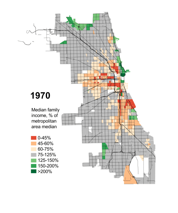
    Anyway, here you go: the disappearance of Chicago’s middle-class and mixed-income neighborhoods since 1970, measured by each Census tract’s median family income as a percentage of the median family income for the Chicago metropolitan region as a whole.

    Seg70aSeg80a


    Seg90aSeg00aSeg07aSeg12a


    IncSegGIF


    This piece first appeared at Daniel’s blog City Notes.

  • How Much of the World is Covered by Cities?

    For years, planners and others have raised concerns about the amount of land that urbanization occupies, especially in the United States and other developed nations. My attention was recently drawn to an estimate that 2.7% of the world’s land (excluding Antarctica) is occupied by urban development. This estimate, which is perhaps the first of its kind in the world, is the product of the Columbia University Socioeconomic Data and Applications Center Gridded Population of the World and the Global Rural-Urban Mapping Project (GRUMP) and would amount to 3.5 million square kilometers.

    While the scholars of Columbia are to be complimented for their ground breaking work, their estimate seems very high, especially in light of the fact that in the United States, with the world’s lowest density urban areas, only 2.6% of land is urbanized. Further, the data developed for our Demographia World Urban Areas and Population Projections would seem to suggest a significant overstatement of urbanization’s extent. Demographia World Urban Areas and Population Projections data are generally from national census authorities and examination of satellite photography.

    The GRUMP overestimation is illustrated by the following.

    GRUMP places the total of all urban extents in the United States at 754,000 square kilometers, more than three times the 240,000 square kilometers reported by the Bureau of the Census in 2000. This is despite the fact that GRUMP uses the same urbanization criteria as the Bureau of the Census. At the average GRUMP population density, most US urban areas would not even qualify as urban under the national standards used in countries such as the US, Canada, the UK and France.

    The overestimation can be illustrated by Cairo, which surrounded by desert land virtually devoid of urbanization. GRUMP places Cairo’s urban land area (“urban extent”) at 10,900 square kilometers. Cairo is well known among demographers as one of the world’s most dense urban areas. Yet the GRUMP urban density, at 1,550 per square kilometer would make Cairo no more dense than Fresno, though somewhat more dense than Portland. The Demographia Cairo urban area is estimated at 1,700 square kilometers, more than 80% smaller. The contrast between the GRUMP and Demographia land area estimates is illustrated in the figure. There are a numerous additional discrepancies of similar scope.


    One problem with the GRUMP estimates is their reliance on lights at night as observed from satellites. The problem is that lights illuminate large areas and any estimates based upon them would be likely to be inflated. Documentation associated with GRUMP acknowledges this effect, which it refers to as “blooming.”

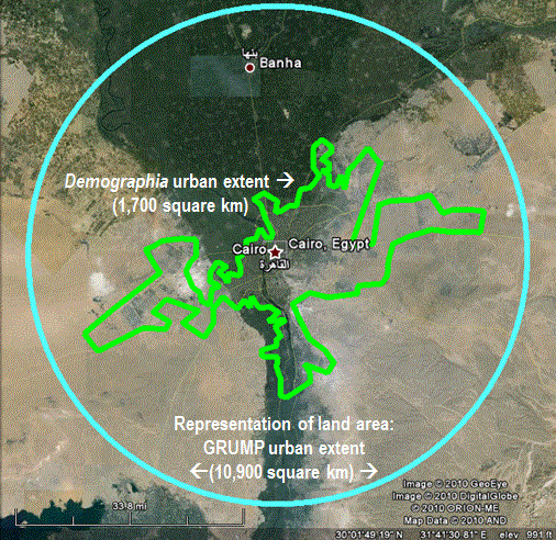
    But “blooming” is not the only problem. The poorest urban areas tend to have fewer lights and are thus illuminated to a larger degree than more affluent areas. The result, in the GRUMP data is that some of the project’s most dense urban areas are in fact not the world’s most dense. For example, low income Kinshasa (former Leopoldville), in the Democratic Republic of the Congo is indicated by GRUMP to be 40% more dense than Hong Kong. The reality is that Hong Kong is twice the density of Kinshasa, the difference being the effect of “blooming,” combined with more sparse electricity consumption in the African urban area.

    Demographia World Urban Areas and Population Projections accounts for more than 50% of world urbanization and includes all identified urban areas with 500,000 population or more. These urban areas cover only 0.3% of the world’s land area. There is only the most limited data for smaller urban areas. However, it is generally known that smaller urban areas tend to be less dense than larger urban areas (which makes one wonder why the anti-sprawl interests have targeted larger urban areas). In the United States, the urban areas with less than 500,000 population average about one-half the density of larger urban areas. University of Avignon data indicates that the smaller urban areas of western Europe are about 60% less dense than the larger ones.

    If it the US 50% less factor is assumed, then urbanization would cover approximately 0.85% of the world’s land (1.1 million square kilometers).

    If the European 60% less factor is assumed, then urbanization would cover 1% of the world’s land (1.3 million square kilometers).

    By these estimates, the GRUMP urbanization estimates would be more than 200% high.

    GRUMP has contributed a useful term to the parlance of urban geography — the “urban extent.” An urban extent is simply continuous urbanization, without regard to labor markets or economic ties. For example,

    The Tokyo urban extent might be considered to run from the southern Kobe suburbs, through the balance of the Osaka-Kobe-Kyoto urban area, Otsu, Nagoya, Hamamatsu, Shizuoka and through the Tokyo urban area to the northern suburbs, a distance of 425 miles (GRUMP calls the Tokyo urban extent the world’s largest).

    China’s Pearl River Delta, with its physically connected but relatively economically disconnected, urban areas (including at least Hong Kong, Shenzhen, Dongguan, Guanzhou-Foshan, Zhongshan, Jiangmen, Zhuhai and Macao) is another example.

    Despite its difficulties, the GRUMP project is an important advance and it is to be hoped will produce more accurate estimates in the future.


    Note: The Demographia Cairo urban area is also the urban extent (the extent of continuous urban development). It includes the 6th of October new town and New Cairo, but excludes the 10th of Ramadan new town, which is physically disconnected from the Cairo urban extent.

    Photograph: In the GRUMP Cairo Urban Area (by the author)

  • Mapping Industry Employment Trends by State

    Mark Hovind at Jobbait.com has released another fascinating set of maps and data on industry employment trends by state over the past few months. Here’s a taste:

    The maps below show the employment trends by state and industry sector for the 12 months ending June 2009 (July will be available August 21). Green is growing faster than the workforce. Grey is growing slower. Red is declining. Black is declining more than 8%. White is not available.

    Head over to Jobbait.com for the full analysis.

  • Meet Me in St. Louis

    There is a bend in the river – and that’s where they put the city of St. Louis.

    St. Louis is fun – and here is a guide to finding your way around. Just remember the bend in the river.

    Imagine a bow (as in bow and arrow) aimed to the east. The imaginary arrow slides right through the Gateway Arch overlooking the river. Just to the west, behind the levee, is the old downtown.

    The St. Louis westernmost city limit parallels Skinker Blvd. That boundary mirrors the river just as the string mirrors the bow. The city is almond-shaped, with the river on the east and Skinker Blvd. to the west. These two arcs meet at the northern and southern points of town. This is a simplification: Skinker Blvd. goes by that name for only a short part of the arc, roughly where the arrow’s feathers would be. To the north it becomes Goodfellow Blvd., and to the south it turns into McCausland Ave., along with other names. But those are details – the main point is this: following Skinker (or its renamed equivalents) to the north will eventually get you to the river, and likewise, following it to the south will also lead you to the river.

    And this is helpful: north-south streets in St. Louis form arcs parallel to Skinker that lead from river to river. Let’s call them arc streets. The inner-most such street is Parnell/Jefferson, followed by Grand Blvd. (that’s where St. Louis University is), Kingshighway Blvd., and then Skinker. To a first approximation, all of these streets parallel Skinker and intersect the river at points north and south of downtown.

    Superimposed on this are streets that radiate from downtown. Two important ones are North Florissant Ave., and South Broadway. These directly parallel the river, and (this is important) will intersect all of the arc streets. Thus North Grand Blvd. intersects North Florissant at approximately right angles – try something like that in Chicago. But in St. Louis it makes perfect sense – Grand is an arc that will intersect the river, and Florissant is a radial that parallels the river. (S. Grand Ave. should also intersect S. Broadway, but doesn’t because the very southern part of the city doesn’t follow the rules. I’ve never been there, so I don’t know why.)

    Starting with Florissant, the important radial streets are Natural Bridge, Martin Luther King, Page Blvd., Delmar, Olive/Lindell, Market/Forest Park, Chouteau, Gravois, and Broadway. These radiate fan-like from downtown, and all of them intersect the arc streets at approximately right angles. Of these, Lindell, Forest Park, and Chouteau are roughly east-west streets; the others head either northwest or southwest. (Quiz: which radial streets also intersect the river?)

    St. Louis University is at Grand & Lindell. Washington University is at Skinker & Forest Parkway. The justly famous Forest Park stretches along Forest Parkway from Kingshighway to Skinker. The Arch is at the foot of Market St. The cultural heart of the city is along Lindell Blvd. near Vandeventer Ave. (which, if it went through, would be an arc street west of Grand).

    Will you meet me in St. Louis? How about at a nice restaurant near the corner of Delmar and Skinker?

    You do know where that is, don’t you?

    Daniel Jelski is Dean of Science & Engineering State University of New York at New Paltz.

  • Local and State Tax Burden Maps

    The Tax Foundation calculates the taxes paid per capita, including what is spent by people on average in neighboring states, including state and local fees. The two maps show, first, the tax burden, taxes paid as a percent of income, the second, the difference in the ranks of states in tax burden and in income.

    The map for tax burden is colorful, so one might suppose there is a big difference in the local and state burden. There is variation, but the amazing story is how small the differences really are. The variation is from a maximum of 11.8 percent in New Jersey (note that Taxachusetts is in the middle of the pack) to a low of 6.4 percent in Alaska. But most states, 38, are in between 8.6 and 10.2 percent.

    The lowest tax burdens are not surprising – Alaska (6.4) and Nevada (6.6), but the next lowest, Wyoming (7) and Florida (7.4), may be a surprise. The highest tax burdens, as may be expected, are megalapolitan New Jersey, New York (11.7), Connecticut (11.1) and Maryland (10.8), but Hawaii (10.6) in this group may be a surprise. The states in the middle, besides Massachusetts, include a contiguous set centered in Chicago – Illinois, Indiana, Iowa, Michigan, Kentucky and West Virginia (all 9.3 to 9.5).

    The modest range of burdens implies that generally richer states have higher tax burdens and poorer states have lower burdens, but the second map shows that there are many exceptions. Richer states with higher tax burdens include (a small difference in tax and income ranks) District of Columbia, New Jersey, Connecticut, New York and Maryland, and poorer states with a moderately low tax burden are few – Alabama, New Mexico and Montana. Poorer states but with a high tax burden are Arkansas, Kentucky, Utah and Idaho, but this finding perhaps tells us the statistical problem or risk in using per capita rather than per household measures. Strongly Mormon Utah and Idaho, indeed all four states have high average household size, so are not as disadvantaged as the data suggest. For a similar reason, Florida may not be as good as it looks, since it has a quite low average household size.

    Most interesting may be the richer states with lower ranking tax burdens, notably Wyoming, New Hampshire, Washington and Nevada. Other states with a relatively low burden (lower tax rank than income rank) include Alaska, Colorado, Florida, Massachusetts, and Texas and other states with a relatively high burden (much higher tax rank than income rank) include Georgia, Kentucky, Ohio and West Virginia.

    Finally states with close to the same rank in income and tax burden include a set of contiguous Midwestern states, Iowa, Minnesota, Missouri, and Kansas, then Michigan, Oregon and California.

    But in sum, choosing a state based on its local and state tax burden could be worth the effort, but the effects by themselves could be more limited than commonly supposed.

  • Mapping Farmers Markets

    New Geography contributor Richard Reep has written lately on the increasing activity of farmer’s markets and how the financial crisis may boost local markets.

    Here’s a great interactive map at FortiusOne GeoCommons of a USDA database of national farmers markets.