Tag: migration

  • New York City Net Domestic Migration Losses Improving

    A New York Times article by Sam Roberts indicates that

    "According to Census Bureau estimates released last week, in the year ending July 1, 2013, the city recorded the third consecutive gain in its non-Hispanic white population.

    During that same period, the city gained more people than it lost through migration. Neither of those gains has probably happened since the 1960s, according to demographers."

    It is true that net migration, domestic and international, was positive between 2012 and 2013. However, net migration was also positive in the years ended 2012 and 2011, according to Census Bureau data.  Among the three recent years, the lowest net migration total was in 2013 (Table).

    New York City Net Migration: 2011-2013
    Year Domestic International Combined
    2011    (55,807)           69,076       13,269
    2012    (64,383)           71,752         7,369
    2013    (67,629)           73,615         5,986
    Total  (187,819)         214,443       26,624
    Data from Census Bureau

    Further, net domestic migration has continued to be negative. The city has lost a net 187,000 domestic migrants in the first three years of the decade. This is an average of more than 60,000 annually. This is, however, an improvement from the 2000s, when net domestic migration averaged a minus 135,000.

  • Time Magazine Gets it Wrong on the Suburbs

    Time Magazine’s Sam Frizell imagines that the American Dream has changed, in an article entitled "The New American Dream is Living in a City, Not Owning a House in the Suburbs." Frizell further imagines that "Americans are abandoning their white-picket fences, two-car garages, and neighborhood cookouts in favor of a penthouse view downtown and shorter walk to work." The available population data shows no such trend.

    Frizell’s evidence is the weak showing in single family house building permits last month and a stronger showing in multi-family construction.

    This is just the latest in the "flocking to the city" mantra that is routinely mouthed without any actual evidence (see: Flocking Elsewhere: The Downtown Growth Story). The latest Census Bureau estimates show that net domestic migration continues to be negative in the core counties (which include the core cities) of the major metropolitan areas (those with more than 1,000,000 residents). The county level is the lowest geographical level for which data is available.

    At the same time, there is net domestic inward migration to the suburban counties. Moreover, much of the net domestic migration to metropolitan areas has been to the South and Mountain West, where core cities typically include considerable development that is suburban in nature (such as in Austin, Houston and Phoenix). As the tepid "recovery" has proceeded, net domestic migration to suburban counties has been strengthened (see: Special Report: 2013 Metropolitan Area Population Estimates), as is indicated in the Figure.

    There is no question but that core cities are doing better than before. It helps that core city crime is down and that the South Bronx doesn’t look like Berlin in 1945 anymore. For decades, many inclined toward a more urban core lifestyle were deterred by environments that were unsafe, to say the least. A principal driving force of this has been millennials in urban core areas. Yet, even this phenomenon is subject to over-hype. Two-thirds of people between the ages of 20 and 30 live in the suburbs, not the core cities, according to American Community Survey data.

    To his credit, Frizell notes that the spurt in multi-family construction is "not aspirational," citing the role of the Great Recession in making it more difficult for people to buy houses. As I pointed out in No Fundamental Shift to Transit: Not Even a Shift, 2013 is the sixth year in a row that total employment, as reported by the Bureau of Labor Statistics was below the peak year of 2007. This is an ignominious development seen only once before in the last 100 years (during the Great Depression).

    In short, urban cores are in recovery. But that does not mean (or require) that suburbs are in decline.

  • Business Insider: “Americans are Still Moving to the Suburbs”

    Andy Kiersz’s article in the Business Insider  (see Americans are Still Moving to the Suburbs) summarizes data from the US Census Bureau’s American Community Survey (ACS) to conclude that "Americans still love the suburbs, and are still moving there from big cities."

    This has long been and continues to be indicated in the data, even as major media rely on anecdotes are to suggest that large numbers of people are leaving the suburbs to "return" to the core cities (from which, by the way, most never moved). There is no doubt that the core cities are doing much better than before, and that is a good thing. Much of this is because the cities are safer than in the 1970s and 1980s. The historic urban core has been restored as an integral part of the modern urban area. However, promoting the health of core cities does not require demeaning or dismissing the suburbs, which are just as integral to modern urbanism as core cities.

    Kiersz refers to a list of the 25 largest met migration movements between counties as reported by the ACS for 2007 to 2011. In every case, the 25 largest net domestic migration movements are from more highly urban core environments to more suburban environments (domestic migration is measured only at the county level).

    The list shows that even within the nation’s largest core city, New York, people are moving to more dispersed areas. This includes net migration from Manhattan to the Bronx and Brooklyn to Queens. Then there is the suburban movement, with a stream of migrants from Queens, in the city to adjacent, suburban Nassau County. Migration from Nassau County even further out, to Suffolk County also made the top 25.

    The outward movement is not limited to New York. A net 50,000 people left the Los Angeles metropolitan area than arrived, just among the 25 largest county migration pairs. Most went to the Riverside-San Bernardino area (which depending on the definition can be called "exurban") and a large number to the Bakersfield metropolitan area. Within the metropolitan area, 10,000 moved from Los Angeles County to Orange County.

    The city (also a county) of San Francisco, which has had the strongest growth of any fully developed major US municipality that has not annexed since 1950, lost 5,000 people to nearby suburban San Mateo County.

    The top 25 also includes nearly 20,000 people moving from Chicago’s core Cook County to three suburban counties.

    It will probably be quite a long time, if ever, before the top 25 migration list has meaningful representation showing movement from suburban counties to core counties. Yet, today’s more healthy cities will do better if they genuinely tackle their remaining challenges. Most important are their education systems that send a disproportionate share of young families to the suburbs. However, from the United States to Europe, Japan, and China, the natural order is that cities (metropolitan areas with their core cities, suburbs, and exurbs) tend to disperse as they add population. That reality is again confirmed by the new data.

  • Moving from Travis County (Austin) to Williamson County

    In an article entitled, “The People Moving to Austin and ‘Ruining It’ are from Texas,” the Austinist notes that more people are moving to Austin from neighboring Williamson County than from Los Angeles County.

    The article has the potential to mislead in two ways.

    The lesser of the problems is that it confuses Austin with Travis County. The cited data is for Travis County, not the city of Austin. The source of the data, the American Community Survey does not report on municipal migration. (Austin is most of Travis County’s population, but itself has sections in Williamson and Hayes counties).

    The bigger problem is that the article tells only half the story. Yes, 10,500 people moved from Williamson to Travis over the 2006-2010 period, but 14,200 moved from Travis to Williamson. Thus, there was a net outflow of 3,700 people from Travis to Williamson. Meanwhile, there was a net gain of residents in Travis County from Los Angeles County of approximately 800.

    Thus, while there is net migration from Los Angeles County to Travis County, the net migration from Travis County to Williamson County is 4.5 times as large.

  • Texas Two Step

    There has been a huge spike in the number of New Yorkers relocating to Texas in recent years, even at a time when fewer city residents were departing for Charlotte, Atlanta, Philadelphia and other traditional destinations.


    Borough Breakdown: NYC Residents Moving to
    Houston, Austin, Dallas, Fort Worth and San Antonio (2004/05 to 2009/10)

    Migration from Bronx to…
      2004/2005 2009/2010 % Change
    Dallas County 77 92 19.5%
    Harris County 202 310 53.5%
    Tarrant County 28 58 107.1%
    Travis County 22 27 22.7%
    Bexar County 29 66 127.6%
    Fort Bend County 31 33 6.5%
    Total 389 586 50.6%


    Migration from Brooklyn to…
      2004/2005 2009/2010 % Change
    Dallas County 132 152 15.2%
    Harris County 271 351 29.5%
    Tarrant County 64 71 10.9%
    Travis County 83 224 169.9%
    Bexar County 76 64 -15.8%
    Fort Bend County 40 62 55.0%
    Total 666 924 38.7%


    Migration from Queens to…
      2004/2005 2009/2010 % Change
    Dallas County 146 166 13.7%
    Harris County 412 404 -1.9%
    Tarrant County 117 125 6.8%
    Travis County 56 89 58.9%
    Bexar County 80 99 23.8%
    Fort Bend County 67 90 34.3%
    Total 878 973 10.8%


    Migration from Manhattan to…
      2004/2005 2009/2010 % Change
    Dallas County 311 356 14.5%
    Harris County 346 508 46.8%
    Tarrant County 51 107 109.8%
    Travis County 167 303 81.4%
    Bexar County 96 91 -5.2%
    Fort Bend County 15 54 260.0%
    Total 986 1419 43.9%


    Migration from Staten Island to…
      2004/2005 2009/2010 % Change
    Dallas County N/A N/A N/A
    Harris County 36 55 52.8%
    Tarrant County N/A N/A N/A
    Travis County N/A N/A N/A
    Bexar County N/A N/A N/A
    Fort Bend County N/A N/A N/A
    Total 36 55 52.8%

    Source: IRS Migration Data. For Staten Island, data was only available for migrations to Harris County.

    This piece originally appeared a tthe Center for an Urban Future data blog.

  • The (White) British are Leaving (London)

    As reported in The Evolving Urban Form: London, last July the Greater London Authority (GLA), located inside the Green Belt, grew strongly from 2001 to 2011, though remains well below its peak estimated population in 1939. Substantial domestic migration from the core area to the exurbs was a major contributor to their growth during between 2000 and 2010 (Figure 1).

    Obviously, with all that growth and all that domestic out-migration, international migration had to be driving the population growth in the GLA. The British Broadcasting Corportation (BBC) confirms that, reporting that, for the first time "white British" residents of GLA represent a minority of the population. At 45 percent, this population segment is down from 58 percent in 2011.

    Whites, however, remain a majority, with more than 1.3 who do not consider themselves British, according to the 2011 census data. The combined white population is nearly 60 percent of the GLA total. The table below provides the ethnic data as reported by the Office for National Statistics.

    Greater London Authority: Ethnicity
    2011 Census
    All categories: Ethnic group      8,173,941 100.0%
    White: English/Welsh/Scottish/Northern Irish/British      3,669,284 44.9%
    White: Irish         175,974 2.2%
    White: Gypsy or Irish Traveller              8,196 0.1%
    White: Other White      1,033,981 12.6%
    Mixed/multiple ethnic group: White and Black Caribbean         119,425 1.5%
    Mixed/multiple ethnic group: White and Black African            65,479 0.8%
    Mixed/multiple ethnic group: White and Asian         101,500 1.2%
    Mixed/multiple ethnic group: Other Mixed         118,875 1.5%
    Asian/Asian British: Indian         542,857 6.6%
    Asian/Asian British: Pakistani         223,797 2.7%
    Asian/Asian British: Bangladeshi         222,127 2.7%
    Asian/Asian British: Chinese         124,250 1.5%
    Asian/Asian British: Other Asian         398,515 4.9%
    Black/African/Caribbean/Black British: African         573,931 7.0%
    Black/African/Caribbean/Black British: Caribbean         344,597 4.2%
    Black/African/Caribbean/Black British: Other Black         170,112 2.1%
    Other ethnic group: Arab         106,020 1.3%
    Other ethnic group: Any other ethnic group         175,021 2.1%
    Source: Office for National Statistics, United Kingdom
  • Moving to North Dakota: The New Census Estimates

    The new state (and DC) population estimates indicate a substantial slowdown in growth, from an annual rate of 0.93 percent during the 2000s to 0.75% between 2011 and 2012. This 20 percent slowdown in growth was driven by a reduction in the crude birth rate to the lowest point ever recorded in the United States (12.6 live births per 1000 population).

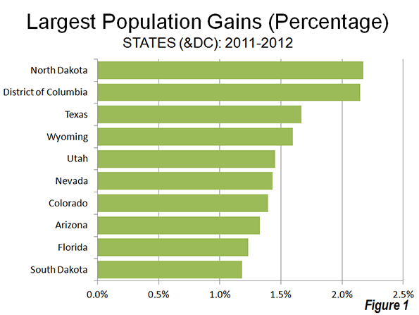
    The big surprise was the population growth leader, North Dakota, which has experienced a strong boom in natural resource extraction. Between 1930 and 2010, North Dakota had lost population. However in the first two years of the new decade, North Dakota has experienced strong growth, and reached its population peak, according to the new estimates, in 2012. North Dakota’s population growth rate between 2011 and 2012 was 2.17%. Nearby South Dakota also grew rapidly, ranking 10th in population growth. The other fastest-growing states were all in the South or the West. The District of Columbia, located in the strongly growing Washington, DC Metropolitan area ranked second in growth rate behind North Dakota (Figure 1).

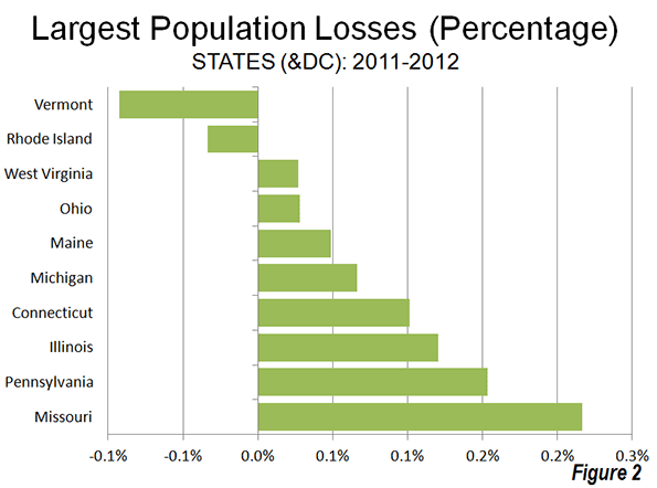
    Two states lost population, Vermont and Rhode Island, as the Northeast and Midwest represented all but one of the 10 slowest growing states. West Virginia, in the South, was also included among the slowest growing states (Figure 2).

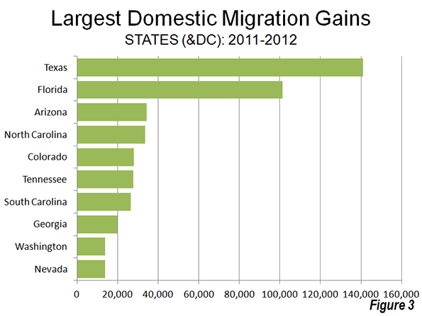
    The domestic migration trends continue to favor the South and West. Texas continues to attract the largest number of domestic migrants (141,000), followed by Florida (101,000). These two states have been the domestic migration leaders in the nation every year since 2000 (Figure 3). Four states gained from 25,000 to 35,000 domestic migrants (Arizona, North Carolina, Tennessee and South Carolina).

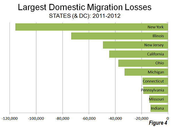
    Generally, the same states continued to dominate domestic migration losses, with New York losing the most migrants, Illinois ranking second, followed by California, Ohio and Michigan. With the exception of California, all of the 10 states losing the largest number of domestic migrants were in the Northeast or the Midwest (Figure 4).

    Overall, domestic migration continues to be dominated by the South, which attracted 354,000 residents from other states. The West added 52,000 domestic migrants, however virtually all of this gain occurred in the Intermountain West. Gains in Oregon and Washington were far more than offset by the large losses in California, as well as losses in Hawaii and Alaska. The Intermountain West gained more than 70,000 domestic migrants. The Northeast lost 221,000 domestic migrants, while the Midwest lost 185,000.

  • IRS to Continue Migration Data

    " The IRS should be applauded" — it is hard to imagine a public statement to this effect, other than from a government insider. But this was the Tax Foundation, improbably and correctly complimenting the Internal Revenue Service in announcing that its annual income tax migration data would continue to be produced. This apparently reverses a decision to discontinue the data. The Tax Foundation noted that there was:

    … outrage when the IRS announced that they were canceling the program. An IRS economist, informed of the decision by higher-ups, told the Daily Caller: "We were just told this morning that the program is indeed going to be discontinued.  It is not our decision at all and we are very disappointed." Jim Pettit, of the activist group Change Maryland, penned a National Review piece noting that the decision came soon after the data put Maryland Governor Martin O’Malley on the defensive (O’Malley has routinely asserted that Maryland has a great tax system and business climate, despite strong evidence to the contrary), and the Washington Examiner followed up with an editorial saying that the data is vital for ascertaining which "model" of states (high-tax, high-service vs. low-tax, low-service) Americans were preferring. Members of Congress also started calling, demanding an explanation.

    We join in the chorus. This data has been valuable for many uses and many will continue to use it in the years to come.

  • Exodus to Suburbs Continues Through 2012

    The latest US Census Bureau migration data shows that people continue to move from principal cities (which include core cities) in metropolitan areas to what the Census Bureau characterizes as "suburbs" (Note). Between 2011 and 2012, a net 1.5 million people moved from principal cities to suburbs (principal cities lost 1.5 million people to the suburbs). The movement to the suburbs was pervasive. In each of the age categories, there was a net migration from the principal cities to the suburbs. There was also net migration to the "suburbs" in all categories of educational attainment.

    These data are in contrast to claims that people are moving from a suburbs to central cities. Virtually none of the migration data has shown any such movement. Moreover, the city population estimates produced for 2011 by the Census Bureau, which indicated stronger central city growth have been shown to be simply allocations of growth within counties, rather than genuine estimates of population increase.

    —-

    Note on Census Bureau "Suburbs:"

    The movement to the suburbs is undoubtedly understated in the Census Bureau estimates, because many jurisdictions included in the "principal city" classification are in fact suburbs. The Real State of Metropolitan America showed that virtually all population growth in principal cities was either in suburban jurisdictions classified as principal cities, or in cities with substantial expenses of post-World War II automobile oriented (or suburban) land-use patterns. The remaining core cities that are largely only urban core in land use accounted for only 2% of principal city growth from 2000 to 2008.

    For a decade, the Census Bureau has used a "principal city" designation instead of the former "central city" term. All former "central cities" are "principal cities." The Census Bureau characterizes all other areas of metropolitan areas as "suburbs." In fact, many of the principal cities are functionally suburbs, having barely existed or not existed at all at the beginning of the great automobile oriented suburban exodus following World War II.

    Examples of such suburban principal cities, with their metropolitan areas in parentheses, are Hoffman Estates (Chicago), Arlington (Dallas-Fort Worth), Aurora (Denver), Fountain Valley (Los Angeles), Eden Prairie (Minneapolis-St. Paul), Mesa (Phoenix), Hillsboro (Portland), San Marcos (San Diego), Pleasanton (San Francisco), Kent (Seattle), Virginia Beach (Virginia Beach-Norfolk) and many others.

  • Core Cities Growing: Available Data Indicates Domestic Migration Losses


    Redaction Notice: September 17, 2012

    Part of this article from June 28, 2012 has been redacted because of difficulties with the US Census Bureau’s 2011 sub-county population estimates. In fact, these were not genuine population estimates at all, but were largely "fair share" allocations of county population change rates based upon the share of population in each jurisdiction. This issue is further described at was revealed on newgeography.com by Chris Briem and our new URL.

    However, the fact remains that domestic migration trends continue to be from historical core cities to the suburbs, as the unredacted data below indicates.


    Just released United States Bureau of the Census estimates indicate that the urban cores of major metropolitan areas (over 1,000,000) grew slightly faster than their suburbs between July 2010 and July 2011. Overall, the historical core municipalities grew 1.03 percent, compared to the suburban growth of 0.93 percent. Among the 51 metropolitan areas, 26 urban cores grew at a faster percentage rate than their suburbs (Note 1). However, suburban areas continued to add many more people. Over suburban areas grew 1,150,000, compared to 462,000 for the urban cores, indicating that approximately 75 percent of new residents were in the suburbs. Suburban areas had greater population growth in 43 of the 51 metropolitan areas (Table 1).

    Table 1
    DELETED


    As was noted in Still Moving to the Suburbs and Exurbs, the core counties of US metropolitan areas, which contain the greatest portion of the historical core municipalities (Note 2) also grew faster than suburban counties between 2010 and 2011. However, that is not an indication of an exodus from the suburbs to urban cores.
    Migration Continues from Cores (County Data)
    There was net domestic migration (people moving between counties of the United States) of minus 67,000 in the core counties, while a net 121,000 domestic migrants moved into suburban areas between 2010 and 2011. The stronger core growth was driven by stronger international migration and a larger natural growth rate (births minus deaths).
    Limited City Data Confirms the Trend
    Migration data is not reported below the county level. As a result, historical core municipality migration data is not available, except where cities and counties are combined. A review of such cases confirms the finding from Still Moving to the Suburbs and Exurbs(Table 2). Among the 12 combined city/counties, there was a net domestic migration loss of 49,000 in the historical core municipalities, while there was a much smaller net domestic migration loss of 1,000 in the corresponding suburban areas.

    Note: Table 2 is retained since the Census Bureau produced genuine population estimates for counties. Table 2 includes only municipalities that are coterminous with counties, and thus were not subject to the "fair share" population growth allocation method inappropriately applied at the sub-county level.


    Table 2
    Historical Core Municipality Domestic Migration 2010-2011
    (Where Cities and Counties are Combined)
      Central City/County Suburban Counties
    PRE-1950 CITY/COUNTIES (55,441) (21,306)
    Baltmore (3,638) 2,297
    Denver 8,281 11,284
    New York (56,982) (41,993)
    Philadelphia (5,466) (7,667)
    San Francisco 416 5,464
    St. Louis (4,959) (5,301)
    Washington 6,907 14,610
     
    POST-1950 CITY/COUNTIES (4,119) 20,179
    Indianapolis (3,401) 5,341
    Jacksonville (1,485) 4,396
    Louisville 18 1,868
    Nashville 749 8,574
     
    NOT CLASSIFIED (Due to Hurricane Katrina)
    New Orleans 10,243 (90)
     
    TOTAL (49,317) (1,217)


    • Among the seven combined city/counties formed before 1950 (excluding New Orleans), the historical core municipalities had a net domestic migration loss of 55,000, while the suburban areas had a smaller net domestic loss of 21,000. In four cases, the historical core municipalities had domestic migration losses. In the three cases in which cities had domestic migration gains, there were also domestic migration gains in the suburbs. In this group, New York had a domestic migration loss of 57,000 despite having an overall population gain of 55,000 (the gain resulting from international migration and natural growth)
    • Among the four combined city/counties formed after 1950, the historical core municipalities had a net domestic migration loss of 4,000, while the suburban areas had a net domestic migration gain of 20,000. In two cases, the historical core municipalities had domestic migration losses. In the two cases in which cities had domestic migration gains, there were also domestic migration gains in the suburbs.
    • New Orleans is a special case, by virtue of the fact that it is "still rebounding from the effects of Hurricane Katrina," according to the Bureau of the Census and remains 20 percent below its 2005 population. New Orleans is the only case that meets the requirement of historical core net domestic migration gain and suburban net domestic migration loss to demonstrate the likelihood of movement from the suburbs to the city. The historical core municipality had a net gain of 10,000 domestic migrants, while the suburbs lost 90, which could indicate that a very small number of people moved to the city from the suburbs (Note 3).

    Moreover, the county data indicates that in 25 of the 49 metropolitan areas with suburban counties, core counties lost domestic migrants between 2010 and 2011.

    The Effect of "Staying Put"

    As with the previously released county population estimates, the city data that is available indicates that Americans are staying put in the difficult economy. Domestic migration has fallen substantially. Over the past year, 590,000 people moved between the nation’s counties. This domestic migration compares to an annual average of 1,080,000 between the 2000 and 2009 (Figure 1). This reduction in domestic migration has made international migration and natural growth more prevalent, and as a result, core growth has been stronger.


    Note 1: An article in this morning’s Wall Street Journal contains information different from this article. The Wall Street Journal article classifies some cities as urban core that this article defines as suburbs (such as Fort Lauderdale [Miami], Aurora [Denver] and Arden-Arcade [Sacramento]). This article defines urban cores as historical core municipalities.

    Note 2: All historical core municipalities are principally in one county, except for New York (city), which is five counties.

    Note 3: The Bureau of the Census domestic migration data is limited to a net number for each county, so it is not possible to determine where people are moving to or moving from.