Tag: New York

  • Back to the City?

    The 2010 Census results were mostly bleak for cities, especially for those who believed the inflated hype about the resurgence of the city at the expense of the suburbs.  Despite claims of an urban renaissance, the 2000s actually turned out to be worse than the 1990s for central cities.  The one bright spot was downtowns, which showed strong gains, albeit from a low base.  The resurgence of the city story seemed largely fueled by intra-census estimates by the government that proved to be wildly inflated when the actual 2010 count was performed.

    But beyond the headline numbers, there is intriguing evidence of a shift in intra-regional population dynamics in the migration numbers. The Internal Revenue Service uses tax return data to track movements of people around the country on a county-to-county and state-to-state basis. These can be used to look at movements of people within a metro area.

    Because this data is at the county level, it does not map directly to what we might think of as the “urban core” as most counties that are home to central cities contain large suburban areas as well. There are also areas inside many central cities themselves that are suburban in their built form.

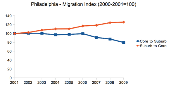
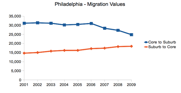
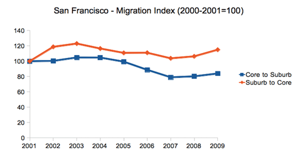
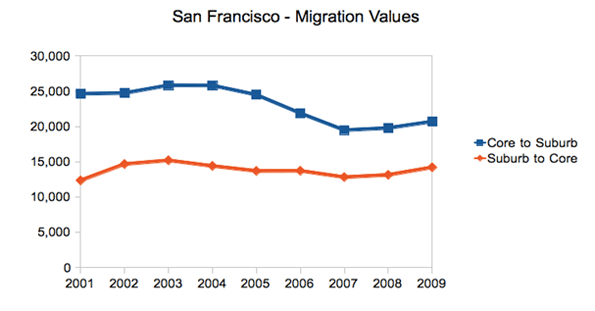
    However, there are a limited number of cities that have combined city-county definitions that approximate the urban core. Looking at a few of these – New York, Philadelphia, San Francisco, and Washington, DC – we see that over the 2000s out-migration from the core to the suburban counties was relatively flat or even declined late in the decade as general mobility declined in the Great Recession. In contrast, migration from the suburban counties to the core stayed flat or actually increased, even late in the decade when again overall migration declined nationally.

    It should be stressed that the overall trend is still that of net out-migration from the core to the suburbs. But in searching for any potential inflection point, changes in the dynamics are clearly of interest.

    New York City

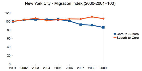
    First let us look at New York City. The city proper consists of five boroughs, each of which is a separate county. Treating the city as a whole as the core reveals these migration trends during the 2000s:


    Note: Core defined as the five boroughs of New York City

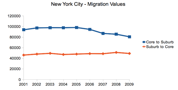
    This chart renders migration as an index, to show changes in in- and out-migration on the same scale. This should not be confused with the total number of people moving, which still shows overall net out-migration, though the trend lines show the same dynamic as above:


    Note: Core defined as the five boroughs of New York City

    Philadelphia

    Perhaps the most dramatic shift in these four cities was in Philadelphia, where the central city actually gained population for the first time since 1950.

    Here are the raw migration numbers, which again show net out-migration, but a distinct shift over the decade.

    San Francisco

    The Bay Area has been divided into two metro areas by the government, San Francisco and San Jose. Therefore, an intra-regional migration analysis looking at San Francisco alone will miss certain migration within the broader Bay Area. With that caveat in mind, we see again the same trend, albeit somewhat less pronounced:

    And here are the total migrants:

    Washington, DC

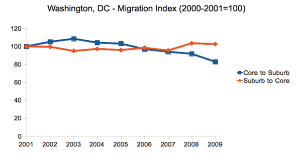
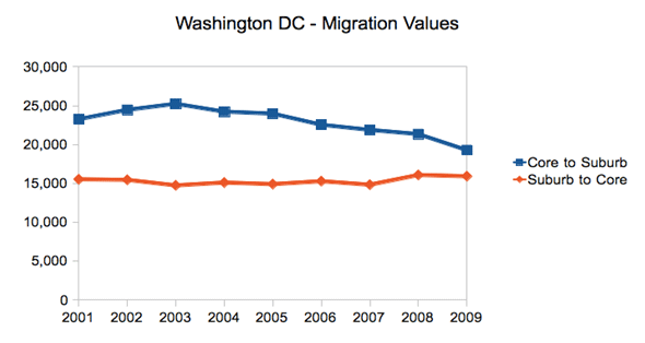
    Due to its very nature as a government town, Washington’s migration patterns differ from the many other cities. However, it has still experienced the same suburbanization phenomenon as the rest of America, and the same changes in intra-regional migration dynamics as the other cities highlighted here, though we see the shift beginning only in mid-decade:

    And the raw values:

    Conclusion

    Given the overblown triumphalist rhetoric about the urban core that ultimately hasn’t been backed up by the data, we should be cautious about reading too much into this. Again, net migration remains outward towards the suburbs and away from denser cities to smaller, generally less dense ones (from Chicago to Indianapolis or New York to Raleigh). Overall city population figures were disappointing. And the housing crash and the Great Recession have clearly wreaked havoc with migration patterns on a national level.

    Still, these are clearly figures that should inspire some at least small-scale optimism in urban advocates.  There has clearly been a shift affecting the net migration in these cities. And the same pattern is visible, though less easily attributable to just the urban core, in a large number of other metros around the country.  In particular, the fact the in-migration from the suburbs to the core held steady or even increased is a sign of some urban health.

    Back to the city as a mass movement?  Not yet.  But it’s certainly an improvement. These intra-regional migration statistics are key figures to keep an eye on as we look for any sign of a true inflection point in the overall population trends for America’s urban centers. The whole pattern could also shift again — in one direction or the other — as the economy, albeit slowly, comes back to life and people once again get back into the housing market.

    Aaron M. Renn is an independent writer on urban affairs based in the Midwest. His writings appear at The Urbanophile, where this piece originally appeared. Telestrian was used to analyze data and to create charts for this piece.

    Chicago photo by Storm Crypt / Flickr

  • More Americans Move to Detached Houses

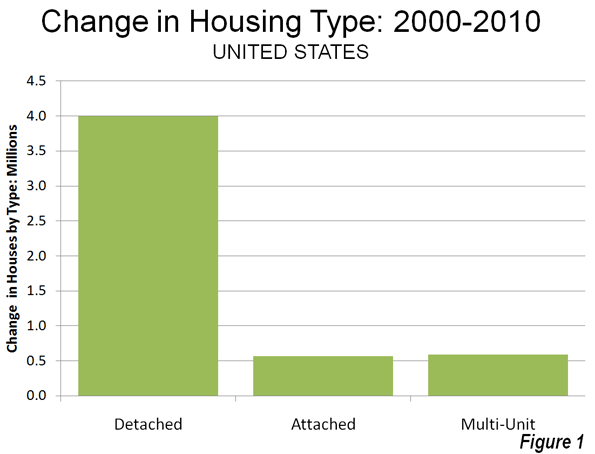
    In defiance of the conventional wisdom in the national media and among most planning professionals, Americans continue not only to prefer, but to move into single family detached houses. Data from the 2010 American Community Survey indicates that such housing attracted 79.2% of the new households in the 51 major metropolitan areas (over 1,000,000 population) over the past decade.

    In contrast households in multi-unit buildings (apartments and condominiums) represented 11.8% of the new housing, while two-unit attached housing represented 11.3% of the increase. There was a 2.3% decline in the "other" category of new housing, which includes mobile homes and boats. A total of 4 million net new occupied detached houses were added in the largest metropolitan areas, while there were 590,000 additional apartments and condominiums and 570,000 attached houses (Figure 1).

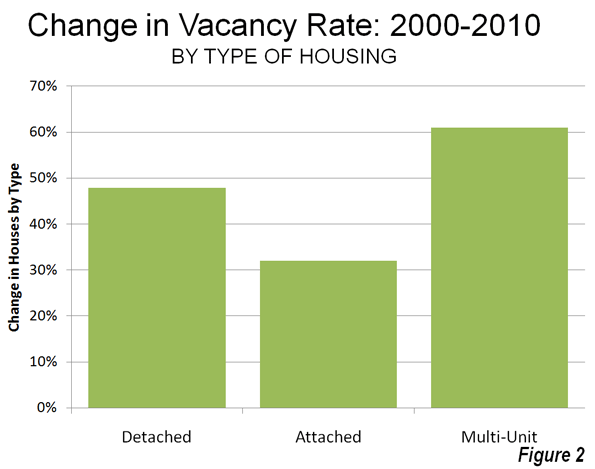
    Detached Vacancy Rate Rises Less than Multi-Unit: Another conventional assumption is that single family homes have been disproportionately abandoned by their occupants, particularly since the collapse of the housing bubble. This is also not true. In 2010 detached housing enjoyed a 92.4% occupancy rate in 2010 which is higher than the 89.4% occupancy rate in attached housing and 84.2% occupancy rate in multi-unit buildings. Because a more of the multi-unit housing is rental, it is to be expected that the vacancies would be the highest in this category. However, at the national level, overall vacancy rates rose the most in multi-unit housing, with an increase of 61%, from 10.7% in 2000 to 17.1% in 2010. The vacancy rate in detached housing rose at a slower rate, from 7.3% in 2000 to 10.7% in 2010, an increase of 48%. Attached housing – such as townshouses – have the slowest rise in vacancy rate, from 8.4% in 2000 to 11.0% in 2010, an increase of 32% (Figure 2).

    Detached and Attached Up in Most Markets, Apartments and Condominiums Down in Most: The move to detached housing was pervasive at the major metropolitan area level. Among the 51 largest metropolitan areas, the share of detached housing rose in 44 and declined in seven. The share of attached housing rose in 32 of the metropolitan areas, while declining in 19. Multi-unit housing experienced an increase in its market share in only three markets, while declining in 48.

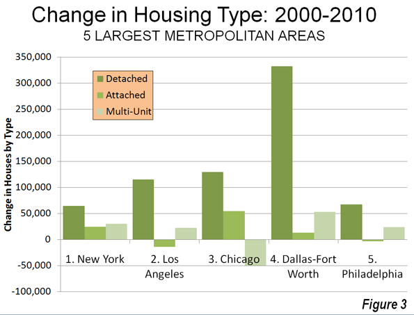
    Largest Metropolitan Areas: Detached housing also increased more than attached housing and multi-unit housing in each of the nation’s five largest metropolitan areas.

    • In the largest metropolitan area, New York, 51.9% of the new housing was detached. This is considerably more than the 36.9% detached market share in 2000. Multi-unit housing accounted for 24.1% of the increase in the market. This is a far smaller share than the 55.7% that multi-unit housing represented in 2000. Attached housing was 19.9% of the increase, nearly 3 times its 2000 share of 6.7%. This movement of New Yorkers to less dense housing forms is particularly significant, in view of the fact that New York has historically had the lowest share of lower density housing (detached and attached) and the highest share of multi-unit houses.
    • In the second largest metropolitan area, Los Angeles, 96.0% of the new housing was detached. This is nearly double the 49.7% that detached housing represented of the market in 2000. The balance of the new housing was split between a share of 18.6% for multi-unit housing and a loss of 11.8% in the attached housing. The share of new units represented by multi-unit houses was less one-half than its percentage of the market in 2000 (39.0%).
    • In the third largest metropolitan area, Chicago, 95.9% of the new housing was detached, well above the 52.5% share in 2000. There was a huge loss in apartment and condominium share, at 31% of the market, while attached housing captured 40.4% of the market.
    • In the fourth largest metropolitan area, Dallas Fort Worth, 84.3% of the new housing was detached, well above the 62.0% share in 2000. Multi-unit housing accounted for 13.5% of the increase, approximately one-half the 2000 market share. Attached housing represented 3.2% of the increase.
    • In the fifth largest metropolitan area, Philadelphia, 77.6% of new housing was detached, well above the 45.3% market share for detached housing in 2000. Apartments and condominiums accounted for 27.7% of the increase between 2000 and 2010, slightly more than the 2000 market share 23.7%. Attached housing represented a minus 4.3% of the new housing.

    Despite being only the fourth largest metropolitan area, Dallas-Fort Worth accounted for 46% of the new housing in the five largest metropolitan areas (Figure 3).

    The three largest metropolitan markets where there was an increase in multi-unit housing share were San Jose, New Orleans and Denver. In San Jose, 55.5% of new housing was multi-unit, while only 10.3 percent was detached. New Orleans had a similar 10.5% detached new housing share, while 65.8% of the new housing was multi unit. In Denver, 31.3% of the new housing was multi-unit, while 60.2% was detached.

    The share of detached housing also declined between 2000 and 2010 in Boston, Kansas City, Minneapolis-St. Paul and Portland. In each of these metropolitan areas, the share of attached housing increased, while the share of multi-unit housing decreased. Nonetheless, detached housing continued to attract a majority of new housing in Kansas City (70.8 percent) and Portland (56.6 percent). Despite Portland’s strong planning emphasis on high density housing, its share of multi-unit housing, and 26.8% between 2000 and 2010 was less than its 2000 market share of 27.5%, with a strong 20.6 percent share in attached housing. Attached housing also accounted for a comparatively large share of new housing in Boston (45.7 percent), Minneapolis-St. Paul (39.7 percent) and Kansas City (25.8 percent). The stronger densification policies that existed in Minneapolis-St. Paul until the middle of the decade may have artificially raised the share of attached new housing.

    Share by housing type data is provided for the major metropolitan areas in Tables 1 and 2.

    Table 1
    Occupied Housing by Major Metropolitan Area: 2000
    Metropolitan Area Detached Attached Multi-Unit Other
    Atlanta, GA 66.6% 3.5% 25.5% 4.4%
    Austin, TX 57.7% 3.7% 32.1% 6.6%
    Baltimore, MD 46.0% 28.5% 24.2% 1.3%
    Birmingham, AL 68.3% 2.6% 17.9% 11.2%
    Boston, MA-NH 48.9% 4.4% 45.4% 1.3%
    Buffalo, NY 60.0% 2.8% 35.1% 2.1%
    Charlotte, NC-SC 67.5% 3.4% 21.8% 7.3%
    Chicago, IL-IN-WI 52.5% 6.3% 40.1% 1.1%
    Cincinnati, OH-KY-IN 64.7% 3.6% 27.8% 3.9%
    Cleveland, OH 65.7% 5.5% 27.7% 1.2%
    Columbus, OH 62.8% 5.5% 29.1% 2.6%
    Dallas-Fort Worth, TX 62.0% 3.1% 30.3% 4.6%
    Denver, CO 60.9% 7.8% 29.0% 2.3%
    Detroit,  MI 70.5% 5.5% 20.7% 3.3%
    Hartford, CT 60.0% 5.2% 34.1% 0.8%
    Houston, TX 61.4% 3.6% 29.1% 6.0%
    Indianapolis. IN 68.4% 5.2% 23.2% 3.3%
    Jacksonville, FL 63.5% 3.9% 22.3% 10.3%
    Kansas City, MO-KS 71.3% 4.6% 21.4% 2.6%
    Las Vegas, NV 53.4% 6.0% 34.7% 5.9%
    Los Angeles, CA 49.7% 8.6% 39.6% 2.0%
    Louisville, KY-IN 70.7% 2.1% 22.2% 5.0%
    Memphis, TN-MS-AR 69.1% 3.8% 22.8% 4.2%
    Miami, FL 45.4% 9.9% 42.1% 2.6%
    Milwaukee,WI 55.7% 5.3% 38.3% 0.7%
    Minneapolis-St. Paul, MN-WI 62.8% 7.7% 27.4% 2.0%
    Nashville, TN 64.9% 4.4% 24.4% 6.2%
    New Orleans. LA 59.9% 7.7% 28.5% 3.9%
    New York, NY-NJ-PA 36.9% 6.5% 56.3% 0.4%
    Oklahoma City, OK 71.6% 3.1% 19.2% 6.0%
    Orlando, FL 61.5% 4.5% 25.1% 8.9%
    Philadelphia, PA-NJ-DE-MD 45.3% 29.8% 23.5% 1.4%
    Phoenix, AZ 61.6% 6.1% 24.9% 7.4%
    Pittsburgh, PA 68.8% 6.5% 20.4% 4.4%
    Portland, OR-WA 63.8% 3.3% 27.5% 5.5%
    Providence, RI-MA 54.3% 2.9% 41.6% 1.2%
    Raleigh, NC 63.6% 5.2% 21.5% 9.8%
    Richmond, VA 71.3% 4.9% 20.4% 3.4%
    Riverside-San Bernardino, CA 67.0% 5.1% 18.6% 9.3%
    Rochester, NY 65.7% 4.3% 26.5% 3.5%
    Sacramento, CA 66.1% 6.0% 24.0% 3.9%
    Salt Lake City, UT 67.0% 4.8% 25.4% 2.8%
    San Antonio, TX 67.4% 2.9% 22.2% 7.5%
    San Diego, CA 51.7% 9.4% 34.5% 4.4%
    San Francisco-Oakland, CA 50.3% 9.3% 39.1% 1.3%
    San Jose, CA 57.0% 9.1% 30.5% 3.4%
    Seattle, WA 60.2% 3.5% 31.6% 4.8%
    St. Louis,, MO-IL 70.2% 3.1% 21.9% 4.8%
    Tampa-St. Petersburg, FL 58.4% 4.6% 25.7% 11.4%
    Virginia Beach-Norfolk, VA-NC 61.4% 10.4% 25.2% 3.0%
    Washington, DC-VA-MD-WV 47.6% 19.4% 32.1% 0.8%
    Average (Weighted) 55.9% 7.5% 33.3% 3.3%
    Data from 2000 Census
    Metropolitan areas over 1,000,000 population as defined in 2010


    Table 2
    Occupied Housing by Major Metropolitan Area: 2010
    Metropolitan Area Detached Attached Multi-Unit Other
    Atlanta, GA 69.2% 5.3% 22.7% 2.7%
    Austin, TX 60.4% 2.6% 31.8% 5.1%
    Baltimore, MD 47.4% 27.3% 24.2% 1.1%
    Birmingham, AL 70.8% 2.4% 16.8% 10.0%
    Boston, MA-NH 48.7% 5.9% 44.2% 1.2%
    Buffalo, NY 62.3% 2.9% 33.0% 1.8%
    Charlotte, NC-SC 68.9% 5.1% 20.4% 5.6%
    Chicago, IL-IN-WI 54.2% 7.6% 37.1% 1.1%
    Cincinnati, OH-KY-IN 68.9% 4.8% 23.2% 3.1%
    Cleveland, OH 68.7% 5.1% 25.1% 1.1%
    Columbus, OH 64.1% 7.3% 26.6% 2.1%
    Dallas-Fort Worth, TX 65.9% 3.1% 27.4% 3.6%
    Denver, CO 60.8% 7.9% 29.4% 1.9%
    Detroit,  MI 71.6% 6.3% 19.1% 2.9%
    Hartford, CT 60.9% 5.3% 33.1% 0.7%
    Houston, TX 65.1% 3.5% 26.0% 5.3%
    Indianapolis. IN 71.3% 5.0% 21.1% 2.6%
    Jacksonville, FL 66.3% 4.8% 21.3% 7.6%
    Kansas City, MO-KS 71.3% 6.4% 20.1% 2.2%
    Las Vegas, NV 60.9% 5.4% 29.9% 3.8%
    Los Angeles, CA 51.0% 8.0% 39.0% 1.9%
    Louisville, KY-IN 71.6% 3.6% 20.9% 4.0%
    Memphis, TN-MS-AR 72.5% 3.3% 20.4% 3.7%
    Miami, FL 47.0% 10.8% 40.0% 2.1%
    Milwaukee,WI 56.2% 6.5% 36.5% 0.8%
    Minneapolis-St. Paul, MN-WI 61.5% 11.0% 25.9% 1.6%
    Nashville, TN 67.2% 5.6% 22.3% 4.9%
    New Orleans. LA 65.1% 6.1% 24.6% 4.2%
    New York, NY-NJ-PA 37.2% 6.7% 55.7% 0.4%
    Oklahoma City, OK 74.3% 3.0% 17.1% 5.6%
    Orlando, FL 64.1% 5.5% 23.4% 6.9%
    Philadelphia, PA-NJ-DE-MD 46.6% 28.5% 23.7% 1.3%
    Phoenix, AZ 67.2% 4.8% 22.2% 5.8%
    Pittsburgh, PA 69.4% 7.5% 19.1% 4.0%
    Portland, OR-WA 62.8% 5.5% 27.4% 4.3%
    Providence, RI-MA 55.7% 3.7% 39.6% 1.0%
    Raleigh, NC 65.4% 8.0% 20.5% 6.2%
    Richmond, VA 73.2% 4.9% 19.0% 3.0%
    Riverside-San Bernardino, CA 70.7% 4.3% 17.1% 7.9%
    Rochester, NY 66.9% 4.8% 25.3% 2.9%
    Sacramento, CA 68.8% 5.6% 22.6% 3.0%
    Salt Lake City, UT 67.8% 6.1% 23.9% 2.2%
    San Antonio, TX 70.8% 2.2% 21.1% 5.9%
    San Diego, CA 53.0% 9.0% 34.5% 3.5%
    San Francisco-Oakland, CA 50.7% 9.4% 38.8% 1.1%
    San Jose, CA 54.3% 10.7% 32.0% 3.0%
    Seattle, WA 60.5% 4.2% 31.5% 3.8%
    St. Louis,, MO-IL 70.8% 4.2% 21.1% 3.9%
    Tampa-St. Petersburg, FL 59.6% 5.6% 24.7% 10.1%
    Virginia Beach-Norfolk, VA-NC 62.5% 11.1% 24.0% 2.5%
    Washington, DC-VA-MD-WV 48.1% 19.6% 31.7% 0.7%
    Average (Weighted) 57.8% 7.9% 31.5% 2.8%
    Data from 2010 American Community Survey
    Metropolitan areas over 1,000,000 population as defined in 2010


    In Housing, Preference Trumps Policy: The trend of the last decade is evidence of a continued preference of American households for detached housing. The results are remarkable for at least two reasons:

    • The first is that there have been unprecedented policy initiatives to discourage, if not to prohibit the building of new detached houses. It seems likely that the miniscule new detached housing share in San Jose, for example, is a direct result of that metropolitan area’s virtual prohibition of new detached housing, rather than any evidence that households have begun to prefer higher density housing. A small detached housing share in the face of a strong public policy bias toward higher density housing says nothing about preferences.
    • Second; the media and wishful advocates of denser settlement patterns have continuously referred to detached housing as having been severely overbuilt during the housing bubble, while suggesting an imperative for households to move into multiunit, often rented housing. The new data, with the larger increase in multi-unit vacancy rates, indicates that there was at least as much overbuilding in more dense housing types as there was in detached housing.

    Despite the expressed preferences of planners, academics and even many builders, American households continue to make their own decisions about housing.

    Wendell Cox is a Visiting Professor, Conservatoire National des Arts et Metiers, Paris and the author of “War on the Dream: How Anti-Sprawl Policy Threatens the Quality of Life

    Lead photo: Houses in Los Angeles. Photograph by author.

  • Major Metropolitan Commuting Trends: 2000-2010

    As we indicated in the last article, solo automobile commuting reached an all time record in the United States in 2010, increasing by 7.8 million commuters. At the same time, huge losses were sustained by carpooling, while the largest gain was in working at home, which includes telecommuting. Transit and bicycling also added commuters.  This continues many of the basic trends toward more personalized employment access that we have seen since 1960.

    Solo Automobile Commuting: Among the nation’s 51 metropolitan areas with more than 1 million population, 38 experienced increases in solo automobile commuting between 2000 and 2010. More than 80% of commuting is by solo automobile in 25 of the 51 largest metropolitan areas, with the highest rates being in Birmingham, Detroit, Cincinnati, Indianapolis and Kansas City. Another 28 metropolitan areas have single automobile commute shares of between 70% and 80%, with Boston, Washington and San Francisco between 60% and 70%. As would be expected, the lowest solo automobile commute share was in New York at 51%.

    Car Pools: The national data also showed a nearly 2.4 million loss in carpool use. The losses were pervasive, occurring in all 51 metropolitan areas. Riverside-San Bernardino had the highest carpool market share at just under 15%, while all other major metropolitan areas were below 12%. Car pools have been losing market share for decades.

    Work at Home (Includes Telecommuting): In what we have previously labeled as The Decade of the Telecommute, the nation experienced a 1.7 million increase in working at home over the past decade. The market share gains in working at home were as pervasive as the losses in carpooling, with all 51 metropolitan areas registering increases. Austin had the strongest work-at-home market share, at 7.3%, followed by Portland at 6.5%, San Francisco and Denver at 6.2%, Phoenix at 6.0%, with San Diego, Raleigh and Atlanta above 5.5%. Overall, working at home exceeded transit commuting in 37 major metropolitan areas out of 51 in 2010, up from 27 in 2000. Three metropolitan areas had work at home market shares of less than 3%, including Memphis, New Orleans and last place Buffalo.

    Transit: As noted before, transit enjoyed its first 10 year gain since journey to work data was first collected by the Census Bureau 50 years ago. Overall, transit added 900,000 daily commuters, roughly half that for telecommuters. Transit’s market share increased in 25 of the top 51 metropolitan areas. It is also notable that in a number of the metropolitan areas with the largest expenditures for new rail systems, there were either losses or commuting gains were concentrated in the more flexible bus services.

    New York: As so often has been the case, transit was largely a "New York story." More than one half of the new transit commuters were in the New York metropolitan area, more than 450,000 of the 900,000 increase. New York boasts by far the most extensive transit system in the nation, which serves the second largest central business district in the world and by far the nation’s most important. In 2000, New York had a transit work trip market share of 27.4%. By 2010, New York’s transit work trip market share had risen to 30.7%, more than double that of any other metropolitan area. More than 70% of the new transit commuters in the New York area were on its subway (Metro), suburban rail and light rail systems.

    San Francisco: San Francisco retained its position as the second strongest transit metropolitan area, with a 14.6% work trip market share in 2010. This is up from 13.8% in 2000.

    Washington: Washington was the third strongest transit commuting market, with a 14.0% work trip market share in 2010. This modest increase from 13.4% nonetheless produced the second largest ridership increase in the nation, at more than 130,000. This reflects the strength of Washington’s job market over the decade. Rail ridership accounted for 53% of this increase, while buses accounted for the other 47%.

    Boston and Chicago: Boston passed Chicago to become the fourth strongest transit market, at 11.8% in 2010. This is an increase from 11.2% in 2000. Chicago ranked fifth at 11.2%, a small reduction from the 11.3% in 2000.

    Los Angeles: Los Angeles had the third largest increase in transit commuting, adding 60,000 daily transit commuters. Approximately 75% of these new commuters were attracted by the region’s extensive bus system as opposed to its very expensive but limited rail system. This increase placed Los Angeles in a virtual tie with Portland, with a work trip market share of 6.2%.

    Portland: Portland continued to experience its now 30 year transit market share erosion, despite having added three new light rail lines between 2000 and 2010. Portland’s transit work trip market share fell to 6.2% from 6.3% and now trails the work at home and telecommute market share of 6.5%.

    Seattle:Seattle added 29,000 new transit commuters for the fourth strongest growth in the nation. Approximately 75% of the new commuters were on the metropolitan area’s bus system.

    Atlanta: Atlanta, which is home to the third largest postwar Metro system in the nation (MARTA) gained nearly 9000 new transit commuters, all of them on the bus, while losing more than 3000 rail commuters.

    Miami:Miami added 16,000 new transit commuters, though more than 90% were attracted to the bus system, rather than the rail services.

    Rail and Bus in Texas: Other metropolitan areas with new and expanded rail systems did not fare as well. In Dallas-Fort Worth, the light rail system was more than doubled in length, yet there was a reduction of more than 3000 daily transit commuters. The transit work trip market share in Dallas-Fort Worth dropped from 1.8% to 1.4%, approximately one quarter lower than that of any other major metropolitan area with a new light rail or Metro system. Houston, which built its first light rail line during the period, lost nearly 3000 daily transit commuters, with its transit work trip market share dropping by nearly one-third, from 3.2% to 2.3%. By contrast, the third largest metropolitan area in Texas, San Antonio, lost no commuters from its bus only transit system.

    Other New Rail Metropolitan Areas: Other metropolitan areas with new rail systems experienced modest ridership increases, with 60 to 70 percent of the increase on the bus systems in Charlotte, Minneapolis-St. Paul and Phoenix. Salt Lake City experienced a small decline in transit commuting.

    Below 1 Percent: Four metropolitan areas had transit work trip market shares of less than 1%, including Indianapolis, Raleigh, Birmingham and last place Oklahoma City, with a market share of 0.4%.

    Bicycles: It was also a good decade for bicycle commuting, with the national increase of nearly 250,000. The bicycle commuting market share rose in 45 of the 51 largest metropolitan areas. Portland had the highest bicycle market share at 2.2%, with three other metropolitan areas at 1.5% or above, Sacramento, San Francisco and San Jose. The lowest bicycle commuting market shares were in San Antonio, Cincinnati, Birmingham and Memphis, all at 0.1 percent.

    Walking: There was little change in walking among the nations major metropolitan areas. The largest shares were in New York (5.9%) and Boston (5.4%), with the smallest shares in Raleigh (1.1%), Orlando (1.1%) and Birmingham (1.0%).

    Drifting Away from Shared Commuting: In some ways, the 2000s were different than previous decades, especially with the reversals in bicycle commuting and transit. However, overall, shared ride commuting (transit and car pools) lost share due to the precipitous decline in car pooling. Longer term share increase trends also continued in single-occupant automobile commuting and working at home. The bottom line: personal employment access (personal mobility plus working at home) continues to carve away at the smallish share still held by shared commuting.

    ————-

    Data: The 2000 and 2010 commuting market shares by mode are shown in Tables 1 and 2 (2010 metropolitan area boundaries).

    ————

    Table 1
    Work Trip Market Share: 2000
    Metropolitan Areas Over 1,000,000 Population in 2010
    Metropolitan Area Car, Truck or Van: Alone Car/Van Pool Transit Bicycle Walk Other Work at Home (Includes Telecommute)
    Atlanta 77.0% 13.7% 3.4% 0.1% 1.3% 1.1% 3.5%
    Austin 76.5% 13.7% 2.5% 0.6% 2.1% 1.1% 3.6%
    Baltimore 75.5% 11.5% 5.9% 0.2% 2.9% 0.9% 3.2%
    Birmingham 83.3% 12.0% 0.7% 0.1% 1.2% 0.7% 2.1%
    Boston 71.1% 8.6% 11.2% 0.5% 4.6% 0.8% 3.3%
    Buffalo 81.7% 9.4% 3.3% 0.2% 2.7% 0.5% 2.1%
    Charlotte 80.7% 12.8% 1.4% 0.1% 1.2% 0.8% 2.9%
    Chicago 70.4% 11.0% 11.3% 0.3% 3.1% 1.0% 2.9%
    Cincinnati 81.3% 10.1% 2.8% 0.1% 2.3% 0.6% 2.7%
    Cleveland 81.3% 8.8% 4.1% 0.2% 2.2% 0.6% 2.7%
    Columbus 82.1% 9.7% 2.1% 0.2% 2.3% 0.6% 3.0%
    Dallas-Fort Worth 78.7% 13.9% 1.8% 0.1% 1.5% 1.0% 3.0%
    Denver 76.0% 11.7% 4.4% 0.4% 2.1% 0.8% 4.6%
    Detroit 84.7% 9.2% 1.7% 0.1% 1.4% 0.6% 2.2%
    Hartford 82.6% 8.7% 2.8% 0.2% 2.5% 0.6% 2.6%
    Houston 77.0% 14.3% 3.2% 0.3% 1.6% 1.1% 2.5%
    Indianapolis 82.8% 10.4% 1.3% 0.2% 1.7% 0.7% 3.0%
    Jacksonville 80.3% 12.6% 1.3% 0.5% 1.7% 1.4% 2.3%
    Kansas City 82.6% 10.6% 1.2% 0.1% 1.4% 0.7% 3.5%
    Las Vegas 74.6% 14.7% 4.4% 0.5% 2.3% 1.3% 2.3%
    Los Angeles 71.9% 14.6% 5.6% 0.7% 2.7% 1.0% 3.5%
    Louisville 81.8% 11.2% 2.0% 0.2% 1.7% 0.7% 2.5%
    Memphis 80.7% 13.3% 1.6% 0.1% 1.3% 0.9% 2.2%
    Miami-West Palm Beach 77.3% 13.1% 3.2% 0.5% 1.7% 1.2% 3.1%
    Milwaukee 79.7% 9.9% 4.2% 0.2% 2.9% 0.6% 2.6%
    Minneapolis-St. Paul 78.3% 10.0% 4.4% 0.4% 2.4% 0.6% 3.8%
    Nashville 80.5% 13.1% 0.8% 0.1% 1.5% 0.8% 3.2%
    New Orleans 72.9% 14.6% 5.4% 0.6% 2.7% 1.3% 2.4%
    New York 52.7% 9.3% 27.4% 0.3% 6.0% 1.5% 2.9%
    Oklahoma City 81.6% 12.1% 0.5% 0.2% 1.7% 1.0% 2.9%
    Orlando 80.6% 12.1% 1.6% 0.4% 1.3% 1.1% 2.9%
    Philadelphia 73.1% 10.2% 8.9% 0.3% 3.9% 0.7% 2.9%
    Phoenix 74.6% 15.3% 1.9% 0.9% 2.1% 1.4% 3.7%
    Pittsburgh 77.5% 9.8% 5.9% 0.1% 3.6% 0.6% 2.5%
    Portland 73.1% 11.5% 6.3% 0.8% 2.9% 0.8% 4.6%
    Providence 80.7% 10.5% 2.4% 0.2% 3.3% 0.8% 2.2%
    Raleigh 80.8% 12.1% 0.9% 0.2% 1.6% 1.0% 3.5%
    Richmond 81.7% 10.9% 1.9% 0.2% 1.8% 0.8% 2.7%
    Riverside-San Bernardino 73.5% 17.6% 1.6% 0.5% 2.2% 1.2% 3.5%
    Rochester 81.7% 9.1% 2.0% 0.2% 3.5% 0.6% 2.9%
    Sacramento 75.3% 13.5% 2.7% 1.4% 2.2% 0.9% 4.0%
    Salt Lake City 76.0% 13.4% 3.3% 0.5% 2.1% 0.7% 4.0%
    San Antonio 76.2% 14.9% 2.7% 0.1% 2.4% 1.2% 2.6%
    San Diego 73.9% 13.0% 3.3% 0.6% 3.4% 1.4% 4.4%
    San Francisco-Oakland 62.8% 12.7% 13.8% 1.1% 3.9% 1.3% 4.3%
    San Jose 77.2% 12.4% 3.4% 1.2% 1.8% 0.9% 3.1%
    Seattle 71.6% 12.7% 7.0% 0.6% 3.1% 0.8% 4.2%
    St. Louis 82.5% 10.0% 2.2% 0.1% 1.7% 0.6% 2.9%
    Tampa-St. Petersburg 79.7% 12.4% 1.3% 0.6% 1.7% 1.2% 3.1%
    Virginia Beach-Norfolk 78.8% 12.1% 1.7% 0.3% 2.7% 1.6% 2.7%
    Washington 67.5% 13.4% 11.2% 0.3% 3.0% 0.9% 3.7%
    Top 51 Metropolitan Areas 73.2% 11.8% 7.5% 0.4% 2.9% 1.0% 3.2%
    Calculated from Census Bureau data
    Metropolitan areas as defined in 2010
    Table 2
    Work Trip Market Share: 2010
    Metropolitan Areas Over 1,000,000 Population in 2010
    Car, Truck or Van: Alone Car/Van Pool Transit Bicycle Walk Other Work at Home (Includes Telecommute)
    Atlanta 77.6% 10.3% 3.4% 0.2% 1.3% 1.5% 5.8%
    Austin 75.6% 10.5% 2.3% 0.6% 1.9% 1.8% 7.3%
    Baltimore 76.5% 9.6% 6.0% 0.2% 2.6% 1.0% 4.1%
    Birmingham 84.8% 10.0% 0.6% 0.1% 1.0% 0.5% 3.1%
    Boston 69.5% 7.5% 11.8% 0.7% 5.4% 0.8% 4.4%
    Buffalo 82.0% 7.5% 3.8% 0.3% 3.0% 1.1% 2.3%
    Charlotte 80.6% 10.0% 2.0% 0.2% 1.5% 0.6% 5.1%
    Chicago 71.0% 8.5% 11.2% 0.6% 3.1% 1.0% 4.5%
    Cincinnati 84.1% 7.9% 2.1% 0.1% 2.0% 0.4% 3.4%
    Cleveland 82.3% 7.2% 3.6% 0.3% 2.2% 0.7% 3.7%
    Columbus 82.4% 8.0% 1.7% 0.5% 2.3% 0.6% 4.6%
    Dallas-Fort Worth 81.3% 10.1% 1.4% 0.2% 1.2% 1.4% 4.6%
    Denver 76.3% 9.6% 4.1% 0.8% 1.9% 1.1% 6.2%
    Detroit 84.6% 8.5% 1.5% 0.2% 1.4% 0.8% 3.0%
    Hartford 81.5% 7.9% 3.1% 0.3% 3.0% 1.0% 3.2%
    Houston 79.4% 11.5% 2.3% 0.3% 1.4% 1.7% 3.4%
    Indianapolis 83.9% 8.2% 0.9% 0.3% 1.5% 0.8% 4.3%
    Jacksonville 82.5% 8.9% 1.0% 0.5% 1.4% 1.2% 4.5%
    Kansas City 83.7% 8.5% 1.2% 0.2% 1.4% 0.9% 4.1%
    Las Vegas 78.9% 10.5% 3.8% 0.6% 1.6% 1.3% 3.3%
    Los Angeles 73.5% 10.7% 6.2% 0.9% 2.6% 1.2% 5.0%
    Louisville 83.5% 9.2% 1.9% 0.2% 1.3% 0.9% 3.1%
    Memphis 83.6% 10.3% 1.0% 0.1% 1.5% 0.9% 2.7%
    Miami-West Palm Beach 78.8% 9.4% 3.5% 0.6% 2.0% 1.4% 4.4%
    Milwaukee 80.1% 9.3% 3.4% 0.5% 2.6% 0.7% 3.4%
    Minneapolis-St. Paul 78.3% 7.9% 4.8% 0.7% 2.4% 0.9% 4.9%
    Nashville 81.3% 10.7% 1.0% 0.2% 1.2% 1.0% 4.6%
    New Orleans 78.1% 11.0% 3.2% 0.7% 2.6% 1.9% 2.5%
    New York 50.5% 6.8% 30.7% 0.5% 5.9% 1.6% 3.9%
    Oklahoma City 82.7% 10.6% 0.5% 0.3% 1.6% 1.0% 3.4%
    Orlando 82.1% 9.2% 1.6% 0.3% 1.1% 1.4% 4.4%
    Philadelphia 73.9% 8.0% 9.6% 0.5% 3.5% 0.8% 3.8%
    Phoenix 76.7% 11.8% 2.0% 0.6% 1.5% 1.5% 6.0%
    Pittsburgh 77.0% 8.9% 5.6% 0.3% 3.7% 0.9% 3.5%
    Portland 72.1% 8.8% 6.2% 2.2% 3.3% 0.9% 6.5%
    Providence 81.3% 8.3% 2.6% 0.5% 3.2% 0.9% 3.2%
    Raleigh 82.0% 8.7% 0.9% 0.3% 1.1% 1.1% 5.9%
    Richmond 81.2% 10.1% 1.8% 0.4% 1.2% 0.7% 4.6%
    Riverside-San Bernardino 76.1% 14.8% 1.7% 0.4% 1.8% 1.4% 3.8%
    Rochester 82.6% 7.1% 1.8% 0.4% 3.9% 0.7% 3.6%
    Sacramento 75.6% 11.2% 2.9% 1.7% 1.9% 1.1% 5.5%
    Salt Lake City 77.7% 11.3% 2.9% 0.8% 2.3% 1.0% 4.0%
    San Antonio 79.5% 11.5% 2.1% 0.1% 2.0% 1.4% 3.3%
    San Diego 76.2% 10.1% 3.3% 0.8% 2.8% 1.0% 5.9%
    San Francisco-Oakland 61.5% 10.6% 14.6% 1.7% 4.2% 1.2% 6.2%
    San Jose 77.5% 10.3% 2.9% 1.6% 1.8% 0.9% 5.1%
    Seattle 70.5% 10.2% 8.2% 1.1% 3.5% 1.0% 5.5%
    St. Louis 83.0% 7.7% 2.6% 0.2% 1.9% 0.8% 3.7%
    Tampa-St. Petersburg 80.3% 9.5% 1.6% 0.8% 1.4% 1.4% 5.0%
    Virginia Beach-Norfolk 80.9% 9.4% 1.8% 0.5% 3.3% 0.9% 3.1%
    Washington 65.6% 10.6% 14.0% 0.5% 3.5% 1.0% 4.9%
    Top 51 Metropolitan Areas 73.7% 9.4% 7.9% 0.6% 2.8% 1.2% 4.4%
    Calculated from Census Bureau data
    Metropolitan areas as defined in 2010

    Wendell Cox is a Visiting Professor, Conservatoire National des Arts et Metiers, Paris and the author of “War on the Dream: How Anti-Sprawl Policy Threatens the Quality of Life

    Photo: Manhattan (New York), with the Woolworth Building in the distance (by author)

  • Housing Bottom? Not Yet.

    Weakness in housing activity and in housing prices continues to be a major drag on the overall economy. My colleagues at California Lutheran University’s Center for Economic Research and Forecasting have long maintained that the home ownership rate (HOR) needs to fall back to its historical norm of 64% before housing can recover. Their view has been that the attempt to increase the HOR by loosening credit standards contributed to creating financial instability. In a classic case of unintended consequences, the attempt to improve the home ownership rate contributed to rising home prices which ended up lowering affordability for first-time buyers.

    A rising home ownership rate has been a major goal of public policy for several decades under both Republican and Democratic administrations. The rationale was multi-part. First, it was believed that communities are stronger where home ownership is greater. Second, building equity in a home was viewed as the primary path to improving a family’s financial condition. Finally, lower home ownership among minorities was felt to be an indicator of bias.

    Policies directed towards increasing the rate of home ownership included subsidizing first time home buyers, reducing required down payments, and streamlining the application process. Weaker underwriting standards increased the effective demand for housing and helped propel a boom in housing activity and home price appreciation between 1995 and 2006. The overall HOR rose from 65% in 1990 to 69% in 2006 which was applauded on both sides of the political aisle.

    However, rising home prices eventually reduced affordability and, along with excess supplies of housing due to overbuilding, led to a peak and then a decline in housing prices. The price decline eventually set in motion forces that generated severe losses to mortgage investors and homeowners alike. The underwriting pendulum shifted from easy to tight, and effective demand for houses plummeted. Millions of people have lost their homes, and many more have zero or negative equity in their homes. The homeownership rate has now declined from 69% to 66%, and appears to be headed lower.

    Another fundamental indicator of housing weakness is the large number of delinquent mortgages and the implied backlog of future foreclosures. Of course, as the foreclosure backlog is worked through, the result will be a decline in the home ownership rate, as newly foreclosed-upon home owners become renters. Thus, this issue is not separate from the HOR issue.

    The large number of vacant homes is also a measure of housing market health. During the period of 2002 through 2005 the housing industry massively overbuilt. The degree of overbuilding can seen by comparing the rate of household formation (about 1.1 million new households per year during this period) with total housing starts, which is the number of new units (including rentals) completed each year.

    This number exceeded two million units per year during the boom. Since the end of the housing boom, total starts have fallen dramatically to around 600,000 per year. If the rate of household formation had remained at 1.1 million per year, then the surplus developed during the boom would have been eliminated by now. However, an important yet obscure statistic maintained by the Census Department, the Vacant Homes For Sale (VHFS), remains at more than one million above its long-term average. What is going on?

    I suspect that the rate of household formation dramatically declined following the crisis and subsequent recession because more young adults returned to their family homes, and because multiple families are occupying the same housing unit.

    The problem of too much housing stock and too few households will not be resolved purely by a lower home ownership rate. It will be resolved by rising household formation , even if the new households are renters instead of owners. What we need is more people. One strategy to accelerate the process is to streamline legal immigration and to lift or eliminate quotas on the number of people who can legally come to this country.

    Jeff Speakes is Executive in Residence at California Lutheran University, and Lecturer in economics at the University of Southern California.

  • Brain Drain or Birth Dearth?

    Observers and advocates on Long Island — New York’s Nassau and Suffolk counties — have repeatedly used age group population estimates to bolster land use policies based on their preferred narrative. The assumption? Young adults are moving away from the region in large numbers due to the high cost of living, particularly housing prices. So, the story goes, the suburban pattern must be broken, and small, high density housing units must replace detached, single-family homes as the dominant urban form if young adults are to be retained.

    When the Long Island Housing Partnership dedicated a dozen affordable housing units in Southampton town in 2007, a spokesperson explained. “We’re losing our young from the ages of 20 to 34 at five times the national average. People can’t stay because of the high cost of living.” The region’s premiere daily, Newsday, editorialized a few years later, “Unless Long Island stops this brain drain, it won’t prosper.”

    In reality, explanations for the changes in the size of age cohorts from decade to decade amount to little more than speculation. Census estimates of the population by age group tell us next to nothing about if, when, where, or why people are moving or “disappearing.” The data is a static picture of population age groups as they exist in a given geography on a given day.

    Demographers have long believed that the primary driver of changes in age cohorts are changing patterns of birth and death rates. For example, in 1980, there were 141,917 fewer children below the age of 10 than in 1970 in Nassau-Suffolk (484,145 vs. 342,228). This correlates roughly with the decline of 150,262 in the number of 10-19 year-olds between 1980 and 1990, the decline of 110,663 in the number of people between 20 and 29 years of age in the 1990s, and the decline of 107,657 in the number of people between the ages of 30 and 39 in the 2000s (441,008 vs. 333,351).

    This makes perfect sense. Individuals born in the 1970s would be in their teens in the 1980s, in their 20s in the 1990s, and in their 30s in the 2000s. If there were 150 thousand fewer children aged 0-9 in the 1970s, one would expect there to be over 100 thousand fewer people in their 30s in the 2000s.

    It is, in other words, the case that the sharp decline of twenty-somethings in the 1990s and of thirty-somethings in the 2000s is largely the result of the “birth dearth,” a sharp decline in the birth rate that Nassau-Suffolk experienced in the 1970s, the decade after the “baby boom” from 1947 to 1964. The 1970s birth cohort is wending its way through the life cycle.

    Indeed, even as critics decry the “brain drain,” it looks like this pattern has started to partially reverse in Nassau-Suffolk. Because birth rates rose in the late 1980s and early 1990s, there has been a substantial increase in the number of people between 15 and 24 years of age in the past decade. The population aged 15-19 increased by 17.4 percent, between 2000 and 2010, while the 20-24 year-old group increased by 18 percent, for a total increase of 15-24 year-olds of 54,726 over the last ten years. If the correlation between housing costs and people in their early 20s was strong, it is unlikely that during a period when the median price of a single-family home increased by 66 percent (from $220,000 in 2000 to $366,000 in 2010), that the population in their early twenties would increase as well.

    All of this is not to discount the importance of migration patterns, or the attractiveness of a particular region to those in a particular age group. But the misinterpretation of data can lead to misplaced policy priorities. In this case, it’s generally believed that when young adults move away from a region it’s unhealthy for the area, and that policies that encourage a reversal of the trend — “hip” downtowns, sports stadiums, entertainment venues, small attached housing units — should be put in place.

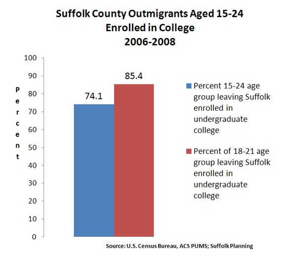
    But numbers from the U.S. Census Bureau’s American Community Survey, recently crunched for the Suffolk County Comprehensive Plan, show that 74.1 percent of 15-24 year-olds who move out of Suffolk are enrolled in college. When looking at only 18-21 year-olds, the primary college-aged group, the percentage of those leaving Suffolk because they’re enrolled in college rises to 85.4 percent (see Figure 1).

    Suffolk County had a college-going rate among high school graduates of 86.5 percent in 2010. Is this high rate something that needs to be reversed? Many of these college goers return to Long Island, sometimes after stints in New York or other cities as young careerists, and help to raise the median household income of migrants coming into Suffolk county to $81,471 (2008 dollars), compared to only $67,241 for those leaving Suffolk.

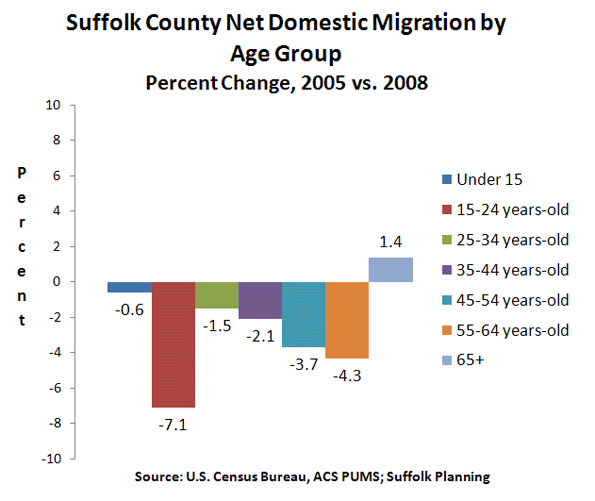
    One more finding from the Suffolk Comprehensive Plan on domestic migration —movement within the United States — seems to mitigate against received wisdom. While the college-goers age group had the largest net domestic migration out of Suffolk, the second largest group was the 55-64 year-olds. (see Figure 2)

    In other words, the age groups widely believed to be the most in danger of shrinking or “disappearing” due to outmigration are, according to the best available data, the least in danger of doing so. In general, the 25-34 and 35-44 year-old age groups are the smallest net domestic migration “losers,” because it is a relatively stable time in life. If people marry, and/or care for young children, move up the ranks of a career, or invest in a home, it is typically in these years that they do so.

    As far back as 1978, Newsday screamed that “An Exodus of the Young Threatens Life-Style.” In fact, the 1970s saw a sharp increase in the number of young adults in Nassau-Suffolk; as the population aged 15-39 grew by 178,179, or 21 percent, from 846,070 in 1970 to 1,019,249 in 1980.

    Demographic data can be a useful tool for policy makers attempting to clarify complicated public issues. But when data is not properly understood, or it is misinterpreted, then public policy debate is stymied.

    Seth Forman, Ph.D, AICP, is author of American Obsession: Race and Conflict in the Age of Obama and Blacks in the Jewish Mind: A Crisis of Liberalism, among other books. His work has appeared in publications that include National Review, Frontpagemag.com, The Weekly Standard, and The American. He is currently Research Associate Professor at Stony Brook University, and the Chief Planner for the Long Island Regional Planning Council. His opinions are not associated with any of these institutions. He blogs at www.mrformansplanet.com.

    Photo by SaraPritchard, Warped Tour’10, Long Island, New York

  • The Demise Of The Luxury City

    The Republican victory in New York City’s ninth congressional district Sept. 13 — in a special election to replace disgraced Rep. Anthony Weiner — shocked the nation.  But more important, it also could have signaled the end of the idea, propagated by Mayor Michael Bloomberg, of New York’s future as a “luxury product.”

    For a decade, the Bloomberg paradigm has held the city together: Wall Street riches fund an expanding bureaucracy that promotes social liberalism and nanny-state green politics. Indeed, Wall Street’s fortune — guaranteed by federal bailouts and monetary policy under both Presidents George W. Bush and Barack Obama — has been the key to the mayor’s largely self-funded political success. Under Bloomberg, Wall Street’s profits allowed city expenditures to grow 40% faster than the rate of inflation. Bloomberg was also able to buy political peace by bestowing raises two to three times the rate of inflation on the city’s unionized workers.

    Now this calculus is falling apart. Layoffs are mounting on Wall Street, while bonuses — the red meat that fuels everything from high-end condos to expensive boutiques and restaurants — are expected to drop 30% from last year.

    The newly Republican ninth district — stretching from south Brooklyn through the upper-middle-class strongholds around Forest Hills, Queens — reflects growing unease in the non-luxury parts of the city. The area is decidedly middle class, but with a median income of $55,000 it is the city’s least wealthy white district. For the most part, its residents have not benefited from Bloomberg’s management nor from Obama’s economic policies.

    Rather, the district reflects the kind of anxiety that is sweeping middle class areas across the country. “These people are worried about their kids and their future,” says Seth Bornstein, executive director the Queens Economic Development Corp. “The fire may not be in the backyard, but it’s around the corner.”

    Like many native New Yorkers, Bornstein sees Manhattan — the epicenter of the “luxury city” — as something of a “fantasy land,” inhabited by those who, despite living in Gotham’s historic core, are “not really New Yorkers.” Most Manhattanites, he notes, did not grow up in New York, and a majority live in single households. They largely either go to school, work in media or Wall Street, or make their livings servicing the rich.

    The ninth district is different socially as well. It is family-oriented. Barely one-third live in single households, compared with a near majority in Manhattan. Unlike the tony Upper East Side or trendy Soho, there are few celebrities or multi-millionaires. Although some of the ninth district’s inhabitants do work in the financial sector, many are tied to industries such as garments, work as professionals, such as doctors or accountants, or own their own small businesses.

    Some Democrats like California Rep. Henry Waxman have another explanation for the vote: greed. “They want to protect their wealth,” he explained, “which is why a lot of well-off voters vote for Republicans.” You almost have to admire the chutzpah of such views from a man who represents Beverly Hills.

    Waxman, of course, is wrong. This election was driven not by desertions of the rich but by the shift to the GOP among largely middle or working class voters. In many ways this election followed the pattern established by Sen. Scott Brown’s stunning 2009 Massachusetts victory, which came largely from middle-income voters. The ninth district’s new representative, Bob Turner, won big in modest Middle Village and South Brooklyn, while losing decisively in the wealthiest precincts such as Forest Hills and some minority, immigrant-oriented enclaves.

    The big story here, as Bornstein suggests, lies in the growing unease about the national and New York economies among large sections of the city’s beleaguered middle class. Despite the enormous wealth generated on Wall Street, New York’s middle class has been fleeing the city at breakneck speed for decades.

    According to the Brookings Institution, New York has suffered the fastest declines of middle class neighborhoods in the U.S.: Its share of middle income neighborhoods is roughly half that of Seattle or the much maligned Long Island suburbs. Twenty-five percent of New York City was middle-class in 1970, but by 2008 that figure had dropped to 16%.

    Even the young, who so dominate parts of lower Manhattan and Brooklyn, do not appear to be hanging around once they get into their 30s, particularly after their children reach school age. One reason: Bloomberg’s much touted school reforms have been, for the most part, ineffective in turning the bulk of the city’s public schools around.

    Ultimately, the basic truth is this: Bloomberg’s luxury city has failed most of its citizens. Despite its self-celebrated “progressive” image, New York has the most unequal distribution of income in the nation. The bulk of the job growth has not been on Wall Street, where employment has declined over the decade, but in hospitality and restaurants, which pay salaries 60% below the city average. In fact, restaurants are now the largest single private employers in Manhattan, with more people serving tables than trading equities.  As the New York Post quipped: “If you can make it here, you can make it anywhere — as a waiter.”

    It gets worse for the poor. One in five New Yorkers lives in poverty. Black male joblessness hovers at around 50%. Overall, New York’s household income, based on purchasing power, ranks 21st in the nation, behind not only such rich areas as San Francisco or Washington, but also places like Houston, Dallas, Indianapolis, Kansas City and even Pittsburgh.

    Ultimately, suggests Jonathan Bowles, president of the Center for an Urban Future, the future of New York’s middle class depends on reducing dependence on Wall Street.  The city needs to focus on industries and niches outside finance, including education, health, design, high-tech services, media and smaller businesses, many of them owned by immigrants.

    Bowles suggests diversification needs to speed up particularly now that Wall Street, the very engine of the “luxury” economy, is sputtering. Such a change will require a new political climate.  Voter engagement and political choice in New York have atrophied under the Medici-like Bloomberg, who has managed to pay off many interest groups with a combination of his own and the city’s money. Combined with a union-financed get-out-the-vote, the choices offered by the city’s once contentious politics have become increasingly constricted.

    But something is stirring in the boroughs.  The district’s voters not only embarrassed their civic betters by voting Republican, but they also demonstrated that New York’s middle class, politically quiescent under Bloomberg, may need to be taken seriously again.

    This gives hope for what Bornstein calls “the real New York” — a place that is neither particularly glamorous nor severely bifurcated between the rich and those who service their needs. With a more diversified economy and family orientation, this unexpected rebellion could represent the first step toward restoring New York’s roots as a city not of luxury but of aspiration.

    This piece originally appeared at Forbes.com.

    Joel Kotkin is executive editor of NewGeography.com and is a distinguished presidential fellow in urban futures at Chapman University, and an adjunct fellow of the Legatum Institute in London. He is author of The City: A Global History. His newest book is The Next Hundred Million: America in 2050, released in February, 2010.

    Photo by flickr user zoonabar

  • Beyond Words: A 9/11 Remembrance

    On September 7, 2001, a Friday, the communications staff of New York City Mayor Rudolph Giuliani gathered to plan for the week ahead. I had joined the Giuliani administration the previous April as a speechwriter, one of three on the mayor’s staff.

    The biggest event on the schedule was the primary election on Tuesday, September 11, when New Yorkers would choose each party’s nominee to succeed Giuliani. The mayor would be casting his own ballot at Public School 66 on East 88th Street at 7 a.m., followed by a fairly routine round of staff meetings.

    In the evening, he was scheduled to give remarks at the black-tie opening night performance of the New York City Opera, which was to debut its season at Lincoln Center with Wagner’s The Flying Dutchman. Concurrently, there would be an election-night party at the Dylan Hotel on East 41st Street. The mayor might drop in on either of these events, or both of them, or so we all assumed on September 7.

    Four mornings later, I got off the subway at the Brooklyn Bridge station. Looking up, the sky was a bright blue, with one exception: running across it, like a ribbon stretched taut, was a thin but dense cloud of grey. This surprised me a bit, because no one had predicted a storm.

    Up on the sidewalk I kept my eyes on the pavement, lost in my own thoughts. Finally, after a good 70 yards or so, it occurred to me that the street was different today. There were countless people out, as always, but instead of rushing around in their usual morning bustle, they were standing still. Something about this felt weird, displaced, transfixed. It momentarily reminded me of children huddled outside a school during a fire alarm.

    Then I looked up. Ahead and to the right, four blocks to the southwest, the Twin Towers were burning. Keeping symmetry even now, each tower had a gash of yellow flame from which black smoke blew upward in tight veils.

    City Hall was a whirl of confused, frightened activity. The mayor was not in the building. He had gone to the towers. In the frenzied buzz, reports and rumors flew. Someone said a hijacked plane had hit the State Department; someone else added that another plane had struck the Pentagon; another jet, its intentions unknown, was said to be heading for New York.

    Then speculation stopped, and there was only sound.

    It penetrated like the blast of close thunder, but it was not instant. This was a terrible unfurling of sound, a prolonged cascading roar with a shrieking undertone of metal. Then, an ashen cloud – a swirl of chalk-white, grey and brown – hit the glass front doors of City Hall like a wave. Shadows appeared in the cloud, and hands thrust out from the billows, grasping at the doors.

    “Let them in! Let them in!” someone shouted. But a security guard had raced across the rotunda floor and held the doors shut. The ash cloud covered the front of City Hall like a curtain, blinding us to the world outside.

    After a few minutes, we learned that the building was being evacuated. Someone handed me a paper respiratory mask as we went out the front doors. The air was hazy, and the plaza in front of the building was coated in white ash, as if snow had fallen.

    We boarded a city bus that had been detailed to get us out of Lower Manhattan. But then we saw police officers and firefighters in full bunker gear running up the street toward us, as if in flight from something. Because the pall at the World Trade Center was still so thick, we couldn’t see what was going on back there. We just scrambled off the bus and ran. As we did, there was another terrible roar.

    After a few dozen yards, we stopped running. We joined the hundreds of other people walking uptown. We soon came to a scene from another era: A throng of New Yorkers huddled around a radio on the sidewalk, listening for news from the front. It was there that I first learned that the Twin Towers had been completely destroyed, dissolved, along with anyone still inside them. This was an astonishing fact to absorb, a vast and sudden elision of prior understandings. There was nothing to do but keep walking uptown.

    So we did. Almost everybody seemed calm, orderly, reasonable. There were exceptions. One woman in the middle of the sidewalk wasn’t walking anywhere. She was just standing there, facing uptown and then downtown, screaming the same thing over and over again: “This is Jesus’s will!”

    We tried to determine where the scattered members of the mayor’s staff were reassembling. At Union Square, which had a subterranean police station, we learned that the mayor and his team were gathering at the police academy on East 20th Street between Second and Third avenues.

    The police academy served as mayoral headquarters for a few days following September 11. Then operations moved to Pier 92, a shipping terminal on the Hudson River at 52nd Street.

    This huge interior space housed not only the mayor’s office, but also the operations of many city, state and federal agencies. At the end of the terminal was the river. On the banks, soldiers in green camouflage stood at sandbagged gun turrets, as armed patrol boats worked the currents.

    ***
    Mayor Giuliani conducted meetings on the rescue and recovery effort in a small conference room upstairs from the main floor of the makeshift command center. This room, really just a small, rectangular space set off with partitions, was where the mayor brought together the heads of the relevant agencies to talk about every aspect of the city’s response to 9/11.

    At a large table, the mayor sat in the middle, typically with Fire Commissioner Thomas Von Essen and Police Commissioner Bernard Kerik close by. Other officials – a shifting cast that included New York Governor George Pataki and visiting national politicians – would also attend, with aides taking up chairs along the wall or standing near the doorway.

    I valued the opportunity to sit in on these meetings. It was heartening to see a roomful of public officials address an acute challenge with civility and seriousness. In the meetings I witnessed, grandstanding was at a minimum – no small feat, considering that the individuals around the table were accustomed to supremacy within their administrative domains.

    One day, Massachusetts Senator John Kerry walked into the conference room. Giuliani interrupted the meeting to welcome the Democratic senator, and graciously invited him to sit at the table. Kerry just as graciously declined, and remained standing near the doorway as the meeting continued. It was a nice interaction, instructive in its way, though much of what it represented would soon pass.

    ***
    In the spring and summer months leading up to 9/11, Mayor Giuliani’s speech schedule had stuck to the standard big-city ceremonial fare: ribbon cuttings, ethnic festivals, the occasional policy address. Only once during this period did anything jar the normal rhythms and knock all other priorities off the board.

    On June 17, Father’s Day, a Queens hardware-store fire killed three firefighters – John Downing, Brian Fahey and Harry Ford, all fathers themselves. For the next week, researching and preparing the funeral speeches was more or less the sole focus of our office.

    The message was clear: When a firefighter or police officer dies in the line of duty, giving his life in service to the city, all other demands on a mayor’s attention come second. That the mayor would personally attend the funeral – upending any prior commitments, no matter how important – went without saying.

    The sheer scale of the September 11 attacks meant that the process of civic bereavement would have to be handled differently: 343 firefighters were dead, along with 23 New York City police officers and 37 members of the Port Authority Police Department (PAPD).

    There was no way the mayor could attend each uniformed service member’s funeral. Several would be taking place at once: a dozen were on the schedule for Friday, September 28; there were 21 listed for the following day. The funerals would be held in all five boroughs, the Long Island suburbs, New Jersey, and southerly “upstate” New York counties like Dutchess and Orange.

    The mayor would attend as many services as he could, but some other senior municipal official – typically a deputy mayor or the head of a major department – would be representing the city at most of them. This arrangement satisfied no one, including the mayor, but it was the only way to proceed under the circumstances.

    The mayor’s speechwriters wrote for any official who spoke for the administration at the funerals. There were four of us now – John Avlon, Owen Rounds, Matt Lockwood and myself. The directive remained the same as it had been after the Father’s Day fire: Recognize the uniqueness of each firefighter or police officer who had died.

    If anything, this rule was especially important now, since many surviving service members and civilians would be attending multiple funerals and hearing a lot of eulogies. We did not want these speeches to seem in any way rote or impersonal. Some repetition of certain general sentiments from one eulogy to another was unavoidable, but we tried to individualize the speeches as much as possible.

    This involved learning all we could about the lives of those now dead. We did not contact the families, but relied instead upon the public-information staffs of the FDNY, NYPD and PAPD, who were generally thorough, timely and gracious in providing necessary biographical details. The daily work of gathering these details and writing the eulogies gave us an ongoing introduction to a community of men and women who had all been taken from this world prematurely, brutally, and more or less simultaneously.

    FDNY Battalion Chief John Moran, who had directed rescue efforts at the Father’s Day fire, was among the dead on September 11. So was First Deputy Fire Commissioner William Feehan. He had been the first person in the history of the fire department to hold every possible rank, and it was said that he knew the location of every hydrant in the city.

    Gone now, too, was Lieutenant Joseph Leavey, who was laid to rest on what should have been his 46th birthday. Like many firefighters, Lieutenant Leavey had an esoteric field of interest. He was an avid student of New York architecture, and had a fascination with the Twin Towers, taking numerous photographs of them.

    NYPD Sergeant Timothy Roy, 36 years old, had served in the Crown Heights section of Brooklyn. He earned praise for his efforts to ease tensions between blacks and Jews following the 1991 riots in that neighborhood. Sergeant Roy was last seen alive in the main concourse of the 5 World Trade Center building, helping someone who had suffered severe burns.

    I was drawn to a particular group of the fallen, the officers of the Port Authority Police Department. For many Americans, the abbreviations FDNY and NYPD were synonymous with the lost rescuers of 9/11. Those totemic letters were everywhere in the months following the attacks – t-shirts, hats, bumper stickers, even the flanks of missiles in Afghanistan. There were few such references to the PAPD, despite that department’s grievous losses and the bravery of its officers.

    In a way, this was in keeping with the nature of the PAPD’s mission, which involves patrolling airports, bridges, tunnels and harbors in New York and New Jersey, as well as the Port Authority’s namesake bus terminal on Eighth Avenue. This is essential, life-protecting work, but not quite the stuff of television dramas.

    September 11 was a many-layered tragedy for the Port Authority. This was the agency, after all, that had built the World Trade Center in the first place, as a 1970’s downtown-renewal project. Its headquarters were there. Soon after the planes hit on 9/11, PAPD officers from both sides of the Hudson River sped toward the Twin Towers. At least one, Officer Kenneth Tietjen, commandeered a taxicab to reach them. PAPD Captain Kathy Mazza, a former operating-room nurse, assisted the evacuation of Tower One by shooting out glass walls in the mezzanine.

    Officer Tietjen and Captain Mazza were among the PAPD officers killed at the World Trade Center, as was the department’s police superintendent, Fred Morrone. In addition to the heavy toll on its police force, the Port Authority lost 47 civilian employees, including its executive director, Neil Levin. The agency’s role in the rescue effort was both noble and underappreciated, and I sought to write the eulogies for its members whenever I could.

    ***
    Just as the number of casualties on 9/11 altered the city’s official mourning process, so too did the nature of the violence. The steel-buckling forces of fire and gravity that drove two skyscrapers into the earth made the recovery and identification of the dead especially difficult. As of early October, for example, only five PAPD officers were confirmed dead, with 32 still officially counted as missing.

    Recognizing the inevitable, relatives of the missing began to hold memorial services. As the recovery team at Ground Zero gradually found more remains, several families had second ceremonies to mark their return. The funerals would take place through the end of the year, as the recovery team continued its work.

    Researching and writing the eulogies was a daily reminder that the September 11 attack was the murder of thousands of individual human beings. It is easy to remember that day as a collision of mass forces, of crashing planes and clashing civilizations. Yet 9/11 was not just the death of an era, or of our innocence, or of a relatively quiescent phase in geopolitics.

    It was also the death of Officer Antonio Rodrigues, 35, husband of Cristina; father of Sara and Adam; son of Jose and Cecilia; brother of Marisa; four years with the NYPD; one with the PAPD; a landscape artist and trained aeronautical engineer; a native of Portugal.

    One man, gone a decade now. To pause on a single life lost is – as it was then – to consider the numberless possibilities of stolen years, and to fail in the attempt to multiply the unknowable by thousands.

    The author was a senior speechwriter for Rudolph Giuliani from April to December of 2001. He returned to his hometown of St. Louis, where he worked for Mayor Francis Slay as a speechwriter and crime-policy aide, and then joined the Progressive Policy Institute as director of policy development. He is now the senior communications advisor to the Under Secretary of Defense for Policy at the Pentagon.

    Photo by Ennuipoet * FreeVerse Photography (David Bledsoe): 9/11 Memorial; September 11, 2010, Floating Lanterns. At Pier 40, New Yorkers gathered for an interfaith memorial, including floating paper lanterns with messages from New Yorkers written on them.
  • Ground Zero Tolerance: With No Politician Willing to Take Charge, the 9/11 Recovery has Dragged on Far Too Long

    This piece originally appeared in the Village Voice.

    A decade into its unhappy and unexpectedly long life, Ground Zero has undergone its annual if short-lived transformation from New York politicos’ red-headed stepchild to belle of the ball, at least until September 12.

    Governors Cuomo and Christie, among other politicians, have been reportedly jockeying with the mayor for pride of place at the Bloomberg-run anniversary ceremony to score valuable camera time at a charged event that’s valuable to politicians precisely because of its aura of being outside of politics—much as the 40-plus TV specials, complete with “investigations” of twins lost in the twin towers and endless ads featuring terror porn of the planes striking the towers are somehow supposed to be in the “public interest.” The “sacred” site has doubled nicely as a profitable one, as detailed by Graham Rayman in last week’s Voice.

    In a sense, the politicians who will pay tribute this week are benefiting from their own neglect: Except for one week a year, New York’s elected leaders try to have as little as possible to do with Ground Zero. And that’s the main reason why 10 years later and despite a booming real estate market for most of it, there’s still a Ground Zero for them to make pilgrimage to and offer on-air genuflections. The question remains: Once the annual ritual has passed, is there a politician willing to take ownership of Ground Zero?

    In part, the problem has been Giuliani’s big shadow. “American’s Mayor,” who has profited immensely from the unlikely title in the years since, emerged as such a potent symbol in his final days in office that the area’s political leaders turned their attention elsewhere—and let a series of unelected, unresponsive, and unproductive special authorities (read: bureaucrats) take control of the site. Mayor Bloomberg turned his attention to his Far West Side Olympics dream, while a succession of weak governors in New York and New Jersey never managed to leave a mark despite their control of the Port Authority, which owns the site. Bloomberg, whose star has of late been dimmed by two strong new governors, has emerged as the closest thing to a de facto spokesman for the site, while still maintaining some distance from it.

    Absent an elected leader willing to stake his office to the site, a dangerous gamble no one has taken so far—Ground Zero has “progressed” through a series of ill-conceived “master plans”—the Freedom Tower, the Libeskind Master Plan, the insanely pricey Calatrava PATH station, the ever-more-pricey memorial that will finally open on September 11, 2011—that kept the private market from rebuilding even as demand boomed in the low-interest bubble the Fed inflated after the attack in part to dampen its economic impact. It’s no coincidence that the only completed structure at the 16-acre site is private developer Larry Silverstein’s 7 World Trade Center and that the other towers have managed to draw future tenants only through highly subsidized leases for “needy” tenants such as Goldman Sachs. The most glaring example of the absence of leadership, though, was the August 2007 Deutsche Bank fire, which killed two firefighters and seriously injured dozens more after city Housing and Fire inspectors missed glaring violations in the structure, which, at that point, had been awaiting teardown for nearly six years. (It finally took more than nine to take it down.) Neither Bloomberg nor any other politician took much heat for a needless tragedy that cost the lives of additional first responders.

    Years of public frustration with the impossibly slow pace of rebuilding finally manifested in last year’s ugly fight over the so-called “Ground Zero mosque.” Although liberal New Yorkers tried to pretend Republicans had hijacked a local issue to score cheap points nationally, polls showed New Yorkers overwhelmingly opposed the Muslim community center, which, in fact, would be located several blocks from the site. Margaret and Peter Steinfels, co-directors of the Fordham Center on Religion and Culture, recalled hearing a Catholic priest speculate that the surprising outburst of anti-Muslim sentiment, which was largely absent from the city after the attack itself, wouldn’t have happened if the site had been rebuilt. “The priest,” the Steinfelses said, “felt that this void left a lot free-floating emotion that had been displaced to opposition to the Islamic center.”

    The absence of local accountability extends to the events of 9/11, as well as the site. The brave uniformed officials who ran into the cloud as others fled now find themselves reduced to actuarial table figures. The Victims Compensation Fund Special Master Sheila L. Birnbaum, another politically insulated appointee, isn’t covering cancer-related medical costs, arguing a causal link hasn’t yet been proved.

    Chris Ward, the Port Authority executive director appointed by Governor Paterson in 2008, who has had success in pushing construction forward ahead of the anniversary, when national attention will briefly refocus on the site, albeit at a steep price tag, delivered a powerful speech last week that seemed to be a parting shot amid reports that Governor Cuomo wants to bring in his own man after the anniversary to finish the job.

    Calling the September 11, 2011, opening a moment to “begin the important process of weaving this memorial at the heart of the site into the fabric of New York City,” Ward said the PA had “stepped back from a difficult conversation about what the World Trade Center should be, and stripped the site of what I call monumentalism, and focused on construction, of what it could be.”

    If Cuomo manages, with Ward or a replacement, to finally heal the open wound that’s bedeviled the city for a decade, New Yorkers will remember. If he fiddles around as his predecessors have, we’ll remember that, too. Any change at the Port Authority needs to come with a credible plan and time frame on which to judge the results and the governor.

    It’s late, but it might not be too late.

    Contact Harry Siegel at hsiegel@villagevoice.com

    Photo courtesy of bbcworldservice

  • Who Lost the Middle Class?

    Forty years from now, politicians, writers, and historians may struggle to understand how America, once the quintessential middle-class society, became as socially stratified as Europe or even Brazil. Should that dark scenario come to pass, they would do well to turn their attention first to New York City and New York State, which have been in the vanguard of middle-class decline.

    It was in mid-1960s New York—under the leadership of a Barack Obama precursor, Hollywood-handsome John Lindsay—that the country’s first top-bottom political coalition emerged. In 1965, Gotham had more manufacturing jobs than any other city in the country.programs failed. New York City responded by inflating its unionized public-sector workforce to incorporate minority workers.

    Higher taxes to pay for bigger government joined higher crime to produce a massive exodus of manufacturing and middle-class jobs. Over the last 45 years, New York has led the country in outmigration. A recent study by E. J. McMahon and Robert Scardamalia of the Empire Center for New York State Policy notes that since 1960, New York has lost 7.3 million residents to the rest of the country. For the last 20 years, “New York’s net population loss due to domestic migration has been the highest of any state as a percentage of population.”

    New York City, meanwhile, solidified its standing as the most unequal city in America. Twenty-five percent of New York was middle-class in 1970, according to a Brookings Institution study. By 2008, that figure had dropped to 16 percent, and the numbers have only plunged further since the financial crisis, with virtually all the new jobs in the city’s hourglass economy coming at either the high end or the low. Only high-end businesses can succeed in a local economy that has the nation’s highest taxes and highest cost of living—and even those businesses, in many cases, weathered the downturn only by living off the Fed’s policy of subsidizing banks. Despite the federal largesse, more of the city’s new jobs are in the low-wage hospitality and food-services industries than in the financial sector. The middle has lost its political voice in a city dominated by the politically wired wealthy and the public-sector unions that service the poor.

    New York is the picture of what the Tea Party fears for the country at large. In the 1970s, liberal mandarins seized the high ground of American institutions in the name of managing social, racial, gender, and environmental justice on behalf of the disadvantaged. Their job, as they saw it, was to protect minorities from the depredations of middle-class mores. In the wake of the Aquarian age, the U.S. developed the first mass upper-middle class in the history of the world. These well-to-do, often politically connected professionals—including the increasingly intertwined wealthy of Wall Street, Hollywood, and Silicon Valley—espoused what might be called gentry liberalism, a creed according to which the middle classes had to be punished for their racism, sexism, and excess consumption.

    And they have been punished—with job losses. These losses are the inevitable result of the costs of an ever-expanding, European-style public sector; environmental restrictions on manufacturing, mining, and forestry, which push high-paying jobs offshore; and illegal immigration, which reduces overall wage levels. At the same time, the decline in the quality of K–12 schools has undermined what was once a ladder of economic ascent. After completing high school today, students are likely to require a raft of remedial courses in college. Then, after college, many middle-class students graduate not with an education but with a credential—and a bag of enormous college loans that paid for the intermittent attention of a highly paid, tenured faculty.

    The private-sector middle class’s plight has been exacerbated by international competition and technological innovation, which have undermined job security, including for unionized manufacturing workers, who had enjoyed an unprecedented prosperity for about a quarter-century. Median household incomes have grown only marginally since the early 1970s, despite the mass movement of women into the workplace. Many dual-earner families have been caught in the two-income tax trap: on the one hand, they pay for services once performed by the homemaker; on the other, notes economist Todd Zywicki, they’re pushed into a higher tax bracket when the wife’s salary is added to the husband’s.

    Adding to the woes of the middle and lower classes is that their families are far less stable than they were a generation ago. The decline of marriage has been driven not only by changing mores but also by a decline in male employment. In 1970, only one of 14 working-age men was out of the workforce. Today, notes Nina Easton, one in five is either “collecting unemployment, in prison, on disability, operating in the underground economy, or getting by on the paychecks of wives or girlfriends or parents.” Whites who don’t attend college have out-of-wedlock birthrates approaching those that triggered Daniel Patrick Moynihan’s concerns about the black family in 1965. Today, four in ten American babies are born out of wedlock.

    During the current downturn, the black and Hispanic middle class has been particularly hard hit. From 2005 to 2009, according to a recent Pew survey, inflation-adjusted wealth fell by 66 percent among Hispanic households and by 53 percent among black households, compared with 16 percent among white households. These families worry with good reason that in the face of continuing high unemployment, they may fall out of the middle class. For the Obama administration and the public-sector unions, the solution to this slide is to force the nearly one in four employers that have contracts with the federal government to pay above-market wages. Here again, New York has been a pacesetter. Recently, public-sector unions and their allies tried to force a developer rebuilding a decayed Bronx armory to follow their wage and hiring guidelines; the deal collapsed, leaving one of the poorest sections of Gotham in the lurch.

    There’s a major difference, though, between New York and the country as a whole. The New York option—move somewhere else—doesn’t apply to private-sector middle-class workers fighting adverse conditions that exist throughout America. So they’ve exercised the classic democratic right of political action, organizing themselves to compete in elections. The Tea Party is the national voice of the private-sector middle class—despite the demonizations heaped upon it by public-policy elites whose own judgment and competence leave much to be desired.

    Middle-class decline should be front and center in 2012, which is shaping up as a firestorm of an election. It’s likely to be a bitter contest, in which the polarized class interests of those who identify with the growth of government and those who are being undermined by its expansion face off without the buffer of mutual goodwill. Liberals, unless they change their tune, will blame Tea Party “terrorists” for the tragedy of a fading middle class. They will continue to delude themselves into thinking, as Al Gore said in 2000, that their rivals represent “the powerful” and that they themselves act on behalf of “the people,” even though President Obama’s policies have poured money into Wall Street and the politically connected “green” businesses that form the upper half of his top-bottom electoral coalition. The question is whether the country will buy this line and, more broadly, whether it will follow the New York model. Should it do so, those future historians will no doubt look at the election of 2012 as the contest in which the middle class staggered past the point of no return.

    This piece originally appeared in The City Journal.

    Fred Siegel is a contributing editor of City Journal, a senior fellow at the Manhattan Institute, and a scholar in residence at St. Francis College in Brooklyn.

    Photo by SEIU International.

  • The Shifting Geography of Black America

    Black population changes in various cities have been one of the few pieces of the latest Census to receive significant media coverage.  The New York Times, for example, noted that many blacks have returned to the South nationally and particularly from New York City.  The overall narrative has been one of a “reverse Great Migration.”  But while many northern cities did see anemic growth or even losses in black population, and many southern cities saw their black population surge, the real story actually extends well beyond the notion of a monolithic return to the South.

    The map below, showing total growth in Black Only population from 2000 to 2010, indeed shows that northern and west coast cities had low or even negative growth while various southern cities boomed.


    Here is a list of the top ten metro areas (among those with more than a million total people) for black population growth:


    And here are the bottom ten (among those with more than one million people):


    Of course, looking at total population numbers can mislead. Some cities grew slowly or lost people as a whole while others boomed. With Houston, Dallas, and Atlanta all adding over a million people each, it’s no surprise these regions added lots of blacks. Working and middle class African-Americans likely shared many of the same motivations to move to these cities – such as lower housing prices – as Americans of other ethnicities. In that light, a look at change in black population share (the percentage of the population that is black) provides additional perspective:


    Here we see not a single-minded return to the South, but a complex mixture of shrinking and growing regions in various parts of the country.  This includes some surprising places, like Minneapolis-St. Paul, which was one of the top ten metros in the country for total black population growth, and also saw its black population share grow strongly.  Now the Twin Cities, along with Columbus, Ohio, another strong performer, are two of the top destination for African immigrants from Somalia and elsewhere, which doubtless accounts for part of that strong growth. But anecdotal reports indicate that they are also benefitting from Chicago’s expanding black diaspora, along with places like Indianapolis and various Downstate metros.

    Atlanta, well known as America’s premier metro area for blacks, continued to dominate the charts. Not only far and away the leader in adding raw numbers of blacks, the African-American share also grew share strongly too. Charlotte is also clearly emerging as another key black population hub, ranking #6 in America for total black population growth, which is impressive for a smaller city, and adding nearly two percentage points in black population share.  It grew its black population much faster than other fast growing small cities like Raleigh or Nashville, and added share at more than three times as fast.

    By contrast, Houston, which grew total black population significantly, had a much lower share gain. Austin, one of America’s fastest growing metros, added only 28,000 blacks and actually lost black population share. And Washington, DC, despite being a traditional black population and cultural hub, also lost black population share regionally as gentrification in the District resulted in its loss of its black majority for the first time in decades, according to the Brookings Institution. 

    So even among rapidly growing metro areas in the South, the appeal to black population is selective, favoring places like Atlanta, Charlotte, Florida cities, and even slower growing cities along the length of the Mississippi River like Memphis.  Even some cities in the North are retaining their allure to blacks as well. Less favored or even out of favor are metros like DC, Dallas, and Houston as well as cities such as Charleston and Savannah along the southeast coast.

    Slow or negative black population growth is particularly concentrated in traditional tier one “global cities”, as well as those facing economic or other hardship like Detroit, Cleveland, and immediate post-Katrina New Orleans.

    The latter may be understandable – whites have been leaving these regions as well – but the former is quite troubling.  The global city model, focused on high end and creative services, is supposedly the bright and shining savior of American urbanism. Indeed, it’s hard to find a city that doesn’t have some aspect of that as a core plank in its civic strategy. Yet the cities that have been most focused at promoting this notion – such as New York, San Francisco, and Chicago – are generally those  disproportionately driving blacks away. The reasons for this aren’t clear, but the high and increasing cost of living in those places seems like one logical explanation.

    Here’s a more detailed look at the percentage growth in Black Only population in some tier one global type metros:


    New York barely broke even on black population, while Chicago, LA, and the Bay Area all actually lost black residents, a stunning reversal from their past as black magnets. However, Boston, not a traditional black population hub, grew its black population strongly on a percentage basis, as did Miami and DC, though as noted before, the share change in DC was negative.  Here is that metric for the same metros:


    With the notable exceptions of Boston and Miami – and Philadelphia, seldom ranked highly as a global city but still a traditional large northern metropolis – most global city regions appear to be increasingly inhospitable to Blacks.  Thus their model of success, whatever its appeal to some, at a basic level simply lacks inclusiveness. This shows its clear limits as an overall model for America’s urban centers as a whole.

    Aaron M. Renn is an independent writer on urban affairs based in the Midwest. His writings appear at The Urbanophile. Data analysis, maps, and charts in this piece were prepared with Telestrian.