Tag: New York

  • Who’s Dependent on Cars? Try Mass Transit

    The Smart Growth movement has long demonstrated a keen understanding of the importance of rhetoric. Terms like livability, transportation choice, and even “smart growth” enable advocates to argue by assertion rather than by evidence. Smart Growth rhetoric thrives in a political culture that rewards the clever catchphrase over drab data analysis, but often fails to identify the risks for cities inherent in their war against “auto-dependency” and promotion of large-scale mass transit to boost the “sustainability” of communities.

    Yet in pursuing this transit-friendly future political leaders rarely confront this inescapable reality: public transportation is fiscally unsustainable and utterly dependent on the very car-drivers transit boosters so often excoriate. For example, a major source of funding for transit comes from taxes paid by motorists, which include principally fuel taxes but also sales taxes, registration fees and transportation grants. The amount of tax diversion varies from place to place, but whether the metro region is small or large the subsidies are significant. In Gainesville, Florida – a college town of 120,000 – the regional transit system received 80 percent of the city’s local option gas tax in 2008. In New York City, the Triborough Bridge and Tunnel Authority diverts 68 percent of its toll revenues to subways and buses.

    In addition to local subsidies, state and federal agencies fund transit operations with revenue from gas taxes and other motorist user fees. In 2007 transit agencies received $10.7 billion from the federal Highway Trust Fund, and that is a conservative figure since another $11.7 billion was diverted for vaguely phrased “non-highway purposes.”

    In contrast, fare box recovery doesn’t come close to covering operating expenses. Nor can transit pay for its own capital outlay. Last year the Metropolitan Washington Airports Authority moved to dedicate toll revenue and toll bonds to cover half the cost of the $5.26 billion Dulles Metrorail project.

    The implications of transit’s auto-dependency are serious. Americans drove 11 billion fewer miles between 2008 and 2009, and for each mile not traveled local, state, and federal taxes were not collected. Without these anticipated revenues, transit systems across the country have suffered and, ironically, those hit hardest are the people who are dependent on public transportation ,that is in most cities, the poor and the young.

    In D.C., transit riders are being warned by Metro officials to expect half-hour waits for buses and trains and more crowded rides as they cut services and lay off positions to close a $40 million budget shortfall. Santa Clara County’s Valley Transit Authority has announced plans to reduce bus service by 8 percent and light rail service by 6.5 percent. In Arizona, both Tempe and Phoenix face major cuts that will lengthen wait times and eliminate routes. Even as demand for transit increases in states like Minnesota, the decline in funding is leading to major readjustments in service.

    The situation is so dire in New York City – with by far the most extensive transit system in the country – that advocates used students as props to protest service cuts caused by a $400 million budget shortfall. Though transit receives funding from other sources, there can be no mistaking the key role played by motorists.

    The decline in driving can be attributed largely to the economic downturn and increased unemployment, but even when the recession ends transit agencies will face an uncertain funding future. New technologies are making automobiles cleaner and more fuel efficient, which will allow people to drive more while paying and polluting less. If auto makers meet new federal standards, cars will soon be achieving 35.5 miles per gallon instead of today’s 27.5 mpg average. Economic growth continues to disperse and there has been a strong uptick in telecommuting.

    But perhaps the biggest threat to the future of auto-dependent transit is the very “cause” that seeks to establish it as the preferred travel mode. The planning doctrine called Smart Growth with its rationale of sustainable development is growing in popularity in urban areas across the country. Local officials are enamored with visions of auto-light cities where the buses are full, sidewalks are crowded and there are more bicycles on the road than cars.

    Beneath the appealing rhetoric of Smart Growth rests the assumption that automobiles are intrinsically bad and that public policy should be directed at restricting their use. Rarely do policymakers weigh the automobile’s many benefits and the improving technologies that are mitigating its negative environmental impact. Even rarer is discussion of whether transit can realistically match the convenience and flexibility of the automobile for both individuals and families.

    Distracted perhaps by pictures of ornate transit hubs and shiny rail cars, many policy makers fail to focus on developing a fiscally sustainable plan for public transportation. They miss the fundamental problem that anything heavily subsidized –particularly in a budget constrained atmosphere – is, by definition, unsustainable. (To the extent roads are subsidized, it breaks down to about a half-penny per passenger mile; transit subsidies are 100 times more than driving subsidies.) Ideally, user fees would cover all expenses of all transportation modes, including driving.

    A responsible policy goal should be for transit users to put their fair share in the fare box. However, given the current tax diversion imbalance, local officials should at least target a near-term goal for fare box recovery of 85 percent of costs instead of its current one-third average. This will reduce both their fatal auto-dependency and the instability that comes when external revenue sources are impacted by external factors like an economic downturn.

    Transit agencies should also right-size their bus fleets. Despite visions of large 55-passenger vehicles filled to capacity with contented commuters, only a small portion of routes in any urban area can fill these big box buses even during certain peak times. A smaller sized fleet would be not only less expensive but also more flexible, allowing cities to adjust routes and increase headways for greater service. It would also have a smaller carbon footprint.

    Finally, responsible policymakers should suspend most of their plans to build rail transit. In addition to routinely running over-budget, rail transit- outside of a few cities such as Washington DC and New York- simply does not carry many passengers relative to automobiles to justify its enormous operating expenses . The Santa Clara Valley Transportation Authority, for example, spent $55.5 million in operating expenses in 2008, recovering just $8.6 million from passenger fares and costing taxpayers an average of $5.88 per trip.

    Rubber tire transit is more efficient compared to rail as a service to those needing public transportation. Santa Clara’s operating expenses per vehicle revenue mile were 25 percent less for bus than for light rail. Additionally, bus transit is far more flexible, easier to expand and less disruptive in the construction phase.

    Essentially, policymakers need to see transit as a service with an important but limited role to play in most urban regions. With jobs and more activities spreading to the suburbs and exurbs – a process often accelerated by economically disruptive urban policies, cities should focus transit on a limited number of central core commuters as well as those people who cannot drive. Unfortunately, such goals are too modest for planners who envision transit as the catalyst for large scale social engineering and who have little concern for their regions’ economic bottom line.

    The dirty little secret remains that public transportation would collapse without the automobile. It will remain unsustainable as long as it remains dependent on that which public policy is trying to discourage. Smart Growth rhetoric makes for great campaign literature but not for smart decision-making. Responsible officials should question the underlying assumptions about automobiles and begin reconsidering the fiscal calculus that underlies transit policy.

    Ed Braddy is the executive director of the American Dream Coalition, a non-profit public policy organization that examines transportation and land-use policies at the local level. The ADC’s annual conference will be held this year on June 10-12 in Orlando, Florida.

    Photo: ahockley
  • The Limits Of Politics

    Reversing the general course of history, economics or demography is never easy, despite even the most dogged efforts of the best-connected political operatives working today.

    Since the 2006 elections – and even more so after 2008 – blue-state politicians have enjoyed a monopoly of power unprecedented in recent history. Hardcore blue staters control virtually every major Congressional committee, as well as the House Speakership and the White House. Yet they still have proved incapable of reversing the demographic and economic decline in the nation’s most “progressive” cities and states.

    Obama and his congressional allies have worked overtime in favor of urban blue-state constituencies in everything from transportation funding and energy policies to the Wall Street bailouts and massive transfers of private wealth to powerful public-employee unions. Yet these areas continue suffering from net outmigration and stubbornly high job losses – as well as from some of the most severe fiscal imbalances in the nation.

    Nowhere is this more evident than in the president’s hometown of Chicago. The Windy City has suffered a very bad recession and may have fallen to its worst relative position since the Daley reconquista in 1989. As Chicago blogger Steve Bartin points out, even the presence of a Daley operative in the White House has failed to prevent the city from falling “in a funk.” He writes that even a reliable booster, columnist Mary Schmich of the Chicago Tribune, has lately described the city “as edgy, a little sullen and scared, verging on depressed.”

    There’s plenty reason for feeling low, well beyond the humiliating loss of the Obama-backed Olympics bid last year. For example, Oprah Winfrey, the city’s one bona fide A-list celebrity, is retiring her talk show in 2011. She is also reportedly shifting much of her media empire to Southern California, which, for all its admitted problems, has gads of celebrities and much better weather.

    Chicago’s most serious concern, however, revolves around the economy. In June, its unemployment rate peaked at 11.3%, far outpacing the national unemployment rate of 10%. Since 2007, the region has lost more jobs than Detroit, and more than twice as many as New York. Chicago’s total loss over the entire decade is greater than any region outside Detroit: about 250,000 positions, which is about the amount its emerging mid-American rival Houston has gained. In hard times businesses tend to look for places with a friendly environment for their enterprise. They avoid high taxes, political payoffs and inflated public employee salaries – all well-known Chicago specialties. These costs are undermining the city’s competitive position in, for example, the convention business, among others.

    Other key sectors are also flailing. Political influence in Washington will not stem the flow of high-wage trading jobs away from the Mercantile Exchange to decentralized electronic exchanges. Nor can it reverse the deteriorating state fiscal crisis caused by weak economies and exacerbated by insanely high pensions and out of control spending policies. Late last month Moody’s and S&P downgraded the debt ranking for the State of Illinois. Of course, such fiscal malaise is not limited to Chicago or Illinois. True blue California has an even worse debt rating. New York, another blue bastion, is also just about out of cash.

    To be sure, the recession has not hurt New York as much as Chicago, but the Big Apple has lost heavily , including 50,000 financial sector jobs since 2007. The outrageous bonuses to a few well-placed financial types will cushion but not deflect the influence of declining high-wage jobs. This can be seen in the striking weakness in the once seemingly unstoppable high-end condominium market. Particularly hard hit have been recent gentrified neighborhoods like Williamsburg in Brooklyn, N.Y., much like the hard-hit, newly developed areas along the Chicago lakefront.

    Other blue bastions have been shedding jobs as well, both during the recession and over the whole decade. Beyond Chicago and Detroit, the biggest losses among the mega-regions have taken place in the San Francisco Bay Area, Los Angeles-Long Beach and Boston. Big money can still be made in Silicon Valley, Hollywood or around the academic economy of Boston, but in terms of overall jobs, the past decade has been dismal for these regions. Meanwhile, the consistent big gainers have been – besides Houston – Dallas and Washington, D.C., the one place money really does seem to grow on trees. Even Miami, Phoenix and San Bernardino-Riverside, in California, boast more jobs today than in 2000, despite significant setbacks in the recent recession.

    These trends coincide with continuing shifts in demographics. The recession may have slowed the pace of net migration, but the essential pattern has remained in place. People continue to leave places like New York, Chicago, San Francisco and Los Angeles for more affordable, economically viable regions like Houston, Dallas, Austin and San Antonio. Overall, the big winners in net migration have been predominately conservative states like Texas – with over 800,000 net new migrants – notes demographer Wendell Cox. In what Cox calls “the decade of the South,” 90% of all net migration went to southern states.

    Utah, Colorado and the Pacific Northwest have also experienced positive flows – but perhaps most striking have been the migration gains, albeit modest, in Great Plains states such as Oklahoma and South Dakota as well as Appalachian Kentucky and West Virginia. Historically these places shipped many of their people to cities of the industrial Midwest, the eastern seaboard and California; that is no longer the case.

    Ultimately these shifts could undermine the true blue political strategy, perhaps as early as the 2010 congressional and state elections, and certainly after reapportionment. By 2012, the census will likely take seats from New York, Michigan, Pennsylvania and Ohio, handing them over to Texas, North Carolina, Georgia and Utah. Perhaps nothing will epitomize the new reality more than the fact that California, now among the most extreme blue states in terms of governance, will not gain a Congressional seat for the first time since the 1860s.

    These trends suggest that the current administration and the majority party in Congress must adjust their strategy. Further attempts to push a radical “progressive” agenda – expansive public employee bailouts, higher taxes and radical measures to combat “climate change” and suburban development – might please their current core constituencies, but they have the perverse effect of driving even more people and jobs out of these regions.

    All these underlying trends appear a boon to Republicans. But Democrats could counter the emerging GOP edge by appealing to the needs of these ascendant regions. By their very nature, growth states have the most urgent need for government investments in basic infrastructure, something traditional Democrats long have espoused. Moreover, such areas tend to become more tolerant as they welcome outsiders, and could be turned off to excessive Republican social conservatism.

    For any of this to work, however, Democrats must first abandon their current narrow, urban-centric blue-state strategy. They must learn to adjust their appeal to regions on the upswing, or things could turn out very badly for them very soon.

    This article originally appeared at Forbes.com.

    Joel Kotkin is executive editor of NewGeography.com and is a distinguished presidential fellow in urban futures at Chapman University. He is author of The City: A Global History. His next book, The Next Hundred Million: America in 2050, will be published by Penguin Press early next year.

  • Why New York City Needs a New Economic Strategy

    When Michael Bloomberg stood on the steps of City Hall last week to be sworn in for a third term as New York City’s mayor, he spoke in upbeat terms about the challenges ahead. The situation, however, is far more difficult than he portrays it. American financial power has shifted from New York to Washington, while global clout moves toward Singapore, Hong Kong, and Shanghai. Even if the local economy rebounds, the traditional media industries that employ many of Bloomberg’s influential constituents likely will continue to decline. New Yorkers have long had an outsize view of their city; historically, its mayors have touted mottos that encouraged that view, from Rudy Giuliani’s “capital of the world” to Mike Bloomberg’s “luxury city.” But as Bloomberg begins his new term, New York needs to reexamine its core economic strategy.

    A good first step would be to recognize that the world owes New York nothing. The city cannot simply rely on inertia and the disbursements of Wall Street megabonuses to save its economy. Instead, it needs to rebuild its middle-class neighborhoods and diversify toward a wide range of industries that can capitalize on the city’s unique advantages—including its appeal to immigrants; the port; and its leadership in design, culture, and high-end professional services.

    It’s also time to get rid of the Sex and the City image and start making New York a city where people can have both sex and children. This will become more important as the millennial generation enters its late 20s and early 30s later this decade. This is when many young migrants to the city, including upwardly mobile immigrants, typically become ex–New Yorkers.

    Despite all the “back to the city” hype, New York over the past decade suffered one of the highest rates of out-migration of any region in the country. Young singles may come to New York, but many leave as they get older and have families. An analysis by the city controller’s office in 2005 found that people leaving the city were three times more likely to have children than those arriving.

    If New York is to thrive, it will need to keep more of these largely middle-class families. To do that, it needs to diversify its economy beyond Wall Street, which in 2007 provided roughly 35 percent of all income earned in the city. Since the recession, the city has lost 40,000 financial-service jobs, but the industry has been quietly downsizing for years: over the past two decades, more than 100,000 financial-services jobs have disappeared from New York. In good years, financial services provided an enormous cash engine, but it can no longer provide enough jobs. According to an analysis by the Praxis Strategy Group, finance now accounts for barely one in eight jobs in New York City. Most job growth has come instead in lower-paying professions like health care and tourism.

    To become economically sustainable, New York needs to create policies that help encourage development in areas where its less wealthy citizens live. Most outsiders identify New York almost exclusively with Manhattan, yet roughly three out of four New Yorkers actually live in the outer boroughs: Queens, Brooklyn, Staten Island, and the Bronx. Neighborhoods like Bay Ridge, Whitestone, Flatbush, Howard Beach, and Middle Village are really New York’s middle-class bastions.

    Over the past decade, these communities have provided a critical middle ground between the bifurcated Bloombergian “luxury city” with its high-end enclaves and the many distressed neighborhoods throughout the city. Although the mayor, some urbanists, and many developers would like to make these middle-class enclaves ever denser, their very appeal often lies in their moderate scale, proximity to work areas, decent schools, and parks. Those attributes hold sway, even in a recession. “Brand- new and expensive places have not held up as well as the established family neighborhoods,” says Jonathan Bowles, director of the New York–based Center for an Urban Future.

    Nurturing these neighborhoods will require a distinct shift in public policy. During the Bloomberg years the big subsidies have gone to luxury condo megadevelopments, sports stadiums, or huge office complexes. Consider the 22-acre Atlantic Yards project in downtown Brooklyn, which will include luxury housing and a new arena for the NBA’s Nets; one recent report by the city’s Independent Budget Office put the total subsidies provided by the city, New York state, and the transit authority at $726 million and estimated the project will hurt, not help, the city’s economy over time.

    More than anything, the plain-vanilla neighborhoods that represent New York’s real future will require policies that create a broad array of economic opportunities. Right now New York is so overregulated and highly taxed that only the most high-end business, such as big media and financial firms, can possibly thrive. The city has neglected its smaller firms, typically engaged in such activities as food processing, furniture making, and garment production. Traditionally these industries were run by Russian, German, Polish, and Italian immigrants; West Indians, Latinos, Koreans, Chinese, and South Asians do much of this work today. Over the past decade, the number of self-employed immigrants in New York has grown even as the number of self-employed among the native-born has dropped.

    Earlier generations of urban residents as well as many immigrants today stay in the city to be close to their communities and industries dominated by them. These days many others stay in the city largely because of its cultural attributes and quality of life. This doesn’t mean these workers remain unreconstructed bohemians forever. Their priorities often change as they age, start businesses, and raise families. Different, more mundane issues—stable employment, taxes, safety, schools, and housing affordability—often determine whether they stay in the city. “It’s easy to name the things that attracted us—the neighbors, the moderate density,” says Nelson Ryland, a film editor with two children who works in his sprawling home in Brooklyn’s Flatbush neighborhood. “More than anything it’s the sense of the community. That’s the great thing that keeps people like us here.”

    Technology will boost this sense of community. Online groups like the Flatbush Family Network can facilitate contact in different parts of a city among artists, families, and neighborhood groups, supplementing the traditional community adhesives of schools, churches, synagogues, and clubs. These new online institutions can perform some of the functions that urbanist Jane Jacobs’s “eyes on the street” did in the old, cohesive city neighborhood. Information about the arrival of a promising new store or restaurant, or the unwelcome appearance of a possible child molester, travels through these community networks much as it did when mothers spoke over the washing, men went to the pool hall, or kids hung out at the candy store.

    Bloomberg has built on many of the achievements of his predecessor during his eight years in City Hall. This, combined with huge campaign spending from his personal fortune, is why voters sent him back for a third term. To position the city for prosperity in an economy that’s no longer overly dominated by Wall Street, he’d be wise to spend his final term focused on making new opportunities for people who live far from his own Upper East Side neighborhood—the people who represent the real future of New York.

    This article originally appeared at Newsweek.

    Joel Kotkin is executive editor of NewGeography.com and is a distinguished presidential fellow in urban futures at Chapman University. He is author of The City: A Global History. His next book, The Next Hundred Million: America in 2050, will be published by Penguin Press early next year.

  • What To Look For In Healthcare Reform: Location, Location, Location

    A Reuters article that was widely picked up around the globe recently raised the question, Are Doctors What Ails US Healthcare? Comparing the New York suburb of White Plains to Bakersfield, California, the article uses the evergreen two-Americas paradigm to discuss disparities in health care. Drawing heavily on the Dartmouth Atlas of Healthcare, it highlights a sad but inescapable fact: doctors want to live in some places and not in others, giving the “have” populations more intensive medical care which they might or might not need, while have-nots, who tend to be older, sicker and poorer, get health care to match. The article asserts that there’s nothing in current health care reform legislation that will do anything to address the disparities.

    I agree. But then, what should we expect? The legislation, which I find marginally more desirable than doing nothing at all, is largely about insurance, not about health care. This is what happens when we emphasize how we pay for something, rather than what we are paying for. Are doctors what ails U.S. health care? Only in the sense that they are operating on the same basis as everyone else in the health care market: every man for himself.

    You don’t have to make bi-coastal comparisons to find the disparities highlighted in the Reuters article. My own Hudson Valley not-for-profit insurance company faces them every day. We cover the Medicaid populations from the aforementioned White Plains, NY, to the South, to the blighted economies of the Catskills to the North and West. The distance involved is only about 150 miles, but day in, day out it might as well be 1500. And socially, it might as well be 150 years. Sullivan County is still organized geographically the way it developed in the eighteenth and nineteenth centuries — farms, woods, and mills, only without the mill jobs.

    There was a brief shining moment (well, half a century) when urban Jews and other vacationers formed the basis of a thriving tourist trade in the “Borscht Belt” resorts of Monticello, Sullivan County’s hot spot. When they closed, they provided ideal settings for residential drug and alcohol rehab for poor people from New York City, but those aren’t exactly the foundation for high-quality community health care. When we initially started offering state-sponsored insurance to the poor of Sullivan County, the historical dearth of specialists made it a laboratory for what a free market looks like when there’s no competition. (Do I hear the words “strong public option”?) Because New York State requires us to have a decent network of contracted doctors for our enrollees, the sole cosmetic surgeon – for example – could extract pretty much any fee he wanted from us in exchange for seeing a patient who needed emergency reconstructive surgery.

    Your tax dollars meet supply and demand and a mandate to pay within a private market.

    I don’t blame the specialists. They are highly trained and skilled, and have paid their dues. If I blame anyone, it’s the system that sets the dues so high, in the form of college and medical school loans and years of fellowships that leave well-meaning doctors feeling that they deserve all that money, just like corporate farmers and hedge fund managers.

    It’s also not the doctors’ fault that they want good schools and cultural amenities. I haven’t seen much of Bakersfield, but I know that schools in and around White Plains have good reputations and are just twenty miles from Broadway and the Metropolitan Museum (and ten miles from my Tarrytown office). Maybe we can fix schools and reinvigorate the National Endowment for the Arts to make every remote locale more like Westchester, but that would be socialism.

    Dartmouth Atlas data is easily available online, and well worth spending some time with. You can use it to create all kinds of two-America scenarios that provide instant object lessons in our health care inequities. My personal favorite is that health care spending in Miami, Florida for Medicare patients in the last two years of life (highest in the nation) is exactly twice that in Portland, Oregon (lowest of the regions studied), with commensurate volumes of appointments, referrals, tests and hospitalizations, and no better outcomes. Here we see the same dynamics that make pawnshops spring up around gambling casinos and candy stores near public schools. Doctors go where the customers are, and once they arrive they maximize their revenues and measure success by volume, not outcomes.

    Why should we expect anything different, when reform legislation is captive to the same kind of have/have not dichotomy that shapes health care delivery itself? Senators Max Baucus of Montana and Kent Conrad of North Dakota are two of the pillars of the anti-public option caucus. They come from states with small populations, and both take barrels of money from the health insurance industry because they can’t raise it locally. If they play their cards right, who knows? They could leave Congress and become haves themselves, like Billy Tauzin, who is now Big Pharma’s man in Washington, having engineered the passage of Medicare Part D, or Tom Daschle, once a champion of single payer, who now plays both sides of the street with special interest money.

    Are Doctors What Ails US Healthcare? quotes David Goodman, Director of Health Policy Research at the Dartmouth Institute for Health Policy and Clinical Practice, who says there’s an “irrational distribution” of the most valuable and expensive U.S. health care resources. I would say that the distribution is entirely rational given the insanity of the larger situation.

    If we’re ever going to find our way out of this mess, we’re going to have to do for these health care backwaters, both rural and urban, what we used to do when private capital wouldn’t do the job. Set goals and build the infrastructure to serve them, because the market won’t do it. Want to electrify Appalachia? You need the TVA. Want to make the desert bloom? Build dams and aqueducts. Want to open up the interior of the country? Build an Interstate Highway system. Want doctors to practice in unattractive markets? Create an MD Bill for doctors like the old GI Bill for veterans, so that doctors emerge from training feeling more like public servants and less like indentured servants.

    I attended a discussion of health care reform not long ago at the Yale School of Public Health. The representative of the private health insurance industry put the issues in a compelling perspective, although not, perhaps, for the reasons he cited.

    His arguments were three: First, we require automobile owners to carry insurance, so requiring everyone to carry health insurance shouldn’t be a problem (I know that President Obama made this point, too, and I hated him for it). Second, do you want a health care system that runs like the Post Office, or one that runs like Federal Express? And third, the health insurance industry is really a jobs program, and do we really want to put all those people out of work?

    These are shallow arguments. Car insurance? There’s no law that says you have to own a car, but everyone needs health care. A health insurance mandate is more like forcing every American to buy a new car and giving them a choice between Ford or GM. Post Office and FedEx? A company that can’t send a package overnight from suburban Tarrytown into New York City without round-trip flights to Memphis and back is no model for health care delivery, and besides, I’d like to see what FedEx can do for the price of first class postage. Jobs? A dynamic economy finds ways of redeploying redundant workers in more significant jobs. Wouldn’t those actuaries make good math teachers?

    The arguments were so hollow that no one bothered to argue, and the insurance rep was undoubtedly relieved. A fellow panelist who practices medicine in Cambridge, Dr. David Himmelstein of Harvard, said simply, “My practice would have no trouble making money on Medicare, single-payer reimbursement rates if we didn’t have to pay so many people to argue with insurance companies.”

    Unfortunately, the larger discussion is still stuck on insurance, and as long as it is, the two health care Americas will never become one.

    Georganne Chapin is President and CEO of Hudson Health Plan, a not-for-profit Medicaid managed care organization, and the Hudson Center for Health Equity & Quality, an independent not-for-profit that promotes universal access and quality in health care through streamlining. Both organizations are based in Tarrytown, New York.

  • Migration: Geographies In Conflict

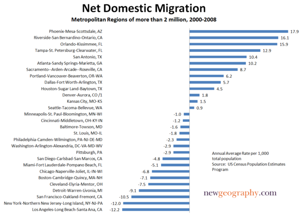
    It’s an interesting puzzle. The “cool cities”, the ones that are supposedly doing the best, the ones with the hottest downtowns, the biggest buzz, leading-edge new companies, smart shops, swank restaurants and hip hotels – the ones that are supposed to be magnets for talent – are often among those with the highest levels of net domestic outmigration. New York City, Los Angeles, San Francisco, Boston, Miami and Chicago – all were big losers in the 2000s. Seattle, Denver, and Minneapolis more or less broke even. Portland is the only proverbially cool city with a regional population over two million that gained any significant number of migrants.

    Those who find this an occasion for a schadenfreude moment attribute it to tax and regulatory climates. Clearly, things like cost of doing business are clearly very important. And indeed this is often under-rated by cool city proponents. And other things equal, people do prefer low tax jurisdictions. Still, is this the only answer, or is there another explanation? Could it be that rather than high costs driving migration, both costs and migration are being driven by other underlying factors?

    Perhaps the root problem is structural change in the economy in the age of globalization. As business became more globalized and more virtualized, this created demand for new types of financial products and producer services – notably in the law, accounting, consultancy, and marketing areas – to help businesses service and control their far flung networks. Unlike many activities, financial and producer services are subject to clustering economics, and have ended up concentrated in a relatively small number of cities around the world.

    These so-called “global cities” serve as control nodes for various global networks and key production sites for these services, along with other specialized niches they long had. In effect, more distributed economic activities requires increasing centralization of select functions, particularly the most highly value-added functions. Yet these activities are not set in stone; for example, areas that were once centers for global business, like Cleveland or Detroit, are fading; others like Houston and Dallas are rising.

    Yet unlike the Texas cities, which retain a strong middle-class and middle-echelon economy, many of the more elite, established urban centers – for example New York and London – increasingly create parallel economies and labor markets in those cities. These cities now generally contain two kinds of people and firms: those who are part of the global city functions and those who are not. Those who are engaged in global city functions operate in a world of very high value-added activities; specialized, niche skill markets; and rising demand conditions. Those skills are not readily acquired outside of global cities. Often, they are sub-specialized to particular places as different global cities specialize in different niches.

    In many cases, these functions have not yet migrated to India or China or often even another global city. This tends to inflate salaries significantly for these specialized, niche skill jobs.

    On the other hand, many people who once thrived in these cities have not benefited from these economic forces. They often are in occupations where labor arbitrage is feasible, and their jobs can either be off-shored, or readily transferred to lower cost locales in the US. This includes manufacturing work, but also important but less specialized white collar occupations like basic accounting, loan officers, corporate IT, and HR. In short, the routine side of the traditional monolithic corporate headquarters and services firm.

    In effect, in these global cities, two economic geographies share the same physical geography – and those economic geographies are in conflict. One set requires catering to high skill, highly paid workers and firms where cost is a secondary concern. The other involves occupations and industries where cost is very much a concern. The occupants of these two geographies have very different public policy priorities. Which of them will win out?

    In a global city, particularly a mature and expensive one, the elite geography wins. It is generating the most money, and with money comes power and influence. Additionally, the high wage workers in these industries are simply able to pay more for real estate and other items. Their mere paychecks are driving up costs in the city they live in. They are re-ordering the city in their own high income image, aided and abetted by a speculative financial fueled housing bubble.

    The prestige of these industries burnishes the civic brand, making them attractive to civic boosters. What’s more, leaders in global cities feel that these are their businesses of their future. For them the attractiveness of concentrating in areas where you think you can create a “wide moat” advantage makes sense.

    This is why cities like Portland, Minneapolis, Denver, and Seattle haven’t fared nearly so badly – they aren’t really full metal global cities and thus, while not always cheap, have remained relatively affordable versus places like San Francisco and New York.

    At the same time it is not easy for these more expensive cities to adopt a low tax, low cost approach. For many reasons, places like San Francisco, New York, and London will never, no matter what they do, be able to match Atlanta, Houston, or Dallas, or even Chicago in a war on costs. That would be a suicide mission. Their logical strategy is to follow the law of comparative advantage, and specialize where you have the best competitive position in the market, and that’s global city functions.

    Many other cities have followed this strategy, but with differing success. Fearing to end up like the next Michigan and Detroit pair, many states and cities have invested heavily to build up urban amenities to cater to the global city firms and their workers: transit systems, showplace public buildings, art and culture events, bike lanes, and beautification. Cost fell by the wayside as a concern, as did investments in priorities of the traditional middle class.

    This explains why, for example, not only have taxes gone up, but things like schools and other basic services have declined so badly in places like California. Traditional primary and secondary education is not important to industries where California is betting its future. Silicon Valley, Hollywood, and biotech draw their workers from the best and brightest of the world. They source globally, not locally. Their labor force is largely educated elsewhere. Basic education and investments in poorer neighborhoods has no ROI for those industries. With the decline of high tech manufacturing in Silicon Valley, even previously critical institutions such as community colleges are no longer as needed.

    The same goes for growth and sprawl. They are playing a game of quality over quantity. They specialize in elite urban areas and elite suburbs or exurbs. For example, San Francisco also has Marin, Palo Alto and Los Altos Hills. New York has, in addition to Manhattan, Greenwich and northern Westchester. The only thing they need size for is sheer scale in certain urban functions, and they already have it. Growth is unnecessary for them and only brings problems.

    It also explains the highly pro-immigration stance of these cities, as a large service class is needed for globalization’s new aristocrats. Immigrants are needed as low cost labor in the burgeoning restaurant and hotel business. In America’s global cities immigrant housekeepers, landscapers, and nannies are common. They may not dress like His Lordship’s butler, but that doesn’t make them any less servants.

    Lastly, it explains why we have seen the same polarizing class pattern so consistently despite broad geographic and socio-political differences between places like Los Angeles, Boston, and Chicago, to say nothing of overseas locales like London. A common global phenomenon probably has a common underlying cause.

    The traditional middle class, feeling the squeeze, is simply moving to where its own kind is king and its own priorities are catered to. In a battle of conflicting economic geographies, the one with higher value added wins, displacing others in what Jane Jacobs termed the “self-destruction of diversity”. First, an attractive environment draws diverse uses, then one becomes economically dominant and, through superior purchasing power, displaces other uses over time. The story ends when that dominant economic activity exhausts itself – the true danger facing global cities, though fortunately they are generally not dependent on just one small niche. It’s basic comparative advantage.

    If you are just an average middle class guy, why live in one of those global cities anyway? Unless you have roots there that you value, take advantage of something you can’t get anywhere else such as by having a passion for world class opera, or are one of globalization’s courtiers – a hanger on like a high end chef, artist, or indie rocker, perhaps – why put up with the high cost and hassles? It makes no sense. You’re better off living in suburban Cincinnati than suburban Chicago.

    And frankly, the folks on the global city side prefer it if you leave anyway. Immigrants are unlikely to start trouble, but a middle class facing an economic squeeze and threat to its way of life might raise a ruckus. That won’t happen if enough of them move to Dallas and rob the rest of critical mass and resulting political clout.

    Many of those leaving are college educated, especially, when they get older, get married, and start having families. A relatively large number of these people could be replaced by a smaller number of elite bankers, biotech PhDs, and celebrity chefs. In that case, both “narratives” could hold simultaneously. One type of talent moves in, while a greater number of a different kind moves out. As with trade generally, this could even be viewed as a win-win in some regard.

    Again, it is easy to blame the costs and public policy. Clearly there is room for improvement in governance such as reigning in out of control civil service pay and pensions in places like California and New York. But what is more pernicious is the rising income gap in America, and the likely outcomes it drives when a city acquires a small elite economic class with incomes that far outstrip the average, and lacks strong economic linkages to the rest of the city other than for personal services. It sets in motion economic logic that undermines the traditional middle class, which then starts leaving, exacerbating the gap.

    For years we worried that a large, stable middle class with a permanent, largely minority underclass constituted an unjust order. As it turns out, the alternatives are sometimes worse. Ultimately some American cities have come to take on the cast of their third world brethren, a perhaps somewhat less extreme version of Mexico City or São Paulo, where vast wealth and glitter exist side by side with the favelas.

    This explains why America’s global cities often feel more kinship with their international peers than with many of the places in their own country. The global cities, which now enjoy something of a political ascendency, are also sundering the American commonwealth. Taking steps to prevent a further widening of the income gap may be the only way to save these cities’ middle class – and maintain the solidarity of the country.

    Aaron M. Renn is an independent writer on urban affairs based in the Midwest. His writings appear at The Urbanophile.

  • It’s Crowded Out Here

    Do you know that where I’m sitting right now, the population density is 2,787,840 people per square mile?

    And here are two other numbers (from Wikipedia) that you shouldn’t believe: The population density of Manhattan is 71,201/sq mi. And of Australia: 7.3/sq mi.

    And now a number that might just be credible: Hong Kong has 2,346.1/sq mi.

    My personal population density I got by allotting myself 10 square feet, and then extrapolating to a square mile. True, as far as it goes, but this must be what Mark Twain meant by “lies, damned lies, and statistics.”

    Population densities (PDs) have meaning only if averaged over some relevant space. The size of that space is a matter of geographical judgment, and cannot simply be left to the statistician’s computer.

    Australia’s is easy to discredit: 90% of the country is empty desert. The habitable land (on which the population survives) is much smaller, and the relevant population density must therefore be (a still low) 70-80 people per square mile.

    So let’s consider some relevant spaces. We’ll start in Indiana, come back to New York, and end up in Hong Kong.

    Indiana is a state where the population is fairly evenly dispersed: there are no large uninhabited spaces, and likewise, no megacities of enormous density. The PD is 169.5/sq. mile.

    In Table 1, I have taken 2000 census data and ranked Indiana counties by population, reporting also the land area and the density.

    Geographic area

    Population

    Land
    area
    Pop.
    Density/sq.
    mi of land

    Cumulative Population
    Cumulative area
    Cumulative Density
    Anti-cumulative Density
     
    Indiana
    6,080,485
    35,867
    169.50
     
    #
    COUNTY
    1
    Marion County
    860,457
    396.25
    2,171.50
    860,457
    396.25
    2,171.50
    169.53
    2
    Lake County
    484,556
    496.98
    975.00
    1,345,012
    893.23
    1,505.79
    147.16
    3
    Allen County
    331,846
    657.25
    504.90
    1,676,858
    1,550.48
    1,081.51
    135.40
    4
    St. Joseph County
    265,577
    457.34
    580.70
    1,942,435
    2,007.82
    967.43
    128.32
    5
    Elkhart County
    182,788
    463.81
    394.10
    2,125,223
    2,471.63
    859.85
    122.21
    6
    Hamilton County
    182,734
    397.94
    459.20
    2,307,957
    2,869.57
    804.29
    118.44
    7
    Vanderburgh County
    171,916
    234.57
    732.90
    2,479,873
    3,104.14
    798.89
    114.33
    8
    Tippecanoe County
    148,937
    499.79
    298.00
    2,628,811
    3,603.93
    729.43
    109.90
    9
    Porter County
    146,798
    418.11
    351.10
    2,775,609
    4,022.04
    690.10
    106.99
    10
    Madison County
    133,378
    452.13
    295.00
    2,908,987
    4,474.17
    650.17
    103.78
    11
    Monroe County
    120,553
    394.35
    305.70
    3,029,540
    4,868.52
    622.27
    101.03
    12
    Delaware County
    118,774
    393.29
    302.00
    3,148,314
    5,261.81
    598.33
    98.42
    13
    Johnson County
    115,204
    320.19
    359.80
    3,263,518
    5,582.00
    584.65
    95.81
    14
    LaPorte County
    110,136
    598.24
    184.10
    3,373,654
    6,180.24
    545.88
    93.02
    15
    Vigo County
    105,864
    403.29
    262.50
    3,479,518
    6,583.53
    528.52
    91.18
    16
    Hendricks County
    104,099
    408.39
    254.90
    3,583,616
    6,991.92
    512.54
    88.82
    17
    Clark County
    96,460
    375.04
    257.20
    3,680,077
    7,366.96
    499.54
    86.47
    18
    Howard County
    84,961
    293.07
    289.90
    3,765,038
    7,660.03
    491.52
    84.23
    19
    Kosciusko County
    74,068
    537.5
    137.80
    3,839,105
    8,197.53
    468.32
    82.09
    20
    Grant County
    73,408
    414.03
    177.30
    3,912,513
    8,611.56
    454.33
    81.01
    21
    Bartholomew County
    71,441
    406.84
    175.60
    3,983,954
    9,018.40
    441.76
    79.54
    22
    Wayne County
    71,109
    403.57
    176.20
    4,055,063
    9,421.97
    430.38
    78.09
    23
    Floyd County
    70,818
    148
    478.50
    4,125,881
    9,569.97
    431.13
    76.59
    24
    Morgan County
    66,702
    406.47
    164.10
    4,192,582
    9,976.44
    420.25
    74.33
    25
    Hancock County
    55,377
    306.12
    180.90
    4,247,960
    10,282.56
    413.12
    72.92
    26
    Warrick County
    52,387
    384.07
    136.40
    4,300,347
    10,666.63
    403.16
    71.63
    27
    Henry County
    48,527
    392.93
    123.50
    4,348,874
    11,059.56
    393.22
    70.64
    28
    Noble County
    46,291
    411.11
    112.60
    4,395,165
    11,470.67
    383.17
    69.80
    29
    Dearborn County
    46,117
    305.21
    151.10
    4,441,282
    11,775.88
    377.15
    69.08
    30
    Boone County
    46,091
    422.85
    109.00
    4,487,372
    12,198.73
    367.86
    68.04
    31
    Lawrence County
    45,915
    448.83
    102.30
    4,533,288
    12,647.56
    358.43
    67.31
    32
    Marshall County
    45,138
    444.27
    101.60
    4,578,426
    13,091.83
    349.72
    66.63
    33
    Shelby County
    43,451
    412.64
    105.30
    4,621,877
    13,504.47
    342.25
    65.95
    34
    Jackson County
    41,356
    509.31
    81.20
    4,663,233
    14,013.78
    332.76
    65.23
    35
    Cass County
    40,915
    412.87
    99.10
    4,704,148
    14,426.65
    326.07
    64.85
    36
    DeKalb County
    40,280
    362.88
    111.00
    4,744,428
    14,789.53
    320.80
    64.19
    37
    Dubois County
    39,654
    430.09
    92.20
    4,784,082
    15,219.62
    314.34
    63.39
    38
    Knox County
    39,255
    515.83
    76.10
    4,823,337
    15,735.45
    306.53
    62.79
    39
    Huntington County
    38,068
    382.59
    99.50
    4,861,404
    16,118.04
    301.61
    62.45
    40
    Montgomery County
    37,636
    504.51
    74.60
    4,899,041
    16,622.55
    294.72
    61.73
    41
    Miami County
    36,097
    375.62
    96.10
    4,935,138
    16,998.17
    290.33
    61.39
    42
    Putnam County
    36,023
    480.31
    75.00
    4,971,161
    17,478.48
    284.42
    60.70
    43
    Wabash County
    34,954
    413.17
    84.60
    5,006,115
    17,891.65
    279.80
    60.33
    44
    LaGrange County
    34,920
    379.56
    92.00
    5,041,035
    18,271.21
    275.90
    59.77
    45
    Harrison County
    34,305
    485.22
    70.70
    5,075,340
    18,756.43
    270.59
    59.07
    46
    Clinton County
    33,866
    405.1
    83.60
    5,109,206
    19,161.53
    266.64
    58.74
    47
    Adams County
    33,631
    339.36
    99.10
    5,142,837
    19,500.89
    263.72
    58.14
    48
    Steuben County
    33,218
    308.72
    107.60
    5,176,055
    19,809.61
    261.29
    57.29
    49
    Greene County
    33,154
    541.73
    61.20
    5,209,209
    20,351.34
    255.96
    56.33
    50
    Gibson County
    32,504
    488.78
    66.50
    5,241,713
    20,840.12
    251.52
    56.15
    51
    Jefferson County
    31,692
    361.37
    87.70
    5,273,405
    21,201.49
    248.73
    55.82
    52
    Whitley County
    30,700
    335.52
    91.50
    5,304,105
    21,537.01
    246.28
    55.03
    53
    Jasper County
    30,065
    559.87
    53.70
    5,334,170
    22,096.88
    241.40
    54.18
    54
    Daviess County
    29,802
    430.66
    69.20
    5,363,972
    22,527.54
    238.11
    54.20
    55
    Wells County
    27,599
    369.96
    74.60
    5,391,571
    22,897.50
    235.47
    53.71
    56
    Jennings County
    27,537
    377.22
    73.00
    5,419,108
    23,274.72
    232.83
    53.12
    57
    Randolph County
    27,396
    452.83
    60.50
    5,446,504
    23,727.55
    229.54
    52.52
    58
    Washington County
    27,213
    514.42
    52.90
    5,473,717
    24,241.97
    225.80
    52.23
    59
    Posey County
    27,043
    408.5
    66.20
    5,500,760
    24,650.47
    223.15
    52.20
    60
    Clay County
    26,571
    357.62
    74.30
    5,527,331
    25,008.09
    221.02
    51.69
    61
    Ripley County
    26,514
    446.36
    59.40
    5,553,844
    25,454.45
    218.19
    50.94
    62
    Fayette County
    25,580
    214.96
    119.00
    5,579,425
    25,669.41
    217.36
    50.58
    63
    White County
    25,262
    505.24
    50.00
    5,604,687
    26,174.65
    214.13
    49.14
    64
    Decatur County
    24,554
    372.6
    65.90
    5,629,241
    26,547.25
    212.05
    49.09
    65
    Starke County
    23,569
    309.31
    76.20
    5,652,810
    26,856.56
    210.48
    48.42
    66
    Scott County
    22,961
    190.39
    120.60
    5,675,772
    27,046.95
    209.85
    47.46
    67
    Franklin County
    22,156
    386
    57.40
    5,697,928
    27,432.95
    207.70
    45.89
    68
    Owen County
    21,801
    385.18
    56.60
    5,719,729
    27,818.13
    205.61
    45.36
    69
    Jay County
    21,791
    383.64
    56.80
    5,741,520
    28,201.77
    203.59
    44.82
    70
    Sullivan County
    21,734
    447.2
    48.60
    5,763,254
    28,648.97
    201.17
    44.22
    71
    Fulton County
    20,526
    368.51
    55.70
    5,783,780
    29,017.48
    199.32
    43.95
    72
    Spencer County
    20,373
    398.69
    51.10
    5,804,153
    29,416.17
    197.31
    43.32
    73
    Carroll County
    20,176
    372.26
    54.20
    5,824,329
    29,788.43
    195.52
    42.84
    74
    Orange County
    19,297
    399.52
    48.30
    5,843,626
    30,187.95
    193.57
    42.14
    75
    Perry County
    18,917
    381.39
    49.60
    5,862,543
    30,569.34
    191.78
    41.71
    76
    Rush County
    18,250
    408.28
    44.70
    5,880,793
    30,977.62
    189.84
    41.14
    77
    Fountain County
    17,964
    395.69
    45.40
    5,898,758
    31,373.31
    188.02
    40.84
    78
    Parke County
    17,257
    444.77
    38.80
    5,916,015
    31,818.08
    185.93
    40.44
    79
    Vermillion County
    16,801
    256.89
    65.40
    5,932,815
    32,074.97
    184.97
    40.62
    80
    Tipton County
    16,587
    260.39
    63.70
    5,949,402
    32,335.36
    183.99
    38.94
    81
    Brown County
    14,957
    312.26
    47.90
    5,964,359
    32,647.62
    182.69
    37.12
    82
    Newton County
    14,547
    401.85
    36.20
    5,978,906
    33,049.47
    180.91
    36.07
    83
    Blackford County
    14,050
    165.1
    85.10
    5,992,956
    33,214.57
    180.43
    36.05
    84
    Pulaski County
    13,748
    433.68
    31.70
    6,006,704
    33,648.25
    178.51
    33.00
    85
    Pike County
    12,842
    336.18
    38.20
    6,019,546
    33,984.43
    177.13
    33.25
    86
    Crawford County
    10,729
    305.68
    35.10
    6,030,275
    34,290.11
    175.86
    32.37
    87
    Martin County
    10,353
    336.14
    30.80
    6,040,629
    34,626.25
    174.45
    31.84
    88
    Benton County
    9,426
    406.31
    23.20
    6,050,055
    35,032.56
    172.70
    32.13
    89
    Switzerland County
    9,068
    221.18
    41.00
    6,059,123
    35,253.74
    171.87
    36.47
    90
    Warren County
    8,429
    364.88
    23.10
    6,067,552
    35,618.62
    170.35
    34.84
    91
    Union County
    7,351
    161.55
    45.50
    6,074,903
    35,780.17
    169.78
    52.09
    92
    Ohio County
    5,619
    86.72
    64.80
    6,080,522
    35,866.89
    169.53
    64.37

    There are big differences from one part of the state to another. Marion County (Indianapolis) is the most populous, with PD = 2171. At the other extreme, Warren County has the smallest density (90 of 92 by population), with PD = 23.1, or 100-fold smaller. Does averaging these numbers make any sense?

    I have calculated what I call the Cumulative Density (CD). For Marion County, being the most populous, the CD is simply the PD for that county. For Lake County (Gary-Hammond, and #2 in population), the CD is the sum of the populations of the two counties, divided by the sum of their land areas, and so on. For Ohio County (smallest by population) all populations and all land areas are added, and CD = PD for the state.

    Similarly, I have calculated the Anti-cumulative density (aCD), which is the same thing, but now starting at the bottom of the table. The aCD for Ohio County equals the PD for Ohio County, whereas the aCD for Marion County equals that for the state as a whole.

    So what does this mean in terms of observables? Consider the drive from Indianapolis to St. Louis, westbound on I-70. This is a heavily traveled road, with lots of truck traffic. The largest city along this stretch is Terre Haute, in Vigo County.

    Now consider an alternate, parallel route: the four-lane highway – US 40 (known for much of its stretch as the National Road). This has very little traffic, and almost no truck traffic. Why?

    The interstate connects metropolitan areas, and hence traffic on the interstate will reflect the cumulative density. The parallel side roads such as US 40 carry mostly local traffic, and thus traffic should be proportional to the anti-cumulative density.

    So the cumulative density for Vigo County is 528/sq mile, a number that averages in Indianapolis and its collar counties. On the other hand, the anti-cumulative density is 91/sq mile, or approximately 6 times smaller. Indeed, a factor of six is probably a good estimate for the traffic difference between I-70 and US 40. So for a more relaxing trip to Indy – if somewhat slower – take US 40.

    The population density of Manhattan is almost as absurd as my personal population density. Manhattan is not an appropriate average: one needs to include reasonable hinterland space from which the island draws its food, water and labor. The metropolitan area does just fine.

    Table 2 shows census data for Downstate New York, defined as the metro area most generously understood. This includes much of the Catskill Park from which the City gets its water. This area has 12.9 million people spread over 5100 square miles, for a PD of 2,530. (Including relevant parts of NJ reduces this number to 2140.)

    Geographic area
    Population

    Land
    area

    Pop. Density
    Cumulative Population Cumulative area Cumulative Density Anti-cumulative Density
    New York 18,976,457 47213.79 401.90
    Upstate New York 6,109,043 42128.85 145.01
    # COUNTY
    1 Kings County 2,465,326 70.61 34,916.60 2,465,326 70.61 34,914.69 2,530.49
    2 Queens County 2,229,379 109.24 20,409.00 4,694,705 179.85 26,103.45 2,074.47
    3 New York County 1,537,195 22.96 66,940.10 6,231,900 202.81 30,727.77 1,666.17
    4 Suffolk County 1,419,369 912.2 1,556.00 7,651,269 1,115.01 6,862.06 1,359.14
    5 Nassau County 1,334,544 286.69 4,655.00 8,985,813 1,401.70 6,410.65 1,313.91
    6 Bronx County 1,332,650 42.03 31,709.30 10,318,463 1,443.73 7,147.09 1,053.86
    7 Westchester County 923,459 432.82 2,133.60 11,241,922 1,876.55 5,990.74 700.03
    8 Richmond County 443,728 58.48 7,587.90 11,685,650 1,935.03 6,039.00 506.64
    9 Orange County 341,367 816.34 418.20 12,027,017 2,751.37 4,371.28 375.17
    10 Rockland County 286,753 174.22 1,645.90 12,313,770 2,925.59 4,208.99 360.13
    11 Dutchess County 280,150 801.59 349.50 12,593,920 3,727.18 3,378.94 256.39
    12 Ulster County 177,749 1126.48 157.80 12,771,669 4,853.66 2,631.35 201.43
    13 Putnam County 95,745 231.28 414.00 12,867,414 5,084.94 2,530.49 413.98
    Total Downstate New York 12,867,414 5084.94 2,530.49
    New Jersey 6,208,552 3838.53 1,617.43
    Total Metro 19,075,966 8,923 2,137.73

    This isn’t Indiana anymore! Metro New York City really is more densely populated than the Hoosier state – by about a factor of 10. The aCD where I live (Ulster County) is double that of Vigo County, and indeed, my local highways are at least twice as busy.

    But it would be a mistake to average in all of New York State into a single PD number. The census tells us that NYS has 401/sq. mile, but that is Mark-Twain-land. Upstate New York – beyond the political – has only tenuous connections with the City.

    Table 3 shows the census data for all upstate counties in New York – the PD is 145/sq mile, or sparser than Indiana. Indeed, Hamilton County, entirely within the Adirondack Park, only has 3/sq. mile! I once lived in Chautauqua County (aCD = 71), and can compare upstate NY, Indiana, and downstate NY; my car insurance rates have varied proportionally to the aCD.

    Geographic area Pop.
    Land
    area

    Pop. Density
    Cumulative Population Cumulative area Cumulative Density Anti-cumulative Density
    Upstate New York 6,109,043 42128.85 145.01
    # COUNTY
    1 Erie County 950,265 1044.21 910.00 950,265 1,044.21 910.03 145.01
    2 Monroe County 735,343 659.29 1,115.30 1,685,608 1,703.50 989.50 125.56
    3 Onondaga County 458,336 780.29 587.40 2,143,944 2,483.79 863.17 109.42
    4 Albany County 294,565 523.45 562.70 2,438,509 3,007.24 810.88 100.01
    5 Oneida County 235,469 1212.7 194.20 2,673,978 4,219.94 633.65 93.82
    6 Niagara County 219,846 522.95 420.40 2,893,824 4,742.89 610.14 90.61
    7 Saratoga County 200,635 811.84 247.10 3,094,459 5,554.73 557.09 86.00
    8 Broome County 200,536 706.82 283.70 3,294,995 6,261.55 526.23 82.42
    9 Rensselaer County 152,538 653.96 233.30 3,447,533 6,915.51 498.52 78.46
    10 Schenectady County 146,555 206.1 711.10 3,594,088 7,121.61 504.67 75.58
    11 Chautauqua County 139,750 1062.05 131.60 3,733,838 8,183.66 456.26 71.84
    12 Oswego County 122,377 953.3 128.40 3,856,215 9,136.96 422.05 69.97
    13 St. Lawrence County 111,931 2685.6 41.70 3,968,146 11,822.56 335.64 68.28
    14 Jefferson County 111,738 1272.2 87.80 4,079,884 13,094.76 311.57 70.64
    15 Ontario County 100,224 644.38 155.50 4,180,108 13,739.14 304.25 69.89
    16 Steuben County 98,726 1392.64 70.90 4,278,834 15,131.78 282.77 67.94
    17 Tompkins County 96,501 476.05 202.70 4,375,335 15,607.83 280.33 67.79
    18 Wayne County 93,765 604.21 155.20 4,469,100 16,212.04 275.67 65.37
    19 Chemung County 91,070 408.17 223.10 4,560,170 16,620.21 274.37 63.28
    20 Cattaraugus County 83,955 1309.85 64.10 4,644,125 17,930.06 259.01 60.72
    21 Cayuga County 81,963 693.18 118.20 4,726,088 18,623.24 253.77 60.54
    22 Clinton County 79,894 1038.95 76.90 4,805,982 19,662.19 244.43 58.84
    23 Sullivan County 73,966 969.71 76.30 4,879,948 20,631.90 236.52 58.00
    24 Madison County 69,441 655.86 105.90 4,949,389 21,287.76 232.50 57.18
    25 Herkimer County 64,427 1411.25 45.70 5,013,816 22,699.01 220.88 55.64
    26 Livingston County 64,328 632.13 101.80 5,078,144 23,331.14 217.66 56.37
    27 Warren County 63,303 869.29 72.80 5,141,447 24,200.43 212.45 54.84
    28 Columbia County 63,094 635.73 99.20 5,204,541 24,836.16 209.55 53.97
    29 Otsego County 61,676 1002.8 61.50 5,266,217 25,838.96 203.81 52.31
    30 Washington County 61,042 835.44 73.10 5,327,259 26,674.40 199.71 51.74
    31 Genesee County 60,370 494.11 122.20 5,387,629 27,168.51 198.30 50.59
    32 Fulton County 55,073 496.17 111.00 5,442,702 27,664.68 196.74 48.22
    33 Tioga County 51,784 518.69 99.80 5,494,486 28,183.37 194.95 46.07
    34 Chenango County 51,401 894.36 57.50 5,545,887 29,077.73 190.73 44.07
    35 Franklin County 51,134 1631.49 31.30 5,597,021 30,709.22 182.26 43.15
    36 Allegany County 49,927 1030.22 48.50 5,646,948 31,739.44 177.92 44.84
    37 Montgomery County 49,708 404.82 122.80 5,696,656 32,144.26 177.22 44.48
    38 Cortland County 48,599 499.65 97.30 5,745,255 32,643.91 176.00 41.30
    39 Greene County 48,195 647.75 74.40 5,793,450 33,291.66 174.02 38.35
    40 Delaware County 48,055 1446.37 33.20 5,841,505 34,738.03 168.16 35.71
    41 Orleans County 44,171 391.4 112.90 5,885,676 35,129.43 167.54 36.20
    42 Wyoming County 43,424 592.91 73.20 5,929,100 35,722.34 165.98 31.91
    43 Essex County 38,851 1796.8 21.60 5,967,951 37,519.14 159.06 28.09
    44 Seneca County 33,342 324.91 102.60 6,001,293 37,844.05 158.58 30.61
    45 Schoharie County 31,582 622.02 50.80 6,032,875 38,466.07 156.84 25.15
    46 Lewis County 26,944 1275.42 21.10 6,059,819 39,741.49 152.48 20.80
    47 Yates County 24,621 338.24 72.80 6,084,440 40,079.73 151.81 20.62
    48 Schuyler County 19,224 328.71 58.50 6,103,664 40,408.44 151.05 12.01
    49 Hamilton County 5,379 1720.39 3.10 6,109,043 42,128.83 145.01 3.13

    And finally, a word on Hong Kong. I’ve never been there, and haven’t looked up any statistics other than the Wikipedia number, but I tend to believe that. It seems remarkably close to the New York metro number, which I hypothesize is a reasonable density for any large mega-city in the world.

    Do you know that where I’m sitting right now, the population density is 2,140 people per square mile?

    Now that’s a number you can believe in.

    Daniel Jelski is Dean of Science & Engineering State University of New York at New Paltz.

  • Numbers Don’t Support Migration Exodus to “Cool Cities”

    For the past decade a large coterie of pundits, prognosticators and their media camp followers have insisted that growth in America would be concentrated in places hip and cool, largely the bluish regions of the country.

    Since the onset of the recession, which has hit many once-thriving Sun Belt hot spots, this chorus has grown bolder. The Wall Street Journal, for example, recently identified the “Next Youth-Magnet Cities” as drawn from the old “hip and cool” collection of yore: Seattle, Portland, Washington, New York and Austin, Texas.

    It’s not just the young who will flock to the blue meccas, but money and business as well, according to the narrative. The future, the Atlantic assured its readers, did not belong to the rubes in the suburbs or Sun Belt, but to high-density, high-end places like New York, San Francisco and Boston.

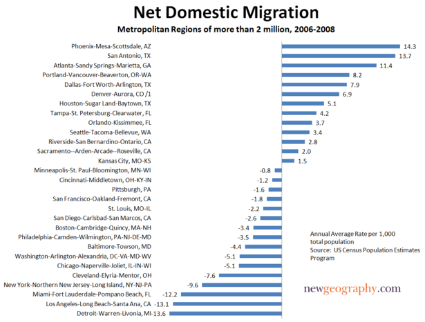
    This narrative, which has not changed much over the past decade, is misleading and largely misstated. Net migration, both before and after the Great Recession, according to analysis by the Praxis Strategy Group, has continued to be strongest to the predominately red states of the South and Intermountain West.

    This seems true even for those seeking high-end jobs. Between 2006 and 2008, the metropolitan areas that enjoyed the fastest percentage shift toward educated and professional workers and industries included nominally “unhip” places like Indianapolis, Charlotte, N.C., Memphis, Tenn., Salt Lake City, Jacksonville, Fla., Tampa, Fla., and Kansas City, Mo.

    The overall migration numbers are even more revealing. As was the case for much of the past decade, the biggest gainers continue to include cities such as San Antonio, Dallas and Houston. Rather than being oases for migrants, some oft-cited magnets such as New York, Boston, Los Angeles and Chicago have all suffered considerable loss of population to other regions over the past year.

    Much the same pattern emerges when you look at longer-term state demographic patterns. A recent survey by the Empire Center for New York State Policy found that the biggest net losers in terms of per capita outmigration between 2000 and 2008 were, with the exception of Louisiana, all blue state bastions. New York residents lead in terms of rate of exodus, closely followed by the District of Columbia, Michigan, Pennsylvania, Massachusetts and California.

    An even greater shock to the sensibilities of the insular, Manhattan-centric media, the report found that most of the movement from the Empire State was not from the much-dissed suburbia, but from that hip and cool paragon, New York City. This can not be ascribed as a loss of the unwanted: According to the report, those leaving the city had 13% higher incomes than those coming in.

    How can this be, when everyone who’s smart and hip is headed to the Big Apple? This question was addressed in a report by the center-left, New York-based Center for an Urban Future. True, considerable numbers of young, educated people come to New York, but it turns out that many of them leave for the suburbs or other states as they reach their peak earning years.

    Indeed, it’s astonishing given the many clear improvements in New York that more residents left the five boroughs for other locales in 2006, the peak of the last boom, than in 1993, when the city was in demonstrably worse shape. In 2006, the city had a net loss of 153,828 residents through domestic out-migration, compared to a decline of 141,047 in 1993, with every borough except Brooklyn experiencing a higher number of out-migrants in 2006.

    Of course, blue state boosters can point out that the exodus has slowed with the recession, as opportunities have dried up elsewhere. True, the flood of migration has slowed across the nation. Yet it has only slowed, not dried up. When the economy revives, it’s likely to start flowing heavily again.

    More important, the key group leaving New York and other so-called “youth-magnets” comprises the middle class, particularly families, critical to any long-term urban revival. This year’s Census shows that the number of single households in New York has reached record levels; in Manhattan, more than half of all households are singles. And the Urban Future report’s analysis found that even well-heeled Manhattanites with children tend to leave once they reach the age of 5 or above.

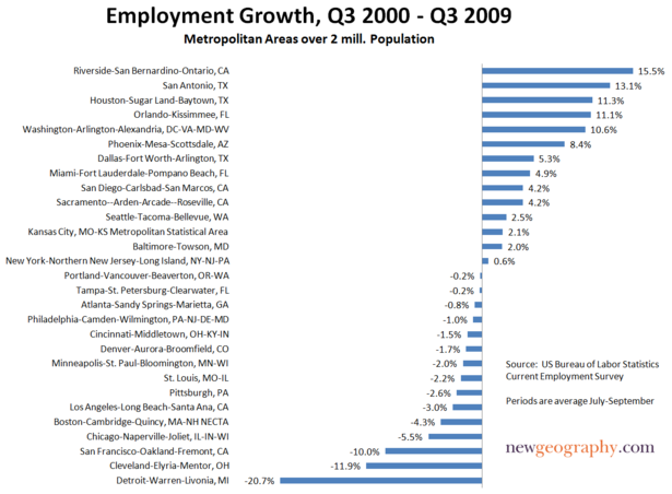
    The key factor here may well be economic opportunity. Virtually all the supposedly top-ranked cities cited in this media narrative have suffered below-average job growth throughout the decade. Some, like Portland and New York, have added almost no new jobs; others like San Francisco, Boston and Chicago have actually lost positions over the past decade.

    In contrast, even after the current doldrums, San Antonio, Orlando, Houston, Dallas and Phoenix all boast at least 5% more jobs now than a decade ago. Among the large-narrative magnet regions only one–government-bloated greater Washington–has enjoyed strong employment growth.

    The impact of job growth on the middle class has been profound. New York City, for example, has the smallest share of middle-income families in the nation, according to a recent Brookings Institution study; its proportion of middle-income neighborhoods was smaller than that of any metropolitan area except Los Angeles.The same pattern has also emerged in what has become widely touted as America’s “model city”–President Obama’s adopted hometown of Chicago.

    The likely reasons behind these troubling trends are things rarely discussed in “the narrative”–concerns like high costs, taxes and regulations making it tough on industries that employ the middle class. One clear culprit: out of control state spending. State spending in New York is second per capita in the nation (anomalous Alaska is first); California stands fourth and New Jersey seventh. Illinois is down the list but coming up fast. Over the past decade, while its population grew by only 7%, Illinois’ spending grew by an inflation-adjusted 39%.

    The problem here is more than just too-large government; it lies in how states spend their money. Massive public spending increases over the past decade in California, New Jersey, Illinois and New York have gone overwhelmingly into the pockets and pensions of public employees. It certainly has not flowed into such basic infrastructure as roads, bridges and ports that are needed to keep key industries competitive.

    The American Association of State Highway Transportation, for example, ranked New York 43rd in the country and New Jersey dead last in terms of quality of roads. Some 46% of the Garden State’s roads were rated in poor condition, compared with the national average of 13%, even as the state’s spending reached new highs. The typical New Jersey driver spends almost $600 a year in auto repairs necessitated by the poor conditions of the roads.

    In contrast, states in the South and parts of the Plains tend to pour their public resources into productive uses. Cities like Mobile, Ala., Houston, Charleston, S.C., and Savannah, Ga., have been investing in port facilities to take advantage of the planned widening of the Panama Canal. The primary goal is to take business away from the increasingly expensive, overregulated and under-invested ports of the Northeast and West Coast. Similarly, places like Kansas City and the Dakotas are looking to boost their basic rail and road networks to support export-heavy industries.

    Even in the face of the Obama administration’s strongly urban-centric, blue state-oriented economic policy, these generally less than hip places appear poised to grow as the economy recovers. Virtually all the top 10 economies that have withstood the recession come from outside the “youth-magnet” field: San Antonio; Oklahoma City; Little Rock, Ark.; Dallas, Baton Rouge, La.; Tulsa, Okla., Omaha, Neb.; Houston and El Paso, Texas. The one exception to this rule, Austin, also benefits from being located in solvent, generally low-tax Texas.

    This continued erosion of jobs and the middle class from the blue states and cities is not inevitable. Many of these places enjoy enormous assets in terms of universities, strategic location, concentrations of talented workers and entrenched high-wage industries. But short of a massive and continuing bailout from Washington, the only way to reverse their decline will be a thorough reformation of their governmental structure and policies. No narrative, no matter how well spun, can make up for that reality.

    This article originally appeared at Forbes.com.

    Joel Kotkin is executive editor of NewGeography.com and is a distinguished presidential fellow in urban futures at Chapman University. He is author of The City: A Global History. His next book, The Next Hundred Million: America in 2050, will be published by Penguin Press early next year.

  • New York Migration Study, the State Continues to Lose Residents

    The Empire Center for New State Policy has released “Empire State Exodus,” which details New York’s continuing loss of people and their incomes to other states. The report was authored by E. J. McMahon, senior fellow with the Manhattan Institute and director of the Empire Center and me.

    Since the beginning of the decade, New York has experienced a net domestic migration loss of more than 1,500,000, the largest loss in the nation. The extent of this loss is illustrated by the fact that Katrina/Rita/defective dike ravaged Louisiana lost a smaller share of its population than New York, which also led in relative terms.

    The report uses the latest Census Bureau and Internal Revenue Service (IRS) data to examine how many New Yorkers have left the state, where they have gone and how much income they have taken with them. It includes detailed breakdowns of population migration patterns at a regional and county level.

    More than 85% of the domestic migration loss was from the New York City region (combined statistical area) of New York State and more than 70% of the loss was from New York City itself. The data shows a continuing exodus from the city, to the suburbs and to elsewhere in the nation.

    The annual net loss of New Yorkers to other states has ranged from a high of nearly 250,000 people in 2005 to a low of 126,000 last year, when moves nationwide slowed down sharply along with the economy.

    Households moving out of New York State had average incomes 13 percent higher than those moving into New York during the most recent year for which such data are available. In 2006-07 alone, the migration flow out of New York drained $4.3 billion in taxpayer income from the state. New York taxpayers moving to other states had average incomes of $57,144, while those
    moving into New York averaged $50,533 as of 2007, according to the report.

    “Even with its large domestic migration losses, New York’s total population has grown slightly since 2000, thanks to a large influx of immigrants from foreign countries,” the report says. “But New York’s share of U.S. population is still shrinking. A continuation of the domestic migration trends highlighted here will translate into slower economic growth and diminishing political influence in the future.”

    The report is available at EmpireCenter.org.

  • The White City

    Among the media, academia and within planning circles, there’s a generally standing answer to the question of what cities are the best, the most progressive and best role models for small and mid-sized cities. The standard list includes Portland, Seattle, Austin, Minneapolis, and Denver. In particular, Portland is held up as a paradigm, with its urban growth boundary, extensive transit system, excellent cycling culture, and a pro-density policy. These cities are frequently contrasted with those of the Rust Belt and South, which are found wanting, often even by locals, as “cool” urban places.

    But look closely at these exemplars and a curious fact emerges. If you take away the dominant Tier One cities like New York, Chicago and Los Angeles you will find that the “progressive” cities aren’t red or blue, but another color entirely: white.

    In fact, not one of these “progressive” cities even reaches the national average for African American percentage population in its core county. Perhaps not progressiveness but whiteness is the defining characteristic of the group.

    The progressive paragon of Portland is the whitest on the list, with an African American population less than half the national average. It is America’s ultimate White City. The contrast with other, supposedly less advanced cities is stark.

    It is not just a regional thing, either. Even look just within the state of Texas, where Austin is held up as a bastion of right thinking urbanism next to sprawlvilles like Dallas-Ft. Worth and Houston.

    Again, we see that Austin is far whiter than either Dallas-Ft. Worth or Houston.

    This raises troubling questions about these cities. Why is it that progressivism in smaller metros is so often associated with low numbers of African Americans? Can you have a progressive city properly so-called with only a disproportionate handful of African Americans in it? In addition, why has no one called these cities on it?

    As the college educated flock to these progressive El Dorados, many factors are cited as reasons: transit systems, density, bike lanes, walkable communities, robust art and cultural scenes. But another way to look at it is simply as White Flight writ large. Why move to the suburbs of your stodgy Midwest city to escape African Americans and get criticized for it when you can move to Portland and actually be praised as progressive, urban and hip? Many of the policies of Portland are not that dissimilar from those of upscale suburbs in their effects. Urban growth boundaries and other mechanisms raise land prices and render housing less affordable exactly the same as large lot zoning and building codes that mandate brick and other expensive materials do. They both contribute to reducing housing affordability for historically disadvantaged communities. Just like the most exclusive suburbs.

    This lack of racial diversity helps explain why urban boosters focus increasingly on international immigration as a diversity measure. Minneapolis, Portland and Austin do have more foreign born than African Americans, and do better than Rust Belt cities on that metric, but that’s a low hurdle to jump. They lack the diversity of a Miami, Houston, Los Angeles or a host of other unheralded towns from the Texas border to Las Vegas and Orlando. They even have far fewer foreign born residents than many suburban counties of America’s major cities.

    The relative lack of diversity in places like Portland raises some tough questions the perennially PC urban boosters might not want to answer. For example, how can a city define itself as diverse or progressive while lacking in African Americans, the traditional sine qua non of diversity, and often in immigrants as well?

    Imagine a large corporation with a workforce whose African American percentage far lagged its industry peers, sans any apparent concern, and without a credible action plan to remediate it. Would such a corporation be viewed as a progressive firm and employer? The answer is obvious. Yet the same situation in major cities yields a different answer. Curious.

    In fact, lack of ethnic diversity may have much to do with what allows these places to be “progressive”. It’s easy to have Scandinavian policies if you have Scandinavian demographics. Minneapolis-St. Paul, of course, is notable in its Scandinavian heritage; Seattle and Portland received much of their initial migrants from the northern tier of America, which has always been heavily Germanic and Scandinavian.

    In comparison to the great cities of the Rust Belt, the Northeast, California and Texas, these cities have relatively homogenous populations. Lack of diversity in culture makes it far easier to implement “progressive” policies that cater to populations with similar values; much the same can be seen in such celebrated urban model cultures in the Netherlands and Scandinavia. Their relative wealth also leads to a natural adoption of the default strategy of the upscale suburb: the nicest stuff for the people with the most money. It is much more difficult when you have more racially and economically diverse populations with different needs, interests, and desires to reconcile.

    In contrast, the starker part of racial history in America has been one of the defining elements of the history of the cities of the Northeast, Midwest, and South. Slavery and Jim Crow led to the Great Migration to the industrial North, which broke the old ethnic machine urban consensus there. Civil rights struggles, fair housing, affirmative action, school integration and busing, riots, red lining, block busting, public housing, the emergence of black political leaders – especially mayors – prompted white flight and the associated disinvestment, leading to the decline of urban schools and neighborhoods.

    There’s a long, depressing history here.

    In Texas, California, and south Florida a somewhat similar, if less stark, pattern has occurred with largely Latino immigration. This can be seen in the evolution of Miami, Los Angeles, and increasingly Houston, San Antonio and Dallas. Just like African-Americans, Latino immigrants also are disproportionately poor and often have different site priorities and sensibilities than upscale whites.

    This may explain why most of the smaller cities of the Midwest and South have not proven amenable to replicating the policies of Portland. Most Midwest advocates of, for example, rail transit, have tried to simply transplant the Portland solution to their city without thinking about the local context in terms of system goals and design, and how to sell it. Civic leaders in city after city duly make their pilgrimage to Denver or Portland to check out shiny new transit systems, but the resulting videos of smiling yuppies and happy hipsters are not likely to impress anyone over at the local NAACP or in the barrios.

    We are seeing this script played out in Cincinnati presently, where an odd coalition of African Americans and anti-tax Republicans has formed to try to stop a streetcar system. Streetcar advocates imported Portland’s solution and arguments to Cincinnati without thinking hard enough to make the case for how it would benefit the whole community.

    That’s not to let these other cities off the hook. Most of them have let their urban cores decay. Almost without exception, they have done nothing to engage with their African American populations. If people really believe what they say about diversity being a source of strength, why not act like it? I believe that cities that start taking their African American and other minority communities seriously, seeing them as a pillar of civic growth, will reap big dividends and distinguish themselves in the marketplace.

    This trail has been blazed not by the “progressive” paragons but by places like Atlanta, Dallas and Houston. Atlanta, long known as one of America’s premier African American cities, has boomed to become the capital of the New South. It should come as no surprise that good for African Americans has meant good for whites too. Similarly, Houston took in tens of thousands of mostly poor and overwhelmingly African American refugees from Hurricane Katrina. Houston, a booming metro and emerging world city, rolled out the welcome mat for them – and for Latinos, Asians and other newcomers. They see these people as possessing talent worth having.

    This history and resulting political dynamic could not be more different from what happened in Portland and its “progressive” brethren. These cities have never been black, and may never be predominately Latino. Perhaps they cannot be blamed for this but they certainly should not be self-congratulatory about it or feel superior about the urban policies a lack of diversity has enabled.

    Aaron M. Renn is an independent writer on urban affairs based in the Midwest. His writings appear at The Urbanophile.

  • Go to Middle America, Young Men & Women

    A few weeks ago, Eamon Moynihan reviewed economic research on cost of living by state in a newgeography.com article. The results may seem surprising, given that some of the states with the highest median incomes rated far lower once prices were taken into consideration. The dynamic extends to the nation’s 51 metropolitan areas with more than 1,000,000 population (See Table).

    There is a general perception that the most affluent metropolitan areas are on the east coast and the west coast. Indeed, 8 of the 10 metropolitan areas with the highest nominal per capita income in 2006 were on the two coasts. These included San Francisco, San Jose and Seattle on the west coast and Washington, Boston, New York, Hartford and Philadelphia on the east coast. Middle-America is represented by Denver and Minneapolis-St. Paul. However, as anyone who has lived on the coasts and Middle America knows, a dollar in New York or San Francisco does not buy nearly as much as a dollar in Dallas-Fort Worth or Cincinnati.

    Per Capita Income: Purchasing Power Parity
    US Metropolitan Areas over 1,000,000 Population
        2006 Per Capita Income  
    Rank Metroplitan Area Purchasing Power Adjusted Nominal Nominal Rank
    1 San Francisco $46,287 $57,747 1
    2 Washington $45,178 $51,868 3
    3 Denver $44,798 $44,691 8
    4 Minneapolis-St. Paul $44,326 $44,237 9
    5 Houston $42,815 $43,174 11
    6 Boston $42,571 $50,542 4
    7 Pittsburgh $41,716 $38,550 20
    8 St. Louis $41,613 $37,652 27
    9 Milwaukee $41,572 $39,536 19
    10 Baltimore $41,451 $43,026 12
    11 Seattle $41,448 $45,369 6
    12 Kansas City $41,329 $37,566 28
    13 Hartford $41,104 $44,835 7
    14 New Orleans $40,935 $40,211 16
    15 Philadelphia $40,725 $43,364 10
    16 Dallas-Fort Worth $40,643 $39,924 17
    17 Cleveland $39,997 $37,406 30
    18 Indianapolis $39,843 $37,735 26
    19 Chicago $39,752 $41,591 14
    20 Richmond $39,282 $38,233 22
    21 New York $39,201 $49,789 5
    22 Birmingham $39,057 $37,331 31
    23 Cincinnati $38,691 $36,650 36
    24 Nashville $38,680 $37,758 25
    25 Detroit $38,670 $38,119 24
    26 Charlotte $38,632 $38,164 23
    27 Miami $38,555 $40,737 15
    28 San Jose $38,505 $55,020 2
    29 Jacksonville $38,413 $37,519 29
    30 Louisville $38,262 $36,000 41
    31 Oklahoma City $38,156 $35,637 42
    32 Las Vegas $37,691 $38,281 21
    33 Salt Lake City $37,381 $35,145 45
    34 San Diego $37,358 $42,801 13
    35 Rochester $37,066 $36,179 38
    36 Columbus $37,058 $36,110 39
    37 Atlanta $36,691 $36,060 40
    38 Memphis $36,501 $35,470 44
    39 Tampa-St. Petersburg $36,260 $35,541 43
    40 Portland $36,131 $36,845 35
    41 Buffalo $36,091 $33,803 48
    42 Norfolk (Virginia Beach metropolitan area) $35,418 $34,858 46
    43 Raleigh $35,087 $37,221 32
    44 San Antonio $34,913 $32,810 50
    45 Providence $34,690 $37,040 34
    46 Austin $33,832 $36,328 37
    47 Phoenix $33,809 $34,215 47
    48 Sacramento $32,750 $37,078 33
    49 Los Angeles $32,544 $39,880 18
    50 Orlando $32,095 $33,092 49
    51 Riverside-San Bernardino $25,840 $27,936 51
    Source:        
    http://www.bea.gov/scb/pdf/2008/11%20November/1108_spotlight_parities.pdf

    Purchasing Power Parity: Things change rather dramatically when purchasing power is factored in. Some years ago, international economic organizations, such as the Organization for Economic Cooperation and Development, the World Bank and the International Monetary Fund began using costs of living by nation to compare national economic performance, rather than currency exchange rate. This practice, called “purchasing power parity” is based upon the recognition that there may be substantial differences in the cost of living between nations.

    This can be illustrated by comparing Switzerland and the United States. For years, Switzerland has had a higher per capita GDP than the United States on an exchange rate basis. Switzerland’s gross domestic product per capita was $53,300 in 2006, nearly 30% above that of the United States ($42,000). However price levels in Switzerland are so high that incomes do not go nearly as far as the exchange rate would suggest. Once adjusted for purchasing power parity, the Swiss GDP per capita in 2006 drops to $39,000, well below that of the United States. Much of the difference has to do with regulation. The more liberal economy of the United States produces a lower cost economy than in Switzerland, or for that matter most of Western Europe. The US economic advantage would be even greater measured on a household basis, since US households include nearly 10% more members (generally children) than those in Western Europe.

    The same concept was applied by the Department of Commerce Bureau of Economic Analysis researchers in their review of purchasing power parities between US metropolitan areas in 2006. When purchasing power is factored in, five of the top metropolitan areas in nominal per capita income (not adjusted for purchasing power) drop out and are replaced by other metropolitan areas rarely thought of as among the nation’s most affluent.

    Among the three west coast nominal leaders, San Francisco remains as #1, in both nominal and purchasing power adjusted per capita income. Seattle dropped from 6th to 11th position. However, the real surprise is San Jose, which dropped from 2nd position to 28th.

    The east coast regions ranked among the top 10 metropolitan areas in nominal income also were decimated by their high costs, with only Washington (which rose from 3rd to 2nd) and Boston (which fell from 4th to 6th) remaining. New York fell from 5th to 21st, Hartford from 7th to 13th and Philadelphia from 10th to 16th.

    The two non-coastal metropolitan areas in the nominal top 10 remain, with Denver rising from to 3rd and Minneapolis-St. Paul rising from 9th to 4th.

    It can be argued that Middle-America replaced the five metropolitan areas dropping out of the top ten. Houston, long one of the most disparaged metropolitan areas among urbanists, occupies the 5th position (compared to its 11th ranking in the nominal list). Three of the new entrants are confirmed members of the Rust Belt: Pittsburgh (7th), St. Louis (8th) and Milwaukee (9th). Finally, there is a new east coast entrant, blue-collar Baltimore (10th).

    The Impact of Taxes: But that is just the beginning. Taxes also diminish the purchasing power of households. Unfortunately, there is virtually no readily available information on state and local taxation by metropolitan area. There is, however state and local government taxation data at the state level. If it is assumed that this data is representative of metropolitan differences (weighted proportionately by state in multi-state metropolitan areas), there would be changes in rank among the top 10. Denver would displace Washington in the number two position, closing more than one-half the gap with San Francisco. Even more surprisingly, St. Louis would move ahead of both Boston and Pittsburgh to rank 6th. Kansas City would leap over #11 Seattle, Baltimore, Milwaukee and Pittsburgh to rank 8th, trailing #7 Boston by $25, not much more than the price of a Red Sox standing room ticket. Pittsburgh would occupy the #9 position and Milwaukee #10 (See Figure).

    More than Housing: The largest differences in purchasing power stem from housing, with east coast and west coast metropolitan areas having generally higher housing costs. As a result of the housing bust and the larger house price drops in those areas, purchasing power adjusted incomes could recover relative to those of Middle America. However, the high cost of living on the east and west coasts extend to more than housing prices. Generally, according to proprietary (and for sale) ACCRA cost of living data, the west coast and east coast metropolitan areas have higher costs of living even without housing. These differences are largely in grocery costs, which probably reflects the anti-big box store planning regulations and politics that exist in many of these areas. Grocery costs in the more affluent middle-American metropolitan areas tend to be lower.

    Other Surprises: Outside the top 10 most affluent metropolitan areas, there are other surprises. Urban planning favorite Portland ranks 40th, just above Buffalo. Rust Belt Cleveland ranks 17th, a few positions above New York. Kansas City, with its highly decentralized civic architecture, ranks 12th, just behind Seattle. Indianapolis (17th) is more affluent than Chicago (18th) and both are more affluent than New York.

    Five of the bottom 10 metropolitan areas are in the south, including Virginia Beach, Raleigh, Austin, San Antonio and Orlando. But perhaps the biggest surprise of all is that four of the five lowest ranking metropolitan areas are in the southwest: Phoenix (47th), Sacramento (48th), Los Angeles (49th) and Riverside-San Bernardino (51st).

    The Dominance of Middle America: But among the 10 most affluent metropolitan areas in the nation, six or seven may be counted as Middle-America (depending on how Baltimore is classified). Only three are from the original group that supplies 8 of the top metropolitan areas when purchasing power is not considered.


    Related articles:
    Gross Domestic Product per Capita, PPP: World Metropolitan Regions
    Gross Domestic Product per Capita, PPP: China Metropolitan Regions

    Photograph: Pittsburgh

    Wendell Cox is a Visiting Professor, Conservatoire National des Arts et Metiers, Paris. He was born in Los Angeles and was appointed to three terms on the Los Angeles County Transportation Commission by Mayor Tom Bradley. He is the author of “War on the Dream: How Anti-Sprawl Policy Threatens the Quality of Life.