Tag: New York

  • Is Michael Bloomberg Finally Ready for His Close-Up?

    After being elected New York City’s mayor in 2002, Michael Bloomberg quickly expanded on the city’s progress during the 1990s. He combined predecessor Rudolph Giuliani’s reforms in welfare and policing with his own. He rezoned land for needed housing, reduced public school inefficiencies, and advanced major transportation projects like the 7-train extension and rapid buses. Along with these, he pioneered changes in the urban fabric—from the High Line Park to an automobile-free Times Square—that may have seemed insubstantial to outsiders, but were appreciated by New Yorkers.

    These and other measures supported Bloomberg’s reputation as a pragmatic-businessman-turned-public-servant who could generate economic dynamism in a city often hostile to it. Journalists described Bloomberg as, for example a “centrist” and data-driven “technocrat” who was “beholden to no one.” The mayor quickly gained national credibility, and was even mentioned as a possible independent presidential candidate.

    Now, as Bloomberg nears the end of his third term, the thought of him having this platform seems far less attractive. Just as the term itself violated local term limit legislation (that was overturned before his election), the policies he’s enacted show that his ideal model of government is not just one that spurs growth and delivers services, but that excessively polices private behavior, setting a dangerous precedent for urban America.

    The best-publicized of these was Bloomberg’s recently-defeated measure to ban large sodas. But this only echoed other products the board of health has targeted, including trans-fat in cooking oils, Styrofoam containers, and salt. He extended New York’s decade-long ban on cigarette smoking in bars to some other public spaces.

    These measures may seem like benevolent ways to protect New York’s citizens from themselves. But they underlie a broader willingness to intrude in other ways. For example, following the Kelo v. New London Supreme Court case, Bloomberg enthusiastically supported eminent domain for land transfers in both Brooklyn’s Atlantic Yards and by Columbia University in Harlem.

    Bloomberg has also expanded New York’s unpopular stop-and-frisk policy, which allows police to search people not after arrest, but based on “reasonable suspicion.” The policy was begun in the 1970s as a way for police to intervene in overtly threatening situations. But under Bloomberg it has been used reflexively five million times. It overwhelmingly targets minorities, and has proven to be poor at accomplishing its stated goal of collecting illegal guns. According to an analysis by Columbia University law professor Jeffrey Fagan, the first 4.4 million stop-and-frisks under Bloomberg yielded under 6,000 guns, (just over 0.01% of stops).

    Some of the same behaviors discouraged by Bloomberg are violated in his personal life. His insistence that New York rigorously combat global warming is ironic, given that he frequently flies private jets to homes in Bermuda, London, and Colorado. He blasted attempts by businesses and unions to roll back campaign finance reform, even after forming his own super-PAC for favored Congressional candidates, and using hundreds of millions of his personal fortune on his own mayoral campaigns. This same chutzpah is evident in his endless bloviating on national issues. While sometimes refreshing, it seems inane coming from a jet-setting mayor who, in lusting for national attention, ignores his own city. Although unemployment has decreased recently, it still remains over 8%, above the national average. The city continues to suffer from high taxes and slow job growth. Income inequality in Bloomberg’s New York has also risen at well above the national rate.

    Bloomberg doesn’t necessarily have control over all of this. But he can at least control what appears as his administration’s priorities. Over the course of his mayoralty, they seem to have shifted from addressing practical aspects of city management to pet peeves about citizen behavior. This has brought New York City negative publicity, and grown offensive to many of those who value personal freedom, with all its flaws, over the tedious and destructive encroachment of “technocrats.”

    Flickr photo from Be the Change, Inc. by Gillooly/PEI.

    Scott Beyer is traveling the nation to write a book about revitalizing U.S. cities. His blog, Big City Sparkplug, features the latest in urban news. Originally from Charlottesville, VA, he is now living in different cities month-to-month to write new chapters.

  • Observations on Urbanization: 1920-2010

    Ninety years have made a world of difference in the United States. Between 1920 and 2010, the nation’s population nearly tripled. But that was not the most important development. Two other trends played a huge role in shaping the United States we know today. The first trend was increasing urbanization, a virtually universal trend, but one which occurred earlier in the high income countries, while the other was a rapidly falling average household size. 

    National Trends

    In 1920, the United States had just crossed the same 50 percent urbanization threshold that China recently crossed. By 2000, the United States was 81 percent urban. 

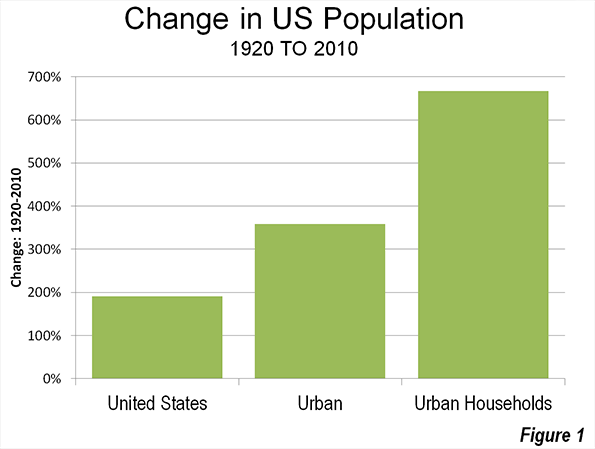
    The second trend was even more significant. Average household size has fallen from 4.6 in 1920 to 2.6 by 2000, where it remained in the 2010 census. The result is that there are now 7.7 times as many households (Note 1) in urban areas as there were in 1920 (Figure 1).

    Urban Area Trends

    In the 1960s, the Urban Land Institute sponsored research by Jerome P. Pickard (Note 2) to replicate urban area population and density data going back to 1920, using the generalized criteria that had been developed by the Census Bureau for the 1950 and 1960 censuses.

    According to Pickard’s work, there were five urban areas in the United States with more than 1 million population in 1920. Unfortunately, the publication did not include Detroit, which undoubtedly had an urban area population of more than 1 million in 1920 (Note 3). In addition, Pickard found nine urban areas with populations between 500,000 and 1 million.

    By contrast, today there are 42 urban areas with more than 1 million population and 38 with between 500,000 and 1 million population.

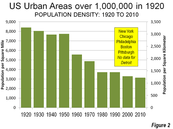
    In 1920, the five major urban areas for which there is data had an overall population density of 8,400 per square mile (3,700 per square kilometer). This figure dropped continually, except for between 1940 and 1950 as to its present level (Figure 2) of approximately 3,100 per square mile (1,200 per square kilometer).

    However, caution is required, because before 2000, urban areas generally contained only complete municipalities. Two of the nation’s major urban areas had substantial rural (greenfield) expenses inside their core cities in 1920. This was most pronounced in the core city of New York, where most of Queens and most of Staten Island were undeveloped. Between 1920 and 2010, these two boroughs added more than 1.8 million population, most of which was on greenfield land, rather than the densification of the existing urban neighborhoods. This was in effect, suburban expansion within the city of New York. The same dynamics occurred, to a lesser degree in core cities such as Philadelphia and Los Angeles.

    Pickard finds a population density of 10,600 per square mile (4,100 per square kilometer) for the New York urban area in 1920. It had fallen by half to 5,300 per square mile (2,050 per square kilometer) by 2010.

    Core City and Suburban Growth

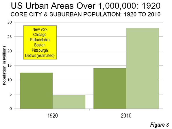
    Over the period, the bulk of the population growth (92 percent) was in the suburbs (Figure 3). Even that figure, however, understates the extent of suburban growth. As was above, the inclusion of rural areas as urban in municipalities appears to have been a major driver of the population increase in the city of New York, which added 2.4 million people between 1920 and 2010. Among the other five major urban areas, which includes an estimate for Detroit (Note 2), the core municipalities lost population in each case over the 90 years, though they all continued to grow at least until 1950.

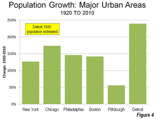
    All of the six major urban areas in 1920 were in the Northeast or the Midwest. The fastest growing urban area from 1920 to 2010 among the six was Detroit, despite the huge losses of its core municipality (Figure 4). No municipality in the world of Detroit’s 1950 size (1.85 million) has lost so much of its population (1.1 million) in all of history. Yet, the Detroit urban area is estimated to have added approximately 2.6 million people to its urban area population since 1920, for an approximately 240 percent increase in population. The Detroit urban area peaked in 2000 at 160,000 higher than in 2010. The second fastest growing larger urban area was Chicago, at approximately 175 percent, while Philadelphia gained 146 percent and Boston 142 percent.

    Urban Areas with 500,000 to 1,000,000 Population in 1920

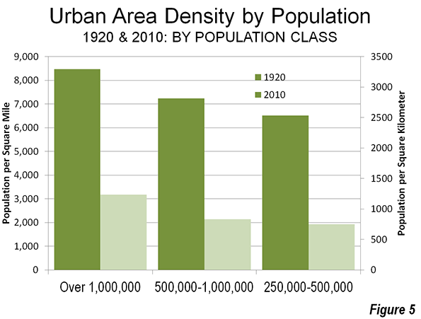
    The nine urban areas with 500,000 to 1,000,000 population in 1920 had a much lower population density, at 7,200 per square mile (2,800 per square kilometer). This figure, however, is artificially low because of the Los Angeles urban area’s extremely small 1920 density (1,700 per square mile or 650 per square kilometer). Just a few years before the 1920 census, Los Angeles had annexed the San Fernando Valley and other largely rural areas. As a result the city quadrupled in land area. Again, the inclusion of rural areas in the core city rendered Pickard’s urban area (and that of the Census Bureau to at least in 1950) unreflective of actual urban densities in Los Angeles.

    Milwaukee: More Dense than New York

    The Milwaukee urban area, with a population of 504,000 had the highest density in the nation, at 10,900 per square mile (4,200 per square kilometer), which was the last time before 1990 that the New York urban area was not the most dense major urban area. In 1990, the Los Angeles area became more dense than  the New York urban area. By 2000, both the San Francisco and the all-suburban San Jose urban area had also passed New York,

    Falling Densities and Causes

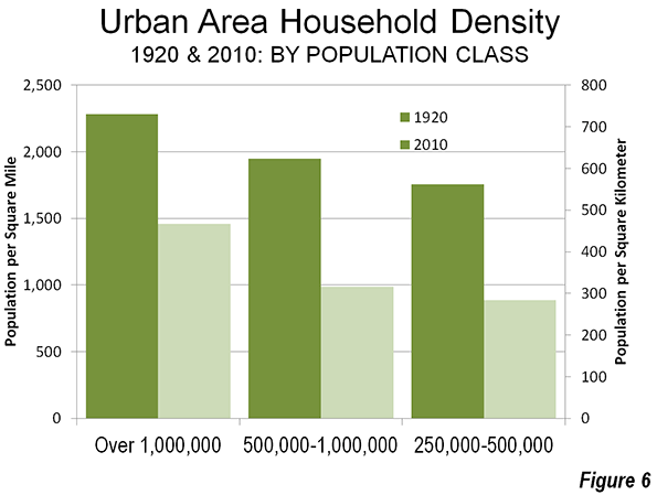
    The population density declines were substantial over the period, at from 63 percent to 70 percent. At the same time, falling household sizes created the requirement for more houses and household densities fell at a slower rate, 37 percent in the largest areas and 50 percent in the smaller metropolitan areas. There were other factors as well, such as more efficient manufacturing and commercial operations, that took more space, urban planning requirements in some metropolitan areas (such as Boston and Atlanta) that required larger than market  building lots (large lot zoning)and the general preference for more land and space on the part of consumers. The US has not been alone in this. The trend toward lower densities has been virtually universal, from Mumbai and Manila to Moscow and Milan.


    Wendell Cox is a Visiting Professor, Conservatoire National des Arts et Metiers, Paris and the author of “War on the Dream: How Anti-Sprawl Policy Threatens the Quality of Life.

    —-

    Note 1: Assumes the same average household size for urban and rural areas.

    Note 2: Jerome P. Pickard, Dimensions of Metropolitanism, Urban Land Institute, 1967.

    Note 3: In 1920, the municipality of Detroit had a population of 993,000 and a population density of 12,700 per square mile (4,900 per square kilometer). Wayne County, which includes Detroit, had a population of 1,170,000. The land area of the county was approximately nine times that of the municipality, nearly all of it rural. On that basis it is estimated that the urban area would have had no more than 1,100,000 residents.

    Photo: New York in the 1920s (Singer Building in foreground, Woolworth Building in the background). Photograph by the U.S. Census Bureau, Public Information Office (PIO).

  • New York Catholic Schools: Will Decline Spark Innovation?

    In a heart-breaking scene in the 2010 documentary Waiting for Superman, a young mother is crying in her Harlem apartment, which overlooks her daughter’s school. Bianca, her daughter, has been barred from attending graduation. The villain isn’t a union boss or a bureaucrat in Albany – instead, it’s the Archdiocese of New York and its affable leader, Cardinal Dolan. Bianca hadn’t misbehaved or been excessively tardy. But her mother owed the school a few hundred dollars in tuition and fees.

    The Archdiocese’s schools cannot afford to be lenient with such hard-luck cases, because they are drowning in red ink, too. The solution has been to shutter uneconomical schools, even those where parents raised vast sums to keep them open. If the un-named Catholic school Bianca attended hasn’t been closed already, it probably will be soon. In late January, the Archdiocese released a list of 26 schools slated for closure in June, on top of the 50 it closed in the two years previous.

    Across the US, 167 Catholic schools closed in 2012, according the National Catholic Education Association, with 27 in the New York Archdiocese alone. If nothing radical is done, by this time next year parents at another two dozen Catholic schools in New York will be scrambling to find a new school for their kids.

    The decline of New York’s Catholic schools has been dramatic. In 1961, the Archdiocese boasted over 414 elementary and high schools, and an enrollment of over 213,000 pupils. After the latest round of closings, the Archdiocese will have fewer than 250 schools and an enrollment of 70,000 students.

    For decades, Catholic schools promised poor and urban communities rigorous academic and values-based education at a low cost. Catholic school alumni graduated high school, attended college, stayed out of jail and joined the middle class at staggering rates. Hardworking parents like Bianca’s mom recognized the value proposition of a high-quality education at a low cost.

    But for many of New York’s neediest families that promise is going unfulfilled. Most parents sacrifice immensely to pay tuition, but it’s becoming prohibitively expensive. Catholic school costs are rising, as personnel costs balloon and dilapidated, century-old buildings need repairs. In the event of layoffs, teachers unions (yes, Catholic schools are closed shops in New York) insist the most senior (read: expensive) teachers be the first re-hired when an opening occurs.

    Across the US, the Catholic school average annual per-pupil cost jumped from $5,600 in 1998 to $10,800 in 2010, and tuition costs for 9th graders doubled from $4,300 to $8,800 in the same period. Philanthropists have tried to make up the shortfall, but the waves of red ink keep swallowing up school budgets. Furthermore, Catholic schools are rarely transparent as to why tuition is rising twice as fast as inflation (because per-pupil costs are rising even faster).

    Adding to Catholic school woes, new research by Albany Law School’s Abe Lackman suggests that competition with charter schools is partly responsible for the Catholic school enrollment decline. Although the future of charters in a post-Mayor Bloomberg New York remains unclear, the promise of charter schools – a high-quality education for no cost – has created an education marketplace where Catholic schools must compete to survive. Says John Eriksen, the former superintendent of Paterson, New Jersey’s diocese schools, “Charter schools are competition, and Catholic schools that don’t recognize that will be on the menu instead of having a seat at the table.”

    Catholic schools should recognize that the rise of charters is an opportunity, not a threat. Charters borrowed Catholic schools’ best practices (discipline, academic rigor, and uniforms), and now Catholic schools should return the favor and adopt the entrepreneurial and innovation-focused ethos of charter schools (you can see my report for the Lexington Institute, urging this approach, here.)

    One such path is “blended learning” – an academic model that promises not only excellence but financial sustainability. At blended learning charter schools from Newark’s Merit Prep to San Jose’s Rocketship schools, instructors work in concert with online tools to deliver the right lesson to the right student at the right time. Students progress through lessons at their own pace toward subject mastery, while teachers use real-time data generated from students’ online work to guide individual and small-group instruction to children’s specific levels of mastery. The results have been impressive: Rocketship’s five schools are among California’s highest performing elementary schools.

    On the brink of closure, a Catholic K-8 school in San Francisco, Mission Dolores Academy, adopted this innovative method. After one year, student scores jumped 16% in math and 6% in reading. By increasing class sizes and enrollment, per-pupil costs have fallen by an astounding 20% over the last two years.

    Mission Dolores and its sister school in Seattle, St. Therese, were only able to innovate because their respective parishes granted the schools independence. Philadelphia’s Archbishop Charles Chaput recognized the need for independence to enact reform and ceded control of its 17 high schools to the Faith in the Future Foundation, led by longtime education reformer Casey Carter. Another 16 inner-city elementary schools joined the Independent Mission Schools consortium. Both organizations have committed to transparency, efficiency and major investments in academic excellence like blended learning.

    Cardinal Dolan should follow Chaput’s lead. Excellent and efficient Catholic schools are sustainable and necessary.

    Flickr photo by Joe Shlabotnik, Our Lady Queen of Martyrs School, Forest Hills, New York.

    Sean Kennedy is a fellow at the Lexington Institute in Arlington, Va., and author of the recent study, Building 21st Century Catholic Learning Communities: Enhancing the Catholic Mission with Data, Blended Learning, and Other Best Practices From Top Charter Schools. Kennedy is a graduate of Catholic elementary and secondary schools.

  • New York City’s Revival: The Post-Sandy Apple

    Although its manufacturing jobs are gone forever, New York continues to ride the crests of its paper-profits prosperity. Housing in once-notorious slums now costs more than $1.5 million. The waterfront is getting a green-space makeover. The city’s future depends on Wall Street’s ability to attract capital, be it from clients or bailouts. And the jury is still out how the rise and rise of New York reflects on the legacies of former mayors Rudy Giuliani, Ed Koch, and (soon to be former) Michael Bloomberg.

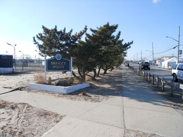
    While in New York for the last month, I took stock of the city (post Great Recession and post Hurricane Sandy) on a number of bicycle rides, in the company of city-pigeon friends, from Breezy Point in Queens to the northern reaches of the Bronx.

    Biking around New York is a lot easier now than it was when I last lived in the city, from 1976 to 1991. Bike lanes were nonexistent in those days, the curbs were littered with broken glass, and many potholes were the size of Lake Erie.

    Thanks to Mayor Michael Bloomberg (a riding friend said, “He’s not pro-bike; he’s anti-car”), the city now has a growing network of dedicated, at least with paint, bike lanes. One runs up First Avenue, another goes from Williamsburg to downtown Brooklyn, and a great one travels the length of the West Side.

    One of the longer rides took us from midtown Manhattan out to Breezy Point, to see what remains of the beach community that Sandy flooded and burned. From the Queensboro Bridge, we took in Greenpoint and Williamsburg, two of Brooklyn’s hottest neighborhoods (“hot” means rents have tripled and Sunday brunch costs $29), and then meandered through Bedford Stuyvesant, another stop on the gentrification express.

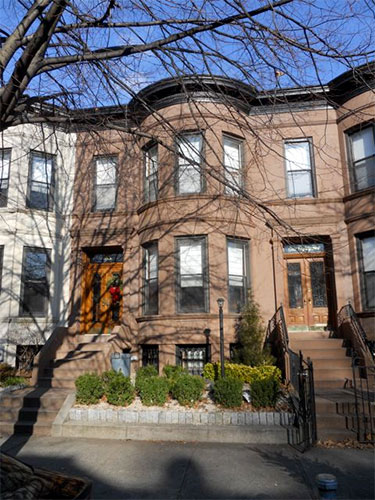
    In the 1980s, Bed Stuy meant vacant lots and high crime rates. Now it’s a neighborhood of elegant—million dollar plus—brownstones and a growing number of boutiques. At Atlantic and Flatbush avenues, the new Barclay Center, home to the Brooklyn Nets, looms over the tracks of the Long Island Rail Road.

    I don’t believe in stadiums as anchor tenants in transitional neighborhoods: most of the time they are empty, and when in use they provide jobs only for ushers. Nor do I care much for the center’s rusted-iron exterior; Brooklyn has enough corroded steel. But if it helps to brand Brooklyn as a modern and dynamic city or bring a wine bar to our old Flatbush neighborhood, I will not complain.

    At the southern end of the borough, Breezy Point is the tip of an Atlantic barrier peninsula. As we rode toward Sandy’s ground zero, we passed emergency services checkpoints and many police out on patrol, although the approach is along a desolate road and the community has the feeling of Appalachia-by-the-sea.

    Breezy Point isn’t a summer beach colony so much as a year-round enclave of firefighters and police who like the location as a world apart. Even riding bikes along the main streets, we felt like trespassers. When we couldn’t find the blocks of houses that burned during the storm, I asked directions from one of the police officers. His answer was: “Are you kidding me? Get the fuck out of here.”

    The bizarre rumor that I heard in the Rockaways is that some residents torched their own houses, as fire insurance covers more damage than that underwritten for hurricanes and floods. Such speculation is impossible to verify, although the media obsession with the beached whales from Sandy—and thus the need for disaster-relief millions—was at odds with what we saw: a beach community suffering after a bad storm but still mostly intact.

    At the other end of the Rockaways, the more substantial houses came through the storm fine, although many had flooded to their first floors, alas, a hazard that comes from living near the beach and, again, not a national tragedy.

    Uptown Manhattan neighborhoods never lost power during Sandy, although the Lower East Side, a mix of high-rise apartments and funky restaurants, had some buildings in the dark well into December.

    Nor did the storm or, for that matter, the Great Recession, sidetrack Harlem’s latest renaissance, which can be seen on many of the area’s roughly 200 blocks. When I was a student at Columbia University in the 1970s, Harlem was overrun with arsonists and drug dealers. Morningside Park, which borders the university, was nicknamed Needle Park. The neighborhood’s proud history as a spawning ground for Jews, Italians, Latinos, and African-Americans was shrouded in the dark waters of abandoned buildings, graffiti, and nighttime sirens.

    This time, I rode my bike, as if on a lawn mower, up and down the blocks between 110th and 145th streets and was charmed to find so many renovated apartments and brownstones, not to mention restaurants and trendy stores on the avenues. In his elegant history, Harlem, Jonathan Gill quotes Langston Hughes: “I would rather have a kitchenette in Harlem than a mansion in Westchester.” Ed Koch said the same.

    Sadly, the jazz and night clubs are largely gone, and the Apollo Theater is among the last of its cultural generation still in use. Many longtime Harlem residents are now being priced out of the neighborhood. Nevertheless, the streets around Mount Morris Park (Fifth Avenue and 120th Street) and Striver’s Row (West 137th and 138th streets) are more elegant than many on Manhattan’s East Side. The only thing now being traded in Morningside Park appears to be Pampers.

    Because I was in New York when Koch died, much of the handlebar conversation, especially as we rode around his Crotona Park birthplace in the Bronx, was about whether he or Rudy Giuliani deserved the most credit for New York’s return from the dead. Not part of the discussion was the mayoralty of David Dinkins, including the legendary three or four showers that he took each day in office.

    I argued for Koch, as he became mayor at the city’s ebb tide in the late 1970s, when Howard Cosell said, during the World Series, “Ladies and gentlemen, the Bronx is burning,” and President Jimmy Carter visited the smoldering rubble of Charlotte Street (now a suburban-like development). Gill wrote: “Huge swatches of the neighborhood began to resemble the bombed-out European cities of World War II.”

    The argument for Giuliani’s contribution is that he took on petty crime, which in turn got bigger criminals off the streets, although my revivalist heart is with Koch, who as mayor had accepted an invitation to lunch that my friends and I extended (in person he was more serious and very tall). More than Giuliani, he epitomized the city, as when he said: “If you agree with me on 9 out of 12 issues, vote for me. If you agree with me on 12 out of 12 issues, see a psychiatrist.”

    Koch understood that cities rise or fall on questions of confidence or, as he asked rhetorically, “How’m I doin’?” Giuliani, despite his 9/11 heroics, always struck me as having the soul of a TV detective, although with less empathy than Kojak. Bloomberg is praised as being a grown up—competent and capable at managing city affairs, even if he sounds like a shoe salesman.

    On one subfreezing, windy day I biked the length of the Bronx’s Grand Concourse, stopping to warm up in a hospital waiting room when no Starbucks appeared on the frigid horizon. I loved the Botanical Gardens, but loathed the pretentious new Yankee Stadium, whose $1.5 billion construction budget did little for the South Bronx (hand-lettered signs for game parking probably do not count).

    The risk of the New York renaissance is that the era of good-feeling is a variation on the bonds for the new stadium. It’s something that’s funded on Wall Street, which may explain why Harlem brownstones cost $2 million, but the only new jobs in the neighborhood are for part-time clerks at CVS or Dunkin’ Donuts.

    Photos by the author: A bike lane near Mount Morris Park in Harlem; Breezy Point; the author’s former home in Brooklyn.

    Matthew Stevenson, a contributing editor of Harper’s Magazine, is the author of Remembering the Twentieth Century Limited, a collection of historical travel essays. His next book is Whistle-Stopping America.

  • Texas Two Step

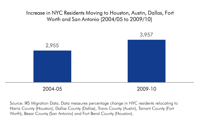
    There has been a huge spike in the number of New Yorkers relocating to Texas in recent years, even at a time when fewer city residents were departing for Charlotte, Atlanta, Philadelphia and other traditional destinations.


    Borough Breakdown: NYC Residents Moving to
    Houston, Austin, Dallas, Fort Worth and San Antonio (2004/05 to 2009/10)

    Migration from Bronx to…
      2004/2005 2009/2010 % Change
    Dallas County 77 92 19.5%
    Harris County 202 310 53.5%
    Tarrant County 28 58 107.1%
    Travis County 22 27 22.7%
    Bexar County 29 66 127.6%
    Fort Bend County 31 33 6.5%
    Total 389 586 50.6%


    Migration from Brooklyn to…
      2004/2005 2009/2010 % Change
    Dallas County 132 152 15.2%
    Harris County 271 351 29.5%
    Tarrant County 64 71 10.9%
    Travis County 83 224 169.9%
    Bexar County 76 64 -15.8%
    Fort Bend County 40 62 55.0%
    Total 666 924 38.7%


    Migration from Queens to…
      2004/2005 2009/2010 % Change
    Dallas County 146 166 13.7%
    Harris County 412 404 -1.9%
    Tarrant County 117 125 6.8%
    Travis County 56 89 58.9%
    Bexar County 80 99 23.8%
    Fort Bend County 67 90 34.3%
    Total 878 973 10.8%


    Migration from Manhattan to…
      2004/2005 2009/2010 % Change
    Dallas County 311 356 14.5%
    Harris County 346 508 46.8%
    Tarrant County 51 107 109.8%
    Travis County 167 303 81.4%
    Bexar County 96 91 -5.2%
    Fort Bend County 15 54 260.0%
    Total 986 1419 43.9%


    Migration from Staten Island to…
      2004/2005 2009/2010 % Change
    Dallas County N/A N/A N/A
    Harris County 36 55 52.8%
    Tarrant County N/A N/A N/A
    Travis County N/A N/A N/A
    Bexar County N/A N/A N/A
    Fort Bend County N/A N/A N/A
    Total 36 55 52.8%

    Source: IRS Migration Data. For Staten Island, data was only available for migrations to Harris County.

    This piece originally appeared a tthe Center for an Urban Future data blog.

  • Transit Legacy Cities

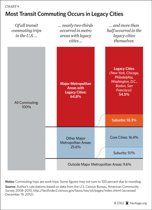
    Transit’s greatest potential to attract drivers from cars is the work trip. But an analysis of US transit work trip destinations indicates that this applies in large part to   just a few destinations around the nation. This is much more obvious in looking at destinations than the more typical method of analysis, which looks at the residential locations of commuters. This column is adapted from my new Heritage Foundation Backgrounder "Transit Policy in an Era of the Shrinking Federal Dollar."

    Transit Legacy Cities

    Transit commuting is heavily concentrated to destinations in just the six core cities (historical core municipalities) of New York, Chicago, Philadelphia, San Francisco, Boston and Washington (Backgrounder Chart 9). I call them the "transit legacy cities," because their high transit market shares relate to their development before the automobile became dominant. Because there is such a lack of clarity in the use of terms that apply to cities, it is important to emphasize that the transit legacy cities are municipalities, not the surrounding metropolitan areas or urban areas, where the majority of residents live (Note 1). 


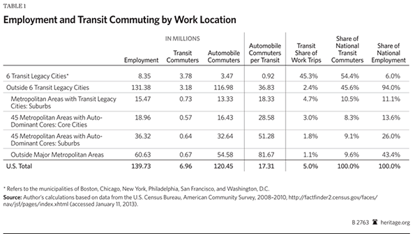
    The transit legacy cities account for nearly 55 percent of the nation’s transit commuters, by work trip destinations, according to the American Community Survey (2008-2010). By contrast, the transit legacy cities have an overall national employment market share barely one-tenth their national transit share (6 percent). Moreover, combined, the transit legacy cities cover a land area little larger than the core city (municipality) of Jacksonville, Florida.

    At the same time, the "other side of the coin" is that commuting to other destinations is dominated by the automobile, from the suburbs in metropolitan areas with transit legacy cities, and even more so in the other 45 major metropolitan areas (with more than 1,000,000 population) and the balance of the nation.

    Legacy Cities: Transit’s Strength

    The extent of the concentration in the six transit legacy cities is illustrated in Backgrounder Table 1. In some ways, transit is, first and foremost,  really a New York story. More than one-third of all transit work-trip commuting is to destinations in the core city of New York. The dominance is even greater for high-capacity subways/elevated services, a mode in which where New York represents two-thirds of national commuting.

    The Key: Large, Concentrated, Well Served Downtowns: The concentration of transit commuting in the six transit legacy cities reflects the factor that is probably more responsible than any other for attracting people from cars to transit. This is a highly concentrated downtown area (central business district, or "CBD") from which a dense network of rapid transit services radiates.

    The six transit legacy cities are also home to the six largest CBDs in the nation, where transit’s share of commuting is far higher than compared to the rest of the nation. Approximately three quarters of commuters to the sprawling Manhattan CBD in New York (south of 59th Street) commuted by transit in 2000. Less well known is that New York also contains the CBD with the second largest transit work trip destination, downtown Brooklyn (58 percent), which is followed by downtown Chicago (55 percent).

    In addition, between nearly 40 percent and more than 50 percent of commuters used transit to the CBDs of Boston, San Francisco, Philadelphia and Washington. While covering a land area less than one-half the size of Orlando’s Walt Disney World, these downtowns accounted for 35 percent of national transit commuting.

    Outside the Transit Legacy Cities: Automobile and Work at Home Country

    So what about the 94 percent of US commuters who work outside the transit legacy cities? The answer is that the automobile dominates, and transit has been overtaken by working at home. In the suburban areas of metropolitan areas with transit legacy cities, the car carries 18 times as many people to work locations as transit. In the core municipalities of the 45 major metropolitan areas without legacy cities, cars carry 29 times as many commuters as transit, and 51 times as many in the suburbs. Outside the nation’s major metropolitan areas, cars carry 82 times as many commuters as transit (Backgrounder Table 1)

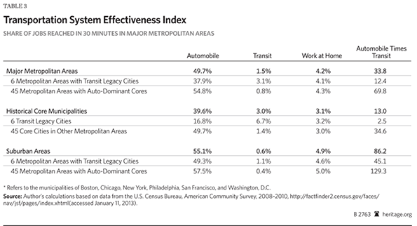
    Further, outside the transit legacy cities, working at home (including telecommuting) provides access to twenty percent more jobs than transit (Backgrounder Table 3).

    An American Love Affair with the Automobile?

    The enduring myth of the American love affair with automobile is countered by the huge transit market shares to city downtowns . For example, commuters to Manhattan are five times as likely to use transit as cars. On the other hand, commuters to the edge city of Parsippany, on the I-287 corridor in suburban New Jersey are 50 times as likely to use their cars as transit. Yet both employment centers serve the same labor market. The issue is not preferences, it is rather rational choice. It would be irrational for most people to commute to Manhattan by car, principally because of the traffic congestion and cost, particularly for parking. It would similarly be irrational for most people to commute to Parsippany by transit, because it either could not be done at all, or it would take too long.

    Transit’s work trip destination market share is an effective measure of its relevance to the market.

    And lest anyone should counter that the answer is more money, consider this.

    A Cost Not A Revenue Problem

    Portland (with a core city that is not a legacy city) has long been held out as a model for improving transit. Yet, after billions of dollars in federal and local tax subsidies, more than 50 times as many people travel to work to suburban locations by car as by transit. More than five times as many work at home as use transit, and working at home costs taxpayers virtually nothing. Yet, despite all these billions, Portland’s transit system is in crisis. Tri-Met’s  Executive Director Neil McFarlane has warned of 70 percent service cuts over 12 years without substantial changes to union contracts.

    Transit’s fundamental problem is not insufficient revenue but insufficient cost control. Since 1983, national transit expenditures have risen at an inflation-adjusted rate nine times that of its increase in commuters (Note 2). Even if costs were under control, it would be financially impossible to provide automobile-competitive transit throughout the modern urban area, as Professor Jean-Claude Ziv and I showed in our WCTRS paper (Megacities and Affluence: Transport and Land Use Considerations).

    Celebrating Transit

    Yet, beyond its inability to convert generous taxpayer subsidies into corresponding ridership increases, transit deserves credit for the large number of people it moves to jobs in the legacy cities. This success should be celebrated although it remains an impossible, prohibitively expensive, dream elsewhere.

    Wendell Cox is a Visiting Professor, Conservatoire National des Arts et Metiers, Paris and the author of “War on the Dream: How Anti-Sprawl Policy Threatens the Quality of Life.”

    —-

    Note 1: Each of the transit legacy cities has a lower population than the surrounding suburbs. This ranges from nearly 45 percent of the population in the suburbs of the New York metropolitan area to little more than 10 percent in Washington.

    Note 2: Within the first 30 days of my time on the Los Angeles County Transportation Commission, I became convinced that transit’s principal problem was cost control (see Toward More Prosperous Cities). This was then and today remains clear from the above-inflationary escalation of unit costs. Regrettably that trend continues today and has seriously impeded transit’s ability to increase ridership.

    —–

    Photo: Downtown Philadelphia (by author)

  • The New Places Where America’s Tech Future Is Taking Shape

    Technology is reshaping our economic geography, but there’s disagreement as to how. Much of the media and pundits like Richard Florida assert that the tech revolution is bound to be centralized in the dense, often “hip” places where  “smart” people cluster. Some, like Slate’s David Talbot, even fear the new tech wave may erode whatever soul is left to increasingly family free, neo-gilded age San Francisco.

    Such claims have been bolstered by the tech boom of the past few years — especially the explosion of social media firms in places like Manhattan and San Francisco. Yet longer-term trends in tech employment suggest such favored media memes will ultimately prove well off the mark. Indeed, according to an analysis by the Praxis Strategy Group, the fastest growth over the past decade in STEM (science, technology, engineering and mathematics-related) employment has taken place not in the most fashionable cities but smaller, less dense metropolitan areas.

    From 2001 to 2012, STEM employment actually was essentially flat in the San Francisco and Boston regions and  declined 12.6% in San Jose. The country’s three largest mega regions — Chicago, New York and Los Angeles — all lost tech jobs over the past decade. In contrast, double-digit rate expansions of tech employment have occurred in lower-density metro areas such as Austin, Texas; Raleigh, N.C.; Columbus, Ohio; Houston and Salt Lake City. Indeed, among the larger established tech regions, the only real winners have been Seattle, with its diversified and heavily suburbanized economy, and greater Washington, D.C., the parasitical beneficiary of an ever-expanding federal power, where the number of STEM jobs grew 21% from 2001 to 2012, better than any other of the 51 largest U.S. metropolitan statistical areas over that period.

    The question is whether the last two to three years, during which places like San Francisco, New York and Boston have enjoyed stronger STEM growth than their peripheries, represents a paradigm shift or is just a cyclical phenomenon. As with tech in general, the long-term trends are not so city-centric; over the past decade,  the core counties nationwide overall have lost about 1.1% of their tech jobs while more peripheral areas have experienced a gain of 3.5%.

    Today’s urban tech boom looks a lot like a rerun of the dot-com boom of the late 1990s. In that period media-savvy dot-com startups proliferated in such places as South of Market in San Francisco and the Silicon Alley in lower Manhattan. At their height, these firms and their founders were as likely to be covered in the fashion and lifestyle sections as on the business pages.

    Yet by the early 2000s, many of these dot-com darlings had merged, been acquired or simply gone out of business. Anchored largely on hype, they fell victim to flawed business models, and rapid industry consolidation.  In San Francisco, for example, tech employment crashed from a high of 34,000 in 2000 to barely 18,000 four years later. Silicon Alley suffered a similar downward trajectory, losing 15,000 of its 50,000 information jobs in the first five years of the decade.

    The peaking social media boom, marked by the weak performance of Facebook’s IPO last year, suggest another bust at the end of the “hype cycle.” Urban darlings such as  San Francisco’s Zynga and Chicago’s Groupon have floundered in spectacular fashion. More are likely to join them.

    These firms may have generated buzz, but they have done not so well at the mundane task of making money. One problem may be that  the most avid users of social media are largely young people from the “screwed” generation who lack much in the way of spending power — a clear turnoff to advertisers. Now , with venture capital flows declining overall,  cooler heads in the Valley are shifting bets to more business-oriented engineering and research-intensive fields more grounded in marketplace realities.

    And what about the future of the Valley — still home to virtually all the Bay Area’s top tech firms? Its glory days as a job generator and economic exemplar seem to have passed. Between 1970 and 1990 the number of people employed in tech in the Valley more than doubled to 268,000, and then burgeoned to over 540,000 in the 1990s. At the peak of the last tech boom in 2001, the unemployment rate in Santa Clara County was a tiny 3%; the Silicon Valley Manufacturing Group confidently predicted there would be another 200,000 jobs by 2010.

    However, at what may be the peak of the current boom, the number of tech jobs in the Valley remains down from a decade ago and unemployment is over 7.7%, just around the national average. In reality, social media was never going to reverse the downward trajectory in the rate of job growth. Old-line companies like  Hewlett-Packard or Intel, with over 50,000 employees in the U.S. alone, were capable of creating a broad range of opportunities for workers; in contrast, the social media big three of Facebook, LinkedIn and Twitter together have less than 6,500 employees.

    As the social media industry matures and consolidates,   employment is likely to continue shifting to less expensive, business-friendly areas. The Bay Area, where the overall cost of living is 68% higher than the national average and housing is the most expensive in the nation, may continue to attract and retain only the highest-end, best-paid workers. But for the most part they will follow the path of established tech firms such as  Apple, Intel, Adobe, eBay and IBM  to lower-cost places like Austin, Columbus and Salt Lake City. A similar phenomena also can be seen in other urban-centered industries, such as entertainment and finance where  virtually all employment growth is in places like St. Louis, Des Moines and Phoenix, even as the largest centers, New York, Chicago, Boston, Los Angeles and San Francisco have suffered significant job losses.

    Demographic forces may further accelerate these trends. The critical fuel for tech growth, educated labor, is now expanding faster in places like Columbus, Austin, Raleigh, Dallas and Houston than in Boston, San Jose and San Francisco. The old centers may still enjoy a lead in brains, but other places are catching up rapidly.

    Companies may also discover that with many millennials starting to hit their 30s, some may seek to leave their apartments to buy houses and start families. In California new local regulations essentially ban the construction of new single-family homes in some of the state’s biggest metro areas, pricing this option out of reach for all but a few, and forcing a key demographic group to seek residence elsewhere.

    Under these conditions, Silicon Valley will be forced to rely increasingly on inertia and mustering of financial resources than innovation. As a result, the nation’s tech map will continue to expand from the Bay Area, Boston, Seattle and Southern California to emerging metropolitan areas in North Carolina, Texas, Utah, Colorado and the Pacific Northwest. In the future parts of Florida, Phoenix, and even Great Plains cities like Sioux Falls and Fargo could also achieve some critical mass.

    Ultimately, one of the main dynamics of the information age — that even sophisticated tasks  can be done from anywhere — works against the dominion of single hegemonic industry centers like Wall Street, Hollywood and Silicon Valley. The tech sector is particularly vulnerable to declustering, due in large part thanks to the freedom from geography created by technologies of its own making.   Silicon Valley may continue to reap riches from the periodic technology  gold rush , but in the longer term, tech growth will continue its long-term dispersion to ever more parts of the country.

    STEM Occupations in the Nation’s 51 Largest Metropolitan Areas
    MSA Name 2001 – 2012 Growth 2005 – 2012 Growth 2010 – 2012 Growth 2012 Location Quotient LQ Change, 2001 – 2012
    Washington-Arlington-Alexandria, DC-VA-MD-WV 21.1% 12.7% 3.7% 2.19 10.6%
    Riverside-San Bernardino-Ontario, CA 18.6% -1.4% 2.2% 0.57 1.8%
    San Antonio-New Braunfels, TX 18.3% 17.2% 4.5% 0.83 1.2%
    Baltimore-Towson, MD 17.9% 11.4% 3.9% 1.37 15.1%
    Raleigh-Cary, NC 17.9% 14.6% 6.2% 1.53 0.0%
    Las Vegas-Paradise, NV 17.2% -2.6% 0.8% 0.52 4.0%
    Salt Lake City, UT 16.3% 18.1% 7.4% 1.16 4.5%
    Houston-Sugar Land-Baytown, TX 15.7% 17.2% 6.6% 1.20 -2.4%
    Seattle-Tacoma-Bellevue, WA 15.4% 22.2% 6.7% 1.86 8.1%
    Jacksonville, FL 13.0% 6.5% 2.4% 0.87 8.7%
    Austin-Round Rock-San Marcos, TX 12.2% 17.2% 9.1% 1.82 -8.5%
    San Diego-Carlsbad-San Marcos, CA 11.3% 8.0% 2.1% 1.38 6.2%
    Columbus, OH 10.4% 12.8% 4.7% 1.27 7.6%
    Orlando-Kissimmee-Sanford, FL 9.4% -1.1% 0.8% 0.84 -3.4%
    Indianapolis-Carmel, IN 6.9% 6.5% 2.7% 1.04 2.0%
    Nashville-Davidson–Murfreesboro–Franklin, TN 6.7% 3.5% 2.4% 0.77 -1.3%
    Sacramento–Arden-Arcade–Roseville, CA 6.4% 3.5% 0.4% 1.33 2.3%
    Oklahoma City, OK 5.5% 9.6% 6.4% 0.89 -1.1%
    Pittsburgh, PA 5.3% 10.3% 4.9% 1.07 5.9%
    Virginia Beach-Norfolk-Newport News, VA-NC 4.8% 2.3% 0.5% 1.10 3.8%
    Charlotte-Gastonia-Rock Hill, NC-SC 4.3% 8.2% 5.7% 0.99 -3.9%
    Kansas City, MO-KS 4.0% 5.8% 4.6% 1.12 4.7%
    Richmond, VA 3.8% 4.4% 3.4% 0.99 0.0%
    Cincinnati-Middletown, OH-KY-IN 3.7% 5.5% 6.8% 1.02 4.1%
    Buffalo-Niagara Falls, NY 3.2% 6.4% 3.6% 0.90 4.7%
    Dallas-Fort Worth-Arlington, TX 3.1% 11.4% 5.5% 1.19 -5.6%
    San Francisco-Oakland-Fremont, CA 2.5% 15.0% 9.9% 1.63 5.8%
    Phoenix-Mesa-Glendale, AZ 2.3% 3.5% 3.9% 1.05 -6.3%
    Minneapolis-St. Paul-Bloomington, MN-WI 2.2% 6.7% 5.9% 1.31 1.6%
    Portland-Vancouver-Hillsboro, OR-WA 1.6% 6.4% 5.4% 1.19 -3.3%
    Louisville/Jefferson County, KY-IN 0.9% 9.6% 6.9% 0.76 0.0%
    Denver-Aurora-Broomfield, CO 0.5% 10.8% 3.7% 1.43 -2.1%
    Atlanta-Sandy Springs-Marietta, GA -1.0% 5.5% 6.5% 1.07 -2.7%
    Boston-Cambridge-Quincy, MA-NH -1.3% 11.2% 6.0% 1.64 -1.2%
    Providence-New Bedford-Fall River, RI-MA -1.5% -1.6% 1.9% 0.88 2.3%
    Philadelphia-Camden-Wilmington, PA-NJ-DE-MD -2.8% -1.4% 1.4% 1.06 -1.9%
    Hartford-West Hartford-East Hartford, CT -4.5% 1.5% 0.3% 1.10 -3.5%
    New York-Northern New Jersey-Long Island, NY-NJ-PA -4.6% 2.8% 3.2% 0.90 -6.2%
    St. Louis, MO-IL -4.8% -1.7% 1.4% 1.05 -0.9%
    Milwaukee-Waukesha-West Allis, WI -6.1% -0.8% 4.0% 1.00 0.0%
    Tampa-St. Petersburg-Clearwater, FL -6.3% -4.3% 2.5% 0.89 -3.3%
    Miami-Fort Lauderdale-Pompano Beach, FL -6.4% -8.3% 0.6% 0.67 -8.2%
    Los Angeles-Long Beach-Santa Ana, CA -7.1% -3.5% 3.1% 0.98 -5.8%
    Memphis, TN-MS-AR -7.3% -4.0% 0.7% 0.62 -4.6%
    Cleveland-Elyria-Mentor, OH -8.8% -2.1% 4.3% 0.89 1.1%
    Chicago-Joliet-Naperville, IL-IN-WI -10.8% -1.4% 3.5% 0.87 -7.4%
    Birmingham-Hoover, AL -11.4% -8.0% -2.0% 0.76 -8.4%
    Rochester, NY -12.0% -2.1% 4.1% 1.14 -10.2%
    San Jose-Sunnyvale-Santa Clara, CA -12.6% 12.4% 8.3% 3.18 -4.8%
    New Orleans-Metairie-Kenner, LA -16.0% -7.4% -2.4% 0.74 0.0%
    Detroit-Warren-Livonia, MI -17.7% -10.3% 10.5% 1.42 -3.4%
    Analysis by Mark Schill, Praxis Strategy Group
    Data Source: EMSI 2012.4 Class of Worker – QCEW Employees, Non-QCEW Employees & Self-Employed 

    The LQ (location quotient) figure in the table above is the local share of jobs that are STEM occupations divided by the national share of jobs that are STEM occupations. A concentration of 1.0 indicates that a region has the same concentration of STEM occupations as the nation. The analysis covers 80 STEM occupations in all industries.

    Joel Kotkin is executive editor of NewGeography.com and a distinguished presidential fellow in urban futures at Chapman University, and a member of the editorial board of the Orange County Register . He is author of The City: A Global History and The Next Hundred Million: America in 2050. His most recent study, The Rise of Postfamilialism, has been widely discussed and distributed internationally. He lives in Los Angeles, CA.

    This piece originally appeared at Forbes.com.

    Computer engineer photo by BigStockPhoto.com.

  • The Dispersion of Financial Sector Jobs

    When you think of financial services, one usually looks at iconic downtowns such as New York’s Wall Street, Montgomery Street San Francisco’s or Chicago’s LaSalle Street. But since the great financial crisis of 2007-8 the banking business is on the move elsewhere. Over the last five years (2007 to 2012), even as the total number of financial jobs has declined modestly, they have been growing elsewhere.

    This is the conclusion of an analysis of data supplied by Moody’s Analytics for an article in The Wall Street Journal ("Meet Them in St. Louis: Bankers Move). This analysis adjusts the data provided by Moody’s Analytics, combining portions of metropolitan areas (called "metropolitan divisions")into their complete metropolitan areas (See Note 1).

    The financial sector tends to be comparatively concentrated. In 2007, approximately one-third of the financial sector jobs reported by Moody’s were located in the New York metropolitan area. New York is the home of one of world’s largest financial sector hubs, Manhattan.

    New York: Financial Sector Employment Losses and Dispersion

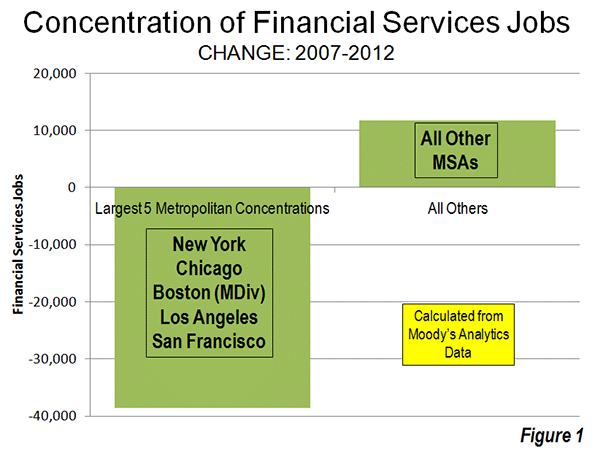
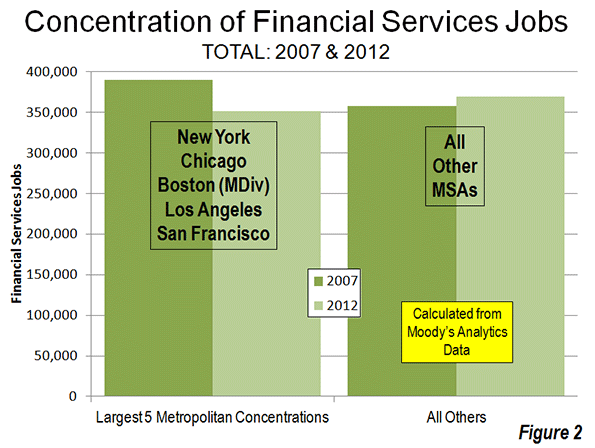
    However, the New York metropolitan area and the other four largest concentrations of financial sector jobs – New York, Chicago, Boston, Los Angeles and San Francisco – accounted all of the net job losses over the period. Between 2007 and 2012, the five largest financial sector markets, lost 39,000 jobs. Outside these five metropolitan areas, the number of financial sector jobs increased by 12,000 (Figure 1).

    The extent of this dispersal away from the five most concentrated markets is illustrated by the decline in their financial sector jobs compared to the other metropolitan areas. In 2007, the five most concentrated markets had 32,000 more financial sector jobs than the other metropolitan areas. By 2012, the other metropolitan areas achieved a total number of 19,000 more financial sector jobs than the five most concentrated markets (Figure 2).

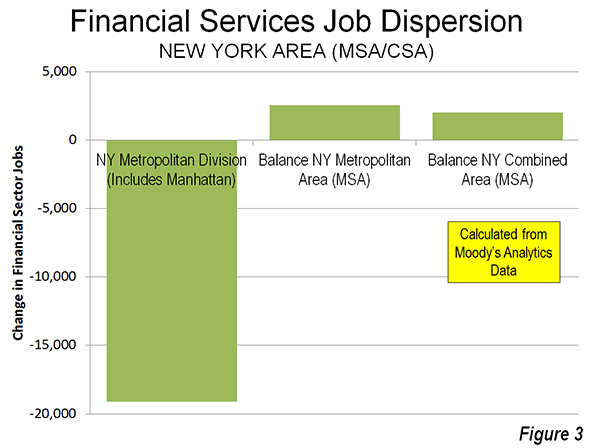
    The dispersion of financial sector jobs is evident even within the New York area itself. The central metropolitan division of the New York metropolitan area (New York-White Plains-Wayne), which includes Manhattan, lost 19,000. However, the balance of the New York metropolitan area experienced a 2500 increase in financial sector jobs, resulting in a overall loss of 16,500 jobs in the metropolitan area

    Not all of the New York metropolitan area jobs were lost to places like Dallas-Fort Worth and Des Moines. The balance of the New York combined statistical area (formerly called consolidated metropolitan statistical areas) added 2000 jobs, principally in the Bridgeport (Fairfield County, Connecticut) metropolitan area (Figure 3). Thus, while the core of the New York metropolitan area was losing 9 percent of its financial sector jobs, the more suburban balance of the combined area gained 11 percent, even as the total region lost employment.

    California: Substantial Financial Sector Employment Losses

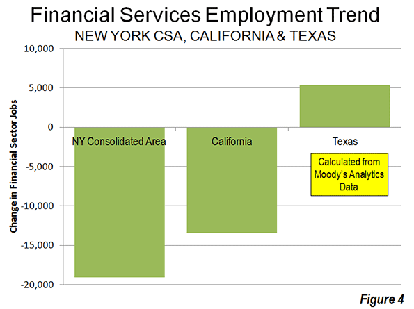
    However, New York’s percentage losses paled by comparison to those in the Los Angeles (Los Angeles and Riverside-San Bernardino) and San Francisco combined (San Francisco and San Jose) statistical areas. The losses in the Los Angeles area were 21 percent, while in the San Francisco area the losses reached 17 percent. The losses in Los Angeles and San Francisco regions exceeded that of the New York combined statistical area, which had three times as many financial sector jobs in 2007. San Diego also experienced a 5percent job loss, while Sacramento’s loss was miniscule. Overall, California lost 17 percent of its financial sector jobs between 2007 and 2012.

    Texas: Gaining Financial Sector Employment

    The large metropolitan areas of Texas and did better. Dallas-Fort Worth, Houston, San Antonio and Austin added 5400 financial sector jobs, an increase of 14 percent (Figure 4).

    Metropolitan Area Performance

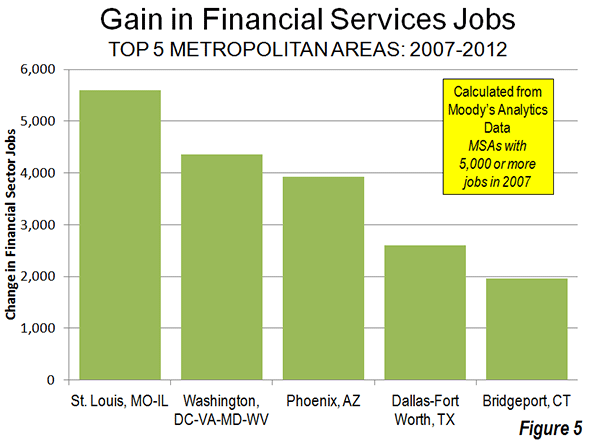
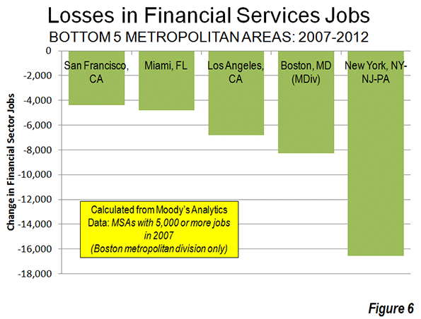
    St. Louis added 5,600 financial sector jobs, the most of any single metropolitan area (Figure 5). The Washington area added 4,400, followed by Phoenix (3,900), Dallas-Fort Worth (2,600) and Bridgeport (2,000). New York, as mentioned above, lost 16,500 financial sector jobs, the most of any individual metropolitan area (Figure 6). Boston had the second largest loss (8,300), followed by Los Angeles (6,800), Miami (4,800) and San Francisco (4,400).

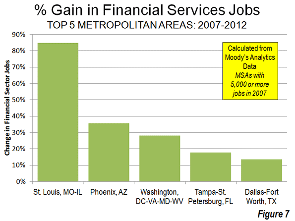
    The metropolitan areas with the largest percentage gains include net job leader St. Louis which grew 85 percent (Figure 7). Phoenix gained 36 percent, Washington 28 percent, Tampa-St. Petersburg 18 percent and Dallas-Fort Worth 14 percent. Des Moines, which had only 1,400 financial sector jobs in 2007 had the largest percentage gain, at 96 percent.

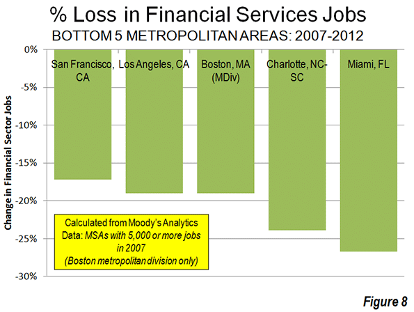
    Miami had the largest loss, at 27 percent (Figure 8). Charlotte, having risen to prominence with its large banks may have been in the wrong place at the wrong time, losing 24 percent of its financial sector jobs, followed by Boston and Los Angeles (19 percent) and San Francisco (17 percent).

    Dispersing to Lower Density Areas

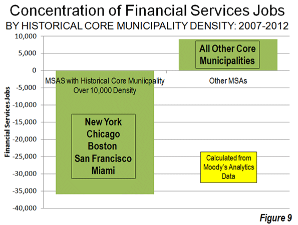
    The data is not sufficiently precise to distinguish between central business district, urban core and suburban trends. However, the metropolitan areas with high density historical core municipalities (above 10,000 persons per square mile or 4,000 per square kilometer in 2010), suffered a loss of 35,000 financial sector jobs between 2007 and 2012, more than the total national metropolitan loss of 27,000. The six high density historical core municipalities (Note 2) include New York, Chicago, Philadelphia Boston, San Francisco and Miami all suffered significant losses while the metropolitan areas with less dense cores gained 9,000 financial sector jobs (Figure 9).

    Further, the losses were concentrated in the metropolitan areas with the four most dense major urban areas, Los Angeles, San Francisco, San Jose and New York and the losses in these areas exceeded the overall industry loss. This movement away from density reinforces the often misconstrued conclusions of the Santa Fe Institute Urban Scaling research to the effect that metropolitan area size was a principal determinant of productivity, however not urban density (see: Density is Not the Issue: The Urban Scaling Research). Larger, less dense regions did far better — for example Houston, Dallas and St. Louis — than their more dense rivals.

    Dispersion to Housing Affordability

    There is also a strong trend of financial sector job gains where housing is more affordable and job losses where housing is less affordable. This is indicated by the median multiple (median house price divided by gross median household income) data from the 8th Annual Demographia International Housing Affordability Survey (Table below).


    Demographia International Housing Affordability Survey

    Housing Affordability Rating Categories

    Rating

    Median Multiple

    Severely Unaffordable

    5.1 & Over

    Seriously Unaffordable

    4.1 to 5.0

    Moderately Unaffordable

    3.1 to 4.0

    Affordable

    3.0 & Under


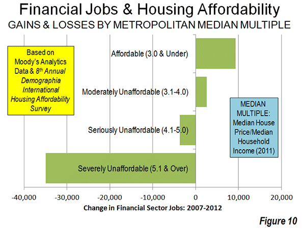
    Metropolitan areas rated as affordable (median multiple 3.0 or lower) gained 9,300 financial sector jobs between 2007 and 2012. Metropolitan areas rated moderately unaffordable (median multiple 3.1 to 4.0) gained 2,600 jobs. The metropolitan areas with the most unaffordable housing suffered a net loss in financial sector jobs. Seriously unaffordable (median multiple 4.1 to 5.0) metropolitan areas lost 3,700 jobs. Metropolitan areas rated seriously unaffordable (median multiple 5.1 or higher) lost 35,000 jobs. This is more than the overall loss reported in the data of 27,000 (Figure 10).

    Financial Sector Jobs: Reflecting Urban Dispersion

    The dispersion of financial sector jobs away from concentrated areas may come as a surprise, given the close association that the industry has with the largest central business districts. Yet, the trend mirrors the more general, but overwhelming trends of dispersion indicated over the last decade in both population and domestic migration.

    Wendell Cox is a Visiting Professor, Conservatoire National des Arts et Metiers, Paris and the author of “War on the Dream: How Anti-Sprawl Policy Threatens the Quality of Life.”

    ——

    Note 1: The data used in this analysis is limited to that provided in The Wall Street Journal article. Data was provided for only is only for a part of the Boston metropolitan area (the Boston-Quincy metropolitan division).

    Note 2: In 1940, at least 15 of the historical core municipalities had population densities exceeding 10,000 per square mile (4,000 per square kilometer)

    Photo by Flickr user IABoomerFlickr

  • A Volunteer Army’s Attempt to Fill the New York Hurricane Response Gap

    On November 6, eight days after Hurricane Sandy’s surge waters flooded the streets, I started volunteering in the Rockaways, where I stayed for much of the next three weeks.

    On that first day, I joined an ad hoc group of volunteers and took a school bus full of supplies donated by my Brooklyn neighbors out to a church on Beach 67th Street. Unloading the bus alongside parishioners at the Battalion Pentecostal church I learned that it was the first shipment they had received for the immediate area since the storm, and that aside from the traffic cops waving cars through and a National Grid trailer parked in the church lot, there was still no official presence in the neighborhood.

    The donations we brought were being carried away even before the last of them was off the bus, as word spread through the row houses that lined the block. The mother of a disabled girl carried a box of canned food to her powerless apartment and came back to ask for more. Her fridge and cupboards were already emptied.

    The other volunteers and I took the empty bus back to Brooklyn to refill it with more supplies and return later that day. On the drive back, only a mile away from the church, I saw a supermarket parking lot with truckloads of donated material guarded by police and national guardsmen. The people around the church, many of whom lost their cars in the flood, had no way to get the supplies from the parking lot back to their homes, which was incidental since most of them, cut off from any news that didn’t pass by mouth, didn’t even know that the goods were there.

    On my second day in the Rockaways I took some time to drive around and see how things were in other neighborhoods, looking for places like the church on 67th Street that were not yet being helped. I found that at the St. Francis de Sales church in Belle Harbor, on 129th Street, some supplies were already being turned away, as boxes had filled the large main hall and were now overflowing into additional rooms to accommodate the constant influx of donations.

    Several days later I returned to Francis de Sales to ask that they send food to an apartment complex I had found on the tip of the peninsula near Nassau county, where hundreds of elderly residents were living without heat or power, rationing canned goods and prescription medicine. An Australian volunteer at the church told me that he would take care of it, and while I believed he meant it, I also knew that he might be gone the next day, back to work or to his life outside volunteering.

    No one was keeping track.

    There is a city agency charged with just that: the Office of Emergency Management (O.E.M.). Emergencies are, by definition, chaotic, and the office is there to do two things: to compile block-by-block information into a unifying big picture, and to ensure responders and resources are allocated in accordance with that picture. In short: triaging, first understanding needs, and then prioritizing among them. But O.E.M. was conspicuously absent while I was in the Rockaways, and according to volunteers and officials I spoke with while reporting this story.

    Trying to get people food and basic supplies took up much of my first week in the Rockaways, and yet there was no problem with scarcity. The city spent close to $3 million for food and water distribution and, as of November 26, had distributed over 2 million meals, while donations poured in from New York and out-of-state charities.

    Individuals and small groups were doing their best to attend to immediate need, but the lack of direction was acute, resulting in a feast-or-famine situation that varied block by block.

    I visited the parking lot where I had seen the trucks of supplies parked and asked if they could be moved to the under-served church on 67th Street but the National Guardsman posted there explained apologetically that taking supplies neighborhood-to-neighborhood, a more effective manner of distribution, didn’t match their orders.

    Though city officials had been working hard since even before the storm struck, one thing they weren’t doing was taking control of the situation on the ground, canvassing neighborhoods to determine needs and directing services and supplies accordingly. Nor, since they may not have enough staff to do this all themselves, were they effectively organizing and commanding the hodge-podge of official and unofficial groups and the steady stream of volunteers attempting to make themselves useful.

    Relief supplies managed by the city were being delivered to a handful of centralized points without much of a plan for getting them to the people in need, even as the National Guard and the many volunteers looked for ways to help.

    Some volunteer groups had identified this issue early on and attempted to deal with it, on their own, in various ways.

    Some drove around with supplies until they found people who obviously needed them, and some groups like Occupy Sandy and Save the Rockaways used social media and web presence to post alerts identifying where food and volunteers were needed.

    Team Rubicon, a veteran-led relief group, took things even further, using a computer program called Palantir to create an annotated map of conditions in the Rockaways and by stepping up to fill the leadership vacuum. Palantir is a data visualization platform used by the military and intelligence agencies to track and analyze the information gathered from complex environments. It can be highly effective but ultimately relies on human users inputting information gathered from the field.

    The group was initially collecting handwritten work orders and reports on local conditions from team members and local residents to track what work was ongoing and what remained to be done. The task of gathering intelligence and feeding into a single model, whether by writing on a map or using a digital database, is a basic pre-condition for conducting any complex operation—you need to understand an environment in order to address its problems. Once they had Palantir added to their system, Team Rubicon could take any report and add it to their database to create a single fluid model of conditions on the ground.

    When they first arrived in the Rockaways Team Rubicon intended to be a labor force moving supplies and shoveling out flooded basements. But as the crisis dragged on and more volunteers began arriving in the thousands without any government agency directing their work, Rubicon’s leaders shifted their priorities. Rather than doing all the shoveling themselves, they organized the incoming volunteers into small groups with one Rubicon member assigned to each as a team leader, and dispatched the groups to fill the hundreds of work orders that they had compiled through their canvassing.

    As effective as Team Rubicon’s approach was, their reach was limited by their size and the fact that they were only one group among many without any official authority to direct overall efforts. Rubicon’s methodology, collecting and centralizing information in order to coordinate actions, could have been used by the city and implemented on a larger scale and in fact is precisely the approach outlined in the city’s own emergency relief protocols. But, over a month after the hurricane hit, the city’s relief effort still lacks the crucial aspect that has been missing from the start—an effective overhead body leading operations.

    Information management is not just an issue for the next emergency: inefficiencies and failures are still occurring because different volunteer groups are not forced to share information and none of them, despite their working relationships, are really on the same page as the city. As one official in a volunteer group that worked with the city during relief efforts put it, “The city had the intel arms in place, the volunteer groups out in the neighborhoods, but they had no system to receive our reports.”

    When the city finally started to use volunteer groups for canvassing, it appears to have done so only at the urging of those groups, long after the storm hit.

    A Times article details the city housing authority’s failure to properly account for and provide relief to city residents, many of them elderly and unable to evacuate, stuck for weeks in buildings without power or heat. Almost two weeks after the storm, the city called on volunteer groups to go door to door in public housing in Coney Island, surveying to establish how many thousands were stuck in the buildings and what their immediate needs were.

    Responding to complaints from volunteers about the city’s lack of leadership in those relief efforts, Nazli Parvizi, the city’s commissioner for community affairs, is quoted in the Times piece saying that the she didn’t want to disturb the volunteers’ good work by taking control of the situation.

    According to Parvizi, “I wasn’t here to change that narrative [of volunteers leading while the city played a supporting role]. I was asking them, ‘What do you need?’”

    Give Parvizi credit for being honest and not pretending, as many officials have, that the city was aggressively leading relief operations.

    The task of coordinating the efforts of various government agencies, volunteers and non-governmental organizations, and providing an overarching structure for emergency response, is precisely what New York City’s Office of Emergency Management (O.E.M.) was created to do.

    On its website O.E.M. lists “on-scene coordination” as one of the core responsibilities it assumes an emergency. Yet it was only seen sporadically in the hardest-hit parts of the city—including the Rockaways, Staten Island and Coney Island—and was entirely absent from the wave of city-official-sourced tick-tocks and other stories.

    Founded in 1996 by an executive order from Rudy Giuliani, the office effectively took responsibility for emergency planning and response away from the NYPD and gave it directly to the mayor’s office, reportedly to the displeasure of Howard Safir, who was the police commissioner at the time.

    In 2001 after becoming its own independent department outside of the mayor’s office and proving its worth in the eyes of many by its response to the attacks of 9/11, O.E.M. seemed to have justified its founding mission and earned an enduring presence. But things changed when Bloomberg was elected and Ray Kelly returned to take over the NYPD. According to multiple sources and news accounts, Kelly, like Safir before him, saw O.E.M. as an affront to the primacy of the police department’s role in ensuring public safety and pressured the mayor to marginalize the organization.

    Apparently he had some success in this regard. In 2005, O.E.M. commissioner Joseph Bruno testified before the City Council in a hearing over Bloomberg’s decision to place responsibility for handling hazardous materials in a potential terrorist incident into the hands of the NYPD.

    In his testimony, Bruno stated that his office had been more powerful under Giuliani and that in the event of a dispute between the FDNY and NYPD on the site of an emergency he would “give advice,” but “O.E.M. is not going to come in and say, ‘We’ll tell you how to do it.’”

    According to a high-ranking official in a prominent volunteer relief organization who has worked closely with both the mayor’s office and O.E.M., tensions between the offices were obvious during the initial, crucial days following the hurricane and communications terse and perfunctory. This official said that whenever there were disagreements between O.E.M. and the mayor’s office, the mayor’s office won.

    O.E.M. declined to provide comment for this story, but conversations with sources with knowledge of O.E.M.’s operations and a review of the organization’s history and the turf wars that have shaped its current role provide some insight into what went wrong, and ideas about why those problems are likely to recur in the next disaster. On paper, OEM had all of the tools and resources in place to address these problems. The Citywide Asset and Logisitics Management System (CALMS), created in 2003, is touted by the office as its means of facilitating the movement of supplies in emergency response, and as a crucial part of their mission to “[work] with government agencies and nonprofit organizations to provide assistance to disaster victims and manage relief efforts, donations, and spontaneous volunteers.” According to the O.E.M. website, “CALMS integrates multiple resource management systems and provides a single view of the resources managed or accessible to response agencies.”

    But at a meeting held two weeks ago by the New York City chapter of Voluntary Organizations Active in Disaster (VOAD), with an O.E.M. liaison in attendance, the system’s shortcomings were made clear.

    VOAD, which brings together a coalition of volunteer groups to plan and coordinate relief efforts and which has been meeting regularly since before Hurricane Sandy, seems not to have been connected to O.E.M.’s system. The volunteer official that I spoke with attended the VOAD meeting last week and told me that a member of Occupy Sandy stood up to plead for help with ongoing food shortages while across the table a Red Cross official offered that he had a fleet of trucks loaded with food and only needed to know where to send them.

    A second official in a volunteer group I spoke to described driving around the Rockaways on the day of the Northeaster that followed Hurricane Sandy, canvassing neighborhoods to find the people most vulnerable to the coming snowfall. Seeing an O.E.M. setup, he stopped to do some coordination and trade notes and found that the O.E.M. officials were packing up to leave the Rockaways and return to Manhattan in anticipation of the storm.

    “Here we were, volunteers going into the storm, and they were leaving,” he said. “It was just gross negligence on their part.”

    Media coverage of the city’s reaction to the storm mostly reflects the overriding political priority, which is getting as much federal aid money as possible, and figuring out the expected tens of billions in funding once it begins to come in.

    Bloomberg, aware that the polls showed a big majority of New Yorkers approved of the administration’s response to the storm, has focused his limited criticism on flaws in preparedness and on the question of whether to build sea walls.

    A full accounting of the city’s performance will take time and the disclosure of public records not yet available, but the process can start with some simple questions. What should New Yorkers expect of the city when disasters occur? What agencies are responsible for the unique and critical needs that arise from emergencies? Whose job is it to feed individuals and families stuck in homes without power? What is the role of volunteer organizations in disasters of this kind, and to whom are they accountable?

    The core elements of OEM’s mission—on-scene coordination, logistics management, directing government and non-government groups—constitute a short list of the critical functions that have been most lacking in the city’s response. New Yorkers will need real transparency from the office and an accounting of the functioning of city agencies during and after the storm.

    As of this writing, the records of O.E.M.’s action since the hurricane are still minimal, and the office has yet to initiate its own after-action review.

    This piece first appeared at Capital New York.

    Jake Siegel was born and raised in Brooklyn. His writing has appeared in The New York Times, New York Press and New Partisan. HIs short story will appear in "Fire and Forget" an anthology of fiction written by Iraq and Afghanistan veterans being released by Da Capo on February 12, 2013.

    Rockaway Beach hurricane response photo by Bigstock.
  • Where Americans Are Moving

    The red states may have lost the presidential election, but they are winning new residents, largely at the expense of their politically successful blue counterparts. For all the talk of how the Great Recession has driven people — particularly the “footloose young” — toward dense urban centers, Census data reveal that Americans are still drawn to the same sprawling Sun Belt regions as before.

    An analysis of domestic migration for the nation’s 51 largest metropolitan statistical areas by demographer Wendell Cox shows that the 10 metropolises with the largest net gains from 2000 through 2009 are in the Sun Belt, led by Phoenix, and followed by Riverside-San Bernardino, Calif.; Atlanta; Dallas-Ft. Worth; and Las Vegas.

    Migration has slowed from a high of nearly 2 million annually in 2006 to less than 800,000 last year, but the most recent numbers show that the Sun Belt states, though chastened by the recession, are far from dead, as often alleged. This part of America, widely consigned to what the Bolshevik firebrand Leon Trotsky called the “dustbin of history” by Eastern pundits, somehow manages to continue to draw Americans seeking opportunities, in particular from the large coastal metropolitan regions.

    Migration data for the most recent one-year period available, July 2010 t0 July 2011, show the Great Recession has shaken the rankings up quite a bit within the circle of fast-growth regions. The biggest winner has been Texas. The Lone Star state boasts four of the 10 metro areas with the largest net migration gains for the past two years.  Dallas ranks first, followed by Austin in third place, Houston in fifth and San Antonio in eighth. In contrast, some of the growth leaders over the 2000-09 period, notably Las Vegas, and to a lesser extent Phoenix, have tumbled considerably in the rankings. The lesson here: a strong economy has to be based on something more than gaming, tourism and home construction. Energy, technology, manufacturing and trade are far preferable as an economic base.

    Also posting strong net migration gains for 2010-11 were Miami (second place), Washington, D.C. (sixth), and Seattle (ninth). In each of these areas, economic conditions appear to have improved. The once disastrous condo glut in the Miami area, which includes Dade, Broward and Palm Beach counties, has begun to clear up as foreign buyers pour into the region. Taxpayer-funded Washington is surging with new jobs and the highest incomes in the land. Seattle continues a long-term evolution toward the healthiest of the blue-state private economies. San Francisco, a consistent big loser for the last decade, jumped to 19th, presumably as a result of the current dot.com bubble.

    Another huge turnaround can be seen in New Orleans, which ranked a dismal 43rd for 2000-09 as residents fled not only Katrina but a stagnant, low-wage, corruption-plagued economy. But in our 2010-11 ranking, the Crescent City surged to a respectable 16th, one of the biggest migration turnarounds in the country.

    How about the biggest losers? From 2000-09, the metropolitan areas that suffered the biggest net domestic migration losses resemble something of an urbanist dream team: New York, which saw a net outflow of a whopping 1.9 million citizens, followed by the Los Angeles metro area (-1,337,522), Chicago, Detroit, and, despite recent improvements, San Francisco-Oakland. The raw numbers make it clear that California has lost its appeal for migrants from other parts of the U.S., and has become an exporter of people and talent (and income).

    And despite the cheap money Bernanke-Geithner policies of the past few years that have benefited giant banks centered in the bluest big cities, people continue to leave these areas.  The 2010-11 numbers show the deck chairs on the migratory titanic have stayed remarkably similar, with New York still ranking first among the 51 biggest metro areas for net migration losses, followed by Chicago, Los Angeles, Detroit and Philadelphia. In most of these cases only immigration from abroad, and children of immigrants, have prevented a wholesale demographic decline.

    What can we expect now? It seems clear that the urban-centric policies of the Obama administration have not changed Americans’ migration patterns. The weak recovery has slowed migration, but expensive, overregulated and dense metropolitan areas continue to lose population to lower-cost, less regulated and generally less dense regions. This may speed up as recent tax hikes squeeze the hard-pressed middle class and if, as appears likely, the social media bubble continues to deflate.

    If the economy somehow gains strength, it may only serve to further accelerate these trends. The incipient recovery in housing prices seems likely, at least in places like California and the Northeast, to create yet another bubble. This will give people more incentive to move to less expensive areas, particularly those who can cash in by selling a house in a pricier city and moving to a less expensive one. The differential in housing costs between New York and Tampa-St. Petersburg now stands at historic highs, and near peak bubble highs between Los Angeles and Phoenix; the traditional growth states are looking more attractive all the time for people looking to make quick money in an economy with shrinking opportunities elsewhere. This includes the massive wave of aging boomers, many of whom may see selling a house in California or the Northeast as a way to make up for less than adequate IRAs. The combination of low prices and warmer weather in the past has proven an irresistible one for those retiring or simply down-shifting their careers. This appeal is likely to grow as the senior population expands.

    Other demographic factors could further drive this trend. As the millennial generation ages and starts looking for places to buy homes and raise families, many will seek out places that are both affordable and offer better economic opportunities. These will tend to be in the South and Southwest, particularly Texas, and Plains States metro areas such as Oklahoma City.

    Finally we can expect immigrants, particularly from Asia, to continue to seek out housing bargains and new opportunities primarily in the Sun Belt states, as our recent study of changing Asian settlement patterns revealed. More will be shifting from the high-priced, low-growth big metros for opportunity cities such as Houston, Dallas-Fort Worth, Raleigh and Charlotte.

    Overall we can  expect domestic migration to pick up, and to follow the well-trodden path from the great cities of the Northeast and California to the Sun Belt’s  resurgent boom towns. This may be bad news to many urban pundits and big city speculators, but it also should create new opportunities for more perceptive, and less jaded, investors.

    2010-2011 Net Domestic Migration for the Nation’s 51 Largest Regions
    Rank by Net Flow Metropolitan Area Net Flow Rate Per 1,000 Residents Rank by Rate
    1 Dallas-Fort Worth-Arlington, TX 39,021 6.04 10
    2 Miami-Fort Lauderdale-Pompano Beach, FL 36,191 6.43 9
    3 Austin-Round Rock-San Marcos, TX 30,669 17.47 1
    4 Tampa-St. Petersburg-Clearwater, FL 27,157 9.68 3
    5 Houston-Sugar Land-Baytown, TX 21,580 3.58 16
    6 Washington-Arlington-Alexandria, DC-VA-MD-WV 21,517 3.80 15
    7 Denver-Aurora-Broomfield, CO 19,565 7.59 7
    8 San Antonio-New Braunfels, TX 19,515 8.97 4
    9 Seattle-Tacoma-Bellevue, WA 17,598 5.07 13
    10 Riverside-San Bernardino-Ontario, CA 15,131 3.54 17
    11 Charlotte-Gastonia-Rock Hill, NC-SC 13,778 7.74 6
    12 Raleigh-Cary, NC 13,262 11.53 2
    13 Atlanta-Sandy Springs-Marietta, GA 12,419 2.33 18
    14 Portland-Vancouver-Hillsboro, OR-WA 11,388 5.07 12
    15 Orlando-Kissimmee-Sanford, FL 10,394 4.82 14
    16 New Orleans-Metairie-Kenner, LA 10,153 8.59 5
    17 Nashville-Davidson–Murfreesboro–Franklin, TN 9,323 5.81 11
    18 Oklahoma City, OK 8,746 6.90 8
    19 San Francisco-Oakland-Fremont, CA 5,880 1.35 22
    20 Phoenix-Mesa-Glendale, AZ 5,585 1.32 24
    21 Pittsburgh, PA 3,740 1.59 20
    22 Jacksonville, FL 2,911 2.15 19
    23 Sacramento–Arden-Arcade–Roseville, CA 2,856 1.32 23
    24 Columbus, OH 2,219 1.20 26
    25 Indianapolis-Carmel, IN 1,940 1.10 27
    26 Louisville/Jefferson County, KY-IN 1,886 1.46 21
    27 Richmond, VA 1,546 1.22 25
    28 Salt Lake City, UT 915 0.80 28
    29 San Diego-Carlsbad-San Marcos, CA 816 0.26 29
    30 Minneapolis-St. Paul-Bloomington, MN-WI 536 0.16 30
    31 Baltimore-Towson, MD -1,341 -0.49 32
    32 Boston-Cambridge-Quincy, MA-NH -1,627 -0.36 31
    33 Birmingham-Hoover, AL -2,452 -2.17 35
    34 Buffalo-Niagara Falls, NY -2,558 -2.25 38
    35 San Jose-Sunnyvale-Santa Clara, CA -2,704 -1.46 34
    36 Kansas City, MO-KS -2,820 -1.38 33
    37 Memphis, TN-MS-AR -2,933 -2.22 37
    38 Rochester, NY -3,320 -3.15 40
    39 Hartford-West Hartford-East Hartford, CT -4,749 -3.92 45
    40 Milwaukee-Waukesha-West Allis, WI -4,862 -3.12 39
    41 Providence-New Bedford-Fall River, RI-MA -6,254 -3.91 44
    42 Las Vegas-Paradise, NV -6,353 -3.24 41
    43 Virginia Beach-Norfolk-Newport News, VA-NC -7,086 -4.22 47
    44 Cincinnati-Middletown, OH-KY-IN -7,149 -3.35 42
    45 St. Louis, MO-IL -10,260 -3.64 43
    46 Cleveland-Elyria-Mentor, OH -12,521 -6.04 51
    47 Philadelphia-Camden-Wilmington, PA-NJ-DE-MD -13,133 -2.20 36
    48 Detroit-Warren-Livonia, MI -24,170 -5.64 49
    49 Los Angeles-Long Beach-Santa Ana, CA -50,549 -3.92 46
    50 Chicago-Joliet-Naperville, IL-IN-WI -53,908 -5.68 50
    51 New York-Northern New Jersey-Long Island, NY-NJ-PA -98,975 -5.22 48


    Joel Kotkin is executive editor of NewGeography.com and is a distinguished presidential fellow in urban futures at Chapman University, and contributing editor to the City Journal in New York. He is author of The City: A Global History. His newest book is The Next Hundred Million: America in 2050, released in February, 2010.

    This piece originally appeared at Forbes.

    Dallas photo by Bigstock.