Tag: New York

  • Faking It: The Happy Messaging of Placemaking

    Picasso said “Art is a lie that tells the truth”. Nowadays, there’s less truth to that, as the creative process is increasingly about prettying up and papering over what’s broke.

    More on that shortly, but first, about the breakage: it’s legitimate. Said Nobel laureate Joseph E. Stiglitz in a recent NY Times piece that plain-talks our economic conditions: “Increasing inequality means a weaker economy, which means increasing inequality, which means a weaker economy.”

    That assessment—from a very smart man studying the problem—isn’t good. But in the American feel-good milieu you wouldn’t know it: “We’re coming out if it.” “Tomorrow is forever.” “Start-ups will save the U.S.” Etc. And while tone deaf, this kind of brushing off of problems isn’t new, but part of what social critic Barbara Ehrenreich refers to as America’s “cult of cheerfulness”, and it’s a “cult” that has spawned a longstanding and growing American feel-good industry.

    Recently, researcher Jeff Faux—in his book The Servant Economy: Where America’s Elite is Sending the Middle Class—says the feel-good industry has disarmed social urgency and unrest with “cheerful denial”, particularly as it relates to declining standards of living. Faux writes:

    [T]he positive-thinking industry has gone from publishing self-improvement books and training sales people to smile even when they don’t feel like it to loosely constructed system of social engineering that distracts and discourages Americans from dealing with what is happening to their society.

    This form of social control is wide and far-reaching, ranging from the smiley face Wal-Mart logo to motivational seminars for laid off workers that spoon feed a “can do” attitude like it’s castor oil, regardless if it is the context that really “can’t.” Increasingly, cheerful denial has become the purview of artists and designers; that is, instead of using aesthetics to tear down—like did Picasso, Duchamp, and Matta-Clark—we use aesthetics to prop up.

    Enter placemaking, or that medium of developing “place” in our cities through shared efforts of artists and designers alike.

    Placemaking does a lot of good. Parks, festivals, and various urban design interventions can create for a myriad of positive attributes related to happiness, worth, and reinvestment. But placemaking in its pervasive search for vibrancy can often come off as Pollyannaish, or yet another means at happy messaging. At its worst, placemaking not only distracts from pressing concerns if only to provide a place to collectively clap, but—when done in exceedingly high rent spots continuously immune to economic downturns—can also serve to reinforce the bubble mentality of the elite.

    One needs to go no further than America’s cultural capital, New York City, to see this operating. For instance, in a recent article called the “How Rust Became the New Urban Luxury Item”, the author talks about how the aesthetic of rust is being remade from a reality into a motif. The new billion-dollar Barclays Center was made rusty on purpose, and a new section of the High Line—the park made from an abandoned rail line—will most certainly retain its wear, with its decay polished if need be.


    Courtesy of Techcat

    Why is this occurring? The author writes:

    [R]ust has become fashionable. It’s a sign of street cred, kind of like the pre-fab holes in a pair of $500 designer jeans…

    …The kind of rust you find on the Barclays Center and in the refurbished High Line park is a luxury item. In places like Cleveland and Detroit and the parts of New York without corporate sponsorship, rust is still just rust.

    There is a lot of truth there: rust is still just rust in places that have come to exist in post-industrialization, but for others: rust is luxury, rust is christened from the landscape of one’s hard times up to the decor of the powerful’s play areas.

    On one hand, there is nothing new here. Beautification efforts to attend to social ills is a longstanding method of inflicting good feelings over hard realities. There was the City Beautiful Movement, the Urban Renewal Movement, etc. But what’s rarer is the fact that the aesthetics of disinvestment—in this case rust, and its “hard time” connotations—are being brought in to “dirty” the pretty up. In other words, by “street cred-ing” spaces for the elite, design is used to legitimize the extravagant via images of the honest-to-god consequences of the all-too every day.

    The problem of course is that it elevates how things look and feel in places like the Rust Belt into a luxury status. But in reality, the Rust Belt has been anything but. And while rust is a genuine and pulsating aesthetic in post-industrial America, it is more so akin to the look of a scar: or a character-molding image of resilience that’s now part of the culture’s flesh, and as such can come off as lame when it’s fabricated to make the appearance of something look “harder” than what is.


    Courtesy of Vagabondish

    Of course this adopting of the Rust Belt aesthetic is but part of a cultural authenticity movement that has been going on for some time. People are tiring of the flighty, ephemeral, and the rootless. People want reminders of where America came from and the fight it has in it. But designing for authenticity, according to scholar Jeanne Liedtka, is not only foolhardy—“the authentic emerges; it is not summoned…”—but yet another indication that America is spending more energy on faking it then fixing it.

    Richey Piiparinen is a writer and policy researcher based in Cleveland. He is co-editor of Rust Belt Chic: The Cleveland Anthology. This piece originally appeared at his blog.

    Happy smiley photo by Bigstock.

  • The New York Marathon Vs the NFL

    The ING New York City Marathon was cancelled, but the football game of the New York Giants against the Pittsburgh Steelers went ahead. Why? The nation places a higher value on sedentary spectators popping Advil and Viagra, than on lean and wiry runners, whose idea of a big night out is pasta and a few sips of Gatorade. It also helps that pro football has a televised address on 21st and Primetime, while the pleasure of a marathon is simply to finish one, even in the dark.

    In canceling the road race, New York Mayor Michael Bloomberg made the decision that it would have been insensitive to have marathoners running around a city that was still digging out from the wreckage caused by Sandy, or past those lining up with gas cans. Nor did anyone want police officers or emergency health workers officials involved with the marathon when they could be assisting the recovery of Staten Island or Breezy Point.

    On the same Sunday, however, the National Football League, took the position that, even with gasoline short for essential services, the game must go on, much as it did earlier this fall when the regular game officials were locked out of work. The office of NFL Commissioner Roger Goodell spends a lot of time invoking the mysticism of “the Game,” as though it were the Force or the Church—a higher being (“brought to you by Ford…”).

    To protect the interests of the Game, the commissioner regularly suspends or levies fines on coaches or players for putting out bounties, making unfair hits, showing positive drug tests, or for conduct “unbecoming” an NFL player, which ranges from sponsoring dog fighting to taking part in drive-by shootings. His job description is to sustain the illusion that the Raider Nation is the spiritual heir to those chariots of fire.

    The reason the NFL takes itself more seriously than, say, the Vatican, is that its revenue stream is built on the faith that the games are sport: athletic contests with winners and losers, not simply pay-per-view broadcasts that seek to divide each given Sunday into thousands of thirty-second spots, each of which can be sold to beer companies, hotel chains, and airlines.

    The league structure is an oligopoly, sustained by a sweetheart antitrust exemption, with each franchise sharing the collective revenue. Having a winning season doesn’t make the owner of an NFL team richer; the Jets are worth about as much as the 49ers (who actually win their games), and the average value of each franchise is more than $1 billion. The value of the NFL is that it can sell everything from diapers to cures for erectile dysfunction.

    To get an idea of the extent to which team owners have contempt for the actual sport of football, look no further than the Great Referee Crisis. The calamity began when about a hundred NFL game officials, at the time of a contract renegotiation, decided that they were entitled to keep their defined-benefit pension plans—meaning, their retirement packages would continue to be a percentage of their annual salaries, which average about $150,000 (for three hours of work, seventeen weeks a year, with a twenty-minute break for halftime).

    Owners of the NFL’s 32 football franchises—which have annual payrolls (measured in “cap space”) of $120 million and evenly split a revenue jackpot of $9.5 billion—reacted with indignation that the referees had the temerity to expect a pension from the league, and locked them out from work, pending a contract settlement.

    Instead of canceling the games as well, the Dickensian owners scoured the playing fields of Pop Warner and Arena football to find officials capable of throwing a few flags and uttering the phrase, “After further review, the ruling on the field stands.”

    The replacement refs showed up at the games like dads waylaid from the stands to umpire at Little League. They mastered the coin toss, some rudiments of whistle-blowing, and were given directions to the sideline peep shows that rerun the booth reviews of controversial plays. The replacement officials thought they were judging a game, and never understood they were regulating an industry.

    Without the regular officials seamlessly stopping the game after each punt, incomplete pass, out-of-bounds, or change of possession, there would be no way to securitize the game’s three hours into marketable segments lasting thirty seconds, which is how the league pulls down $9.5 billion a year. Untrained in choreography, the stopgap refs had to go.

    In its formative years, when the Game was played with leather helmets, games lasted sixty minutes. At half time, the teams switched ends. The two-minute warning was a courtesy to coaches, but not the occasion to hawk Ram Tough pickups, eTrade, Geico, and Domino’s Pizza. Imagine how little the Game would be worth if the clock simply ran for an hour?

    When football was a sport, players were expected to play offense, defense, kick, tackle, run, pass, and block. Now, as befits a featherbedded monopoly, the average pro team has about twenty coaches and specialists are engaged to handle kick returns, long snapping, field-goal holding, and obscure functions in “nickel” and “dime” formations on defense. Hyped as he might be, Tim Tebow is scorned as a marginal player in the age of free substitution. In the glory days, however, he would have been compared favorably to Jim Thorpe, as he can do it all.

    Perhaps the reason that this year’s New York marathon was deemed unworthy to help heal the wounds of a flooded city is because it is only a sport. Its participants are amateurs who buy their own uniforms, travel at their own expense, and sleep on sofas. The runners are in it for the love of the game, to compete, perchance to finish — not to provide a stage set for Cialis-popping men to leer at their wives.

    When the networks and corporations finally get their hands on the New York City Marathon, maybe then it will become worthy of a superstorm indulgence. It could go on air with about 32 runners, national sponsors, halftime around mile 13, booth reviews, and coaches’ challenges. The spectacle could last all day, and Dan, Shannon, Boomer, and Coach Cowher could analyze the winners. Then no one would mess with the Race.

    Matthew Stevenson, a contributing editor of Harper’s Magazine, is the author of Remembering the Twentieth Century Limited, a collection of historical travel essays. His next book is “Whistle-Stopping America”.

    Flickr photo by Joe Shlabotnik: Little Giants. A wall of New York Giants clothes for sale at BuyBuy Baby.

  • Superstorm Sandy & The Beachfront Bailout

    Deadline reporters, especially in weather broadcasts from the surf line, have been wailing about “this enormous storm” or “the unfolding tragedy.” What they might also say is that hurricanes are a munificent windfall for newspapers, television stations, the federal government, construction unions, and politicians seeking reelection. In addition to classifying storms from one to five on the Saffir-Simpson scale, going forward it might also be possible to grade hurricanes as profit centers, or by the surge levels that they generate in reelection campaigns.

    By all (usually breathless) accounts, Hurricane Sandy delivered a wide band of damage and destruction to areas stretching from North Carolina to Maine. Along with a death toll now approaching 50, a 13 foot storm surge in New York harbor inundated parts of lower Manhattan and Brooklyn, and millions of residents around New York, New Jersey, Maryland, and Pennsylvania lost power in their homes. The aftermath, unlike the legacy of Hurricane Katrina, however, is that the waters which flooded Manhattan’s streets, tunnels and subways are receding with ebb tides, although the damage from surging waves and fallen trees is widespread, especially across New Jersey.

    Although the storm will have cost the Mid-Atlantic region some $45 billion in cleanup costs, not to mention the loss of work days for many, even this perfect storm not seen in “a millennium” did not rack up the apocalypse that was predicted as Sandy “barreled” up the coast on its “rendezvous with destiny” in Atlantic City. From the teeth of the storm in New Jersey, my sister reported only an epic loss of cable and Internet.

    The reasons storms rarely appear as they are cast on television is because, instead of acts of nature with a lot of wind and rain, hurricanes are now best understood as political spectacles, somewhere between nominating conventions and state lotteries.

    Take the federalization of the disaster business. Previously storm damage and the costs of clean up were the responsibilities of states and municipalities, who in the first place made the decisions to allow homeowners to build houses and businesses on barrier islands, sand dunes, and low-lying waterfront property.

    For much of the twentieth century, insurance companies refused to write flood or hurricane policies for stilted houses perched precariously on Cape Hatteras or wherever, which angered wealthy political donors, who equate their life successes with owning beachfront property.

    Enter the federal government into the realm of disaster indemnification, when Congress passed the National Flood Insurance Program in 1968, to mandate that vulnerable home owners in potential flood zones purchase adequate insurance that private companies were refusing to cover. Think of it as Obamacare for beachfront homes.

    Although the legislation was designed to cover the undue risks of shore properties, it also gave the political parties a mechanism that would allow (for all those waterfront contributors) a building boom on hurricane-exposed barrier islands.

    At a time when global warming has increased the intensity and frequency of major storms and hurricanes (which are nature’s teapots blowing off steam), we are living with the fallout of an earlier era, when the federal government doubled down by writing insurance for beachfront condos from Maine to Texas.

    After the 2000 recount election came the transformation of Florida into a swing state in presidential elections, insuring that claim adjusters would reach hurricane damage zones as fast as FEMA’s first responders. Before the 2004 election arrived, four more hurricanes had passed over Florida. In their wake came billions in federal aid relief, just to insure that neither awnings nor chads would be floating in the wind.

    As powerful as hurricanes may be, they are no match for the construction lobbies, something I learned in the 1980s when writing about the National Hurricane Center in Coral Gables, Florida.

    The then-director, Neil Frank, a man of ebullience and integrity, showed me a slide show on the back of his office door, explaining that it was folly to allow construction on Gulf and Atlantic barrier islands. That was thirty years ago, and since then cities of flimsy beachside construction have risen along the dunes.

    What I admired about Frank was his passion for hurricane preparedness. He had walked the beaches of Biloxi, Mississippi in 1969, after Hurricane Camille, and measured that surge at 25 feet—something he then extrapolated to other beaches around the United States, including Atlantic City. But in urging a ban on beachfront buildings, he was shouting into an ill wind.

    Not only was the federal government complicit in allowing places like Myrtle Beach to become housing projects (the poet Robert Watson called it “white Harlem by the sea”), it also assumed that its job performance could be measured by the number of blankets and water bottles that reached those crazy enough to “ride out” a major storm in their seaside mobile homes.

    No doubt this is the Katrina Effect in American politics: The truism that if a big storm hits, the best place for the president probably isn’t dockside in San Diego, playing Otis Redding tunes on a guitar. Nevertheless, it means that the federal government (not exactly a profit center these days) is on the hook for the rescues, the clean up, and the insurance claims.

    The sad reality of Hurricane Sandy is that, despite all the Weather Channel epithets that it was “the storm of the century,” a lot of it was ordinary. It wasn’t even technically a hurricane when it came ashore near Atlantic City. What made it destructive was its size, and that it arrived late in the hurricane season and, by chance, merged with other Atlantic and Canadian storm systems. Imagine, however, if it had been one of Neil Frank’s dreaded Category 4 storms?

    Undoubtedly, President Obama would love to turn Hurricane Sandy into a backdrop for reelection spots that show him compassionate to his fellow Americans in times of need. The problem is that neither Wall Street underwater nor the flooded roulette tables in Atlantic City makes an ideal photo op or headline (“President Vows: We Will Not Let This Stop Us From Gambling!”). And I doubt he wants to campaign as the Claims-Adjustor-in-Chief.

    Photo: MTA New York City Transit, Bus on the Move. Morningside Heights, 125th and Broadway, October 28, 2012, as Hurricane Sandy approached New York City.

    Matthew Stevenson, a contributing editor of Harper’s Magazine, is the author of Remembering the Twentieth Century Limited, a collection of historical travel essays. His next book is “Whistle-Stopping America”.

  • Flocking Elsewhere: The Downtown Growth Story

    The United States Census Bureau has released a report (Patterns of Metropolitan and Micropolitan Population Change: 2000 to 2010.) on metropolitan area growth between 2000 and 2010. The Census Bureau’s the news release highlighted population growth in downtown areas, which it defines as within two miles of the city hall of the largest municipality in each metropolitan area. Predictably, media sources that interpret any improvement in core city fortunes as evidence of people returning to the cities (from which they never came), referred to people "flocking" back to the "city" (See here and here, for example).

    Downtown Population Trends: Make no mistake about it, the central cores of the nation’s largest cities are doing better than at any time in recent history. Much of the credit has to go to successful efforts to make crime infested urban cores suitable for habitation, which started with the strong law enforcement policies of former New York Mayor Rudy Giuliani.

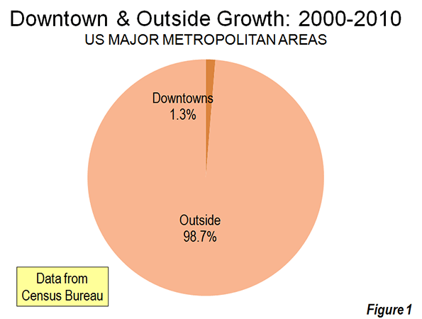
    However, to characterize the trend since 2000 as reflective of any "flocking" to the cities is to exaggerate the trend of downtown improvement beyond recognition. Among the 51 major metropolitan areas (those with more than 1 million population), nearly 99 percent of all population growth between 2000 and 2010 was outside the downtown areas (Figure 1).

    There was population growth in 33 downtown areas out of the 51 major metropolitan areas. As is typical for core urban measures, nearly 80 percent of this population growth was concentrated in the six most vibrant downtown areas, New York, Chicago, Philadelphia, Washington, Boston and San Francisco.

    If the next six fastest-growing downtown areas are added to the list (Dallas-Fort Worth, Houston, Los Angeles, Portland, San Diego and Seattle), downtown growth exceeds the national total of 205,000 people, because the other 39 downtown areas had a net population loss. Overall, the average downtown area in the major metropolitan areas grew by 4000 people between 2000 and 2010. That may be a lot of people for a college lacrosse game, but not for a city. While in some cases these increases were substantial in percentage terms, the population base was generally small, which was the result of huge population losses in previous decades as well as the conversion of old disused office buildings, warehouses and factories into residential units.

    Trends in the Larger Urban Cores: The downtown population gains, however, were not sufficient to stem the continuing decline in urban core populations. Among the 51 major metropolitan areas, the aggregate data indicates a loss of population within six miles of city hall. In essence, the oasis of modest downtown growth was more than negated by losses surrounding the downtown areas. Virtually all the population growth in the major metropolitan areas lay outside the six mile radius core, as areas within the historical urban core, including downtown, lost 0.4 percent.

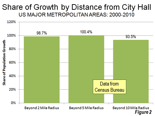
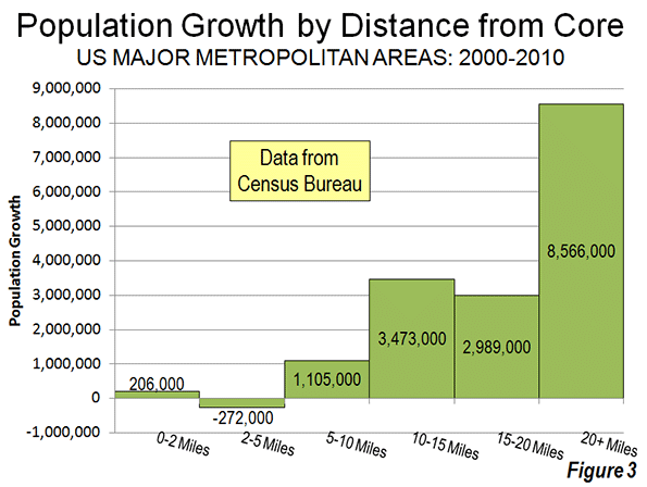
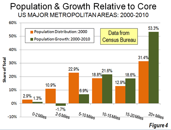
    Even when the radius is expanded to 10 miles, the overwhelming majority of growth remains outside. Approximately 94 percent of the aggregate population growth of the major metropolitan areas occurred more than 10 miles from downtown (Figure 2). Figure 3 shows that more than one-half of the growth occurred 20 miles and further from city hall. Further, the population growth beyond 10 miles (10-15 mile radius, 15-20 miles radius and 20 mile and greater radius) from the core exceeded the (2000) share of population, showing the continuing dispersal of American metropolitan areas (Figure 4).

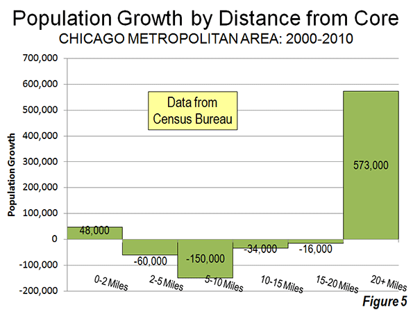
    Chicago: The Champion? The Census Bureau press release highlights the fact that downtown Chicago experienced the largest gain in the nation. Downtown Chicago accounted for 13 percent of the metropolitan area’s growth with an impressive 48,000 new residents. However, while downtown Chicago was prospering, people were flocking away from the rest of the city. Within a five mile radius of the Loop, there was a net population loss of 12,000 and a net loss of more than 200,000 within 20 miles (Figure 5). Only within the 36th mile radius from city hall is there a net population gain.

    Cleveland: Comeback City and Always Will Be? In view of Cleveland’s demographic decline (down from 915,000 in 1950 to 397,000 in 2010), any progress in downtown Cleveland is welcome. But despite the frequently recurring reports, downtown Cleveland’s population growth was barely 3,000. Despite this gain, the loss within a 6 mile radius was 70,000 and 125,000 within a 12 mile radius. Beyond the 12- mile radius, there was a population increase of nearly 55,000, which insufficient to avoid a metropolitan area population loss.

    Other Metropolitan Areas: A total of 30 major metropolitan areas suffered core population losses, despite the fact that many had downtown population increases.

    • Five major metropolitan areas suffered overall population losses (Buffalo, Cleveland, Detroit, Pittsburgh and Katrina ravaged New Orleans).
    • St. Louis, with a core city that holds the modern international record for population loss (from 857,000 in 1950 to 319,000 in 2010), experienced a population decline within a 27 mile radius of city hall. Approximately 150 percent of the growth in the St. Louis metropolitan area was outside the 27 mile radius. Even so, there was an increase of nearly 6,000 in the population of downtown St. Louis.
    • There were population losses all the way out to a considerable distance from city halls in Memphis (16 mile radius), Cincinnati (15 mile radius) and Birmingham (14 mile radius). The three corresponding downtown areas also lost population.
    • Despite having one of the strongest downtown population increases (12,000), population declined within a 10 mile radius of the Dallas city hall. This contrasts with nearby Houston, which also experienced a strong downtown increase (10,000) but no losses at any radius of the urban core.
    • Milwaukee experienced a small downtown population increase (2,000), but had a population loss within an11 mile radius.

    The other 21 major metropolitan areas experienced population gains throughout. Even so, most of the growth (77 percent) was outside the 10 mile radius. San Jose had the most concentrated growth, with only 24 percent outside a 10 miles radius from city hall. All of the other metropolitan areas had 60 percent or more of their growth outside a 10 mile radius from city hall.

    As we have observed before, 2000 to 2010 was, unlike the 1970s and other decades, more friendly to the nation’s core cities, although less so than the previous decade. Due to the repurposing of old offices and other structures, sometimes aided by subsidies, small downtown slivers may have done better than at any time since before World War II. But the data is clear. Suburban growth was stronger in the 2000s than in the 1990s. The one percent flocked to downtown and the 99 percent flocked to outside downtown.

    Population Loss Radius: Major Metropolitan Areas
    Miles from City Hall of Historical Core Municipality*
    Major Metropolitan Areas (Over 1,000,000 Population Share of Metropolitan Growth Population Loss Radius (Miles)
    "Outside Downtown" (2- Mile Radius) Outside 5-Mile Radius Outside 10-Mile Radius
    MAJOR METROPOLITAN AREAS: TOTAL 98.7% 100.4% 93.5% 6
    Atlanta, GA 99.6% 101.1% 99.9% 9
    Austin, TX 98.1% 96.7% 81.9% 0
    Baltimore, MD 106.5% 118.7% 99.5% 9
    Birmingham, AL 104.2% 132.5% 124.9% 14
    Boston, MA-NH 90.8% 76.9% 67.3% 0
    Buffalo, NY Entire Metropolitan Area Loss
    Charlotte, NC-SC 99.1% 97.4% 75.0% 3
    Chicago, IL-IN-WI 86.7% 103.3% 144.6% 35
    Cincinnati, OH-KY-IN 105.1% 126.8% 135.2% 15
    Cleveland, OH Entire Metropolitan Area Loss
    Columbus, OH 100.5% 104.3% 86.9% 7
    Dallas-Fort Worth, TX 99.0% 101.0% 100.7% 10
    Denver, CO 98.0% 100.3% 89.8% 5
    Detroit,  MI Entire Metropolitan Area Loss
    Hartford, CT 99.2% 92.7% 67.2% 0
    Houston, TX 99.2% 99.5% 98.0% 0
    Indianapolis. IN 102.1% 112.1% 89.6% 8
    Jacksonville, FL 100.2% 106.3% 85.3% 8
    Kansas City, MO-KS 99.5% 109.0% 113.3% 12
    Las Vegas, NV 101.4% 98.0% 63.6% 4
    Los Angeles, CA 97.3% 102.2% 97.6% 8
    Louisville, KY-IN 102.5% 108.5% 90.9% 8
    Memphis, TN-MS-AR 101.2% 118.5% 143.5% 16
    Miami, FL 99.4% 93.0% 91.3% 0
    Milwaukee,WI 95.9% 109.0% 107.5% 11
    Minneapolis-St. Paul, MN-WI 97.4% 99.2% 100.1% 7
    Nashville, TN 100.0% 101.4% 92.4% 7
    New Orleans. LA Entire Metropolitan Area Loss
    New York, NY-NJ-PA 93.5% 81.7% 68.9% 0
    Oklahoma City, OK 100.1% 96.8% 83.5% 2
    Orlando, FL 99.7% 99.4% 84.2% 0
    Philadelphia, PA-NJ-DE-MD 92.6% 98.8% 96.3% 7
    Phoenix, AZ 100.7% 101.8% 93.6% 6
    Pittsburgh, PA Entire Metropolitan Area Loss
    Portland, OR-WA 95.0% 91.5% 62.7% 0
    Providence, RI-MA 96.2% 91.7% 70.1% 0
    Raleigh, NC 99.6% 93.0% 67.7% 0
    Richmond, VA 95.7% 91.7% 70.2% 0
    Riverside-San Bernardino, CA 99.5% 97.2% 85.8% 0
    Rochester, NY 146.9% 149.3% 82.5% 9
    Sacramento, CA 99.9% 94.4% 79.5% 0
    Salt Lake City, UT 98.9% 95.1% 84.1% 0
    San Antonio, TX 101.1% 102.5% 86.7% 7
    San Diego, CA 96.3% 94.1% 90.1% 0
    San Francisco-Oakland, CA 90.7% 87.6% 82.2% 0
    San Jose, CA 95.1% 79.1% 24.3% 0
    Seattle, WA 96.5% 91.9% 81.4% 0
    St. Louis,, MO-IL 94.8% 119.7% 148.9% 27
    Tampa-St. Petersburg, FL 98.6% 97.8% 83.7% 0
    Virginia Beach-Norfolk, VA-NC 93.1% 90.1% 82.3% 0
    Washington, DC-VA-MD-WV 97.5% 94.5% 87.9% 0
    Calculated from Census Bureau data
    *Except in Virginia Beach-Norfolk, Where Virginia Beach is used


    ——-

    Notes:

    Population Weighted Density: In its report, the Census Bureau uses "population-weighted density," rather than average population density to compare metropolitan areas. The Census Bureau justified this use as follows:

    "Overall densities of CBSAs can be heavily affected by the size of the geographic units for which they are calculated. Metropolitan and micropolitan statistical areas are delimited using counties as their basic building blocks, and counties vary greatly across the country in terms of their geographic size. With this in mind, one way of measuring actual residential density is to examine the ratio of population to land area at the scale of the census tract, which—of all the geographic units for which decennial census data are tabulated—is typi­cally the closest in scale to urban and subur­ban neighborhoods".

    The Census Bureau rightly points out the problem with comparing metropolitan area density. However, it is a problem of the federal government’s making, by virtue of using metropolitan area building blocks (counties) that are sometimes too large for designation of genuine metropolitan areas. These difficulties have been overcome by the national census authorities in Japan in Canada, for example, where smaller building blocks are used (such as municipalities or local government authorities).

    Further, the Census Bureau already has a means for measuring population density at the census tract level, which is "the closest in scale to urban and suburban neighborhoods." This is the urban area.

    "Population-weighted density" is an interesting concept that can provide an impression of the density that is perceived by the average resident of the metropolitan area. Unfortunately, in its report, the Census Bureau is less than precise with its terminology and repeatedly fails to modify the term density with the important "population-weighted" qualification. This could lead to considerable misunderstanding.

    The Census Bureau did not provide average population densities based for the mileage radii. Because of large bodies of water (such as Lake Michigan in Chicago can reduce land areas, it was not possible to estimate population densities by radius.

    Census Bureau Revision of Incorrect Report: We notified the Census Bureau of errors in its press release and report on September 27. The problems included substitution of San Francisco population data for Salt Lake City as well as metropolitan population in the supporting spreadsheet file. On September 28, the Census Bureau issued a revised press release and report to rectify the errors. Later the erroneous spreadsheet was withdrawn and had not been re-posted as of October 1. We have made corrections to the spreadsheet for this analysis.

    Note: Larger "Downtown" Populations in Smaller Metropolitan Areas: Because of the broad 2-mile radius measure used by the Census Bureau, most of the population increase characterized as relating to downtown occurred outside the major metropolitan areas. This is simply because in smaller metropolitan areas, such an area (12.6 square miles) will necessarily contain a larger share of the metropolitan area. Further, many smaller metropolitan areas are virtually all suburban and had experienced little or no core population losses over the decades that have been so devastating to many large core municipalities. On average, 2.7 percent of the population of major metropolitan areas was within a two-mile radius of city hall in 2010. By comparison, in smaller metropolitan areas, approximately 12.7 percent of the population was within a two mile radius.

    Photograph: Chicago Suburbs: (where nearly all the growth occurred), by author

  • The Hollow Boom Of Brooklyn: Behind Veneer Of Gentrification, Life Gets Worse For Many

    After a decade of increasingly celebrated gentrification, many believe Brooklyn — the native borough of both my parents — finally has risen from the shadows that were cast when it became part of New York City over a century ago.  Brooklyn has gotten “its groove back” as a “post-industrial hotspot,” the well-informed conservative writer Kay Hymowitz writes, a perception that is echoed regularly by elements of a Manhattan media that for decades would not have sullied their fingers writing about the place.

    And to be sure, few parts of urban America have enjoyed a greater public facelift — at least in prominent places — than New York’s County of Kings, home to some 2.5 million people. The borough is home to four of the nation’s 25 most rapidly gentrifying ZIP codes, notes a recent Fordham study. When you get a call from the 718 area code these days, it’s as likely to be from your editor’s or investment bankers’ cell as from your grandmother.

    Yet there’s a darker side to the story. This became clear to me not long ago when driving with my wife and youngest daughter to a friend’s house in the Ditmas Park section of Flatbush, one of the finest exemplars of urban renaissance in the country. We encountered a huge traffic jam on the Belt Parkway, so we exited on Linden Boulevard. For the next half hour we drove through an expanse of poverty, public housing and general destitution that hardly jibes with the “hip, cool” image Brooklyn now projects around the world.

    A look at the numbers shows this was not an isolated experience. Despite the influx of hipsters and high-income sophisto professionals, Brooklyn is home to one of New York State’s poorest populations, with over one in five residents under the official poverty line, roughly 50 percent above the state average. This likely understates the problem since the cost of living in the borough is now the second-highest in the nation to Manhattan, surpassing even high-tone San Francisco.

    Overall, despite some job gains, the borough’s unemployment rate stood at 11 percent this summer, up from 9.7 percent a year ago and well above the national average. Much of recent job growth has been in lower-wage industries, notes Martin Kohli, chief regional economist with the Bureau of Labor Statistics in New York City. Despite a much celebrated start-up scene, some 30,000 of the 50,000 jobs created since the recession have been in the generally low-wage health care and social assistance sector, with another 9,000 in the hospitality industry.

    Poverty citywide, meanwhile, has been rising for three years running and the real Brooklyn, roughly half non-white, remains surprisingly poor. Brooklyn’s median per capita income in 2009 was just under $23,000, almost $10,000 below the national average.

    So what’s going on here? Urban historian Fred Siegel, a longtime Brooklyn resident, sees a classic tale of two cities. “Brownstone and Victorian Brooklyn is booming,” he says, due in part to uncle Ben Bernanke‘s inflationary policies, which have bailed out the Wall Street banks whose profits are the bedrock of New York City’s prosperity. This money has now spread to those parts of “Manhattanized” Brooklyn closest to the core of the Big Apple, with bankers, lawyers and the like opting to settle in more human-scale neighborhoods.

    But lower middle-class Brooklyn “is pockmarked with empty stores,” Siegel notes. With its once robust industrial- and port-based economy shrunken to vestigial levels, opportunities for Brooklynites who lack high-end skills or nice inheritances are shrinking. Some other areas, like Bensonhurst and Sheepshead Bay, have been revived through immigration.

    Jonathan Bowles, president of the New York-based Center for an Urban Future, sees a divide between, on the one hand, “the creative class” and some immigrant neighborhoods, and on the other, “the concentrated poverty” in many other struggling areas like Brownsville (where my mother grew up) and East New York. “There are clearly huge swaths of Brooklyn where you don’t see gentrification and there won’t be anytime soon,” Bowles observes.

    Part of the problem is structural. Many of Brooklyn’s working-class commuters — particularly in the eastern end of the borough — depend on a transit system designed to funnel people into the giant office clusters of Manhattan. Those left looking for work in the borough, often in low-paid service jobs, face long commutes or have to get a car, a big expense in a city with ultra-high rents, taxes and insurance costs.

    Mayor Michael Bloomberg’s administration identifies itself closely with Manhattan’s “luxury city” economy. Focused on finance, media and high-end business services, this approach does not offer much to blue-collar Brooklyn. New York over the past decade has suffered among the worst erosions of its industrial base of any major metropolitan area. Brooklyn alone has lost 23,000 manufacturing jobs during that time.

    Inequality in the Bloombergian “luxury city” is growing even faster than in the nation as whole. In fact, the gap between rich and poor is now the worst in a decade. New York’s wealthiest one percent earn a third of the entire city’s personal income — almost twice the proportion for the rest of the country.

    So while artisanal cheese shops serve the hipsters and high-end shops thrive, one in four Brooklynites receives food stamps.

    We see similar patterns across even the most vibrant of the nation’s urban regions. San Francisco gets richer with trustifarians, hedge fund managers and, for now at least, social media firms. Yet Oakland, just across the bay, suffers severe unemployment, rising crime and high vacancies. The cool bars and restaurants frequented by the creatives get the media attention, but as demographer Wendell Cox notes, roughly 80 percent of the population growth in the nation’s largest cities over the past decade consisted of people living below the poverty line.

    High costs and regulatory burdens make changing this reality ever more difficult; what can be borne by Manhattan or an upscale Brooklyn neighborhood like Park Slope can devastate a grittier locale like East New York. A well-heeled banker or trust-funder may find the costs of higher taxes and regulation burdensome but still relatively trivial; such factors more strongly impact a struggling immigrant entrepreneur, or a small manufacturer, construction firm or warehouse operation. Upzonings and subsidies for real estate developers — such as those around the new Nets arena — tend to work to the benefit of high-end chains, rather than smaller, often minority-owned businesses.

    Finally for all the talk, in Brooklyn and elsewhere, of a “great inversion” sending the well-to-do to cities, and what my mother would call shleppers to the suburbs, this is not the reality. Immigration and new births have supported Brooklyn’s population numbers, up 40,000 over the past decade, but as rapid outflow of Brooklynites has continued: over 460,000 more residents left than other New Yorkers or Americans moved in between 2001 and 2009, the largest loss of any borough.

    These phenomena can be seen in almost every American city; anyone traveling from west Los Angeles to the east side can see the divide between the posh shops and restaurants nearer the beach and greater commercial vacancies, abandoned factories and empty offices further inland. That this is happening as well in “booming” Brooklyn is rarely acknowledged, but worth confronting. We need to learn not only how to hype “hip” cities, but think about how to restore them as aspirational places for those who aren’t members of the privileged and cool set.

    Joel Kotkin is executive editor of NewGeography.com and is a distinguished presidential fellow in urban futures at Chapman University, and contributing editor to the City Journal in New York. He is author of The City: A Global History. His newest book is The Next Hundred Million: America in 2050, released in February, 2010.

    This piece originally appeared in Forbes.

    Brooklyn row houses photo by Bigstock.

  • A Look at Commuting Using the Latest Census Data

    Continuing my exploration of the 2011 data from the American Community Survey, I want to look now at some aspects of commuting.

    Public Transit

    Public transit commuting remains overwhelmingly dominated by New York City, with a metro commute mode share for transit of 31.1%. There are an estimated 2,686,406 transit commuters in New York City. All other large metro areas (1M+ population) put together add up to 3,530,932 transit commuters. New York City metro accounts for 39% of all transit commuters in the United States.

    If one were to guess the #2 city for transit commuting, another older, pre-auto, centralized city on the lines of New York (say Chicago) might be the obvious guess. It would also be wrong. It’s actually Washington, DC that has the second highest transit commute share among large metros at 14.8%. Here’s the complete top ten:

    Rank

    Metro Area

    2011

    1

    New York-Northern New Jersey-Long Island, NY-NJ-PA

    2,686,406 (31.1%)

    2

    Washington-Arlington-Alexandria, DC-VA-MD-WV

    439,194 (14.8%)

    3

    San Francisco-Oakland-Fremont, CA

    299,204 (14.6%)

    4

    Chicago-Joliet-Naperville, IL-IN-WI

    503,535 (11.6%)

    5

    Boston-Cambridge-Quincy, MA-NH

    267,568 (11.6%)

    6

    Philadelphia-Camden-Wilmington, PA-NJ-DE-MD

    251,285 (9.3%)

    7

    Seattle-Tacoma-Bellevue, WA

    137,858 (8.1%)

    8

    Portland-Vancouver-Hillsboro, OR-WA

    66,619 (6.3%)

    9

    Los Angeles-Long Beach-Santa Ana, CA

    355,811 (6.2%)

    10

    Baltimore-Towson, MD

    80,472 (6.1%)


    Not only are New York and Washington top two cities for public transit commuting, they are also the two cities that have been dominant in increasing transit’s market share. Both cities showed material share gains since 2000, over three and a half percentage points each, for transit. Among large cities, Seattle was the only one that managed to post a share gain of even one percent.

    Rank

    Metro Area

    2000

    2011

    Change in % of Workers Age 16 and Over

    1

    New York-Northern New Jersey-Long Island, NY-NJ-PA

    2,181,093 (27.4%)

    2,686,406 (31.1%)

    3.74%

    2

    Washington-Arlington-Alexandria, DC-VA-MD-WV

    278,842 (11.2%)

    439,194 (14.8%)

    3.61%

    3

    Seattle-Tacoma-Bellevue, WA

    106,784 (7.0%)

    137,858 (8.1%)

    1.17%

    4

    Orlando-Kissimmee-Sanford, FL

    12,601 (1.6%)

    24,901 (2.5%)

    0.91%

    5

    Hartford-West Hartford-East Hartford, CT

    15,755 (2.8%)

    21,794 (3.7%)

    0.91%

    6

    Charlotte-Gastonia-Rock Hill, NC-SC

    9,532 (1.4%)

    19,227 (2.3%)

    0.91%

    7

    San Francisco-Oakland-Fremont, CA

    278,207 (13.8%)

    299,204 (14.6%)

    0.81%

    8

    Los Angeles-Long Beach-Santa Ana, CA

    287,392 (5.6%)

    355,811 (6.2%)

    0.67%

    9

    Miami-Fort Lauderdale-Pompano Beach, FL

    67,685 (3.2%)

    95,536 (3.8%)

    0.61%

    10

    Nashville-Davidson–Murfreesboro–Franklin, TN

    5,574 (0.8%)

    10,705 (1.4%)

    0.55%


    Vaunted Portland only managed to eke out a share gain of 0.07%, which could be entirely statistical noise. Its performance lagged even auto-centric cities like Charlotte and Nashville.

    Bicycling

    Every city out there seems to be vying to be the bike friendliest city in the world. Yet bicycling has yet to make much of an impact on commuting. Only 7 out of 51 large metros even post 1% mode share for cycling:

    Row

    Geography

    2011

    1

    Portland-Vancouver-Hillsboro, OR-WA

    23,941 (2.3%)

    2

    San Francisco-Oakland-Fremont, CA

    38,419 (1.9%)

    3

    San Jose-Sunnyvale-Santa Clara, CA

    16,013 (1.9%)

    4

    Sacramento–Arden-Arcade–Roseville, CA

    15,804 (1.8%)

    5

    Austin-Round Rock-San Marcos, TX

    8,847 (1.0%)

    6

    New Orleans-Metairie-Kenner, LA

    5,307 (1.0%)

    7

    Phoenix-Mesa-Glendale, AZ

    18,007 (1.0%)

    8

    Seattle-Tacoma-Bellevue, WA

    15,949 (0.9%)

    9

    Denver-Aurora-Broomfield, CO

    12,052 (0.9%)

    10

    Los Angeles-Long Beach-Santa Ana, CA

    50,080 (0.9%)


    Portland grew bicycle mode share by 1.51% Perhaps this explains its poor transit performance. Cycling is canabalizing transit growth.

    Walking

    The low level of bicycling can perhaps best be illustrated by comparing it to walking. Even in Portland more people walk to work than ride bikes.


    Rank

    Metro Area

    2011

    1

    New York-Northern New Jersey-Long Island, NY-NJ-PA

    540,733 (6.3%)

    2

    Boston-Cambridge-Quincy, MA-NH

    121,537 (5.3%)

    3

    San Francisco-Oakland-Fremont, CA

    87,409 (4.3%)

    4

    Philadelphia-Camden-Wilmington, PA-NJ-DE-MD

    101,107 (3.7%)

    5

    Seattle-Tacoma-Bellevue, WA

    62,238 (3.7%)

    6

    Pittsburgh, PA

    36,857 (3.4%)

    7

    Portland-Vancouver-Hillsboro, OR-WA

    35,242 (3.4%)

    8

    Rochester, NY

    15,573 (3.2%)

    9

    Washington-Arlington-Alexandria, DC-VA-MD-WV

    94,698 (3.2%)

    10

    Chicago-Joliet-Naperville, IL-IN-WI

    134,399 (3.1%)


    Working from Home

    Looking at telecommuting gives a much different list of top cities, this one dominated by “wired” metros like Austin and Raleigh. The share of telecommuters in these cities is bigger than walking or biking, or even transit in many cities. This is an oft-overlooked part of the green transport agenda. The most green commute possible is the one you never have to make.

    Rank

    Metro Area

    2011

    1

    Austin-Round Rock-San Marcos, TX

    62,593 (7.1%)

    2

    Raleigh-Cary, NC

    37,030 (6.6%)

    3

    Portland-Vancouver-Hillsboro, OR-WA

    67,223 (6.4%)

    4

    San Francisco-Oakland-Fremont, CA

    131,029 (6.4%)

    5

    San Diego-Carlsbad-San Marcos, CA

    89,547 (6.3%)

    6

    Denver-Aurora-Broomfield, CO

    76,025 (5.9%)

    7

    Phoenix-Mesa-Glendale, AZ

    105,570 (5.8%)

    8

    Sacramento–Arden-Arcade–Roseville, CA

    52,143 (5.8%)

    9

    Atlanta-Sandy Springs-Marietta, GA

    132,979 (5.5%)

    10

    Seattle-Tacoma-Bellevue, WA

    87,839 (5.2%)


    Commute Times

    Unsurprisingly, large cities – including New York and Washington again at the top – feature the longest average commute times. Larger cities tend to have worse congestion and feature longer commutes. As transit commutes are generally longer than driving, the high transit mode share helps to drive up commute times in those cities.

    Rank

    Metro Area

    2011

    1

    New York-Northern New Jersey-Long Island, NY-NJ-PA

    34.9

    2

    Washington-Arlington-Alexandria, DC-VA-MD-WV

    34.5

    3

    Riverside-San Bernardino-Ontario, CA

    31.0

    4

    Chicago-Joliet-Naperville, IL-IN-WI

    30.9

    5

    Atlanta-Sandy Springs-Marietta, GA

    30.6

    6

    Baltimore-Towson, MD

    30.3

    7

    Boston-Cambridge-Quincy, MA-NH

    29.2

    8

    San Francisco-Oakland-Fremont, CA

    29.2

    9

    Los Angeles-Long Beach-Santa Ana, CA

    28.6

    10

    Philadelphia-Camden-Wilmington, PA-NJ-DE-MD

    28.5


    Whether New York might prefer a more auto-oriented layout in order to reduce commute times is a different matter. There’s no precedent for such a huge region having anything less than terrible congestion and commute times. And clearly New York would not be New York with such a radical change. The same forces that drive up commute times in places like New York and Washington are some of the same forces that sustain them as centers of elite economic production.

    Note: An early version of this piece contained an incorrect version of “Working from Home” table.

    Aaron M. Renn is an independent writer on urban affairs and the creator of Telestrian, a data analysis and mapping tool. He writes at The Urbanophile.

    Light trails photo by Bigstock.

  • The Growing Number of Freelancers in Entertainment

    When people were preparing eulogies for the entertainment sector, Techdirt’s Mike Masnick popped out with his bold piece, “The Sky is Rising,” and poked holes in the gloomy forecast. His scrutiny of the numbers revealed that the entertainment industry is actually growing. Entertainment consumption per household increased from 2000 to 2008. Employment in the entertainment sector jumped 20% from 1998 to 2008. And the number of independent artists rose 43% over the same period.

    While the outlook for the sector might not be quite as sunny as Masnick indicates in his report (case in point: the share of household income spent on entertainment has declined every year since 2008), it’s true that entertainment employment is on the rise. Over the last decade-plus, the number of entertainment and sports-related jobs — a group of 10 occupations that includes actors, musicians, and dancers, as well as coaches and referees, etc. — has grown 30%.

    But much of this job growth, especially since the recession, is not of the traditional wage-and-salary variety. Instead, EMSI’s new class-of-worker data shows that proprietors account for 242,000-plus, or nearly 80%, of the jobs added since 2001 in the main entertainment and sports-related occupations. This includes workers whose main income comes from self-employment, and even more so those doing side gigs in addition to their day job (what EMSI labels as “extended proprietors” but might better be referred to as freelancers in this case).

    Note: EMSI’s employment estimates are a count of jobs, not a count of workers. One person can hold more than one job, and this is particularly the case with the types of worker activity tracked in our extended proprietor dataset.

    ENTERTAINMENT-RELATED JOBS (2001-2012)
    Source: EMSI 2012.2 Class of Worker
    2001 Jobs 2008 Jobs 2012 Jobs % Growth Since 2001 % Growth Since 2008 Avg. Hourly Wage
    Wage-and-Salary 492,960 549,333 556,765 13% 1% $19.32
    Self-Employed & Extended Proprietors 512,383 685,773 755,137 47% 10% $17.24
    Total 1,005,343 1,235,106 1,311,902 30% 6% $18.15


    Since 2001, employment in entertainment and sports among wage-and-salary workers (those who draw benefits and pay into the unemployment insurance program) has increased 13%. This is a solid gain, but consider that since ’08, the heart of the recession, the job gains have been minimal (1% growth, or 7,432 jobs added).

    But look at the self-employed and extended proprietors row in the above table: this part of the entertainment and sports-related workforce has mushroomed 47% since ’01, and 10% since ’08.

    The growth in proprietors makes sense when you think about the work being done in these fields — moms and dads coaching their kids (or serving as referees) in soccer, office workers moonlighting in a band that does local gigs, men and women working part-time for the local stage company as an actor or director. These are just a few examples. But it’s clear businesses that hire these types of workers require or prefer freelancers or part-timers; it’s just the nature of the work. And as families’ budgets get tighter or single people need extra (or any) income, these jobs are a welcomed option, at least in the short term.

    There are still more than a half million salaried jobs in these fields. But increasingly, freelance workers are becoming the norm in entertainment and sports.

    The Workforce Breakdown

    Overall, 58% of the “entertainers and performers, sports and related” workforce, as it’s classified by the Bureau of Labor Statistics, is made up of proprietors. That’s up from 51% in 2001 and 56% in 2008.

    The largest occupation in this sector, musicians & singers, is predominantly composed of those who do work on the side. Just over 265,000 of 440,000-plus musician jobs in the US fall under EMSI’s extended proprietor category, and there are nearly as many self-employed musicians (73,875) as traditional W-2 musicians (102,628).

    Musicians aren’t alone in this trend, of course. Of the 118,000-plus estimated actors in the US, almost half are extended proprietors and another 18,520 are self-employed. Dancers, coaches & scouts, and others have a similar labor force breakdown.

    The highest percentage growth since 2001 among these 10 occupations has come in coaches and scouts (51%). Second is actors at 42%; of the 34,706 new actors jobs in the last decade-plus, all but 2,230 have come in the self-employed and extended proprietor categories.

    SOC Code Description 2001 Jobs 2012 Jobs Change % Change Median Hourly Wage Education Level
    Source: EMSI 2012.2 Class of Worker – QCEW Employees, Non-QCEW Employees, Self-Employed, Extended Proprietors
    27-2011 Actors 83,451 118,157 34,706 42% $16.54 Long-term on-the-job training
    27-2012 Producers and Directors 126,576 124,670 -1,906 -2% $28.86 Bachelor’s or higher degree, plus work experience
    27-2021 Athletes and Sports Competitors 28,335 38,520 10,185 36% $27.30 Long-term on-the-job training
    27-2022 Coaches and Scouts 198,681 299,509 100,828 51% $13.89 Long-term on-the-job training
    27-2023 Umpires, Referees, and Other Sports Officials 25,547 34,447 8,900 35% $11.31 Long-term on-the-job training
    27-2031 Dancers 29,914 37,496 7,582 25% $14.70 Long-term on-the-job training
    27-2032 Choreographers 17,343 22,628 5,285 30% $18.30 Work experience in a related occupation
    27-2041 Music Directors and Composers 65,593 79,927 14,334 22% $19.31 Bachelor’s or higher degree, plus work experience
    27-2042 Musicians and Singers 324,934 441,882 116,948 36% $18.01 Long-term on-the-job training
    27-2099 Entertainers and Performers, Sports and Related Workers, All Other 104,970 114,665 9,695 9% $18.47 Long-term on-the-job training
    Total 1,005,343 1,311,902 306,559 30% $18.15


    Across the board, the job growth numbers look radically different if we take out proprietors. Looking just at EMSI’s QCEW dataset, which corresponds to published Quarterly Census of Employment and Wages data, only four of these occupations have had double-digit growth since ’01: coaches and scouts (39%); choreographers (32%); entertainers and performers, sports and related workers, all other (15%); and music directors and composers (13%).

    Top Metros for Entertainment

    We all know New York City and Los Angeles are major entertainment hubs. But EMSI’s data is still startling: The nation’s two largest cities account for nearly 1 out of every 5 entertainment and sports-related jobs in America. The New York City metro area has the most jobs in entertainment and sports-related fields of any MSA (with more than 116,000 estimated in 2012), followed by L.A. (112,528). These two have nearly four times the number of jobs as Chicago, which has the third-most in the US at nearly 37,000.

    Of the 50 most populous metros in the U.S., Los Angeles is also the most concentrated in entertainment and sports-related workers. With a location quotient of 2.06, L.A. is more than twice as concentrated as the national average of 1.0. Nashville, with an LQ of 2.02, is close behind, followed by San Francisco, New York, Las Vegas, and Austin, Texas.

    Since 2008, Austin has blown away every other big metro in terms of its job growth in entertainment and sports jobs (18.4%). Second is Richmond, VA (13.4%).

    ENTERTAINMENT-RELATED JOBS IN 50 LARGEST METRO AREAS
    Source: EMSI 2012.2
    MSA Name 2012 Jobs 2008-2012 Percentage Growth Median Hourly Earnings 2012 National Location Quotient
    Los Angeles-Long Beach-Santa Ana, CA 112,528 1.3% $26.22 2.06
    Nashville-Davidson–Murfreesboro–Franklin, TN 15,442 7.8% $22.12 2.02
    San Francisco-Oakland-Fremont, CA 30,667 5.6% $23.80 1.51
    New York-Northern New Jersey-Long Island, NY-NJ-PA 116,234 7.9% $23.81 1.43
    Las Vegas-Paradise, NV 10,242 5.0% $21.14 1.29
    Austin-Round Rock-San Marcos, TX 10,421 18.4% $16.51 1.27
    Orlando-Kissimmee-Sanford, FL 11,380 5.4% $17.42 1.22
    Portland-Vancouver-Hillsboro, OR-WA 11,953 6.2% $16.01 1.21
    Salt Lake City, UT 7,480 9.1% $18.46 1.20
    Boston-Cambridge-Quincy, MA-NH 26,143 5.1% $20.53 1.14
    New Orleans-Metairie-Kenner, LA 5,906 6.5% $15.85 1.13
    Seattle-Tacoma-Bellevue, WA 18,608 6.1% $19.06 1.13
    Minneapolis-St. Paul-Bloomington, MN-WI 17,912 4.0% $18.94 1.11
    Atlanta-Sandy Springs-Marietta, GA 24,329 12.9% $19.39 1.06
    Washington-Arlington-Alexandria, DC-VA-MD-WV 30,413 7.5% $19.64 1.06
    Milwaukee-Waukesha-West Allis, WI 7,385 -0.2% $16.21 1.05
    Denver-Aurora-Broomfield, CO 12,975 0.4% $18.08 1.04
    Hartford-West Hartford-East Hartford, CT 5,842 8.5% $19.33 1.02
    Indianapolis-Carmel, IN 8,184 11.3% $16.60 1.02
    Kansas City, MO-KS 9,226 10.7% $16.17 1.01
    Providence-New Bedford-Fall River, RI-MA 6,235 3.0% $16.47 1.00
    Raleigh-Cary, NC 4,897 8.7% $15.55 1.00
    Birmingham-Hoover, AL 4,713 5.6% $14.64 0.99
    Dallas-Fort Worth-Arlington, TX 28,900 13.2% $18.42 0.96
    Richmond, VA 5,363 13.4% $15.50 0.95
    Tampa-St. Petersburg-Clearwater, FL 10,409 9.5% $17.60 0.95
    St. Louis, MO-IL 11,182 2.7% $18.81 0.94
    Cleveland-Elyria-Mentor, OH 8,465 4.4% $14.95 0.93
    Sacramento–Arden-Arcade–Roseville, CA 7,844 1.2% $17.26 0.93
    San Diego-Carlsbad-San Marcos, CA 12,478 1.4% $21.90 0.93
    San Jose-Sunnyvale-Santa Clara, CA 7,991 8.2% $19.51 0.92
    Baltimore-Towson, MD 11,283 2.7% $18.28 0.91
    Jacksonville, FL 5,305 12.2% $17.98 0.91
    Charlotte-Gastonia-Rock Hill, NC-SC 7,130 5.4% $18.80 0.90
    Chicago-Joliet-Naperville, IL-IN-WI 35,828 4.8% $16.91 0.89
    Philadelphia-Camden-Wilmington, PA-NJ-DE-MD 21,974 7.3% $18.29 0.89
    Cincinnati-Middletown, OH-KY-IN 8,041 5.8% $17.61 0.88
    Columbus, OH 7,586 8.0% $16.84 0.88
    Miami-Fort Lauderdale-Pompano Beach, FL 20,187 5.4% $22.13 0.86
    Pittsburgh, PA 8,991 10.8% $17.61 0.86
    Louisville/Jefferson County, KY-IN 4,743 5.6% $15.98 0.85
    Detroit-Warren-Livonia, MI 13,422 0.0% $16.29 0.81
    Buffalo-Niagara Falls, NY 3,768 -0.2% $15.66 0.80
    Memphis, TN-MS-AR 4,531 7.0% $16.74 0.80
    Oklahoma City, OK 4,534 11.9% $15.62 0.79
    Virginia Beach-Norfolk-Newport News, VA-NC 5,814 4.8% $14.31 0.79
    Phoenix-Mesa-Glendale, AZ 13,194 6.7% $18.27 0.78
    Riverside-San Bernardino-Ontario, CA 9,203 1.6% $18.51 0.76
    San Antonio-New Braunfels, TX 6,732 11.2% $16.98 0.76
    Houston-Sugar Land-Baytown, TX 18,270 11.8% $18.87 0.69


    What About All MSAs?

    Among all MSAs in the US with at least 500 jobs in these fields, the highest concentration in the entertainment and sports-related sector belongs to Edwards, Colorado, which is just west of the resort community of Vail (home to the Vail Jazz Festival). The Edwards MSA has just 1,100 estimated entertainment and sports-related jobs. But with a location quotient of 8.42, it is more than eight times as concentrated as the national average in these fields.

    Next is an MSA that you’d probably expect to see this high on the list: Santa Fe, New Mexico (with an LQ of 4.01). Sante Fe is known for its art galleries, museums, and other tourist-friendly sites, and it has more than 2,000 entertainment and sports-related jobs.

    Joshua Wright is an editor at EMSI, an Idaho-based economics firm that provides data and analysis to workforce boards, economic development agencies, higher education institutions, and the private sector. He manages the EMSI blog and is a freelance journalist. Contact him here.

    Film crew photo by Bigstock.

  • Infographics: The Decongestion of Manhattan, New York Walking Commutes

    Jim Russell pointed me at an interesting article about densification vs. de-densification over at the Urbanization Project at NYU Stern. It contains this very interesting map of the change in census tract densities in Manhattan over the century between 1910 and 2010:


    Walking Related Commutes

    Streetsblog, in an article covering the annual NYC DOT scorecard, included this graphic of the percentage of commutes that include walking as a core component (e.g, transit) in various parts of New York:

    This post originally appeared at The Urbanophile.

  • Density is Not the Issue: The Urban Scaling Research

    The "urban scaling" research of Geoffrey West, Luis Bettencourt, Jose Lobo, Deborah Strumsky, Dirk Helbing and Christian Kuhnert on cities has attracted considerable attention (references below). They have provided strong quantitative evidence, based upon voluminous econometric analysis that cities tend to become more efficient as they grow in population.

    Specifically, West, a theoretical physicist, and his team show that measures such as gross domestic product per capita and income per capita rise, on average, 15 percent with each doubling of city population. They draw parallels with the animal kingdom, noting that larger animals tend to be more efficient than smaller ones, and comparing elephants, efficient because of their size, to cities.

    This is all very attractive, especially the elephant analogy, which appropriately suggests that cities are organisms.

    The Urban Organism

    Yet the research has been widely reported to suggest that density as opposed to size is the key to urban productivity. West et al look at cities as "integrated economic and social units," at the "level of metropolitan statistical areas (MSAs); in the European Union, larger urban zones (LUZs); and in China, urban administrative units." This is the economic, or functional manifestation of the urban organism (the urban area, the area of continuous urbanization, is the physical manifestation). In so doing, West, et al demonstrate a familiarity with urban geography that is all too rare, even among analysts who have studied cities for far longer.

    The key issue here is what constitutes a “city”.  New York is a good, example, as headquarters to the national media, a world class city and as urban as it gets in the United States. But the New York metropolitan area, the "integrated economic and social unit" is not Manhattan or even five boroughs. It stretches from a bit west of Blooming Grove Township, in Pike County 25 miles west of Port Jervis, a city 90 miles from Manhattan located in western Orange County, NY, to Montauk Point in Suffolk County and from north of West Point, in Putnam County to Egg Harbor Township, in Ocean County, New Jersey (that’s nearly 30 miles south of Toms River). Suffice it to say most of this vast region is not dense at all.

    Divining Density

    Yet, some analysts have characterized the West, et al research as being about higher densities, Richard Florida wrote in The Wall Street Journal:

    Researchers at the Santa Fe Institute have been able to demonstrate that bigger, denser cities literally speed up the metabolism of daily life.

    That’s only half right. The research was about city size, not density, as the authors indicate (below).

    All too typical of the way that suburbanized America is disparaged by the media, Jonah Lehrer, of The New York Times sputtered that:

    In recent decades, though, many of the fastest-growing cities in America, like Phoenix and Riverside, Calif., have given us a very different urban model. These places have traded away public spaces for affordable single-family homes, attracting working-class families who want their own white picket fences.

    In reality, the kind of suburbs found in Phoenix and Riverside-San Bernardino will be found surrounding every one of the nation’s core cities, including New York, an urban area that covers  more land area than any urban area in the world at 3,450 square miles (8,935 square kilometers), according to the Census Bureau. That’s twice the expanse of the Los Angeles urban area. Granted, New York’s Hudson Valley suburbs are greener and more affluent than most in Phoenix, but their population density is nearly the same. Moreover, neither Phoenix nor New York (think Staten Island or much of Long Island) should be ashamed of attracting "working class families who want their own white picket fences." Why demean aspiration?

    Urban blogger James Withow refers to their "remarkable findings" that "raise interesting policy issues on density." Another analyst wrote "West offers data that shows cities create economies of scale that suburbs and small towns cannot match." This is patently absurd since, as noted above, West did not study any part of the urban organism below the metropolitan area. There was no attempt to make a distinction between the productivity of say, Manhattan or Brooklyn, to White Plains or even Blooming Spring Township. No core city or suburb is an "integrated economic and social unit."

    West et al on Density

    Indeed, West et al make it very clear that their findings have nothing to do with urban population density. They tested for correlations population growth and income, patents and violent crimes, and found "no significant trend exists between residuals for income, patents and violent crime and population growth or density." They further note their equations showed an "R2 consistent with zero" (in every day English, that means they found no relationship between density and the other variables).

    This conclusion was correct, though comparing metropolitan area densities is less than ideal. Just to check, we reran the equations with urban density data and found that this approach too produced an "R2 consistent with zero," not only for income, patents and violent crimes, but also gross metropolitan product.

    West et al pointed out that:

    The shape of the city in space, including for example its residential density, matter much less than (and are mostly accounted for by) population size in predicting indicators of urban performance. Said more explicitly, whether a city looks more like New York or Boston or instead like Los Angeles or Atlanta has a vanishing effect in predicting its socio-economic performance. (emphasis by author)

    In other words, the same improvement in urban performance would be predicted from doubling the population of Atlanta, with an urban density of 1,700 per square mile (700 per square kilometer) as in New York, with more than three times Atlanta’s density or Los Angeles’ with more than four (Los Angeles is highest density large urban area in the United States).

     It turns out – counter the misunderstandings of some urbanists – that higher or lower density simply does not matter according to the West, et al research.

    It’s About Density Thresholds and Efficient Labor Markets

    Cities (integrated economic and social units) are created by reaching urban density thresholds. They tend to become more productive as they grow, so long as they are not too large to function as a labor market. Density doesn’t matter particularly. Indeed, the general tendency is for cities to become more dispersed (less dense) as they grow, as indicated by longer term data in the US, Canada and around the world.

    For example, the Seattle and Houston urban areas have population densities much lower than those of Paris, London, Hong Kong and even Los Angeles – yet they still rank higher among the most productive metropolitan areas in the world, according to the Brookings Institution Global Metropolitan Monitor 2011. Brookings rates Hartford as the most productive metropolitan area in the world, yet its urban population density is nearly as low as Atlanta’s.

    Finally, the Brookings list excludes the world’s most dense major city, Dhaka. That’s because the economic output of its 15 million people is insufficient to make a list that includes cities one-tenth its size. Dhaka combines the highest population density in the world with perhaps the lowest per capita economic output of any megacity in the world.

    Allowing Organisms to Grow

    As West et al suggests, cities, like elephants, are organisms. Both expand (dare we say "sprawl") as they grow. This should be cause for concern, given planning dictates that would restrain urban organism, such as urban growth boundaries. These restraints are akin to depriving a large mammal of sufficient space to roam and feed. That’s no way to treat a productive organism, or a great city.

    ——-

    Reference Materials:
    Growth, innovation, scaling, and the pace of life in cities
    Urban Scaling and Its Deviations: Revealing the Structure of Wealth, Innovation and Crime across Cities
    2010 US Urban Area Data

    ——-

    African Bush Elephant photo by flickr user nickandmel2006.

    Wendell Cox is a Visiting Professor, Conservatoire National des Arts et Metiers, Paris and the author of “War on the Dream: How Anti-Sprawl Policy Threatens the Quality of Life.”

  • Coney Island’s Invisible Towers

    When crowds thronged Coney Island for the annual Nathan’s hot dog eating contest on July 4th, they found a boardwalk amusement strip that was, for the umpteenth year in a row, undergoing a summer of change and transition.

    There is the new: go-carts and a new roller coaster for the "Scream Zone" that the Luna Park amusement park added last summer; and the start of a new pavilion alongside the Parachute Jump, where the old B&B Carousell (second "l" now enshrined as a historic typo), relegated to storage since 2005 and painstakingly restored at city expense, will once again whirl next spring.

    There is the disappeared and the disappearing: Henderson’s Music Hall, where Harpo Marx made his stage debut, was demolished two winters ago by landowner Thor Equities; this spring, it was replaced by a nondescript one-story structure that, lacking tenants, was instantly boarded up with plywood. And barring an unforeseen reprieve, this will be the final summer for both Denny’s ice cream and the Eldorado bumper cars, each of which is expected to see its Surf Avenue storefront razed for new construction — or at least occupied by new businesses — in the near future.

    It’s another step in the remaking of the Brooklyn beachfront that began in 2003, when the city launched a rezoning process to transform the diminished yet still-popular summer destination into what it hoped would be a year-round hot spot for both residents and entertainment-seekers. In the years since, what seemed like the beach’s inexorable slow slide into decay — a bathhouse burned down one decade, a derelict rollercoaster razed the next —turned into a whirlwind of change, as developers and longtime neighborhood property owners alike began smelling greenbacks in the air, and the 46-year-old Astroland amusement park and many longtime boardwalk businesses were pushed out in the rush to make way for promised glitzier attractions.

    Yet amidst all the noisy mermaid-filled debates that accompanied the rezoning battle, it’s been easy to forget that the amusement district proper — a beachfront strip of rides, carny games and skeeball parlors that over the decades has shrunk to a relict dozen or so acres — was never the main target of the city’s rezoning efforts. Though the storefronts along Surf (including the homes of Denny’s and Eldorado) were slated for high-rise hotels on the city’s rezoning renderings, much of the focus of the Coney Island Development Corporation (spun off by the city Economic Development Corporation in 2003 to oversee redevelopment plans) was to the west, where the city’s stated intent was to bring mixed-use housing and retail towers to the vacant lots that have littered Surf Avenue since they were cleared for urban renewal in the 1960s. Click here to see a map of the rezoned area.

    "It’s a neighborhood with a significant amount of poverty, very few jobs and lots of abandoned lots," said city Economic Development Corporation (EDC) president Seth Pinsky after the rezoning was approved by the City Council in 2009. The hope at the time was that by dropping some high-end residents into Coney Island, as well as new storefronts along Surf Avenue that could host restaurants, movie theaters and other year-round attractions, local residents could finally have access to more than the seasonal jobs that have traditionally accompanied the summer beach season.

    Three years later, though, there is little sign of the condo messiah arriving anytime soon. A single apartment building on the boardwalk at West 32nd Street was begun two winters ago, but today remains unfinished. Nearby, Coney Island Commons, a mixed-income coop complex that will include a new YMCA-run community center, has blown past its original summer 2009 target completion date — thanks to delays in finalizing financing and community agreements, according to developer Jerome Kretchmer — and is now slated for an opening in 2013.

    Among the actual lots rezoned three years ago, meanwhile, Thor’s plywood-bedecked single-story building is the only sign of new construction. In particular, the "Coney West" lots just west of the Brooklyn Cyclones stadium, which in city renderings appeared as modern glass-and-brick towers fronting tree-lined boulevards, remain much as they have for decades: empty expanses of dirt and gravel, used as ad-hoc parking lots if anything at all.

    Some of this, no doubt, can be blamed on the collapse of the housing bubble, which struck just as the city put the finishing touches on its rezoning plan. Yet even if demand for beachfront condos rebounded tomorrow, many longtime residents warn that it would still take years, if not decades, of sewer and electrical upgrades before Bloomberg’s residential dreams could become reality.

    "Before they put up one major building, they basically have to rip up the entire peninsula, and put in stormwater lines and sewage lines," says Ida Sanoff, a former Community Board 13 member who has become the beachfront’s most dedicated environmental watchdog.

    It’s an investment that the city says it’s willing to make — eventually: The EDC is now openly talking about a "30-year plan" for redevelopment. The price tag, according to city figures, could run close to half a billion dollars, making it one of the most expensive city redevelopment projects of the Bloomberg era. And even then, it’s an expensive gamble by the city that the promised construction will ever arrive.

    * * * *

    If Thor Equities’ Joe Sitt was the developer that Coney fans loved to hate — the man who evicted Astroland, who threatened to build high-rise apartment buildings and hotels right on the boardwalk — then Taconic Investment Partners were the designated good guys. With none of Sitt’s bluster, the real estate investment firm quietly bought up several blocks of vacant lots along Surf Avenue — one, bought by Sitt for $13 million, cost Taconic $90 million less than a year later — and announced plans to work with the city to bring in mixed-use condo towers at a respectful distance from the amusement zone.

    Taconic officials were amiable and readily accessible at the time, but have since all but disappeared from public view; company officials did not return numerous calls and emails for this article, and its websitenotes only that "Taconic is in the process of evaluating the economics of a planned development for some or all of our holdings."

    The city, meanwhile, is moving slowly on the infrastructure upgrades that it will take to support the new buildings, when and if they arrive. The first phase — a set of new storm sewers and ungraded sanitary pipes along W. 15th St. and a short stretch of Surf Avenue — is currently in the design phase, with work set to start in the fall and a target completion date of 2015. Two more phases will expand into surrounding blocks, but not until 2022. A total of $140 million has been budgeted for new sewer and water lines between West 12th Street and West 21st Street, according to EDC.

    But the peninsula’s infrastructure needs, according to longtime locals, go far beyond the few square blocks around the Taconic properties. "Everything south of Surf Ave., there’s no storm water lines in," says Sanoff. "You’re going to have a lot of paved surfaces, and where is all that stormwater going to go?" Already, she says, "If you walk the beach here after a heavy rain, it’s just littered with poop bags" that dog owners have thrown into the sewers — and which have popped back up when stormwater backs up.

    "The whole peninsula is in need of [infrastructure work]," says CB13 district manager Chuck Reichenthal. "You can’t put up highrise hotels, buildings, or anything else, when what exists now has flooding problems."

    Brian Gotlieb, who served as chair of Community Board 13 from 2002 to 2006, says he expects that the city would have moved more quickly on sewer upgrades if developers were champing at the bit to put shovels in the ground. Even so, he worries that sewers are only the tip of the iceberg when it comes to needed infrastructure upgrades. "Coney Island has always had problems with brownouts and blackouts," he says, predicting a need for major electrical upgrades. (EDC says these will be handled by ConEd on an as-needed basis.) And then there’s the eventual demand for schools to educate the children of all those condo dwellers if and when they arrive.

    What the total cost would be, no one can say. The city Independent Budget Office projects a total city expense of $277 million on land acquisition, park and boardwalk reconstruction, and other neighborhood capital projects through 2013; add in the $140 million budgeted by the Department of Environmental Protection for sewer work, and the total price tag is at $417 million. (If you include the $39 million Keyspan Park and $250 million Stillwell Avenue subway terminal — first put in motion when Rudy Giuliani was touting Coney Island and as the next Times Square — total public expense on the rebuilding of Coney rises to more than $700 million.) And that’s not even factoring in any increased costs of protecting a newly developed beachfront from the ravages of climate change: In 2007, Rohit Aggarwala, who was then running Mayor Bloomberg’s PlaNYC project to plan for the city’s future growth, called a five-inch rise in water level by 2030 "a moderate scenario"; a University of Arizona sea-level mapping toolprojects that in a worst-case scenario, Coney Island could be reduced to three disconnected islands by the end of this century. (The rezoning does require that local streets be raised to guard against sea-level rise, according to EDC, but specific plans—and budgets—will be worked out only "as sites are developed.")

    This is par for the course in city redevelopment efforts, says Hunter College planning professor Tom Angotti. "I don’t know of anyone who systematically calculates costs in New York City," he says. "The infrastructure that does get built is a very pragmatic response to either developer needs or community opposition." In other cities, he notes, "when you have a significant negative impact, then there’s a whole discussion of whether new infrastructure is needed — here, it doesn’t get discussed."

    * * * *

    If there’s an upside to the city’s deliberate pace, it’s that if the market for Coney condos never recovers to pre-crash expectations, then taxpayers save the hundreds of millions of dollars it would take to build the infrastructure to support the influx of new inhabitants. (The $95 million the city spent to relieve Sitt of his stretch of the amusement district, though, is a sunk cost.) The downside is that then the last ten years of upheaval on Coney Island has failed to achieve its primary goal.

    It would also mean the death of hopes that the rezoning drama will ultimately produce jobs for the impoverished blocks to the west, a cul-de-sac known as the West End that sports some of the highest unemployment rates in the city. During the rezoning battle, a coalition calling itself Coney Island CLEAR, made up of representatives of several city unions and a handful of locals (most prominently Rev. Connis Mobley of the West End’s United Community Baptist Church), lobbied for job guarantees for local residents as part of the rezoning.

    Gotlieb, who served on CLEAR’s board, says that the hope was that new development would bring not just jobs — which in Brooklyn as often as not employ people outside the immediate neighborhood— but training opportunities to help residents plan for careers. And while the CIDC has helped some people get building certifications, he says, so far there’s been little to build. "Once the economy took a turn that it did, nobody was doing a heck of a lot."

    For now, the city is publicly professing patience, with an EDC spokesperson saying that an timetable for the Taconic properties "is determined by the private developer," adding, "We’re less than three years into a 30-year redevelopment plan and significant progress has already been made. We’re confident the 2009 rezoning lays out a practical pathway going forward."

    Looked at another way, though, this round of predictions of a reborn Coney Island has been going on for almost a decade, and its biggest booster is only a year and a half from departing City Hall. If the long history of failed plans for the neighborhood — from the post-war urban renewal plans that first created today’s vacant lots to Ed Koch’s late-’70s promises of beachfront casinos — tells us anything, it’s that in Coney Island, nothing is a sure bet.

    This piece originally appeared at The Brooklyn Bureau.

    Photo By Pearl Gabel.