Tag: Philadelphia

  • How Does Housing Stock Affect Urban Revitalization?

    The second of Pete Saunders’ nine reasons why Detroit failed is “poor housing stock,” particularly its overweighting towards small, early postwar cottages. Here’s a sample:


    Here’s what Pete had to say:

    Detroit may be well-known for its so-called ruins, but much of the city is relentlessly covered with small, Cape Cod-style, 3-bedroom and one-bath single family homes on slabs that are not in keeping with contemporary standards for size and quality…..The truth, however, is that Detroit may have one of the greatest concentrations of post-World War II tract housing of any major U.S. city….True, Detroit has more than its share of abandoned ruins that negatively impact housing prices. But it also has many more homes that simply don’t generate the demand that higher quality housing would. That is a major contributor to the city’s abundance of very cheap housing.

    I have often been struck by the same thing in Philadelphia. There are some districts of great buildings, but most of the city is made up of mile after mile of two-story, very small row houses. Here’s a snap I took in the Kensington neighborhood that provides a sample.

    This is decent density of these to be sure. However, keep in mind that most of these row houses contain a single unit. The Upper West Side brownstone I live in has been converted into ten units. Also, many of these rowhouse units are extremely shallow. Here’s a picture I found online that illustrates a typical depth.

    Photo credit: Flickr/pwbaker CC BY-NC 2.0

    As it happens, there has been some redevelopment activity in Kensington, both in residential and industrial spaces. (Some neighborhoods nearby are seeing significant redevelopment).

    Someone I know recently bought and renovated a rowhouse in the neighborhood, so I got to tour it. It’s a two-bedroom unit, but very small. It’s barely bigger than your average one bedroom apartment. Unsurprisingly, the person who bought it is in her 20s and single.

    As nice as this unit was, it’s basically a starter home, much like those Detroit Cape Cods. Cities need to have housing like that, but if it is overwhelmingly dominant, that’s not healthy.

    It’s similar to how so many downtowns are seeing tons of Millennial targeting apartment construction. Older families can have trouble finding housing in these areas because there isn’t great housing to take you through your full lifecycle.

    Philadelphia should be fine in the near term. The city has great bones and I really find it compelling in a lot of ways. But I wonder if this type of housing stock is one reason the city has seen less demand than other old major tier one urban centers with great transit.

    I put out a poll on Twitter about this and most people didn’t seem to agree with me on the potential negative of being overweight very small rowhouses. We will see how this plays out for Philly.

    Aaron M. Renn is a senior fellow at the Manhattan Institute, a contributing editor of City Journal, and an economic development columnist for Governing magazine. He focuses on ways to help America’s cities thrive in an ever more complex, competitive, globalized, and diverse twenty-first century. During Renn’s 15-year career in management and technology consulting, he was a partner at Accenture and held several technology strategy roles and directed multimillion-dollar global technology implementations. He has contributed to The Guardian, Forbes.com, and numerous other publications. Renn holds a B.S. from Indiana University, where he coauthored an early social-networking platform in 1991.

    This piece originally appeared on Urbanophile.

    Top photo by Aaron M. Renn.

  • New York, Legacy Cities Dominate Transit Urban Core Gains

    Much attention has been given the increase in transit use in America. In context, the gains have been small, and very concentrated (see: No Fundamental Shift to Transit, Not Even a Shift). Much of the gain has been in the urban cores, which house only 14 percent of metropolitan area population. Virtually all of the urban core gain (99 percent) has been in the six metropolitan areas with transit legacy cities (New York, Chicago, Philadelphia, San Francisco, Boston, and Washington).

    In recent articles, I have detailed a finer grained, more representative picture of urban cores, suburbs and exurbs than is possible with conventional jurisdictional (core city versus suburban) analysis. The articles published so far are indicated in the "City Sector Articles Note," below.

    Transit Commuting in the Urban Core

    As is so often the case with transit statistics, recent urban cores trends are largely a New York story. New York accounted for nearly 80 percent of the increase in urban core transit commuting. New York and the other five metropolitan areas with "transit legacy cities" represented more than 99 percent of the increase in urban core transit commuting (Figure 1). This is not surprising, because the urban cores of these metropolitan areas developed during the heyday of transit dominance, and before broad automobile availability. Indeed, urban core transit commuting became even more concentrated over the past decade. The 99 percent of new commuting (600,000 one-way trips) by transit in the legacy city metropolitan areas was as well above their 88 percent of urban core transit commuting in 2000.

    New York’s transit commute share was 49.7 percent in 2010, well above the 27.6 percent posted by the other five metropolitan areas with transit legacy cities. The urban cores of the remaining 45 major metropolitan areas (those over 1,000,000 population) had a much lower combined transit work trip market share, at 12.8 percent.

    The suburban and exurban areas, with 86 percent of the major metropolitan area population, had much lower transit commute shares. The Earlier Suburban areas (generally median house construction dates of 1946 to 1979, with significant automobile orientation) had a transit market share of 5.7 percent, the Later Suburban areas 2.3 percent and the Exurban areas 1.4 percent (Figure 2).

    The 2000s were indeed a relatively good decade for transit, after nearly 50 years that saw its ridership (passenger miles) drop by nearly three-quarters to its 1992 nadir. Since that time, transit has recovered 20 percent of its loss. Transit commuting has always been the strongest in urban cores, because the intense concentration of destinations in the larger downtown areas (central business districts) that can be effectively served by transit, unlike the dispersed patterns that exist in the much larger parts of metropolitan areas that are suburban or exurban. Transit’s share of work trips by urban core residents rose a full 10 percent, from 29.7 percent to 32.7 percent (Figure 3).

    There were also transit commuting gains in the suburbs and exurbs. However, similar gains over the next quarter century would leave transit’s share at below 5 percent in the suburbs and exurbs, because of its small base or ridership in these areas.

    Walking and Cycling

    The share of commuters walking and cycling (referred to as "active transportation" in the Queen’s University research on Canada’s metropolitan areas) rose 12 percent in the urban core (from 9.2 percent to 10.3 percent), even more than transit. This is considerably higher than in suburban and exurban areas, where walking and cycling remained at a 1.9 percent market share from 2000 to 2010.

    Working at Home

    Working at home (including telecommuting) continues to grow faster than any work access mode, though like transit, from a small base. Working at home experienced strong increases in each of the four metropolitan sectors, rising a full percentage point or more in each. At the beginning of the decade, working at home accounted for less work commutes than walking and cycling, and by 2010 was nearly 30 percent larger.

    The working at home largest gain was in the Earlier Suburban Areas, with a nearly 500,000 person increase. Unlike transit, working at home does not require concentrated destinations, effectively accessing employment throughout the metropolitan area, the nation and the world. As a result, working at home’s growth is fairly constant across the urban core, suburbs and exurbs (Figure 4). Working at home has a number of advantages. For example, working at home (1) eliminates the work trip, freeing additional leisure or work time for the employee, (2) eliminates greenhouse gas emissions from the work trip, (3) expands the geographical area and the efficiency of the labor market (important because larger labor markets tend to have greater economic growth and job creation, and it does all this without (4) requiring government expenditure.

    Driving Alone

    Despite empty premises about transit’s potential, driving remains the only mode of transport capable of comprehensively serving the modern metropolitan area. Driving alone has continued its domination, rising from 73.4 percent to 73.5 percent of major metropolitan area commuting and accounting for three quarters of new work trips. In the past decade, driving alone added 6.1 million commuters, nearly equal to the total of 6.3 million major metropolitan area transit commuters and more than the working at home figure of 3.5 million. To be sure, driving alone added commuters in the urban core, but lost share to transit, dropping from 45.2 percent to 43.4 percent. In suburban and exurban areas, driving alone continued to increase, from 78.2 percent to 78.5 percent of all commuting.).

    Density of Cars

    The urban cores have by far the highest car densities, despite their strong transit market shares. With a 4,200 household vehicles available per square mile (1,600 per square kilometer), the concentration of cars in urban cores was nearly three times that of the Earlier Suburban areas (1,550 per square mile or  600 per square kilometer) and five times that of the Later Suburban areas (950 per square kilometer). Exurban areas, with their largely rural densities had a car density of 100 per square mile (40 per square kilometer).

    Work Trip Travel Times

    Despite largely anecdotal stories about the super-long commutes of those living in suburbs and exurbs, the longest work trip travel times were in the urban cores, at 31.8 minutes one-way. The shortest travel times were in the Earlier Suburbs (26.3 minutes) and slightly longer in the Later Suburbs (27.7 minutes). Exurban travel times were 29.2 minutes. Work trip travel times declined slightly between 2000 and 2010, except in exurban areas, where they stayed the same. The shorter travel times are to be expected with the continuing evolution from monocentric to polycentric and even "non-centric" employment patterns and a stagnant job market (Figure 5).

    Contrasting Transportation in the City Sectors

    The examination of metropolitan transportation data by city sector highlights the huge differences that exist between urban cores and the much more extensive suburbs and exurbs. Overall the transit market share in the urban core approaches nine times the share in the suburbs and exurbs. The walking and cycling commute share in the urban core is more than five times that of the suburbs and exurbs. Moreover, the trends of the past 10 years indicate virtually no retrenchment in automobile orientation, as major metropolitan areas rose from 84 percent suburban and exurban in 2000 to 86 percent in 2010. This is despite unprecedented increases is gasoline prices and the disruption of the housing market during worst economic downturn since the Great Depression.

    —————————-

    Wendell Cox is principal of Demographia, an international public policy and demographics firm. He is co-author of the "Demographia International Housing Affordability Survey" and author of "Demographia World Urban Areas" and "War on the Dream: How Anti-Sprawl Policy Threatens the Quality of Life." He was appointed to three terms on the Los Angeles County Transportation Commission, where he served with the leading city and county leadership as the only non-elected member. He was appointed to the Amtrak Reform Council to fill the unexpired term of Governor Christine Todd Whitman and has served as a visiting professor at the Conservatoire National des Arts et Metiers, a national university in Paris.

    Photograph: DART light rail train in downtown Dallas (by author)

    —————————-

    City Sector Note: Previous articles in this series are listed below:
    From Jurisdictional to Functional Analyses of Urban Cores & Suburbs
    The Long Term: Metro American Goes from 82 percent to 86 percent Suburban Since 1990
    Functional v. Jurisdictional Analysis of Metropolitan Areas
    City Sector Model Small Area Criteria

  • The Evolving Urban Form: Philadelphia

    Philadelphia was America’s first large city and served as the nation’s capital for all but nine months between the inauguration of George Washington is the first president in 1789 and the capital transferred to Washington, DC in 1800.

    Before the early 1900s, the United States Census Bureau had not developed a metropolitan area (labor market area) concept. However, the website peakbagger.com has attempted to define earlier metropolitan areas based on concepts similar to those used today. In the case of Philadelphia, this is important, because it was somewhat unique in having virtually adjacent, highly populated suburbs that make comparisons of municipal populations (the only population data available) misleading.

    The Nation’s Largest City

    According to municipal population data, New York had become the largest municipality in the United States by the time of the first census, in 1790. Philadelphia was ranked second. However, a list of the top 24 urban places in 1790 shows two Philadelphia suburbs, Northern Liberties and the Southwark district. When peakbagger.com includes these suburbs, Philadelphia rises as the largest city (metropolitan area) in the nation in the 1790 and 1800 censuses. The New York metropolitan area is shown as rising to number one in 1810, a position it is held for 200 years and may last for much longer in light of the much slower growth rate recently for Los Angeles.

    Soon the Nation’s 9th Largest City?

    Those were the glory days. In the years since 1800, Philadelphia has been falling in population rank. The Philadelphia metropolitan area was displaced first by Chicago in 1900, according to the metropolitan district estimates of the US Census Bureau. In 1940, Philadelphia was demoted to fourth place by Los Angeles. Philadelphia held fourth position until 2006, when Dallas-Fort Worth raced past it. Then just a few years later (2010), Houston knocked Philadelphia down to 6th place. The downward trend could accelerate rather quickly. At current growth rates (2010 to 2013), Philadelphia would be passed by Washington and Miami by the time of the 2020 census. The Atlanta metropolitan area would also pass Philadelphia if its population growth rate is restored to pre-Great Recession rates. Philadelphia should start the next decade as either the 9th or 10th largest metropolitan area in the nation.

    Population Growth in the Philadelphia Metropolitan Area

    The Philadelphia metropolitan area is unusual in being divided between four states. The core city of Philadelphia is located in Pennsylvania. Directly across the Delaware River are the suburban counties of New Jersey. Wilmington, formerly the largest metropolitan area in Delaware has been incorporated into the Philadelphia metropolitan area (New Castle County). Maryland’s Cecil County is also included in the metropolitan area.

    All of Philadelphia’s population growth since 1950 has been in the suburbs. In that year, the city of Philadelphia peaked at 2,072,000 residents. This was a healthy increase from the 1,930,000 in the 1940 census. However, this represented a decline from 1,951,000 in 1930 and shadowed massive population losses that would follow after 1950 (Cleveland and St. Louis also lost population between 1930 and 1940).

    By 2000, the city’s population had dropped 27 percent to 1,518,000. This could prove its modern low, as the population recovered to 1,526,000 in the 2010 census and was estimated by the Census Bureau at 1,553,000 in 2013.

    The suburbs of the metropolitan area as presently defined added nearly 2.6 million residents between 1950 and 2013. However, the metropolitan area only grew by 2.1 million residents because of the more than 500,000 loss in the city of Philadelphia. The inner ring suburbs, counties abutting Philadelphia County in Pennsylvania and New Jersey gained 1.8 million residents, while the outer suburbs gained nearly 800,000 residents (Figure 1).

    Domestic Migration

    Philadelphia has continued to lose domestic migrants to other areas of the country. Between 2010 and 2013, approximately 50,000 net domestic migrants left the Philadelphia area. Of this, 22,000 left the city of Philadelphia and 28,000 left the suburbs. The rate of domestic migration loss was 0.8 percent in the metropolitan area, 1.4 percent in the city of Philadelphia and 0.6 percent in the suburbs (Figure 2).

    Employment

    Within the metropolitan area, the commercial primacy of the core city of Philadelphia also has been reduced. Philadelphia has long been known for having one of the largest central business districts in the United States. The most recent census tract data from the CTPP indicates that Philadelphia has the sixth largest business district in the United States, with approximately 240,000 jobs. This represents only 8.7 percent of the metropolitan area employment, a figure slightly above the 8.4 percent average of the 52 major metropolitan areas (those with more than 1 million residents).

    The development of Philadelphia’s "center city" business district may have been stunted by city regulations that prohibited buildings to exceed the height of City Hall, topped off by a statue of city founder William Penn. At nine floors and approximately 550 feet (165 meters), City Hall was briefly the tallest building in the world in the early 1900s. City Hall remained a dominant feature of the skyline until the late 1980s, when One Liberty Place, with its 61 floors rose to 945 feet (290 meters). There are now 8 buildings taller than City Hall. Construction will soon begin on a new office and hotel tower , which at 1,120 foot tall (340 meters), 59 floor building would be the tallest building in the United States outside New York and Chicago (and taller, by 20 feet than Wilshire Grand now under construction in Los Angeles).

    Transportation

    I have described the city of Philadelphia as a "transit legacy city," which along with New York, Chicago, San Francisco, Boston, and Washington account for 55 percent of all the transit commuting destinations in the United States. This is nearly 10 times the share of jobs that are located in these six municipalities (not metropolitan areas).

    Philadelphia, like the other five other transit legacy cities has an extensive urban rail system. Philadelphia has commuter rail lines extending outward to suburban locations in Pennsylvania, New Jersey and Delaware. There are also two Metro lines (subway lines) and electric trolley lines. This transit system delivers 44 percent of commuters to "center city" jobs. This represents more than 40 percent of the transit commuting in the Philadelphia metropolitan area. Transit’s market share to work locations outside downtown is relatively small at 6.0 percent.

    The nation’s first long intercity tollway (the Pennsylvania Turnpike) passes through the Philadelphia metropolitan area. This route, in connection with the New Jersey Turnpike, the Ohio Turnpike, the Indiana Toll Road and the Chicago Skyway provided freeway equivalent access between the New York, Philadelphia, Pittsburgh, Cleveland and Chicago metropolitan areas in the middle 1950s, before the interstate highway system was authorized.

    Philadelphia’s stagnant population growth is typical for the Northeast, which continues to lose domestic migrants to the rest of the nation. It seems likely to continue. In the two decades following 2020, Phoenix and Riverside-San Bernardino are projected by the US Conference of Mayors to pass Philadelphia. This would push Philadelphia down to 12th place, compared to the 4th ranking it had at the beginning of the 21st century. Quite a ride down for the City of Brotherly Love, and its surrounding region.

    Wendell Cox is principal of Demographia, an international public policy and demographics firm. He is co-author of the "Demographia International Housing Affordability Survey" and author of "Demographia World Urban Areas" and "War on the Dream: How Anti-Sprawl Policy Threatens the Quality of Life." He was appointed to three terms on the Los Angeles County Transportation Commission, where he served with the leading city and county leadership as the only non-elected member. He was appointed to the Amtrak Reform Council to fill the unexpired term of Governor Christine Todd Whitman and has served as a visiting professor at the Conservatoire National des Arts et Metiers, a national university in Paris.

    Photo: Philadelphia City Hall by Max Binder

  • New Central Business District Employment and Transit Commuting Data

    Photographs of downtown skylines are often the "signature" of major metropolitan areas, as my former Amtrak Reform Council colleague and then Mayor of Milwaukee (later President and CEO of the Congress of New Urbanism) John Norquist has rightly said. The cluster of high rise office towers in the central business district (CBD) is often so spectacular – certainly compared with an edge city development or suburban strip center – as to give the impression of virtual dominance. I have often asked audiences to guess how much of a metropolitan area’s employment is in the CBD. Answers of 50 percent to 80 percent are not unusual. In fact, the average is 7 percent in the major metropolitan areas (over 1,000,000) and reaches its peak at only 22 percent in New York (Figure 1), which sports the second largest business district in the world (after Tokyo).

    Only seven of the 52 major metropolitan areas have CBDs with 10 percent or more of employment. Some are much lower. For example, Los Angeles and Dallas have had some of the nation’s tallest skyscrapers outside New York or Chicago for decades, yet these downtowns have only 2.4 percent and 2.3 percent of their metropolitan area employment respectively (Figure 2).

    This and similar information has been summarized in the third edition of Demographia Central Business Districts, which is based on the 2006-2010 Census Transportation Planning Package, a joint venture of the Census Bureau and the American Association of State Highway and Transportation Officials (AASHTO). The two previous editions of the report summarized data from the 1990 and 2000 censuses.

    The Declining Role of Downtown

    Downtowns have become far less important than before World War II, when a large share of American households did not have access to automobiles and when employment was far more concentrated than today. Indeed, the highly concentrated American downtown area is "unique," as Robert Fogelson indicates in Downtown: Its Rise and Fall: 1880-1950, and could be easily located as the destination of the "street railways." Downtown was a product of transit and remains transit’s principal destination today. The concentrated US style CBD form is really quite rare outside other new world nations, such as Canada, Australia, South Africa and New Zealand. Some, but only a few Asian cities have also followed the example, most notably Shanghai, Hong Kong, Nanjing, Chongqing, Singapore, and Seoul.

    The US, however, for all its role as originator of the downtown paradigm has also led the world in employment dispersion. This reflects the dominance in the US of automobiles. Dispersion is more amenable to mobility by the car, which dominates motorized mobility in virtually all major metropolitan areas of North America and Western Europe. This has led in the US to generally shorter work trip travel times and less traffic congestion, according to Tom Tom and Inrix. The continuing expansion of working at home could improve the situation even more.

    New York has the largest CBD in the nation by far, with nearly 2,000,000 jobs. Chicago’s CBD (the Loop and North Michigan Avenue) has about one-quarter as many jobs (500,000) and Washington approximately 375,000. San Francisco, Boston and Philadelphia, also ranked among the nation’s transit "legacy cities," have between 200,000 and 300,000 jobs. Automobile oriented Houston and Atlanta are the largest otherwise, with Houston’s downtown being much more compact than Atlanta’s. Atlanta’s downtown has expanded strongly (and less densely) to the north and includes "Midtown" (Figure 3)

    Transit is About Downtown

    Transit is about downtown. Approximately 55 percent of transit commuting in the United States is to jobs in just six municipalities (not to be confused with metropolitan areas), which I have called transit’s "legacy cities." Most of that commuting is to the six downtown areas. Of course, the city of New York is dominant, which alone accounts for 55 percent of the country’s CBD transit commuting (Figure 4), with much of the balance in the other five legacy cities (Figure 4). Only 14 percent of the CBD commuting is to the other 46 smaller downtowns.

    More than 1.5 million transit commuters converge on jobs in Manhattan every day. In the other five legacy cities, the figure ranges from 100,000 to 300,000 daily. All of the other central business districts draw fewer than 100,000 daily commuters. Seattle ranks 7th, at 60,000, and has double or more the CBD transit commuters of any of the other 44 CBDs (Figure 5). 

    New York has by far the highest transit commuting share of any downtown in the nation. Approximately 77 percent of people who work in the New York central business district commute by transit. The other legacy cities post impressive market shares as well, though well below those of New York. The CBDs in Chicago, Boston, and San Francisco draw between 50 percent and 60 percent of their commuters by transit. Downtown Philadelphia and Washington attract more than 40 percent of their commuters by transit (Figure 6).

    Transit is About Downtown II

    The importance of downtown to transit is also indicated by its predominance in transit commuting destinations. In the New York metropolitan area, with a transit market share of approximately 30 percent, 57 percent of all transit commuting is to downtown jobs. Chicago’s transit commuting is concentrated in downtown to a slightly greater degree than in New York. One half of all the transit commuting in the San Francisco metropolitan area is to downtown. The CBDs of Boston, Philadelphia, and Washington account for between 40 percent and 50 percent of all transit commuting in their downtown areas. Seattle and Pittsburgh also are in this range (Figure 7). Seven of the eight metropolitan areas with the largest transit market shares have a CBD commuting dominance of 40 percent or more (Pittsburgh is the exception).

    The 52 major metropolitan area CBDs combined have less than five percent of the nation’s jobs. Elsewhere, downtowns and otherwise, the other 95 percent of American commuters use transit at only a three percent rate.

    Other Employment Centers

    In a new feature, Demographia Central Business Districts also provides data for selected employment centers other than the principal central business districts. These also include some surprises. For example, downtown Brooklyn, long since engulfed by the expansion of New York, has the second highest transit market share of any employment center identified other than New York, at 60 percent. Across the river, the Jersey City Waterfront area achieves a transit market share of more than 50 percent, greater than the downtowns of legacy cities Philadelphia and Washington.

    Data on supplemental employment center and corridor data is selected and therefore not representative. It is notable that some employment corridors and centers have employment totals that dwarf those of the principal downtown areas in their respective metropolitan areas, such as Los Angeles, Portland, Dallas, and Kansas City.

    With a few exceptions, the transit commuting shares for most of these selected centers and corridors is modest. Many are served by new rail systems, which are simply not up to the task of providing mobility to these dispersed centers. Nor can they provide the radial, high quality service that makes transit such a success in the six legacy city downtowns. For example, the Dallas light rail system provides service along virtually the entire US-75 corridor from north of downtown to Plano. Transit’s share of commutes in this corridor is only 2 percent, far below the downtown Dallas share of 14 percent and the legacy city downtown average of 65 percent.

    Wendell Cox is principal of Demographia, an international public policy and demographics firm. He is co-author of the "Demographia International Housing Affordability Survey" and author of "Demographia World Urban Areas" and "War on the Dream: How Anti-Sprawl Policy Threatens the Quality of Life." He was appointed to three terms on the Los Angeles County Transportation Commission, where he served with the leading city and county leadership as the only non-elected member. He was appointed to the Amtrak Reform Council to fill the unexpired term of Governor Christine Todd Whitman and has served as a visiting professor at the Conservatoire National des Arts et Metiers, a national university in Paris.

  • No Fundamental Shift to Transit: Not Even a Shift

    The American Public Transportation Association (APTA) is out with news of higher transit ridership. APTA President and CEO Michael Melaniphy characterizes the new figures as indicating "a fundamental shift going on in the way we move about our communities.” Others even characterized the results as indicating "shifting consumer preferences." The data shows either view to be an exaggeration.

    1935 and 2013

    This is hardly a reliable time for making judgments about fundamental shifts or shifts in consumer preferences. Economic performance has been more abysmally abnormal only once in the last century –during the Great Depression – than at present.

    The last year, 2013, is the sixth year in a row that total employment, as reported by the Bureau of Labor Statistics was below the peak year of 2007 (Figure 1). This run of dismal job creation was exceeded only between the Great Depression years of 1929 and 1936 in the last 100 years (Note 1). From World War II until the Great Recession, the maximum number of years that employment fell below a previous peak was two, following the 9/11 terrorist attacks (2001 to 2003). The Great Recession may have ended, according to the National Bureau of Economic Research, but the Great Malaise continues as the economy is performing well below historic levels. Judgments about fundamental shifts and consumer choice today are not more reliable than they would have been in the Great Depression year of 1935.

    Transit’s Market Share: Stuck in Neutral

    But more importantly, there is no shift to transit.  APTA is right to point out that transit ridership has grown faster than vehicle travel in the United States since 1995. Nonetheless, transit’s share of urban travel has barely budged, because its 1995 share of travel was so small. This is indicated by Figure 2, which compares the overall market share of transit to that of cars and light trucks from 1995 to 2013. Indeed, the top of Figure 2 (the 100 percent line) is virtually indistinguishable from the personal vehicle share over the entire period. The bottom of the chart (the zero percent line) is virtually indistinguishable from the transit share. This is not the stuff of fundamental shift.

    Commuting: The Story is Not Transit

    A similar pattern of little or no change is indicated by the commuting (work access) data from the Census Bureau’s American Community Survey.

    Over the past five years, as with virtually all the years since such data has been collected, the overwhelming majority of new commuters have driven alone (Figure 3). Indeed, transit has not taken a single net automobile off the road since 1960, and not in the last five years. Between 2007 and 2012, 93 percent of the additional commuters drove alone (Note 2). The drive alone market, which might have been thought to be saturated, actually rose from 76.1 percent to a 76.3 percent market between 2007 and 2012.

    The biggest change has been the continuing loss in carpool use, which dropped from 10.4 percent to 9.7 percent from 2007 to 2012. It is estimated that nearly 450,000 passengers left carpools (excluding drivers), approximately 1.8 passengers for each additional commuter using transit (250,000).

    The largest gain from 2007 to 2012 was in working at home, including telecommuting. Working at home increased from 4.1 percent to 4.4 percent. In actual numbers, working at home added 1.9 times the increase in transit commuting. Its change in market share was greater than that of transit in 42 of the 52 major metropolitan areas. Surprisingly, this includes New York, with its incomparable transit system (by US standards).

    Transit’s share of commuting inched up only 0.1 percentage points between 2007 and 2012. This is so small that if this rate of annual increase were sustained for 50 years, transit’s commute market share would  edge up to only 6 percent (Figure 4), approximately transit’s 1980 market share (doubling to 10 percent would require 130 years). The latest data indicates both gains and losses for transit, with market shares up in 28 major metropolitan areas and down in 24.

    Transit Losses

    In Atlanta, with the nation’s second largest Metro (subway) system built since 1975, a declining overall employment base was accompanied by a loss of 13,000 transit commuters, at the same time that there was an increase in working at home of 19,000.

    In Portland, considered by many around the world to be an urban planning Utopia, the data is hardly favorable. Since 1980, the last year with data before the first of five light rail lines and one commuter rail line opened, transit’s market share has dropped from 8.4 percent to 6.0 percent. While spending billions of dollars on rail, working at home – which involves little or no public expenditure – increased by triple the number of people drawn to transit. And things have not changed materially, even during the claimed "fundamental shift." In the last five years, the working at home increase is more than double that of transit.

    In Los Angeles, ridership at the largest transit agency continues to languish below its 1985 peak, despite having opened 9 light rail, Metro, and rapid busway lines and adding more than 1.5 million residents. Even this decline may be under-stated because of how transit counts passengers. Each time someone steps on a transit vehicle, they are counted (as a boarding). A person who transfers between two or three buses to make a trip counts as two or three boardings, which is what the APTA data reports.

    When rail is added to a transit system, bus services are reconfigured to serve the rail system. This can mean many more boardings from transfers without more passenger trips. This potential inflation of ridership is likely to have occurred not only in Los Angeles, but in all metropolitan areas that added rail systems.

    Transit Gains

    At the same time, gains are being made in some metropolitan areas. Ridership has risen more strongly in transit’s six "legacy cities," the municipalities (not metropolitan areas) of New York, Chicago, Philadelphia, San Francisco, Boston, and Washington. Between 2007 and 2012, 68 percent of the additional transit commuting occurred to employment locations in these six municipalities. This is higher than the 55 percent of national transit commuting that these areas represented in 2012. The much larger share being attracted by these areas in the last 5 years is an indication that transit ridership, already highly concentrated in just a few places, is becoming even more concentrated.  Further, 50 percent to 75 percent of commuters to the corresponding six downtowns reach work by transit.

    Rational Consumer Behavior

    Even when the nation finally emerges from the Great Malaise, only vain hope will be able to conceive of a large scale consumer preference driven shift toward transit. The rational consumer will not choose transit that is slower or less convenient than the car. Where transit access is impractical or impossible, people will use cars. This is the case for most trips in all US metropolitan area, as the Brookings Institution research cited below indicates

    The Brookings Institution research indicated that the average employee in the nation’s major metropolitan areas are able to access fewer than 10 percent of jobs in 45 minutes. This is not only a small number of jobs, but it is a travel time that is approximately twice that of the average employee in the United States (most of whom travel by car).

    More funding for transit cannot solve this problem. The kind of automobile competitive transit system needed to provide rational consumer choice between cars and transit would require annual expenditures rivaling the total personal income in the metropolitan area, as Jean-Claude Ziv and I showed in our 2007 11th World Conference on Transport Research paper (2007). It is no wonder that not a single comprehensive automobile competitive transit system exists or has been seriously proposed in any major US or Western European metropolitan area (Note 3).  Transit is about the largest downtowns and the largest urban cores.

    Unbalanced Coverage

    All of this appears to have escaped many media outlets, which largely parroted the APTA press release. For example, The New York Times, CBS News, the Washington Post, and the Chicago Tribune were as parish newsletters commenting on a homily by the priest, for their failure to report both sides. A notable exception was USA Today, whose reporter consulted outsider Alan Pisarski (who has written for newgeography.com). Pisarski placed the APTA figures in historical context and expressed reservations about restoration of the transit commuting share numbers of 1980 or before. 

    Wendell Cox is principal of Demographia, an international public policy and demographics firm. He is co-author of the "Demographia International Housing Affordability Survey" and author of "Demographia World Urban Areas" and "War on the Dream: How Anti-Sprawl Policy Threatens the Quality of Life." He was appointed to three terms on the Los Angeles County Transportation Commission, where he served with the leading city and county leadership as the only non-elected member. He was appointed to the Amtrak Reform Council to fill the unexpired term of Governor Christine Todd Whitman and has served as a visiting professor at the Conservatoire National des Arts et Metiers, a national university in Paris.

    Photograph: DART light rail train in downtown Dallas (by author)

    ———————

    Note 1: Current Employment Statistics Survey data, 1939 to 2013. 1913 to 1938 estimated from data in Historical Statistics of the United States: Bicentennial Edition.

    Note 2: The source for the commuting data is the American Community Survey of the Census Bureau, which indicates an employment level in 2012 that is higher than in 2007. The Current Employment Statistics Survey of the Bureau of Labor Statistics indicates a decline.

    Note 3: I would be pleased to be corrected on this. In 2004, we issued a challenge on this subject, and while there were some responses, none met the required criteria (see http://demographia.com/db-challenge-choice.htm). The criteria are repeated below:

    To identify an actual system or propose a system that provides the following in an urban area of more than 1,000,000 population:

    · Transit choice (automobile competitive public transport service) for at least 90 percent of trips and passenger kilometers in the particular urban area.

    · Automobile competitiveness is defined as door to door trip times no more than 1.5 times automobile travel time.

    The description of any system not already in operation should also include an estimate of its cost, capital and annual operating.

  • Driving Alone Dominates 2007-2012 Commuting Trend

    New data from the American Community Survey makes it possible to review the trend in mode of access to employment in the United States over the past five years. This year, 2012, represents the fifth annual installment of complete American Community Survey data. This is also a significant period, because the 2007 was a year before the Lehman Brothers collapse that triggered the Great Financial crisis, while gasoline prices increased about a third between 2007 and 2012.

    National Trends

    The work trip access data is shown in Tables 1 and 2. Driving alone continued to dominate commuting, as it has since data was first reported in the 1960 census. In 2007, 76.1 percent of employment access was by driving alone, a figure that rose to 76.3 percent in 2012. Between 2007 and 2012, driving alone accounted for 94 percent of the employment access increase, capturing 1.55 million out of the additional 1.60 million daily one-way trips (Figure 1). The other 50,000 new transit commutes were the final result of increases in working at home, transit and bicycles, minus losses in car pooling and other modes.

    Carpools continued to their long decline, losing share in 43 of the 52 major metropolitan areas. Approximately 810,000 fewer people travel to work by carpools in 2012, which reduced its share from 10.7 percent to 9.7 percent.

    Transit did better, rising from 4.9 percent of work access in 2007 to 5.0 percent in 2012. There was an overall increase of approximately 250,000 transit riders. This increase, however, may be less than might have anticipated in view of the much higher gasoline prices and the imperative for commuters to save money in a more difficult economy.

    Bicycling also did well, rising from a 0.5 percent share in 2007 to a 0.6 percent share in 2012. Approximately 200,000 more people commuted by bicycle by 2012.

    Walking retained its 2.8 percent share, with only a modest 15,000 increase over the period. The largest increase in employment access outside single occupant driving was working at home, which rose from 4.1 percent to 4.4 percent. This translated into an increase of approximately 470,000.

    Metropolitan Area Highlights

    Among the 52 metropolitan areas with more than 1 million population (major metropolitan areas), 47 had drive alone market shares of 70 percent or more. Birmingham was the highest, at 85.6 percent. Surprisingly, this grouping included metropolitan areas with reputations for strong transit ridership, such as Chicago, Philadelphia, and Portland. Four metropolitan areas had drive alone shares of between 60 percent and 70 percent: Seattle, Washington, Boston, and San Francisco, which had the second lowest in the nation at 60.8 percent. As would be expected, New York had by far the lowest drive alone market share at 50.0 percent.

    Consistent with its low drive alone market share, New York led by a large margin the other metropolitan areas in its transit work trip market share. Transit carried 31.1 percent of New York commuters, up nearly a full percentage point from the 30.2 percent in 2007. New York alone accounted for nearly one-half of the growth in transit commuting over the period.

    San Francisco continued to hold onto second place, with a 15.1 percent transit market share, up a full percentage point from 2007. Washington rose to 14.0 percent, up from 13.2 percent in 2007. Boston (11.9 percent) and Chicago (11.0 percent) were the only other major metropolitan areas to achieve a transit work trip market share of more than 10 percent, and were little changed from 2007.

    Working at home continued to increase at a larger percentage rate than any other mode of work access. Four metropolitan areas were tied for the top position in 2012, at 6.4 percent. These included Raleigh, Austin, San Diego, and Portland, all metropolitan areas with a strong high-tech orientation. In San Diego and Portland, where large light rail systems have been developed, working at home is now more popular as a mode of access to work than transit.

    According to 2012 US Census Bureau estimates, the major metropolitan areas comprised 55.2 percent of the national population. These metropolitan areas represented a slightly larger share of total employment, at 57.3 percent. The combined major metropolitan areas also had similar shares to their national population share in each of the employment access modes, ranging from a low of 55.3 percent of communters driving alone to 59.9 percent of walkers. The one exception was transit, where the major metropolitan areas constituted nearly all of commuters, at 90.7 percent, well above their 55.2 percent share of US population (Table 1).

    Table 1
    Distribution of Employment Access (Commuting) by Employment Location: 2012
    SHARE OF WORK ACCESS BY MODE (2012)
      All Employment Drive Alone Car Pool Transit Bike Walk Other Work at Home
    MAJOR METROPOLITAN AREAS 57.3% 55.3% 55.4% 90.7% 59.9% 56.0% 55.6% 59.3%
    Metropolitan Areas with Legacy Cities 17.1% 13.8% 14.4% 65.4% 21.5% 27.8% 18.3% 17.1%
      6 Legacy Cities (see below) 6.0% 2.7% 4.1% 55.1% 12.7% 16.3% 7.8% 4.6%
      Suburban 11.1% 11.1% 10.3% 10.3% 8.8% 11.5% 10.5% 12.6%
      New York Metropolitan Area 6.4% 4.2% 4.5% 39.6% 5.8% 13.6% 8.5% 5.9%
        Legacy City: New York 3.1% 1.0% 1.5% 35.4% 4.2% 9.5% 4.2% 2.5%
        Suburban 3.3% 3.2% 3.0% 4.2% 1.7% 4.1% 4.3% 3.5%
      5 Other Metropolitan Areas with Legacy Cities 10.7% 9.6% 9.9% 25.8% 15.7% 14.2% 9.8% 11.2%
        5 Legacy Cities (CHI, PHI, SF, BOS, WDC) 2.9% 1.7% 2.6% 19.7% 8.5% 6.8% 3.6% 2.1%
        Suburban 7.8% 7.9% 7.3% 6.1% 7.1% 7.5% 6.2% 9.1%
    46 Other Major Metropolitan Areas 40.2% 41.5% 41.0% 25.3% 38.4% 28.2% 37.3% 42.2%
    OUTSIDE MAJOR METROPOLITAN AREAS 42.7% 44.7% 44.6% 9.3% 40.1% 44.0% 44.4% 40.7%
    United States 100% 100% 100% 100% 100% 100% 100% 100%
    Calculated from American Community Survey: 2012 (one year)

    Follow this link to a table containing data for the nation’s major metropolitan areas.

    Commuting Becomes More Concentrated in Legacy Cities

    This concentration of transit commuting was most evident to the six large "transit legacy cities," (the core cities of New York, Chicago, Philadelphia, San Francisco, Boston, and Washington), which still exhibit sufficient remnants of their pre-automobile urban cores that support extraordinarily high transit market shares. The transit legacy cities accounted for 55 percent of all transit commuting destinations in the United States, yet have only six percent of the nation’s jobs. Between 2007 and 2012, the concentration increased, with transit legacy cities accounting 68 percent of the additional transit commutes were between 2007 and 2012. Outside the legacy cities, there was relatively little difference in the share of transit commutes within metropolitan areas with legacy cities and in the other major metropolitan areas (Figure 2)

    The key to the intensive use of transit in the legacy cities is the small pockets of development that are particularly amenable to high transit market shares – the six largest downtown areas (central business districts) in the United States. Most of the commuting to transit legacy cities is to these downtown areas, Yet, the geographical areas of these downtowns is very small. Combined, the six downtown areas are only one-half larger than the land area of Chicago’s O’Hare International Airport. This yields employment per square mile densities of from 40 to 150 times densities of employee residences throughout their respective urban areas.  

    Not surprisingly, transit has very strong market shares to work locations in the transit legacy cities, at 45.8 percent. At the same time, transit commuting to locations outside the transit legacy cities is generally well below the national average. The exception is New York, where transit commuting to suburban locations is 6.4 percent, above the overall national average of 5.0 percent. In the five other metropolitan areas with transit legacy cities, transit commuting to suburban locations is 3.9 percent. This drops to 3.1 percent, overall, in the 46 other major metropolitan areas and 1.1 percent in the rest of the nation (Table 2 and Figure).

    Table 2
    Employment Access (Commuting) by Employment Location: 2012
      Drive Alone Car Pool Transit Bike Walk Other Work at Home
    MAJOR METROPOLITAN AREAS 73.6% 9.4% 7.9% 0.6% 2.8% 1.2% 4.5%
    Metropolitan Areas with Legacy Cities 61.7% 8.2% 19.2% 0.8% 4.6% 1.3% 4.4%
      6 Legacy Cities (see below) 33.9% 6.5% 45.8% 1.3% 7.6% 1.6% 3.3%
      Suburban 76.8% 9.1% 4.7% 0.5% 2.9% 1.1% 5.0%
      New York Metropolitan Area 50.0% 6.8% 31.1% 0.6% 6.0% 1.6% 4.1%
        Legacy City: New York 23.7% 4.6% 57.1% 0.8% 8.6% 1.6% 3.5%
        Suburban 74.8% 8.9% 6.4% 0.3% 3.5% 1.6% 4.6%
      5 Other Metropolitan Areas with Legacy Cities 68.6% 9.0% 12.1% 0.9% 3.7% 1.1% 4.6%
        5 Legacy Cities (CHI, PHI, SF, BOS, WDC) 44.8% 8.6% 33.7% 1.8% 6.5% 1.5% 3.1%
        Suburban 77.6% 9.1% 3.9% 0.6% 2.7% 1.0% 5.1%
    46 Other Major Metropolitan Areas 78.7% 9.9% 3.1% 0.6% 2.0% 1.1% 4.6%
    OUTSIDE MAJOR METROPOLITAN AREAS 79.9% 10.1% 1.1% 0.6% 2.9% 1.3% 4.2%
    United States 76.3% 9.7% 5.0% 0.6% 2.8% 1.2% 4.4%
    Transit legacy cities include the municipalities of New York, Chicago, Philadelphia, San Francisco, Boston & Washington

    Staying the Same

    The big news in the last five years of commuting data is that virtually nothing has changed. This is remarkable, given the greatest economic reversal in 75 years and continuing gasoline price increases that might have been expected to discourage driving alone. Yet, driving alone continues to increase, while the most cost effective mode of car pooling continued to suffer huge losses, while working at home continued to increase strongly.

    Wendell Cox is a Visiting Professor, Conservatoire National des Arts et Metiers, Paris and the author of “War on the Dream: How Anti-Sprawl Policy Threatens the Quality of Life.

    Photograph: DART light rail train in downtown Dallas (by author)

  • Transit Legacy Cities

    Transit’s greatest potential to attract drivers from cars is the work trip. But an analysis of US transit work trip destinations indicates that this applies in large part to   just a few destinations around the nation. This is much more obvious in looking at destinations than the more typical method of analysis, which looks at the residential locations of commuters. This column is adapted from my new Heritage Foundation Backgrounder "Transit Policy in an Era of the Shrinking Federal Dollar."

    Transit Legacy Cities

    Transit commuting is heavily concentrated to destinations in just the six core cities (historical core municipalities) of New York, Chicago, Philadelphia, San Francisco, Boston and Washington (Backgrounder Chart 9). I call them the "transit legacy cities," because their high transit market shares relate to their development before the automobile became dominant. Because there is such a lack of clarity in the use of terms that apply to cities, it is important to emphasize that the transit legacy cities are municipalities, not the surrounding metropolitan areas or urban areas, where the majority of residents live (Note 1). 


    The transit legacy cities account for nearly 55 percent of the nation’s transit commuters, by work trip destinations, according to the American Community Survey (2008-2010). By contrast, the transit legacy cities have an overall national employment market share barely one-tenth their national transit share (6 percent). Moreover, combined, the transit legacy cities cover a land area little larger than the core city (municipality) of Jacksonville, Florida.

    At the same time, the "other side of the coin" is that commuting to other destinations is dominated by the automobile, from the suburbs in metropolitan areas with transit legacy cities, and even more so in the other 45 major metropolitan areas (with more than 1,000,000 population) and the balance of the nation.

    Legacy Cities: Transit’s Strength

    The extent of the concentration in the six transit legacy cities is illustrated in Backgrounder Table 1. In some ways, transit is, first and foremost,  really a New York story. More than one-third of all transit work-trip commuting is to destinations in the core city of New York. The dominance is even greater for high-capacity subways/elevated services, a mode in which where New York represents two-thirds of national commuting.

    The Key: Large, Concentrated, Well Served Downtowns: The concentration of transit commuting in the six transit legacy cities reflects the factor that is probably more responsible than any other for attracting people from cars to transit. This is a highly concentrated downtown area (central business district, or "CBD") from which a dense network of rapid transit services radiates.

    The six transit legacy cities are also home to the six largest CBDs in the nation, where transit’s share of commuting is far higher than compared to the rest of the nation. Approximately three quarters of commuters to the sprawling Manhattan CBD in New York (south of 59th Street) commuted by transit in 2000. Less well known is that New York also contains the CBD with the second largest transit work trip destination, downtown Brooklyn (58 percent), which is followed by downtown Chicago (55 percent).

    In addition, between nearly 40 percent and more than 50 percent of commuters used transit to the CBDs of Boston, San Francisco, Philadelphia and Washington. While covering a land area less than one-half the size of Orlando’s Walt Disney World, these downtowns accounted for 35 percent of national transit commuting.

    Outside the Transit Legacy Cities: Automobile and Work at Home Country

    So what about the 94 percent of US commuters who work outside the transit legacy cities? The answer is that the automobile dominates, and transit has been overtaken by working at home. In the suburban areas of metropolitan areas with transit legacy cities, the car carries 18 times as many people to work locations as transit. In the core municipalities of the 45 major metropolitan areas without legacy cities, cars carry 29 times as many commuters as transit, and 51 times as many in the suburbs. Outside the nation’s major metropolitan areas, cars carry 82 times as many commuters as transit (Backgrounder Table 1)

    Further, outside the transit legacy cities, working at home (including telecommuting) provides access to twenty percent more jobs than transit (Backgrounder Table 3).

    An American Love Affair with the Automobile?

    The enduring myth of the American love affair with automobile is countered by the huge transit market shares to city downtowns . For example, commuters to Manhattan are five times as likely to use transit as cars. On the other hand, commuters to the edge city of Parsippany, on the I-287 corridor in suburban New Jersey are 50 times as likely to use their cars as transit. Yet both employment centers serve the same labor market. The issue is not preferences, it is rather rational choice. It would be irrational for most people to commute to Manhattan by car, principally because of the traffic congestion and cost, particularly for parking. It would similarly be irrational for most people to commute to Parsippany by transit, because it either could not be done at all, or it would take too long.

    Transit’s work trip destination market share is an effective measure of its relevance to the market.

    And lest anyone should counter that the answer is more money, consider this.

    A Cost Not A Revenue Problem

    Portland (with a core city that is not a legacy city) has long been held out as a model for improving transit. Yet, after billions of dollars in federal and local tax subsidies, more than 50 times as many people travel to work to suburban locations by car as by transit. More than five times as many work at home as use transit, and working at home costs taxpayers virtually nothing. Yet, despite all these billions, Portland’s transit system is in crisis. Tri-Met’s  Executive Director Neil McFarlane has warned of 70 percent service cuts over 12 years without substantial changes to union contracts.

    Transit’s fundamental problem is not insufficient revenue but insufficient cost control. Since 1983, national transit expenditures have risen at an inflation-adjusted rate nine times that of its increase in commuters (Note 2). Even if costs were under control, it would be financially impossible to provide automobile-competitive transit throughout the modern urban area, as Professor Jean-Claude Ziv and I showed in our WCTRS paper (Megacities and Affluence: Transport and Land Use Considerations).

    Celebrating Transit

    Yet, beyond its inability to convert generous taxpayer subsidies into corresponding ridership increases, transit deserves credit for the large number of people it moves to jobs in the legacy cities. This success should be celebrated although it remains an impossible, prohibitively expensive, dream elsewhere.

    Wendell Cox is a Visiting Professor, Conservatoire National des Arts et Metiers, Paris and the author of “War on the Dream: How Anti-Sprawl Policy Threatens the Quality of Life.”

    —-

    Note 1: Each of the transit legacy cities has a lower population than the surrounding suburbs. This ranges from nearly 45 percent of the population in the suburbs of the New York metropolitan area to little more than 10 percent in Washington.

    Note 2: Within the first 30 days of my time on the Los Angeles County Transportation Commission, I became convinced that transit’s principal problem was cost control (see Toward More Prosperous Cities). This was then and today remains clear from the above-inflationary escalation of unit costs. Regrettably that trend continues today and has seriously impeded transit’s ability to increase ridership.

    —–

    Photo: Downtown Philadelphia (by author)

  • The Dispersion of Financial Sector Jobs

    When you think of financial services, one usually looks at iconic downtowns such as New York’s Wall Street, Montgomery Street San Francisco’s or Chicago’s LaSalle Street. But since the great financial crisis of 2007-8 the banking business is on the move elsewhere. Over the last five years (2007 to 2012), even as the total number of financial jobs has declined modestly, they have been growing elsewhere.

    This is the conclusion of an analysis of data supplied by Moody’s Analytics for an article in The Wall Street Journal ("Meet Them in St. Louis: Bankers Move). This analysis adjusts the data provided by Moody’s Analytics, combining portions of metropolitan areas (called "metropolitan divisions")into their complete metropolitan areas (See Note 1).

    The financial sector tends to be comparatively concentrated. In 2007, approximately one-third of the financial sector jobs reported by Moody’s were located in the New York metropolitan area. New York is the home of one of world’s largest financial sector hubs, Manhattan.

    New York: Financial Sector Employment Losses and Dispersion

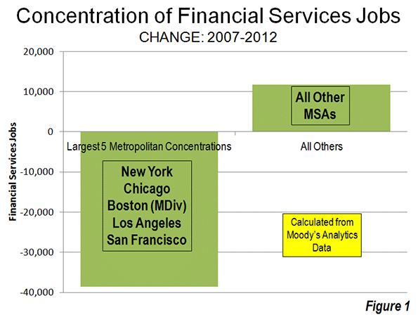
    However, the New York metropolitan area and the other four largest concentrations of financial sector jobs – New York, Chicago, Boston, Los Angeles and San Francisco – accounted all of the net job losses over the period. Between 2007 and 2012, the five largest financial sector markets, lost 39,000 jobs. Outside these five metropolitan areas, the number of financial sector jobs increased by 12,000 (Figure 1).

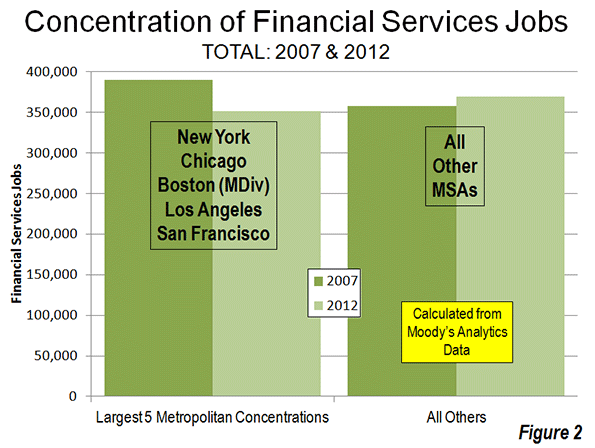
    The extent of this dispersal away from the five most concentrated markets is illustrated by the decline in their financial sector jobs compared to the other metropolitan areas. In 2007, the five most concentrated markets had 32,000 more financial sector jobs than the other metropolitan areas. By 2012, the other metropolitan areas achieved a total number of 19,000 more financial sector jobs than the five most concentrated markets (Figure 2).

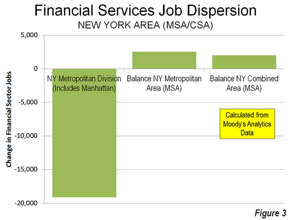
    The dispersion of financial sector jobs is evident even within the New York area itself. The central metropolitan division of the New York metropolitan area (New York-White Plains-Wayne), which includes Manhattan, lost 19,000. However, the balance of the New York metropolitan area experienced a 2500 increase in financial sector jobs, resulting in a overall loss of 16,500 jobs in the metropolitan area

    Not all of the New York metropolitan area jobs were lost to places like Dallas-Fort Worth and Des Moines. The balance of the New York combined statistical area (formerly called consolidated metropolitan statistical areas) added 2000 jobs, principally in the Bridgeport (Fairfield County, Connecticut) metropolitan area (Figure 3). Thus, while the core of the New York metropolitan area was losing 9 percent of its financial sector jobs, the more suburban balance of the combined area gained 11 percent, even as the total region lost employment.

    California: Substantial Financial Sector Employment Losses

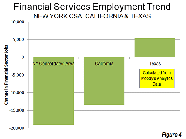
    However, New York’s percentage losses paled by comparison to those in the Los Angeles (Los Angeles and Riverside-San Bernardino) and San Francisco combined (San Francisco and San Jose) statistical areas. The losses in the Los Angeles area were 21 percent, while in the San Francisco area the losses reached 17 percent. The losses in Los Angeles and San Francisco regions exceeded that of the New York combined statistical area, which had three times as many financial sector jobs in 2007. San Diego also experienced a 5percent job loss, while Sacramento’s loss was miniscule. Overall, California lost 17 percent of its financial sector jobs between 2007 and 2012.

    Texas: Gaining Financial Sector Employment

    The large metropolitan areas of Texas and did better. Dallas-Fort Worth, Houston, San Antonio and Austin added 5400 financial sector jobs, an increase of 14 percent (Figure 4).

    Metropolitan Area Performance

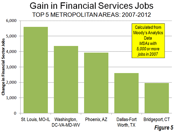
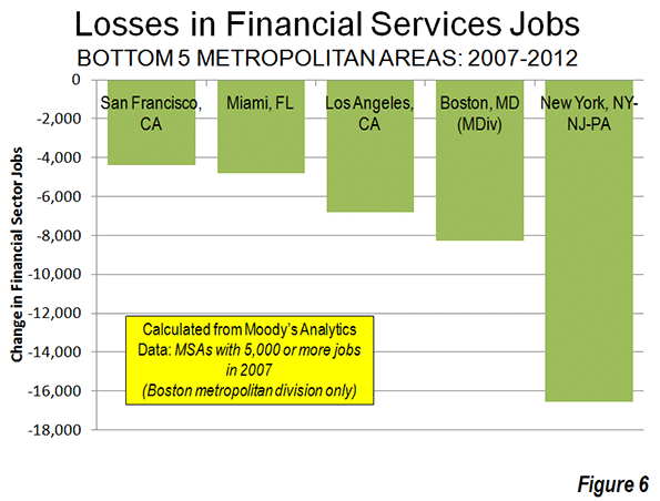
    St. Louis added 5,600 financial sector jobs, the most of any single metropolitan area (Figure 5). The Washington area added 4,400, followed by Phoenix (3,900), Dallas-Fort Worth (2,600) and Bridgeport (2,000). New York, as mentioned above, lost 16,500 financial sector jobs, the most of any individual metropolitan area (Figure 6). Boston had the second largest loss (8,300), followed by Los Angeles (6,800), Miami (4,800) and San Francisco (4,400).

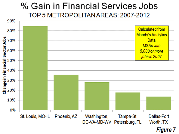
    The metropolitan areas with the largest percentage gains include net job leader St. Louis which grew 85 percent (Figure 7). Phoenix gained 36 percent, Washington 28 percent, Tampa-St. Petersburg 18 percent and Dallas-Fort Worth 14 percent. Des Moines, which had only 1,400 financial sector jobs in 2007 had the largest percentage gain, at 96 percent.

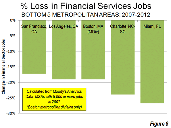
    Miami had the largest loss, at 27 percent (Figure 8). Charlotte, having risen to prominence with its large banks may have been in the wrong place at the wrong time, losing 24 percent of its financial sector jobs, followed by Boston and Los Angeles (19 percent) and San Francisco (17 percent).

    Dispersing to Lower Density Areas

    The data is not sufficiently precise to distinguish between central business district, urban core and suburban trends. However, the metropolitan areas with high density historical core municipalities (above 10,000 persons per square mile or 4,000 per square kilometer in 2010), suffered a loss of 35,000 financial sector jobs between 2007 and 2012, more than the total national metropolitan loss of 27,000. The six high density historical core municipalities (Note 2) include New York, Chicago, Philadelphia Boston, San Francisco and Miami all suffered significant losses while the metropolitan areas with less dense cores gained 9,000 financial sector jobs (Figure 9).

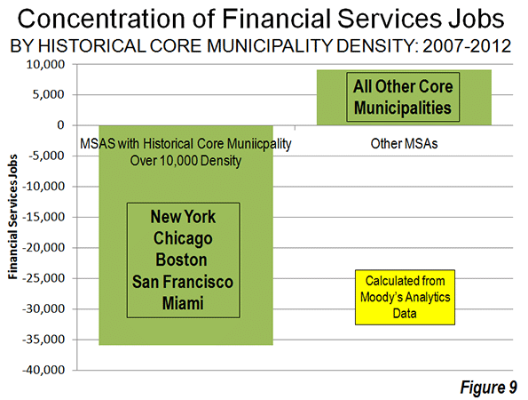
    Further, the losses were concentrated in the metropolitan areas with the four most dense major urban areas, Los Angeles, San Francisco, San Jose and New York and the losses in these areas exceeded the overall industry loss. This movement away from density reinforces the often misconstrued conclusions of the Santa Fe Institute Urban Scaling research to the effect that metropolitan area size was a principal determinant of productivity, however not urban density (see: Density is Not the Issue: The Urban Scaling Research). Larger, less dense regions did far better — for example Houston, Dallas and St. Louis — than their more dense rivals.

    Dispersion to Housing Affordability

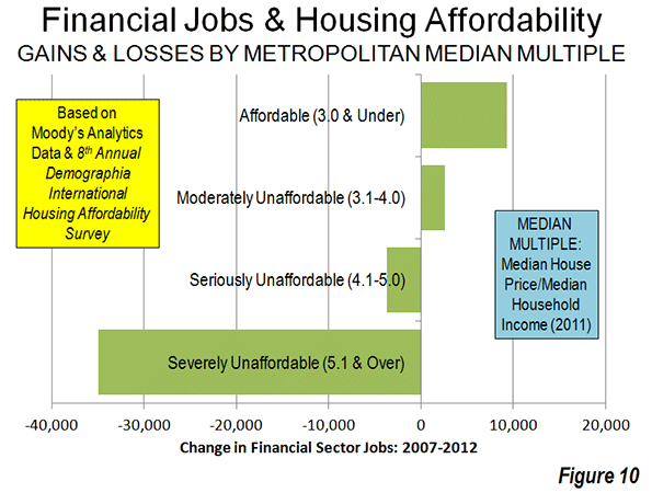
    There is also a strong trend of financial sector job gains where housing is more affordable and job losses where housing is less affordable. This is indicated by the median multiple (median house price divided by gross median household income) data from the 8th Annual Demographia International Housing Affordability Survey (Table below).


    Demographia International Housing Affordability Survey

    Housing Affordability Rating Categories

    Rating

    Median Multiple

    Severely Unaffordable

    5.1 & Over

    Seriously Unaffordable

    4.1 to 5.0

    Moderately Unaffordable

    3.1 to 4.0

    Affordable

    3.0 & Under


    Metropolitan areas rated as affordable (median multiple 3.0 or lower) gained 9,300 financial sector jobs between 2007 and 2012. Metropolitan areas rated moderately unaffordable (median multiple 3.1 to 4.0) gained 2,600 jobs. The metropolitan areas with the most unaffordable housing suffered a net loss in financial sector jobs. Seriously unaffordable (median multiple 4.1 to 5.0) metropolitan areas lost 3,700 jobs. Metropolitan areas rated seriously unaffordable (median multiple 5.1 or higher) lost 35,000 jobs. This is more than the overall loss reported in the data of 27,000 (Figure 10).

    Financial Sector Jobs: Reflecting Urban Dispersion

    The dispersion of financial sector jobs away from concentrated areas may come as a surprise, given the close association that the industry has with the largest central business districts. Yet, the trend mirrors the more general, but overwhelming trends of dispersion indicated over the last decade in both population and domestic migration.

    Wendell Cox is a Visiting Professor, Conservatoire National des Arts et Metiers, Paris and the author of “War on the Dream: How Anti-Sprawl Policy Threatens the Quality of Life.”

    ——

    Note 1: The data used in this analysis is limited to that provided in The Wall Street Journal article. Data was provided for only is only for a part of the Boston metropolitan area (the Boston-Quincy metropolitan division).

    Note 2: In 1940, at least 15 of the historical core municipalities had population densities exceeding 10,000 per square mile (4,000 per square kilometer)

    Photo by Flickr user IABoomerFlickr

  • Urban Housing: A Master Plan for the Few

    How we, as a nation, find bounty and beauty in the future depends upon how we react to two trends emerging from the recent difficult period in American urbanism. The first of these trends is the increasing lack of affordability in mainstream urban America, with the costs of maintaining a middle-class lifestyle at a level where distinct have/have-not lines are now drawn. The second is the increasing authoritarianism in mainstream urban America, where decisions about how our cities function are guided by a new array of authority figures that represent the common good. Both trends point to a disempowerment of a vast section of the American population.

    Our loss of housing affordability is an insidious development that will continue to eat away at the urban triumphalism that marked the beginning of this century. Generation Xers, seniors on fixed incomes and the struggling middle class will have much in common during the coming decade, with fewer and fewer housing solutions designed for them. If half of our consumer goods are purchased by the top ten percent, then the rest of us are increasingly irrelevant in terms of goods, and services, as well as in housing,

    Affordability on Main Street was once a concern of Wall Street. It was broadly known as Fordism, from the days when Henry Ford paid decent wages so that his workers could afford his new product, the car. Today, with Main Street on its knees, Fordism is dead and Wall Street turns more and more to itself, and to large, multinational conglomerates for profits. Volume generated by the middle class comes from a few companies like Apple, and, as the class shrinks, psychological distance between the haves and have-nots widens the gap, especially for those with memories of the material wealth they had in earlier days.

    Solutions to the affordability gap in the urban realm are conspicuous by their absence. Desirable addresses, decent houses, and access to amenities are now the province of relatively few, who are serviced by those on the outside, commuting into town from less hip and trendy places. New residential housing, driven by the Wall Street investment community, is geared towards the market-rate. The linkage between mass transit and affordable housing has been deftly snipped apart by the investment community, where the topic of affordable housing generates a yawn.

    Solutions? We might do well to investigate anti-urban trends, where peripheral and rural communities are stable and growing, and look at how these communities cope. Housing solutions like prefabricated units (think trailer parks, America’s answer to the favela) might be studied.

    Non-affordability, as a trend, is strongly linked to a co-evolutionary partner that is driving a wedge between the haves and have-nots: an authority figure which has become a new interlocutor in of the urban conversation, a sort of urban do-gooder to save us from ourselves, pushing more requirements and accepting fewer improvisations. Affordable housing has less to do with the square footage that is in that space, and more to do with the ingredients found within the square footage.

    The gloved hand of quasi-government authority has come to rest upon our cities with an increasingly tight grip, in the name of the green lobby or in the name of the traditional town.

    Cities underwent rapid change in the fifties and sixties due to the car, and subsequently parking garages, commercial strips, suburbs and highway overpasses sprouted. All these developments facilitated growth and expansion. Americans were remarkably unsentimental about their historic urban fabric, and notably experimental about innovative technological solutions to remove obstacles to this growth.

    Today, our confidence is shaken. The rise of authorities to dictate urban form signals that the era of innovation and improvisation is over, and that American cities are entering a new era of more rigid control of what gets built. The authority, in the form of a Master Plan, treats the city as if it were a vast, private land holding, and its citizens as if they were animals in a forest that was about to be developed.

    Master Plans have already been passed in Denver, Philadelphia, and Miami, and are on the boards for other cities in 2013. When a developer Master-Plans his land, he relies upon a Master to create the vision for the land, and this Master – credentialed, experienced, and hopefully talented – sets out the form of the future construction. The Master may have a passing interest in the voices from the land itself – biologists who count endangered species, for example – but the overarching form comes out of his mind, and the developer then implements the plan.

    When the same process is used upon a living, dynamic city, the results vary. Future citizens, bound by the edicts of this Master Plan, may submit to the Master’s vision, or, they may chafe at its restrictions. These Master Plans are formulated with great citizen input and collaboration until the time at which they are set. After that, they are to be obeyed. The plans create a physical model, or form; they are like a glove into which the city must fit its future hand.

    Master Plans attempt to take all possibilities into account, while creating ‘perfect’ rules by which the city can grow. Physical order, it is hoped, will lead to social order, as buildings once again behave like they did before the car. Should the future evolve as the Master predicts, the glove will fit the grown-up hand However, the future is notoriously difficult to predict.

    The new regulatory regime has become fashionable as citizens, sickened by the dirt and ugliness of our cities, seek an authority to keep us from temptation. As such, Master Plans arise from a noble intent not unlike the one held by city planners at the turn of the 20th century: to improve urban hygiene. And they may be correct in thinking that emulating urban form as it was before the car might just bring walkability back into fashion once again.

    The future, however, is ephemeral and dynamic, not static like a Master Plan, and may become frustrating to the Master Planners who have created elaborate blueprints for our nation’s cities. America’s fluid economic situation is giving rise to in-home workplaces, negating the need for traditional office space. It is giving rise to in-home manufacturing, reducing the size and complexity of factories. Warehouses, in today’s era of just-in-time-delivery, are being converted into other uses. And finally, Master Plans all seem to reminisce about Main Streets with lovely, tree-lined rows of shops under apartment (parking would be safely tucked in the back). These shops, renting for top dollar, stand empty today, made even more remote from reality with the advent of online retail.

    In short, Master Plans that rigidly enforce an urban form of yesteryear may become next year’s white elephants. Cities bearing these master plans may find themselves with a regulatory burden that is reducing their desirability as places to live and work. Following these cities specifically, learning of their successes and failures, and analyzing how Master Plans are working will tell us a lot about the future.

    As affordability is reduced and regulation increases, American cities could soon evolve into forms that are quite different from those of our past. And as confidence in the future fades, our cities take increasing comfort in the past, fossilizing our urban form as the Romans once did. For those underneath the affordability curve, improvisation and innovation will still continue, and insight into both of these emerging trends will yield a new sense of direction for the places where we live and work.

    Richard Reep is an architect and artist who lives in Winter Park, Florida. His practice has centered around hospitality-driven mixed use, and he has contributed in various capacities to urban mixed-use projects, both nationally and internationally, for the last 25 years.

    Flickr photo by alesh houdek: A walled and gated Miami home.

  • Flocking Elsewhere: The Downtown Growth Story

    The United States Census Bureau has released a report (Patterns of Metropolitan and Micropolitan Population Change: 2000 to 2010.) on metropolitan area growth between 2000 and 2010. The Census Bureau’s the news release highlighted population growth in downtown areas, which it defines as within two miles of the city hall of the largest municipality in each metropolitan area. Predictably, media sources that interpret any improvement in core city fortunes as evidence of people returning to the cities (from which they never came), referred to people "flocking" back to the "city" (See here and here, for example).

    Downtown Population Trends: Make no mistake about it, the central cores of the nation’s largest cities are doing better than at any time in recent history. Much of the credit has to go to successful efforts to make crime infested urban cores suitable for habitation, which started with the strong law enforcement policies of former New York Mayor Rudy Giuliani.

    However, to characterize the trend since 2000 as reflective of any "flocking" to the cities is to exaggerate the trend of downtown improvement beyond recognition. Among the 51 major metropolitan areas (those with more than 1 million population), nearly 99 percent of all population growth between 2000 and 2010 was outside the downtown areas (Figure 1).

    There was population growth in 33 downtown areas out of the 51 major metropolitan areas. As is typical for core urban measures, nearly 80 percent of this population growth was concentrated in the six most vibrant downtown areas, New York, Chicago, Philadelphia, Washington, Boston and San Francisco.

    If the next six fastest-growing downtown areas are added to the list (Dallas-Fort Worth, Houston, Los Angeles, Portland, San Diego and Seattle), downtown growth exceeds the national total of 205,000 people, because the other 39 downtown areas had a net population loss. Overall, the average downtown area in the major metropolitan areas grew by 4000 people between 2000 and 2010. That may be a lot of people for a college lacrosse game, but not for a city. While in some cases these increases were substantial in percentage terms, the population base was generally small, which was the result of huge population losses in previous decades as well as the conversion of old disused office buildings, warehouses and factories into residential units.

    Trends in the Larger Urban Cores: The downtown population gains, however, were not sufficient to stem the continuing decline in urban core populations. Among the 51 major metropolitan areas, the aggregate data indicates a loss of population within six miles of city hall. In essence, the oasis of modest downtown growth was more than negated by losses surrounding the downtown areas. Virtually all the population growth in the major metropolitan areas lay outside the six mile radius core, as areas within the historical urban core, including downtown, lost 0.4 percent.

    Even when the radius is expanded to 10 miles, the overwhelming majority of growth remains outside. Approximately 94 percent of the aggregate population growth of the major metropolitan areas occurred more than 10 miles from downtown (Figure 2). Figure 3 shows that more than one-half of the growth occurred 20 miles and further from city hall. Further, the population growth beyond 10 miles (10-15 mile radius, 15-20 miles radius and 20 mile and greater radius) from the core exceeded the (2000) share of population, showing the continuing dispersal of American metropolitan areas (Figure 4).

    Chicago: The Champion? The Census Bureau press release highlights the fact that downtown Chicago experienced the largest gain in the nation. Downtown Chicago accounted for 13 percent of the metropolitan area’s growth with an impressive 48,000 new residents. However, while downtown Chicago was prospering, people were flocking away from the rest of the city. Within a five mile radius of the Loop, there was a net population loss of 12,000 and a net loss of more than 200,000 within 20 miles (Figure 5). Only within the 36th mile radius from city hall is there a net population gain.

    Cleveland: Comeback City and Always Will Be? In view of Cleveland’s demographic decline (down from 915,000 in 1950 to 397,000 in 2010), any progress in downtown Cleveland is welcome. But despite the frequently recurring reports, downtown Cleveland’s population growth was barely 3,000. Despite this gain, the loss within a 6 mile radius was 70,000 and 125,000 within a 12 mile radius. Beyond the 12- mile radius, there was a population increase of nearly 55,000, which insufficient to avoid a metropolitan area population loss.

    Other Metropolitan Areas: A total of 30 major metropolitan areas suffered core population losses, despite the fact that many had downtown population increases.

    • Five major metropolitan areas suffered overall population losses (Buffalo, Cleveland, Detroit, Pittsburgh and Katrina ravaged New Orleans).
    • St. Louis, with a core city that holds the modern international record for population loss (from 857,000 in 1950 to 319,000 in 2010), experienced a population decline within a 27 mile radius of city hall. Approximately 150 percent of the growth in the St. Louis metropolitan area was outside the 27 mile radius. Even so, there was an increase of nearly 6,000 in the population of downtown St. Louis.
    • There were population losses all the way out to a considerable distance from city halls in Memphis (16 mile radius), Cincinnati (15 mile radius) and Birmingham (14 mile radius). The three corresponding downtown areas also lost population.
    • Despite having one of the strongest downtown population increases (12,000), population declined within a 10 mile radius of the Dallas city hall. This contrasts with nearby Houston, which also experienced a strong downtown increase (10,000) but no losses at any radius of the urban core.
    • Milwaukee experienced a small downtown population increase (2,000), but had a population loss within an11 mile radius.

    The other 21 major metropolitan areas experienced population gains throughout. Even so, most of the growth (77 percent) was outside the 10 mile radius. San Jose had the most concentrated growth, with only 24 percent outside a 10 miles radius from city hall. All of the other metropolitan areas had 60 percent or more of their growth outside a 10 mile radius from city hall.

    As we have observed before, 2000 to 2010 was, unlike the 1970s and other decades, more friendly to the nation’s core cities, although less so than the previous decade. Due to the repurposing of old offices and other structures, sometimes aided by subsidies, small downtown slivers may have done better than at any time since before World War II. But the data is clear. Suburban growth was stronger in the 2000s than in the 1990s. The one percent flocked to downtown and the 99 percent flocked to outside downtown.

    Population Loss Radius: Major Metropolitan Areas
    Miles from City Hall of Historical Core Municipality*
    Major Metropolitan Areas (Over 1,000,000 Population Share of Metropolitan Growth Population Loss Radius (Miles)
    "Outside Downtown" (2- Mile Radius) Outside 5-Mile Radius Outside 10-Mile Radius
    MAJOR METROPOLITAN AREAS: TOTAL 98.7% 100.4% 93.5% 6
    Atlanta, GA 99.6% 101.1% 99.9% 9
    Austin, TX 98.1% 96.7% 81.9% 0
    Baltimore, MD 106.5% 118.7% 99.5% 9
    Birmingham, AL 104.2% 132.5% 124.9% 14
    Boston, MA-NH 90.8% 76.9% 67.3% 0
    Buffalo, NY Entire Metropolitan Area Loss
    Charlotte, NC-SC 99.1% 97.4% 75.0% 3
    Chicago, IL-IN-WI 86.7% 103.3% 144.6% 35
    Cincinnati, OH-KY-IN 105.1% 126.8% 135.2% 15
    Cleveland, OH Entire Metropolitan Area Loss
    Columbus, OH 100.5% 104.3% 86.9% 7
    Dallas-Fort Worth, TX 99.0% 101.0% 100.7% 10
    Denver, CO 98.0% 100.3% 89.8% 5
    Detroit,  MI Entire Metropolitan Area Loss
    Hartford, CT 99.2% 92.7% 67.2% 0
    Houston, TX 99.2% 99.5% 98.0% 0
    Indianapolis. IN 102.1% 112.1% 89.6% 8
    Jacksonville, FL 100.2% 106.3% 85.3% 8
    Kansas City, MO-KS 99.5% 109.0% 113.3% 12
    Las Vegas, NV 101.4% 98.0% 63.6% 4
    Los Angeles, CA 97.3% 102.2% 97.6% 8
    Louisville, KY-IN 102.5% 108.5% 90.9% 8
    Memphis, TN-MS-AR 101.2% 118.5% 143.5% 16
    Miami, FL 99.4% 93.0% 91.3% 0
    Milwaukee,WI 95.9% 109.0% 107.5% 11
    Minneapolis-St. Paul, MN-WI 97.4% 99.2% 100.1% 7
    Nashville, TN 100.0% 101.4% 92.4% 7
    New Orleans. LA Entire Metropolitan Area Loss
    New York, NY-NJ-PA 93.5% 81.7% 68.9% 0
    Oklahoma City, OK 100.1% 96.8% 83.5% 2
    Orlando, FL 99.7% 99.4% 84.2% 0
    Philadelphia, PA-NJ-DE-MD 92.6% 98.8% 96.3% 7
    Phoenix, AZ 100.7% 101.8% 93.6% 6
    Pittsburgh, PA Entire Metropolitan Area Loss
    Portland, OR-WA 95.0% 91.5% 62.7% 0
    Providence, RI-MA 96.2% 91.7% 70.1% 0
    Raleigh, NC 99.6% 93.0% 67.7% 0
    Richmond, VA 95.7% 91.7% 70.2% 0
    Riverside-San Bernardino, CA 99.5% 97.2% 85.8% 0
    Rochester, NY 146.9% 149.3% 82.5% 9
    Sacramento, CA 99.9% 94.4% 79.5% 0
    Salt Lake City, UT 98.9% 95.1% 84.1% 0
    San Antonio, TX 101.1% 102.5% 86.7% 7
    San Diego, CA 96.3% 94.1% 90.1% 0
    San Francisco-Oakland, CA 90.7% 87.6% 82.2% 0
    San Jose, CA 95.1% 79.1% 24.3% 0
    Seattle, WA 96.5% 91.9% 81.4% 0
    St. Louis,, MO-IL 94.8% 119.7% 148.9% 27
    Tampa-St. Petersburg, FL 98.6% 97.8% 83.7% 0
    Virginia Beach-Norfolk, VA-NC 93.1% 90.1% 82.3% 0
    Washington, DC-VA-MD-WV 97.5% 94.5% 87.9% 0
    Calculated from Census Bureau data
    *Except in Virginia Beach-Norfolk, Where Virginia Beach is used


    ——-

    Notes:

    Population Weighted Density: In its report, the Census Bureau uses "population-weighted density," rather than average population density to compare metropolitan areas. The Census Bureau justified this use as follows:

    "Overall densities of CBSAs can be heavily affected by the size of the geographic units for which they are calculated. Metropolitan and micropolitan statistical areas are delimited using counties as their basic building blocks, and counties vary greatly across the country in terms of their geographic size. With this in mind, one way of measuring actual residential density is to examine the ratio of population to land area at the scale of the census tract, which—of all the geographic units for which decennial census data are tabulated—is typi­cally the closest in scale to urban and subur­ban neighborhoods".

    The Census Bureau rightly points out the problem with comparing metropolitan area density. However, it is a problem of the federal government’s making, by virtue of using metropolitan area building blocks (counties) that are sometimes too large for designation of genuine metropolitan areas. These difficulties have been overcome by the national census authorities in Japan in Canada, for example, where smaller building blocks are used (such as municipalities or local government authorities).

    Further, the Census Bureau already has a means for measuring population density at the census tract level, which is "the closest in scale to urban and suburban neighborhoods." This is the urban area.

    "Population-weighted density" is an interesting concept that can provide an impression of the density that is perceived by the average resident of the metropolitan area. Unfortunately, in its report, the Census Bureau is less than precise with its terminology and repeatedly fails to modify the term density with the important "population-weighted" qualification. This could lead to considerable misunderstanding.

    The Census Bureau did not provide average population densities based for the mileage radii. Because of large bodies of water (such as Lake Michigan in Chicago can reduce land areas, it was not possible to estimate population densities by radius.

    Census Bureau Revision of Incorrect Report: We notified the Census Bureau of errors in its press release and report on September 27. The problems included substitution of San Francisco population data for Salt Lake City as well as metropolitan population in the supporting spreadsheet file. On September 28, the Census Bureau issued a revised press release and report to rectify the errors. Later the erroneous spreadsheet was withdrawn and had not been re-posted as of October 1. We have made corrections to the spreadsheet for this analysis.

    Note: Larger "Downtown" Populations in Smaller Metropolitan Areas: Because of the broad 2-mile radius measure used by the Census Bureau, most of the population increase characterized as relating to downtown occurred outside the major metropolitan areas. This is simply because in smaller metropolitan areas, such an area (12.6 square miles) will necessarily contain a larger share of the metropolitan area. Further, many smaller metropolitan areas are virtually all suburban and had experienced little or no core population losses over the decades that have been so devastating to many large core municipalities. On average, 2.7 percent of the population of major metropolitan areas was within a two-mile radius of city hall in 2010. By comparison, in smaller metropolitan areas, approximately 12.7 percent of the population was within a two mile radius.

    Photograph: Chicago Suburbs: (where nearly all the growth occurred), by author