Tag: Pittsburgh

  • Anorexic Vampires and the Pittsburgh Potty: The Story of Rust Belt Chic

    “Rust Belt Chic is the opposite of Creative Class Chic. The latter [is] the globalization of hip and cool. Wondering how Pittsburgh can be more like Austin is an absurd enterprise and, ultimately, counterproductive. I want to visit the Cleveland of Harvey Pekar, not the Miami of LeBron James. I can find King James World just about anywhere. Give me more Rust Belt Chic.” Jim Russell, blogger at Burgh Diaspora

    National interest in a Rust Belt “revival” has blossomed. There are the spreads in Details, Atlantic Cities, and Salon, as well as an NPR Morning Edition feature. And so many Rust Belters are beginning to strut a little, albeit cautiously–kind of like a guy with newly-minted renown who’s constantly poking around for the “kick me” sign, if only because he has a history of being kicked.

    There’s a term for this interest: “Rust Belt Chic”. But the term isn’t new, nor is the coastal attention on so-called “flyover” country. Which means “Rust Belt Chic” is a term with history–loaded even–as it arose out of irony, yet it has evolved in connotation if only because the heyday of Creative Class Chic is giving way to an authenticity movement that is flowing into the likes of the industrial heartland.

    About that historical context. Here’s Joyce Brabner, wife of Cleveland writer Harvey Pekar, being interviewed in 1992, and introducing the world to the term:

    I’ll tell you the relationship between New York and Cleveland. We are the people that all those anorexic vampires with their little black miniskirts and their black leather jackets come to with their video cameras to document Rust Belt chic. MTV people knocking on our door, asking to get pictures of Harvey emptying the garbage, asking if they can shoot footage of us going bowling. But we don’t go bowling, we go to the library, but they don’t want to shoot that. So, that’s it. We’re just basically these little pulsating jugular veins waiting for you guys to leech off some of our nice, homey, backwards Cleveland stuff.

    Now to understand Brabner’s resentment we step back again to 1989. Pekar–who is perhaps Cleveland’s essence condensed into a breathing human–had been going on Letterman. Apparently the execs found Pekar interesting, and so they’d book him periodically, with Pekar–a file clerk at the VA–given the opportunity to promote his comic book American Splendor. Well, after long, the relationship soured. Pekar felt exploited by NYC’s life of the party, with his trust of being an invited guest giving way to the realization he was just the jester. So, in what would be his last appearance, he called Letterman a “shill for GE” on live TV. Letterman fumed. Cracked jokes about Harvey’s “Mickey Mouse magazine” to a roaring crowd before apologizing to Cleveland for…well…being us.


    Think of this incident between two individuals–or more exactly, between two realities: the famed and fameless, the make-up’d and cosmetically starved, the prosperous and struggled–as a microcosm for regional relations, with the Rust Belt left to linger in a lack of illusions for decades.

    But when you have a constant pound of reality bearing down on a people, the culture tends to mold around what’s real. Said Coco Chanel:

    “Hard times arouse an instinctive desire for authenticity”.

    And if you can say one thing about the Rust Belt–it’s that it’s authentic. Not just about resiliency in the face of hardship, but in style and drink, and the way words are said and handshakes made. In the way our cities look, and the feeling the looks of our cities give off. It’s akin to an absence of fear in knowing you aren’t getting ahead of yourself. Consider the Rust Belt the ground in the idea of the American Dream.


    2012-06-29-toledo_rust_harticle_intro.jpg

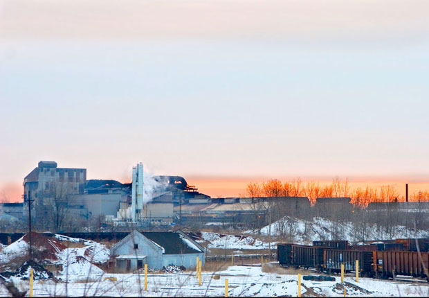
    Photo credit: Sean Posey

    Of course this is all pretty uncool. I mean, pierogi and spaetzle sustain you but don’t exactly get you off. Meanwhile, over the past two decades American cities began their creative class crusade to be the next cool spot, complete with standard cool spot amenities: clubs, galleries, bike paths, etc. Specifically, Richard Florida, an expert on urbanism, built an empire advising cities that if they want creative types they must in fact get ahead of themselves, as the young are mobile and modish and are always looking for the next crest of cool.

    These “Young and the Restless”–so they’re dubbed–are thus seeking and hunting, but also: apparently anxious. And this bit of pop psychology was recently illustrated beautifully in the piece “The Fall of the Creative Class” by Frank Bures:

    I know now that this was Florida’s true genius: He took our anxiety about place and turned it into a product. He found a way to capitalize on our nagging sense that there is always somewhere out there more creative, more fun, more diverse, more gay, and just plain better than the one where we happen to be.

    After long–and with billions invested not in infrastructure, but in the ephemerality of our urbanity–chunks of America had the solidity of air. Places without roots. People without place. We became a country getting ahead of itself until we popped like a blowfish into pieces. Suddenly, we were all Rust Belters, and living on grounded reality.

    Then somewhere along the way Rust Belt Chic turned from irony into actuality, and the Rust Belt from a pejorative into a badge of honor. Next thing you know banjo bingo and DJ Polka are happening, and suburban young are haunting the neighborhoods their parents grew up in then left. Next thing you know there are insights about cultural peculiarities, particularly those things once shunned as evidence of the Rust Belt’s uncouthness, but that were–after all–the things that rooted a history into a people into a place.

    Take the Pittsburgh Potty. For recent generations it was about the shame of having a toilet with no walls becoming the pride of having a toilet with no walls. From Pittsburgh Magazine:

    We purchased a house with a stray potty, and we’ve given that potty a warm home. But we simply pretended as if the stray potty didn’t exist, and we certainly didn’t make eye contact with the potty when we walked past it to do laundry.

    The Pittsburgh Potty is basically a toilet in the middle of many Pittsburgh basements. No walls and no stalls. It existed so steel workers can get clean and use the bathroom without dragging soot through ma’s linoleum.


    2012-06-29-PghPotty.JPG

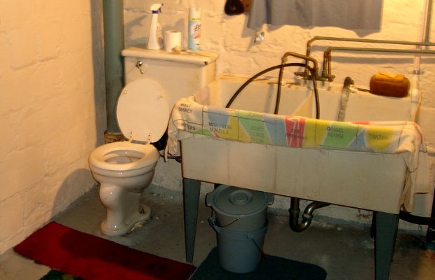
    Photo credit: Brookline Connection

    Authentic: yes. Cool? A toilet?

    Only in the partly backward Rust Belt of Harvey Pekar and friends. From the twitter feed of @douglasderda who asked “What is a Pittsburgh Potty?” Some responses follow:

    “I told my wife I wanted to put ours back in, but she refused. I threatened to use the stationary tubs.”

    “In my house, that would be known as my husband’s bathroom.”

    “It’s a huge selling feature for PGH natives. I’m not kidding. We weren’t so lucky in our SS home.”

    “We’re high class people. Our Pittsburgh Potty has a bidet. Well, it’s a hose mounted on the bottom, but still ….”

    Eventually, this satisfaction found in re-rooting back into our own Rust Belt history has become the fuel of wisdom for even Coastal elites. Here’s David Brooks recently talking about the lessons of Bruce Springsteen’s global intrigue being nested in the locality that defines Rust Belt Chic:

    If your identity is formed by hard boundaries, if you come from a specific place…you are going to have more depth and definition than you are if you grew up in the far-flung networks of pluralism and eclecticism, surfing from one spot to the next, sampling one style then the next, your identity formed by soft boundaries, or none at all.

    Brooks continues:

    The whole experience makes me want to pull aside politicians and business leaders and maybe everyone else and offer some pious advice: Don’t try to be everyman…Go deeper into your own tradition. Call more upon the geography of your own past. Be distinct and credible. People will come.

    And some are coming, albeit slowly, unevenly. But more importantly, as a region we are once again becoming–but nothing other than ourselves.

    Authenticity, reality: this was and always will be the base from which we wrestle our dreams back down to solid ground.

    American splendor, indeed.

    This is an excerpt from the forthcoming book Rust Belt Chic: A Cleveland Anthology. It first appeared at RustBeltChic.com.

  • The Cities Where A Paycheck Stretches The Furthest

    When we think of places with high salaries, big metro areas like New York, Los Angeles or San Francisco are usually the first to spring to mind. Or cities with the biggest concentrations of educated workers, such as Boston.

    But wages are just one part of the equation — high prices in those East and West Coast cities mean the fat paychecks aren’t necessarily getting the locals ahead. When cost of living is factored in, most of the places that boast the highest effective pay turn out to be in the less celebrated and less expensive middle part of the country. My colleague Mark Schill of Praxis Strategy Group and I looked at the average annual wages in the nation’s 51 largest metropolitan statistical areas and adjusted incomes by the cost of living. The results were surprising and revealing.

    In first place is Houston, where the average annual wage in 2011 was $59,838, eighth highest in the nation. What puts Houston at the top of the list is the region’s relatively low cost of living, which includes such things as consumer prices and services, utilities and transportation costs and, most importantly, housing prices: The ratio of the median home price to median annual household income in Houston is only 2.9, remarkably low for such a dynamic urban region; in San Francisco a house goes for 6.7 times the median local household income. Adjusted for cost of living, the average Houston wage of $59,838 is worth $66,933, tops in the nation.

    Most of the rest of the top 10 are relatively buoyant economies with relatively low costs of living. These include Dallas-Fort Worth (fifth), Charlotte, N.C. (sixth), Cincinnati (seventh), Austin, Texas (eighth), and Columbus, Ohio (10th). These areas all also have housing affordability rates below 3.0 except for Austin, which clocks in at 3.5. Similar  situations down the list include such mid-sized cities as  Nashville, (11th), St.Louis (12th), Pittsburgh, (13th), Denver (15th) and New Orleans (16th).

    One major surprise is the metro area in third place: Detroit-Warren-Livonia, Mich. This can be explained by the relatively high wages paid in the resurgent auto industry and, as we have reported earlier, a huge surge in well-paying STEM (science, technology, engineering and math-related) jobs. Combine this with some of the most affordable housing in the nation and sizable reductions in unemployment — down 5% in Michigan over the past two years, the largest such drop in the nation. This longtime sad sack region has reason to feel hopeful.

    Only two expensive metro areas made our top 10 list. One is Silicon Valley (San Jose-Sunnyvale-Santa Clara), where the average annual wage last year of $92,556, the highest in the nation, makes up for its high costs, which includes the worst housing affordability among the 51 metro areas we considered: housing prices are nearly 7 times the local median income. Adjusted for cost of living, that $92,556 paycheck is worth $61,581, placing the Valley second on our list.

    In ninth place is Seattle, which placed first on our lists of the cities leading the way in manufacturing and STEM employment growth. Housing costs, while high, are far less than in most coastal California or northeast metropolitan areas.

    What about the places we usually associate with high wages and success? The high pay is offset by exceedingly high costs. Brain-rich Boston has the fifth-highest income of America’s largest metro areas but its high housing and other costs drive it down to 32nd on our list. San Francisco ranks third in average pay at just under $70,000, some $20,000 below San Jose, but has equally high costs. As a result, the metro area ranks a meager 39th on our list.

    Much the same can be said about New York which, like San Francisco, is home to many of the richest Americans and best-paying jobs. The average paycheck clocks in at $69,029, fourth-highest in the country, but high costs, particularly for housing, eat up much of the locals’ pay: adjusted for cost of living, the average salary is worth $44,605. As a result, the Big Apple and its environs rank only 41st on our list.

    Long associated with glitz and glitter, Los Angeles does particularly poorly, coming in 46th on our list. The L.A. metro area may include Beverly Hills, Hollywood and Malibu, but it also is home to South-Central Los Angeles, East L.A. and small, struggling industrial cities surrounding downtown. The relatively modest average paycheck of $55,000 annually, 12th on our list, is eaten up by a cost of living that is well above the national average. This creates an unpleasant reality for many non-celebrity Angelenos.

    Many of the metro areas that rank highly on our list have enjoyed rapid population growth and strong domestic in-migration. Houston, Dallas-Fort Worth, and Austin all have been among the leaders the nation in both domestic migration and overall growth both in the last decade and so far in this one. In the past year, for example, Dallas led the nation with 40,000 net migrants while Austin’s population growth, 4 percent, was the highest rate among the large metropolitan areas.

    In contrast, many of the cities toward the bottom of our list — notably the Los Angeles and New York areas — have led the country in domestic outmigration. Between 2000 and 2009, the nation’s cultural capitals lost a total of over 3 million people to other parts of the country. Although migration has slowed in the recession, the pattern has continued since 2010.

    And how about the future? Income and salary growth has been so tepid recently that few large cities can claim to have made big gains over the past five years; there has been continued volatility as some regions that did worst in the past decade — for example San Francisco — pick up steam. Unfortunately any growth in such highly regulated areas also tends to increase costs rapidly, particularly for housing. In California, this is made much worse by both soaring taxes and a regulatory regime that drives up costs faster than income games.

    Similarly these high prices seem to have the effect of driving out middle-class workers; places like New York, Los Angeles and San Francisco have extraordinary concentrations of both rich and poor workers but fewer in the middle. As we pointed out in our annual job and STEM rankings, many technology, manufacturing and business service jobs are heading not to the hotspots but more to the central part of the country.

    Over time, it seems clear that, for the most part, the best prospects for the future lie in places that both experience income and employment gains but remain relatively affordable. These include some cities that didn’t crack the top 10 of our list but appear to be gaining ground, such as Nashville, Pittsburgh, St. Louis, San Antonio and New Orleans, a once beleaguered city that has experienced the nation’s fastest per capita personal income growth since 2005.

    Maintaining affordability and a wide range of high-paying jobs many not be as glamorous a metric for success as the number of hip web startups or the concentration of educated people. But over time it is likely to be about as good a guide to future prospects as we have.

    Joel Kotkin is executive editor of NewGeography.com and is a distinguished presidential fellow in urban futures at Chapman University, and contributing editor to the City Journal in New York. He is author of The City: A Global History. His newest book is The Next Hundred Million: America in 2050, released in February, 2010.

    This piece originally appeared in Forbes.

    Houston photo by BigStockPhoto.com.


    Note: The table below was updated with 2012 data, so it may not match the narrative above discussing 2011 data. Contact Mark Schill at mark@praxissg.com.

    Metropolitan Pay per Job 2012 – Adjusted for Cost of Living
    MSA Name 2012 Avg. Annual Wage Unadj. Rank 2012 Adj Annual Wage Adj. Rank Rank Change
    Houston-Sugar Land-Baytown, TX $67,279 7 $75,256 1 6
    San Jose-Sunnyvale-Santa Clara, CA $107,515 1 $71,534 2 (1)
    Detroit-Warren-Livonia, MI $60,503 16 $64,571 3 13
    Dallas-Fort Worth-Arlington, TX $60,478 17 $62,867 4 13
    Austin-Round Rock-San Marcos, TX $58,103 19 $62,679 5 14
    Memphis, TN-MS-AR $53,069 36 $61,780 6 30
    Charlotte-Gastonia-Rock Hill, NC-SC $57,506 20 $61,636 7 13
    Atlanta-Sandy Springs-Marietta, GA $58,836 18 $60,844 8 10
    Seattle-Tacoma-Bellevue, WA $67,225 8 $60,237 9 (1)
    Cincinnati-Middletown, OH-KY-IN $54,683 26 $59,828 10 16
    Nashville-Davidson–Murfreesboro–Franklin, TN $53,928 30 $59,787 11 19
    Birmingham-Hoover, AL $52,773 37 $59,563 12 25
    St. Louis, MO-IL $54,112 29 $59,398 13 16
    Columbus, OH $53,634 33 $59,395 14 19
    Denver-Aurora-Broomfield, CO $62,021 11 $59,068 15 (4)
    Washington-Arlington-Alexandria, DC-VA-MD-WV $79,852 2 $58,672 16 (14)
    Chicago-Joliet-Naperville, IL-IN-WI $62,746 10 $58,477 17 (7)
    Pittsburgh, PA $55,004 24 $58,021 18 6
    New Orleans-Metairie-Kenner, LA $54,636 27 $57,151 19 8
    Salt Lake City, UT $53,901 31 $56,978 20 11
    Raleigh-Cary, NC $53,243 34 $56,762 21 13
    Milwaukee-Waukesha-West Allis, WI $55,434 22 $55,825 22 0
    Phoenix-Mesa-Glendale, AZ $53,835 32 $55,788 23 9
    Minneapolis-St. Paul-Bloomington, MN-WI $61,515 14 $55,645 24 (10)
    Oklahoma City, OK $50,641 42 $55,345 25 17
    Jacksonville, FL $51,763 40 $55,126 26 14
    Richmond, VA $55,065 23 $55,010 27 (4)
    Tampa-St. Petersburg-Clearwater, FL $50,462 43 $54,969 28 15
    Louisville/Jefferson County, KY-IN $50,385 44 $54,945 29 15
    Hartford-West Hartford-East Hartford, CT $67,826 6 $54,787 30 (24)
    Kansas City, MO-KS $54,378 28 $54,706 31 (3)
    Philadelphia-Camden-Wilmington, PA-NJ-DE-MD $63,615 9 $54,372 32 (23)
    Cleveland-Elyria-Mentor, OH $54,701 25 $53,946 33 (8)
    Boston-Cambridge-Quincy, MA-NH $73,267 5 $53,363 34 (29)
    San Francisco-Oakland-Fremont, CA $79,137 3 $52,988 35 (32)
    San Antonio-New Braunfels, TX $49,219 47 $52,867 36 11
    Rochester, NY $51,798 39 $52,533 37 2
    Baltimore-Towson, MD $61,542 13 $51,759 38 (25)
    Buffalo-Niagara Falls, NY $50,013 46 $50,723 39 7
    Las Vegas-Paradise, NV $50,378 45 $50,328 40 5
    New York-Northern New Jersey-Long Island, NY-NJ-PA $77,640 4 $50,169 41 (37)
    Portland-Vancouver-Hillsboro, OR-WA $56,134 21 $49,414 42 (21)
    Virginia Beach-Norfolk-Newport News, VA-NC $51,693 41 $49,091 43 (2)
    Miami-Fort Lauderdale-Pompano Beach, FL $52,357 38 $48,012 44 (6)
    Orlando-Kissimmee-Sanford, FL $46,481 48 $47,771 45 3
    San Diego-Carlsbad-San Marcos, CA $61,149 15 $46,822 46 (31)
    Los Angeles-Long Beach-Santa Ana, CA $61,634 12 $46,411 47 (35)
    Providence-New Bedford-Fall River, RI-MA $53,071 35 $42,254 48 (13)
    Riverside-San Bernardino-Ontario, CA $46,084 49 $41,000 49 0
    Indianapolis-Carmel, IN $53,839 No data
    Sacramento–Arden-Arcade–Roseville, CA $59,200 No data
    2012 wage data: EMSI Class of Worker, 2012.3
    Cost of living data: C2ER
  • Moving from the Coast

    For years both government and media have been advancing the notion that   America’s coastal counties are obtaining most of the population growth at the expense of interior counties. For example, the National Oceanic and Atmospheric Administration reported in the 1990s: Coastal areas are crowded and becoming more so every day. More than 139 million people–about 53% of the national total–reside along the narrow coastal fringes.

    NOAA went on to say that the population of the coastal counties is expected to increase by an average of 3600 people per day and noted further that the coastal counties were growing faster than the nation as a whole. NOAA has designated 673 counties on four coasts (Atlantic, Gulf, Pacific and Great Lakes) in the contiguous United States, Hawaii and Alaska as coastal counties.

    Population Growth: In fact, coastal counties are not growing faster than the nation as a whole and were not when NOOA issued the 1990s report. For most of the last 40 years, the nation’s interior counties have been adding more population. From 1970 to 2010, interior counties added 55.7 million new residents, compared to 49.7 million new residents in coastal counties. This is a reversal from 1940 to 1970, when two thirds of the nation’s population growth was in the coastal counties.

    The trends today actually have become more favorable for the interior than at any time in a century. From 2000 to 2010, the interior counties captured more of the nation’s growth than in any decade since 1900 (Table). From 2000 to 2010, the interior counties added 16.0 million residents, 59.6 percent of the nation’s growth compared to 11.4 million new residents in the coastal counties.

    Coastal and Interior Population: Counties
    1900-2010
    Coastal Counties Interior Counties United States
    Year Population Share Change Population Share Change Population Change
    1900         30.2 39.7%         46.0 60.3%         76.2
    1910         38.2 41.4%           8.0         54.0 58.6%           8.0         92.2         16.0
    1920         46.2 43.6%           8.0         59.8 56.4%           5.8       106.0         13.8
    1930         57.4 46.6%         11.2         65.8 53.4%           6.0       123.2         17.2
    1940         62.3 47.1%           4.9         69.8 52.9%           4.0       132.2           9.0
    1950         75.2 49.9%         12.9         75.5 50.1%           5.7       150.7         18.5
    1960         94.4 52.6%         19.2         85.0 47.4%           9.5       179.3         28.6
    1970       109.9 54.0%         15.6         93.5 46.0%           8.5       203.4         24.1
    1980       119.8 52.9%           9.9       106.7 47.1%         13.2       226.5         23.2
    1990       133.4 53.6%         13.6       115.3 46.4%           8.6       248.7         22.2
    2000       148.2 52.7%         14.9       133.2 47.3%         17.9       281.4         32.7
    2010       159.6 51.7%         11.4       149.1 48.3%         16.0       308.7         27.3
    Population in Millions
    Calculated from US Census Bureau Data
    Coastal counties designated by NOAA (673 counties)
    Totals may vary due to rounding


    As of 2010, the coastal counties have 51.7 percent of the nation’s population, having dropped from 52.7 percent in 2000 and a peak of 54.0 percent in 1970 (Figure 1). Rather than adding 3600 new people every day, coastal counties added 3100 people per day, while interior counties added 4400 per day during the 2000s. A smaller sample of 559 counties that was examined by economists Jordan Rapaport and Jeffrey Sachs in the early 2000s experienced an even more pronounced movement away from the coasts between 2000 and 2010, with more than 60 percent of the nation’s growth taking place in the interior counties.

    There may also be some concern about density in coastal counties.   Yet Malthusian fears need not grip coastal residents. With a population density of approximately 315 per square mile (120 per square kilometer), the coastal counties of the contiguous United States have only a slightly higher density than the post-enlargement 27-nation European Union. The coastal counties have a density one-half that of Germany. In contrast, the interior counties are far less dense, at 60 persons per square mile.

    There has also been significant change in coastal population trends since the middle 1990s. The largest Pacific Coast metropolitan areas, such as Los Angeles, San Francisco, San Diego, San Jose and Seattle have seen their growth slow considerably. In the 1990s, NOAA was projecting huge population increases for Los Angeles and San Diego counties. It appears likely that these 2015 projections will fall at least 600,000 short in both counties. Even Seattle, arguably the healthiest economically among the west coast metropolitan areas, is now growing more slowly than former laggards Oklahoma City, Indianapolis and Columbus in the interior.

    Regional Population Growth: There was significant variation in growth among the varied regions of the country. In the Northeast, there was much stronger growth on the coast, which added 1.6 million people, compared to a gain of less than 150,000 in the interior. In the Midwest, the coastal counties (along the Great Lakes) lost 120,000 people, while the interior counties gained 2.7 million. In the South, the interior grew more, at 8.1 million, slightly more than 6.3 million in coastal counties.  In the West, interior counties gained 5.1 million people, while the coastal counties gained 3.7 million (Figure 2). This drop in coastal growth was a principal reason why the West grew less quickly than the South, which experienced the most robust coastal growth. For this reason, the West failed to be the nation’s fastest growing region for the first time since 1900.

    Personal Income: Rappaport and Sachs noted in their early 2000s work that the density of economic activity was far greater in the coastal counties. Of course this is to be expected, due to their greater population density. However the data with respect to the distribution of personal income is less clear. Since 1969, coastal and interior counties have been alternating leadership in personal income growth per capita. During the 2000s, interior counties experienced average personal income growth slightly less than that of the coastal counties (Figure 3). However, average per capita income since 1970 has risen 81 percent, compared to a lower 75 percent in the coastal counties (adjusted for inflation).  Overall, the share of income in the interior counties has been growing modestly (Figure 4).

    Domestic Migration: The most important factor in the growth of the interior counties in the 2000s lies with net domestic migration, with more residents moving from the coastal counties to the interior counties. Between 2000 and 2009, 4.5 million people moved to the interior counties, while 4.5 million people moved away from the coastal counties, according to Census Bureau estimates (Figure 5).

    Rappaport and Sachs had theorized that the greater concentration of population and economic activity in the coastal counties could be reflective of a more attractive quality of life. The domestic migration data would suggest that, at least over the last decade, people are opting for the interior, perhaps sensing that the coastal quality of life may not be as affordable and accessible as in the past.  

    Cost of Living: The key here lies with the cost of living, which has become far higher on the coasts then in the interior. The most significant cost of living differences for households are in the cost of housing.   

    From 2000 to 2009, housing affordability deteriorated markedly in the coastal counties. Census Bureau data indicates that the Median Multiple (median house founded divided by median household income) rose from 3.6 to 5.4 in the coastal counties (population weighted). By contrast, housing affordability worsened far less in the interior counties, where the Median Multiple rose from 2.5 to 3.1. Thus, the median household saw owned housing increase 22 months worth of income in value in coastal counties, compared to seven months worth of income in interior counties (Figure 6). At the same time, these higher coastal house prices developed as demand for housing was dropping substantially, with 4.5 million people moving away from coastal counties (above).

    Many of the coastal counties have strong land use regulation (smart growth or urban containment regulation), especially in California, Oregon, Washington, Florida and the metropolitan areas of Boston, New York and Washington. A considerable body of research, both econometric and descriptive, has associated more restrictive land use regulation (called smart growth, urban consolidation or urban containment) with higher house price increases, reaching back at least to the seminal 1970s work by Sir Peter Hall and his associates in the United Kingdom. It thus seems likely that the deterioration of housing affordability in coastal counties is materially associated with their less robust growth. The quality of life on the coasts may simply have become too expensive.

    The Future? It is unclear whether the recent higher population growth rates, stronger migration trends and improved economic performance of the interior will continue into the future. The 1940 to 1970 dominance of the coastal counties surged as coastal metropolitan areas, especially in Florida and California, grew much more quickly. Now that pattern has been reversed.  More favorable trends over the past 40 years in the interior counties seem likely continue, unless coastal house prices and the cost of living begin to swing back toward the national norm.

    —-

    Note: Complete county data is at County Coastal Population (also attached to this article)

    Photograph: San Diego, which experienced greater domestic outmigration than Pittsburgh in the 2000s.

  • Listing the Best Places Lists: Perception Versus Reality

    Often best places lists reflect as much on what’s being measured, and who is being measured as on the inherent advantages of any locale.  Some cities that have grown rapidly in jobs, for example, often do not do as well if the indicator has more to do with perceived “quality” of employment.

    Take places like Denver and Seattle. Both do well on what may be considered high-tech measurements – bandwidth, educated migration, entrepreneurial start ups – but have trailed other places in terms of creating jobs. Others, such as Oklahoma City and Raleigh, do better in terms of overall job creation and cost competitiveness.

    There are effectively few truly objective criteria, and the Area Development list does tend to weigh a bit heavy on the factors that help more expensive – although not necessarily the most costly – cities. If cost of doing business, or regulatory environments were given more weight, some of the high fliers would not do as well.

    We prefer to focus less on atmospherics and more on how people, and businesses, are voting for their feet. San Francisco and New York have generally had slower job growth and greater outmigration, but do well on lists that focus on perceived qualitative factors.

    But then there is Austin. Here is one region that has it all, the low costs and favorable regulatory climate of Texas along with the amenities associated with a high-tech region. The area creates a large number of jobs of varying types and is still inexpensive enough to attract young, upwardly mobile families. This gives it a critical advantage over places like Silicon Valley, Los Angeles or New York.  Unlike those three centers, Austin performs extraordinarily well in quantitative measurements.

    The region that most closely matches Austin in these respects is not Seattle and Denver, but Raleigh Durham. Recently a group of leaders from Raleigh made a visit to Denver to learn what makes that city successful. Speaking to the group, we pointed out that by objective measurement – job growth, educated migration, population growth – Raleigh beat Denver by a long shot, yet it was to Denver the group was looking for inspiration. In fact, over the past three years, Americans have moved to Raleigh at a rate more than three times that of Denver.  Perception can be a funny thing which makes a winner feel inferior to a clear runner-up.

    Another strange result is that New York and Houston had the same number of mentions. Yet looking at numbers — from educated migration, job growth, population increase — Houston slaughters New York. People, from the college educated on down are flocking to Houston while fleeing, in rather large numbers, from New York. One has to wonder where the rankers live and where they are coming from. Houston triumphs on performance, while New York, to a large extent, wins on perception. 

    Looking simply at job growth over the past ten years for the Leading Locations mentioned on at least five surveys, the 14 regions separate themselves into three groups.  The top tier of places – Austin, Raleigh, San Antonio, and Houston – all have seen job growth of more than 12% and seem to be recovering from the recession faster than the others.  

    Salt Lake City and Charlotte were tracking with the top tier of places until 2007 but have since fallen to the second tier of cities.  The remainder of the second tier includes steady growers Dallas and Lincoln, along with Oklahoma City, a region that has seen a boom in jobs since bottoming out in 2003.

    The final job growth tier of places includes five regions that have fewer jobs than ten years ago.  Seattle drops just below the zero line after being hit particularly hard by the 2001 and 2008 recessions, while New York and Denver finish near the national rate.  Pittsburgh and Boston spent most of the decade below their 2000 employment levels, but each seem to be recovering from the recession faster than many of the other Leading Locations cities. 

    But perhaps the biggest problem with lists has to do with the size of regions. Much of the fastest growth in America, particularly in terms of jobs, has been in small metros, many with fewer than 1 million or 500,000 residents. Smaller dynamic areas such as Anchorage, Alaska; Bismarck, North Dakota; Dubuque, Iowa; or Elizabethtown, Kentucky – all in the top 25 of NewGeography’s Best Cities for Job Growth 2011 Rankings – are too small to show up on some lists yet may be a location of choice for expansion. This reflects not so much their relative desirability but the fact that, unlike larger regions, they simply are not included on many rankings.

    Ultimately, a list of lists does tell us much, but perhaps only so much for a specific individual or business. For someone interested in the movie business, for example, Los Angeles – and increasingly places like New Orleans or Albuquerque – are great draws, but perhaps not so much for financial services.  The lists of lists are useful to identify hotspots, but for most location decisions, it may be more imperative to drill down to more detailed industry sectors and workforce attributes. And most of all, take the perception factor into account and look instead at the real numbers to tell you where to go.

    This piece first appeared at AreaDevelopment.com, as part of its Leading Locations series discussing best cities rankings.

    Joel Kotkin is a Distinguished Presidential Fellow in Urban Futures at Chapman University in California, an adjunct fellow with the London-based Legatum Institute, and the author of The Next Hundred Million: America in 2050. Mark Schill is Vice President of Research at Praxis Strategy Group, an economic research and community strategy firm.  Both are editors at NewGeography.com, a provider of two surveys for Area Development’s Leading Locations list.

    Photo by mclcbooks

  • Manufacturing Stages A Comeback

    This year’s survey of the best cities for jobs contains one particularly promising piece of news: the revival of the country’s long distressed industrial sector and those regions most dependent on it. Manufacturing has grown consistently over the past 21 months, and now, for the first time in years, according to data mined by Pepperdine University’s Michael Shires, manufacturing regions are beginning to move up on our list of best cities for jobs.

    The fastest-growing industrial areas include four long-suffering Rust Belt cities Anderson, Ind. (No. 4), Youngstown, Ohio (No. 5), Lansing, Mich. (No. 9) and Elkhart-Goshen, Ind. (No. 10). The growth in these and other industrial areas influenced, often dramatically, their overall job rankings. Elkhart, for example, rose 137 places, on our best cities for jobs list; and Lansing moved up 155. Other industrial areas showing huge gains include Niles-Benton Harbor, Mich., up 242 places, Holland-Grand Haven, Mich., (up 172),  Grand Rapids, Mich., (up 167)   Kokomo Ind., (up 177) ; and Sandusky, Ohio, (up 128).

    Industrial growth also affected some of the largest metros, whose economies in other areas, such as business services, often depend on customers from the industrial sector. Economist Hank Robison, co-founder of the forecasting firm EMSI, points out that manufacturing jobs — along with those in the information sector — are unique in creating high levels of value and jobs across other sectors in the economy.  They constitute a foundation upon which other sectors, like retail and government, depend on.

    Take the case of Milwaukee. The Wisconsin city rode a nearly 3% boost in industrial employment to increase its ranking among the best large metros for jobs: It rose from a near-bottom No. 49 (out of 65) to a healthy No. 23. As manufacturing employment surged, others sectors, notably business services, warehousing and hospitality, showed solid increases after years of slow or even negative growth.

    Milwaukee’s growth reflects some of the greater trends affecting the industrial sector, whose overall income is up 21% since mid-2009.  The Fed’s monetary policy, combined with deficit-related concerns, has certainly helped by depressing the value of the dollar, keeping American prices more competitive with foreign producers. Low prices have helped U.S. industrial exporters gain sales, much as it has boosted agricultural commodity producers to sell their goods to growing countries like China, India and Brazil. Exports now account for 12.8% of all U.S. output, the largest percentage since the Commerce Department starting tracking in 1929.

    These new markets are particularly strategic to regions like Milwaukee and other parts of the Great Lakes. Despite the industry’s massive shrinkage of the past decade, these areas retain significant specialized skills in fields like machine tools, automotive parts and temperature controls, which are all in demand in the developing world as well as at locally based firms, many of which are enjoying high profits. Allen-Edmunds, a high-end shoe maker based in the region, has seen export business surge.

    Similarly Peoria, Ill., has benefited from a boom in overseas orders for heavy equipment from Caterpillar, its dominant industrial company. Caterpillar sells the kind of heavy moving and mining machinery now in great demand, particularly in developing countries.

    One big driver of industrial growth has come from the source of so much pain in the past: the auto industry. Although production remains 25% below its 2007 peak, the industry, which accounts for roughly one-fifth of the nation’s industrial output, is on the rebound.  Ford Motor is achieving its best profits in over a decade, and both Chrysler and General Motors are officially in the black.

    Long-depressed industry center Warren-Troy-Farmington Hills, Mich., topped our list of manufacturing job-creators, with an impressive 8.2% increase. Second place went to the Detroit-Livonia-Dearborn area, which experienced 3.5% growth. Of course this recent expansion hardly makes up for decades of decline — auto industry employment, for example, is still down over 34% from its 2005 peak. But industrial expansion has clearly improved job prospects across the board; over the past year, for example, Warren experienced healthy growth in its information, business services and wholesale trade sectors.

    Of course, not all the big gainers in the industrial sphere are located in Great Lakes. The movement of manufacturing to other parts of the country, particularly to Texas and the Southeast means a better industrial climate helps those regions as well.  The list of fastest-growing industrial areas among our big metros includes San Antonio, Texas (No. 3); Atlanta (No. 7); Oklahoma City (No. 8) and Austin-Roundrock, Texas (No. 10) — all of which did very well in our overall jobs survey. Many of these areas are business-friendly, have low housing costs, reasonable taxation and business-friendly regulatory environments that induce industrial expansions.

    Another contributing factor to industrial growth in places like Austin is high-tech manufacturing. Covering everything from servers to specialized production equipments, the expansion of this sector accounts for a healthy 1.7% upturn in San Jose, No. 6 among our large metro regions, a welcome turnaround for an area that shed some 17% of its industrial jobs over the past decade.

    But some of the best progress took place in smaller communities spread across the country. Take Yakima, Wash., which came out first on our manufacturing job growth list with a heady 19% growth in industrial jobs.  Metal fabrication plants companies such as Canam Steel have led the way, with some of the new demand coming from Canadian sources.

    Other strong performers included Midland, Texas, which ranked sixth in our industrial rankings — fifth  among the smaller cities. Here an expanding oil and gas sector has sparked a strong revival not only in manufacturing but also in business services and finance.

    If manufacturing growth has become a new shaper of overall job growth, some regions may need to move beyond the post-industrial mindset that dominates so much of regional e development orthodoxy. Take the coastal areas in California: Los Angeles-Long Beach, which has the nation’s largest industrial base and high unemployment, continues to lose manufacturing jobs – over 28% gone over the past decade — in part due to strict regulatory controls and a basic inattention to this sector by government officials.

    In contrast, some hard-hit economic regions like Modesto, in California’s Central Valley, have promoted industrial growth. Last year, a nearly 14% increase in manufacturing jobs — much of it food related — helped the area gain some 92 places on our survey . They have not exactly won a gold medal, but certainly the improvement amount to  more than chopped liver.

    To be sure, cities can grow without robust manufacturing. Take financial centers like New York, university towns or Washington, D.C., where paper-pushing remains the core competency. But for many areas, particularly those beyond the urban “glamour zone,” getting down and dirty at the factory represents a solid economic strategy. In fact, it may be one of the best way to nurture your region back to health.

    Top Cities for Manufacturing Job Growth, 2009-2010
    Yakima, WA 19.0%
    Sebastian-Vero Beach, FL 17.4%
    Palm Coast, FL 16.7%
    Anderson, IN 14.3%
    Youngstown-Warren-Boardman, OH-PA 13.2%
    Midland, TX 13.0%
    Modesto, CA 12.0%
    Yuma, AZ 9.8%
    Lansing-East Lansing, MI 9.3%
    Elkhart-Goshen, IN 9.3%
    Top Big Cities for Manufacturing Job Growth, 2009-2010
    Warren-Troy-Farmington Hills, MI 8.2%
    Detroit-Livonia-Dearborn, MI  3.5%
    San Antonio-New Braunfels, TX 3.2%
    Milwaukee-Waukesha-West Allis, WI 2.9%
    Louisville-Jefferson County, KY-IN 2.0%
    San Jose-Sunnyvale-Santa Clara, CA 1.7%
    Atlanta-Sandy Springs-Marietta, GA 1.7%
    Oklahoma City, OK 1.6%
    Pittsburgh, PA 1.6%
    Austin-Round Rock-San Marcos, TX 1.5%

    This piece originally appeared in Forbes.com

    Joel Kotkin is executive editor of NewGeography.com and is a distinguished presidential fellow in urban futures at Chapman University, and an adjunct fellow of the Legatum Institute in London. He is author of The City: A Global History. His newest book is The Next Hundred Million: America in 2050, released in February, 2010.

    Photo by bobengland

  • Pittsburgh: Metropolitan, Suburban and Core Losses

    Just released census data indicates that the Pittsburgh metropolitan area declined in population from 2,431,000 in 2000 to 2,356,000 in 2010, a loss of 3.1 percent. The loss reflects a continuing trend of regional declines. The present geographical area of the Pittsburgh metropolitan area has a population below that of 1930 and has lost 400,000 residents (at percent) since 1960. No other major metropolitan area has experienced a loss since 1960 (including Katrina ravaged New Orleans).

    Both the historical core municipality, the city of Pittsburgh and the suburbs declined. The suburbs experienced a loss of 2.2 percent, but accounted for 61 percent of the metropolitan area loss. All six suburban counties except Butler (5.6 percent) and more distant Washington (2.4 percent) experienced losses. The core county of Allegheny (which includes the city of Pittsburgh) lost 4.6 percent of its population and nearly 80 percent of the metropolitan area’s numeric population loss.

    The city of Pittsburgh continued its long decline, falling to 306,000 in 2010 from 335,000 in 2000, a loss of 8.6 percent. The city accounted for 39 percent of the metropolitan area population loss. Pittsburgh’s population peaked in 1950 at 677,000 and has fallen 55 percent since that time. Its 2010 population is lower than in any previous census since 1880 (based upon the combined population of Pittsburgh and Allegheny, which subsequently consolidated).

  • Super Bowl XLV: The $10 Billion Bag of Chips

    I am raining on the big parade by equating the Super Bowl with trade deficits, budget shortfalls, state bonds on the edge of default, and unemployment close to ten percent. But if thirty-second ads that cost $2.7 million or The Black Eyed Peas at halftime can’t lift the economy out of its doldrums, how can we expect the same miracles from Troy Polamalu or Aaron Rodgers?

    From the perch of anyone staring at a TV or looking down from a skybox, what industry could be more bullish for America than the National Football League? Revenue for this year will top out between eight and nine billion dollars, which is roughly shared among the thirty-two professional teams. Does it not speak of economic recovery when even the fan-owned Green Bay Packers, with their retro stadium and rust-belt market, are given a market valuation in Forbes Magazine at more than $1 billion?

    How can it be fourth-and-long for America if, at the Super Bowl, tickets on the thirty yard line cost $10,366? Or if half of a sky box is fetching $384,993 at the Dallas stadium, which itself cost $1.5 billion to build?

    For the partners in what Theodore Roosevelt might have called “the football trust,” the economics of the game puts every NFL team owner in the Super Bowl. That the Buffalo Bills chose to pocket their subsidies instead of investing in a quarterback who didn’t graduate from Harvard is their business, and a good one at that. In 2009, they earned $28 million while the New York Giants, fresh from a Super Bowl win, only made $2 million.

    A closer look at football economics, however, makes the touchdown business a perfect metaphor for an industry—not unlike the nation—that talks up competition, “good conduct”, fair play, and free enterprise, but then goes to the subprime bank with hand-offs from sweetheart contracts, congressional subsidies, tax breaks, restrictive labor agreements, and underwater municipal bonds.

    Twenty-eight of the thirty-two NFL stadiums were financed with some public money, and eleven were built entirely on the dole. The NFL has enjoyed something like $10 billion in stadium subsidies in recent years. I wonder how many depleted state and city governments (Cincinnati gave the Bengals $450 million for their stadium) wish that a financial booth review could challenge the ruling on the field. As China built steel mills and high-speed rail, American cities went with skyboxes and entertainment venues that are used on about twelve days a year.

    The MVP of subsidies for the NFL is its antitrust exemption, which limits the number of teams at the professional level. Were free enterprise to govern the sport, instead of a medieval guild, anyone could put together a club.

    The NFL would simply be the best thirty-two teams in any given year. Teams that were improving would move up; bad teams, like the Browns, would be relegated to lesser leagues. Golf is played by this principle. Every town and city in America could compete.

    With Congress stuffing the competition at the line, the NFL enjoys a football monopoly, which allows it to dictate the prices of everything from official jerseys to cable subscriptions. “You want the NFL?….Go to the NFL…with about ten grand for an upper deck seat.”

    To be sure, the NFL has an engaging product and, if you can sit through the hours of time-outs and commercials, even some exciting games. But given that football is staged to sell things, what trots out on the field at the Super Bowl has more in common with billboards or beach banners than with sport.

    The advertisers at this year’s Super Bowl, paying $90,000 a second, include Volkswagen, Bud Light, Cars.com, Mars, Pepsi, Pizza Hut, CareerBuilder, Coca-Cola, and no doubt the knowing leer of the Viagra man, looking over his wife as if she were a Dallas Cowboys cheerleader.

    Their products will be seen in forty-eight million homes and by almost 100 million Americans. Fifty million Americans, myself among them, watched the first Super Bowl in 1967, in which a hung-over Max McGee twice took it to the house against the Kansas City Chiefs. The networks thought so little of the spectacle that no videotape of the game remains.

    The Super Bowl is a windfall for caterers, pizza joints that deliver, beer distributors, and guacamole middle men, not to mention the Dallas escorts who are charging $24,000 for a week of bump-and-run. But does it not also suggest a spectator nation, day dreaming about cars, sex, and getting a job?

    Under the current NFL contract, which expires March 3, the salary cap for each team is between 56 and 60 percent of the league’s revenues. The fans are told that the cap is to insure parity in the league, so that on any give Sunday the Panthers might not lose by more than twenty points. The salary cap also keeps the word “free” out of the enterprise, and fixes the game to insure a profit for every team owner (except maybe the Lions).

    Few NFL player contracts have much in the way of long-term financial guarantees, and teams can cut veterans, even those who have sustained serious injuries, to clear “space” from their cap.

    Very much in the spirit of earlier monopolists, NFL owners are not content with their billion dollar team valuations, subsidized stadiums, cozy TV contracts, and parking lot rebates.

    Now owners are asking the players’ association to accept an 18 percent pay cut in the next Collective Bargaining Agreement. Among the owners’ negotiating demands are a reduction in player salaries, especially for rookies, and an addition of two more games to the schedule.

    Owners are threatening to lockout the players (as if they were Pullman workers) and suspend football for next year. Or the games could be played with scabs, as happened in 1987. Shutdown losses would run into the billions.

    Fans can only hope that Taft-Hartley would be invoked to keep the Oakland Raiders on the field, or that President Obama would pass a Football Recovery and Mall Consumption Act to rush stimulus money into the red zone.

    After such a diatribe, will I be watching Super Bowl XLV? Of course I will. From the first Super Bowl (which was really an exhibition game at which tickets were $12) onward, I have seen some or all of the other forty-three games. Along with cheering McGee, I have seen the Packers’ Donny Anderson knock out the Chiefs’ Fred Williamson (aka “The Hammer”), the reigns of Terry Bradshaw and Joe Montana, and even those four terrible Super Bowls that the Buffalo Bills lost in a row.

    As a fan of the New York Jets, I remember Super Bowl III more clearly than some others. (As Joe Namath said, “I never drink at halftime.”) But I know where I was when the “Refrigerator” (William Perry) scored in Super Bowl XX, and I cannot read anything about Armenia without thinking about Miami Dolphin kicker Garo Yepremian and that absurd pass.

    Despite my institutional memory for the Super Bowl, I wonder whether it makes sense to elevate a sporting event into a national consumer revival meeting (“brought to you by Cialis…when shopping isn’t enough”). Nor do I think that the hoopla fulfills Vince Lombardi’s dreams, unless they involved Janet Jackson.

    Although he wasn’t speaking about economic competitiveness, former Washington Redskin and current TV announcer Joe Theismann revealed a truth about the big game when he said, “Nobody in football should be called a genius. A genius is a guy like Norman Einstein.”

    Photo by americanistadechiapas

    Matthew Stevenson is the author of Remembering the Twentieth Century Limited, a collection of historical essays. He is also editor of Rules of the Game: The Best Sports Writing from Harper’s Magazine.

  • Regional Exchange Rates: The Cost of Living in US Metropolitan Areas

    International travelers and expatriates have long known that currency exchange rates are not reliable indicators of purchasing power. For example, a traveler to France or Germany will notice that the dollar equivalent in Euros cannot buy as much as at home. Conversely, the traveler to China will note that the dollar equivalent in Yuan will buy more.

    Economists have attempted to solve this problem by developing "purchasing power parities," which are used to estimate currency conversion rates that equalize values based upon prices (Note 1). This helps establish the real value of money in a particular place.

    When people move from one region of the United States to another they can encounter a similar phenomenon. For example, a dollar is not worth as much in San Jose as it is in St. Louis. Research by the US Department of Commerce Bureau of Economic Analysis (BEA), for example, found that in 2006 a dollar purchased roughly 35 cents less in San Jose than in St. Louis. BEA researchers estimated "regional price parities" for states and the District of Columbia and for all of the nation’s metropolitan areas (Note 2). Regional price parities can be thought of as the equivalent of regional (state or metropolitan area) exchange rates. This research was covered in previous newgeography.com articles by Eamon Moynihan and this author.

    This article uses Department of Labor, Bureau of Labor Statistics metropolitan area consumer price indexes to estimate the 2009 cost of living and per capita personal income adjusted for the cost of living.

    Cost of Living: At the regional level (See Census Region Map, Figure 1), there are substantial differences in the cost of living (Figure 2). The lowest cost of living is in the Midwest, at 4.8 percent below the nation. The South has the second lowest cost of living at 3.9 percent above the national level. The West is the most expensive area, 13.5 percent above the national cost-of-living, while the Northeast’s cost-of-living stands 11.3 percent above the national rate.

    The cost of living in the South may seem higher than expected. But if the higher cost metropolitan areas of Washington, Baltimore and Miami are excluded, the cost of living in the South falls to 1.5 percent below the national rate. If the California metropolitan areas are excluded from the West, the cost of living still remains 4.0 percent above the national rate.

    Per Capita Income: The highest unadjusted per capita incomes are in the Northeast, followed by the West, the South and the Midwest. Yet when metropolitan area exchange rates are taken into consideration, the order changes significantly. The Northeast remains the most affluent, and the Midwest moves from last place to second place. The South is in third place, the same as its income rating, while the West falls from second place to fourth place (Figure 3).

    Cost of Living: Variations in the cost of living, which is reflected by the metropolitan area exchange rates, remains similar in 2009 to the 2006 rankings.

    The Top Ten: The lowest costs of living were in (Table 1):

    1. St. Louis, where $0.891 purchased $1.00 in value at the national average.
    2. Kansas City, where $0.903 purchased $1.00 in value at the national average.
    3. Cleveland, where $0.921 purchased $1.00 in value at the national average.
    4. Pittsburgh, where $0.941 purchased $1.00 in value at the national average.
    5. Cincinnati, where $0.944 purchased $1.00 in value at the national average.

    Rounding out the most affordable 10 are two metropolitan areas in the South (Atlanta and Dallas-Fort Worth), two in the Midwest (Detroit and Milwaukee) and one in the West (Denver). No Northeastern metropolitan area was ranked in the top 10.

    Table 1
    Estimated Cost of Living: 2009
    Metropolitan Areas over 1,000,000 with Local CPIs
    Rank Metropolitan Area
    Metropolitan Exchange Rate: to Purchase $1.00 at National Average
    Compared to Lowest Cost of Living
    1
    St. Louis, MO-IL
    $0.891
    0%
    2
    Kansas City, MO-KS
    $0.903
    1%
    3
    Cleveland, OH
    $0.921
    3%
    4
    Pittsburgh. PA
    $0.941
    6%
    5
    Cincinnati, OH-KY-IN
    $0.944
    6%
    6
    Atlanta. GA
    $0.958
    8%
    7
    Detroit. MI
    $0.959
    8%
    8
    Milwaukee. WI
    $0.959
    8%
    9
    Dallas-Fort Worth, TX
    $0.976
    10%
    10
    Denver, CO
    $0.996
    12%
    11
    Minneapolis-St. Paul, MN-WI
    $1.000
    12%
    12
    Houston, TX
    $1.000
    12%
    13
    Tampa-St. Petersburg, FL
    $1.006
    13%
    14
    Phoenix, AZ
    $1.011
    14%
    15
    Portland, OR-WA
    $1.034
    16%
    16
    Chicago, IL-IN-WI
    $1.041
    17%
    17
    Philadelphia, PA-NJ-DE-MD
    $1.054
    18%
    18
    Baltimore, MD
    $1.068
    20%
    19
    Riverside-San Bernardino, CA
    $1.078
    21%
    20
    Miami-West Palm Beach, FL
    $1.085
    22%
    21
    Seattle, WA
    $1.120
    26%
    22
    San Diego, CA
    $1.151
    29%
    23
    Boston, MA
    $1.175
    32%
    24
    Washington, DC-VA-MD-WV
    $1.181
    33%
    25
    Los Angeles, CA
    $1.222
    37%
    26
    San Francisco-Oakland, CA
    $1.258
    41%
    27
    New York, NY-NJ-PA
    $1.281
    44%
    28
    San Jose, CA
    $1.343
    51%
    Estimated from BEA 2006 data, adjusted by local Consumer Price Index for 2006-2009


    The Bottom Ten: The most expensive metropolitan areas were:

    28. San Jose, where $1.343 purchased $1.00 in value at the national average.
    27. New York, where $1.281 purchased $1.00 in value at the national average.
    26. San Francisco, where $1.268 purchased $1.00 in value at the national average.
    25. Los Angeles, where $1.222 purchased $1.00 in value at the national average.
    24. Washington, where $1.181 purchased $1.00 in value at the national average.

    The bottom ten also included three metropolitan areas in the West (Riverside-San Bernardino, San Diego and Seattle), one in the Northeast (Boston) and one in the South (Miami). There were no Midwestern metropolitan areas in the bottom 10.

    Per Capita Income: Per capita income in 2009 was then adjusted for the cost of living.

    Top Ten:Washington has the highest per capita income, adjusted for the cost of living, at $47,800. San Francisco placed second at $47,500. Denver ranked third at $46,200, while the cost-of-living adjusted income in Minneapolis-St. Paul was $45,800 and $45,700 in Boston. The top 10 also included two Midwestern metropolitan areas (St. Louis and Kansas City), two from the Northeast (Baltimore and Pittsburgh) and one from the West (Seattle).

    Bottom Ten: The least affluent metropolitan area was Riverside-San Bernardino, with a per capita income of $27,800. Phoenix was second least affluent at $33,900 while Los Angeles was third least affluent at $35,000. The fourth least affluent metropolitan area was Tampa-St. Petersburg at $36,600 and the fifth least affluent metropolitan area was Portland at $37,400. The bottom 10 also included two metropolitan areas from the South (Atlanta and Miami), two from the Midwest (Cincinnati and Detroit) and one from the West (San Diego).

    The cost of living adjusted income data includes surprises. New York, commonly considered a particularly affluent metropolitan area, ranked 17th in cost-of-living adjusted income, and below such seemingly unlikely metropolitan areas as Pittsburgh, Kansas City, Cleveland, St. Louis and Milwaukee. These metropolitan areas also ranked above San Jose, which ranked first in unadjusted income in 2000, but now ranks 16th in cost of living adjusted income (Table 2).

    Table 2
    Personal Income Per Capita Adjusted for  the Cost of Liviing
    Metropolitan Areas over 1,000,000 with Local CPIs
    Rank (Cost of Living Adjusted)
    Rank (Unadjusted Income)
    Metropolitan Area
    Per Capita Income 2009: Adjusted for Cost of Living
    Per Capita Income 2009: Unadjusted
    1
    2
    Washington, DC-VA-MD-WV
    $47,780
    $56,442
    2
    1
    San Francisco-Oakland, CA
    $47,462
    $59,696
    3
    8
    Denver, CO
    $46,172
    $45,982
    4
    9
    Minneapolis-St. Paul, MN-WI
    $45,772
    $45,750
    5
    4
    Boston, MA
    $45,707
    $53,713
    6
    18
    St. Louis, MO-IL
    $45,288
    $40,342
    7
    7
    Baltimore, MD
    $44,908
    $47,962
    8
    15
    Pittsburgh. PA
    $44,848
    $42,216
    9
    19
    Kansas City, MO-KS
    $43,862
    $39,619
    10
    6
    Seattle, WA
    $43,730
    $48,976
    11
    13
    Houston, TX
    $43,581
    $43,568
    12
    16
    Milwaukee. WI
    $43,477
    $41,696
    13
    11
    Philadelphia, PA-NJ-DE-MD
    $43,247
    $45,565
    14
    21
    Cleveland, OH
    $42,734
    $39,348
    15
    12
    Chicago, IL-IN-WI
    $41,990
    $43,727
    16
    3
    San Jose, CA
    $41,255
    $55,404
    17
    5
    New York, NY-NJ-PA
    $40,893
    $52,375
    18
    20
    Dallas-Fort Worth, TX
    $40,494
    $39,514
    19
    23
    Cincinnati, OH-KY-IN
    $40,437
    $38,168
    20
    10
    San Diego, CA
    $39,647
    $45,630
    21
    24
    Detroit. MI
    $39,147
    $37,541
    22
    17
    Miami-West Palm Beach, FL
    $38,124
    $41,352
    23
    26
    Atlanta. GA
    $38,081
    $36,482
    24
    22
    Portland, OR-WA
    $37,446
    $38,728
    25
    25
    Tampa-St. Petersburg, FL
    $36,561
    $36,780
    26
    14
    Los Angeles, CA
    $35,045
    $42,818
    27
    27
    Phoenix, AZ
    $33,897
    $34,282
    28
    28
    Riverside-San Bernardino, CA
    $27,767
    $29,930
    Estimated from BEA 2009 income data and 2006 regional price parity data, adjusted by local Consumer Price Index for 2006-2009


    Some expensive metropolitan areas such as Washington, San Francisco and Boston ranked at or near the top, but their cost-of-living adjusted incomes were considerably less than the unadjusted incomes. On average, it took $1.20 to purchase $1.00 of value at national rates in these three metropolitan areas. Washington’s unadjusted per capita income was 40 percent ($16,100) higher than that of St. Louis, however when the cost of living is factored in, Washington’s advantage drops to 6 percent ($2,500).

    Caveats: The analysis above does not consider cost-of-living differentials within metropolitan areas. For example, data from the ACCRA cost of living index indicates generally higher prices in the cores of the largest metropolitan areas, such as New York (especially Manhattan), Chicago and San Francisco. Further, these data make no adjustment for relative levels of taxation. A cost of living analysis using disposable income would produce different results, dropping higher taxed metropolitan areas to lower rankings and raising lower taxed metropolitan areas higher.

    Cost of Living Differences: Will They Continue? The spread in cost-of-living between metropolitan areas have been driven wider over the last decade by the relative escalation of house prices in some metropolitan areas in the West, Florida and the Northeast. Whether these shifts in cost of living will be reflected in migration patterns will be one of the things to look for in the new Census.

    ———

    Note 1: Purchasing power parity data is published by the World Bank, the International Monetary Fund (IMF) and the Organization for Economic Cooperation and Development (OECD).

    Note 2: The BEA research applied regional price parity factors only to employee compensation and excluded other income. It is possible that, had the analysis been expanded to these other forms of income, the differences in cost of living would have been greater.

    Photo: Rosslyn, VA business district, Washington (by author)

    Wendell Cox is a Visiting Professor, Conservatoire National des Arts et Metiers, Paris and the author of “War on the Dream: How Anti-Sprawl Policy Threatens the Quality of Life

  • Forged in Pittsburgh: The Football Industry & The Steelers

    When will the Labor Department come up with a statistic (GEP or Gross Entertainment Product) to measure to extent to which the economy is dependent on fun? The Pittsburgh Steelers are, at the very least, the emotional heart of Pittsburgh. In season on Sundays, the faithful wear their jerseys to church, and the city takes a reverential pause during the games, as it did during last Sunday’s AFC championship competition. Football wins in Pittsburgh are best understood as divine rapture, delivered by Steelers quarterback Ben Roethlisberger, despite his pre-season time in purgatory.

    The football industry has its factory lines across the river from downtown Pittsburgh. A joint venture between the Pittsburgh Steelers, the University of Pittsburgh, and local government accounted for the financial package that replaced Three Rivers Stadium with Heinz Field, a hulking monolith that, instead of producing steel by night, hosts football games on about twenty days a year.

    At the same time, the city replaced the baseball stadium and added on to the convention center, for a total expenditure of $809 million. Costs allocated to Heinz Field are estimated to be $281 million, although the accounting is more impenetrable than the Steel Curtain.

    Why would a city struggling to replace jobs lost to Asia put millions into two stadiums that are little more productive than Crusader fortresses in the Levant?

    Some answers might be found in the Obama appointment of the Steelers’ owner, Dan Rooney, as U.S. ambassador to Ireland. Presumably, Rooney and some local unions had delivered Pennsylvania to the Democrats over the course of many elections, and their reward was a sweetheart contract to build a football stadium and an ambassadorship.

    The arrangement casts professional football in the guise of a protected guild, although perhaps one as vulnerable as steel tubing is to competitive destruction.

    Were professional football not to enjoy an antitrust exemption, the Koreans and the Chinese might be supplying games for costs far less than those requiring a publicly funded stadium ($158 million directly) in which the Rooneys pocket the $125,000 per year from each of the high-end sky boxes.

    The first time I went to Pittsburgh, in 1972, I came up the Ohio Valley on a series of buses that stopped in places like Moundsville, Wheeling, Steubenville, and Weirton. Pittsburgh was an iron and steel city, although the London fog of soot no longer hung over the downtown. Still, it looked more like the past than the future, with the riverbanks lined with rusting barges and empty steel mills as forlorn as an Edward Hopper painting. The trip came after two weeks in Appalachia, studying coal mining for a High School project, together with my friend and classmate, Kevin Glynn.

    Approached from the south, Pittsburgh felt like the coal and iron ore capital of America, where train, road, and river traffic came together to form the crossroads of the carbon revolution. Opposition to cap-and-trade explains why Pennsylvania recently voted Republican.

    As we made our way up the Ohio Valley, Kevin and I went by car plants, rail yards, smelters, and gas flares, which, had I known more about economics, I might have recognized as the eternal flame of industrial America. Heavy industry was then moving to the Far East, which left downtown Pittsburgh with the air of a frontier settlement in which the saloon and the company store had closed.

    We stayed in a shabby hotel, went to a baseball game, and caught a night train home to New York, having liked Pittsburgh more than we expected. After the narrow valleys of West Virginia and claustrophobia of the fading coal mines, Pittsburgh had felt expansive, and the three rivers that converged off Fort Pitt suggested that the city had currents to wider worlds, as Abraham Lincoln found when he drifted from Kentucky to New Orleans.

    Thirty-eight years after my first visit, I recently came back to Pittsburgh, this time on the aft, open deck of a private railroad car, as if whistle-stopping in a political campaign.

    Although the private rail car offered excellent food, wine tasting, and good company, what interested me most was to see how Pittsburgh had changed since 1972. A friend who owns the car, New York Central 3, invited me to join him, and the excursion gave me the feeling that I was touring Rust Belt America in a steel gondola.

    I made much of the trip west on an outdoor folding chair that gave me a box seat as the train crossed the Alleghenies and moved toward Pittsburgh through the historically drenched valleys around Conemaugh and Johnstown, site of the flood, nature’s 9/11. At each stop I wondered the extent to which Smokestack American was underwater.

    In 1889 the dam of the South Fork Fishing and Hunting Club, above Johnstown, is said to have contained 20,000,000 tons of water before it broke, equivalent to the amount that goes over Niagara Falls in 36 minutes. A wind tunnel preceded the wall of water that killed 2,000. Another kind of tsunami has since swept over the modern American steel industry.

    Along the banks of the Monongahela and Allegheny rivers, the Pittsburgh steel mills that once belched fire are gone, replaced by highways, empty spaces, apartment blocks, and hotels. Much of the local steel production has been outsourced to Eastern Europe, reminding me that I had seen a train emblazoned “US Steel Serbia,” on a trip to the Balkans.

    The extent to which Pittsburgh has shifted into the service economy was clear, with universities, hospitals, government office buildings, and sports complexes accounting for the local growth industries.

    At the Western Pennsylvania Sports Museum, I collected some notes on the extent to which football is among the region’s thriving investments. A wall map shows the location of the many local quarterbacks exported to the professional ranks. I marveled at finding names like Dan Marino, George Blanda, Joe Montana, and Jim Kelly in places that once produced things like barbed wire.

    My Pittsburgh touring ended in nearby Beaver Falls, Pennsylvania, in homage to quarterback Joe Namath (of the New York Jets), who grew up on several of its gritty streets. A steel products company still operated in the town, but the mill appeared to be closed. Beaver Falls lives on the fumes of a community college and its sporting legends. In his memoirs, Namath writes that the area is “the home of more All-Americans per square mile, I’ll bet, than any other section of the country.”

    I found the houses where Joe Willie grew up, including rooms over a bar & grill then called the 1223 Club, which may explain Joe’s remark that he liked his girls blond and his Johnny Walker Red. Inside the bar both are still available.

    On the way back to the station, I drove past the location of Fort Pitt, the battles for which, as Fort Duquesne, had ignited the global Seven Years War (1756 – 1763) between the English and the French. A young officer, George Washington, conducted a blundering campaign against the then-French held fort, but his reputation survived.

    In the 1750s, Pittsburgh was the heart of the New World, as it was later the industrial capital of an industrial nation. Today, the only wars being fought around the Ohio Valley relate to foreign trade and the Super Bowl.

    Pittsburgh Steelers Photo by pitt6rng

    Matthew Stevenson is the author of Remembering the Twentieth Century Limited, a collection of historical essays. He is also editor of Rules of the Game: The Best Sports Writing from Harper’s Magazine.

  • Personal Income in the 2000s: Top and Bottom Ten Metropolitan Areas

    The first decade of the new millennium was particularly hard on the US economy. First, there was the recession that followed the attacks of 9/11. That was followed by the housing bust and the resulting Great Financial Crisis, which was the most severe economic decline since the Great Depression.

    Per capita personal incomes in America’s major metropolitan areas vary widely. Moreover, the changes in per capita incomes from 2000 to 2009 have also varied. The differences are particularly obvious when average incomes are adjusted for metropolitan area Consumer Price Indexes. The US Bureau of Labor statistics produces a Consumer Price Index for nearly 30 metropolitan areas. Among these, 28 metropolitan areas are covered by these local Consumer Price Indexes.

    While overall national inflation was approximately 25 percent between 2000 and 2009, the metropolitan area inflation indexes ranged from 16 percent in Phoenix to more than 32 percent in San Diego. Five additional metropolitan areas had 2000 to 2009 inflation of more than 30 percent, including Los Angeles, Riverside-San Bernardino, Miami, Tampa-St. Petersburg and San Diego. Four metropolitan areas experienced inflation of less than 20 percent, including Atlanta, Detroit and Cleveland and Phoenix.

    Overall, the 28 metropolitan areas covered by metropolitan inflation indexes averaged a per capita income decrease of 0.1 percent, after adjustment for inflation. Increases were achieved in 18 metropolitan areas, while decreases occurred in 10. The overall average declines occurred because the steepest loss (19 percent in San Jose), was far outside the plus 10 percent to minus 8 percent range of the other 27 metropolitan areas (Table).

    Metropolitan Area: Per Capita Income
    Metropolitan Areas Covered by Metropolitan Consumer Price Indexes
    Inflation Adjusted
    Rank Metropolitan Area
    2000 in 2009$
    2009
    Change
    1 Baltimore
    $    43,729
    $    47,962
    9.7%
    2 Pittsburgh
    $    39,024
    $    42,216
    8.2%
    3 Washington
    $    53,753
    $    56,442
    5.0%
    4 Philadelphia
    $    43,572
    $    45,565
    4.6%
    5 St. Louis
    $    38,636
    $    40,342
    4.4%
    6 Milwaukee
    $    40,028
    $    41,696
    4.2%
    7 Los Angeles
    $    41,382
    $    42,818
    3.5%
    8 Houston
    $    42,232
    $    43,568
    3.2%
    9 Cleveland
    $    38,396
    $    39,348
    2.5%
    10 Chicago
    $    42,761
    $    43,727
    2.3%
    11 Phoenix
    $    33,594
    $    34,282
    2.0%
    12 San Diego
    $    44,812
    $    45,630
    1.8%
    13 Kansas City
    $    39,020
    $    39,619
    1.5%
    14 New York
    $    51,638
    $    52,375
    1.4%
    15 Cincinnati
    $    37,852
    $    38,168
    0.8%
    16 Seattle
    $    48,651
    $    48,976
    0.7%
    17 Boston
    $    53,396
    $    53,713
    0.6%
    18 Minneapolis-St. Paul
    $    45,690
    $    45,750
    0.1%
    19 Denver
    $    46,205
    $    45,982
    -0.5%
    20 Miami-West Pallm Beach
    $    41,937
    $    41,352
    -1.4%
    21 Riverside-San Bernardino
    $    30,600
    $    29,930
    -2.2%
    22 Portland
    $    39,703
    $    38,728
    -2.5%
    23 Tampa-St. Petersburg
    $    38,048
    $    36,780
    -3.3%
    24 San Francico
    $    61,831
    $    59,696
    -3.5%
    25 Dallas-Fort Worth
    $    41,575
    $    39,514
    -5.0%
    26 Detroit
    $    40,412
    $    37,541
    -7.1%
    27 Atlanta
    $    39,775
    $    36,482
    -8.3%
    28 San Jose
    $    68,185
    $    55,404
    -18.7%
    Unweighted Average
    $    43,801
    $    43,700
    -0.2%

    The Top Ten: The strongest per capita personal income growth between 2000 and 2009 was in Baltimore, which had an inflation adjusted increase of 9.7 percent. This strong performance is not surprising due to Baltimore’s proximity to Washington and the federal government’s high paying jobs. It also receives spillover lucrative employment from federal contracts to health, defense and security companies. In fact, Baltimore did better than Washington. Washington, which extends from the District of Columbia and into Maryland, Virginia and West Virginia. Not that DC did badly; it boasted the third highest income growth, and 5.0 percent.

    However, perhaps the biggest surprise is the metropolitan area that slipped into the number two position between Baltimore and Washington. The Pittsburgh metropolitan area, which may have faced the most severe economic challenges of any major metropolitan area over the past 40 years, achieved per capita personal income growth of 8.2 percent. The Pittsburgh gain is all the more significant in view of the local financing difficulties which placed the city of Pittsburgh in the near equivalent of bankruptcy under Pennsylvania’s Act 47. However, as is the case in on number of metropolitan areas, the central city has become much less dominant and no longer seals the fate of the larger metropolitan area. Today, the city of Pittsburgh accounts for only 15 percent of the metropolitan area population.

    Philadelphia, the other long troubled region across the state, constitutes another surprise. Philadelphia placed fourth in per capita income growth at 4.6 percent only slightly behind Washington. The Philadelphia metropolitan area borders on that of Baltimore, stretching from Pennsylvania into New Jersey, Delaware and Maryland. Together with Washington and Baltimore, Philadelphia anchors the northern end of a corridor of comparative prosperity.

    Four of the next six positions are occupied by Midwest metropolitan areas. This may be unexpected because of the significant job losses sustained in this area since 2000. St. Louis, which stretches from Missouri into Illinois, ranked fifth in per capita income growth, at 4.4 percent. Milwaukee ranked sixth in its per capita income growth at 4.2 percent. Cleveland ranked ninth with per capita income growth of 2.5 percent, while Chicago placed 10th, with a gain of 2.3 percent in per capita personal income.

    Los Angeles was the only metropolitan area in the West to place in the top 10 in per capita income growth. Los Angeles ranked seventh growth of 3.5 percent. Houston replaced eighth with personal income growth of 3.2 percent.

    Overall, the East and Midwest captured six of the top ten income positions, while the South and West occupied four of the top ten positions.

    The Bottom 10: If the top 10 contained surprises, the bottom 10 could be even more surprising. Last place (28th) was occupied by San Jose, which experienced a stunning 18.7 percent decline in per capita inflation adjusted income between 2000 and 2009. This income loss is more than double that of the second-worst performing metropolitan area and more than triples that of all but two other metropolitan areas.

    The second worst position (27th) also contained a surprise, in Atlanta, which has enjoyed decades of unbridled growth. Yet, Atlanta experienced a per capita income loss of 8.3 percent. There was no surprise in the third to the last ranking (26th) of Detroit, with its automobile industry employment losses and the physical deterioration of its central city, which may be unprecedented in modern peace-time. Per capita incomes declined 7.1 percent in Detroit.

    Dallas-Fort Worth, which has also experienced strong growth in the past, posted a surprising fourth worst, with a per capita income decline of 5.0 percent. San Francisco, which has now replaced San Jose as the metropolitan area with the highest per capita income, ranked fifth worst and experienced a decline of 3.5 percent.

    All of the remaining bottom 10 positions were occupied by metropolitan areas that have developed a reputation for strong growth. Tampa St. Petersburg ranked 6th worst, with a per capita income loss of 3.3 percent. Portland (Oregon) ranked 7th worst with a personal income loss of 2.5 percent. Riverside San Bernardino, with the lowest per capita income ranking out of the 28 metropolitan areas, ranked 8th worst with a per capita income drop of 2.2 percent.

    The Miami (to West Palm Beach) metropolitan area ranked 9th in personal income growth with a loss of 1.4 percent from 2000 to 2009, while Denver topped out the bottom 10, ranking, with a per capita income loss of 0.5 percent

    Overall, the South and the West captured nine of the bottom ten positions, while only one Midwestern metropolitan area, Detroit, broke into the bottom ten.

    Of course, the 2000s certainly were an unusual time. But it does suggest that the dogma about the geography of regional prosperity needs to be challenged and perhaps thoroughly revised.

    Photo: Pittsburgh: Second Fastest Growing Income per Capita 2000-2009 (photo by author)

    Wendell Cox is a Visiting Professor, Conservatoire National des Arts et Metiers, Paris and the author of “War on the Dream: How Anti-Sprawl Policy Threatens the Quality of Life