Tag: population

  • Visualizing Houston’s Population Density

    Population density may sound like the most mundane of metrics, a column heading in a city planner’s spreadsheet, but in cities across the U.S. it’s been a source of cultural controversy, guiding where people move and why.

    To those seeking a more urban lifestyle, “density” implies walkability, car-free transit, and cosmopolitan culture. To others, “density” equates to crowds, cramped quarters, and the inability to find parking. The debate arises around nearly every planning decision under consideration in cities like Charlotte, often devolving into vicious debate.

    Where these debates often breakdown is when it comes to the relative nature of population density: How dense is ‘dense’? Is Houston dense? We should all be able to agree that New York is dense, right? Well, not compared to Paris, let alone Manila.

    In order to put Houston’s density in perspective, we put together a series of visualizations showing how large Houston would be if it were as dense as other cities.

    If Houston’s population lived as close together as New York’s does, how much space would they take up? Compared to cities like Mumbai, or even Los Angeles, Houston is a sprawl, while compared with Jacksonville and Anchorage, Houston is practically Manhattan.

    Note that Houston’s city limits were used for this visualization, not the metro area. While some readers may object to the exclusion of surrounding locales, metro areas are not as well defined as city limits and that is often a matter of debate itself.

    houston-tx-density-sparefoot-houston-storage-units

  • Metropolitan Populations from 1900 Posted (Current Geographies)

    We have posted population data for the nation’s major metropolitan areas for censuses from 1900 to 2010 and as estimated in 2013. These data are use the current (2013) boundaries to define metropolitan areas. There is no consistent list historical listing of metropolitan area populations using the commuting criteria that define the 2010 and 2013 metropolitan areas. Thus, in using the data in this new report, caution should be employed.

  • North Dakota Leads Population Growth Again

    New US Census Bureau state level estimates have just been released. Repeating the pattern similar to that developing since 2010, North Dakota, the District of Columbia, Texas, Utah and Colorado have posted the strongest percentage gains.  North Dakota added 3.1 percent to its population between 2012 and 2013 and 7.6 percent since the 2010 Census. Close behind was the District of Columbia, which added 7.4 percent since 2010, though its growth over the past year has been at a lower 2.1 percent rate.

    Texas added the most residents of any other state over the last three years (1.3 million), a fifth more than 22nd ranked California, which is nearly 50 percent larger. Texas has added 5.2 percent to its population since 2010, while California has added 2.9 percent.

    Utah grew 5.0 percent, followed closely by Colorado, at 4.8 percent.

    Former perennial growth leader Florida continues to recover, placing 6th, with a three year growth rate of 4.0 percent. At its present growth rate, Florida should pass New York by 2014, to become the fourth largest state. South Dakota, Washington, Arizona and Alaska rounded out the top ten.

    The slowest growing states were Rhode Island (the only state to lose population since 2010), Maine, West Virginia, Michigan and Vermont. A table is attached with the data.

    States Ranked by 2010-2013 Population Change
    Rank   2010 Census 2012 2013 Pop. Change 2010-2013 % Change 2012-2013 % Change 2010-2013
    1  North Dakota           672,591        701,345        723,393         50,802 3.1% 7.6%
    2  District of Columbia           601,723        633,427        646,449         44,726 2.1% 7.4%
    3  Texas      25,145,561   26,060,796   26,448,193    1,302,632 1.5% 5.2%
    4  Utah        2,763,885     2,854,871     2,900,872       136,987 1.6% 5.0%
    5  Colorado        5,029,196     5,189,458     5,268,367       239,171 1.5% 4.8%
    6  Florida      18,801,310   19,320,749   19,552,860       751,550 1.2% 4.0%
    7  South Dakota           814,180        834,047        844,877         30,697 1.3% 3.8%
    8  Washington        6,724,540     6,895,318     6,971,406       246,866 1.1% 3.7%
    9  Arizona        6,392,017     6,551,149     6,626,624       234,607 1.2% 3.7%
    10  Alaska           710,231        730,307        735,132         24,901 0.7% 3.5%
    11  Wyoming           563,626        576,626        582,658         19,032 1.0% 3.4%
    12  Nevada        2,700,551     2,754,354     2,790,136         89,585 1.3% 3.3%
    13  North Carolina        9,535,483     9,748,364     9,848,060       312,577 1.0% 3.3%
    14  Virginia        8,001,024     8,186,628     8,260,405       259,381 0.9% 3.2%
    15  South Carolina        4,625,364     4,723,417     4,774,839       149,475 1.1% 3.2%
    16  Hawaii        1,360,301     1,390,090     1,404,054         43,753 1.0% 3.2%
    17  Georgia        9,687,653     9,915,646     9,992,167       304,514 0.8% 3.1%
    18  Delaware           897,934        917,053        925,749         27,815 0.9% 3.1%
    19  California      37,253,956   37,999,878   38,332,521    1,078,565 0.9% 2.9%
    20  Idaho        1,567,582     1,595,590     1,612,136         44,554 1.0% 2.8%
    21  Maryland        5,773,552     5,884,868     5,928,814       155,262 0.7% 2.7%
    22  Oklahoma        3,751,351     3,815,780     3,850,568         99,217 0.9% 2.6%
    23  Montana           989,415     1,005,494     1,015,165         25,750 1.0% 2.6%
    24  Oregon        3,831,074     3,899,801     3,930,065         98,991 0.8% 2.6%
    25  Tennessee        6,346,105     6,454,914     6,495,978       149,873 0.6% 2.4%
    26  Nebraska        1,826,341     1,855,350     1,868,516         42,175 0.7% 2.3%
    27  Massachusetts        6,547,629     6,645,303     6,692,824       145,195 0.7% 2.2%
    28  Minnesota        5,303,925     5,379,646     5,420,380       116,455 0.8% 2.2%
    29  Louisiana        4,533,372     4,602,134     4,625,470         92,098 0.5% 2.0%
    30  Arkansas        2,915,918     2,949,828     2,959,373         43,455 0.3% 1.5%
    31  Iowa        3,046,355     3,075,039     3,090,416         44,061 0.5% 1.4%
    32  Kansas        2,853,118     2,885,398     2,893,957         40,839 0.3% 1.4%
    33  New York      19,378,102   19,576,125   19,651,127       273,025 0.4% 1.4%
    34  Indiana        6,483,802     6,537,782     6,570,902         87,100 0.5% 1.3%
    35  Kentucky        4,339,367     4,379,730     4,395,295         55,928 0.4% 1.3%
    36  New Mexico        2,059,179     2,083,540     2,085,287         26,108 0.1% 1.3%
    37  New Jersey        8,791,894     8,867,749     8,899,339       107,445 0.4% 1.2%
    38  Alabama        4,779,736     4,817,528     4,833,722         53,986 0.3% 1.1%
    39  Wisconsin        5,686,986     5,724,554     5,742,713         55,727 0.3% 1.0%
    40  Missouri        5,988,927     6,024,522     6,044,171         55,244 0.3% 0.9%
    41  Mississippi        2,967,297     2,986,450     2,991,207         23,910 0.2% 0.8%
    42  Connecticut        3,574,097     3,591,765     3,596,080         21,983 0.1% 0.6%
    43  Pennsylvania      12,702,379   12,764,475   12,773,801         71,422 0.1% 0.6%
    44  New Hampshire        1,316,470     1,321,617     1,323,459           6,989 0.1% 0.5%
    45  Illinois      12,830,632   12,868,192   12,882,135         51,503 0.1% 0.4%
    46  Ohio      11,536,504   11,553,031   11,570,808         34,304 0.2% 0.3%
    47  Vermont           625,741        625,953        626,630              889 0.1% 0.1%
    48  Michigan        9,883,640     9,882,519     9,895,622         11,982 0.1% 0.1%
    49  West Virginia        1,852,994     1,856,680     1,854,304           1,310 -0.1% 0.1%
    50  Maine        1,328,361     1,328,501     1,328,302              (59) 0.0% 0.0%
    51  Rhode Island        1,052,567     1,050,304     1,051,511         (1,056) 0.1% -0.1%
     United States  308,745,538 313,873,685 316,128,839    7,383,301 0.7% 2.4%


  • How Electricity and TV Diffused the “Population Bomb”

    In the late sixties, India was the poster child of Third World poverty. In 1965, the monsoon rains failed to arrive, food production crashed, and much of the country was on the brink of starving. Asked for help, President Lyndon Johnson is reported to have told an aide, “I’m not going to piss away foreign aid in nations where they refuse to deal with their own population problems.” Johnson came around, but by the end of the decade India was viewed in the West as, at best, a basket case and, at worst, a “population bomb” that threatened the entire planet.

    Given this history, it’s hard not to see the success India has had feeding its people and slowing population growth as the finale to a Bollywood movie — one most Americans stopped watching in 1970. “In a recent exercise,” Stanford’s Martin Lewis writes in a new article for The Breakthrough, “most of my students believed that India’s total fertility rate was twice that of the United States. Many of my colleagues believed the same. In actuality, it is only 2.5, barely above the estimated U.S. rate of 2.1 in 2011, and essentially the replacement level.”

    What did it? Lewis created a series of fascinating maps comparing Indian fertility rates to per capita wealth, female education level, electrification, access to TV, and other metrics to answer this question. His first map is one of the most striking. It shows the entire southern half of the country, plus the northern pan handle, as having fertility rates below replacement levels. 

    Wealth, electricity, education, and moving to the city are all loosely correlated with lower fertility, but the strongest correlation is watching television. “The map of television ownership in India,” writes Lewis, “does bear a particularly close resemblance to the fertility map.” He notes that two Indian states with a low level of female education, which is traditionally inversely correlated with low fertility, still had low fertility rates, a fact that may be explained by its high levels of TV penetration. Lewis bolsters his argument by pointing to a study from India that found declining fertility after cable TV was introduced into poor neighborhoods.

    How does TV act as a contraceptive? Lewis notes it may be because “many of its offerings provide a model of middle class families successfully grappling with the transition from tradition to modernity, helped by the fact that they have few children to support.” It may not be TV generally, but rather soap operas specifically that paint a vision for poor women of how much better life with fewer kids might be.

    Maybe the reason the West has been so slow to appreciate this Indian success story, Lewis speculates, is because it contradicts everything we’ve come to believe about overpopulation. Back in the late sixties, some prominent Western ecologists called for the sterilization of Indian men and the halting of food aid, so as to not prolong the suffering. A book called The Population Bomb that proposed these things sold four million copies. 

    Hopefully now, anyone concerned about both human development and the environment will come to see electricity, rising wealth for the poor, and even TV not as anathema to human development but, at least in many parts of the world, essential to it.

    Read the article at The Breakthrough: "Population Bomb? So Wrong, How Electricity, Development, and TV Reduce Fertility"

  • New Metropolitan Area Definition Winners: New York, Charlotte, Grand Rapids, and Indianapolis

    Metropolitan America continues to expand. The new Office of Management and Budget metropolitan area definitions, based upon the 2010 census indicate that the counties composing the 52 metropolitan areas with more than 1 million population increased by 1.65 million from the previous definition. This includes more than 1.4 million new residents in the previous 51 major metropolitan areas and more than 200,000 in Grand Rapids, which has become the nation’s 52nd metropolitan area with more than 1 million population.

    The fastest growers due to the addition of counties were New York, Charlotte, Grand Rapids, and Indianapolis. New York had a 670,000 increase in its metropolitan population, resulting from the addition of Dutchess and Orange counties. New counties also increased the population of the Charlotte metropolitan area by 459,000, the Grand Rapids metropolitan area by 215,000 and Indianapolis by 132,000. The largest percentage gains were in Grand Rapids (28%) and Charlotte (26%).

    Ten metropolitan areas had population increases under 100,000 from expansion of the metropolitan area definitions.

    For the most part, the major metropolitan area county components were unchanged, with 31 having the same boundaries as under the previous definition. Six metropolitan areas were reduced in geographic size.

    The changes in population for 2000 based upon the new metropolitan area definitions are indicated in the table. The components of metropolitan areas are determined by commuting patterns to urban areas (not to the historical core municipalities).

    Effect of New Metropolitan Area Geographic Definition on Population: 2010
    Population Change Rank Metropolitan Area Old Definition New Definition (2013) Change % Change
    12 Atlanta, GA        5,268,860        5,286,728 17,868 0.3%
    15 Austin, TX        1,716,289        1,716,289 0 0.0%
    15 Baltimore, MD        2,710,489        2,710,489 0 0.0%
    15 Birmingham, AL        1,128,047        1,128,047 0 0.0%
    15 Boston, MA-NH        4,552,402        4,552,402 0 0.0%
    15 Buffalo, NY        1,135,509        1,135,509 0 0.0%
    2 Charlotte, NC-SC        1,758,038        2,217,012 458,974 26.1%
    15 Chicago, IL-IN-WI        9,461,105        9,461,105 0 0.0%
    46 Cincinnati, OH-KY-IN        2,130,151        2,114,580 (15,571) -0.7%
    15 Cleveland, OH        2,077,240        2,077,240 0 0.0%
    7 Columbus, OH        1,836,536        1,901,974 65,438 3.6%
    8 Dallas-Fort Worth, TX        6,371,773        6,426,214 54,441 0.9%
    15 Denver, CO        2,543,482        2,543,482 0 0.0%
    15 Detroit,  MI        4,296,250        4,296,250 0 0.0%
    3 Grand Rapids, MI           774,160           988,938 214,778 27.7%
    15 Hartford, CT        1,212,381        1,212,381 0 0.0%
    49 Houston, TX        5,946,800        5,920,416 (26,384) -0.4%
    4 Indianapolis. IN        1,756,241        1,887,877 131,636 7.5%
    15 Jacksonville, FL        1,345,596        1,345,596 0 0.0%
    48 Kansas City, MO-KS        2,035,334        2,009,342 (25,992) -1.3%
    15 Las Vegas, NV        1,951,269        1,951,269 0 0.0%
    15 Los Angeles, CA     12,828,837     12,828,837 0 0.0%
    51 Louisville, KY-IN        1,283,566        1,235,708 (47,858) -3.7%
    13 Memphis, TN-MS-AR        1,316,100        1,324,829 8,729 0.7%
    15 Miami, FL        5,564,635        5,564,635 0 0.0%
    15 Milwaukee,WI        1,555,908        1,555,908 0 0.0%
    6 Minneapolis-St. Paul, MN-WI        3,279,833        3,348,859 69,026 2.1%
    5 Nashville, TN        1,589,934        1,670,890 80,956 5.1%
    11 New Orleans. LA        1,167,764        1,189,866 22,102 1.9%
    1 New York, NY-NJ-PA     18,897,109     19,567,410 670,301 3.5%
    15 Oklahoma City, OK        1,252,987        1,252,987 0 0.0%
    15 Orlando, FL        2,134,411        2,134,411 0 0.0%
    15 Philadelphia, PA-NJ-DE-MD        5,965,343        5,965,343 0 0.0%
    15 Phoenix, AZ        4,192,887        4,192,887 0 0.0%
    15 Pittsburgh, PA        2,356,285        2,356,285 0 0.0%
    15 Portland, OR-WA        2,226,009        2,226,009 0 0.0%
    15 Providence, RI-MA        1,600,852        1,600,852 0 0.0%
    15 Raleigh, NC        1,130,490        1,130,490 0 0.0%
    52 Richmond, VA        1,258,251        1,208,101 (50,150) -4.0%
    15 Riverside-San Bernardino, CA        4,224,851        4,224,851 0 0.0%
    10 Rochester, NY        1,054,323        1,079,671 25,348 2.4%
    15 Sacramento, CA        2,149,127        2,149,127 0 0.0%
    47 St. Louis,, MO-IL        2,812,896        2,787,701 (25,195) -0.9%
    50 Salt Lake City, UT        1,124,197        1,087,873 (36,324) -3.2%
    15 San Antonio, TX        2,142,508        2,142,508 0 0.0%
    15 San Diego, CA        3,095,313        3,095,313 0 0.0%
    15 San Francisco-Oakland, CA        4,335,391        4,335,391 0 0.0%
    15 San Jose, CA        1,836,911        1,836,911 0 0.0%
    15 Seattle, WA        3,439,809        3,439,809 0 0.0%
    15 Tampa-St. Petersburg, FL        2,783,243        2,783,243 0 0.0%
    14 Virginia Beach-Norfolk, VA-NC        1,671,683        1,676,822 5,139 0.3%
    9 Washington, DC-VA-MD-WV        5,582,170        5,636,232 54,062 1.0%
    Total   167,861,575   169,512,899    1,651,324 1.0%


  • Moving to North Dakota: The New Census Estimates

    The new state (and DC) population estimates indicate a substantial slowdown in growth, from an annual rate of 0.93 percent during the 2000s to 0.75% between 2011 and 2012. This 20 percent slowdown in growth was driven by a reduction in the crude birth rate to the lowest point ever recorded in the United States (12.6 live births per 1000 population).

    The big surprise was the population growth leader, North Dakota, which has experienced a strong boom in natural resource extraction. Between 1930 and 2010, North Dakota had lost population. However in the first two years of the new decade, North Dakota has experienced strong growth, and reached its population peak, according to the new estimates, in 2012. North Dakota’s population growth rate between 2011 and 2012 was 2.17%. Nearby South Dakota also grew rapidly, ranking 10th in population growth. The other fastest-growing states were all in the South or the West. The District of Columbia, located in the strongly growing Washington, DC Metropolitan area ranked second in growth rate behind North Dakota (Figure 1).

    Two states lost population, Vermont and Rhode Island, as the Northeast and Midwest represented all but one of the 10 slowest growing states. West Virginia, in the South, was also included among the slowest growing states (Figure 2).

    The domestic migration trends continue to favor the South and West. Texas continues to attract the largest number of domestic migrants (141,000), followed by Florida (101,000). These two states have been the domestic migration leaders in the nation every year since 2000 (Figure 3). Four states gained from 25,000 to 35,000 domestic migrants (Arizona, North Carolina, Tennessee and South Carolina).

    Generally, the same states continued to dominate domestic migration losses, with New York losing the most migrants, Illinois ranking second, followed by California, Ohio and Michigan. With the exception of California, all of the 10 states losing the largest number of domestic migrants were in the Northeast or the Midwest (Figure 4).

    Overall, domestic migration continues to be dominated by the South, which attracted 354,000 residents from other states. The West added 52,000 domestic migrants, however virtually all of this gain occurred in the Intermountain West. Gains in Oregon and Washington were far more than offset by the large losses in California, as well as losses in Hawaii and Alaska. The Intermountain West gained more than 70,000 domestic migrants. The Northeast lost 221,000 domestic migrants, while the Midwest lost 185,000.

  • Census Bureau Finds 3.2 Million More People in Salt Lake City?

    Today the US Bureau of the Census released a fascinating report on metropolitan area population growth by radius from the corresponding city halls. The report provides summary tables indicating the metropolitan areas that had the greatest and least growth, for example, near the downtown areas.  I was surprised to find that Salt Lake City had done so well, having seen is population rise from 336,000 to 355,000 within a two mile radius of city hall (Table 3-7). That struck me as odd. A two mile radius encompasses an area of only 12.6 square miles, for a density of about 28,000 per square mile. Only the city San Francisco has densities that high over such a large area in the West. Moreover, all of the municipality of Salt Lake City is within two miles of city hall, and the 2010 census counted only 186,000 people in the entire  city of more nearly 110 square miles.

    In reviewing the backup file, Worksheets “Pop2000″, Pop2010”, “Density2000” and “Density 2010”), I discovered that Salt Lake City’s data was actually that of San Francisco and that metropolitan Salt Lake City was credited with 3.2 more people than it had Another surprise was that the San Francisco metropolitan area was reported with 260,000 people, less than one-third the population reported for the core city of San Francisco in 2010. Santa Fe had a reported population 3.4 million people, about 1.4 million people more than live in the entire state of which it is the capital. Further, in at least 35 cases, the populations for metropolitan areas did not correspond to those reported in the 2010 census.

    Obviously this is the kind of automated (computer) error that can happen to anyone or any agency. Nonetheless, an immediate correction would be appropriate.

    With considerable effort, we were able to get through to the public information office at the Bureau of the Census to notify them of the error.

    Until a corrected report is issued, any analysis of the report will need to be very cautious indeed. We look forward to the revision.

  • Tokyo: Population Swan Dive Predicted

    In a recent Evolving Urban Form article, we speculated that Tokyo, the world’s largest urban area (population more than 35 million) could be displaced by fast-growing Jakarta or Delhi as early as 2030. If the prediction of central jurisdiction administrators and academics come true, Tokyo could be passed by many other urban areas in population by 2100.

    The Japan Times reports forecasts that the population of the Prefecture of Tokyo, the central jurisdiction of the metropolitan area, could decline by nearly 50 percent (chart) between 2010 and 2100 (Note). Yet, while the overall population is dropping in half, the elderly population would increase by more than 20 percent. The resulting far less favorable ratio of elderly to the working population would present unprecedented social and economic challenges.

    The article provides no information on the population of the entire urban area in 2100. The Prefecture of Tokyo constitutes somewhat over one third of the present population of the urban area.

    During the last census period (between 2005 2010) the four prefecture Tokyo metropolitan area (Tokyo, Kanagawa, Saitama and Chiba), gained approximately 1,100,000 new residents, while the balance of the country was losing 1,400,000 residents. Japan is forecast to suffer substantial population losses in the decades to come. The United Nations forecasts that its population will decline from approximately 125 million in 2010 to 90 million in 2100. This is the optimistic scenario. The National Institute of Population and Social Security Research forecasts a drop to under 50 million, a more than 60 percent population reduction.

    There are serious concerns about the projected population decline. According to the Japan Times, the researchers said that " … it will be crucial to take measures to turn around the falling birthrate and enhance social security measures for the elderly,"  A professor the National Graduate Institute for Policy Studies, expressed concern that "If the economies of developing countries continue growing, the international competitiveness of major companies in Tokyo will dive."

    —-

    Note: the Prefecture of Tokyo government is called the Tokyo Metropolitan Government. This term can mislead, because the prefecture itself is not the metropolitan area, but only part of the four prefecture metropolitan area. The pre-– amalgamation predecessor of the current city of Toronto was called the Municipality of Metropolitan Toronto. Like the Prefecture of Tokyo, the Municipality of Metropolitan Toronto comprised only part of the Toronto metropolitan area. Confusion over these terms not only resulted in incorrect press reports, but even misled some academic researchers to treat these sub-metropolitan jurisdictions as metropolitan areas.

  • Observations on Exurban Trends

    Getting the Migration Story Straight: Analysts continue to misunderstand the recent metropolitan area census estimates. Much of the misunderstanding arises from a misinterpretation of a chart produced by the Brookings Institution, which indicates that the rate of population growth has fallen in exurban counties and was, last year, less than the rate of growth in what Brookings calls emerging suburbs and "city/high density suburbs." However, the Brookings chart characterizes  only total population growth, which is the combination of the natural growth rate, net international migration and net domestic migration. In other words, the Brookings Institution chart includes both people who move between areas of the United States and the net of those who move from outside the United States, are born or died.

    Perhaps the most befuddled was the Arch Daily, which says that "people are leaving the suburbs and once again flocking to the cities…"  In fact exurban and suburban areas continue to grow, though their growth rates have fallen. The highly touted decline in exurban growth rates is for one year only (2010-2011) and represents only the first year in the last 20 that the exurban has trailed that of the "city/high density suburbs." It is also the first year out of the last 20 that the "city/high density suburbs" did not trail both the suburbs and exurbs.

    However, aggregate growth rates say nothing about moving to or from cities. Only one of the components of population change, domestic migration, can possibility indicate movement from the suburbs and exurbs to the cities. People who migrate from outside the nation, for example, are not moving from suburbs to the city (the suburbs of Paris don’t count). People who are born or die are not migrating from the suburbs to the cities (where they might come from or are going has been the source of endless debate through history). The only people who can possibly be moving from suburbs and exurbs to the city are domestic migrants —people who move within the United states.

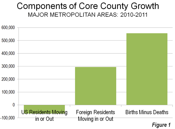
    Figure 1 indicates the components of population change in the core counties of the nation’s 51 metropolitan areas with more than 1,000,000 population (there are no city level migration data).

    • There was a net gain in natural growth of 556,000 (births minus deaths)
    • There was a net gain in international migration of 295,000 (people who moved from outside the nation to the core counties.
    • There was a net loss in domestic migrants of 67,000. These US residents moved  away from the core counties.

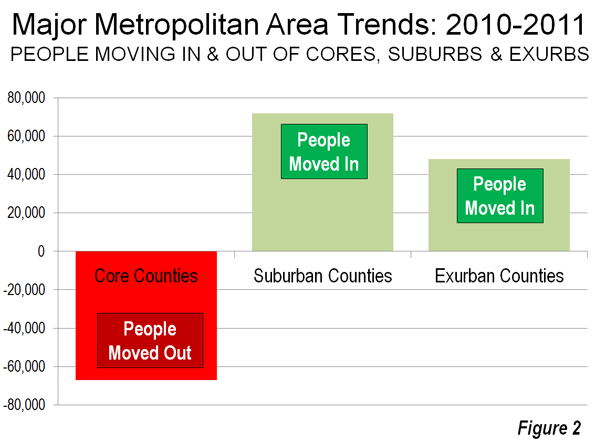
    As we indicated in Still Moving to the Suburbs and Exurbs: The 2011 Census Estimates, there was net domestic migration to the suburbs and exurbs between 2010 and 2011. There was net domestic migration out of the central counties (there is no "city" migration data). This is illustrated in Figure 2, which has been annotated to make the actual moving of people clear.

    If it should ever occur, it will be very clear when people are moving to the cores from the suburbs and exurbs. There will be PLUS domestic migration numbers to the core counties and MINUS domestic migration numbers from the suburbs and exurbs. Until that time any flocking (though that is too strong a word for current trends) will be away from the cores and to the suburbs and exurbs.

    Of course, in the greatest economic downturn in more than 75 years, domestic migration has slowed considerably. It is not surprising, therefore that population growth rates in the exurbs and suburbs have fallen, since far fewer people are moving.

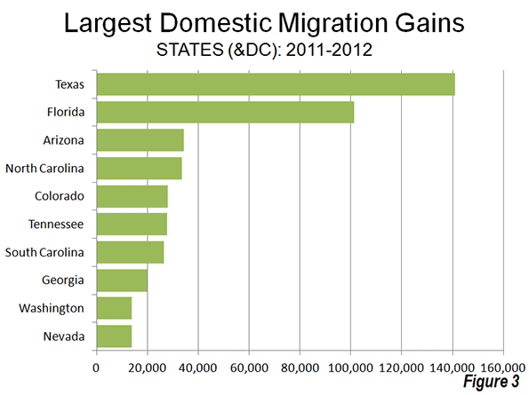
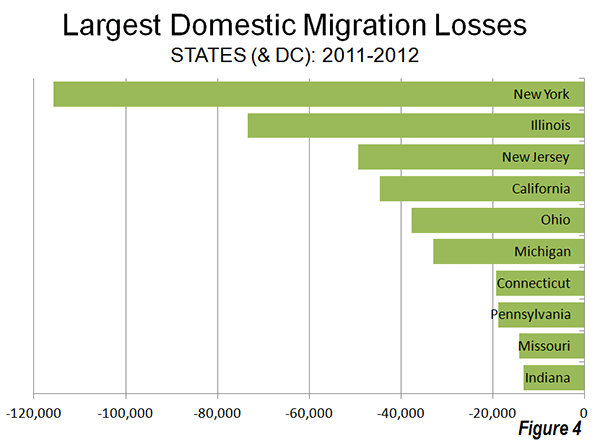
    All Domestic Migration was to the Suburbs: Finally, all of the net domestic migration in the nation was to the suburbs and exurbs of the nation’s major metropolitan areas (Also see Figure 2).

    On the Health of Exurban Housing Markets

    On a related subject, University of South Florida Professor Steven Polzin offered an interesting comment on the Planetizen site:

    While I have not explicitly researched the distribution of home foreclosures as a function of the transportation costs of residents, I would caution analysts to more fully explore the nature of the housing foreclosure trend before jumping to the assumption that transportation costs were a significant contributor to geographically differential rates of foreclosure. Foreclosures were more prominent in homes purchased more recently relative to the housing crash. These new home purchasers were more often highly leveraged, had little equity in their home, and in many cases younger workers with less job seniority and more susceptible to layoffs. In addition, in fringe areas that had been growing there was a high concentration of homes all purchased recently. Thus, new growth areas were more susceptible to both foreclosures and the cascading effect of home depreciation spreading based on nearby foreclosed properties.

    In a new suburb a young financially extended family may lose their job, have no equity in the house and quickly lose their house. Its depreciated value is soon reflected in adjacent appraisals cascading the stress throughout relatively fragile neighborhoods. On the other hand in established neighborhoods only a relatively small share of the homes changed hands near the peak of the building bubble. Thus, many of those homeowners had far more equity in their home and perhaps more job seniority and security enabling them to whether a housing downturn. In addition, the diversity of home ages and types and the less frequent occurrence of foreclosed properties will control the pace at which home value depreciation will cascade through the neighborhood.

    If commuting cost was as big a contributor to suburban fringe foreclosure rates then one would have expected downtown condominiums to weather the housing bubble. In many locations like Florida large clusters of new downtown residential properties suffered the same rapid depreciation as did suburban fringe areas. The concentration of new units seemed to be more critical than the location.

    Similar sentiments have been posted on these pages from time to time, such as here and here.

  • New US Urban Area Data Released

    This morning the US Bureau of the Census released data for urban areas in the United States. The urban population of the US rose to 249.3 million in 2010, out of a total population of 308.7 million. Urbanization covered 106,000 square miles, representing 3.0 percent of the US land mass. Overall urban density was 2,342 per square mile (905 per square kilometer).

    The Los Angeles urban area was again the nation’s most dense, at 6,999 per square mile (2,702 per square kilometer), a slight reduction from the 7,068 figure (2,729 per square kilometer) in 2000. The most dense urban areas with more than 1,000,000 population were Los Angeles, San Francisco, San Jose, New York and Las Vegas (in that order).

    Overall, the 41 major urban areas had an average density of 3,245 per square mile (1,253 per square kilometer). The table below provides data for the major urban areas and overall data.

    United States Urban Area Data: 2010 Census
    Major Urban Areas  & Summary
    Rank Urban Area
    Population
    Land Area (Square Miles)
    Density
    Density per Square KM
    1 New York–Newark, NY–NJ–CT
    18,351,295
    3,450
    5,319
    2,054
    2 Los Angeles–Long Beach–Anaheim, CA
    12,150,996
    1,736
    6,999
    2,702
    3 Chicago, IL–IN
    8,608,208
    2,443
    3,524
    1,361
    4 Miami, FL
    5,502,379
    1,239
    4,442
    1,715
    5 Philadelphia, PA–NJ–DE–MD
    5,441,567
    1,981
    2,746
    1,060
    6 Dallas–Fort Worth–Arlington, TX
    5,121,892
    1,779
    2,879
    1,112
    7 Houston, TX
    4,944,332
    1,660
    2,979
    1,150
    8 Washington, DC–VA–MD
    4,586,770
    1,322
    3,470
    1,340
    9 Atlanta, GA
    4,515,419
    2,645
    1,707
    659
    10 Boston, MA–NH–RI
    4,181,019
    1,873
    2,232
    862
    11 Detroit, MI
    3,734,090
    1,337
    2,793
    1,078
    12 Phoenix–Mesa, AZ
    3,629,114
    1,147
    3,165
    1,222
    13 San Francisco–Oakland, CA
    3,281,212
    524
    6,266
    2,419
    14 Seattle, WA
    3,059,393
    1,010
    3,028
    1,169
    15 San Diego, CA
    2,956,746
    732
    4,037
    1,559
    16 Minneapolis–St. Paul, MN–WI
    2,650,890
    1,022
    2,594
    1,002
    17 Tampa–St. Petersburg, FL
    2,441,770
    957
    2,552
    985
    18 Denver–Aurora, CO
    2,374,203
    668
    3,554
    1,372
    19 Baltimore, MD
    2,203,663
    717
    3,073
    1,187
    20 St. Louis, MO–IL
    2,150,706
    924
    2,329
    899
    21 Riverside–San Bernardino, CA
    1,932,666
    545
    3,546
    1,369
    22 Las Vegas–Henderson, NV
    1,886,011
    417
    4,525
    1,747
    23 Portland, OR–WA
    1,849,898
    524
    3,528
    1,362
    24 Cleveland, OH
    1,780,673
    772
    2,307
    891
    25 San Antonio, TX
    1,758,210
    597
    2,945
    1,137
    26 Pittsburgh, PA
    1,733,853
    905
    1,916
    740
    27 Sacramento, CA
    1,723,634
    471
    3,660
    1,413
    28 San Jose, CA
    1,664,496
    286
    5,820
    2,247
    29 Cincinnati, OH–KY–IN
    1,624,827
    788
    2,063
    796
    30 Kansas City, MO–KS
    1,519,417
    678
    2,242
    865
    31 Orlando, FL
    1,510,516
    598
    2,527
    976
    32 Indianapolis, IN
    1,487,483
    706
    2,108
    814
    33 Virginia Beach, VA
    1,439,666
    515
    2,793
    1,078
    34 Milwaukee, WI
    1,376,476
    546
    2,523
    974
    35 Columbus, OH
    1,368,035
    510
    2,680
    1,035
    36 Austin, TX
    1,362,416
    523
    2,605
    1,006
    37 Charlotte, NC–SC
    1,249,442
    741
    1,685
    651
    38 Providence, RI–MA
    1,190,956
    545
    2,185
    844
    39 Jacksonville, FL
    1,065,219
    530
    2,009
    775
    40 Memphis, TN–MS–AR
    1,060,061
    497
    2,132
    823
    41 Salt Lake City–West Valley City, UT
    1,021,243
    278
    3,675
    1,419
    Total
    133,490,862
    41,139
    3,245
    1,253
    Other Urban Areas
    115,762,409
    65,247
    1,774
    685
    Total Urban
    249,253,271
    106,386
    2,343
    905
    Rural
    59,492,267
    3,431,052
    17
    7
    Total Population
    308,745,538
    3,537,439
    87
    34
    Share Urban
    80.7%
    3.0%