Tag: Portland

  • Bridges Boondoggle, Portland Edition

    A couple weeks ago I outlined how the Ohio River Bridges Project in Louisville had gone from tragedy to farce. Basically none of the traffic assumptions from the Environmental Impact Statements that got the project approved are true anymore. According to the investment grade toll study recently performed to set toll rates and sell bonds, total cross river traffic will be 78,000 cars (21.5%) less than projected in the original FEIS. What’s more, tolls badly distort the distribution of traffic that will come such that the I-65 downtown bridge, which is being doubled in capacity, will never carry just what the existing bridge carries right now anytime during the study period, and won’t exceed the design capacity even slightly until 2050. Meanwhile, the I-64 bridge that will remain free will grow in traffic by 55% by 2030, when it will be 34% over capacity.

    A nearly identical scenario is playing out in Portland with the $2.75 billion I-5 Columbia River Crossing. Joe Cortright of Impresa consulting unearthed the information through freedom of information requests looking into the investment grade toll study on that is being conducted for that bridge. You can see his report here (there’s also a summary available).

    I’ll highlight some of his truly eye-popping findings. Traffic forecasts are inflated, of course. The toll study is suggesting traffic increases of 1.1% to 1.2% per year when over the last decade traffic has actually declined by 0.2% per year on average even though there are no tolls. But it’s the addition of tolls that badly distort cross-river traffic and make a mockery out of the EIS. Here’s the money chart for the I-5 bridge itself:


    How is it possible that after building a gigantic multi-billion dollar bridge traffic declines? For the same reason as Louisville: tolling will cause huge amounts of traffic to divert to the I-205 free bridge. By 2016 traffic on I-205 would rise from 140,000 per day to 188,000 – and up to 210,000 by 2022 (full capacity).

    This is so eerily similar to the Louisville situation, that someone suggested, only half in jest I suspect, that they must be having “how to” training sessions on this stuff over at AASHTO HQ.

    Unlike Louisville, where a docile press is basically in cahoots with the state DOTs pushing the project, Portland’s media started asking questions. And one local paper even caught a civil engineering professor from Georgia serving on the independent review board for the project labeling the tolling scheme “stupid.” (Louisvillians take note).

    Oregon DOT director Matt Garrett released a letter in response in which he says, “This work is fundamentally different than the traffic analysis completed for the Final Environmental Impact Statement, and with very different goals in mind.” I agree. The FEIS was performed with the goal of getting this bridge the DOT wanted built approved. The toll study was designed to withstand financial scrutiny on Wall Street and be relied on in selling securities. I’ll let you be the judge of which is more likely to be closer to the truth. What’s more, Cortright addresses this very issue by saying in his report, “Neither federal highway regulations nor federal environmental regulations authorize or direct using multiple, conflicting forecasts for a single project, or using one set of traffic numbers for one purpose, and a different set for another.” I might also add that the DOTs in Louisville have not to the best of my knowledge made similar claims to explain away an identical discrepancy there. Nevertheless, the rest of Garrett’s letter acknowledges that I-5 will see a big traffic drop and there will be diversion from tolling. So he appears to just be doing the bureaucratic equivalent of “pay no attention to that man behind the curtain.”

    Again, want to know how it is that we spend so much money on transport infrastructure and get so little value? It’s because far too many of our highway dollars go into boondoggle mega-projects ginned up through political pressure (watch this space as I have another example coming soon) instead of into projects that make transportation sense. It may well be that there are legitimate problems with the existing I-5 river crossing, but these numbers give no confidence that the Oregon DOT has come up with a good or cost-effective plan for dealing with them. Unlike some, I do think we need to build more roads in America. Unfortunately our system is set up to ensure the survival of the unfittest instead of projects that make actual transportation and economic sense.

    Aaron M. Renn is an independent writer on urban affairs and the founder of Telestrian, a data analysis and mapping tool. He writes at The Urbanophile, where this piece originally appeared.

    Photo of current Columbia River crossing by Jonathan Caves.

  • The Evolving Urban Form: Portland

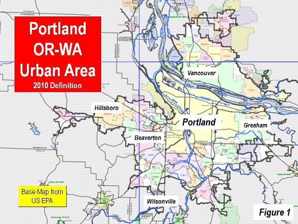
    Among urban planners, there is probably not a more revered urban area in the world than Portland (Oregon). The Portland metropolitan area and its core urban area , principally located in Oregon, stretches across the Columbia River into the state of Washington (Figure 1). Nearly four decades ago, the state of Oregon adopted strong urban planning requirements, including the requirement of an urban growth boundary. Two principal purposes of the resulting policies (referred to as “smart growth,” “urban containment, “compact cities,” etc.) were densification and transferring travel demand from cars to transit.

    Portland’s progress toward these objectives has been modest, at best. Most growth has continued to be in the suburbs. There has been only modest densification, and employment has continued to disperse from the core. At the metropolitan area level, travel by car remains virtually as dominant as before and traffic congestion has intensified materially. Finally, house prices have been driven up relative to incomes (Note 1).

    Portland: A Dispersing Metropolitan Area

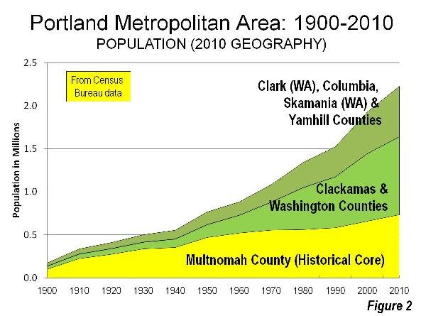
    Like virtually all major metropolitan areas in the world, Portland has experienced substantial dispersion. The core county of Multnomah peaked at more than two thirds of the metropolitan area population in 1930, as defined in 2000 (Note 2). By 2010, Multnomah County had dropped to one third of the metropolitan area population (Figure 2).

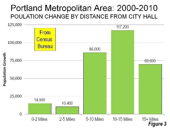
    The dispersion has continued in recent years, though there has been core growth (as has been the case in many metropolitan areas). Between 2000 and 2010, the area within two miles (three kilometers) of Portland City Hall grew more than 20 percent. However, this was only five percent of the metropolitan area’s growth. In the inner ring extending to five miles (eight kilometers) from City Hall, the growth was only three percent, well below the metropolitan area’s overall 15 percent growth rate. More than 90 percent of the metropolitan area’s population growth was outside a five mile radius (Figure 3).

    Portland: A Low Density Urban Area

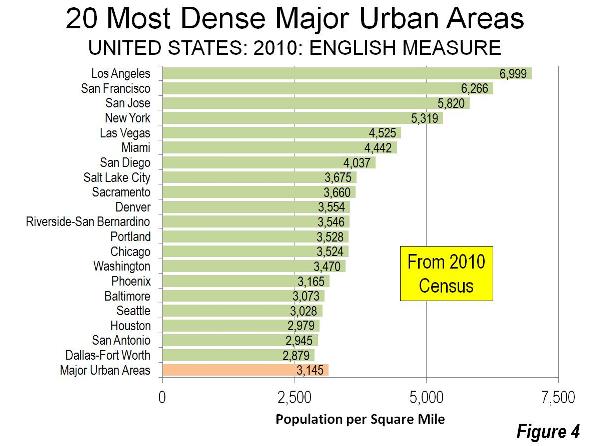
    Despite its international reputation as an exemplar of compactness , Portland is a low density urban area. Among the 875 urban areas in the world with more than 500,000 population, 797 are denser than Portland.

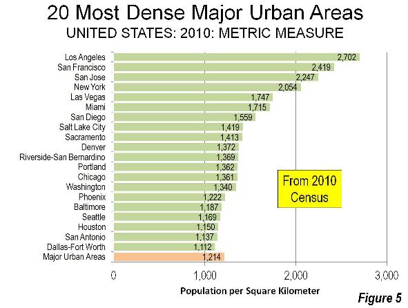
    In the low density United States, Portland ranked 12th among major urban areas (over 1 million population), at approximately 3,500 residents per square mile (1,350 per square kilometer) in 2010. This is approximately 10% higher than the major urban area average density but barely half that of the densest, Los Angeles, with its undeserved reputation for low-density, “sprawling” development (Figures 4 and 5).

    Portland is less dense than all major urban areas in the 13 western states, with the exception of Seattle. Notably, Riverside San Bernardino is denser, despite consisting almost exclusively of post-World War II automobile-oriented development. Even much smaller California urban areas, such as Stockton, Bakersfield, Lodi and Delano are denser than Portland.

    Portland and Houston: Density Cousins

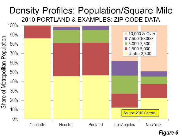
    The Portland metropolitan area’s density profile nearly duplicates that of Houston, which is just as famous for its liberal land use and transportation policies nearly the opposite of Portland’s (Note 3). Both metropolitan areas have nearly the same percentage of their populations living at densities below 7,500 per square mile (2,865 per square kilometer). A 40 percent larger share lives at densities of from 7,500 to 10,000 per square mile (3,860 per square kilometer) in Portland, while Houston’s share of its population living at densities above 10,000 per square mile is three times that of Portland (Figure 6).

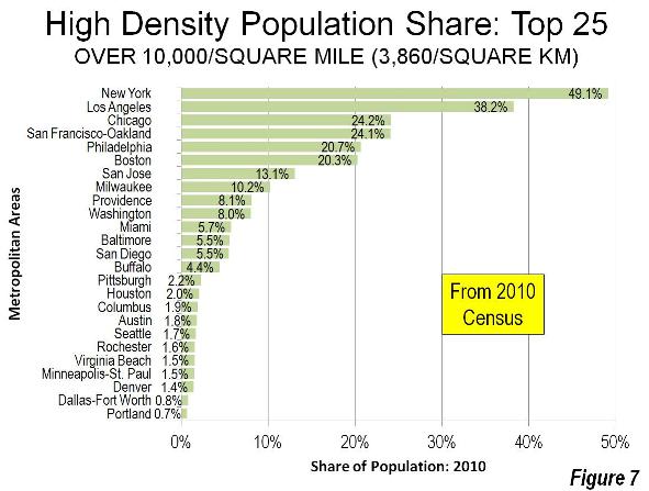
    Among the nation’s 51 major metropolitan areas, Portland ranks 25th in the share of population living in zip codes with more than 10,000 people per square mile in 2010 (Figure 7).

    Portland’s Job Dispersion

    As in other metropolitan areas, jobs have dispersed substantially around Portland. Today, fewer than 10% of the jobs are located in downtown Portland (the central business district). The city of Portland itself has approximately 1.41 jobs per resident worker. Suburban Hillsboro, with the third largest employment base in the metropolitan area, has slightly more jobs per resident workers (a higher “jobs-housing balance”) according to American Community Survey data.

    Transit in Portland

    Portland has developed an extensive rail system, intended to attract drivers from their cars. Today, six light rail lines (five light rail) radiate toward the urban periphery, focusing on downtown (the central business district, or CBD).

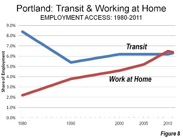
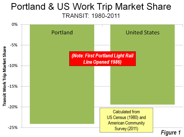
    Yet the share of commuters using transit has fallen by a quarter since 1980, the last data available before the first light rail line opened. In short, rail has not changed the calculus of travel in Portland. Working at home, which is a less expensive and more environmentally friendly work access mode, has caught up with and now exceeds transit, as has occurred in most US major metropolitan areas. (Figure 8)

    Worse, transit may have already experienced its “best of times.” The future could be grim. Opposition to rail expansion has grown, and longer term transit service cuts of up to 70 percent have been threatened. (See Portland’s Transit Halcyon Days?)

    As elsewhere, transit in Portland is “about downtown.” The Portland Business Alliance estimates that 36% of downtown workers commute by transit. This is nearly one-half of all transit commuting in the Portland metropolitan area. Even in the job rich suburbs of Hillsboro and Beaverton, the share of people using transit for the work trip is less than the 5.0 percent national average.

    Portland: Intensifying Traffic Congestion

    Clinging to the fantasy transit can materially reduce automobile travel, Oregon officials have blocked substantial roadway expansions. Residents have been rewarded with much intensified traffic congestion.

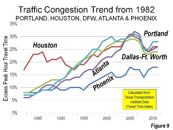
    The Texas A&M Texas Transportation Institute Annual Mobility Report (Note 4) reveals Portland to have the 6th worst traffic congestion in the nation among major metropolitan areas. This compares to a before-rail ranking of 39th in 1982. Now Houston, Atlanta, Dallas-Fort Worth and Phoenix all have lower levels of traffic congestion than Portland (Figure 9). Without decades of urban containment and anti-mobility policies, these metropolitan areas have improved traffic congestion relative to Portland. This is despite far larger increases in travel demand. Since the early 1980s, each of these metropolitan areas has added more residents than live in the entire Portland metropolitan area. Portland also ranks among the worst (5th) in commuter stress (a measure of peak direction traffic congestion), according to the Annual Mobility Report

    Portland: Congestion and Higher Greenhouse Gas Emissions

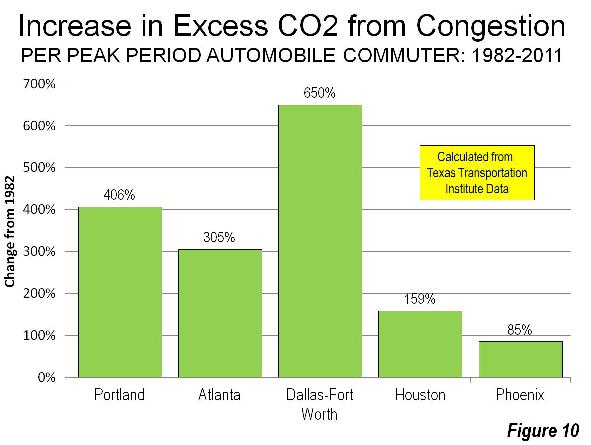
    Reflecting the reality that greater traffic congestion increases greenhouse gas emissions, Portland’s carbon dioxide (CO2) emissions per automobile commuter have increased substantially and transit has made only the scantest difference. Between 1982 and 2011, Portland’s increase in CO2 emissions was greater than Houston, Atlanta and Phoenix, though less than Dallas- Fort Worth (Figure 10).

    Deteriorating Housing Affordability in Portland

    In Portland, consistent with both economic principle and considerable research, urban containment policy drives house prices up relative to incomes higher by rationing the supply of land and housing. In 2010, values of comparable land on either side of the urban growth boundary varied by more than 10 times in value per acre (a phenomenon also identified in Auckland, New Zealand by Chairman of the Reserve Bank of New Zealand, Arthur Grimes).

    The most recent Demographia International Housing Affordability Survey indicated that Portland’s median multiple (median house price divided by median household income) was 4.3. In normally functioning housing markets, the median multiple is typically 3.0 or less, a ratio last achieved in Portland in 1995. This higher median house price means than approximately 125,000 fewer Portland households —or 15% of households — are able to afford the median priced house. (Note 5).

    Higher housing costs retard the standard of living by reducing discretionary incomes (gross income minus taxes and necessities). This, in turn, leads to less demand for other goods and services (in the “discretionary economy”), less job creation and less economic growth.

    Even so, Portland’s rising house prices have been moderated by the nearby availability of less expensive houses on larger lots in the Vancouver area (Clark County, Washington). There, more liberal land use regulation permits consumer-driven housing choice, rather forcing households to choose from the limited offerings planning authorities prefer.

    In part due to rising prices, Portland is becoming less diverse . Indeed, Aaron Renn has called Portland the penultimate example in his searing critique, The White City. After the results of the 2010 census were announced. The Oregonian quoted then Mayor Sam Adams’ concern about the exodus of African-Americans from the city (municipality), saying that Portlanders should care about the fact that we offer ¬such limited access to equal opportunities. Local policymakers are largely oblivious to the role that urban containment policy may have played in diminishing those opportunities.

    Misplaced Priorities

    Despite all of this, Portland has its advantages.

    As in Houston, Seattle, Atlanta and virtually all other major metropolitan areas regardless of land use regulations, a core renaissance is underway that is making a dense urban lifestyle more practical for the relatively few who both prefer it and can afford it. The suburban lifestyle, dominant virtually everywhere in the United States, remains alive and well in Portland (Note 6). Portland’s physical location remains the envy of most metropolitan areas. There is little better scenery than the nearby Columbia Gorge or majestic Mt. Hood, which crowns the area on clear days.

    However, Portland has been sidetracked by a pre-occupation with urban design, at least partially driven by concerns about reducing greenhouse gas emissions. The good news is that technological advances are poised to do far more to reduce greenhouse gas emissions than could ever be achieved by urban containment policy.

    But scenery aside, cities are primarily economic organisms. Cities have grown by serving the aspirations of people for a better standard of living. The very purpose of cities is to facilitate affluence and minimize poverty among residents (see Toward More Prosperous Cities). Yet policies, such as urban containment, that inherently reduce household discretionary incomes and impose greater congestion costs reduce discretionary incomes. Despite intentions to the contrary, the results show this to be the real Portland story.

    —————————————–

    Note 1: Some other metropolitan areas that have embraced urban containment policy have produced even worse results. For example, traffic congestion is worse in Vancouver, Sydney, Melbourne and far smaller Auckland, according to the “Tom Tom Congestion Index,” a real-time traffic reporting competitor to INRIX. Portland has seriously unaffordable housing, though has not retarded the standard of living nearly so much as in Vancouver, Sydney, Melbourne or Auckland, where housing is severely unaffordable. Attention is drawn to Portland’s negative outcomes because of the extent to which its policies are revered in the urban planning community around the world.

    Note 2: Multnomah County is used in this analysis, instead of the historical core city of Portland, which has grown in large measure by annexation. Since 1950, the city added 108 percent to its land area and little more than half (56 percent) to its population.

    Note 3: Houston is sometimes referred to as having deregulated land use. This is not strictly correct, though Houston is closer to a deregulated model than any other US metropolitan area. The city of Houston does not have zoning, though some municipalities in the suburbs are zoned. Many neighborhoods in the city of Houston have private land use covenants.

    Note 4: The Annual Mobility Report has been the authoritative measure of traffic congestion in US urban areas for three decades. More recently, the report’s traffic congestion measures have been significantly strengthened by the use of actual global positioning data from INRIX, which also produces its own Traffic Scorecard both for US and international urban areas, using satellite based real-time traffic data.

    Note 5: Estimated from income qualifying income requirements as reported by the National Association of Realtors for the third quarter of 2012 and the metropolitan income distribution modeled based on the 2011 American Community Survey.

    Note 6: In 1999, new urbanist architect Andres Duany evaluated Portland in a commentary for The Oregonian: “To my surprise, as soon as I left the prewar urbanism (to which my previous visits had been confined), I found all the new areas on the way to the urban boundary were chock full of the usual sprawl one finds in any U.S. city, no better than in Miami. The outcome wasn’t that different after all.”

    ————————-

    Wendell Cox is a Visiting Professor, Conservatoire National des Arts et Metiers, Paris and the author of “War on the Dream: How Anti-Sprawl Policy Threatens the Quality of Life.

    Photo: Mount Hood (by author)

  • Portland’s Transit Halcyon Days?

    For more than a quarter century, the leaders in the Oregon portion of the Portland metropolitan area have sought to transfer demand for urban travel from automobiles to transit. Six rail lines have been built, five of which are light rail and bus service has been expanded. If their vision were legitimate, transit’s market share should have risen substantially and automobile travel should have declined. Neither happened.

    The results have been modest, to say the least. Since 1980, before the first rail line was opened, transit’s share of work trip travel in the metropolitan area has declined by one-quarter, from 8.4 percent to 6.3 percent. Overall, the share of travel by car remains about the same as before the first light rail line opened (based upon data from the Texas Transportation Institute and the Federal Transit Administration).

    Transit access to destinations outside downtown Portland remains scant. Despite the huge expenditures on transit, only 8 percent of the jobs in the metropolitan area can be reached by the average employee in 45 minutes, despite the fact that nearly 85 percent of workers are within walking distance of the transit stops or stations. Portland’s transit access is better than the national major metropolitan average of six percent. But Portland trails a number of other metropolitan areas and is well behind the best, Milwaukee, Wisconsin, which has a transit access figure of only 14 percent. This makes a mockery of the “transit access” measure used by many planning agencies. Being close to a transit stop or station is of little help if service to the desired destination is not available or takes too much time.

    According to the latest American Community Survey data, the average work trip by people driving alone in Portland is 23.6 minutes, while the average transit commute trip is 43.8 minutes.

    Further, Portland transit users could face draconian service reductions. Tri-Met, which operates light rail and most Oregon services, has warned that it may be required eventually to cut 70 percent of its service. This results from the failure to control labor costs, particularly pension costs, which is detailed in an Oregonian article. John Charles, president of the Cascade Policy Institute found that $1.63 all the benefits were being paid out for every dollar of wages, a claim confirmed by PolitiFact. The concern extends to the state capital, where the legislature has overwhelmingly approved a bill requiring an audit of Tri-Met by the Secretary of State.

    Tri-Met continues to expand light rail, but with some “pushback.” An under-construction line to Milwaukie evoked such controversy in Clackamas County, that voters elected an anti-light rail majority to the county commission. Voters have banned light rail expenditures without a public vote in the suburban municipalities of Tigard and King City. Clark County (Washington), voters rejected funding for a light rail connection to the Portland system. This opposition was at the heart of defunding a replacement Interstate 5 bridge over the Columbia River. The project recently closed after spending $175 million (see Project Closing Notice).

    With the investment and expansions, these should have been the halcyon days of transit in Portland. The future could be even more challenging.

  • Leaving Portlandia

    There have been two universal reactions to my announcement that I was going to move from Portland to the Midwest: surprise and disbelief. But I also found a number of people who, if given a few moments to find clear and honest footing in the conversation, could see through the self-absorbed mental fog that covers the city in equal measure to the grey rain clouds and tells its inhabitants every day that Portland is the most amazing possible place in this country to live. The amount of media devoted to reinforcing this idea is overwhelming in the sense that I believe it has overwhelmed people’s ability to have their own thoughts and identity in Portland.  Instead they have a Portland identity…because they live in Portland and that is what defines them.

    On the surface, Portland has many progressive aspects. Sustainability and the “greening of the city” stand front and foremost as two easily recognized. Curbside recycling and composting, increasing investment in bicycle transportation, native gardening, and urban farming. There is an intense concentration of a wide range of alternative health practitioners. Artisan craftspeople abound, creating specialty foods and other handcrafted products. “Shop local” is the resounding cry to support small businesses, and farmers markets adorn every neighborhood in the summertime.

    Idyllic as this sounds, there is a less appealing aspect to this picture. As Portland concentrates is cultural practices into a few baskets, the proliferation of other ideas diminishes. Ten years ago I would have characterized Portland as a place that had progressive perspectives. Now I would characterize Portland as a place with few ideas, all perpetually reinforced and more deeply ingrained every day.  People regurgitate a handful of versions of the same thoughts in ever narrowing expressions.  Everywhere you look it is repetition of the same ideas, whether it be on politics, design, or social culture. People strive to look the same, to dress the same, and to have the same lifestyle.  It is so pervasive, that women within a 30 to 40 year age range may display similar choices in hair, dress, and accessories.  What began as a city with progressive and forward looking ideas to develop a new urban course has become a closed container of cultural conformity.  There is a new cookie cutter in Portland, and it is young, alterna-hip, and white.

    I grew up in a place like this…it is called Orange County.

    Sweeping shocked gasps aside, this comparison is worth a long pause to consider.  Stripping away the key difference between Multnomah and Orange County of political affiliation, with Orange County being a historic Republican stronghold and Portland staunchly Democrat, these two counties have some key cultural similarities all hinging on a pivotal word used above: conformity. Conformity of dress, thought, and mannerisms, shared ideas and ideals, and a strong attitudinal belief that there is a “right” or “correct” way to be and to appear to others. There is also limited interest or investment in the arts, creative, innovative, or intellectual development. Just because the surface ideals these two places seem extremely different from each other, does not mean that they don’t breed the same obedience to a self-referencing norm within themselves. And by perpetuating their particular cultures and tailoring their environments to fit with a narrow range of ideals, the inhabitants of these areas increasingly live on the margins of reality and instead inhabit a fabricated cocoon of their own self-rewarding design.

    What disturbed me most about Portland in the months leading up to my decision to leave was the increasingly strong social culture of invisibility. I am referring to the tendency of people in Portland to not acknowledge the physical presence of other people around them in close proximity. This can easily be seen by the increasing tendency of people to brush past you without making eye contact or saying “excuse me” and instead being intensely focused on some spot just beyond your left shoulder. But it manifests in countless other ways: letting dogs off leash (and not picking up after them), ignoring red lights and stop signs, allowing children license to act out without discipline in the presence of other adults.

    In this city where conformity to a particular identity is so strong, people no longer see each other as people. People come in and out of your field of vision as an object to be ranked according to usefulness to you, and invariably avoided, ignored and dismissed the majority of the time. It is unpleasant, unsettling and dehumanizing. The countless tiny social interactions we have with other people throughout the day are the glue that hold us together as a community and keep us from being automatons randomly bumping into one another like the balls in a pinball machine. This critical stickiness in Portland is dissolving rapidly. As people lose the ability to engage and connect with one another, there appears to be an increasingly growing level of resentment, frustration and anger brewing under the surface of social interactions. Not just interactions where overt conflict is involved, but all of them. Because it feels like they all contain some level of conflict just by the occurrence of people being together in a place, time and circumstance.

    There is little likelihood that I would ever have been physically assaulted in Portland. But I think there is a pretty strong likelihood that if I were physically assaulted that no one around me would react or get involved or help. Because chances are, I wouldn’t even be seen.

    When confronted with difficult situations or challenging environments, often it is heard “it’s the people that keep me here…keep me working, living, etc. in this place despite its shortcomings”. In Portland, the situation is reversed….the environment is being made increasingly pleasant and comfortable, but it is the people that make it so difficult to live there.

    Read Jennifer Wyatt’s blog about her cross country move at isaymissourah.wordpress.com.

  • Portland’s Slothful Creative Class?

    In an article entitled "Portland area’s college-educated workers depress metro earning power by choosing low-paying fields, shorter hours," The Oregonian’s Betsy Hammond reports on a new study decrying the less than robust economic impact of Portland’s younger college graduates, especially males. According to Hammond, " the Portland metro area’s young college-educated white men are slackers when it comes to logging hours on the job, and that’s one reason people here collectively earn $2.8 billion less a year than the national average." The report is characterized as finding that "Portlanders tend to choose majors, careers and work hours that lead to low pay."

    The report, "Higher Education & Regional Prosperity; The Story Behind Portland-Metro’s Income Decline," was commissioned by the Value of Jobs Coalition. It documents a "startling decline in per capita income relative to the US" metropolitan average. Since 1997, metropolitan Portland’s per capita income has fallen from 5% above the national metropolitan average to 5% below.

    The report indicates that "the biggest driver of this trend is our college educated workers, who work less and earn less, creating a significant income gap," though cautiously notes that it is not clear whether” the lower hours and earnings are the result of a lack of higher-paying/time-intensive jobs available or the result "life style choice(s)" to not work in higher-paying jobs."

    The report found the largest differences compared to other metropolitan areas to be among white males from 25 to 39 years old. The differences with the rest of the country were substantially less among older white males.

  • The Drive-It-Yourself Taxi: A Smooth Ride?

    Despite a corporate sponsor that paid handsomely for the naming rights, Londoners stubbornly refer to our bikesharing system as ‘Boris Bikes’, in a nod to our colourful Mayor, Boris Johnson. But what will we call our new drive-it-yourself taxis? My suggestion: ‘Boris Cabs’ – and they are now a reality here, thanks to Daimler’s car2go service, if you happen to live in one of three small and separate sections of town. But why did a one-way carsharing system have to limp into London, when more than a dozen other cities have welcomed these arrangements with open arms? In the US, car2go first appeared in Austin, Texas, and since then has moved into Washington, D.C, Miami, Portland Oregon, San Francisco, San Diego, and Seattle. It operates in Canada and, on the Continent, in Paris and Amsterdam, among other locations. So why no splashy launch across England’s Capital, and no images of a smiling Boris cutting a ribbon?

    First, roads in London are balkanised. Our regional transport agency (Transport for London) runs the main arteries, and they provide little on-street parking, the mother’s milk of one-way carsharing. That leaves the local streets in the the domain of the 33 boroughs that are each independent municipalities. Car2go is making a brave attempt to get off the ground here by starting with hundreds of cars (the press release reports 500; in practice,170 are in operation two weeks after the launch) in disconnected sections of town, something it has not resorted to anywhere else. Its standard practice is to strike a city-wide deal with whoever’s in charge of on-street parking, and no single agency fits that bill here. What’s the rush? Well, BMW is hot on their heels with its competing DriveNow system, with staff in London well into the advanced stages of planning.

    Second, there is genuine uncertainty about the impacts”. Will we take drive-it-yourself cabs to work, and avoid the crush on the Tube? It would be a very different experience than traditional carsharing — London is said to be Zipcar’s second-biggest market after NYC — which doesn’t work for the daily commute. In the Zipcar model (soon to be the ‘Zipcar by Avis’ model?) you take a car on a round-trip basis and pay by the hour, like filling a parking meter. The novelty of this new generation of drive-yourself cabs lies in their flexibility: as with a taxi meter, you pay by the minute for just the time it takes you to get from ‘A’ to ‘B’, then drop the car off and forget about it.

    What does this mean for traffic congestion? CO2 emissions? What about the cute blue-and-white Smart Fortwo-model cars now parked in your neighbourhood – will they mean less parking for private car owners? Not bloody likely. The expectation is that, in time, enough private car owners will switch to using the fleet’s cars, meaning that on balance fewer cars will need to be parked. But try explaining this to car2go’s new neighbours who are not familiar with the subtleties and will be the ones dealing with the growing pains as we feel our way forward.

    Transport is a long game, so it will be years until we properly understand the impacts of drive-yourself cabs. My research suggests that likely impacts are:

    1) A much larger market than traditional carsharing (about four times as many subscribers)
    2) A roughly 4% reduction in personal car ownership
    3) About a 1% decrease in car driving vehicle miles travelled (including personal cars, traditional carsharing, and drive-yourself cabs)
    4) About a 1% decrease in the number of public transport journeys

    We can be reasonably certain that some surprising impacts will be revealed during field trials, and if at some future point London’s authorities are not happy with the knock-on effects there’s nothing to stop us from regulating the industry like any other. But for the moment we don’t understand it well enough to do anything other than let the operators experiment and keep tabs on what’s happening.

    We just don’t know what the impacts on traffic levels and CO2 will turn out to be, and, frankly, it’s unfair to – as some suggest – hold the industry to a no-net-traffic/CO2 standard. We don’t do that to Black Cabs or [advance-booking-only] minicabs, or indeed to the automotive or urban transport sectors more broadly. A fairer standard, admittedly more complex to administer, would be to assess whether net value is created after accounting for effects on traffic levels, emissions and more. In other words: get the prices right, just like the economics textbooks say.

    The question that needs thinking through is what would transport in London look like if drive-yourself taxi systems went viral and we came to depend on them. What happens, for instance, when instead of 500 of these cabs there are 50,000, and the necessary communication links go down? How would the transport system work if on-road congestion became replaced by virtual queuing to get access to a car? And what about times when the system is under stress, like when a hurricane is approaching, for instance. Is it OK to just flip the switch off on the whole fleet? Who would make this decision, and what guidelines would they follow?

    If the history of the car in cities has taught us anything, it is that we need to be humble about our ability to forecast the future. So what is the way forward for Boris Cabs in London? Start with a small fleet and short-duration contracts. Be clear on the objectives and flexible on the implementation. Keep our options open. It will be an interesting ride.

    Scott Le Vine, AICP is a research associate in transport systems at Imperial College London and a trustee of the shared-mobility NGO Carplus, which serves as the UK’s carsharing trade body. He authored the recent study Car Rental 2.0: Car club [carsharing] innovations and why they matter.

    Flickr photo: Car 2 Go in the 1700 block of Q Street, NW, Washington DC on Easter Sunday, 8 April 2012 by Elvert Barnes Photography

  • Election: “Stop Portland Creep” Resonates in Suburbs

    Election results from all three of Portland, Oregon’s largest suburban counties indicate a reaction against what has been called "Portland Creep," the expansion of the expansive light rail system without voter approval and the imposition of restrictive densification measures by Metro, the regional land-use agency.

    Portlanders in the three largest Oregon counties (Multnomah, Washington and Clackamas) have previously voted against financing light rail extensions, however the transit agency has found ways to continue the expansion and now operates five lines, with a sixth under construction. While urban rail aficionados tout the success of the Portland system, transit use by commuters has fallen significantly in relative terms from before the opening of the first light rail line. At the same time, working at home, which does not need billions in taxpayer subsidies, has caught up to and passed transit (Figure).

    The electoral events of the past 60 days could severely limit future expansion.

    Clackamas County: Chicanery and its Price

    In a September 2012 election, voters in Clackamas County approved a measure by a 60% – 40% majority requiring that any commitment of funding to rail would require a vote of the people. Perhaps fearing a negative result in the election, the pro-rail Clackamas County commission hastily approved $20 million to support the under construction Portland to Milwaukie (Clackamas County) light rail line.

    Things were to become substantially more difficult for light rail in the November election. In Clackamas County, the two incumbent commissioners on the ballot, both of whom voted for the $20 million bond issue, lost their seats. Voters rewarded their chicanery by replacing them with anti-rail commissioners, leaving the Clackamas County commission with a 3 to 2 anti-rail majority. The Oregonian characterized the election as "a referendum on light rail."

    John Ludlow, who defeated Clackamas County commission chair Charlotte Lehan by a 52% to 48% margin, told The Oregonian:

    "I think the biggest boost my campaign got was when those commissioners agreed to pay that $20 million to TriMet" for Portland-Milwaukie light rail four days before the September election. I think that put Tootie and me over the top." 

    "Tootie" is Tootie Smith, a former state legislator who unseated commissioner Jamie Damon in the same election by a similar margin.

    Washington County, Oregon: Taxpayers Take Control

    Meanwhile, light rail has run into substantial difficulty in suburban Washington County. In September, voters in King City approved a measure to require all light rail funding to be approved by the voters. In the more recent November election, voters in Tigard, the 6th largest city (50,000 population) in the metropolitan area, voted 81%-19% to subject all light rail expenditures to a vote of the people.

    Clark County, Washington: Voters Say No

    Portland’s transit agency also had its eye on expanding light rail service across the state line and the Columbia River to Vancouver, in Clark County, Washington. The plan was to build a new "Interstate Bridge" (Interstate 5) across the river, which would include light rail. The voters of Clark County were asked in a referendum to approve funding for the light rail system and turned it down soundly according to the Columbian, by a 56% – 44% margin.

    But there was more. For some time, citizen activist and business leader David Madore has been working to stop both tolls on the new bridge and light rail service. Madore was elected to the board of commissioners of Clark County at the same time that the light rail referendum was being defeated. Madore, like the two other Clark County commissioners, also hold seats on the transit agency board.

    Tri-Met’s Death Spiral?

    Further, Tri-Met’s dire financial situation could be another barrier to future expansion. As John Charles of the Cascade Policy Institute has shown, Tri-Met’s fringe-benefit bill is astronomically high, at $1.63 for each $1.00 in wages. This is more than five times the average for public employers, according to US Department of Commerce Bureau of Economic Analysis data. Charles refers to Tri-Met as being in a "death spiral" and says that:  

    "The agency is steadily devolving from a transit district to a retirement and health-care center, with unsustainable fringe benefit costs that now far exceed the mere cost of wages."

  • A Look at Commuting Using the Latest Census Data

    Continuing my exploration of the 2011 data from the American Community Survey, I want to look now at some aspects of commuting.

    Public Transit

    Public transit commuting remains overwhelmingly dominated by New York City, with a metro commute mode share for transit of 31.1%. There are an estimated 2,686,406 transit commuters in New York City. All other large metro areas (1M+ population) put together add up to 3,530,932 transit commuters. New York City metro accounts for 39% of all transit commuters in the United States.

    If one were to guess the #2 city for transit commuting, another older, pre-auto, centralized city on the lines of New York (say Chicago) might be the obvious guess. It would also be wrong. It’s actually Washington, DC that has the second highest transit commute share among large metros at 14.8%. Here’s the complete top ten:

    Rank

    Metro Area

    2011

    1

    New York-Northern New Jersey-Long Island, NY-NJ-PA

    2,686,406 (31.1%)

    2

    Washington-Arlington-Alexandria, DC-VA-MD-WV

    439,194 (14.8%)

    3

    San Francisco-Oakland-Fremont, CA

    299,204 (14.6%)

    4

    Chicago-Joliet-Naperville, IL-IN-WI

    503,535 (11.6%)

    5

    Boston-Cambridge-Quincy, MA-NH

    267,568 (11.6%)

    6

    Philadelphia-Camden-Wilmington, PA-NJ-DE-MD

    251,285 (9.3%)

    7

    Seattle-Tacoma-Bellevue, WA

    137,858 (8.1%)

    8

    Portland-Vancouver-Hillsboro, OR-WA

    66,619 (6.3%)

    9

    Los Angeles-Long Beach-Santa Ana, CA

    355,811 (6.2%)

    10

    Baltimore-Towson, MD

    80,472 (6.1%)


    Not only are New York and Washington top two cities for public transit commuting, they are also the two cities that have been dominant in increasing transit’s market share. Both cities showed material share gains since 2000, over three and a half percentage points each, for transit. Among large cities, Seattle was the only one that managed to post a share gain of even one percent.

    Rank

    Metro Area

    2000

    2011

    Change in % of Workers Age 16 and Over

    1

    New York-Northern New Jersey-Long Island, NY-NJ-PA

    2,181,093 (27.4%)

    2,686,406 (31.1%)

    3.74%

    2

    Washington-Arlington-Alexandria, DC-VA-MD-WV

    278,842 (11.2%)

    439,194 (14.8%)

    3.61%

    3

    Seattle-Tacoma-Bellevue, WA

    106,784 (7.0%)

    137,858 (8.1%)

    1.17%

    4

    Orlando-Kissimmee-Sanford, FL

    12,601 (1.6%)

    24,901 (2.5%)

    0.91%

    5

    Hartford-West Hartford-East Hartford, CT

    15,755 (2.8%)

    21,794 (3.7%)

    0.91%

    6

    Charlotte-Gastonia-Rock Hill, NC-SC

    9,532 (1.4%)

    19,227 (2.3%)

    0.91%

    7

    San Francisco-Oakland-Fremont, CA

    278,207 (13.8%)

    299,204 (14.6%)

    0.81%

    8

    Los Angeles-Long Beach-Santa Ana, CA

    287,392 (5.6%)

    355,811 (6.2%)

    0.67%

    9

    Miami-Fort Lauderdale-Pompano Beach, FL

    67,685 (3.2%)

    95,536 (3.8%)

    0.61%

    10

    Nashville-Davidson–Murfreesboro–Franklin, TN

    5,574 (0.8%)

    10,705 (1.4%)

    0.55%


    Vaunted Portland only managed to eke out a share gain of 0.07%, which could be entirely statistical noise. Its performance lagged even auto-centric cities like Charlotte and Nashville.

    Bicycling

    Every city out there seems to be vying to be the bike friendliest city in the world. Yet bicycling has yet to make much of an impact on commuting. Only 7 out of 51 large metros even post 1% mode share for cycling:

    Row

    Geography

    2011

    1

    Portland-Vancouver-Hillsboro, OR-WA

    23,941 (2.3%)

    2

    San Francisco-Oakland-Fremont, CA

    38,419 (1.9%)

    3

    San Jose-Sunnyvale-Santa Clara, CA

    16,013 (1.9%)

    4

    Sacramento–Arden-Arcade–Roseville, CA

    15,804 (1.8%)

    5

    Austin-Round Rock-San Marcos, TX

    8,847 (1.0%)

    6

    New Orleans-Metairie-Kenner, LA

    5,307 (1.0%)

    7

    Phoenix-Mesa-Glendale, AZ

    18,007 (1.0%)

    8

    Seattle-Tacoma-Bellevue, WA

    15,949 (0.9%)

    9

    Denver-Aurora-Broomfield, CO

    12,052 (0.9%)

    10

    Los Angeles-Long Beach-Santa Ana, CA

    50,080 (0.9%)


    Portland grew bicycle mode share by 1.51% Perhaps this explains its poor transit performance. Cycling is canabalizing transit growth.

    Walking

    The low level of bicycling can perhaps best be illustrated by comparing it to walking. Even in Portland more people walk to work than ride bikes.


    Rank

    Metro Area

    2011

    1

    New York-Northern New Jersey-Long Island, NY-NJ-PA

    540,733 (6.3%)

    2

    Boston-Cambridge-Quincy, MA-NH

    121,537 (5.3%)

    3

    San Francisco-Oakland-Fremont, CA

    87,409 (4.3%)

    4

    Philadelphia-Camden-Wilmington, PA-NJ-DE-MD

    101,107 (3.7%)

    5

    Seattle-Tacoma-Bellevue, WA

    62,238 (3.7%)

    6

    Pittsburgh, PA

    36,857 (3.4%)

    7

    Portland-Vancouver-Hillsboro, OR-WA

    35,242 (3.4%)

    8

    Rochester, NY

    15,573 (3.2%)

    9

    Washington-Arlington-Alexandria, DC-VA-MD-WV

    94,698 (3.2%)

    10

    Chicago-Joliet-Naperville, IL-IN-WI

    134,399 (3.1%)


    Working from Home

    Looking at telecommuting gives a much different list of top cities, this one dominated by “wired” metros like Austin and Raleigh. The share of telecommuters in these cities is bigger than walking or biking, or even transit in many cities. This is an oft-overlooked part of the green transport agenda. The most green commute possible is the one you never have to make.

    Rank

    Metro Area

    2011

    1

    Austin-Round Rock-San Marcos, TX

    62,593 (7.1%)

    2

    Raleigh-Cary, NC

    37,030 (6.6%)

    3

    Portland-Vancouver-Hillsboro, OR-WA

    67,223 (6.4%)

    4

    San Francisco-Oakland-Fremont, CA

    131,029 (6.4%)

    5

    San Diego-Carlsbad-San Marcos, CA

    89,547 (6.3%)

    6

    Denver-Aurora-Broomfield, CO

    76,025 (5.9%)

    7

    Phoenix-Mesa-Glendale, AZ

    105,570 (5.8%)

    8

    Sacramento–Arden-Arcade–Roseville, CA

    52,143 (5.8%)

    9

    Atlanta-Sandy Springs-Marietta, GA

    132,979 (5.5%)

    10

    Seattle-Tacoma-Bellevue, WA

    87,839 (5.2%)


    Commute Times

    Unsurprisingly, large cities – including New York and Washington again at the top – feature the longest average commute times. Larger cities tend to have worse congestion and feature longer commutes. As transit commutes are generally longer than driving, the high transit mode share helps to drive up commute times in those cities.

    Rank

    Metro Area

    2011

    1

    New York-Northern New Jersey-Long Island, NY-NJ-PA

    34.9

    2

    Washington-Arlington-Alexandria, DC-VA-MD-WV

    34.5

    3

    Riverside-San Bernardino-Ontario, CA

    31.0

    4

    Chicago-Joliet-Naperville, IL-IN-WI

    30.9

    5

    Atlanta-Sandy Springs-Marietta, GA

    30.6

    6

    Baltimore-Towson, MD

    30.3

    7

    Boston-Cambridge-Quincy, MA-NH

    29.2

    8

    San Francisco-Oakland-Fremont, CA

    29.2

    9

    Los Angeles-Long Beach-Santa Ana, CA

    28.6

    10

    Philadelphia-Camden-Wilmington, PA-NJ-DE-MD

    28.5


    Whether New York might prefer a more auto-oriented layout in order to reduce commute times is a different matter. There’s no precedent for such a huge region having anything less than terrible congestion and commute times. And clearly New York would not be New York with such a radical change. The same forces that drive up commute times in places like New York and Washington are some of the same forces that sustain them as centers of elite economic production.

    Note: An early version of this piece contained an incorrect version of “Working from Home” table.

    Aaron M. Renn is an independent writer on urban affairs and the creator of Telestrian, a data analysis and mapping tool. He writes at The Urbanophile.

    Light trails photo by Bigstock.

  • The Road Less Understood

    The Economist confuses ends (objectives) and means in its current number examining the peaking of per capita automobile use in the West in two articles ("The http://www.economist.com/node/21563327" and "Seeing the Back of the Car"). In congratulating metropolitan areas for trying "to change the way people move around," The Economist reminds that Portland (Oregon) has developed light rail and that policy supports transit in Los Angeles. So much for the means, but what about the ends?

    In Portland: Transit Loses Ground and a Skeptical Public: Portland, for example, has had anything but stellar performance. Transit has not kept up with growth, having lost 25 percent of its commuting (work trip) share since before the first light rail line was opened in 1986 (Note 1). With five new light rail lines, transit in Portland not only fell short of attracting its previous bus only share of commutes, but also sustained losses greater than the national rate (Figure 1).

    The people of the Portland area may not share The Economist’s ardor. Just last week, The Oregonian headlined "Clackamas County anti-rail measure passes comfortably; effect could resonate for decades," reporting on a 60-40 vote to require referenda for future rail expenditures. As if that were not enough, a similar measure passed by a similar margin in King City, a municipality in Washington County and Tigard, one of the area’s largest municipalities, has placed the matter on the November ballot.

    But Portland does have a substantial success missed by The Economist. Working at home is growing rapidly. From 1980 to 2011, working at home (mostly telecommuting) increased by 55,000. This is more than three times the growth in rail transit commuting (17,500). During the last decade, working at home passed transit as a work access mode in Portland, and with virtually no public expenditures (as opposed to the billions for new rail lines). There has been a 375,000 increase in car use by one-way commuters since 1980, and, not surprisingly, a quadrupling of excess travel time in peak period traffic (based upon Texas Transportation Institute data). In the end, Portland built an extensive rail system and the riders have not come. Portland didn’t expand its highway system, and they came anyway (National 2010-2011 journey to work data is summarized here.).

    In Los Angeles: Long on Rail Lines, Short on Passengers: The Economist rightly points out that Los Angeles has implemented policies to get people out of cars. Indeed, Los Angeles has been the poster child for transit development. In little more than two decades, 11 metro, light rail, and suburban rail lines have been opened. Probably no metropolitan area in the world has opened more miles of new rail service in that period. Matthew Yglesias, writing in Slate was so impressed that he called Los Angeles "America’s next great mass transit city."

    The results are less convincing. The total daily one-way commutes on the 11 rail lines is only 32,000, smaller than the number of people carried daily on a single lane of the San Diego Freeway (I-405) where it crosses over Wilshire Boulevard. Meanwhile, working at home has risen more than four times that of rail commuting since 1990 (Figure 2). Los Angeles may be better described as “America’s next great telecommuting city." However, the auto is still king. From 1990 to 2011, solo automobile commuting increased 340,000, two percentage point gain, three times that of transit.

    Younger People: Driving More to Work and Telecommuting More

    The Economist also jumps on the "young people forsaking driving" bandwagon, a subject that has attracted the attention of others. But, young people are driving more, at least to work. Since 2000, the increase in driving alone to work by people aged 15 to 24 was nearly 260,000, compared to a 4,000 loss in transit commuting. Working at home was up almost as much as driving, at 200,000. Even so, with the declining size of the younger work force, transit’s share was up. From 2000 to 2011, the share of 15-24 year old workers rose from 5.4 percent to 5.8 percent (Figure 3), virtually the same as the overall increase in transit market share of from 4.6 percent to 5.0 percent (Note 2). As with Portland and Los Angeles, the last 11 years saw a much larger increase in working at home, from 3.3 percent to 4.3 percent.

    Further, to the extent working at home, social media and online shopping replace the need for driving among younger adults (and everyone), all the better.

    The Fantastical Claim: 50,000 Passengers Per Hour

    The Economist repeats the specious claim that rail lines can carry 50,000 passengers per hour in each direction. If your world is limited to Paris between Chatelet and Gare de Lyon and the handful of similar places, maybe so. But in most of the rest of the world, it is the stuff of fairy tales.

    The 2011 data shows the extent of the illusion.  The fantastical rail line carrying 50,000 per hour would carry the equal of all the daily rail commuters in Dallas or Miami in less than 20 minutes. It would take only about five minutes to handle the daily rail transit commuting volume in Minneapolis or Salt Lake City.

    Further, some of the new systems have been manifestly unsuccessful in attracting commuters. For example, in Charlotte, there was a strong increase in transit commuting between 2000 and 2011, with transit’s market share rising 64 percent. Yet, more than 60 percent of the new commuters were on buses, rather than on light rail, reflecting a long overdue increase in artificially low service levels. In Phoenix, 85 percent of the transit commuting increase was on buses, rather than the light rail line. The fantastical 50,000 per hour line would take only handle this load in about two minutes.

    Where Rail Works and Why

    None of this is to suggest that rail transit does not have its place. As I pointed out in a Hong Kong Apple Daily commentary, rail transit makes all the sense in the world where appropriate (see: "Hong Kong’s Rail Expansion: Avoiding Western Pitfalls"). Appropriate circumstances include huge central business districts with high employment density and radial rail transit service from throughout the metropolitan area. American Community Survey data indicates that just six municipalities (not metropolitan areas) account for 93 percent of the nation’s rail commuting destinations. The city of New York, alone is the destination of 65 percent of national rail commuters. Another 28 percent commute to the cities of Chicago, Philadelphia, Washington, Boston and San Francisco. Within these six cities, the overwhelming share of transit commuting is to the downtowns (central business districts), which, combined, cover a land area less than half the size of Orlando’s Disney World.

    Why Driving Has Peaked

    Alan Pisarski told us in 1999 "(Cars, Women and Minorities: The Democratization of Mobility in America") that the demand for driving would soon peak. Women were driving nearly as much as men and cars were becoming the dominant mode of transport for low income people. Cars already carry the overwhelming majority of low-income commuters. A "love affair with the automobile" mentality misled many who should have known better into believing that people would eventually drive 24 hours per day. In fact, the huge increase in driving to the 2000s was more about democratizing mobility and access, and as the Washington Times recently put it, prosperity (see "A world without cars:
    The internal-combustion engine has freed mankind"). If home-based access can take up the slack, it would do more for the environment and people’s lives than all the expensive, largely ineffective rail system imagined by the media and the well-financed rail lobby.

    ——

    Note 1: The data in this article is largely taken from the journey to work reports of the US Census (1980, 1990 and 2000) and the American Community Survey (one year data 2011).

    Note 2: The overall 5.0 percent transit market share figure may be high. The USDOT National Household Travel  Survey (NHTS) indicates that people who commute by transit tend to use other modes (such as automobiles) often. NHTS data indicates that, overall transit accounted for 3.7 percent of commuters and an even lower 2.7% of commuting miles in 2009.

    Photo: Harbor Freeway (I-110), Los Angeles (by author)

  • Portland Mixed-Use Condo Converts to Rentals, Mixed Use Nixed

    The Oregonian reports that suburban Hillsboro’s first mixed use condominium development is no more. Washington Street Station, was built near the suburb’s small but historic downtown (see Note on Hillsboro).

    The project was opened in 2009, one block from the Hillsboro Central station on Portland’s Max (photo) light rail line. The four floor building, located in a generally low-rise residential area with detached housing, was to have had commercial development on the street floor and owner occupied condominiums on the top three floors. But the market was not there. As 2012 began, none of the 20 units had been sold.

    At that point, new owners decided to convert the condominiums to rental units and to convert the first floor commercial space into apartments as well.

    Local planning officials indicate no concern about converting the condominium development to rental units, or the loss of the first planned mixed use development in the city. The Oregonian article indicates, however, that a soon to be built development, located just blocks away, will be required to remain mixed use for at least 30 years.

    ——

    Note on Hillsboro: Hillsboro is typical for a mid-20th century exurb that has been engulfed by the expansion of a growing urban area. In 1950, the Portland urban area had a population of 500,000 (density 4,500 per square mile or 1,750 per square kilometer ), and Hillsboro was a compact exurb with less than 5,000 population, located outside the urban area. Today, the Portland urban area has approximately 1,850,000 residents (density 3,500 per square mile or 1,350 per square kilometer). Hillsboro, which is inside the urban area has more than 90,000 residents, most of whom are beyond walking distance from downtown and have much more convenient access to the big box stores (including the claimed largest "Costco" in the world), shopping centers and strip malls that do most of the retail business. Hillsboro is also the heart of "Silicon Forest" with its information technology manufacturing (such as Intel). As a result, the jobs-housing balance in Hillsboro now exceeds that of Portland according to 2010 American Community Survey data (1.48 jobs per resident worker in Hillsboro compared to 1.45 in the city of Portland).