Tag: Portland

  • Portland’s Runaway Debt Train

    Tri-Met, the operator of Portland’s (Oregon) bus and light rail system has been in the news lately, and in less than auspicious ways. For decades, the Portland area’s media – as well as much of the national press – has been filled with stories about the national model that Tri-Met has created, especially with its five light rail lines.

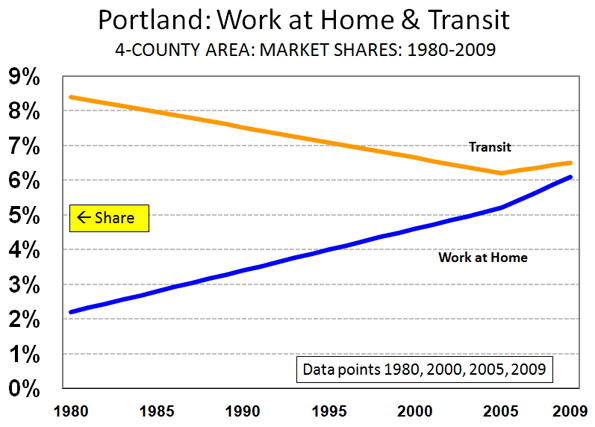
    The reality is less impressive. After spending an extra $5 billion over the past quarter century, public transit’s share of work trip travel in Portland is less than it was before. Moreover, the Portland has now become the 38th of the major metropolitan areas (over 1,000,000 population) in which more people work at home (such as telecommuting) than ride transit to work.

    Tri-Met’s more recent notoriety also reveals some serious concerns about financial management . Auditors recently finished their annual report, and it indicates that that Tri-Met has run up some rather large bills that it may be hard-pressed to pay.

    Unfunded Pension Liabilities: Unfunded liabilities on Tri-met’s employee pension funds have grown to more than $260 million. This deficit has developed because Tri-Met can not meet its obligation to pay into the pension funds on a current basis. Indeed, at the rate Tri-Met paid the pension funds for fiscal year 2010 (ended June 30), they would be more than eight years delinquent. Overall, the pension funds are nearly 50 percent under funded.

    Other Post-Employee Benefits: “Other Post-Employee Benefits” (OPEB), made up principally of retiree health care, pose a much bigger problem. As of the end of the fiscal year, the unfunded liability for these benefits was $817 million, up $185 million in just one year. Underfunding is an even greater problem. The retiree benefits are 100 percent under funded. Tri-Met has simply put no money aside for these benefits. Tri-Met has achieved world class status in underfunding its OPEB. The Los Angeles MTA, which carries nearly five times as much travel volume as Tri-Met had unfunded OPEB liabilities of only $730 million (still a huge figure) in 2009, which is the last data available.

    When challenged on the huge unfunded liability and its growth, Tri-Met General Manager Neil McFarlane responded to KATU-TV: “That’s adding apples, oranges and grapefruits together to get a completely unreasonable number.” One wonders what kind of complications the chief executive office of a publicly traded Fortune 500 company would face for similarly dismissing inconvenient data in its annual report (whether from the Securities and Exchange Commission, the board of directors or the stockholders).

    The auditor, Moss-Adams, LLP appended a standard opinion, to the effect that “… the financial statements … present fairly, in all material respects, the financial position of the District as of June 30, 2010…” At another point the auditors note their obligation to perform the audit to “obtain reasonable assurance about whether the financial statements are free of material misstatement.” As far as McFarlane is concerned, there may be some disagreement on whether the financial statements are “free of material misstatement, “given that they include a “completely unreasonable number.”

    A Train of Debt: Other Tri-Met woes come from its frequent bonds issues, which to date have been approved with little oppostion. The present bonded indebtedness is more than $250 million. The agency is asking the electorate for approval of another $125 million in bonds at the November 2 election. The Oregonian, which has been a friend to nearly everything Tri-Met has done, is recommending a “no” vote on the bonds, pointing out that they would not be necessary if Tri-Met had saved sufficiently for vehicle replacement. Further, Tri-Met is searching hard for more money to fund a deficit in its proposed light rail line to suburban Milwaukie in Clackamas County, which seems a questionable project given the agency’s inability to keep fares under control and maintain service levels.

    Bloated Benefits: John Charles, President of the Cascade Policy Institute raised eyebrows when he noted that Tri-Met’s employee benefits expense is by far the highest in the nation. Charles looked at 20 large transit agencies and found that employee benefits were equal to 152 percent of the wage bill, approaching double that of the next highest, San Francisco’s Bay Area Rapid Transit District and Washington’s Metropolitan Transit Authority. With their above 80 percent employer-paid benefits ratios, albeit lower than Tri-Met’s 152 percent, these agencies have nothing to be proud of. In the private sector, employer-paid benefits tend to be less than 25 percent of wages. Tri-Met’s 152 percent is six times that.

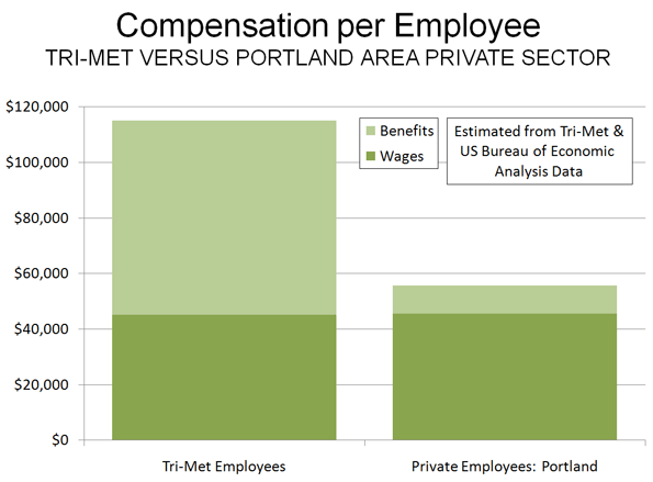
    Bloated Compensation: With a benefits ratio of 152 percent, payroll expense per employee is a stratospheric $115,000 annually (assumes the 2008 staffing ratio, later data not identified). In contrast, the average private sector employee in the Portland metropolitan area is compensated at approximately $55,000 annually, which includes wages and a 22 percent extra for benefits (Figure 1).

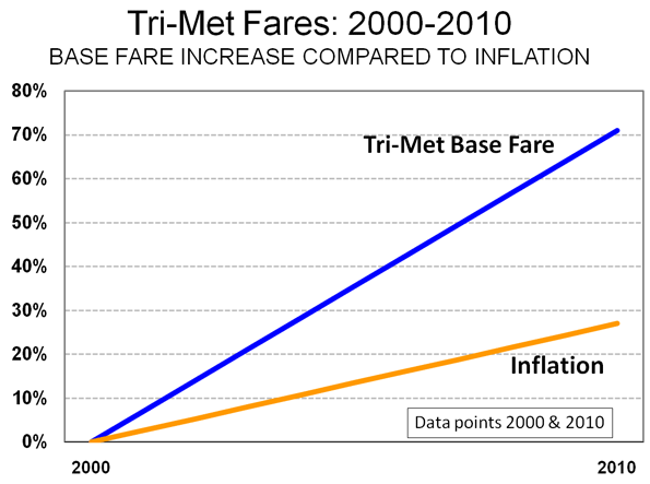
    Employees Ahead of Customers: Tri-Met implemented a fare increase in September and reduced bus service by 5.8 percent and light rail service by 3.5 percent. In the last 10 years, the basic bus fare has risen 71 percent, well above the 27 percent inflation rate (Figure 2). The fare increases and service cuts are imposing substantial hardship on many Tri-Met riders, who have limited incomes and no access to cars. The above inflationary fare increases represent a financial management failure of fundamental proportions.

    Yet while it was raising fares, Tri-Met also increased union employee compensation by three percent and covered increases of 7.5 percent to 22.5 percent on two employee health care programs. Tri-Met has admitted that these increases were not legal obligations (could this be a gift of public funds?). The cost of the non-obligatory wage increase was more than double the amount Tri-Met expects to raise from the September fare increase. Some discontinued service could have been financed with the rest of the wage increase money and the non-obligatory health care premium increases.

    Rising Costs: The question for Portland and Tri-Met remains whether this financial house of cards is sustainable. Operating and capital costs have, not surprisingly, skyrocketed. In fiscal year 2010, it is estimated that costs per passenger mile rose to more than $1.35. This is a full 40 percent above the the national transit average. This is more than five times the per passenger mile – full cost of cars and sport utility vehicles including all user costs and the portion of road expenditures (principally local streets) paid for by taxes – of less than $0.25.

    Fiscal Imprudence: Past and Future: There is some too-little, too-late good news for riders. Tri-Met has told the union that it will not cover health care benefits increases in 2011, nor will there be another non-obligatory wage increase. In its editorial opposing approval of the bond issue The Oregonian spoke of “past fiscal imprudence.” In appears that the mecca of transit is becoming less a role model and more a cautionary tale.

    Wendell Cox is a Visiting Professor, Conservatoire National des Arts et Metiers, Paris and the author of “War on the Dream: How Anti-Sprawl Policy Threatens the Quality of Life

    Photo: Mount Hood in exurban Portland (by author)

  • Property Values 11 Times Higher Across Portland’s Urban Growth Boundary

    One of the starkest impacts of smart growth policies is the huge differentials in property prices that occur on virtually adjacent properties on either side of an urban growth boundary.

    The extent to which regulatory restrictions can drive up prices is illustrated by the differences between the values of undeveloped lands just a few steps from each other, but across the urban growth boundary. Research from more than a decade ago in Portland indicated that land on which development is permitted inside the urban growth boundary tended to be 10 times as valuable per acre as land immediately outside the urban growth boundary, on which development was not permitted. In Auckland, New Zealand, recent research found virtually adjoining undeveloped land value differences at 10 times or more as well. Research in the London area by Dr. Timothy Leunig of the London School of Economics indicates that this difference can be as much as 500 times.

    Recently (February), I examined tax assessment records for all parcels in Portland’s Washington County that abut the urban growth boundary to see if value differences exist. The properties had to be 5 or more acres and be undeveloped. Research was conducted based upon Internet information in February 2010. Property along 25 miles of the urban growth boundary from Cedar Hills to Hillsboro to southwest Beaverton was included in the analysis.

    • The land adjacent to, but outside the urban growth boundary (on which development is prohibited) was assessed at approximately $16,000 per acre.
    • The land adjacent to, but inside the urban growth boundary (on which development is permitted) was assessed at approximately $180,000 per acre, approximately 11 times the price of land that is virtually across the street (across the urban growth boundary)

    A sample was also taken of more remote developable parcels of more than 5 acres, on which development would not be permitted. These parcels, which were from one to five miles outside the urban growth boundary, had a value of approximately $8,500. Thus, the developable land inside the urban growth boundary was 21 times as expensive as the more remote land.

    These data indicate the impact of urban growth boundaries on the price of raw land, which is inevitably passed on to buyers of new housing. Without an urban growth boundary, it would be expected that land on both sides of an urban growth boundary would have similar values. Further, land would be expected to drop in value beyond the urban fringe, but not by the drastic amounts indicated in Portland, Auckland and London.

    —-

    Photograph: (By Author)

  • Decade of the Telecommute

    The rise in telecommuting is the unmistakable message of the just released 2009 American Community Survey data. The technical term is working at home, however the strong growth in this market is likely driven by telecommuting, as people use information technology and communications technology to perform jobs that used to require being in the office.

    In 2009, 1.7 million more employees worked at home than in 2000. This represents a 31% increases in market share, from 3.3 percent to 4.3 percent of all employment. Transit also rose, from 4.6% to 5.0%, an increase of 9% (Note). Even so, single occupant automobile commuting also rose, from 75.7% to 76.1%, despite the huge increase in gasoline prices. The one means of transport that continued to decline was car pooling, which saw its share decline from 12.1% in 2000 to 10.0% in 2009.

    The increase in working at home was pervasive in scope. The share of employees working at home rose in every major metropolitan area (over 1,000,000 population), with an average increase of 38%. The largest increase was in Charlotte – ironically a metropolitan area with large scale office development in its urban core – with an 88% increase in the work at home market share. In five metropolitan areas, the increase was between 70% and 80% (Richmond, Tampa-St. Petersburg, Raleigh, Jacksonville and Orlando). Only five metropolitan areas experienced market share increases less than 20% (New Orleans, Salt Lake City, Rochester, Buffalo and Oklahoma City). Nonetheless, the rate of increase in the work at home market share exceeded that of transit in 49 of the 52 major metropolitan areas. Transit’s increase was greater only in Washington, Seattle and Nashville (where the transit market share is miniscule).

    The working at home market share increase was also strong outside the major metropolitan areas, rising 23%.

    Working at home is fast closing the gap with transit. In part driven by the surge in energy prices since earlier in the decade, transit experienced its first increase since data was first collected by the Bureau of the Census in 1960. Yet working at home is growing more rapidly, and closing the gap, from 1.7 million fewer workers than transit in 2000 to only 1.0 million fewer in 2009. At the current rate, more people could be working at home than riding transit by 2017. This is already the case in much of the country outside the New York metropolitan area, which represents a remarkable 39 percent of the nation’s transit commuters. Taking New York out of the picture, 31% more people (1.35 million) worked at home than traveled by transit, more than 4 times the 7% difference in 2000 (Table 1, click for additional information).

    Table 1
    Transit & Work at Home Share of Commuting
    Major Metropolitan Areas: 2000 & 2009
      Transit Work at Home
    Metropolitan Area 2000 2009 2000-2009 2000 2009 2000-2009
    New York 27.4% 30.5% 11.4% 2.9% 3.9% 32.6%
    Los Angeles 5.6% 6.2% 11.6% 3.5% 4.8% 35.3%
    Chicago 11.3% 11.5% 2.0% 2.9% 4.0% 37.1%
    Dallas-Fort Worth 1.8% 1.5% -13.3% 3.0% 4.1% 37.0%
    Philadelphia 8.9% 9.3% 3.7% 2.9% 3.9% 35.0%
    Houston 3.2% 2.2% -29.2% 2.5% 3.4% 37.4%
    Miami-West Palm Beach 3.2% 3.5% 9.7% 3.1% 4.5% 48.0%
    Atlanta 3.4% 3.7% 8.7% 3.5% 5.6% 59.9%
    Washington 11.2% 14.1% 26.6% 3.7% 4.5% 22.7%
    Boston 11.2% 12.2% 9.8% 3.3% 4.3% 31.9%
    Detroit 1.7% 1.6% -4.7% 2.2% 3.1% 40.1%
    Phoenix 1.9% 2.3% 17.5% 3.7% 5.3% 44.3%
    San Francisco-Oakland 13.8% 14.6% 6.0% 4.3% 6.0% 40.5%
    Riverside 1.6% 1.8% 9.0% 3.5% 4.6% 32.6%
    Seattle 7.0% 8.7% 25.0% 4.2% 5.1% 23.6%
    Minneapolis-St. Paul 4.4% 4.7% 6.4% 3.8% 4.6% 20.6%
    San Diego 3.3% 3.1% -7.0% 4.4% 6.6% 50.2%
    St. Louis 2.2% 2.5% 14.2% 2.9% 3.5% 22.5%
    Tampa-St. Petersburg 1.3% 1.4% 11.0% 3.1% 5.5% 75.7%
    Baltimore 5.9% 6.2% 5.8% 3.2% 3.9% 23.2%
    Denver 4.4% 4.6% 4.3% 4.6% 6.2% 36.4%
    Pittsburgh 5.9% 5.8% -2.9% 2.5% 3.2% 28.5%
    Portland 6.3% 6.1% -3.0% 4.6% 6.1% 32.9%
    Cincinnati 2.8% 2.4% -13.4% 2.7% 3.8% 40.3%
    Sacramento 2.7% 2.7% 0.8% 4.0% 5.4% 33.1%
    Cleveland 4.1% 3.8% -8.1% 2.7% 3.4% 25.0%
    Orlando 1.6% 1.8% 15.4% 2.9% 4.9% 71.4%
    San Antonio 2.7% 2.3% -12.5% 2.6% 3.4% 29.0%
    Kansas City 1.2% 1.2% 4.6% 3.5% 4.3% 24.7%
    Las Vegas 4.4% 3.2% -26.8% 2.3% 3.3% 45.1%
    San Jose 3.4% 3.1% -9.6% 3.1% 4.5% 44.4%
    Columbus 2.1% 1.4% -35.0% 3.0% 4.1% 36.7%
    Charlotte 1.4% 1.9% 32.2% 2.9% 5.4% 88.1%
    Indianapolis 1.3% 1.0% -22.2% 3.0% 3.7% 24.7%
    Austin 2.5% 2.8% 11.7% 3.6% 5.9% 64.6%
    Norfolk 1.7% 1.4% -17.7% 2.7% 3.4% 27.9%
    Providence 2.4% 2.7% 12.8% 2.2% 3.6% 64.5%
    Nashville 0.8% 1.2% 38.5% 3.2% 4.3% 34.6%
    Milwaukee 4.2% 3.7% -12.5% 2.6% 3.2% 25.3%
    Jacksonville 1.3% 1.2% -9.1% 2.3% 4.0% 73.8%
    Memphis 1.6% 1.5% -8.1% 2.2% 3.1% 41.3%
    Louisville 2.0% 2.4% 20.2% 2.5% 3.1% 22.9%
    Richmond 1.9% 2.0% 6.5% 2.7% 4.7% 76.8%
    Oklahoma City 0.5% 0.4% -13.0% 2.9% 3.1% 4.7%
    Hartford 2.8% 2.8% -1.3% 2.6% 4.0% 53.6%
    New Orleans 5.4% 2.7% -50.3% 2.4% 2.9% 19.2%
    Birmingham 0.7% 0.7% -2.3% 2.1% 2.7% 29.5%
    Salt Lake City 3.3% 3.0% -10.1% 4.0% 4.7% 17.8%
    Raleigh 0.9% 1.0% 10.7% 3.5% 6.0% 74.4%
    Buffalo 3.3% 3.6% 7.9% 2.1% 2.3% 8.3%
    Rochester 2.0% 1.9% -4.3% 2.9% 3.3% 13.7%
    Tucson 2.5% 2.5% 1.8% 3.6% 5.0% 36.3%
    Total 7.5% 8.0% 6.4% 3.2% 4.4% 37.7%
    Other 1.0% 1.2% 12.3% 3.4% 4.2% 23.0%
    National Total 4.6% 5.0% 9.2% 3.3% 4.3% 30.9%
    Major metropolitan areas: Over 1,000,000 population in 2009
    Metropolitan Area definitions as of 2009
    Data from 2000 Census and 2009 American Community Survey

    The rise of working at home is illustrated by the number of major metropolitan areas in which it now leads transit in market share. In 2000, working at home had a larger market share than transit in 28 of the present 52 major metropolitan areas. By 2009, working at home led transit in 38 major metropolitan areas, up 10 from 2000. Between 2000 and 2009, the working at home market share increased nearly 6 times as much as the transit share in the major metropolitan areas (38.4% compared to 6.4%).

    Working at Home Leaps Above Transit In Portland and Elsewhere: Perhaps most surprising is the fact that Portland now has more people working at home than riding transit to work. This is a significant development. Portland is a model “smart growth” having spent at least $5 billion additional on light rail and bus expansions over the last 25 years. Portland was joined by other metropolitan areas Houston, Miami-West Palm Beach, New Orleans and San Jose, all of which have spent heavily on urban rail systems. Working at home also passed transit in Cincinnati, Hartford, Las Vegas, Raleigh and San Antonio (Table 2).

    Table 2
    Work at Home Share Greater than Transit
    Major Metropolitan Areas
    Atlanta Houston Norfolk Sacramento
    Austin Indianapolis Oklahoma City Salt Lake City
    Birmingham Jacksonville Orlando San Antonio
    Charlotte Kansas City Phoenix San Digo
    Cincinnati Las Vegas Portland San Jose
    Columbus Louisville Providence St. Louis
    Dallas-Fort Worth Memphis Raleigh Tampa-St. Petersburg
    Denver Miami-West Palm Beach Richmond Tucson
    Detroit Nashville Riverside
    Hartford New Orleans Rochester
    Indicates working at home passed transit between 2000 and 2009

    Further, the shares are close enough at this point that working at home could surpass n transit in Milwaukee, Cleveland and Minneapolis-St. Paul in the next few years.

    Transit: About New York and Downtown

    As noted above, transit also has gained during this decade. However, the gains have not been pervasive. Out of the 52 major metropolitan areas, transit gained market share in 29 and lost in 23. As usual, transit was a New York story, as the New York metropolitan area saw its transit work trip market share rise from 27.4% to 30.5%. New York accounted for 47% of the increase in transit use, despite representing only 37% in 2000. New York added nearly 500,000 new transit commuters. This is nearly five times the increase in working at home (106,000). Washington also did well, adding 125,000 transit commuters, followed by Los Angeles at 73,000 and Seattle at 41,000.

    Transit’s downtown orientation was evident again. This is illustrated by the fact that more than 90% of the increased use in the major metropolitan areas occurred in those metropolitan areas with the 10 largest downtown areas (New York, Los Angeles, Chicago, Philadelphia, Houston, Atlanta, Washington, Boston, San Francisco and Seattle). Among these, only Houston experienced a decline in transit commuting.

    Implications

    Working at home has been the fastest growing component of commuting for nearly three decades. In 1980, working at home accounted for just 2.3% of commuting, a figure that has nearly doubled to 4.3% in 2009. This has been accomplished with virtually no public investment. Moreover, this seems to have happened without any loss of productivity. Companies like IBM, Jet Blue and many others have switched large numbers of their employees to working at home. These firms, which necessarily seek to provide the best return on their investment for stockholders and owners would not have made these changes if it had interfered with their productivity.

    Over the same period, and despite the recent increases, transit’s market share has fallen from 6.4% of commuting in 1980 to 5.0% in 2009. At the same time, gross spending over the period rose more than $325 billion (inflation and ridership adjusted) from 1980 levels. Inflation adjusted expenditures per passenger mile have more than doubled since that time.

    Given the remarkable rise of telecommuting, its low cost and effectiveness as a means to reduce energy use, perhaps it’s time to apply at least some of our public policy attention to working in cyberspace. It presents a great opportunity, perhaps far greater and far more cost-effective than the current emphasis on new rail transit systems.

    ———-

    Note: Work trip market share reflects transit in its strongest market, trips to and from work. Transit’s overall impact, measured by total roadway and transit travel (passenger miles) is approximately 1%, compared to the national work trip market share of 5%.

    Wendell Cox is a Visiting Professor, Conservatoire National des Arts et Metiers, Paris and the author of “War on the Dream: How Anti-Sprawl Policy Threatens the Quality of Life

    Photograph: DDFic

  • Portland Metro’s Competitiveness Problem

    Portland Metro’s president, David Bragdon, recently resigned to take a position with New York’s Bloomberg administration. Bragdon was nearing the end of his second elected term and ineligible for another term. Metro is the three county (Clackamas, Multnomah and Washington counties) planning agency that oversees Portland’s land use planning and transportation policies, among the most stringent and pro-transit in the nation.

    Metro’s jurisdiction includes most of the bi-state (Washington and Oregon) Portland area metropolitan area, which also includes the core municipality of Portland and the core Multnomah County.

    Local television station KGW (Channel 8) featured Bragdon in its Straight Talk program before he left Portland. Some of his comments may have been surprising, such as his strong criticism of the two state (Washington and Oregon) planning effort to replace the aging Interstate Bridge (I-5) and even more so, his comments on job creation in Portland. He noted “alarming trends below the surface,” including the failure to create jobs in the core of Portland “for a long time.”

    Bragdon was on to something. Metro’s three county area suffers growing competitive difficulties, even in contrast to the larger metropolitan area (which includes Clark and Skamania counties in Washington, along with Yamhill and Columbia counties in Oregon). This is despite the fact that one of the most important objectives of Metro’s land use and transportation policies is to strengthen the urban core and to discourage suburbanization (a phenomenon urban planning theologians call “sprawl”).

    Anemic Job Creation: Jobs have simply not been created in Portland’s core. Since 2001, downtown employment has declined by 3,000 jobs, according to the Portland Business Alliance. In Multnomah County, Portland’s urban core and close-by surrounding communities, 20,000 jobs were lost between 2001 and 2009. Even during the prosperous years of 2000 to 2006, Multnomah County lost jobs. Suburban Washington and Clackamas counties gained jobs, but their contribution fell 12,000 jobs short of making up for Multnomah County’s loss. The real story has been Clark County (the county seat is Vancouver), across the I-5 Interstate Bridge in neighboring Washington and outside Metro’s jurisdiction. Clark County generated 13,000 net new jobs between 2001 and 2009 (Figure 1).

    Domestic Migration: Not only are companies not creating jobs in the three county area, but people are choosing to locate in other parts of the metropolitan area.

    Between 2000 and 2009, the three counties – roughly 75% of the region’s total population in 2000 – attracted just one-half of net domestic migration into the metropolitan area. Washington’s suburban Clark County, across the Interstate Bridge, added a net 48,000 by domestic migration and has accounted for 40% of the metropolitan area’s figure all by itself.

    Core Multnomah County, which had nearly double Clark County’s 2000 population, added only 4,000 net domestic migrants, at a rate less than 1/20th that of Clark County. Suburban Clackamas and Washington counties did better, but between them achieved barely one-half of the Clark County rate.

    Exurban Columbia and Yamhill counties, outside the jurisdiction of Metro but inside the metropolitan area, added nearly 13,000 domestic migrants, more than three times that of Multnomah County, despite their combined population less than one-fifth that of Multnomah’s in 2000.

    Effects of Pro-Transit Policies: Portland’s unintended decentralization has even damaged the much promoted, and subsidized, public transit agencies. Despite Portland’s pro-transit policies, the three county transit work trip market share fell from 9.7% in 1980, before the first light rail line was opened, to 7.4% in 2000, after two light rail lines had opened. Two more light rail lines and 9 years later, (2009) the three county transit work trip market share had fallen to 7.4%, despite the boost of higher gasoline prices. The three county transit work trip market share loss from 9.7% in 1980 to 7.4% in 2009 calculates to a near one-quarter market share loss. By contrast, Seattle’s three county metropolitan area, without light rail until 2009, experienced a 5% increase in transit work trip market share from 1980 to 2009 (8.3% to 8.7%).

    While taxpayer funded transit was attracting less than its share of new commuters out of cars, one mode –unsupported by public funds – was doing very well. Between 1980 and 2009, working at home rose from 2.2% of employment to 6.2%. in the four county area (including Clark County). Thus, nearly as many people worked at home as rode transit to work in 2009 (Note). Already, working at home accounts for a larger share of employment than transit in the larger 7 county metropolitan area. All of this is despite Portland’s having spent an extra $5 billion on transit in the last 25 years on light rail expansions and more bus service. (Figure 2).

    Why is the Three County Area Doing Less Well? Why have Portland’s policies that are designed to help the core failed to draw jobs and people? People who move to the Portland area from other parts of the nation are probably drawn by the lower house prices in Clark County, where less stringent land use regulation has kept houses more affordable. New housing in Clark County is also built on average sized lots, rather than the much smaller lots that have been required by Metro’s land use policies. House prices are also lower in the exurban counties outside Metro’s jurisdiction.

    As Metro has forced urban densities up in the three county area and failed to provide sufficient new roadway capacity, traffic congestion has become much worse. A long segment of Interstate 5 in north Portland seems in a perpetual peak hour gridlock unusual for a medium sized metropolitan area, which is obvious from Google traffic maps that show average conditions by time and day of week. Even more unusual is the gridlock on a long stretch of the US-26 Sunset Highway that serves the suburban Silicon Forest of Washington County. A long overdue expansion will soon provide some relief on US-26. However transportation officials seem in no hurry to provide the additional capacity necessary to reduce both greenhouse gas emissions and excessive travel delays on Interstate 5 in north Portland. People who move to Clark or the exurban counties can avoid these bottlenecks by working closer to home or even in the periphery of the three county area.

    Portland has important competitive advantages, such as a temperate climate and marvelous scenery. It also helps to be close to hyper- uncompetitive California, which keeps exporting households to neighboring states. But a higher cost of living driven by policies that have kept prices 40% higher than before the housing bubble (adjusted for household incomes), and increasing traffic congestion make Portland’s three county area less competitive and nearby alternatives more attractive.

    This is not surprising. More intense regulation deters business attraction and expansion. An economic study by Raven Saks of the Federal Reserve Board concluded that … metropolitan areas with stringent development regulations generate less employment growth. At least part of the reason the Metro region’s diminished competitiveness lies with a failed strategy that appears to be having the exact opposite effect to what has been advertised – and widely celebrated – among planners from coast to coast.

    Note: 1980 three county data not available on-line.

    Wendell Cox is a Visiting Professor, Conservatoire National des Arts et Metiers, Paris and the author of “War on the Dream: How Anti-Sprawl Policy Threatens the Quality of Life

    Photograph: South Waterfront Condominiums, Portland. Photo by author

  • Despite Transit’s 2008 Peak, Longer Term Market Trend is Down: A 25 Year Report on Transit Ridership

    In 2008, US transit posted its highest ridership since 1950, a development widely noted and celebrated in the media. Ridership had been increasing for about a decade, however, 2008 coincided with the highest gasoline prices in history, which gave transit a boost.

    Less reported was the fact that despite higher ridership, transit’s market share (of transit and motor vehicles) has fallen since the 1950s. In 1955, transit’s market share was over 10%. By 2005, transit’s share had dropped to 1.5%, but recovered only to 1.6% in 2008. Transit’s all time peak ridership was in 1945, driven up by World War II and gas rationing. It is thus not surprising that national transit ridership (boardings) declined 3.8% in 2009 as gasoline prices moderated.

    Market Share by Major Urban Area

    Demographia has released urban area roadway and transit market share estimates for 2008, based upon Federal Transit Administration and Federal Highway Administration data. The table below compares 2008 with 1983 market share data for 56 urban areas with a corresponding metropolitan area population of more than 900,000 (complete data).

    Urban Areas: Roadway & Transit Market Share: 2008
    Ranked by 2008 Transit Market Share
    With 25 Year (1983) Comparison
        2008 1983 Roadway Share % Change
    Rank Urban Area Roadway Share Transit Share:  Roadway Share Transit Share: 
    1 New York 89.0% 11.0% 87.7% 12.3% 1.5%
    2 San Francisco 95.0% 5.0% 93.7% 6.3% 1.4%
    3 Washington 95.5% 4.5% 96.1% 3.9% -0.6%
    4 Chicago 96.1% 3.9% 94.2% 5.8% 2.0%
    5 Honolulu 96.2% 3.8% 93.2% 6.8% 3.2%
    6 Boston 96.7% 3.3% 97.5% 2.5% -0.8%
    7 Seattle 97.2% 2.8% 97.6% 2.4% -0.4%
    8 Philadelphia 97.3% 2.7% 96.0% 4.0% 1.4%
    9 Portland 97.7% 2.3% 97.6% 2.4% 0.1%
    10 Salt Lake City 97.8% 2.2% 99.1% 0.9% -1.3%
    11 Los Angeles 98.1% 1.9% 98.1% 1.9% 0.0%
    12 Denver 98.2% 1.8% 98.5% 1.5% -0.3%
    13 Baltimore 98.3% 1.7% 97.7% 2.3% 0.6%
    14 Pittsburgh 98.6% 1.4% 97.3% 2.7% 1.3%
    15 Miami-West Palm Beach 98.7% 1.3% 98.8% 1.2% -0.1%
    16 Atlanta 98.8% 1.2% 98.0% 2.0% 0.8%
    16 Cleveland 98.8% 1.2% 98.0% 2.0% 0.8%
    16 Las Vegas 98.8% 1.2% 99.6% 0.4% -0.8%
    16 Minneapolis-St. Paul 98.8% 1.2% 98.8% 1.2% 0.0%
    16 San Diego 98.8% 1.2% 99.3% 0.7% -0.5%
    21 San Jose 99.0% 1.0% 99.0% 1.0% 0.0%
    22 Austin 99.1% 0.9% 99.7% 0.3% -0.6%
    22 Houston 99.1% 0.9% 99.0% 1.0% 0.1%
    22 Milwaukee 99.1% 0.9% 98.3% 1.7% 0.8%
    22 Sacramento 99.1% 0.9% 99.0% 1.0% 0.1%
    22 San Antonio 99.1% 0.9% 98.7% 1.3% 0.4%
    27 St. Louis 99.2% 0.8% 99.0% 1.0% 0.2%
    28 Buffalo 99.3% 0.7% 98.5% 1.5% 0.8%
    28 Providence 99.3% 0.7% 98.9% 1.1% 0.4%
    30 Charlotte 99.4% 0.6% 99.3% 0.7% 0.1%
    30 Cincinnati 99.4% 0.6% 98.7% 1.3% 0.7%
    30 Dallas-Fort Worth 99.4% 0.6% 99.4% 0.6% 0.0%
    30 Hartford 99.4% 0.6% 98.7% 1.3% 0.7%
    30 Orlando 99.4% 0.6% 99.7% 0.3% -0.3%
    30 Phoenix 99.4% 0.6% 99.4% 0.6% 0.0%
    30 Rochester 99.4% 0.6% 98.9% 1.1% 0.5%
    30 Tucson 99.4% 0.6% 98.9% 1.1% 0.5%
    38 Detroit 99.5% 0.5% 98.8% 1.2% 0.7%
    38 Fresno 99.5% 0.5% 99.3% 0.7% 0.2%
    38 New Orleans 99.5% 0.5% 97.4% 2.6% 2.2%
    38 Norfolk-Virginia Beach 99.5% 0.5% 99.2% 0.8% 0.3%
    38 Riverside-San Bernardino 99.5% 0.5% 99.6% 0.4% -0.1%
    43 Columbus 99.6% 0.4% 98.6% 1.4% 1.0%
    43 Louisville 99.6% 0.4% 98.9% 1.1% 0.7%
    43 Memphis 99.6% 0.4% 99.4% 0.6% 0.2%
    43 Tampa-St. Petersburg 99.6% 0.4% 99.5% 0.5% 0.1%
    47 Bridgeport 99.7% 0.3% 99.8% 0.2% -0.1%
    47 Jacksonville 99.7% 0.3% 99.4% 0.6% 0.3%
    47 Kansas City 99.7% 0.3% 99.4% 0.6% 0.3%
    47 Nashville 99.7% 0.3% 99.4% 0.6% 0.3%
    47 Raleigh 99.7% 0.3% 99.9% 0.1% -0.2%
    47 Richmond 99.7% 0.3% 99.1% 0.9% 0.6%
    53 Indianapolis 99.8% 0.2% 99.3% 0.7% 0.5%
    54 Birmingham 99.9% 0.1% 99.5% 0.5% 0.4%
    54 Oklahoma City 99.9% 0.1% 99.9% 0.1% 0.0%
    54 Tulsa 99.9% 0.1% 99.6% 0.4% 0.3%
    Unweighted Average 98.7% 1.3% 98.3% 1.7% 0.4%
    All Urban Areas Combined 98.4% 1.6% 97.5% 2.5% 0.9%
    Based upon passenger miles
    Core urban areas in metropolitan areas with more than 900,000 population in 2009.
    Derived from Federal Transit Administration and Federal Highway Administration data
    Los Angeles and Mission Viejo urban areas combined
    San Francisco, Concord and Livermore urban areas combined
    Historic transit market share data at http://www.publicpurpose.com/ut-usptshare45.pdf
    Maryland commuter rail (MARC) assigned to Washington, DC

    In 1983, transit systems started receiving support from federal taxes on gasoline. This was also the first year that the National Transit Database reported on the same annual basis as it does today. One justification for using funds from road users was the hope of attracting people from cars to transit. The national data above and the urban area below show that the overwhelming share of new travel has, nonetheless, continued to be captured by motor vehicles rather than transit. Among the 56 urban areas, 13 experienced gains in transit market share from 1983 to the peak year of 2008, while 37 posted losses and six had no change. Transit was able to capture only 0.9% of new urban travel between 1983 and 2008, while roadways captured 99.1%. (Note 1).

    The Top 10: Still a New York Story

    #1: New York: The nation’s predominant urban area remains New York, with an 11.0% transit market share. In 2008, 41% of the national transit ridership (passenger miles) was in New York, with much of it either in or focused upon New York City. The New York City Transit Authority, and a host of local public and private systems, principally serve New York City destinations and account for a remarkable 38% of the nation’s transit ridership. Even so, transit’s market share dropped from 12.3% in 1983. As a result, the roadway market share in New York increased 1.5% between 1983 and 2008, the fourth largest gain in the nation. Transit attracted 8.7% of the new demand between 1983 and 2008, while roadways attracted 91.3%.

    #2: San Francisco: San Francisco had the nation’s second highest transit market share in 2008, at 5.0%. This is a decline from 6.3% in 1983. Nonetheless, San Francisco moved up from 6th place in 1983. This produced a 1.4% increase in the roadway market share between 1983 and 2008, the fifth largest gain in the nation. Transit accounted for 2.2% of the new demand, while roadways attracted 97.8%.

    #3: Washington: Washington placed third in transit market share in 2008, at 4.5%. This represents a gain from 3.9% in 1983 and an improvement from 6th place. Washington was the only urban area among the top five to experience an increase in transit market share. Much of Washington’s transit increase was on its expanding Metrorail system and the MARC commuter rail system (most of the ridership on this Maryland based system commutes to Washington. Overall, transit in Washington has attracted 5.1% of new travel over the past 25 years, while roadways attracted 94.9% of new demand.

    #4: Chicago: Chicago ranked fourth in transit market share, at 3.9%. In 1983, Chicago had ranked 3rd, with a market share of 5.8. The roadway market share in Chicago increased 2.0% from 1983 to 2008, the third largest road travel gain in the nation. Transit attracted 1.3% of new demand over the period in Chicago, while roadways attracted 98.7%.

    #5: Honolulu: Honolulu ranked fifth in transit market share, at 3.8%. This is a significant drop from 1983, when Honolulu ranked 2nd in the nation, with a transit market share of 6.8%. Honolulu’s roadway market share gain was the largest in the nation between 1983 and 2005, at 3.8%. Transit ridership also dropped in Honolulu from 1983 to 2008, so that roadways accounted for all new travel.

    #6: Boston: Boston ranked sixth in transit market share in 2008, at 3.3%. This is a gain from 2.5% in 1983, when Boston ranked 9th. Much of Boston’s increase is attributable to its commuter rail expansion. Transit captured 4.1% of new demand, while roadways attracted 95.9%.

    #7: Seattle: Seattle’s principally all bus transit system ranked 7th in 2008 with a market share of 2.8%. This is an increase from 2.4% in 1983, when Seattle ranked 10th. Transit captured 3.1% of new travel over the past 25 years, while roadways accounted for 96.9%.

    #8: Philadelphia: Philadelphia slipped from the 5th largest transit market share in 1983 (4.0%) to 8th in 2008, at 2.7%. Philadelphia’s transit system, one of the most comprehensive in the nation, captured just 1.4% of new travel over the last quarter century, while roadways captured 98.6%.

    #9: Portland: Portland ranked 9th in transit market share in 2008, at 2.3%. This is a decline from 2.4% in 1983 and occurred despite opening the most extensive new light rail system in the nation over the period. Transit attracted 2.2% of new travel over the period, while roadways attracted 97.8%.

    #10: Salt Lake City: Salt Lake City, at 10th, is a new entrant to the top 10 transit market share urban areas, with a share of 2.2%. In 1983, Salt Lake City ranked 34th, with a transit market share of 0.9%. Even with this increase, however, roadways captured the bulk of new travel, at 96.2%, while transit attracted 3.8%, due to transit’s small 1983 base.

    Other Urban Areas: There were also notable developments among the urban areas that did not place in the top 10 in 2008 transit market share.

    Las Vegas: Las Vegas improved its ranking more than any other urban area, moving from 49th in 1983 to 16th in 2008 (in a tie with Atlanta, San Diego, Cleveland and Minneapolis-St. Paul). In 1983, Las Vegas had a transit market share of 0.4%, which improved to 1.2% in 2008. This was an especially notable achievement, because Las Vegas experienced substantial population growth over the period. During the period, Las Vegas established a 100% competitively contracted transit system, the only such transit system in the nation and has seen ridership expand by more than 10 times. Nonetheless, as in other gaining urban areas, such as Salt Lake City and Washington, the transit ridership base was so small that roadways captured nearly all the new demand, at 98.6% (transit obtained 1.4%).

    Atlanta: Atlanta both (1) was the fastest growing larger urban area in the developed world between 1983 and 2008 and (2) built the second most new rail capacity in the nation, in its expansion of the MARTA Metro (trailing only Washington’s Metro). Yet, Atlanta’s transit market share fell from 2.0% to 1.2% between 1983 and 2008, with transit attracting only 0.9% of new travel.

    New Rail Urban Areas: Transit market shares generally failed to increase in urban areas opening new light rail or metro systems over the period (excludes urban areas with new rail systems that were not open at the beginning of fiscal year 2008).

    • Six urban areas with new rail systems experienced market share declines, including Portland, Baltimore, Houston, Sacramento, St. Louis and Buffalo.
    • Four urban areas with new rail systems had static transit market shares, including Los Angeles, Minneapolis-St. Paul, San Jose and Dallas-Fort Worth.
    • Three urban areas with new rail systems experienced transit market share increases. The largest increase was in Salt Lake City (and the largest of any urban area). Denver and Miami-West Palm Beach also experienced increases.

    Where from Here? It might have been expected that transit would have attracted far higher ridership numbers when gasoline prices achieved such heights. Yet, nationally, transit market share increase was only from 1.5% to 1.6%, even as roadway demand was declining modestly.

    Transit’s principal marketing problem lies in its problem serving destinations outside downtown. Downtowns typically account for only 10% of urban area employment. Some trips in an urban cannot even be made on transit. For example, Portland’s extensive transit system connects only about two-thirds of the jobs and residences within the (Tri-Met) service area (Note 2). Further Tri-Met’s award deserving internet trip planner shows that some trips to outside downtown destinations can require more than two hours, even when light rail is used.


    Note 1: This data relates only to passenger transportation. Urban roadways, unlike transit, also carry a substantial amount of local and intercity freight, which is not reflected in this data.

    Note 2: According to Metro’s 2004 Regional Transportation Plan, 78% of the residences and 86% of the jobs in the Tri-Met service area were within walking distance (1/4 mile) of a transit stop. This means that approximately 67% of residences and jobs are within 1/4 mile of a transit stop (0.78 * 0.86). Metro’s plans envision this figure dropping to 59% by 2020 (this data does not include Clark County in Washington, part of which is in the urban area).

    Wendell Cox is a Visiting Professor, Conservatoire National des Arts et Metiers, Paris. He was born in Los Angeles and was appointed to three terms on the Los Angeles County Transportation Commission by Mayor Tom Bradley. He is the author of “War on the Dream: How Anti-Sprawl Policy Threatens the Quality of Life.

  • Planning’s Cultural Cringe?

    First it was Portland, Oregon, touted as a poster child for urban planning in Australia. Now, Vancouver, Canada, is the comparison, and are we seeing another incarnation of Australia’s infamous cultural cringe?

    Advocates of higher density and the “brawl against sprawl” in Australia frequently cite overseas cities as model case studies. Portland, Oregon, was for a long time cited as a good example of pro-density housing strategies which sought to limit ‘sprawl’, to promote public transport by investing in things like light rail, and to promote cycling and a range of other planning ‘solutions’ that would sound remarkably familiar in Australia.

    The truth about Portland, however, didn’t match the hype of its city planners. Much of the boosterism focused on the mostly downtown area of Portland. Like Melbourne, or Sydney, this is its own municipality, with its own Mayor and its own planning officials. As they aggressively sold a story about the virtues of their planning strategy for the city core, they omitted the inconvenient broader metropolitan facts as they went.

    The story of the real Portland, including the surrounding suburban areas, is different than what these policy promoters would have you believe. Portland today, despite hundreds of millions invested in a new light rail system and the promotion of inner city housing density, has fewer public transport trips as a percentage of total travel than in 1980. Urban Growth Boundaries introduced by Oregon State in the 1970s led to housing price pressures which eventually excluded the middle and working class. Leading US city demographer Joel Kotkin describes it as an ‘elite city’ which is ‘remarkably white, young and childless.’ And as international housing market expert Wendell Cox has pointed out, the suggestion that Portland has much to crow about in terms of urban consolidation doesn’t match the official statistics. Portland is as guilty of ‘sprawl’ as Los Angeles.

    The same can be said of Vancouver. Touted by its city officials as a paragon of virtue in planning policy, the Vancouver story is almost entirely limited to its geographically confined downtown. Here, in the wake of overbuilding of office properties in the downtown core, city officials rezoned excess commercial capacity to permit high density residential housing in what we would call the CBD. This ‘living first’ strategy produced a wave of new residential development which saw the core population grow by 20,000 people to around 60,000, and to potentially 90,000 by 2015. Redundant waterside areas have been coverted into residential precincts, and commuting by public transport, cycling or walking are favoured over private vehicles.

    Taken in isolation, the Vancouver story could start to sound convincing. But there are some glaring omissions. The City of Vancouver is home to around 600,000 people. The downtown area – the subject of much of the planning hype – is home to 60,000 people. The broader metro region, based on the same sorts of urban definitions we might use for Brisbane, or Sydney or Melbourne, is home to 2 million people. There is precious little said about the lives of the 1.4 million people who aren’t residents of the City of Vancouver, or the more than 1.9 million who don’t live in the revitalized urban core.

    For these Vancouverites, life isn’t a rosy as the planning hype would have you believe. The most glaring omission about life in Vancouver is that it also happens to be one of the world’s least affordable cities in which to live. According to both the Reserve Bank of Canada and Demographia, Vancouver’s housing rates as severely unaffordable, eating up some three quarters of the region’s median pre-tax household incomes. The problem is so chronic that it has prompted an online game “Crack Shack or Mansion” where visitors are asked: “Can you tell the difference between a crack shack and a Vancouver, BC mansion, listed for one or two million dollars?” Play the game yourself, it’s an eye opener. [A Crack Shack, for the uninitiated, is a den of inequity where illegal drugs are produced].

    That’s hardly the sort of model city you’d want to tout as a planning example we could learn from. The other glaring omission from the planning fairy tale of Vancouver is that life in the city core is vastly different from the overwhelmingly suburban conditions of the vast majority. To the south of Vancouver’s downtown lies an endless suburban grid of detached housing, with limited parklands or open space. Check it out for yourself on Google Maps or Google Earth. Jump into Google Street View and take a walk down a typical Vancouver street. Do that with a housing price list from “Crack Shack or Mansion” in hand and then convince me this is a model for any Australian city.

    A final glaring omission is the climate. This from the official Living in Canada website: “Snow depths of greater than 1 cm are seen on about 10 days each year in Vancouver compared with about 65 days in Toronto. Vancouver has one of the wettest and foggiest climates of Canada’s cities. At times, in winter, it can seem that the rain will never stop.” Summers aren’t so bad though: for two months of the year, the average daily maximum even exceeds 20’c!

    So Vancouver as the next poster child of planning for any Australian city is looking shaky. It’s hopelessly unaffordable (and we have enough problems of our own in that regard), the quality of its majority suburban environment is lower than the standards we already enjoy, and the climate could not be less similar.

    The same can be said of other city-regions often described as examples of how Australian cities could develop. Copenhagen, Paris, or Venice have all in their time been selectively extolled as models for Australian urban planning.

    Maybe this fascination with irrelevant urban models stems from a form of cultural cringe? Whatever the reason, the analogies can be dangerous, especially when they omit the more essential economic or lifestyle based criteria such as housing affordability, share of economic wealth amongst a city/region’s residents, or climate and lifestyle factors.

    It might instead be more helpful if Australian planners referring to overseas examples also kept in mind some of these pragmatic metrics. For example, benchmarking cities with more affordable housing markets than ours and with strong local economies where wealth and standards of living are enjoyed across a wide spectrum of society would produce some very different case studies. Factor in similar climate patterns (which largely dictate recreational and lifestyle behavior) to our own and the choice of comparable cities reduces further.

    We might even start to find that our own cities offer plenty of examples of ‘getting it right.’ Instead of this cultural groveling we could start to define the things we like most about our own existence and plan ways of replicating that, rather than imposing on our cities forms of existence that, appealing as elements might be, are incapable of replication in the Australian context.

    Ross Elliott is a 20 year veteran of property and real estate in Australia, and has held leading roles with national advocacy organizations. He was written and spoken extensively on housing and urban growth issues in Australia and maintains a blog devoted to public policy discussion: The Pulse.

    Photo by ecstaticist

  • The Suburban Exodus: Are We There Yet?

    For many years, critics of the suburban lifestyles that most Americans (not to mention Europeans, Japanese, Canadians and Australians) prefer have claimed that high-density housing is under-supplied by the market. This based on an implication that the people increasingly seek to abandon detached suburban housing for higher density multi-family housing.

    The Suburbs: Slums of the Future?

    The University of Utah’s Arthur C. (Chris) Nelson, indicated in an article (entitled “Leadership in a New Era“) in the Journal of the American Planning Association. that in 2003, 75% of the housing stock was detached and 25% was attached, including townhouses, apartments, and condominiums. By 2025 he predicts that only 62% of consumer will favor detached homes, (Note 1). He also predicts a major shift in consumer preferences from housing on large lots (defined as greater than 1/6th of an acre) to smaller lots (Note 2). This, he suggests, would create a surplus of 22 million detached houses on large lots.

    This predication is largely made on the basis of “stated preference” surveys which the author, Dr. Emil Malizia of the University of North Carolina (commenting on the article in the same issue), and others indicate may not accurately reflect the choices that consumers will actually make. Dr. Nelson’s article has been widely quoted, both in the popular press and in academic circles. It has led some well-respected figures such as urbanist and developer Christopher Leinberger to suggest in an Atlantic Monthly article that “many low-density suburbs and McMansion subdivisions, including some that are lovely and affluent today, may become what inner cities became in the 1960s and ’70s—slums characterized by poverty, crime, and decay.”

    The Condo Market Goes Crazy

    Misleading ideas sometimes have bad consequences. The notion that suburbanites were afflicted with urban envy led many developers to throw up high-rise condominiums in urban districts across the country. Sadly for these developers, the Suburban Exodus never materialized, never occurred. As a result, developers have lost hundreds of millions, if not billions of dollars and taxpayers or holders of publicly issued bonds could be left “holding the bag” (see discussion of Portland, below).

    This weakness has been seen even in the nation’s strongest condominium market, New York City, where one developer offered to pay purchaser’s mortgages, condominium fees and real estate taxes for a year as well as closing costs.

    But the damage is arguably worse in other major markets which lack the amenities and advantages of New York.

    Take, for example, Raleigh (North Carolina), where low density living is the rule (the Raleigh urban area is less dense than Atlanta). The News and Observer reports that the largest downtown condominium building (the Hue) “considered a bold symbol of downtown Raleigh’s revitalization,” has closed its sales office and halted all marketing efforts. The development’s offer of a free washing machine, dryer, refrigerator, and parking space were not enough to entice suburbanites away from the neighborhoods they were said to be so eager to leave.

    This is not an isolated instance. Around the nation, condominium prices have been reduced steeply to attract buyers. New buildings have gone rental, because no one wanted to buy them. Other buildings have been foreclosed upon by banks; and units have been auctioned. Planned developments have been put on indefinite hold or cancelled.

    Miami: Of Little Dubai and Cadavers

    Miami’s core neighborhood (downtown and Brickell, immediately to the south) has experienced one of the nation’s most robust condominium building booms. More than 22,000 condominium high rise units were built between 2003 and 2008. Miami could well have more 50-plus story condominium towers than any place outside Dubai.

    As a result, Miami has suffered perhaps the most severe condominium bust in the nation. According to National Association of Realtors data, the median condominium price in the Miami metropolitan area has dropped 75% from peak levels (2007, 2nd Quarter). By comparison, the detached housing decline in the metropolitan area was 50%; the greatest detached housing price decreases among major metropolitan areas were from 52% to 58% (Riverside-San Bernardino, Sacramento, San Francisco and Phoenix).

    The most recent report by the Miami Downtown Development Authority indicates that 7,000 units still remain unsold. The Brickell area is home to the greatest concentration and largest buildings and has the highest ratio of unsold units at 40%.

    Icon Brickell (see photograph above) may be the largest development in the core. Icon Brickell consists of three towers, at 58, 58 and 50 floors and a total of nearly 1,800 units. Despite opening in 2008 and offering discounts of up to 50%, barely one-third (approximately 620) of the units have been sold, according to the Daily Business Review, which also reported on May 13 that the developer had transferred control of two of the towers to construction lenders.

    One building, Paramount Bay, was referred to by The New York Times as a “47-story steel and glass cadaver” with a lobby “like a mortuary.” A real estate site indicates that only one of the buildings 350 units has been sold.

    More recently sales have inched up in the core but due not to any suburban exodus. According to The Miami Herald, huge discounts that have lured Europeans, Canadians, and Latin Americans to the core. The real estate and consulting firm Condo Vultures notes that more than 1,000 of the sales are to a few bulk buyers, a market segment some might refer to as “speculators.”

    The latest data from the US Bureau of the Census confirms that there is no fundamental shift away from detached housing in the Miami area, as housing trends point toward more detached housing. In 2000, 48.1% of residents in the Miami metropolitan area lived in detached housing. By 2008, the figure had risen to 49.2% (Figure 1). Essentially, the Suburban Exodus remains a mirage.

    Portland: Gift Certificates for Distressed Developers

    If developer greed was the motive in Miami, government subsidies have been the driving force in Portland. The city of Portland will soon have issued nearly $450 million in urban renewal bonds, provides 10-year tax property tax forgiveness, and reduced development fees, which the Portland Development Commission (PDC) has called “gift certificates” for developers (Note 3).

    Gift certificates have not been enough to cure Portland’s sickly downtown condominium market. The Oregonian reported that prices were down, on average, 30% over the year ended the first quarter of 2010. Remarkably prices in the much ballyhooed Pearl District are plummeting even more than those in the rest of the Portland area. According to DQ News, the median sale price of a house in the Pearl District dropped four times the average in Multnomah County and an even greater six times decline relative to suburban counties over the past year.

    There is more. Just this year, the Pearl District has seen its Eddie Bauer, Adidas, and Puma stores close.

    One condominium building the Encore, is reported to have sold only 17 of 177 units. A recent auction of units at the largest building in the city, the John Ross brought prices “far below the replacement cost” according to The Oregonian’s Ryan Frank, who noted that “it will likely be years before there’s a new high-rise condo built.” Late last year, the Pearl District’s Waterfront Pearl was reported to have sold only 31% of its units and had not sold a unit for a year.

    The Portland Development Commission itself has become part of the condominium bust story. PDC had indicated it was considering relocating its offices to a new 32-story mixed use tower (Park Avenue West), which was to have included condominiums, offices, and retail stores. For more than a year, the proposed 32-story tower has been an unsightly hole in the ground, with construction suspended. PDC decided to stay put in its older, less expensive offices. Even before PDC decided not to locate in Park Avenue West, the developers eliminated the plans for 10 floors of condominiums, doubtless because it made no economic sense to add to an already flooded market.

    In Portland, like in Miami, the fact remains that suburbia has not been abandoned. Despite the high density over-building in the Pearl District and elsewhere in the core, detached housing has become even more popular in the region. According to data from the Bureau of the Census, the share of households living in detached housing in the Portland metropolitan area rose from 63.7% in 2000 to 64.5% in 2008 (Figure 2).

    High-Rise Condos: Slums of the Future?

    To say that the high-rise condominium market has fallen on hard times would be an understatement. The condo bust in New York has become so acute that Right to the City, a coalition of community organizations has called upon “the City to acquire the tax delinquent buildings through tax foreclosure and convert vacant units into permanently affordable housing for low-income New Yorkers.” In a report entitled People without Homes and Homes without People: A Count of Vacant Condos in Select NYC Neighborhoods, Right to the City points out that there are more than 4,000 empty condo units in 138 buildings, with owners delinquent on nearly $4 million in taxes to the city.

    Owners of new condominiums around the nation who paid pre-bust prices for their units may not be inclined to stay around if they are surrounded by less affluent renters who have been attracted by desperate building owners and lenders.

    Are these dark towers of discounting the slums of tomorrow? Only the data and time will tell and it’s too early to know, but preliminary findings show little of the predicted shift toward higher density living (Figure 3). Certainly national data indicates, if anything, a slightly strengthening market for detached, rather than attached housing (Figure 4).

    • Between 2000 and 2008, the share of households living in detached housing rose from 61.4% to 63.5%.

    • A similar trend is shown by the national building permits data. Between 2000 and 2009, 75.2% of residential building permits in the United States were for detached housing. This is up strongly from 69.6% in the 1990s and nearly equals the highest on record (the 1960s), when 77.7% of residential building permits (housing units) were detached houses.


    Looking at the data, there remains little evidence that the stated preferences on which the predictions relied have been translated into the reality of a shift in preferences toward smaller lots in cores or inner ring suburbs. Domestic migration continues to be strongly away from core counties to more suburban counties. Core cities are growing less quickly than suburban areas. Exurban areas are growing faster than central areas, including inner suburbs.

    Clearly, the Suburban Exodus has not begun and there is little reason to believe that it will anytime soon.


    Note 1: In estimating the 2003 share of detached housing (75%), Dr. Nelson uses “one-unit structures” data from the 2003 American Housing Survey Table 2-3. US Bureau of the Census American Housing Survey personnel responded to my request for clarification, indicating that “one-unit structures” includes … single detached housing units, mobile homes, and single attached housing units (such as a townhouse).” Thus the 75% detached estimate is high because it includes mobile homes and single attached housing. As is indicated above, data from the US Bureau of the Census data indicates that the share of detached housing of detached plus attached housing in 2000 was 61.4%. This figure, coincidentally, is virtually the same as the 62% Dr. Nelson predicts for 2025.

    Note 2: The assumption that consumers prefer small lot detached housing may not be sufficiently robust and may even be exaggerated. Dr. Nelson appears to principally rely on research by Myers and Gearin (2001) (in the journal Housing Policy Debate) for concluding that consumers prefer small lot rather than larger lot detached housing, defining small lot development as 1/6th of an acre or less or less than 7,000 square feet. Yet neither figure appears in Myers and Gearin. Moreover, a National Association of Home Builders commenter (also in Housing Policy Debate) questions how its data was characterized by Myers and Gearin in justifying a finding of preference for smaller lots (the survey is unpublished). Without access to the original surveys referenced in Myers and Gearin, it is impossible to judge what respondents may have had in mind as the dividing line between large lots and small lots.

    Note 3: This characterization was on the Portland Development Commission website (accessed January 2, 2007). It was cited in our report, Zero Sum Game: The Austin Streetcar and Development and subsequently removed from the website. A large share of Portland’s urban renewal bonds are insured by Ambac Financial Corporation, which has reported losses exceeding $1 billion in the last two quarters. Ambac indicated that it has “insufficient capital to finance its debt service and operating expense requirements beyond the second quarter of 2011 and may need to seek bankruptcy protection.” Ambac was the insurer of State of Nevada bonds to build the Las Vegas Monorail, which has already entered bankruptcy and is unable to pay its bonds.

    Wendell Cox is a Visiting Professor, Conservatoire National des Arts et Metiers, Paris. He was born in Los Angeles and was appointed to three terms on the Los Angeles County Transportation Commission by Mayor Tom Bradley. He is the author of “War on the Dream: How Anti-Sprawl Policy Threatens the Quality of Life.

    Photo: Icon Brickell, Miami

  • Don’t Mess With Texas

    One of the most ironic aspects of our putative “Age of Obama” is how little impact it has had on the nation’s urban geography. Although the administration remains dominated by boosters from traditional blue state cities–particularly the president’s political base of Chicago–the nation’s metropolitan growth continues to shift mostly toward a handful of Sunbelt red state metropolitan areas.

    Our Urbanist in Chief may sit in the Oval Office, but Americans continue to vote with their feet for the adopted hometown of widely disdained former President George W. Bush. According to the most recent Census estimates, the Dallas and Ft. Worth, Texas, region added 146,000 people between 2008 and 2009–the most of any region in the country–a healthy 2.3% increase.

    Other Texas cities also did well. Longtime rival Houston sat in second, with an additional 140,000 residents. Smaller Austin added 50,000–representing a remarkable 3% growth–while San Antonio grew by some 41,000 people.

    In contrast, most blue state mega cities–with the exception of Washington, D.C.–grew much more slowly. The New York City region’s rate of growth was just one-fifth that of Dallas or Houston, while Los Angeles barely reached one-third the level of the Texas cities.

    These trends should continue: According to Moody’s Economy.com, Texas’ big cities are entering economic recovery mode well ahead of almost all the major centers along the East or West Coasts. This represents a continuation of longer-term trends, both before and after the economic crisis. Between 2000 and 2009 New York gained 95,000 jobs while Chicago lost 257,000, Los Angeles over 167,000 and San Francisco some 216,000. Meanwhile, Dallas added nearly 150,000 positions and Houston a hefty 250,000.

    This leads me to believe that the most dynamic future for America urbanism–and I believe there is one–lies in Texas’ growing urban centers. To reshape a city in a sustainable way, you need to have a growing population, a solid and expanding job base and a relatively efficient city administration.

    None of these characteristics apply to places like President Obama’s hometown of Chicago, which continues to suffer from the downturn–but you would never know it based on media coverage of the Windy City.

    The New Yorker, for example, recently published a lavish tribute to the city and its mayor, Richard Daley. But as long-time Chicago observer Steve Bartin points out, the story missed–or simply ignored–many critical facts. Mistaking Daley’s multi-term tenure as proof of effectiveness, it failed to recognize the region’s continued loss of jobs, decaying infrastructure, rampant corruption and continued out-migration of the area’s beleaguered middle class.

    Generally speaking, as Urbanophile blogger Aaron Renn points out, the repeated reports of an urban renaissance in older northern cities should be viewed with skepticism. In the Midwest region over the past year the share of population growth enjoyed in core counties–an area usually much larger than the city boundary–actually declined in most major Midwestern metros, including Chicago.

    Yet urbanists generally have not embraced the remarkable growth in the major Texas metropolitan areas. Only Austin gets some recognition, since, with its hip music scene and more liberal leanings, it’s the kind of place high-end journalists might actually find tolerable. The three other big Texas cities have become the Rodney Dangerfields of urban America–largely disdained despite their prodigious growth and increasingly vibrant urban cores.

    Part of the problem stems from the fact that all Texas cities are sprawling, multi-polar regions, with many thriving employment centers. This seems to offend the tender sensibilities of urbanists who crave for the downtown-centric cities of yesteryear and reject the more dispersed model that has emerged in the past few decades.

    Yet despite planners’ prejudices, places like Houston and Dallas are more than collections of pesky suburban infestations. They are expanding their footprints to the periphery and densifying at the same time.

    Of course, like virtually all other regions, Houston and Dallas suffer excess capacity in both office buildings and urban lofts. But the real estate slowdown has not depressed Texans’ passion for inner city development. Indeed, over the past decade the central core of Houston–inside the boundaries of the 610 freeway loop–has experienced arguably the widest and most sustained densification in the country.

    An analysis of building permit trends by Houston blogger Tory Gattis, for example, found that before the real estate crash, the Texas city was producing more high-density projects on a per-capita basis than the urbanist mecca of Portland. Significantly, as Gattis points out, the impetus for this growth has largely resulted not from planning but from infrastructure investment, job growth and entrepreneurial venturing.

    This process is also evident in the Dallas area, which has experienced a surge in condo construction near its urban core and some very intriguing “town center” developments, such as the Legacy project in suburban Plano. In Big D, developers generally view densification not as an alternative to suburbia but another critical option needed in a growing region.

    It’s widely understood there that many people move to places like Dallas, whether in closer areas or exurbs, largely to purchase affordable single-family homes. But as the population grows, there remains a strong and growing niche for an intensifying urban core as well.

    Dallas and other Texas cities substitute the narrow notion of “or”–that is cities can grow only if the suburbs are sufficiently strangled–with a more inclusive notion of “and.” A bigger, wealthier, more important region will have room for all sorts of grand projects that will provide more density and urban amenities.

    This approach can be seen in remarkable plans for developing “an urban forest” along the Trinity River, which runs through much of Dallas. The extent of the project–which includes reforestation, white water rafting and restorations of large natural areas–would provide the Dallas region with 10,000 acres of parkland right in the heart of the region. In comparison, New York City’s Central Park, arguably the country’s most iconic urban reserve, covers some 800 acres.

    If it is completed within 10 years, as now planned, the Trinity River project will not only spawn a great recreational asset, but could revitalize many parts of the city that have languished over the past few decades. It could become a signature landmark in the urban development of 21st-century America.

    As we look at the coming decades, this Texan vision may help define a new urban future for a nation that will grow by roughly 100 million people by 2050. To get a glimpse of that future, urbanists and planners need to get beyond their nostalgic quest to recreate the highly centralized 19th-century city. Instead they should hop a plane down to Dallas or Houston, where the outlines of the 21st-century American city are already being created and exuberantly imagined.

    This article originally appeared at Forbes.com.

    Joel Kotkin is executive editor of NewGeography.com and is a distinguished presidential fellow in urban futures at Chapman University. He is author of The City: A Global History. His newest book is The Next Hundred Million: America in 2050, released in Febuary, 2010.

    Photo by Stuck in Customs

  • Forced March To The Cities

    California is in trouble: Unemployment is over 13%, the state is broke and hundreds of thousands of people, many of them middle-class families, are streaming for the exits. But to some politicians, like Sen. Alan Lowenthal, the real challenge for California “progressives” is not to fix the economy but to reengineer the way people live.

    In Lowenthal’s case the clarion call is to take steps to ban free parking. This way, the Long Beach Democrat reasons, Californians would have to give up their cars and either take the bus or walk to their local shops. “Free parking has significant social, economic and environmental costs,” Lowenthal told the Los Angeles Times. “It increases congestion and greenhouse gas emissions.”

    Scarily, his proposal actually passed the State Senate.

    One would hope that the mania for changing how people live and work could be dismissed as just local Californian lunacy. Yet across the country, and within the Obama Administration, there is a growing predilection to endorse policies that steer the bulk of new development into our already most-crowded urban areas.

    One influential document called “Moving Cooler”, cooked up by the Environmental Protection Agency, the Urban Land Institute, the Environmental Defense Fund, Natural Resources Defense Council, the Environmental Protection Agency and others, lays out a strategy that would essentially force the vast majority of new development into dense city cores.

    Over the next 40 years this could result in something like 60 million to 80 million people being crammed into existing central cities. These policies work hard to make suburban life as miserable as possible by shifting infrastructure spending to dense areas. One proposal, “Moving Cooler,” outdoes even Lowenthal by calling for charges of upwards of $400 for people to park in front of their own houses.

    The ostensible justification for this policy lies in the dynamics of slowing climate change. Forcing people to live in dense cities, the reasoning goes, would make people give up all those free parking opportunities and and even their private vehicles, which would reduce their dreaded “carbon imprint.”

    Yet there are a few little problems with this “cramming” policy. Its environmental implications are far from assured. According to some recent studies in Australia, the carbon footprint of high-rise urban residents is higher than that of medium- and low-density suburban homes, due to such things as the cost of heating common areas, including parking garages, and the highly consumptive lifestyles of more affluent urbanites.

    Moreover, it appears that even those who live in dense places may be loath to give up their cars. Over 90% of all jobs in American metropolitan regions are located outside the central business districts, which tend to be the only places well suited for mass transit.

    Indeed, despite the massive expansion of transit systems in the past 30 years, the percentage of people taking public transportation in major metropolitan regions has dropped from roughly 8% to closer to 5%. Even in Portland, Ore.–the mecca for new wave transit consciousness–the share of people using transit to get to work is now considerably less than it was in 1980. In recent months overall transit ridership nationwide has actually dropped.

    These realities suggest that densification of most cities–with the exceptions of New York, Washington and perhaps a few others–cannot be supported by transit. Furthermore, drivers in dense cities will be confronted with not less congestion, but more, which will likely also boost pollution. The most congested cities in the country tend to be the densest, such as Los Angeles, Sen. Lowenthal’s bailiwick, which is in an unenviable first place.

    Then there is the little issue of people’s preferences. Urban boosters have been correct in saying that until recently there have been too few opportunities for middle-class residents to live in and around city cores. But over the past decade many cities have gone for broke with dense condo and rental housing and have produced far more product, often at very high cost, than the market can reasonably bear.

    Initially, when the mortgage crisis broke, the density advocates built much of their case on the fact that the biggest hits took place in suburban areas, particularly on the fringe. Yet as suburban construction ended, cities continued building high-density urban housing–sometimes encouraged by city subsidies. As a result, in the last two years massive foreclosures have plagued many cities, and many condominiums have been converted to rentals. This is true in bubble towns like Las Vegas and Miami; “smart-growth” bastions like Portland and Seattle; and even relatively sane places such as Kansas City, Mo. All these places have a massive amount of high-density condos that are either vacant or converted into lower-cost rentals.

    Take Portland. The city’s condo prices are down 30% from their original list price. The 177-unit Encore, one of the fanciest new towers, has closed sales on 12 of its units as of March, while another goes to auction. Meanwhile in New York half-completed structures dot Brooklyn’s once-thriving Williamsburg neighborhood, while the massive Stuyvesant Town apartment complex in Manhattan teeters at the edge of bankruptcy.

    Finally, it is unlikely that cities would be able to accommodate the massive growth promoted by urban boosters, land speculators and policy mavens. Aaron Renn, who writes the influential Urbanophile blog, says that most American cities today struggle to maintain their current infrastructure. They also have limited options to zone land for high-density construction, due in part to grassroots opposition to existing residential neighborhoods. Overall they would be hard-pressed to accommodate much more than 10% of their region’s growth, much less 50% or 60%.

    Given these realities, and the depth of the current recession, one might think that governments would focus more on basics like jobs and fixing the infrastructure–in suburbs as well as cities–than reengineering how people live. Yet it is increasingly clear that for many “progressives” the real agenda is not enabling people to achieve their dreams–especially in the form of a suburban single-family house. It is, instead, forcing them to live in what is viewed as more ecologically and socially preferable density.

    In the next few months we may see more of the kind of hyperregulation proposed by the likes of Sen. Lowenthal. It is entirely possible that a hoary coalition of HUD, Department of Transportation and EPA bureaucrats could start trying to restrict future housing development along the lines suggested in “Moving Cooler.”

    Yet over time one has to wonder about the political efficacy of this approach. Right now Americans are focused primarily on simply economic growth–and perhaps a touch less on the intellectual niceties of the “smart” form. In addition they are increasingly skeptical about climate change, which serves as the primary raison d’etre behind the new regulatory schema.

    Given the zealousness of the density advocates, perhaps the only thing that will slow, and even reverse, this process will be the political equivalent of a sharp slap across the face. Unless the ruling party begins to reacquaint itself with the preferences and aspirations of the vast majority of Americans, they may find themselves experiencing repeats of their recent humiliating defeat–manufactured largely in the Boston suburbs–in true-blue Massachusetts.

    Americans–suburban or urban–may resist a return to unbridled and extreme Republicanism, whether on social issues or in economic policy. But forced to choose between Neanderthals, who at least might leave them alone in their daily lives, and higher-order intellects determined to reengineer their lives, they might end up supporting bipeds lower down the evolutionary chain, at least until the progressive vanguard regains a grip on common sense.

    This article originally appeared at Forbes.com.

    Joel Kotkin is executive editor of NewGeography.com and is a distinguished presidential fellow in urban futures at Chapman University. He is author of The City: A Global History. His newest book is The Next Hundred Million: America in 2050, released in Febuary, 2010.

    Photo: Creativity+ Timothy K Hamilton

  • The Myth of the Strong Center

    At the height of the foreclosure crisis the problems experienced by some so-called “sprawl” markets, like Phoenix and San-Bernardino-Riverside, led some observers to see the largest price declines as largely confined to outer ring suburbs. Some analysts who had long been predicting (even hoping for) the demise of the suburbs skipped right over analysis to concoct theories not supported by the data. The mythology was further enhanced by the notion – never proved – that high gas prices were forcing home buyers closer to the urban core.

    Yet a summary of the trends over the past 18 months show only minor disparities between geographies within leading urban regions. Overall house prices escalated similarly in virtually all areas within the same metropolitan areas and the price drops appear to have also been similar. This is in contrast to a theory that suggests that huge price drops occurred in the outer suburbs while central city prices held up well.

    Summary of 18 Month Subarea Price Declines: This is indicated by a review of 8 metropolitan areas: Los Angeles, the San Francisco Bay Area, San Diego, Sacramento, Atlanta, Chicago, Portland and Seattle (see end note), for which subarea data is readily available (see table). On average, central area median house prices (all houses, including condominiums), fell 3% in relation to the overall metropolitan area average. Inner suburban areas experienced a 3% gain relative to metropolitan area prices, while outer suburban areas changed at the metropolitan area average. In actual price reduction terms, core areas declined 28.8%, inner suburban areas declined 25.7%, and outer suburban areas declined 27.1%. The overall average metropolitan area decline was 27.2%. There was, however, considerable variation in the figures by metropolitan area (see figure below).

    MEDIAN HOUSE PRICE CHANGES BY GEOGRAPHICAL SECTOR
    8 Metroplitan Areas
    CALIFORNIA MARKETS Central Inner Suburbs Outer Suburbs Overall
    Los Angeles -45.3% -30.0% -41.5% -37.1%
    San Francisco Bay -38.0% -39.1% -38.6% -38.6%
    San Diego -36.5% -37.4% -37.0% -36.9%
    Sacramento -53.6% -36.3% -37.5% -44.0%
    OTHER MARKETS
    Atlanta -11.6% -17.0% -15.8% -15.8%
    Chicago -21.0% -16.3% -17.5% -17.8%
    Portland -10.0% -14.5% -15.7% -13.5%
    Seattle -14.2% -14.7% -13.2% -13.7%
    AVERAGE -28.8% -25.7% -27.1% -27.2%
    Estimated from Data Quick information
    California Markets: July 2008 to January 2010
    Other Markets: 2008-2nd Quarter to 2009-4th Quarter

    Where Central Area Losses were Greatest: Over the past 18 months, central areas posted the largest losses in three of the areas. Further, in each of these areas, the smallest price drops were experienced in the inner suburbs.

    • Sacramento had the steepest central area relative price decline. Central area prices declined 37% relative to inner suburban prices, where the smallest losses occurred. The central area price loss averaged 53.6%, compared to the overall metropolitan area loss of 44.0%. The inner suburbs experienced the smallest loss, at 36.3%.
    • Los Angeles also had a steep central area relative price decline. Central area prices declined 45.3%, compared to the overall metropolitan area loss of 37.1%. The inner suburbs experienced the smallest loss, at 30.0% while outer suburbs lost 41.5%.
    • Chicago’s greatest losses also occurred in the central area, but were of a much smaller magnitude. Central area prices declined 21.0%, compared to the overall metropolitan area loss of 17.8%. The inner suburbs experienced the smallest loss, at 16.3%. The outer suburbs lost 17.5%.

    Where Suburban Losses were the Greatest: In two areas, the central area price losses were the least, Atlanta and Portland. Yet, the magnitude of these losses was modest. It is interesting to note that the metropolitan areas with the smallest relative losses in the central areas pursued radically different policies with respect to development. Portland’s “smart growth” policies favor central development at the expense of suburban development, while Atlanta’s more liberal policies do not attempt to steer development to the core.

    • Atlanta’s greatest price declines occurred in the inner suburbs, which experienced a loss of 17.0%, slightly more than that of the outer suburbs (15.8%). In comparison, the central area price drop was the least, at 11.6%, The metropolitan area loss was 15.8%.
    • Portland’s greatest price declines occurred in the outer suburbs which experienced a 15.7% loss, compared to the inner suburbs, at 14.5. The lowest decline was in the central area at 10.0%. The metropolitan area loss was 13.5%.

    Little Difference in Some Markets: There was little difference in the price declines among geographic sectors in three of the metropolitan areas. In the San Francisco Bay area, San Diego and Seattle, the differences between central, inner suburban and outer suburban price declines were all within a 2% range.

    Core Condominium Market Crisis

    However, core area markets where condominiums predominate indicate substantial difficulties in some of the metropolitan areas. These markets are generally only a small part of central cities, principally around downtown areas or major centers. For example, in the Portland area, the core condominium areas ring the downtown area and include the Pearl District and the South Waterfront District. The central area, which encompasses the entire city of Portland, however, is much larger and has a much larger share of detached housing.

    Demand has been so weak in the core condominium markets that substantial price reductions have occurred and a number of buildings have been forced to sell units at auction. Other buildings have given up altogether on selling and have rented condominiums. Some of the price drops, especially in Atlanta, Portland and Seattle are far greater than occurred overall in the respective metropolitan markets. The condominium implosion has not received nearly the level of attention in the national or local media that was accorded the housing bubble and collapse itself.

    Portland: A local television station video indicates that Portland’s condominium market is in crisis. A report in The Oregonian indicates that the downtown area has a “glut” of condominiums and that February sales prices averaged 30% below list. A luxury new 15-story building in the Pearl District (The Wyatt) is now being leased instead. Units at The Atwater in the South Waterfront district were auctioned, with minimum bid prices more than 50% lower than list. The John Ross, also in the South Waterfront District, is Portland’s largest condominium project and will be auctioning its units. Minimum bid prices average 70% below the previous top list prices. The smallest units have a minimum bid price of $110,000. By comparison, over the past year, the median house price in the Portland metropolitan area has dropped approximately 10%.

    Atlanta: Atlanta has a “vast oversupply” of condominiums. The uptown (including Atlantic Station) and Buckhead markets of Atlanta appear to be experiencing some of the worst market conditions in the nation. The prestigious Mansion on Peachtree, a combination hotel and condominium development, was unable to sell 75% of its residences and was recently sold in foreclosure at approximately $0.30 on the dollar. The winning auction bids at The Aqua condominium in Uptown averaged 50% below the last asking price. In Atlantic Station, units at The Element were auctioned at substantial discounts. Among conventional sales, condominium price reductions of up to 40% have been reported. One building has offered discounts of $100,000 per bedroom. Some new buildings have been converted to rentals, while planned projects have been placed upon hold.

    Seattle: Things are little better in Seattle. The overbuilt downtown area condominium market has experienced a median price decline of 35% over the past year. Units at The Gallery in tony Belltown were auctioned off at minimum prices 50% below the last list prices (which had already been discounted). Units at The Brix, on Capitol Hill, attracted bids at auction averaging 30% below previous list prices. Later this month, unsold units at 5th & Madison will be auctioned, at minimum prices below 50% of previous list. For comparison, median house prices in the Seattle metropolitan area declined 6% over the past year.

    Chicago: The downtown area of Chicago has been among the most vibrant condominium markets for more than a decade. However, in 2009, condominium sales fell to the lowest level since 1997. At current sales rates, the downtown area has a supply of more than five years, with annual sales of less than 600 and more than 3,000 units available or under construction.

    Los Angeles: Few markets have seen as many condominium buildings planned as downtown Los Angeles, and few have seen so many put on hold. A recent issue of the Los Angeles Downtown News lists approximately 50 downtown condominium projects. More than three-quarters of the projects have been scaled back, have had construction slowed or are on “hold.” The market has been so weak that a number of developers have taken losses by auctioning condominium units that they have not been able to sell conventionally.

    San Diego: The downtown San Diego condominium is substantially overbuilt. Developers have leased units that were to have been sold and there is virtually no construction of new units.

    Rental Conversions: Even these grim reports, however, may mask an even bigger problem. It is estimated that more than 20,000 condominiums units are completed or nearly completed, but are not listed for sale in Miami. In what is by far the nation’s strongest condominium market, Manhattan, more than 6,000 condominium units are completed or nearly completed, but not listed for sale.

    In core cities, few issues have been as divisive as the conversion of rental units to condominiums. But, now the opposite is now occurring – condominiums are being converted into apartments for rent: This is trend that undermines markets in a way that cannot be measured by median prices, since it replaces generally high-paying condo owners for generally less flush renters. This puts those who bought at higher prices in these markets at a particular disadvantage.

    Conclusion: Overall, contrary to the mythology developed early in the bubble, suburbs and even exurbs have generally performed about as well as closer in markets. The big imponderable will be the future of the core condominium market, which is experiencing significant financial reverses largely ignored by the national media.


    Note: As used in this article, the Los Angeles metropolitan area is the Los Angeles-Riverside Combined Statistical Area, the San Francisco area is the San Francisco-San Jose Combined Statistical Area and all other metropolitan areas are the corresponding metropolitan statistical areas. http://demographia.com/db-prdistr2010.pdf>Subareas defined.

    Photograph: Condominium construction, Atlanta, weekend of the Lehman Brothers collapse.

    Wendell Cox is a Visiting Professor, Conservatoire National des Arts et Metiers, Paris. He was born in Los Angeles and was appointed to three terms on the Los Angeles County Transportation Commission by Mayor Tom Bradley. He is the author of “War on the Dream: How Anti-Sprawl Policy Threatens the Quality of Life.