Tag: Seattle

  • Exporting Metros

    If there’s one thing that people of pretty much every political persuasion agree on, it’s the need to boost exports. This is true not just at the national level, but also the local one. The balance of world population and economic growth is outside the United States. McKinsey estimates that there will be an additional one billion people added to the global “consuming class” by 2025.  An economy focused solely on a domestic American or North American market is missing a huge part of the addressable market, dooming it to slower growth.

    Exports have also long been seen as a key part of economic growth in the city. Jane Jacobs noted how cities develop import substitutes. That is, cities develop replacements for goods and services they formerly imported, and subsequently start exporting these to other places. So exporting, both to domestic and to foreign destinations, is critical for cities.

    The US Department of Commerce recently released foreign export totals by metropolitan area for 2012. The data series goes back as far as 2005. A number of metro regions are exporting power houses.  There are 31 metro areas that export more than $10 billion in goods and services every year.  Here is the top ten:

    Rank

    Metro Area

    2012

    1

    Houston-Sugar Land-Baytown, TX

    110,297,753,116

    2

    New York-Northern New Jersey-Long Island, NY-NJ-PA

    102,298,029,869

    3

    Los Angeles-Long Beach-Santa Ana, CA

    75,007,521,224

    4

    Detroit-Warren-Livonia, MI

    55,387,305,415

    5

    Seattle-Tacoma-Bellevue, WA

    50,301,690,645

    6

    Miami-Fort Lauderdale-Pompano Beach, FL

    47,858,713,857

    7

    Chicago-Joliet-Naperville, IL-IN-WI

    40,567,953,537

    8

    Dallas-Fort Worth-Arlington, TX

    27,820,946,540

    9

    San Jose-Sunnyvale-Santa Clara, CA

    26,687,656,696

    10

    Minneapolis-St. Paul-Bloomington, MN-WI

    25,155,739,576

    Table 1: Dollar Value of Exports, 2012

    Unsurprisingly, bigger cities have more exports, but it’s not a perfect correlation. Energy and chemicals intensive Houston ranks #1, and places like #5 Seattle (home to Boeing and Microsoft) and #6 Miami (the hub of Latin American trade) punch above their weight.

    But perhaps a better measure of the export intensity of an economy is exports per capita. Here’s a map of US metro areas for that metric:


    Map 1: Export dollar value per capita, 2012.

    Here are the top ten metros in America among those with a population greater than one million:

    Rank

    Metro Area

    2012

    1

    New Orleans-Metairie-Kenner, LA

    20209.1

    2

    Houston-Sugar Land-Baytown, TX

    17778.0

    3

    Seattle-Tacoma-Bellevue, WA

    14160.9

    4

    San Jose-Sunnyvale-Santa Clara, CA

    14087.7

    5

    Salt Lake City, UT

    13764.1

    6

    Detroit-Warren-Livonia, MI

    12904.6

    7

    Cincinnati-Middletown, OH-KY-IN

    9312.0

    8

    Portland-Vancouver-Hillsboro, OR-WA

    8881.9

    9

    Memphis, TN-MS-AR

    8522.5

    10

    Miami-Fort Lauderdale-Pompano Beach, FL

    8304.9

    Table 2: Top Ten Large Metros, Dollar Value of Exports Per Capita, 2012

    Here we see that some top exporters like Houston, Seattle, and Miami continue to rank well.  But some smaller metros crack the list like #1 New Orleans (another major petroleum center) and #7 Cincinnati (which has a major GE aircraft engine plant).

    And lastly, here’s a look at the growth in total exports from metro areas over the time period for which data is available:


    Map 2: Percent change in total exports, 2005-2012.

    There was extremely wide variability in the growth rates of exports among metro areas. Here is the top 10 for large metro areas:

    Rank

    Metro Area

    2005

    2012

    Percent
    Change

    1

    San Antonio-New Braunfels, TX

    2,346,954,123

    14,010,234,128

    496.95%

    2

    New Orleans-Metairie-Kenner, LA

    4,857,754,172

    24,359,505,265

    401.46%

    3

    Salt Lake City, UT

    3,912,555,433

    15,989,999,420

    308.68%

    4

    Houston-Sugar Land-Baytown, TX

    41,747,920,224

    110,297,753,116

    164.20%

    5

    Las Vegas-Paradise, NV

    716,805,170

    1,811,480,065

    152.72%

    6

    Birmingham-Hoover, AL

    796,241,450

    1,939,217,017

    143.55%

    7

    Washington-Arlington-Alexandria, DC-VA-MD-WV

    6,058,364,485

    14,609,712,467

    141.15%

    8

    Raleigh-Cary, NC

    974,832,168

    2,308,052,342

    136.76%

    9

    Miami-Fort Lauderdale-Pompano Beach, FL

    20,382,947,257

    47,858,713,857

    134.80%

    10

    Providence-New Bedford-Fall River, RI-MA

    2,667,670,867

    5,830,785,377

    118.57%

    Table 3: Large metro top ten, Percent change in total exports, 2005-2012.

    San Antonio is the champion, but Houston and New Orleans score well again.  A few unexpected metro areas like Birmingham and Providence, traditionally viewed as economic laggards, appear on the list though these are growing admittedly from small bases. What this does show is that even long struggling metros have a major opportunity to improve themselves through focusing on export growth.

    While there’s a general nod of approval in the direction of boosting exports, few urban strategies seem to focus on it. Rather, sexier items like subsidized real estate development is generally front and center. But given the positive results even struggling cities like Providence have seen with exports, this type of more basic economic blocking and tackling would seem to be a better place to focus.

    Aaron M. Renn is an independent writer on urban affairs and the founder of Telestrian, a data analysis and mapping tool. He writes at The Urbanophile.

    Great Lakes Freighter photo by BigStockPhoto.com.

  • Driving Alone Dominates 2007-2012 Commuting Trend

    New data from the American Community Survey makes it possible to review the trend in mode of access to employment in the United States over the past five years. This year, 2012, represents the fifth annual installment of complete American Community Survey data. This is also a significant period, because the 2007 was a year before the Lehman Brothers collapse that triggered the Great Financial crisis, while gasoline prices increased about a third between 2007 and 2012.

    National Trends

    The work trip access data is shown in Tables 1 and 2. Driving alone continued to dominate commuting, as it has since data was first reported in the 1960 census. In 2007, 76.1 percent of employment access was by driving alone, a figure that rose to 76.3 percent in 2012. Between 2007 and 2012, driving alone accounted for 94 percent of the employment access increase, capturing 1.55 million out of the additional 1.60 million daily one-way trips (Figure 1). The other 50,000 new transit commutes were the final result of increases in working at home, transit and bicycles, minus losses in car pooling and other modes.

    Carpools continued to their long decline, losing share in 43 of the 52 major metropolitan areas. Approximately 810,000 fewer people travel to work by carpools in 2012, which reduced its share from 10.7 percent to 9.7 percent.

    Transit did better, rising from 4.9 percent of work access in 2007 to 5.0 percent in 2012. There was an overall increase of approximately 250,000 transit riders. This increase, however, may be less than might have anticipated in view of the much higher gasoline prices and the imperative for commuters to save money in a more difficult economy.

    Bicycling also did well, rising from a 0.5 percent share in 2007 to a 0.6 percent share in 2012. Approximately 200,000 more people commuted by bicycle by 2012.

    Walking retained its 2.8 percent share, with only a modest 15,000 increase over the period. The largest increase in employment access outside single occupant driving was working at home, which rose from 4.1 percent to 4.4 percent. This translated into an increase of approximately 470,000.

    Metropolitan Area Highlights

    Among the 52 metropolitan areas with more than 1 million population (major metropolitan areas), 47 had drive alone market shares of 70 percent or more. Birmingham was the highest, at 85.6 percent. Surprisingly, this grouping included metropolitan areas with reputations for strong transit ridership, such as Chicago, Philadelphia, and Portland. Four metropolitan areas had drive alone shares of between 60 percent and 70 percent: Seattle, Washington, Boston, and San Francisco, which had the second lowest in the nation at 60.8 percent. As would be expected, New York had by far the lowest drive alone market share at 50.0 percent.

    Consistent with its low drive alone market share, New York led by a large margin the other metropolitan areas in its transit work trip market share. Transit carried 31.1 percent of New York commuters, up nearly a full percentage point from the 30.2 percent in 2007. New York alone accounted for nearly one-half of the growth in transit commuting over the period.

    San Francisco continued to hold onto second place, with a 15.1 percent transit market share, up a full percentage point from 2007. Washington rose to 14.0 percent, up from 13.2 percent in 2007. Boston (11.9 percent) and Chicago (11.0 percent) were the only other major metropolitan areas to achieve a transit work trip market share of more than 10 percent, and were little changed from 2007.

    Working at home continued to increase at a larger percentage rate than any other mode of work access. Four metropolitan areas were tied for the top position in 2012, at 6.4 percent. These included Raleigh, Austin, San Diego, and Portland, all metropolitan areas with a strong high-tech orientation. In San Diego and Portland, where large light rail systems have been developed, working at home is now more popular as a mode of access to work than transit.

    According to 2012 US Census Bureau estimates, the major metropolitan areas comprised 55.2 percent of the national population. These metropolitan areas represented a slightly larger share of total employment, at 57.3 percent. The combined major metropolitan areas also had similar shares to their national population share in each of the employment access modes, ranging from a low of 55.3 percent of communters driving alone to 59.9 percent of walkers. The one exception was transit, where the major metropolitan areas constituted nearly all of commuters, at 90.7 percent, well above their 55.2 percent share of US population (Table 1).

    Table 1
    Distribution of Employment Access (Commuting) by Employment Location: 2012
    SHARE OF WORK ACCESS BY MODE (2012)
      All Employment Drive Alone Car Pool Transit Bike Walk Other Work at Home
    MAJOR METROPOLITAN AREAS 57.3% 55.3% 55.4% 90.7% 59.9% 56.0% 55.6% 59.3%
    Metropolitan Areas with Legacy Cities 17.1% 13.8% 14.4% 65.4% 21.5% 27.8% 18.3% 17.1%
      6 Legacy Cities (see below) 6.0% 2.7% 4.1% 55.1% 12.7% 16.3% 7.8% 4.6%
      Suburban 11.1% 11.1% 10.3% 10.3% 8.8% 11.5% 10.5% 12.6%
      New York Metropolitan Area 6.4% 4.2% 4.5% 39.6% 5.8% 13.6% 8.5% 5.9%
        Legacy City: New York 3.1% 1.0% 1.5% 35.4% 4.2% 9.5% 4.2% 2.5%
        Suburban 3.3% 3.2% 3.0% 4.2% 1.7% 4.1% 4.3% 3.5%
      5 Other Metropolitan Areas with Legacy Cities 10.7% 9.6% 9.9% 25.8% 15.7% 14.2% 9.8% 11.2%
        5 Legacy Cities (CHI, PHI, SF, BOS, WDC) 2.9% 1.7% 2.6% 19.7% 8.5% 6.8% 3.6% 2.1%
        Suburban 7.8% 7.9% 7.3% 6.1% 7.1% 7.5% 6.2% 9.1%
    46 Other Major Metropolitan Areas 40.2% 41.5% 41.0% 25.3% 38.4% 28.2% 37.3% 42.2%
    OUTSIDE MAJOR METROPOLITAN AREAS 42.7% 44.7% 44.6% 9.3% 40.1% 44.0% 44.4% 40.7%
    United States 100% 100% 100% 100% 100% 100% 100% 100%
    Calculated from American Community Survey: 2012 (one year)

    Follow this link to a table containing data for the nation’s major metropolitan areas.

    Commuting Becomes More Concentrated in Legacy Cities

    This concentration of transit commuting was most evident to the six large "transit legacy cities," (the core cities of New York, Chicago, Philadelphia, San Francisco, Boston, and Washington), which still exhibit sufficient remnants of their pre-automobile urban cores that support extraordinarily high transit market shares. The transit legacy cities accounted for 55 percent of all transit commuting destinations in the United States, yet have only six percent of the nation’s jobs. Between 2007 and 2012, the concentration increased, with transit legacy cities accounting 68 percent of the additional transit commutes were between 2007 and 2012. Outside the legacy cities, there was relatively little difference in the share of transit commutes within metropolitan areas with legacy cities and in the other major metropolitan areas (Figure 2)

    The key to the intensive use of transit in the legacy cities is the small pockets of development that are particularly amenable to high transit market shares – the six largest downtown areas (central business districts) in the United States. Most of the commuting to transit legacy cities is to these downtown areas, Yet, the geographical areas of these downtowns is very small. Combined, the six downtown areas are only one-half larger than the land area of Chicago’s O’Hare International Airport. This yields employment per square mile densities of from 40 to 150 times densities of employee residences throughout their respective urban areas.  

    Not surprisingly, transit has very strong market shares to work locations in the transit legacy cities, at 45.8 percent. At the same time, transit commuting to locations outside the transit legacy cities is generally well below the national average. The exception is New York, where transit commuting to suburban locations is 6.4 percent, above the overall national average of 5.0 percent. In the five other metropolitan areas with transit legacy cities, transit commuting to suburban locations is 3.9 percent. This drops to 3.1 percent, overall, in the 46 other major metropolitan areas and 1.1 percent in the rest of the nation (Table 2 and Figure).

    Table 2
    Employment Access (Commuting) by Employment Location: 2012
      Drive Alone Car Pool Transit Bike Walk Other Work at Home
    MAJOR METROPOLITAN AREAS 73.6% 9.4% 7.9% 0.6% 2.8% 1.2% 4.5%
    Metropolitan Areas with Legacy Cities 61.7% 8.2% 19.2% 0.8% 4.6% 1.3% 4.4%
      6 Legacy Cities (see below) 33.9% 6.5% 45.8% 1.3% 7.6% 1.6% 3.3%
      Suburban 76.8% 9.1% 4.7% 0.5% 2.9% 1.1% 5.0%
      New York Metropolitan Area 50.0% 6.8% 31.1% 0.6% 6.0% 1.6% 4.1%
        Legacy City: New York 23.7% 4.6% 57.1% 0.8% 8.6% 1.6% 3.5%
        Suburban 74.8% 8.9% 6.4% 0.3% 3.5% 1.6% 4.6%
      5 Other Metropolitan Areas with Legacy Cities 68.6% 9.0% 12.1% 0.9% 3.7% 1.1% 4.6%
        5 Legacy Cities (CHI, PHI, SF, BOS, WDC) 44.8% 8.6% 33.7% 1.8% 6.5% 1.5% 3.1%
        Suburban 77.6% 9.1% 3.9% 0.6% 2.7% 1.0% 5.1%
    46 Other Major Metropolitan Areas 78.7% 9.9% 3.1% 0.6% 2.0% 1.1% 4.6%
    OUTSIDE MAJOR METROPOLITAN AREAS 79.9% 10.1% 1.1% 0.6% 2.9% 1.3% 4.2%
    United States 76.3% 9.7% 5.0% 0.6% 2.8% 1.2% 4.4%
    Transit legacy cities include the municipalities of New York, Chicago, Philadelphia, San Francisco, Boston & Washington

    Staying the Same

    The big news in the last five years of commuting data is that virtually nothing has changed. This is remarkable, given the greatest economic reversal in 75 years and continuing gasoline price increases that might have been expected to discourage driving alone. Yet, driving alone continues to increase, while the most cost effective mode of car pooling continued to suffer huge losses, while working at home continued to increase strongly.

    Wendell Cox is a Visiting Professor, Conservatoire National des Arts et Metiers, Paris and the author of “War on the Dream: How Anti-Sprawl Policy Threatens the Quality of Life.

    Photograph: DART light rail train in downtown Dallas (by author)

  • How Polarization Plays Out in Washington state: Voting for President and the Same-sex Marriage

    Washington may be a left coast “blue” state, but the geography of the voting well illustrates the national phenomena of intensifying polarization.  The division may be among individual people,   but also expressed in geographies down to precincts and census tracts. 

    The Washington 2012 elections provided ample data to assess this political and geographic divide. I review here the two most polarized races, for president (Obama vs. Romney) and for R74, to reaffirm the right to same sex marriage.  

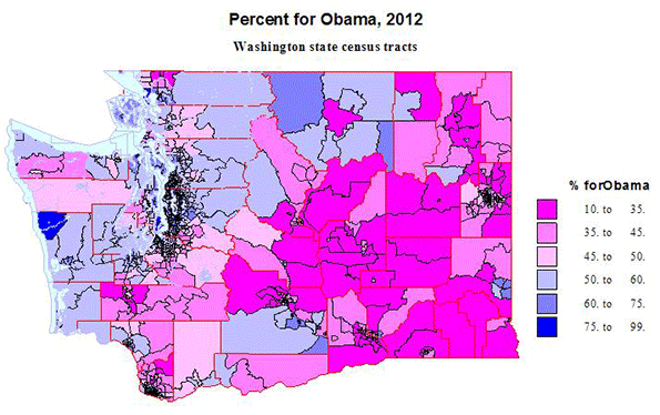
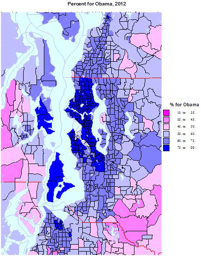
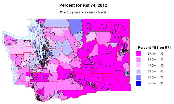
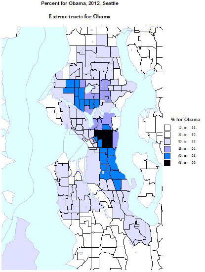
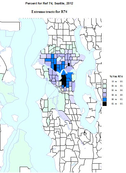
    Here are a series of 6 maps, 3 for the presidential race, for the state as a whole, and for the greater Seattle area, and one showing just the extreme tracts for Obama in the Seattle area, and 3 for the R74 contest, for the state, for greater Seattle and again of just the extreme tracts, all in the city of Seattle.  These maps illustrate the extreme dimensions of polarization impacting the regions.         

    The results suggest three overlapping dimensions. The dominant one is itself ecological – that is the urban-rural, or better large dense metropolitan territory versus rural, small towns, with smaller cities and metropolitan suburbs in between, and less polarized geographically. The strongest correlations in demographic variables are transit use vs. SOV use, density, single persons, and multi-family versus mobile homes.  

    These factors apply to both the Obama race and for R74, but more strongly for Obama. The second dimension is of social liberalism, and is characterized by variables on household relationships, unmarried partners, gay and lesbian, education, e.g., share  with BA vs. with high school only, occupation, e.g., percent managerial professional vs. percent in laboring and construction occupations. The social divide also shows difference by age, those 20-34 more liberal, areas with high shares under 18, that is families, more conservative. This dimension too applies to both contests, but more strongly to R74. The third dimension is race, minority racial areas vs. more white areas, and positively correlated with support for Obama, although the Asian share is much more related to support for R74.  In Washington we will see that the racial dimension really is somewhat distinct from the urban-rural, as Obama did well, but R 74 did poorly in rural small town areas that are now heavily minority (Hispanic and Native American).

    In a few cases with a large difference should be noted. Areas dominantly white are non-supportive of Obama, but not opposed to R74.  Similarly, areas high in managerial-professional occupations and higher education generally are more correlated with support for R74, than for Obama.

    Obama carried Washington state by 464,000 votes, 56 to 44 percent, and R74 won by some 229000 votes, 54 to 46 percent.  Consider first the maps for Washington State as a whole, realizing that like the US as a whole, rural territory dominates most of the physical space.  I use the same intervals for mapping, so comparison is easier.  The main difference between the Obama and R74 maps is race and ethnicity – many of the lighter blue rural small town areas are  Native American Indian reservations, or strongly Latino areas, which voted for Obama, but also cast ballots overwhelmingly against R74, likely reflecting the role of local churches. Obama also did better than R74 in traditional logging areas of western Washington, a continuation of a long history of their identification with Democratic voting, but more conservative on the social issues like same sex marriage. 

    Rural to smaller city areas voting for both Obama and R74 include university towns, notably Pullman (Washington State in eastern Washington,  Bellingham  (Western Washington U), Olympia, the state capitol, and many areas of “spillover” of more educated and professionals, out of the Seattle core to desirable water and mountain environments, for retirement and second homes,    At the other extreme are two areas in western Washington which are extremely “red” , the Centralia area in southwestern Washington,  and the city of Lynden, up at the border with Canada, and still dominated by its Dutch Reformed church adherents.

    Turning to the equivalent maps for Obama and R 74 for the greater Seattle area, with two-thirds of the state population, the picture is broadly the opposite of that for the state. Here blue dominates, with “red” areas pushed to the rural edge.  But the differences in the maps are interesting, illustrating the dimensions of polarization.  The Obama map exhibits a simpler belted pattern, the dense urban core, the city of Seattle with spillover north and south, with an inner suburban belt of moderate Obama domination (60 to 75 percent) and an outer suburban and exurban ring. This pattern was repeated for the city of Tacoma to the south. To the west, however, are two islands of very high Obama support, Vashon and Bainbridge, with very high proportions of professionals commuting to the Seattle core. Areas of support for Romney include a few fairly close in affluent areas and more rural areas, including actual farming areas to the southeast.

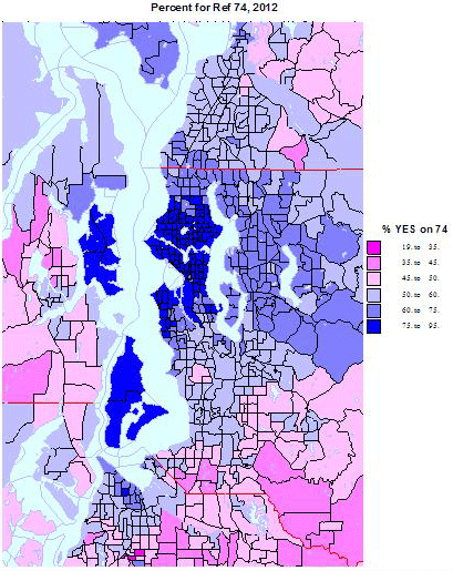
    The map for R74 is subtly different. The area of strongest support is reduced to the city of Seattle, plus the commuter islands, but support for R74 is quite a bit weaker in less affluent and educated black and latino areas. Likewise the majority of inner suburban areas are still supportive for Obama but far less than the core. These are mainly family areas, while the areas of highest support in the city are dominated by singles and childless couples, including unmarried partners.

    Conversely, moderately higher support for Obama and R74 extends somewhat farther east to affluent educated suburbs, e.g, the Microsoft workshed, which is also high in Asian population.  The final two maps are of the tracts with the highest support for Obama and for R74, most of which are confined to the city of Seattle. The areas of over 90 % support are two: the historic CD or Central District, which defined the Seattle Black population as of 1970-1980, not much gentrified at the north end, but also including the core of Seattle’s GLBT community (the westward extension over 90 %. The second area is in near north Seattle, extending from west of the University of Washington westward  in areas dominated by young singles and unmarried couples, including many students. The map for R74 is quite different, with no areas of extreme support to the south of the core GLBT area, but with stronger support than for Obama in the highly affluent and professional areas, just north of the GLBT core.

    Clearly the 3 dimensions of polarization, by settlement type, by social values-education, and by race, all are exemplified by the map results. The geographic concentration of the vote, especially for R74 can be seen in these amazing numbers:

    Vote Results in Washington State
    State State Outside King Co. King Co Seattle King Co. Outside Seattle
    Obama 1,755 1,087 668 279 389
    Romney 1,291 1,015 276 46 230
    Difference 464 72 392 233 159
       
    R74 yes 1,660 1,021 639 274 365
    R74 no 1,431 1,107 315 57 258
    Difference 229 -86 324 217 107


    Obama carried the state by 464,000. Half of this was accounted for by just the city of Seattle. The
    Pro vote for R74 was even more concentrated in the metropolitan core, as the margin just in the central  city of Seattle , 217,000, was essentially the margin for the state!  King County outside Seattle provided an additional margin of 107,000, offsetting a net loss of 86,000 in the entire rest of the state, where the vote was 1,107,000 to 1,021,000 against. 

    It is similarly amazing to note the relative location of areas with very high or very low vote shares for Obama and for R74.  Eighty-nine census tracts were carried by Obama with over 85% of the vote and 83 tracts voted more than 83 percent for R74. The distributions were:

    Number of Census Tracts Voting 85% for Obama or 83% for Measure R74
    Obama R74
    North Seattle 37 33
    Central Seattle 19 26
    South Seattle 26 1
    Pierce (Tacoma, reservation) 1  
    Whatcom (WWU) 2 2
    Whitman (WSU) 2 1
    Yakima (Reservations) 3  
    Thurston (Olympia) 1  

    Eighty-two of 89 of tracts with high Obama shares were in the city of Seattle, dominating the city and well distributed across it. The other 7 were in Tacoma, Olympia, Whatcom and Whitman, both university communities, and in Yakima county Indian reservations.  All these tracts were urban core tracts, except for those on the Yakama reservation.   Sixty of 63 tracts with the highest shares for R74 were in the city of Seattle,  concentrated in the north (University of Washington dominated) or highly professional, and in the center, home of the large GLBT community, with few in the south of the city, which is less affluent and higher in minorities.  The remaining 3 are in Whatcom (WWU) and Whitman (WSU). All these tracts are urban.

    The distribution of tracts with very low shares for Obama and for R74 shows the other side of the   polarization.  Of the 71 tracts where Obama received less than a third of the vote, 34 were in south central Washington, the region of the Tri Cities of Richland, Kennewick and Pasco, Yakima, county and Grant county, home of the Columbia basin irrigation project, all areas high in Mormon and Latino populations. Another 19 were in north central and northeastern Washington, including much of Okanogan and Lincoln counties, and even some exurban counties around Spokane. Another 8 were in southeastern Washington (wheat country), leaving 9 in western Washington.  Three each were in rural parts of Clark County and Lewis County in the southwest, and 3 were in the very conservative small city of Lynden, on the Canadian border, and home of a large Dutch reformed community. All these tracts are rural except for the city of Lynden and 3 suburban tracts in the Tri-Cities.

    Similarly, of 81 tracts with shares below one third for R74, 32 were again in south central Washington, 21 in north central and northeastern Washington, 4 in the southeast, and now a larger 15 in western Washington. The Lynden area of Whatcom county accounts for 4, but now 6 in socially conservative Lewis County, 4 in rural parts of Clark County, and 2 in family dominated military parts of Pierce County.  All these tracts are rural, small town, except for those in Lynden, again in suburban Tri-cities and 2 in suburban Tacoma.

    Differences between Obama and R74 Shares

    The last discussion compares the vote for Obama and for R74, identifying areas with the greatest difference, recalling that the overall correlation was a very high .87.  Please also see Map 7.

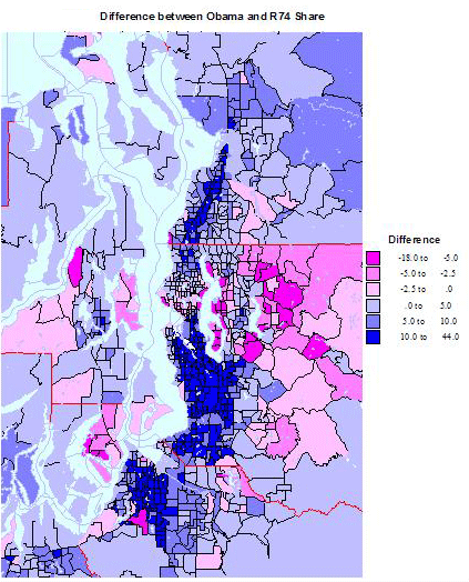
    The Obama vote exceeded the share for R74 by more than 20 percent in 56 census tracts.
    In rural areas Obama did well with the large Latino vote, which also voted against R74. This was true as well in Indian reservation tracts.  In Seattle and Tacoma the tracts are mainly lower to middle class, worker areas, Black or Latino or both.  All of the King county tracts were in south Seattle, extending southward into lower and middle class industrial suburbs.

    The R74 vote exceeded the Obama vote by 5% or more in 51 tracts.

    Overall, R74 fared better than Obama in affluent professional areas, socially more liberal but economically more conservative.  But the pattern surprisingly occurs in several military base areas, as in Island and Kitsap counties. In 15 tracts R74 won but Obama lost, all affluent suburb or military areas in several parts of the state.  In King the 4 tracts are the 2 richest tracts in the state plus 2 near the Microsoft Redmond campus.  In 12 tracts both Obama and R74 won, but R74 polled higher. These tracts were spread across the state, in mainly exurban economically conservative areas. In 24 tracts Obama and R74 won. All but one were in King, most in the professional suburbs east of Seattle and a few in the wealthiest tracts inside the city of Seattle.

    Conclusion

    The electorate of Washington, like that of the country, is ideologically divided, and which is manifest geographically in the familiar red and blue mosaics. Washington overall is on the economically and socially liberal side, although statewide maps would not recognize the degree of this, simply because of the extreme concentration of these sub-populations in the urban cores, and especially in and around the   city of Seattle.

    Richard Morrill is Professor Emeritus of Geography and Environmental Studies, University of Washington. His research interests include: political geography (voting behavior, redistricting, local governance), population/demography/settlement/migration, urban geography and planning, urban transportation (i.e., old fashioned generalist).

  • The New Places Where America’s Tech Future Is Taking Shape

    Technology is reshaping our economic geography, but there’s disagreement as to how. Much of the media and pundits like Richard Florida assert that the tech revolution is bound to be centralized in the dense, often “hip” places where  “smart” people cluster. Some, like Slate’s David Talbot, even fear the new tech wave may erode whatever soul is left to increasingly family free, neo-gilded age San Francisco.

    Such claims have been bolstered by the tech boom of the past few years — especially the explosion of social media firms in places like Manhattan and San Francisco. Yet longer-term trends in tech employment suggest such favored media memes will ultimately prove well off the mark. Indeed, according to an analysis by the Praxis Strategy Group, the fastest growth over the past decade in STEM (science, technology, engineering and mathematics-related) employment has taken place not in the most fashionable cities but smaller, less dense metropolitan areas.

    From 2001 to 2012, STEM employment actually was essentially flat in the San Francisco and Boston regions and  declined 12.6% in San Jose. The country’s three largest mega regions — Chicago, New York and Los Angeles — all lost tech jobs over the past decade. In contrast, double-digit rate expansions of tech employment have occurred in lower-density metro areas such as Austin, Texas; Raleigh, N.C.; Columbus, Ohio; Houston and Salt Lake City. Indeed, among the larger established tech regions, the only real winners have been Seattle, with its diversified and heavily suburbanized economy, and greater Washington, D.C., the parasitical beneficiary of an ever-expanding federal power, where the number of STEM jobs grew 21% from 2001 to 2012, better than any other of the 51 largest U.S. metropolitan statistical areas over that period.

    The question is whether the last two to three years, during which places like San Francisco, New York and Boston have enjoyed stronger STEM growth than their peripheries, represents a paradigm shift or is just a cyclical phenomenon. As with tech in general, the long-term trends are not so city-centric; over the past decade,  the core counties nationwide overall have lost about 1.1% of their tech jobs while more peripheral areas have experienced a gain of 3.5%.

    Today’s urban tech boom looks a lot like a rerun of the dot-com boom of the late 1990s. In that period media-savvy dot-com startups proliferated in such places as South of Market in San Francisco and the Silicon Alley in lower Manhattan. At their height, these firms and their founders were as likely to be covered in the fashion and lifestyle sections as on the business pages.

    Yet by the early 2000s, many of these dot-com darlings had merged, been acquired or simply gone out of business. Anchored largely on hype, they fell victim to flawed business models, and rapid industry consolidation.  In San Francisco, for example, tech employment crashed from a high of 34,000 in 2000 to barely 18,000 four years later. Silicon Alley suffered a similar downward trajectory, losing 15,000 of its 50,000 information jobs in the first five years of the decade.

    The peaking social media boom, marked by the weak performance of Facebook’s IPO last year, suggest another bust at the end of the “hype cycle.” Urban darlings such as  San Francisco’s Zynga and Chicago’s Groupon have floundered in spectacular fashion. More are likely to join them.

    These firms may have generated buzz, but they have done not so well at the mundane task of making money. One problem may be that  the most avid users of social media are largely young people from the “screwed” generation who lack much in the way of spending power — a clear turnoff to advertisers. Now , with venture capital flows declining overall,  cooler heads in the Valley are shifting bets to more business-oriented engineering and research-intensive fields more grounded in marketplace realities.

    And what about the future of the Valley — still home to virtually all the Bay Area’s top tech firms? Its glory days as a job generator and economic exemplar seem to have passed. Between 1970 and 1990 the number of people employed in tech in the Valley more than doubled to 268,000, and then burgeoned to over 540,000 in the 1990s. At the peak of the last tech boom in 2001, the unemployment rate in Santa Clara County was a tiny 3%; the Silicon Valley Manufacturing Group confidently predicted there would be another 200,000 jobs by 2010.

    However, at what may be the peak of the current boom, the number of tech jobs in the Valley remains down from a decade ago and unemployment is over 7.7%, just around the national average. In reality, social media was never going to reverse the downward trajectory in the rate of job growth. Old-line companies like  Hewlett-Packard or Intel, with over 50,000 employees in the U.S. alone, were capable of creating a broad range of opportunities for workers; in contrast, the social media big three of Facebook, LinkedIn and Twitter together have less than 6,500 employees.

    As the social media industry matures and consolidates,   employment is likely to continue shifting to less expensive, business-friendly areas. The Bay Area, where the overall cost of living is 68% higher than the national average and housing is the most expensive in the nation, may continue to attract and retain only the highest-end, best-paid workers. But for the most part they will follow the path of established tech firms such as  Apple, Intel, Adobe, eBay and IBM  to lower-cost places like Austin, Columbus and Salt Lake City. A similar phenomena also can be seen in other urban-centered industries, such as entertainment and finance where  virtually all employment growth is in places like St. Louis, Des Moines and Phoenix, even as the largest centers, New York, Chicago, Boston, Los Angeles and San Francisco have suffered significant job losses.

    Demographic forces may further accelerate these trends. The critical fuel for tech growth, educated labor, is now expanding faster in places like Columbus, Austin, Raleigh, Dallas and Houston than in Boston, San Jose and San Francisco. The old centers may still enjoy a lead in brains, but other places are catching up rapidly.

    Companies may also discover that with many millennials starting to hit their 30s, some may seek to leave their apartments to buy houses and start families. In California new local regulations essentially ban the construction of new single-family homes in some of the state’s biggest metro areas, pricing this option out of reach for all but a few, and forcing a key demographic group to seek residence elsewhere.

    Under these conditions, Silicon Valley will be forced to rely increasingly on inertia and mustering of financial resources than innovation. As a result, the nation’s tech map will continue to expand from the Bay Area, Boston, Seattle and Southern California to emerging metropolitan areas in North Carolina, Texas, Utah, Colorado and the Pacific Northwest. In the future parts of Florida, Phoenix, and even Great Plains cities like Sioux Falls and Fargo could also achieve some critical mass.

    Ultimately, one of the main dynamics of the information age — that even sophisticated tasks  can be done from anywhere — works against the dominion of single hegemonic industry centers like Wall Street, Hollywood and Silicon Valley. The tech sector is particularly vulnerable to declustering, due in large part thanks to the freedom from geography created by technologies of its own making.   Silicon Valley may continue to reap riches from the periodic technology  gold rush , but in the longer term, tech growth will continue its long-term dispersion to ever more parts of the country.

    STEM Occupations in the Nation’s 51 Largest Metropolitan Areas
    MSA Name 2001 – 2012 Growth 2005 – 2012 Growth 2010 – 2012 Growth 2012 Location Quotient LQ Change, 2001 – 2012
    Washington-Arlington-Alexandria, DC-VA-MD-WV 21.1% 12.7% 3.7% 2.19 10.6%
    Riverside-San Bernardino-Ontario, CA 18.6% -1.4% 2.2% 0.57 1.8%
    San Antonio-New Braunfels, TX 18.3% 17.2% 4.5% 0.83 1.2%
    Baltimore-Towson, MD 17.9% 11.4% 3.9% 1.37 15.1%
    Raleigh-Cary, NC 17.9% 14.6% 6.2% 1.53 0.0%
    Las Vegas-Paradise, NV 17.2% -2.6% 0.8% 0.52 4.0%
    Salt Lake City, UT 16.3% 18.1% 7.4% 1.16 4.5%
    Houston-Sugar Land-Baytown, TX 15.7% 17.2% 6.6% 1.20 -2.4%
    Seattle-Tacoma-Bellevue, WA 15.4% 22.2% 6.7% 1.86 8.1%
    Jacksonville, FL 13.0% 6.5% 2.4% 0.87 8.7%
    Austin-Round Rock-San Marcos, TX 12.2% 17.2% 9.1% 1.82 -8.5%
    San Diego-Carlsbad-San Marcos, CA 11.3% 8.0% 2.1% 1.38 6.2%
    Columbus, OH 10.4% 12.8% 4.7% 1.27 7.6%
    Orlando-Kissimmee-Sanford, FL 9.4% -1.1% 0.8% 0.84 -3.4%
    Indianapolis-Carmel, IN 6.9% 6.5% 2.7% 1.04 2.0%
    Nashville-Davidson–Murfreesboro–Franklin, TN 6.7% 3.5% 2.4% 0.77 -1.3%
    Sacramento–Arden-Arcade–Roseville, CA 6.4% 3.5% 0.4% 1.33 2.3%
    Oklahoma City, OK 5.5% 9.6% 6.4% 0.89 -1.1%
    Pittsburgh, PA 5.3% 10.3% 4.9% 1.07 5.9%
    Virginia Beach-Norfolk-Newport News, VA-NC 4.8% 2.3% 0.5% 1.10 3.8%
    Charlotte-Gastonia-Rock Hill, NC-SC 4.3% 8.2% 5.7% 0.99 -3.9%
    Kansas City, MO-KS 4.0% 5.8% 4.6% 1.12 4.7%
    Richmond, VA 3.8% 4.4% 3.4% 0.99 0.0%
    Cincinnati-Middletown, OH-KY-IN 3.7% 5.5% 6.8% 1.02 4.1%
    Buffalo-Niagara Falls, NY 3.2% 6.4% 3.6% 0.90 4.7%
    Dallas-Fort Worth-Arlington, TX 3.1% 11.4% 5.5% 1.19 -5.6%
    San Francisco-Oakland-Fremont, CA 2.5% 15.0% 9.9% 1.63 5.8%
    Phoenix-Mesa-Glendale, AZ 2.3% 3.5% 3.9% 1.05 -6.3%
    Minneapolis-St. Paul-Bloomington, MN-WI 2.2% 6.7% 5.9% 1.31 1.6%
    Portland-Vancouver-Hillsboro, OR-WA 1.6% 6.4% 5.4% 1.19 -3.3%
    Louisville/Jefferson County, KY-IN 0.9% 9.6% 6.9% 0.76 0.0%
    Denver-Aurora-Broomfield, CO 0.5% 10.8% 3.7% 1.43 -2.1%
    Atlanta-Sandy Springs-Marietta, GA -1.0% 5.5% 6.5% 1.07 -2.7%
    Boston-Cambridge-Quincy, MA-NH -1.3% 11.2% 6.0% 1.64 -1.2%
    Providence-New Bedford-Fall River, RI-MA -1.5% -1.6% 1.9% 0.88 2.3%
    Philadelphia-Camden-Wilmington, PA-NJ-DE-MD -2.8% -1.4% 1.4% 1.06 -1.9%
    Hartford-West Hartford-East Hartford, CT -4.5% 1.5% 0.3% 1.10 -3.5%
    New York-Northern New Jersey-Long Island, NY-NJ-PA -4.6% 2.8% 3.2% 0.90 -6.2%
    St. Louis, MO-IL -4.8% -1.7% 1.4% 1.05 -0.9%
    Milwaukee-Waukesha-West Allis, WI -6.1% -0.8% 4.0% 1.00 0.0%
    Tampa-St. Petersburg-Clearwater, FL -6.3% -4.3% 2.5% 0.89 -3.3%
    Miami-Fort Lauderdale-Pompano Beach, FL -6.4% -8.3% 0.6% 0.67 -8.2%
    Los Angeles-Long Beach-Santa Ana, CA -7.1% -3.5% 3.1% 0.98 -5.8%
    Memphis, TN-MS-AR -7.3% -4.0% 0.7% 0.62 -4.6%
    Cleveland-Elyria-Mentor, OH -8.8% -2.1% 4.3% 0.89 1.1%
    Chicago-Joliet-Naperville, IL-IN-WI -10.8% -1.4% 3.5% 0.87 -7.4%
    Birmingham-Hoover, AL -11.4% -8.0% -2.0% 0.76 -8.4%
    Rochester, NY -12.0% -2.1% 4.1% 1.14 -10.2%
    San Jose-Sunnyvale-Santa Clara, CA -12.6% 12.4% 8.3% 3.18 -4.8%
    New Orleans-Metairie-Kenner, LA -16.0% -7.4% -2.4% 0.74 0.0%
    Detroit-Warren-Livonia, MI -17.7% -10.3% 10.5% 1.42 -3.4%
    Analysis by Mark Schill, Praxis Strategy Group
    Data Source: EMSI 2012.4 Class of Worker – QCEW Employees, Non-QCEW Employees & Self-Employed 

    The LQ (location quotient) figure in the table above is the local share of jobs that are STEM occupations divided by the national share of jobs that are STEM occupations. A concentration of 1.0 indicates that a region has the same concentration of STEM occupations as the nation. The analysis covers 80 STEM occupations in all industries.

    Joel Kotkin is executive editor of NewGeography.com and a distinguished presidential fellow in urban futures at Chapman University, and a member of the editorial board of the Orange County Register . He is author of The City: A Global History and The Next Hundred Million: America in 2050. His most recent study, The Rise of Postfamilialism, has been widely discussed and distributed internationally. He lives in Los Angeles, CA.

    This piece originally appeared at Forbes.com.

    Computer engineer photo by BigStockPhoto.com.

  • The Drive-It-Yourself Taxi: A Smooth Ride?

    Despite a corporate sponsor that paid handsomely for the naming rights, Londoners stubbornly refer to our bikesharing system as ‘Boris Bikes’, in a nod to our colourful Mayor, Boris Johnson. But what will we call our new drive-it-yourself taxis? My suggestion: ‘Boris Cabs’ – and they are now a reality here, thanks to Daimler’s car2go service, if you happen to live in one of three small and separate sections of town. But why did a one-way carsharing system have to limp into London, when more than a dozen other cities have welcomed these arrangements with open arms? In the US, car2go first appeared in Austin, Texas, and since then has moved into Washington, D.C, Miami, Portland Oregon, San Francisco, San Diego, and Seattle. It operates in Canada and, on the Continent, in Paris and Amsterdam, among other locations. So why no splashy launch across England’s Capital, and no images of a smiling Boris cutting a ribbon?

    First, roads in London are balkanised. Our regional transport agency (Transport for London) runs the main arteries, and they provide little on-street parking, the mother’s milk of one-way carsharing. That leaves the local streets in the the domain of the 33 boroughs that are each independent municipalities. Car2go is making a brave attempt to get off the ground here by starting with hundreds of cars (the press release reports 500; in practice,170 are in operation two weeks after the launch) in disconnected sections of town, something it has not resorted to anywhere else. Its standard practice is to strike a city-wide deal with whoever’s in charge of on-street parking, and no single agency fits that bill here. What’s the rush? Well, BMW is hot on their heels with its competing DriveNow system, with staff in London well into the advanced stages of planning.

    Second, there is genuine uncertainty about the impacts”. Will we take drive-it-yourself cabs to work, and avoid the crush on the Tube? It would be a very different experience than traditional carsharing — London is said to be Zipcar’s second-biggest market after NYC — which doesn’t work for the daily commute. In the Zipcar model (soon to be the ‘Zipcar by Avis’ model?) you take a car on a round-trip basis and pay by the hour, like filling a parking meter. The novelty of this new generation of drive-yourself cabs lies in their flexibility: as with a taxi meter, you pay by the minute for just the time it takes you to get from ‘A’ to ‘B’, then drop the car off and forget about it.

    What does this mean for traffic congestion? CO2 emissions? What about the cute blue-and-white Smart Fortwo-model cars now parked in your neighbourhood – will they mean less parking for private car owners? Not bloody likely. The expectation is that, in time, enough private car owners will switch to using the fleet’s cars, meaning that on balance fewer cars will need to be parked. But try explaining this to car2go’s new neighbours who are not familiar with the subtleties and will be the ones dealing with the growing pains as we feel our way forward.

    Transport is a long game, so it will be years until we properly understand the impacts of drive-yourself cabs. My research suggests that likely impacts are:

    1) A much larger market than traditional carsharing (about four times as many subscribers)
    2) A roughly 4% reduction in personal car ownership
    3) About a 1% decrease in car driving vehicle miles travelled (including personal cars, traditional carsharing, and drive-yourself cabs)
    4) About a 1% decrease in the number of public transport journeys

    We can be reasonably certain that some surprising impacts will be revealed during field trials, and if at some future point London’s authorities are not happy with the knock-on effects there’s nothing to stop us from regulating the industry like any other. But for the moment we don’t understand it well enough to do anything other than let the operators experiment and keep tabs on what’s happening.

    We just don’t know what the impacts on traffic levels and CO2 will turn out to be, and, frankly, it’s unfair to – as some suggest – hold the industry to a no-net-traffic/CO2 standard. We don’t do that to Black Cabs or [advance-booking-only] minicabs, or indeed to the automotive or urban transport sectors more broadly. A fairer standard, admittedly more complex to administer, would be to assess whether net value is created after accounting for effects on traffic levels, emissions and more. In other words: get the prices right, just like the economics textbooks say.

    The question that needs thinking through is what would transport in London look like if drive-yourself taxi systems went viral and we came to depend on them. What happens, for instance, when instead of 500 of these cabs there are 50,000, and the necessary communication links go down? How would the transport system work if on-road congestion became replaced by virtual queuing to get access to a car? And what about times when the system is under stress, like when a hurricane is approaching, for instance. Is it OK to just flip the switch off on the whole fleet? Who would make this decision, and what guidelines would they follow?

    If the history of the car in cities has taught us anything, it is that we need to be humble about our ability to forecast the future. So what is the way forward for Boris Cabs in London? Start with a small fleet and short-duration contracts. Be clear on the objectives and flexible on the implementation. Keep our options open. It will be an interesting ride.

    Scott Le Vine, AICP is a research associate in transport systems at Imperial College London and a trustee of the shared-mobility NGO Carplus, which serves as the UK’s carsharing trade body. He authored the recent study Car Rental 2.0: Car club [carsharing] innovations and why they matter.

    Flickr photo: Car 2 Go in the 1700 block of Q Street, NW, Washington DC on Easter Sunday, 8 April 2012 by Elvert Barnes Photography

  • Flocking Elsewhere: The Downtown Growth Story

    The United States Census Bureau has released a report (Patterns of Metropolitan and Micropolitan Population Change: 2000 to 2010.) on metropolitan area growth between 2000 and 2010. The Census Bureau’s the news release highlighted population growth in downtown areas, which it defines as within two miles of the city hall of the largest municipality in each metropolitan area. Predictably, media sources that interpret any improvement in core city fortunes as evidence of people returning to the cities (from which they never came), referred to people "flocking" back to the "city" (See here and here, for example).

    Downtown Population Trends: Make no mistake about it, the central cores of the nation’s largest cities are doing better than at any time in recent history. Much of the credit has to go to successful efforts to make crime infested urban cores suitable for habitation, which started with the strong law enforcement policies of former New York Mayor Rudy Giuliani.

    However, to characterize the trend since 2000 as reflective of any "flocking" to the cities is to exaggerate the trend of downtown improvement beyond recognition. Among the 51 major metropolitan areas (those with more than 1 million population), nearly 99 percent of all population growth between 2000 and 2010 was outside the downtown areas (Figure 1).

    There was population growth in 33 downtown areas out of the 51 major metropolitan areas. As is typical for core urban measures, nearly 80 percent of this population growth was concentrated in the six most vibrant downtown areas, New York, Chicago, Philadelphia, Washington, Boston and San Francisco.

    If the next six fastest-growing downtown areas are added to the list (Dallas-Fort Worth, Houston, Los Angeles, Portland, San Diego and Seattle), downtown growth exceeds the national total of 205,000 people, because the other 39 downtown areas had a net population loss. Overall, the average downtown area in the major metropolitan areas grew by 4000 people between 2000 and 2010. That may be a lot of people for a college lacrosse game, but not for a city. While in some cases these increases were substantial in percentage terms, the population base was generally small, which was the result of huge population losses in previous decades as well as the conversion of old disused office buildings, warehouses and factories into residential units.

    Trends in the Larger Urban Cores: The downtown population gains, however, were not sufficient to stem the continuing decline in urban core populations. Among the 51 major metropolitan areas, the aggregate data indicates a loss of population within six miles of city hall. In essence, the oasis of modest downtown growth was more than negated by losses surrounding the downtown areas. Virtually all the population growth in the major metropolitan areas lay outside the six mile radius core, as areas within the historical urban core, including downtown, lost 0.4 percent.

    Even when the radius is expanded to 10 miles, the overwhelming majority of growth remains outside. Approximately 94 percent of the aggregate population growth of the major metropolitan areas occurred more than 10 miles from downtown (Figure 2). Figure 3 shows that more than one-half of the growth occurred 20 miles and further from city hall. Further, the population growth beyond 10 miles (10-15 mile radius, 15-20 miles radius and 20 mile and greater radius) from the core exceeded the (2000) share of population, showing the continuing dispersal of American metropolitan areas (Figure 4).

    Chicago: The Champion? The Census Bureau press release highlights the fact that downtown Chicago experienced the largest gain in the nation. Downtown Chicago accounted for 13 percent of the metropolitan area’s growth with an impressive 48,000 new residents. However, while downtown Chicago was prospering, people were flocking away from the rest of the city. Within a five mile radius of the Loop, there was a net population loss of 12,000 and a net loss of more than 200,000 within 20 miles (Figure 5). Only within the 36th mile radius from city hall is there a net population gain.

    Cleveland: Comeback City and Always Will Be? In view of Cleveland’s demographic decline (down from 915,000 in 1950 to 397,000 in 2010), any progress in downtown Cleveland is welcome. But despite the frequently recurring reports, downtown Cleveland’s population growth was barely 3,000. Despite this gain, the loss within a 6 mile radius was 70,000 and 125,000 within a 12 mile radius. Beyond the 12- mile radius, there was a population increase of nearly 55,000, which insufficient to avoid a metropolitan area population loss.

    Other Metropolitan Areas: A total of 30 major metropolitan areas suffered core population losses, despite the fact that many had downtown population increases.

    • Five major metropolitan areas suffered overall population losses (Buffalo, Cleveland, Detroit, Pittsburgh and Katrina ravaged New Orleans).
    • St. Louis, with a core city that holds the modern international record for population loss (from 857,000 in 1950 to 319,000 in 2010), experienced a population decline within a 27 mile radius of city hall. Approximately 150 percent of the growth in the St. Louis metropolitan area was outside the 27 mile radius. Even so, there was an increase of nearly 6,000 in the population of downtown St. Louis.
    • There were population losses all the way out to a considerable distance from city halls in Memphis (16 mile radius), Cincinnati (15 mile radius) and Birmingham (14 mile radius). The three corresponding downtown areas also lost population.
    • Despite having one of the strongest downtown population increases (12,000), population declined within a 10 mile radius of the Dallas city hall. This contrasts with nearby Houston, which also experienced a strong downtown increase (10,000) but no losses at any radius of the urban core.
    • Milwaukee experienced a small downtown population increase (2,000), but had a population loss within an11 mile radius.

    The other 21 major metropolitan areas experienced population gains throughout. Even so, most of the growth (77 percent) was outside the 10 mile radius. San Jose had the most concentrated growth, with only 24 percent outside a 10 miles radius from city hall. All of the other metropolitan areas had 60 percent or more of their growth outside a 10 mile radius from city hall.

    As we have observed before, 2000 to 2010 was, unlike the 1970s and other decades, more friendly to the nation’s core cities, although less so than the previous decade. Due to the repurposing of old offices and other structures, sometimes aided by subsidies, small downtown slivers may have done better than at any time since before World War II. But the data is clear. Suburban growth was stronger in the 2000s than in the 1990s. The one percent flocked to downtown and the 99 percent flocked to outside downtown.

    Population Loss Radius: Major Metropolitan Areas
    Miles from City Hall of Historical Core Municipality*
    Major Metropolitan Areas (Over 1,000,000 Population Share of Metropolitan Growth Population Loss Radius (Miles)
    "Outside Downtown" (2- Mile Radius) Outside 5-Mile Radius Outside 10-Mile Radius
    MAJOR METROPOLITAN AREAS: TOTAL 98.7% 100.4% 93.5% 6
    Atlanta, GA 99.6% 101.1% 99.9% 9
    Austin, TX 98.1% 96.7% 81.9% 0
    Baltimore, MD 106.5% 118.7% 99.5% 9
    Birmingham, AL 104.2% 132.5% 124.9% 14
    Boston, MA-NH 90.8% 76.9% 67.3% 0
    Buffalo, NY Entire Metropolitan Area Loss
    Charlotte, NC-SC 99.1% 97.4% 75.0% 3
    Chicago, IL-IN-WI 86.7% 103.3% 144.6% 35
    Cincinnati, OH-KY-IN 105.1% 126.8% 135.2% 15
    Cleveland, OH Entire Metropolitan Area Loss
    Columbus, OH 100.5% 104.3% 86.9% 7
    Dallas-Fort Worth, TX 99.0% 101.0% 100.7% 10
    Denver, CO 98.0% 100.3% 89.8% 5
    Detroit,  MI Entire Metropolitan Area Loss
    Hartford, CT 99.2% 92.7% 67.2% 0
    Houston, TX 99.2% 99.5% 98.0% 0
    Indianapolis. IN 102.1% 112.1% 89.6% 8
    Jacksonville, FL 100.2% 106.3% 85.3% 8
    Kansas City, MO-KS 99.5% 109.0% 113.3% 12
    Las Vegas, NV 101.4% 98.0% 63.6% 4
    Los Angeles, CA 97.3% 102.2% 97.6% 8
    Louisville, KY-IN 102.5% 108.5% 90.9% 8
    Memphis, TN-MS-AR 101.2% 118.5% 143.5% 16
    Miami, FL 99.4% 93.0% 91.3% 0
    Milwaukee,WI 95.9% 109.0% 107.5% 11
    Minneapolis-St. Paul, MN-WI 97.4% 99.2% 100.1% 7
    Nashville, TN 100.0% 101.4% 92.4% 7
    New Orleans. LA Entire Metropolitan Area Loss
    New York, NY-NJ-PA 93.5% 81.7% 68.9% 0
    Oklahoma City, OK 100.1% 96.8% 83.5% 2
    Orlando, FL 99.7% 99.4% 84.2% 0
    Philadelphia, PA-NJ-DE-MD 92.6% 98.8% 96.3% 7
    Phoenix, AZ 100.7% 101.8% 93.6% 6
    Pittsburgh, PA Entire Metropolitan Area Loss
    Portland, OR-WA 95.0% 91.5% 62.7% 0
    Providence, RI-MA 96.2% 91.7% 70.1% 0
    Raleigh, NC 99.6% 93.0% 67.7% 0
    Richmond, VA 95.7% 91.7% 70.2% 0
    Riverside-San Bernardino, CA 99.5% 97.2% 85.8% 0
    Rochester, NY 146.9% 149.3% 82.5% 9
    Sacramento, CA 99.9% 94.4% 79.5% 0
    Salt Lake City, UT 98.9% 95.1% 84.1% 0
    San Antonio, TX 101.1% 102.5% 86.7% 7
    San Diego, CA 96.3% 94.1% 90.1% 0
    San Francisco-Oakland, CA 90.7% 87.6% 82.2% 0
    San Jose, CA 95.1% 79.1% 24.3% 0
    Seattle, WA 96.5% 91.9% 81.4% 0
    St. Louis,, MO-IL 94.8% 119.7% 148.9% 27
    Tampa-St. Petersburg, FL 98.6% 97.8% 83.7% 0
    Virginia Beach-Norfolk, VA-NC 93.1% 90.1% 82.3% 0
    Washington, DC-VA-MD-WV 97.5% 94.5% 87.9% 0
    Calculated from Census Bureau data
    *Except in Virginia Beach-Norfolk, Where Virginia Beach is used


    ——-

    Notes:

    Population Weighted Density: In its report, the Census Bureau uses "population-weighted density," rather than average population density to compare metropolitan areas. The Census Bureau justified this use as follows:

    "Overall densities of CBSAs can be heavily affected by the size of the geographic units for which they are calculated. Metropolitan and micropolitan statistical areas are delimited using counties as their basic building blocks, and counties vary greatly across the country in terms of their geographic size. With this in mind, one way of measuring actual residential density is to examine the ratio of population to land area at the scale of the census tract, which—of all the geographic units for which decennial census data are tabulated—is typi­cally the closest in scale to urban and subur­ban neighborhoods".

    The Census Bureau rightly points out the problem with comparing metropolitan area density. However, it is a problem of the federal government’s making, by virtue of using metropolitan area building blocks (counties) that are sometimes too large for designation of genuine metropolitan areas. These difficulties have been overcome by the national census authorities in Japan in Canada, for example, where smaller building blocks are used (such as municipalities or local government authorities).

    Further, the Census Bureau already has a means for measuring population density at the census tract level, which is "the closest in scale to urban and suburban neighborhoods." This is the urban area.

    "Population-weighted density" is an interesting concept that can provide an impression of the density that is perceived by the average resident of the metropolitan area. Unfortunately, in its report, the Census Bureau is less than precise with its terminology and repeatedly fails to modify the term density with the important "population-weighted" qualification. This could lead to considerable misunderstanding.

    The Census Bureau did not provide average population densities based for the mileage radii. Because of large bodies of water (such as Lake Michigan in Chicago can reduce land areas, it was not possible to estimate population densities by radius.

    Census Bureau Revision of Incorrect Report: We notified the Census Bureau of errors in its press release and report on September 27. The problems included substitution of San Francisco population data for Salt Lake City as well as metropolitan population in the supporting spreadsheet file. On September 28, the Census Bureau issued a revised press release and report to rectify the errors. Later the erroneous spreadsheet was withdrawn and had not been re-posted as of October 1. We have made corrections to the spreadsheet for this analysis.

    Note: Larger "Downtown" Populations in Smaller Metropolitan Areas: Because of the broad 2-mile radius measure used by the Census Bureau, most of the population increase characterized as relating to downtown occurred outside the major metropolitan areas. This is simply because in smaller metropolitan areas, such an area (12.6 square miles) will necessarily contain a larger share of the metropolitan area. Further, many smaller metropolitan areas are virtually all suburban and had experienced little or no core population losses over the decades that have been so devastating to many large core municipalities. On average, 2.7 percent of the population of major metropolitan areas was within a two-mile radius of city hall in 2010. By comparison, in smaller metropolitan areas, approximately 12.7 percent of the population was within a two mile radius.

    Photograph: Chicago Suburbs: (where nearly all the growth occurred), by author

  • Facebook’s False Promise: STEM’s Quieter Side Of Tech Offers More Upside For America

    Facebook‘s botched IPO reflects not only the weakness of the stock market, but a systemic misunderstanding of where the true value of technology lies. A website that, due to superior funding and media hype, allows people to do what they were already doing — connecting on the Internet — does not inherently drive broad economic growth, even if it mints a few high-profile billionaires.

    Of course Facebook is a social phenomenon that has affected how people live and interact, but its economic impact — and future level of profitability — is less than clear. This stands in sharp contrast to Apple‘s iTunes, which has become a new distribution platform for small software companies and musicians, not to mention the role of Amazon in the distribution of books and other products.

    From the standpoint of economic development, it’s time to focus on the growing divergence between two different aspects of technology. One is largely an information sector that focuses on such things as information software (think Facebook or Google), publishing and entertainment. For most journalists and urban theoreticians, this is the “sexy” sector, particularly since it tends to employ people just like them: younger, products of elite college educations, often living in “hip and cool” places like San Francisco, Manhattan or west Los Angeles.

    Then there’s a larger, less-heralded group of workers that my colleague Mark Schill at Praxis Strategy Group has focused on: those in STEM (science-, technology-, engineering- and mathematics-related) jobs. These workers perform technology work across a broad array of industries, including but not limited to computers, media and the Internet, representing some 5.3 million jobs in the nation’s 51 largest metropolitan areas. This compares to roughly 2.2 million jobs classified as in the information sector in these 51 regions.

    These STEM occupations are about harnessing technology to improve productivity in mundane traditional industries and the service sector. STEM workers are as likely, if not more so, to be working for manufacturers, retailers or energy producers as for software firms. These workers epitomize the notion of technology, as the French sociologist Marcel Mauss once put it, as “a traditional action made effective.”

    The information sector may be increasingly important, but it is STEM workers, working in a diverse set of industries (including information), who hold the broader hope for the U.S. economy. Over the past decade, the information sector has created many stars, but about as many flameouts. Overall information employment peaked in 2000 at 3.6 million jobs; by 2011 this number had dropped by almost a million. Things have not much improved even in the current “boom”; between February and May this year, the sector lost over 8,000 jobs.

    Essentially the information sector has created a huge amount of churn, as the nature of its employment changes with shifts in technology. For example, the software sector within information has seen real growth, adding some 10,000 jobs the past two years, while other parts of the information sector have suffered significant drops. These include, sadly for aged scribblers, traditional publishing, such as newspapers and book publishing, which has gone from nearly 1 million jobs in 2002 to under 740,000 in May of this year.

    With Facebook stock in the tank, and other major social media sites languishing, the current “boom” may prove among the shortest-lived in recent memory. Shares of less well-anchored companies — meaning those with only a vague outlook for long-term profits — such as Zynga and Groupon have fallen dramatically. The market for the next round of ultra-hyped IPOs also seems to be dissipating rapidly. The carnage has led at least one analyst to suggest Facebook’s fall could “destroy the U.S. economy.”

    Fortunately the overall picture in technology is more hopeful than you’d understand from reading about social media startups. STEM employment has grown 3% over the past two years, more than twice the national average. In the 51 largest metros areas, 150,000 STEM jobs were added from 2009 through 2011. More important still, this reflects a long-term pattern: Over the past decade, STEM employment — despite a drop during the recession — expanded 5.4%.

    These two different classifications underpin geographical differences between and within regions. Sometimes the “hot” areas don’t look so great when it comes to actual job creation in these generally well-paying fields.

    Silicon Valley’s social media boom, for example, may have propelled it once again, at least temporarily, into the ranks of the fastest-growing employment centers. Yet it’s not seeing the gains in STEM jobs that took place during earlier Valley booms in the ’80s or ’90s that were broader based, encompassing manufacturing and industry-oriented software. Indeed STEM employment in the Valley still has not recovered from the 2001 tech bust — the number of STEM jobs is down 12.6% from 10 years ago.

    Metropolitan STEM Job Growth, Sorted by 10-year Growth
    MSA Name 2001-2011 Growth 2009-2011 Growth 2011 Concentration
    Las Vegas-Paradise, NV 25.5% -3.4% 0.51
    Washington-Arlington-Alexandria, DC-VA-MD-WV 20.8% 4.4% 2.16
    San Antonio-New Braunfels, TX 20.1% 3.0% 0.82
    Nashville-Davidson–Murfreesboro–Franklin, TN 18.5% 3.1% 0.74
    Riverside-San Bernardino-Ontario, CA 18.3% -1.6% 0.55
    Seattle-Tacoma-Bellevue, WA 18.1% 7.6% 1.95
    Salt Lake City, UT 17.5% 4.5% 1.17
    Jacksonville, FL 17.4% 3.0% 0.88
    Baltimore-Towson, MD 17.2% 3.9% 1.36
    Raleigh-Cary, NC 14.9% 1.4% 1.56
    Houston-Sugar Land-Baytown, TX 14.3% 3.6% 1.25
    Orlando-Kissimmee-Sanford, FL 14.2% -1.4% 0.90
    San Diego-Carlsbad-San Marcos, CA 13.1% 6.5% 1.38
    Austin-Round Rock-San Marcos, TX 8.8% 2.4% 1.75
    Charlotte-Gastonia-Rock Hill, NC-SC 8.1% 2.1% 0.97
    Columbus, OH 7.8% 3.8% 1.32
    Buffalo-Niagara Falls, NY 7.7% 2.4% 0.96
    Virginia Beach-Norfolk-Newport News, VA-NC 7.5% -3.1% 1.05
    Miami-Fort Lauderdale-Pompano Beach, FL 7.5% 2.8% 0.73
    Indianapolis-Carmel, IN 7.5% 1.2% 1.06
    Oklahoma City, OK 7.3% 2.9% 0.89
    Dallas-Fort Worth-Arlington, TX 6.2% 3.7% 1.21
    Cincinnati-Middletown, OH-KY-IN 6.1% 4.6% 1.08
    Sacramento–Arden-Arcade–Roseville, CA 6.0% -1.6% 1.19
    Louisville/Jefferson County, KY-IN 5.6% 4.3% 0.77
    Phoenix-Mesa-Glendale, AZ 5.4% 1.5% 1.00
    Portland-Vancouver-Hillsboro, OR-WA 5.2% 4.2% 1.24
    Atlanta-Sandy Springs-Marietta, GA 4.8% 4.3% 1.10
    Denver-Aurora-Broomfield, CO 4.0% 2.8% 1.47
    Richmond, VA 3.8% 0.4% 1.14
    Providence-New Bedford-Fall River, RI-MA 3.6% 2.4% 0.90
    Pittsburgh, PA 3.1% 3.6% 1.07
    Hartford-West Hartford-East Hartford, CT 3.1% 1.2% 1.18
    Minneapolis-St. Paul-Bloomington, MN-WI 2.6% 3.1% 1.37
    Tampa-St. Petersburg-Clearwater, FL 2.4% 2.0% 0.88
    Philadelphia-Camden-Wilmington, PA-NJ-DE-MD 2.2% 0.3% 1.19
    Kansas City, MO-KS 1.9% -2.6% 1.15
    New York-Northern New Jersey-Long Island, NY-NJ-PA 1.2% 2.9% 1.00
    San Francisco-Oakland-Fremont, CA 0.8% 3.7% 1.60
    Memphis, TN-MS-AR 0.0% 0.7% 0.56
    Boston-Cambridge-Quincy, MA-NH 0.0% 4.8% 1.64
    Los Angeles-Long Beach-Santa Ana, CA -2.2% 1.7% 0.98
    Milwaukee-Waukesha-West Allis, WI -2.3% 0.2% 1.04
    St. Louis, MO-IL -3.5% -1.4% 1.05
    Birmingham-Hoover, AL -3.9% -3.4% 0.70
    Cleveland-Elyria-Mentor, OH -4.9% 1.2% 0.93
    Chicago-Joliet-Naperville, IL-IN-WI -5.2% 1.1% 0.96
    New Orleans-Metairie-Kenner, LA -6.7% 3.6% 0.71
    Rochester, NY -8.9% 2.1% 1.19
    San Jose-Sunnyvale-Santa Clara, CA -12.6% 4.9% 3.09
    Detroit-Warren-Livonia, MI -14.9% 8.8% 1.42
    Total in Top 51 Regions 4.2% 3.0%

    Data source: EMSI Complete Employment, 2012.1. The “2011 Concentration” figure is a location quotient. That’s the local share of jobs that are STEM occupations divided by the national share of jobs that are STEM occupations. A concentration of 1.0 indicates that a region has the same concentration of STEM occupations as the nation.


    Joel Kotkin is executive editor of NewGeography.com and is a distinguished presidential fellow in urban futures at Chapman University, and contributing editor to the City Journal in New York. He is author of The City: A Global History. His newest book is The Next Hundred Million: America in 2050, released in February, 2010.

    This piece originally appeared in Forbes.

    Computer engineer photo by BigStockPhoto.com.

  • Seattle Is Leading An American Manufacturing Revival – Top Manufacturing Growth Regions

    In this still tepid recovery, the biggest feel-good story has been the resurgence of American manufacturing. As industrial production has fallen in Europe and growth has slowed in China, U.S. factories have continued an expansion that has stretched on for over 33 months. In April, manufacturing growth was the strongest in 10 months.

    There are a number of reasons for this revival. Rising wages in China – up from roughly one-third U.S. levels to half that in a decade — and problems associated with protection of trademarks and other issues have led many U.S. executives to look back home. Some 22% of U.S. product manufacturers surveyed by MFGWatch reported moving some production back to America in the fourth quarter of 2011, and one in three said they were studying the proposition.

    Certainly how long this expansion can last is an open question, particularly given weakness in Europe and the slowdown in formerly fast-growing developing countries. But one thing is clear: the industrial resurgence is reshaping the economic and employment map in often unexpected ways.

    Now rather than being pulled down by manufacturing, our Best Cities For Jobs survey, conducted by Pepperdine University’s Michael Shires, found that many industrial regions are benefiting from their prowess.

    From 2010 through March, manufacturers added 470,000 jobs and enjoyed a rate of job growth 10% faster than the rest of the private economy. In the past many areas suffered from having too many industrial workers. Now it looks like we will have too few skilled ones, even in hard-hit sectors like the auto industry. In 2011 there were 50,000 unfilled U.S. job openings in industrial engineering, welding, and computer-controlled machine tool operating, according to the forecasting firm EMSI. If the revival continues, this shortage could worsen.

    To determine the cities that are leading the manufacturing revival, we assessed manufacturing employment growth in the 65 largest metropolitan statistical areas. Rankings are based on recent growth trends, as well as job growth over the past five and 10 years, and the MSAs’ momentum (see the bottom of this piece for the full rankings list).

    Where Technology Meets Manufacturing

    In an era of excitement over the Internet, it is often forgotten that a majority of the country’s scientists and engineers work for manufacturers, and that industrial companies account for 68% of business R&D spending, which in turn accounts for about 70% of total R&D spending.

    Nowhere is this linkage between technology and industry more evident than in the Seattle-Bellevue-Everett area, which ranks first on our list of the metropolitan areas leading the manufacturing revival. Over the past year the region was No. 2 in the nation in manufacturing growth, with employment expanding 7.9%. The aerospace sector, led by Boeing, accounted for roughly half this expansion.

    The growth in aerospace and high-tech employment creates precisely the kinds of high-wage jobs, including for blue-collar workers, that are lacking in many parts of the country. In 2010 the average factory wage in the area was $64,925, up 9% from 2007. Most critically, manufacturing activity drives growth in other sectors of the economy. About one in six of all private-sector jobs depend on the manufacturing sector, and every dollar of sales of manufactured products generates $1.40 in output from other sectors, the highest of any industry.

    As manufacturing employment overall has dropped, the percentage of higher-wage, skilled industrial jobs has been climbing over the last decades, particularly in high-technology related fields Overall, according to EMSI data, the average American factory worker earned $73,000 in 2011, $20,000 more than the average job.

    Seattle is not alone in creating high-tech-oriented industrial jobs. Over the past two years Salt Lake City, Utah, which ranks third on our list, has seen significant growth in both electronics and aerospace employment, including a new Northrop Grumman facility. Firms connected to the medical device industry such as Biomerics are also expanding in the area.

    Manufacturing is also rebounding in Austin-Round Rock-San Marcos, Texas, which ranks eighth on our list and No. 1 on our overall list of Best Big Cities For Jobs. Last year industrial employment in the Texas state capital area jumped 5%. Semiconductor firms are a big force, employing over 10,000 workers. Although more known for its high-tech electronics, Austin has also enjoyed an expansion in automobile-related employment as well as medical devices.

    Energy Capitals

    The largest grouping of manufacturing stars have emerged from the Texas-Oklahoma energy belt. With the shale drilling boom unlocking ample supplies of natural gas and lowering prices, petrochemical companies have undertaken major expansions. The rise in drilling and exploration has also sparked greater demand for industrial products such as pipes, drill rigs and other machinery. No surprise that the biggest backers of shale gas exploration are prominent CEOs of industrial firms. A recent study by PwC suggests that shale gas could lead to the development of 1 million industrial jobs.

    The shale drilling revolution is making an impact across the country, in places like North Dakota and Youngstown, Ohio, but the epicenter of this boom remains firmly in the oil patch. The Thunder you hear in Oklahoma City is not just on the basketball court — energy growth has propelled a 1,500 person jump in manufacturing employment, a 6.1% increase, with another 1,000 new jobs expected this year. Oklahoma City ranks second on our list.

    Other energy capitals are also thriving on the industrial front, including Houston (fourth place), San Antonio (seventh) and Ft. Worth-Arlington (ninth). Although energy is the main driver, manufacturing has been on the rise in a broad array of areas, including aerospace, biomedical and food processing. The surging export economy — Texas is easily the nation’s number one exporter — has further bolstered this growth.

    Rustbelt Rebounders

    The high-tech and energy economies may be fast-breaking in terms of industrial growth, but manufacturing’s comeback has put some new bounce in the step of many long forlorn parts of the nation’s “rustbelt.” Warren-Troy-Farmington Hills, Mich., epitomizes this trend. Unlike Detroit, which has suffered mass disinvestment, this more suburban area a half hour drive away has become the epicenter of a new, more tech-oriented auto industry.

    The Warren-Troy area’s rich concentration of skilled tradespeople and industrial engineers has been described as America’s “automation alley.” It continues to attract high-industrial firms from abroad such as Brose, a German car parts manufacturer, which has recently announced a $60 million investment in the area. Even housing is on the rebound, with rents rising at the fourth highest clip in the country, just behind such standouts as San Francisco and Miami.

    Nor is the Midwest manufacturing rebound limited to Michigan. Over the past year sixth-ranked Cincinnati enjoyed 5.4% growth in industrial employment. Manufacturing growth was also strong in Milwaukee-Waukesha-West Allis, Wisc., a center for the production of machine tools and other precision equipment that ranks 10th on our list.

    Who’s Falling Behind

    Of course not all regions have benefited from the industrial resurgence. For example, the nation’s largest industrial area, Los Angeles, ranks a miserable 49th. The area lost some 20% of its industrial jobs since 2006, and the losses continued over the past year. This goes a long way to explain the area’s continued underperformance before, during and, now, in the early days of recovery from the financial crisis.

    Some other large regions did even worse, including such one-time industrial powerhouses as Philadelphia (55th) and New York (59th). Some may argue that these, and other areas, which have been losing manufacturing jobs for decades, no longer need to engage in the messy business of making stuff. But that long fashionable way thinking may be outdated itself, as seen by the improving fortunes of our industrial top 10.

    Top Large Regions for Manufacturing Growth

    Rank Area 2012 Weighted INDEX 2011 Manuf. Employment (000s)
    1 Seattle-Bellevue-Everett, WA Metropolitan Division 81.2 164.3
    2 Oklahoma City, OK 74.8 33.6
    3 Salt Lake City, UT 74.7 55.1
    4 Houston-Sugar Land-Baytown, TX 74.6 229.8
    5 Warren-Troy-Farmington Hills, MI Metropolitan Division 74.4 135.3
    6 Cincinnati-Middletown, OH-KY-IN 71.7 109.3
    7 San Antonio-New Braunfels, TX 70.3 46.3
    8 Austin-Round Rock-San Marcos, TX 69.3 50.9
    9 Fort Worth-Arlington, TX Metropolitan Division 68.3 89.1
    10 Milwaukee-Waukesha-West Allis, WI 67.9 118.5
    11 San Jose-Sunnyvale-Santa Clara, CA 67.3 157.9
    12 Buffalo-Niagara Falls, NY 65.8 52.3
    13 Kansas City, MO 65.2 40.5
    14 Omaha-Council Bluffs, NE-IA 64.7 31.8
    15 Minneapolis-St. Paul-Bloomington, MN-WI 63.5 178.7
    16 Fort Lauderdale-Pompano Beach-Deerfield Beach, FL Metro. Division 63.1 27.1
    17 Bergen-Hudson-Passaic, NJ 62.8 63.3
    18 Cleveland-Elyria-Mentor, OH 61.7 121.2
    19 Portland-Vancouver-Hillsboro, OR-WA 61.1 110.0
    20 Santa Ana-Anaheim-Irvine, CA Metropolitan Division 60.0 154.9
    21 Columbus, OH 58.0 65.2
    22 Charlotte-Gastonia-Rock Hill, NC-SC 57.4 67.9
    23 Boston-Cambridge-Quincy, MA NECTA Division 56.9 94.6
    24 Detroit-Livonia-Dearborn, MI Metropolitan Division 55.8 72.9
    25 Atlanta-Sandy Springs-Marietta, GA 55.2 147.9
    26 Chicago-Joliet-Naperville, IL Metropolitan Division 54.4 322.4
    27 Hartford-West Hartford-East Hartford, CT NECTA 54.1 57.0
    28 Pittsburgh, PA 53.3 87.8
    29 San Diego-Carlsbad-San Marcos, CA 52.8 92.0
    30 Dallas-Plano-Irving, TX Metropolitan Division 52.8 167.4
    31 St. Louis, MO-IL 52.8 111.4
    32 Rochester, NY 51.7 61.1
    33 Virginia Beach-Norfolk-Newport News, VA-NC 51.3 52.0
    34 Denver-Aurora-Broomfield, CO 51.0 61.2
    35 Nassau-Suffolk, NY Metropolitan Division 50.4 72.8
    36 Providence-Fall River-Warwick, RI-MA NECTA 48.8 51.8
    37 San Francisco-San Mateo-Redwood City, CA Metropolitan Division 47.4 36.8
    38 New Orleans-Metairie-Kenner, LA 45.8 31.3
    39 Northern Virginia, VA 43.7 23.0
    40 Orlando-Kissimmee-Sanford, FL 43.4 37.8
    41 Tampa-St. Petersburg-Clearwater, FL 43.3 60.0
    42 Memphis, TN-MS-AR 42.9 44.3
    43 Phoenix-Mesa-Glendale, AZ 42.9 112.3
    44 Oakland-Fremont-Hayward, CA Metropolitan Division 42.3 78.2
    45 Raleigh-Cary, NC 41.5 27.3
    46 Birmingham-Hoover, AL 39.7 35.2
    47 Louisville-Jefferson County, KY-IN 38.8 63.5
    48 Nashville-Davidson–Murfreesboro–Franklin, TN 38.3 62.8
    49 Los Angeles-Long Beach-Glendale, CA Metropolitan Division 38.2 359.7
    50 Indianapolis-Carmel, IN 37.9 80.8
    51 Las Vegas-Paradise, NV 37.1 19.7
    52 Newark-Union, NJ-PA Metropolitan Division 35.2 68.8
    53 Jacksonville, FL 34.5 26.7
    54 Bethesda-Rockville-Frederick, MD Metropolitan Division 34.1 16.1
    55 Philadelphia City, PA 33.3 23.1
    56 West Palm Beach-Boca Raton-Boynton Beach, FL Metropolitan Division 32.4 15.0
    57 Sacramento–Arden-Arcade–Roseville, CA 31.9 32.5
    58 New York City, NY 30.9 73.3
    59 Miami-Miami Beach-Kendall, FL Metropolitan Division 28.9 35.4
    60 Camden, NJ Metropolitan Division 27.5 36.2
    61 Washington-Arlington-Alexandria, DC-VA-MD-WV Metro. Division 27.1 33.6
    62 Riverside-San Bernardino-Ontario, CA 25.5 86.6
    63 Putnam-Rockland-Westchester, NY 24.8 24.6
    64 Edison-New Brunswick, NJ Metropolitan Division 24.3 58.2
    65 Richmond, VA 18.7 30.9

    The index is calculated using the same methodology as our Best Cities for Job Growth, but using only manufacturing employment in each region.

    Joel Kotkin is executive editor of NewGeography.com and is a distinguished presidential fellow in urban futures at Chapman University, and contributing editor to the City Journal in New York. He is author of The City: A Global History. His newest book is The Next Hundred Million: America in 2050, released in February, 2010.

    Seattle waterfront photo by BigStockPhoto.com.

  • The Best Cities For Tech Jobs

    With Facebook poised to go public, the attention of the tech world, and Wall Street, is firmly focused on Silicon Valley. Without question, the west side of San Francisco Bay is by far the most prodigious creator of hot companies and has the highest proportion of tech jobs of any region in the country — more than four times the national average.

    Yet Silicon Valley is far from leading the way in expanding science and technology-related employment in the United States.

    To determine which metropolitan areas are adding the most tech-related jobs, my colleague Mark Schill at Praxis Strategy Group developed a ranking system for Forbes that measures employment growth in the sectors most identified with the high-tech economy (including software, data processing and Internet publishing), as well as growth in science, technology, engineering and mathematics-related (STEM) jobs across all sectors. The latter category captures tech employment growth that is increasingly taking place not just in software or electronics firms, but in any industry that needs science and technology workers, from manufacturing to business services to finance. We tallied tech sector and STEM job growth over the past two years and over the past decade for the 51 largest metropolitan statistical areas in the United States. We also factored in the concentration of STEM and tech jobs in those MSAs. (See the end of this piece for a full rundown of our methodology.)

    Anyone who has followed tech over the past 30 years or more understands the cyclical nature of this industry — overheated claims of a “tech-driven jobs boom” often are followed by a painful bust. This is particularly true for Silicon Valley. The remarkable confluence of engineering prowess, marketing savvy and, perhaps most critically, access to startup capital may have created the greatest gold rush of our epoch, but the Valley at the end of 2011 employed 170,000 fewer people than in 2000.

    Most of the job losses came in manufacturing, and business and financial services, sectors with a significant number of STEM workers. Even though the current boom has sparked an impressive 8% expansion in the number of tech jobs in the San Jose-Sunnyvale-Santa Clara metropolitan statistical area over the past two years, and 10% over the past decade, the area still has 12.6% fewer STEM jobs than in 2001. Overall, the recent growth and concentration of tech and STEM jobs remains good enough for the San Jose metro area to take seventh place in our ranking of the Best Cities For Tech Jobs. Next-door neighbor San Francisco, ranked 13th, has enjoyed similar tech and STEM growth over the past two years, but over 2001-2011, its total STEM employment inched up only a modest 0.8%.

    The Established Winners

    So which areas offer better long-term, broad-based prospects for tech growth? The most consistent performer over the period we assessed is the Seattle-Tacoma-Bellevue, Wash., metro area, which takes first place on our list. Its 12% tech job growth over the past two years and 7.6% STEM growth beat the Valley’s numbers. More important for potential job-seekers, the Puget Sound regions has grown consistently in good times and bad, boasting a remarkable 43% increase in tech employment over the decade and an 18% expansion in STEM jobs. Seattle withstood both recessions of the past decade better than most regions, particularly the Valley. The presence of such solid tech-oriented companies as Microsoft, Amazon and Boeing — and lower housing costs than the Bay Area — may have much to do with this.

    Our top five includes two government-dominated regions: the Washington-Arlington-Alexandria MSA places second with 20.6% growth in tech employment since 2001 and 20.8% growth in STEM jobs; and Baltimore-Towson, Md., places fifth with 38.8% growth in tech jobs in the same period and 17.2% growth in STEM. Over the past two years, their tech growth has been a steady, if not spectacular 4%. One key to the stability may be the broadness of the tech economy in the greater D.C. area; as the Valley has become dominated by trends in web fashion, the Washington tech complex boasts substantial employment in such fields as computer systems design, custom programming and private-sector research and development.

    Diversity in tech may also explain the success of other tech hotspots around the country. No. 3 San Diego-Carlsbad-San Marcos, Calif., has ridden growth in such fields as biotechnology and other life and physical sciences research. Over the past decade, tech employment has grown by almost 30% and STEM jobs by 13% in this idyllic Southern California region, and over the past two years, by 15.7% and 6.5%, respectively. Like San Diego, No. 11 Boston is also a well-established tech star, enjoying 11.3% tech growth over the last decade and nearly 10% over the past two years, with a diversified portfolio that includes strong concentrations in biotechnology, software publishing and Internet publishing. STEM employment, however, has remained flat over the past 10 years though.

    New Tech Hotspots

    Which areas are the likely “up and comers” in the next decade? These are generally places that have been building up their tech capacity over the past several decades, and seem to be reaching critical mass. One place following a strong trajectory is Salt Lake City, No. 4 on our list, which has enjoyed a 31% spurt in tech employment over the past 10 years. Some of this can be traced to large-scale expansion in the area by top Silicon Valley companies such as Adobe, Electronic Arts and Twitter.

    These companies have flocked to Utah for reasons such as lower taxes, a more flexible regulatory environment, a well-educated, multilingual workforce and spectacular nearby natural amenities. Perhaps most critical of all may be housing prices: Three-quarters of Salt Lake area households can afford a median-priced house, compared to 45% in Silicon Valley and about half that in San Francisco.

    Several other top players with above average shares of tech jobs are emerging as powerful alternatives to Silicon Valley. Like Salt Lake City, eighth-place Columbus, Ohio, boasts above-average proportions of tech and STEM jobs in the local economy, and benefits from being both affordable and business friendly. The Ohio state capital has enjoyed 31% growth in tech jobs over the past decade and 9.5% in the past two years. Raleigh-Cary, N.C., ranked ninth, is another relatively low-cost, low-hassle winner, expanding its tech employment a remarkable 32.3% in the past decade and STEM jobs 15%.

    Possible Upstarts

    Several places with historically negligible tech presences have broken into our top 10. One is No. 6 Jacksonville, Fla., which has enjoyed a 72.4% surge in tech employment and 17.4% STEM job growth since 2001, mostly as a result of a boom early in the decade in data centers, computer facilities management, custom programming and systems design. Another surprising hotspot: No. 10 Nashville, Tenn., where growth in data processing and systems design fueled tech industry growth of 43% along with 18.5% STEM employment growth over the past decade.

    Who’s Losing Ground

    Some mega-regions with established tech centers have been falling behind, notably No. 47 St. Louis, No. 45 Chicago, No. 41 Philadelphia and No. 39 Los Angeles. These areas still boast strong concentrations of STEM-based employment and prominent high-tech companies, but have suffered losses in fields such as aerospace and telecommunications. Remarkably despite the social media boom, the country’s two dominant media centers — L.A. and No. 33 New York — have also performed poorly enough that their STEM and tech concentrations have fallen to roughly the national average.

    Valley Uber Alles?

    Silicon Valley may be churning out millionaires like burritos at a Mexican restaurant, but looking into the future, one has to wonder if its dominance will diminish. Limited developable land, an extremely difficult planning environment, high income taxes and impossibly stratospheric housing costs may lead more companies and people to relocate elsewhere, particularly if the big paydays needed to make ends meet wind down. Mark Zuckerberg and company can bask in their big IPO this week, but the Valley may soon need to consider what it must do to compete with the many other regions that are inexorably catching up with it.

    Best Metropolitan Areas for Technology Jobs Rankings

    Region Rank Index Score
    Seattle-Tacoma-Bellevue, WA 1 76.0
    Washington-Arlington-Alexandria, DC-VA-MD-WV 2 66.4
    San Diego-Carlsbad-San Marcos, CA 3 66.0
    Salt Lake City, UT 4 58.5
    Baltimore-Towson, MD 5 57.7
    Jacksonville, FL 6 57.6
    San Jose-Sunnyvale-Santa Clara, CA 7 57.2
    Columbus, OH 8 52.9
    Raleigh-Cary, NC 9 51.9
    Nashville-Davidson–Murfreesboro–Franklin, TN 10 51.7
    Boston-Cambridge-Quincy, MA-NH 11 51.4
    San Antonio-New Braunfels, TX 12 50.7
    San Francisco-Oakland-Fremont, CA 13 48.5
    Houston-Sugar Land-Baytown, TX 14 47.6
    Cincinnati-Middletown, OH-KY-IN 15 47.4
    Austin-Round Rock-San Marcos, TX 16 46.8
    Atlanta-Sandy Springs-Marietta, GA 17 46.5
    Portland-Vancouver-Hillsboro, OR-WA 18 46.3
    Detroit-Warren-Livonia, MI 19 46.0
    Dallas-Fort Worth-Arlington, TX 20 44.2
    Denver-Aurora-Broomfield, CO 21 42.9
    Pittsburgh, PA 22 42.9
    Buffalo-Niagara Falls, NY 23 42.3
    Charlotte-Gastonia-Rock Hill, NC-SC 24 42.1
    Indianapolis-Carmel, IN 25 41.5
    Minneapolis-St. Paul-Bloomington, MN-WI 26 41.0
    Providence-New Bedford-Fall River, RI-MA 27 40.5
    Miami-Fort Lauderdale-Pompano Beach, FL 28 40.1
    Richmond, VA 29 39.1
    Phoenix-Mesa-Glendale, AZ 30 38.7
    Louisville/Jefferson County, KY-IN 31 38.6
    New Orleans-Metairie-Kenner, LA 32 38.0
    New York-Northern New Jersey-Long Island, NY-NJ-PA 33 37.8
    Hartford-West Hartford-East Hartford, CT 34 37.6
    Tampa-St. Petersburg-Clearwater, FL 35 36.0
    Oklahoma City, OK 36 35.7
    Orlando-Kissimmee-Sanford, FL 37 35.0
    Riverside-San Bernardino-Ontario, CA 38 33.8
    Los Angeles-Long Beach-Santa Ana, CA 39 33.7
    Las Vegas-Paradise, NV 40 33.4
    Philadelphia-Camden-Wilmington, PA-NJ-DE-MD 41 33.3
    Sacramento–Arden-Arcade–Roseville, CA 42 33.2
    Cleveland-Elyria-Mentor, OH 43 29.9
    Rochester, NY 44 29.5
    Chicago-Joliet-Naperville, IL-IN-WI 45 26.0
    Memphis, TN-MS-AR 46 25.8
    St. Louis, MO-IL 47 24.9
    Kansas City, MO-KS 48 24.4
    Virginia Beach-Norfolk-Newport News, VA-NC 49 24.3
    Milwaukee-Waukesha-West Allis, WI 50 24.1
    Birmingham-Hoover, AL 51 11.3


    Joel Kotkin is executive editor of NewGeography.com and is a distinguished presidential fellow in urban futures at Chapman University, and contributing editor to the City Journal in New York. He is author of The City: A Global History. His newest book is The Next Hundred Million: America in 2050, released in February, 2010.

    Mark Schill is Vice President of Research at Praxis Strategy Group, an economic development and research firm working with communities and states to improve their economies.


    Rankings Methodology

    Our Best Cities for Technology Jobs ranking is a weighted index measuring growth and concentration of technology-related employment in the nation’s 51 largest metropolitan regions. The 51 regions are scored against each other on a 1-to-100 scale. The index includes both tech industry employment data and occupation-based employment data. Our technology industry component covers 11 six-digit NAICS sectors covering information industries such as software publishing, Internet publishing, data processing, and tech-related business services such as computer systems design, custom programming, engineering services, and research and development. The technology industry data covers 4.5 million jobs nationally. The occupation-based component includes 95 science, technology, engineering, and mathematics (STEM) occupations as classified by the federal Standard Occupation Classification system. This covers 8 million STEM workers that could be employed in any industry. Employment data in our analysis is courtesy of EMSI, Inc. and is based upon over 90 federal and state data sources.

    The index comprises four weighted measures: 50% STEM occupation growth, 25% technology industry growth, 12.5% STEM occupation concentration, and 12.5% technology industry concentration. Growth measures are evenly balanced between the 2001-2011 growth rate and the 2009-2011 growth rate, while the concentration measure are job location quotients from 2011.

    Note that there is likely to be some double-counting of STEM workers working in tech industries. The tech industries are also obviously employing others, such as salespeople, managers, janitors, etc.

    Though these types of rankings typically include only industry data, we felt the STEM jobs data captured “tech” more cleanly so we weighted it higher. However we felt it still important to include the data covering the industries that most identify with the high-tech economy.  The heavier weight on STEM helps minimize the effect of a double-counted STEM worker in a tech company.

    Seattle photo courtesy of BigStockPhoto.com.

  • The U.S. Economy: Regions To Watch In 2012

    In an election year, politics dominates the news, but economics continue to shape people’s lives. Looking ahead to 2012 and beyond, it is clear that the United States is essentially made up of many economies, each with distinctly different short- and long-term prospects. We have highlighted the five regions that are most poised to flourish and help boost the national economy.

    Our list assumes that we will be living in a post-stimulus environment. Even if President Obama is re-elected, it will largely be the result of the unattractive nature of his opposition as opposed to his economic policies. And given it is unlikely the Democrats will regain the House — and they could still lose the Senate — we are unlikely to see anything like the massive spending associated with Obama’s first two years in office.

    Clearly the stimulus helped prop up certain regions, such as New York City, Washington and various university towns, which benefited from the financial bailout, lax fiscal discipline and grants to research institutions. But in the foreseeable future, fundamental economic competitiveness will be more important. Global market forces will prove more decisive than grand academic visions.

    With that in mind, here are our five regions to watch in 2012.

    1. The Energy Belt. Even if Europe falls into recession, demand from China and other developing countries, as well as threats from Iran to cut off the Persian Gulf, will keep energy prices high. While this is bad news for millions of consumers, it could be a great boon to a host of energy-rich regions, particularly in Texas, Oklahoma, the Dakotas, Montana, Louisiana and Wyoming. New technologies that allow for greater production require higher prices than more conventional methods — roughly $70 a barrel — and most experts expect prices to stay above $100 for the next year.

    Goldman Sachs recently predicted that the U.S. will become the world’s largest oil producer by 2017. The bounty is so great that the key energy-producing states have consistently out-performed the national average in terms of job and income growth. Houston, the nation’s energy capital, has enjoyed the fastest growth in per-capita income in the past decade. No reason to expect this to slow down much this year.

    Energy growth, notes Bill Gilmer, senior economist at the Federal Reserve Bank of Dallas, also sparks “upstream” expansion in a host of other industries, such as chemicals and plastics. Massive new expansions to serve the industry are being planned not only in Texas and Louisiana but in former rust belt states, including now gas-rich Ohio. The big exception is oil-rich California, which seems determined to keep its fossil fuels — and the growth they could drive — out of mind and underground.

    2. The Agricultural Heartland. You don’t have to have oil or gas to enjoy a strong economy. Omaha, Neb., is not in the energy belt, but its strong agriculture-based economy keeps its unemployment rate well under 5%. Demand from developing countries — especially China, which is expected to supplant Canada as our No. 1 agricultural market — should boost the nation’s farm income to a record $341 billion.

    Most of the increased product demand lies in commodities like soybeans, corn, barley, rice and cotton. Contrary to the assumptions of East Coast magazines such as The Atlantic, which paint a picture of a devastated and dumb rural America, places like Iowa are doing very well indeed and are likely to continue doing so. Urban economies like Des Moines are also benefiting and expanding into finance and other non-farm related activities. The once massive out-migration from the region has slowed to something like a balance, with increasingly strong in-migration from places like Illinois and California.

    3. The New Foundry. The revival of Great Lakes manufacturing is one of the heartening stories of the past year, but the biggest beneficiaries of American manufacturing’s revival will likely be in the Southeast and along the Texas corridor connected to Mexico. Future big growth will not come from bailed-out General Motors or Chrysler, with their legacy costs and still-struggling quality issues, but from foreign makers — Japanese, German and increasingly Korean — that build highly rated, energy-efficient vehicles. These countries are not just investing in cars; they also have placed steel mills and aerospace facilities in the rising south-facing foundry.

    Foreign companies have good reasons to look to an expanded U.S. base: aging domestic markets, diminishing workforces and a growing concern over China’s tendency to steal technology and favor state-owned firms. This shift from domestic production has been building for years, in large part due to familiar reasons of less unionization and lower business costs. Of the ten foreign auto assembly plants opened or announced between 1997 and 2008, eight were in Southern right-to-work states. As the recovery has taken hold, new expansions are being announced. In 2011 Toyota opened a new plant in the tiny hamlet of Blue Springs, Miss., just 17 miles from Elvis’ hometown of Tupelo, while Mercedes-Benz announced  $350 million to add capacity to its plant just outside of Tuscaloosa.

    4. The Technosphere. Silicon Valley, as well as the Boston area, has thrived under the stimulus, and worldwide demand for technology products will continue to spark some growth in those areas. Over the past year, San Jose-Silicon Valley, Boston and Seattle all stood in the top five in job creation among the country’s 32 largest metro areas. The coming IPO for Facebook and other Valley companies may heighten the tech sector’s already smug sense of well-being.

    Unfortunately for the rest of California, and even more blue-collar Bay Area communities like San Jose and Oakland, high costs and an unfavorable regulatory environment will keep this bubble geographically constrained. Historic patterns, particularly over the past decade, suggest that as the core tech companies expand, they are likely to head  to business-friendly places such as  Salt Lake City, Raleigh and Columbus, Ohio, which have picked up both tech companies and educated migrants from California.

    5. The Pacific Northwest. This is one blue region in the country with excellent prospects. For one thing, both Washington and Oregon enjoy considerable in-migration, in sharp contrast to New York, California and Illinois. They also have a more varied economy than Silicon Valley, with strong companies connected to retail (Amazon, Costco and Starbucks), aerospace (Boeing) and software (Microsoft).

    The Seattle region, home to all these companies,  is the real standout. It ranked first on our recent list of technology regions and third in industrial manufacturing, a trend likely to continue as Boeing expands production of its new 787 Dreamliner. The business climate and the housing costs are somewhat challenging, but more favorable than in California. The Bay Area and Los Angeles continue to send large numbers of migrants to the Puget Sound region. Over the long term, the area also benefits from possessing ample cheap renewable energy (mostly hydro) and water, which are both  in short supply elsewhere.

    These scenarios, of course, could be changed by either world events — such as an unexpected crash in the Chinese economy — or a stunning Democratic sweep in 2012 that would occasion another round of Obamaian stimulus and ever more heavy-handed regulation. Yet barring such developments, expect the back to basics economy to continue enriching these regions best positioned to take advantage of it.

    This piece also appeared at Forbes.com.

    Joel Kotkin is executive editor of NewGeography.com and is a distinguished presidential fellow in urban futures at Chapman University, and contributing editor to the City Journal in New York. He is author of The City: A Global History. His newest book is The Next Hundred Million: America in 2050, released in February, 2010.

    Photo by BigStockPhoto.com.