Tag: Seattle

  • The Best Cities For Technology Jobs

    During tough economic times, technology is often seen as the one bright spot. In the U.S. this past year technology jobs outpaced the overall rate of new employment nearly four times. But if you’re looking for a tech job, you may want to consider searching outside of Silicon Valley. Though the Valley may still be the big enchilada in terms of venture capital and innovation, it hasn’t consistently generated new tech employment.

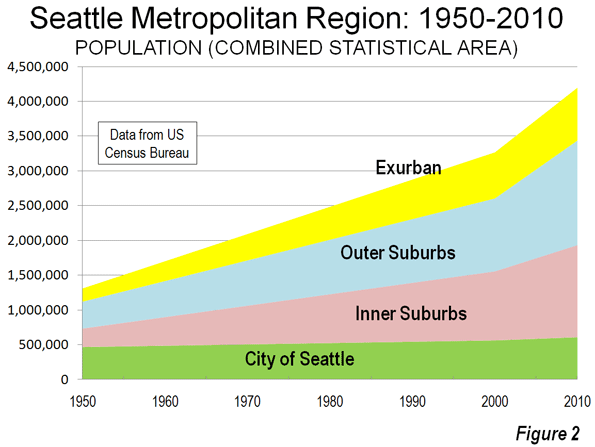
    Take, for example, Seattle. Out of the 51 largest metro areas in the U.S., the Valley’s longtime tech rival has emerged as our No. 1 region for high-tech growth, based on long- and short-term job numbers. Built on a base of such tech powerhouses as Microsoft, Amazon and Boeing, Seattle has enjoyed the steadiest and most sustained tech growth over the past decade. It is followed by Baltimore (No. 2), Columbus, Ohio (No. 3), Raleigh, N.C. (No. 4) and Salt Lake City, Utah (No. 5).

    To determine the best cities for high-tech jobs, we looked at the latest high-tech employment data collected by EMSI, an economic modeling firm. The Praxis Strategy Group‘s Mark Schill charted those areas that have gained the most high-tech manufacturing, software and services jobs over the past 10 years, equally weighting the last five years and the last two. We also included measures of concentration of tech employment in order to make sure we were not giving too much credence to relatively insignificant tech regions. Our definition of high tech industries is based on the one used by TechAmerica, the industry’s largest trade association.

    Despite the Valley’s remarkable concentration of tech jobs — roughly six times the national average — it ranked a modest No. 17 in our survey. This relatively low ranking reflects the little known fact that, even with the recent last dot-com craze sparking over 5% growth over the past two years, the Valley remains the “biggest loser” among the nation’s tech regions, surrendering roughly one quarter of its high -tech jobs — about 80,000 — in the past decade. Only New York City (No. 44) lost more tech jobs during that time.

    In contrast to this pattern of volatility, our top performers have managed to gain jobs steadily in the past decade — and have continued to add new ones in the last two years. In addition to our top five, the only other regions to claim overall tech gains in the last 10 years are Jacksonville, Fla. (No. 6), Washington, D.C. (No. 7), San Bernardino-Riverside, Calif. (No. 9), San Diego, Calif. (No. 9), Indianapolis (No. 11) and Orlando, Fla. (No. 24).

    So what accounts for high-tech success, and where will jobs most likely grow in the next decade? Certainly being home to a major research university makes a big difference. Seattle, Columbus, Raleigh and Salt Lake City all boast major educational and research assets.

    But it’s one thing to produce scientists and engineers; it’s another to generate employment for them over the long term. Clearly for the San Jose metropolitan region (which is home to Stanford) and the much-hyped No. 29 San Francisco area (home to the University of California Medical Center) academic excellence has not translated into steady growth in tech jobs. Over the past decade the Bay Area has given up 40,000 jobs, or 19% of its tech workforce, including a loss of nearly 6,000 in software publishing.

    Or look at the Boston region (ranked No. 22), which arguably boasts the most impressive concentration of research universities in the country. The region did add jobs in research and computer programming, but these were not enough to counter huge losses in telecommunications and electronic component manufacturing. Over the past decade, greater Beantown has given up 18% of its tech jobs, or more than 45,000 positions.

    One possible explanation may lie in costs, including very high housing prices, onerous taxes and a draconian regulatory environment. In tech, company headquarters may remain in the Valley, close to other headquarters and venture firms, but new jobs are often sent either out of the country or to more business friendly regions.

    Just look at the flow of jobs from Bay Area-based companies to places like the Salt Lake area. In the past two years Valley companies such as Twitter, Adobe, eBay, Electronic Arts and Oracle have all expanded into Utah. This region has many appealing assets for Bay Area companies and workers. Salt Lake City is easily accessible by air from California, possesses a well- educated workforce, has reasonable housing costs and offers world-class skiing and other outdoor activities.

    Another huge advantage appears to be closeness to the federal government, which expends hundreds of billions on tech products both hardware and software. This explains why Baltimore, primarily its suburbs, and the D.C. metro area have enjoyed steady tech growth and, under most foreseeable scenarios, likely will continue to do so in the coming years. Both regions have seen large gains in technology services industries, particularly programming, systems design, research, and engineering.

    Yet even business climate, while important, may not be enough to drive tech job growth. Texas ranks highly in most business surveys, including our own, but it did not fare so well in this one. Indeed No. 32 Austin, often thought as the most likely candidate for the next Silicon Valley, lost over 19% of its high-tech jobs over the past decade, including more than 17,000 jobs in semiconductor, computer and circuit board manufacturing. No. 18 Houston did far better, although it has also lost 6% of its tech jobs over the same period due to the cutbacks in the engineering service, a big sector there. Even more shocking: No. 46 Dallas, generally a job-creating dynamo, has seen roughly a quarter of its high-tech jobs go away, due primarily to losses in telecommunications carriers and in manufacturing of communications equipment and electronics.

    How about other potential up and comers for the coming decade? Two potentially big and somewhat surprising winners. The first: Detroit. Though the Motor City area lost 20% of its tech jobs in the past decade (ranking 40th on our list), it still boasts one of the nation’s largest concentrations of tech workers, nearly 50% above the national average. In the past two years, the region has experienced a solid 7.7% increase in technology jobs, the second highest rate of any metro area.

    The Motor City region seems to have some real high-tech mojo. According to the website Dice.com, Detroit has led the nation with the fastest growth in technology job offerings since February — at 101%. This can be traced to the rejuvenated auto industry, which is increasingly dependent on high-tech skills. Manufacturing is increasingly prodigious driver of tech jobs; games and dot-coms are not the only path to technical employment growth. This could mean good news for other Rust Belt cities, such as No. 28 Cincinatti or No. 38 Cleveland, as well as our Midwest standout, Columbus, which could benefit from growth sparked by the local natural gas boom.

    Another potential standout is No. 8 New Orleans, whose tech base remains relatively small but has expanded its tech workforce nearly 10% since 2009 — the highest rate of any of the regions studied. With low costs, a friendly business climate and world-class urban amenities, the Crescent City could emerge as a real player, aided by the growing prominence of research and development around Tulane University. There has also been a recent growing presence of the video game industry in the city.

    Looking forward, however, it makes sense to be cautious about where tech is heading. By its nature, this is a protean industry; the mix of jobs and favored locales tend to change. If the current boom in social media continues, for example, the Bay Area could recover more of its lost jobs and further extend its primacy. Similarly a surge in manufacturing and energy-related technology could be a boon to tech in Houston, Dallas as well as New Orleans. But based on both historic and recent trends, the surest best for future growth still stands with our top five winners, led by the rain-drenched, but prospering Seattle region.

    Best Places for High Tech Growth
    Ranking of 2, 5, and 10 year growth, industry concentration, and 5 and 10 year growth momentum
    Rank Metropolitan Area Rank Score
    1 Seattle  82.2
    2 Baltimore 75.7
    3 Columbus 67.9
    4 Raleigh 63.2
    5 Salt Lake City 60.0
    6 Jacksonville 59.2
    7 Washington, DC 58.9
    8 New Orleans 58.8
    9 Riverside-San Bernardino 58.2
    10 San Diego 56.1
    11 Indianapolis 55.9
    12 Buffalo 55.8
    13 San Antonio 54.0
    14 Charlotte 53.5
    15 St. Louis 51.6
    16 Pittsburgh 50.8
    17 San Jose 50.5
    18 Houston 50.2
    19 Hartford 50.0
    20 Nashville 49.6
    21 Providence 49.2
    22 Boston 48.3
    23 Minneapolis-St. Paul 48.3
    24 Orlando 48.1
    25 Portland 48.1
    26 Philadelphia 47.4
    27 Louisville 47.2
    28 Cincinnati 46.6
    29 San Francisco 46.6
    30 Denver 46.4
    31 Richmond 45.6
    32 Austin 45.1
    33 Atlanta 44.6
    34 Virginia Beach-Norfolk-Newport News 42.4
    35 Memphis 42.2
    36 Milwaukee 41.5
    37 Rochester 41.2
    38 Cleveland 40.9
    39 Phoenix 38.5
    40 Detroit 37.7
    41 Tampa 37.5
    42 Miami 33.2
    43 Sacramento 32.1
    44 New York 31.4
    45 Las Vegas 31.2
    46 Dallas-Fort Worth 31.0
    47 Chicago 30.2
    48 Los Angeles 29.5
    49 Oklahoma City 26.7
    50 Birmingham 23.5
    51 Kansas City 21.6
    Rankings measure employment in 45 high technology manufacturing, services, and software industry sectors.

    This piece first appeared at Forbes.com.

    Joel Kotkin is executive editor of NewGeography.com and is a distinguished presidential fellow in urban futures at Chapman University, and an adjunct fellow of the Legatum Institute in London. He is author of The City: A Global History. His newest book is The Next Hundred Million: America in 2050, released in February, 2010.

    Mark Schill of Praxis Strategy Group perfomed the economic analysis for this piece.

    Seattle photo courtesy of BigStockPhoto.com.

  • Major Metropolitan Commuting Trends: 2000-2010

    As we indicated in the last article, solo automobile commuting reached an all time record in the United States in 2010, increasing by 7.8 million commuters. At the same time, huge losses were sustained by carpooling, while the largest gain was in working at home, which includes telecommuting. Transit and bicycling also added commuters.  This continues many of the basic trends toward more personalized employment access that we have seen since 1960.

    Solo Automobile Commuting: Among the nation’s 51 metropolitan areas with more than 1 million population, 38 experienced increases in solo automobile commuting between 2000 and 2010. More than 80% of commuting is by solo automobile in 25 of the 51 largest metropolitan areas, with the highest rates being in Birmingham, Detroit, Cincinnati, Indianapolis and Kansas City. Another 28 metropolitan areas have single automobile commute shares of between 70% and 80%, with Boston, Washington and San Francisco between 60% and 70%. As would be expected, the lowest solo automobile commute share was in New York at 51%.

    Car Pools: The national data also showed a nearly 2.4 million loss in carpool use. The losses were pervasive, occurring in all 51 metropolitan areas. Riverside-San Bernardino had the highest carpool market share at just under 15%, while all other major metropolitan areas were below 12%. Car pools have been losing market share for decades.

    Work at Home (Includes Telecommuting): In what we have previously labeled as The Decade of the Telecommute, the nation experienced a 1.7 million increase in working at home over the past decade. The market share gains in working at home were as pervasive as the losses in carpooling, with all 51 metropolitan areas registering increases. Austin had the strongest work-at-home market share, at 7.3%, followed by Portland at 6.5%, San Francisco and Denver at 6.2%, Phoenix at 6.0%, with San Diego, Raleigh and Atlanta above 5.5%. Overall, working at home exceeded transit commuting in 37 major metropolitan areas out of 51 in 2010, up from 27 in 2000. Three metropolitan areas had work at home market shares of less than 3%, including Memphis, New Orleans and last place Buffalo.

    Transit: As noted before, transit enjoyed its first 10 year gain since journey to work data was first collected by the Census Bureau 50 years ago. Overall, transit added 900,000 daily commuters, roughly half that for telecommuters. Transit’s market share increased in 25 of the top 51 metropolitan areas. It is also notable that in a number of the metropolitan areas with the largest expenditures for new rail systems, there were either losses or commuting gains were concentrated in the more flexible bus services.

    New York: As so often has been the case, transit was largely a "New York story." More than one half of the new transit commuters were in the New York metropolitan area, more than 450,000 of the 900,000 increase. New York boasts by far the most extensive transit system in the nation, which serves the second largest central business district in the world and by far the nation’s most important. In 2000, New York had a transit work trip market share of 27.4%. By 2010, New York’s transit work trip market share had risen to 30.7%, more than double that of any other metropolitan area. More than 70% of the new transit commuters in the New York area were on its subway (Metro), suburban rail and light rail systems.

    San Francisco: San Francisco retained its position as the second strongest transit metropolitan area, with a 14.6% work trip market share in 2010. This is up from 13.8% in 2000.

    Washington: Washington was the third strongest transit commuting market, with a 14.0% work trip market share in 2010. This modest increase from 13.4% nonetheless produced the second largest ridership increase in the nation, at more than 130,000. This reflects the strength of Washington’s job market over the decade. Rail ridership accounted for 53% of this increase, while buses accounted for the other 47%.

    Boston and Chicago: Boston passed Chicago to become the fourth strongest transit market, at 11.8% in 2010. This is an increase from 11.2% in 2000. Chicago ranked fifth at 11.2%, a small reduction from the 11.3% in 2000.

    Los Angeles: Los Angeles had the third largest increase in transit commuting, adding 60,000 daily transit commuters. Approximately 75% of these new commuters were attracted by the region’s extensive bus system as opposed to its very expensive but limited rail system. This increase placed Los Angeles in a virtual tie with Portland, with a work trip market share of 6.2%.

    Portland: Portland continued to experience its now 30 year transit market share erosion, despite having added three new light rail lines between 2000 and 2010. Portland’s transit work trip market share fell to 6.2% from 6.3% and now trails the work at home and telecommute market share of 6.5%.

    Seattle:Seattle added 29,000 new transit commuters for the fourth strongest growth in the nation. Approximately 75% of the new commuters were on the metropolitan area’s bus system.

    Atlanta: Atlanta, which is home to the third largest postwar Metro system in the nation (MARTA) gained nearly 9000 new transit commuters, all of them on the bus, while losing more than 3000 rail commuters.

    Miami:Miami added 16,000 new transit commuters, though more than 90% were attracted to the bus system, rather than the rail services.

    Rail and Bus in Texas: Other metropolitan areas with new and expanded rail systems did not fare as well. In Dallas-Fort Worth, the light rail system was more than doubled in length, yet there was a reduction of more than 3000 daily transit commuters. The transit work trip market share in Dallas-Fort Worth dropped from 1.8% to 1.4%, approximately one quarter lower than that of any other major metropolitan area with a new light rail or Metro system. Houston, which built its first light rail line during the period, lost nearly 3000 daily transit commuters, with its transit work trip market share dropping by nearly one-third, from 3.2% to 2.3%. By contrast, the third largest metropolitan area in Texas, San Antonio, lost no commuters from its bus only transit system.

    Other New Rail Metropolitan Areas: Other metropolitan areas with new rail systems experienced modest ridership increases, with 60 to 70 percent of the increase on the bus systems in Charlotte, Minneapolis-St. Paul and Phoenix. Salt Lake City experienced a small decline in transit commuting.

    Below 1 Percent: Four metropolitan areas had transit work trip market shares of less than 1%, including Indianapolis, Raleigh, Birmingham and last place Oklahoma City, with a market share of 0.4%.

    Bicycles: It was also a good decade for bicycle commuting, with the national increase of nearly 250,000. The bicycle commuting market share rose in 45 of the 51 largest metropolitan areas. Portland had the highest bicycle market share at 2.2%, with three other metropolitan areas at 1.5% or above, Sacramento, San Francisco and San Jose. The lowest bicycle commuting market shares were in San Antonio, Cincinnati, Birmingham and Memphis, all at 0.1 percent.

    Walking: There was little change in walking among the nations major metropolitan areas. The largest shares were in New York (5.9%) and Boston (5.4%), with the smallest shares in Raleigh (1.1%), Orlando (1.1%) and Birmingham (1.0%).

    Drifting Away from Shared Commuting: In some ways, the 2000s were different than previous decades, especially with the reversals in bicycle commuting and transit. However, overall, shared ride commuting (transit and car pools) lost share due to the precipitous decline in car pooling. Longer term share increase trends also continued in single-occupant automobile commuting and working at home. The bottom line: personal employment access (personal mobility plus working at home) continues to carve away at the smallish share still held by shared commuting.

    ————-

    Data: The 2000 and 2010 commuting market shares by mode are shown in Tables 1 and 2 (2010 metropolitan area boundaries).

    ————

    Table 1
    Work Trip Market Share: 2000
    Metropolitan Areas Over 1,000,000 Population in 2010
    Metropolitan Area Car, Truck or Van: Alone Car/Van Pool Transit Bicycle Walk Other Work at Home (Includes Telecommute)
    Atlanta 77.0% 13.7% 3.4% 0.1% 1.3% 1.1% 3.5%
    Austin 76.5% 13.7% 2.5% 0.6% 2.1% 1.1% 3.6%
    Baltimore 75.5% 11.5% 5.9% 0.2% 2.9% 0.9% 3.2%
    Birmingham 83.3% 12.0% 0.7% 0.1% 1.2% 0.7% 2.1%
    Boston 71.1% 8.6% 11.2% 0.5% 4.6% 0.8% 3.3%
    Buffalo 81.7% 9.4% 3.3% 0.2% 2.7% 0.5% 2.1%
    Charlotte 80.7% 12.8% 1.4% 0.1% 1.2% 0.8% 2.9%
    Chicago 70.4% 11.0% 11.3% 0.3% 3.1% 1.0% 2.9%
    Cincinnati 81.3% 10.1% 2.8% 0.1% 2.3% 0.6% 2.7%
    Cleveland 81.3% 8.8% 4.1% 0.2% 2.2% 0.6% 2.7%
    Columbus 82.1% 9.7% 2.1% 0.2% 2.3% 0.6% 3.0%
    Dallas-Fort Worth 78.7% 13.9% 1.8% 0.1% 1.5% 1.0% 3.0%
    Denver 76.0% 11.7% 4.4% 0.4% 2.1% 0.8% 4.6%
    Detroit 84.7% 9.2% 1.7% 0.1% 1.4% 0.6% 2.2%
    Hartford 82.6% 8.7% 2.8% 0.2% 2.5% 0.6% 2.6%
    Houston 77.0% 14.3% 3.2% 0.3% 1.6% 1.1% 2.5%
    Indianapolis 82.8% 10.4% 1.3% 0.2% 1.7% 0.7% 3.0%
    Jacksonville 80.3% 12.6% 1.3% 0.5% 1.7% 1.4% 2.3%
    Kansas City 82.6% 10.6% 1.2% 0.1% 1.4% 0.7% 3.5%
    Las Vegas 74.6% 14.7% 4.4% 0.5% 2.3% 1.3% 2.3%
    Los Angeles 71.9% 14.6% 5.6% 0.7% 2.7% 1.0% 3.5%
    Louisville 81.8% 11.2% 2.0% 0.2% 1.7% 0.7% 2.5%
    Memphis 80.7% 13.3% 1.6% 0.1% 1.3% 0.9% 2.2%
    Miami-West Palm Beach 77.3% 13.1% 3.2% 0.5% 1.7% 1.2% 3.1%
    Milwaukee 79.7% 9.9% 4.2% 0.2% 2.9% 0.6% 2.6%
    Minneapolis-St. Paul 78.3% 10.0% 4.4% 0.4% 2.4% 0.6% 3.8%
    Nashville 80.5% 13.1% 0.8% 0.1% 1.5% 0.8% 3.2%
    New Orleans 72.9% 14.6% 5.4% 0.6% 2.7% 1.3% 2.4%
    New York 52.7% 9.3% 27.4% 0.3% 6.0% 1.5% 2.9%
    Oklahoma City 81.6% 12.1% 0.5% 0.2% 1.7% 1.0% 2.9%
    Orlando 80.6% 12.1% 1.6% 0.4% 1.3% 1.1% 2.9%
    Philadelphia 73.1% 10.2% 8.9% 0.3% 3.9% 0.7% 2.9%
    Phoenix 74.6% 15.3% 1.9% 0.9% 2.1% 1.4% 3.7%
    Pittsburgh 77.5% 9.8% 5.9% 0.1% 3.6% 0.6% 2.5%
    Portland 73.1% 11.5% 6.3% 0.8% 2.9% 0.8% 4.6%
    Providence 80.7% 10.5% 2.4% 0.2% 3.3% 0.8% 2.2%
    Raleigh 80.8% 12.1% 0.9% 0.2% 1.6% 1.0% 3.5%
    Richmond 81.7% 10.9% 1.9% 0.2% 1.8% 0.8% 2.7%
    Riverside-San Bernardino 73.5% 17.6% 1.6% 0.5% 2.2% 1.2% 3.5%
    Rochester 81.7% 9.1% 2.0% 0.2% 3.5% 0.6% 2.9%
    Sacramento 75.3% 13.5% 2.7% 1.4% 2.2% 0.9% 4.0%
    Salt Lake City 76.0% 13.4% 3.3% 0.5% 2.1% 0.7% 4.0%
    San Antonio 76.2% 14.9% 2.7% 0.1% 2.4% 1.2% 2.6%
    San Diego 73.9% 13.0% 3.3% 0.6% 3.4% 1.4% 4.4%
    San Francisco-Oakland 62.8% 12.7% 13.8% 1.1% 3.9% 1.3% 4.3%
    San Jose 77.2% 12.4% 3.4% 1.2% 1.8% 0.9% 3.1%
    Seattle 71.6% 12.7% 7.0% 0.6% 3.1% 0.8% 4.2%
    St. Louis 82.5% 10.0% 2.2% 0.1% 1.7% 0.6% 2.9%
    Tampa-St. Petersburg 79.7% 12.4% 1.3% 0.6% 1.7% 1.2% 3.1%
    Virginia Beach-Norfolk 78.8% 12.1% 1.7% 0.3% 2.7% 1.6% 2.7%
    Washington 67.5% 13.4% 11.2% 0.3% 3.0% 0.9% 3.7%
    Top 51 Metropolitan Areas 73.2% 11.8% 7.5% 0.4% 2.9% 1.0% 3.2%
    Calculated from Census Bureau data
    Metropolitan areas as defined in 2010
    Table 2
    Work Trip Market Share: 2010
    Metropolitan Areas Over 1,000,000 Population in 2010
    Car, Truck or Van: Alone Car/Van Pool Transit Bicycle Walk Other Work at Home (Includes Telecommute)
    Atlanta 77.6% 10.3% 3.4% 0.2% 1.3% 1.5% 5.8%
    Austin 75.6% 10.5% 2.3% 0.6% 1.9% 1.8% 7.3%
    Baltimore 76.5% 9.6% 6.0% 0.2% 2.6% 1.0% 4.1%
    Birmingham 84.8% 10.0% 0.6% 0.1% 1.0% 0.5% 3.1%
    Boston 69.5% 7.5% 11.8% 0.7% 5.4% 0.8% 4.4%
    Buffalo 82.0% 7.5% 3.8% 0.3% 3.0% 1.1% 2.3%
    Charlotte 80.6% 10.0% 2.0% 0.2% 1.5% 0.6% 5.1%
    Chicago 71.0% 8.5% 11.2% 0.6% 3.1% 1.0% 4.5%
    Cincinnati 84.1% 7.9% 2.1% 0.1% 2.0% 0.4% 3.4%
    Cleveland 82.3% 7.2% 3.6% 0.3% 2.2% 0.7% 3.7%
    Columbus 82.4% 8.0% 1.7% 0.5% 2.3% 0.6% 4.6%
    Dallas-Fort Worth 81.3% 10.1% 1.4% 0.2% 1.2% 1.4% 4.6%
    Denver 76.3% 9.6% 4.1% 0.8% 1.9% 1.1% 6.2%
    Detroit 84.6% 8.5% 1.5% 0.2% 1.4% 0.8% 3.0%
    Hartford 81.5% 7.9% 3.1% 0.3% 3.0% 1.0% 3.2%
    Houston 79.4% 11.5% 2.3% 0.3% 1.4% 1.7% 3.4%
    Indianapolis 83.9% 8.2% 0.9% 0.3% 1.5% 0.8% 4.3%
    Jacksonville 82.5% 8.9% 1.0% 0.5% 1.4% 1.2% 4.5%
    Kansas City 83.7% 8.5% 1.2% 0.2% 1.4% 0.9% 4.1%
    Las Vegas 78.9% 10.5% 3.8% 0.6% 1.6% 1.3% 3.3%
    Los Angeles 73.5% 10.7% 6.2% 0.9% 2.6% 1.2% 5.0%
    Louisville 83.5% 9.2% 1.9% 0.2% 1.3% 0.9% 3.1%
    Memphis 83.6% 10.3% 1.0% 0.1% 1.5% 0.9% 2.7%
    Miami-West Palm Beach 78.8% 9.4% 3.5% 0.6% 2.0% 1.4% 4.4%
    Milwaukee 80.1% 9.3% 3.4% 0.5% 2.6% 0.7% 3.4%
    Minneapolis-St. Paul 78.3% 7.9% 4.8% 0.7% 2.4% 0.9% 4.9%
    Nashville 81.3% 10.7% 1.0% 0.2% 1.2% 1.0% 4.6%
    New Orleans 78.1% 11.0% 3.2% 0.7% 2.6% 1.9% 2.5%
    New York 50.5% 6.8% 30.7% 0.5% 5.9% 1.6% 3.9%
    Oklahoma City 82.7% 10.6% 0.5% 0.3% 1.6% 1.0% 3.4%
    Orlando 82.1% 9.2% 1.6% 0.3% 1.1% 1.4% 4.4%
    Philadelphia 73.9% 8.0% 9.6% 0.5% 3.5% 0.8% 3.8%
    Phoenix 76.7% 11.8% 2.0% 0.6% 1.5% 1.5% 6.0%
    Pittsburgh 77.0% 8.9% 5.6% 0.3% 3.7% 0.9% 3.5%
    Portland 72.1% 8.8% 6.2% 2.2% 3.3% 0.9% 6.5%
    Providence 81.3% 8.3% 2.6% 0.5% 3.2% 0.9% 3.2%
    Raleigh 82.0% 8.7% 0.9% 0.3% 1.1% 1.1% 5.9%
    Richmond 81.2% 10.1% 1.8% 0.4% 1.2% 0.7% 4.6%
    Riverside-San Bernardino 76.1% 14.8% 1.7% 0.4% 1.8% 1.4% 3.8%
    Rochester 82.6% 7.1% 1.8% 0.4% 3.9% 0.7% 3.6%
    Sacramento 75.6% 11.2% 2.9% 1.7% 1.9% 1.1% 5.5%
    Salt Lake City 77.7% 11.3% 2.9% 0.8% 2.3% 1.0% 4.0%
    San Antonio 79.5% 11.5% 2.1% 0.1% 2.0% 1.4% 3.3%
    San Diego 76.2% 10.1% 3.3% 0.8% 2.8% 1.0% 5.9%
    San Francisco-Oakland 61.5% 10.6% 14.6% 1.7% 4.2% 1.2% 6.2%
    San Jose 77.5% 10.3% 2.9% 1.6% 1.8% 0.9% 5.1%
    Seattle 70.5% 10.2% 8.2% 1.1% 3.5% 1.0% 5.5%
    St. Louis 83.0% 7.7% 2.6% 0.2% 1.9% 0.8% 3.7%
    Tampa-St. Petersburg 80.3% 9.5% 1.6% 0.8% 1.4% 1.4% 5.0%
    Virginia Beach-Norfolk 80.9% 9.4% 1.8% 0.5% 3.3% 0.9% 3.1%
    Washington 65.6% 10.6% 14.0% 0.5% 3.5% 1.0% 4.9%
    Top 51 Metropolitan Areas 73.7% 9.4% 7.9% 0.6% 2.8% 1.2% 4.4%
    Calculated from Census Bureau data
    Metropolitan areas as defined in 2010

    Wendell Cox is a Visiting Professor, Conservatoire National des Arts et Metiers, Paris and the author of “War on the Dream: How Anti-Sprawl Policy Threatens the Quality of Life

    Photo: Manhattan (New York), with the Woolworth Building in the distance (by author)

  • Moving from the Coast

    For years both government and media have been advancing the notion that   America’s coastal counties are obtaining most of the population growth at the expense of interior counties. For example, the National Oceanic and Atmospheric Administration reported in the 1990s: Coastal areas are crowded and becoming more so every day. More than 139 million people–about 53% of the national total–reside along the narrow coastal fringes.

    NOAA went on to say that the population of the coastal counties is expected to increase by an average of 3600 people per day and noted further that the coastal counties were growing faster than the nation as a whole. NOAA has designated 673 counties on four coasts (Atlantic, Gulf, Pacific and Great Lakes) in the contiguous United States, Hawaii and Alaska as coastal counties.

    Population Growth: In fact, coastal counties are not growing faster than the nation as a whole and were not when NOOA issued the 1990s report. For most of the last 40 years, the nation’s interior counties have been adding more population. From 1970 to 2010, interior counties added 55.7 million new residents, compared to 49.7 million new residents in coastal counties. This is a reversal from 1940 to 1970, when two thirds of the nation’s population growth was in the coastal counties.

    The trends today actually have become more favorable for the interior than at any time in a century. From 2000 to 2010, the interior counties captured more of the nation’s growth than in any decade since 1900 (Table). From 2000 to 2010, the interior counties added 16.0 million residents, 59.6 percent of the nation’s growth compared to 11.4 million new residents in the coastal counties.

    Coastal and Interior Population: Counties
    1900-2010
    Coastal Counties Interior Counties United States
    Year Population Share Change Population Share Change Population Change
    1900         30.2 39.7%         46.0 60.3%         76.2
    1910         38.2 41.4%           8.0         54.0 58.6%           8.0         92.2         16.0
    1920         46.2 43.6%           8.0         59.8 56.4%           5.8       106.0         13.8
    1930         57.4 46.6%         11.2         65.8 53.4%           6.0       123.2         17.2
    1940         62.3 47.1%           4.9         69.8 52.9%           4.0       132.2           9.0
    1950         75.2 49.9%         12.9         75.5 50.1%           5.7       150.7         18.5
    1960         94.4 52.6%         19.2         85.0 47.4%           9.5       179.3         28.6
    1970       109.9 54.0%         15.6         93.5 46.0%           8.5       203.4         24.1
    1980       119.8 52.9%           9.9       106.7 47.1%         13.2       226.5         23.2
    1990       133.4 53.6%         13.6       115.3 46.4%           8.6       248.7         22.2
    2000       148.2 52.7%         14.9       133.2 47.3%         17.9       281.4         32.7
    2010       159.6 51.7%         11.4       149.1 48.3%         16.0       308.7         27.3
    Population in Millions
    Calculated from US Census Bureau Data
    Coastal counties designated by NOAA (673 counties)
    Totals may vary due to rounding


    As of 2010, the coastal counties have 51.7 percent of the nation’s population, having dropped from 52.7 percent in 2000 and a peak of 54.0 percent in 1970 (Figure 1). Rather than adding 3600 new people every day, coastal counties added 3100 people per day, while interior counties added 4400 per day during the 2000s. A smaller sample of 559 counties that was examined by economists Jordan Rapaport and Jeffrey Sachs in the early 2000s experienced an even more pronounced movement away from the coasts between 2000 and 2010, with more than 60 percent of the nation’s growth taking place in the interior counties.

    There may also be some concern about density in coastal counties.   Yet Malthusian fears need not grip coastal residents. With a population density of approximately 315 per square mile (120 per square kilometer), the coastal counties of the contiguous United States have only a slightly higher density than the post-enlargement 27-nation European Union. The coastal counties have a density one-half that of Germany. In contrast, the interior counties are far less dense, at 60 persons per square mile.

    There has also been significant change in coastal population trends since the middle 1990s. The largest Pacific Coast metropolitan areas, such as Los Angeles, San Francisco, San Diego, San Jose and Seattle have seen their growth slow considerably. In the 1990s, NOAA was projecting huge population increases for Los Angeles and San Diego counties. It appears likely that these 2015 projections will fall at least 600,000 short in both counties. Even Seattle, arguably the healthiest economically among the west coast metropolitan areas, is now growing more slowly than former laggards Oklahoma City, Indianapolis and Columbus in the interior.

    Regional Population Growth: There was significant variation in growth among the varied regions of the country. In the Northeast, there was much stronger growth on the coast, which added 1.6 million people, compared to a gain of less than 150,000 in the interior. In the Midwest, the coastal counties (along the Great Lakes) lost 120,000 people, while the interior counties gained 2.7 million. In the South, the interior grew more, at 8.1 million, slightly more than 6.3 million in coastal counties.  In the West, interior counties gained 5.1 million people, while the coastal counties gained 3.7 million (Figure 2). This drop in coastal growth was a principal reason why the West grew less quickly than the South, which experienced the most robust coastal growth. For this reason, the West failed to be the nation’s fastest growing region for the first time since 1900.

    Personal Income: Rappaport and Sachs noted in their early 2000s work that the density of economic activity was far greater in the coastal counties. Of course this is to be expected, due to their greater population density. However the data with respect to the distribution of personal income is less clear. Since 1969, coastal and interior counties have been alternating leadership in personal income growth per capita. During the 2000s, interior counties experienced average personal income growth slightly less than that of the coastal counties (Figure 3). However, average per capita income since 1970 has risen 81 percent, compared to a lower 75 percent in the coastal counties (adjusted for inflation).  Overall, the share of income in the interior counties has been growing modestly (Figure 4).

    Domestic Migration: The most important factor in the growth of the interior counties in the 2000s lies with net domestic migration, with more residents moving from the coastal counties to the interior counties. Between 2000 and 2009, 4.5 million people moved to the interior counties, while 4.5 million people moved away from the coastal counties, according to Census Bureau estimates (Figure 5).

    Rappaport and Sachs had theorized that the greater concentration of population and economic activity in the coastal counties could be reflective of a more attractive quality of life. The domestic migration data would suggest that, at least over the last decade, people are opting for the interior, perhaps sensing that the coastal quality of life may not be as affordable and accessible as in the past.  

    Cost of Living: The key here lies with the cost of living, which has become far higher on the coasts then in the interior. The most significant cost of living differences for households are in the cost of housing.   

    From 2000 to 2009, housing affordability deteriorated markedly in the coastal counties. Census Bureau data indicates that the Median Multiple (median house founded divided by median household income) rose from 3.6 to 5.4 in the coastal counties (population weighted). By contrast, housing affordability worsened far less in the interior counties, where the Median Multiple rose from 2.5 to 3.1. Thus, the median household saw owned housing increase 22 months worth of income in value in coastal counties, compared to seven months worth of income in interior counties (Figure 6). At the same time, these higher coastal house prices developed as demand for housing was dropping substantially, with 4.5 million people moving away from coastal counties (above).

    Many of the coastal counties have strong land use regulation (smart growth or urban containment regulation), especially in California, Oregon, Washington, Florida and the metropolitan areas of Boston, New York and Washington. A considerable body of research, both econometric and descriptive, has associated more restrictive land use regulation (called smart growth, urban consolidation or urban containment) with higher house price increases, reaching back at least to the seminal 1970s work by Sir Peter Hall and his associates in the United Kingdom. It thus seems likely that the deterioration of housing affordability in coastal counties is materially associated with their less robust growth. The quality of life on the coasts may simply have become too expensive.

    The Future? It is unclear whether the recent higher population growth rates, stronger migration trends and improved economic performance of the interior will continue into the future. The 1940 to 1970 dominance of the coastal counties surged as coastal metropolitan areas, especially in Florida and California, grew much more quickly. Now that pattern has been reversed.  More favorable trends over the past 40 years in the interior counties seem likely continue, unless coastal house prices and the cost of living begin to swing back toward the national norm.

    —-

    Note: Complete county data is at County Coastal Population (also attached to this article)

    Photograph: San Diego, which experienced greater domestic outmigration than Pittsburgh in the 2000s.

  • The Evolving Urban Area: Seattle

    Lunching at Seattle’s Space Needle, the casual observer might imagine that one of the nation’s most dense urban areas is spread out below. To the immediate south of the Space Needle is one of the nation’s premier downtown areas. In 2000 downtown Seattle had the seventh largest employment base in the country and was one of the most dense. Its impressive, closely packed buildings witness a storied past. For more than 60 years, between 1914 and 1990, downtown Seattle has had the tallest building on the West Coast, Smith Tower, and was the fourth tallest building in the world when built. It held the title for an impressive 55 years, from 1914 to 1969, when another Seattle building briefly took the title (1001 4th Avenue). Later (1985), Seattle’s Columbia Center became the first building on the West Coast to exceed 75 floors, but by 1990 had been passed by the U.S. Bank Tower in Los Angeles (see Elliot Bay photograph and Note 1).

    However, looks can be deceiving.  In 2000, Seattle ranked last in urban population density out of the 11 urban areas in the 13 western states with more than 1 million population (just behind Portland, which ranked next-to-last).  The Seattle urban area’s density was approximately 60 percent below that of Los Angeles, the US’s  densest urban area. Even the Houston and Dallas-Fort Worth urban areas, famous for their great expanse, were denser than Seattle. Updated urban area density data from the 2010 census will not be available for at least a year.

    Nor is the historical core municipality of Seattle particularly closely packed. With a population density of 7,200 per square mile, the city of Seattle is considerably less dense than a number of Los Angeles suburbs such as Santa Ana (12,000) and Garden Grove (9,500). Even so, the city of Seattle is nearly two-thirds more dense than the city of Portland (4,400), despite the latter’s densification claims.

    The 2010 Census: The 2010 census indicates a continuing dispersion of population in the Seattle metropolitan region (Figure 1). The Seattle metropolitan region, formally the Seattle combined statistical area (Note 2) is composed of the core Seattle metropolitan area (King, Pierce and Snohomish counties) and five exurban statistical areas, Bremerton (Kitsap County), Olympia (Thurston County), Mount Vernon (Skagit County), Oak Harbor (Island County) and Shelton (Mason County).

    Seattle Combined Statistical Area: Population 2000-2010
    Area 2000 2010 Change % Share of Growth Share of Population
    City of Seattle        563,374        608,660           45,286 8.0% 9.2% 14.5%
    Balance: King County     1,173,660     1,322,589        148,929 12.7% 30.3% 31.5%
    Pierce & Snohomish Counties     1,306,844     1,508,560        201,716 15.4% 41.0% 35.9%
    Metropolitan Area Outside Seattle    2,480,504    2,831,149        350,645 14.1% 71.2% 67.4%
    Metropolitan Area     3,043,878    3,439,809        395,931 13.0% 80.4% 81.9%
    Exurban Metropolitan Areas        663,260        759,503           96,243 14.5% 19.6% 18.1%
    Combined Statistical Area    3,707,138    4,199,312        492,174 13.3% 100.0% 100.0%
    Calculated from US Census data


    City of Seattle (Historical Core Municipality): Overall, the historical core city of Seattle grew 8.0 percent, from 564,000 to 609,000 between 2000 and 2010, which was one of the healthiest increases among major cities. In adding 45,000, the city still only accounted for 9.2 percent of the Seattle metropolitan region population growth.  The city of Seattle now constitutes less than 15 percent of the metropolitan region population, down from 36 percent 1950 (same geographic area). In 1950, the city of Seattle had nearly two thirds of the population of King County. By 2010, the city of Seattle was less than one third of King County’s population, despite annexations. As the city has continued to decline in its share of the metropolitan region’s population, the impressive downtown area has also lost its dominance and by 2009 had fallen to 8 percent of the metropolitan region’s employment.

    Inner Suburbs: Areas outside the city of Seattle accounted for more than 90 percent of growth in the metropolitan region. The inner suburbs, which include the residential development to the south, north and east of Seattle in King County grew more than 50 percent faster than the city of Seattle, at 12.7 percent between 2000 and 2010. The inner suburbs grew from 1,170,000 to 1,320,000, adding nearly 150,000 new residents, more than three times the city of Seattle increase. King County outside Seattle also captured 30 percent of the metropolitan region’s growth and now has 32 percent of the metropolitan region’s population. The eastern suburbs of King County are home to one of the nation’s largest, most diverse and successful edge cities, Bellevue, as well as the Microsoft campus in neighboring Redmond.

    Outer Suburbs: The outer suburbs, which include Pierce County (Tacoma is the county seat) and Snohomish County grew 15.4 percent, nearly double the growth rate of the city of Seattle. The outer suburbs grew from 1.3 million to 1.5 million, adding 200,000 new residents, more than four times the city of Seattle’s increase. Pierce and Snohomish counties captured 41 percent of the metropolitan region’s growth and now account for 36 percent of the metropolitan region’s population.

    Exurban Areas:  The exurban statistical areas grew nearly as quickly as the outer suburbs. Between 2000 and 2010, the exurban areas increased their population by 14.5 percent.  The exurban statistical areas accounted for 20 percent of the metropolitan region’s population growth. These more distant areas grew from 660,000 to 760,000 people, adding nearly 100,000 new residents. This is more than double the increase in the city of Seattle population. Approximately 18 percent of the population in the metropolitan region lives in the exurban statistical areas, a larger number than residing in the city of Seattle.

    The Dispersion Continues: The dispersion of Seattle, like that of metropolitan regions around the nation and the world, has been going on for decades. The city of Seattle has accounted for only 5 percent of the metropolitan region’s population since 1950 (Figure 2) with suburbs and exurbs accounting for the vast majority of the nearly 3,000,000 increase.

    Despite the pre-2010 census media and academic drumbeat to the effect that metropolitan areas were no longer dispersing, the census revealed a totally different and even inconvenient truth. This does not mean that both residents of the entire metropolitan region, suburbs and core city, should not be proud of an attractive urban area in an incomparable natural setting. Yet, the vast majority of the region’s population and employment growth is taking place outside the core. Seattle is following the national and international pattern to ever greater dispersion.

    _________

    Note 1: Downtown Seattle is on a hill and the newer buildings are generally on higher ground than Smith Tower, which makes the difference in height look greater.

    Note 2: "Combined statistical areas" were formerly "consolidated metropolitan statistical areas."

    Top Photograph: Downtown Seattle from the Space Needle (by author)

    Wendell Cox is a Visiting Professor, Conservatoire National des Arts et Metiers, Paris and the author of “War on the Dream: How Anti-Sprawl Policy Threatens the Quality of Life

  • Hey, Dad: Family Still Matters!

    America is getting older. Those over the age of 65, which currently account for 12% of the population, are expected to make up 20% of the population by 2030. People are marrying later, and a growing group, though still a distinct minority, is choosing not to have children. So if there are proportionately fewer traditional households, do families still matter in determining how places and regions grow?

    The answer is yes. Using Census data, with the help of demographer Wendell Cox, we determined the regions in the U.S. with the biggest increases in children ages 5 to 17 (See table below). These family hot spots, which include Raleigh, N.C. (No. 1), Austin, Texas (No. 3) and Charlotte, S.C. (No. 4), are also some of the country’s biggest job generators. Many rank highly in the fastest-growing cities in the U.S. And seven of the ten leading regions for kids also have the fastest-growing foreign-born populations.

    Take the region with the biggest increase in children, Raleigh. The North Carolina powerhouse experienced a nearly 50% jump in residents between ages 5 to 17 over the past decade. There are 70,000 more kids in the Triangle now than a decade ago. The region also experienced the second-highest overall population increase, the second-biggest surge in educated migrants and the third-highest job growth over the past two decades. It also ranked among those regions seeing the biggest jump in new immigrants.

    Texas boasts many of the strongest economies in the country, which helps make it home to many of the leading metros for kids, including Austin (No. 3), Dallas (No. 7),  Houston (No. 9) and San Antonio (No. 10). These areas have emerged as major magnets for migrants from both within the country and abroad. Dallas and Houston, for example, now get more immigrants per capita than Washington, Chicago or Boston.

    The rest of our top ten areas for kids were superstars in employment and population growth during the early years of this decade. Despite tougher times, Las Vegas (No. 2), Charlotte, S.C. (No. 4), Phoenix, Ariz. (No. 5), Atlanta (No. 6) and Orlando, Fla. (No. 8)” were all among leaders in overall population and also saw large increases in their numbers of immigrants.

    One thing these regions share is affordable housing. Throughout the real estate bubble, housing prices in Raleigh, the Texas cities and Atlanta remained low. Today, prices have also plummeted in virtually all the other markets in our top ten, reinforcing their relative affordability.

    A look at the bottom of the list also tells two stories. Some 28 of the 50 largest regions — we took out New Orleans due to the unusual circumstance of Hurricane Katrina — actually experienced an absolute decrease in the number of kids. Buffalo’s youth population dropped by almost 30,000 — a 13.6% decline. Many of the other cities at the bottom of the list came from the familiar ranks of slow- or negative-growth Rust Belt cities, including   Pittsburgh (No. 49), Rochester, N.Y. (No. 48) Cleveland (No. 47) and Detroit (No. 46).

    Other areas losing youngsters included the nation’s three legitimate megacities — Los Angeles (No. 44), New York (No. 38) and Chicago (No. 35) — as well as areas long associated with the migration of the “young and restless,” including Boston (No. 37) and San Francisco (No. 36). Unlike young adults who move to Austin and Raleigh, the “young and restless” in these “hip and cool” centers may not hang around long enough to have children.

    Jobs certainly are a big factor. Like the Rust Belt towns, most of these areas have experienced stagnant job growth or even lost employment over the decade. Another reason young families aren’t staying could be housing costs; all these cities rank among the most unaffordable in the nation. Even if you’re a family with a job, or two, it’s hard to raise the capital to make a down payment unless you have loads of stock in Google, or more likely, well-to-do parents.

    Overall, the places with the absolute fewest kids ages 5 to 17 tend to be dense core cities. Children constitute barely 1 in 10 residents in the city of Seattle.  The urban cores of San Francisco, Washington and Boston show similar low rates.

    The few kids in these regions are mostly in the suburbs.  The Seattle suburbs, for example, have 75% more kids than the city. This difference is driven both by growth in immigrants to more affordable, less dense suburban areas as well as the movements of people of child-bearing age out of the city.

    So what do the numbers suggest about the link between families and regional dynamism? Some demographers and urbanists see the shrinking percentage of families as a sign of their increasing irrelevance to regional growth. One prominent demographer even called traditional families a kind of “endangered species,” although an awfully large one given that they still number one in five households and constitute, with their kids, roughly 90 million people, or almost 30% of the population.

    In reality families are unlikely to go the way of the Dodo. As the large millennial generation, born between 1982 and 2003, enters their late 20s and early 30s, they will naturally begin to spawn. Generational researchers Morley Winograd and Mike Hais have studied millennial attitudes and have found that these young adults are much more family-oriented than Gen Xers and even their own baby boomer parents. Some 85% plan on getting married, and some 77% are inclined toward having children of their own.

    It’s also critical to expand our definition of families. Once children leave their home, parents do not suddenly become footloose, fancy-free singles; they remain parents. Often they end up moving closer to their children, or sometimes the children make a “U-turn” to be close to Mom and Dad: Grandparents, after all, make excellent, and cheap, babysitters.

    Of course, many of the more affluent and educated young adults will initially head to urban centers like New York, San Francisco or Boston as they seek potential spouses and begin their careers. But as they age, Winograd and Hais note, many of the older millennials want to establish roots in more affordable suburbs that are often closer to their work, especially ones with good schools. According to a survey by Frank Magid and Associates, a large plurality of millennials name suburbs as their “ideal” place to settle, more so than earlier generations.

    The surprising uptick in the percentage of multigenerational households also suggests a growing role for extended families. Rather than shrinking, household size is beginning to grow again for the first time in decades.

    According to the Pew Foundation, multi-generational households now make up 15% of households, up from 12% in 1980. If hard times continue this trend likely will accelerate. The percentage of single households has also started to flatten and has actually dropped among the elderly.

    So what’s the lesson here? Ignore the claims of pundits on right and left who long have predicted the demise of the family. The family will prove more important than ever in determining where people live, work and, especially, settle.

    None of this suggests a reprise of the Ozzie and Harriet 1950s. As social historian Stephanie Coontz points out, that era was an outlier created by peculiar circumstances including the Depression and the Second World War, which suppressed child-bearing, followed by a huge and sustained economic boom. For most of our history, Coontz notes, family relations in America have been far less orthodox, with grandparents, aunts, uncles, divorced parents and even siblings raising kids.

    Margaret Mead once wrote, “No matter how many communes anybody invents, the family always comes back.” Those who have children, not those who do not, define and create the future. It’s a lesson companies and economic developers would do well to learn.

    Fastest Growing Areas for 5-17 Year Olds
    Rank
    2000
    2010
    Change
    % Change
    1
    Raleigh 143,369 214,124 70,755 49.4%
    2
    Las Vegas 248,469 349,636 101,167 40.7%
    3
    Austin 223,958 307,256 83,298 37.2%
    4
    Charlotte 243,784 329,495 85,711 35.2%
    5
    Phoenix 619,044 794,609 175,565 28.4%
    6
    Atlanta 813,107 1,016,643 203,536 25.0%
    7
    Dallas-Fort Worth 1,035,311 1,276,916 241,605 23.3%
    8
    Orlando 300,729 367,908 67,179 22.3%
    9
    Houston 988,463 1,190,078 201,615 20.4%
    10
    San Antonio 353,599 418,439 64,840 18.3%
    11
    Riverside-San Bernardino 756,033 893,468 137,435 18.2%
    12
    Nashville 235,779 278,122 42,343 18.0%
    13
    Indianapolis 293,728 332,189 38,461 13.1%
    14
    Denver 402,259 453,645 51,386 12.8%
    15
    Tampa-St. Petersburg 387,074 432,851 45,777 11.8%
    16
    Salt Lake City 210,272 232,331 22,059 10.5%
    17
    Columbus 297,323 327,153 29,830 10.0%
    18
    Washington 878,018 957,157 79,139 9.0%
    19
    Sacramento 361,875 390,940 29,065 8.0%
    20
    Oklahoma City 205,122 221,354 16,232 7.9%
    21
    Jacksonville 216,124 233,109 16,985 7.9%
    22
    Portland 356,220 381,928 25,708 7.2%
    23
    Louisville 212,078 224,638 12,560 5.9%
    24
    Kansas City 356,234 376,038 19,804 5.6%
    25
    Richmond 204,359 215,599 11,240 5.5%
    26
    Memphis 249,261 255,755 6,494 2.6%
    27
    Seattle 548,711 562,461 13,750 2.5%
    28
    San Jose 309,422 317,055 7,633 2.5%
    29
    Minneapolis-St. Paul 580,592 593,309 12,717 2.2%
    30
    Miami 870,894 881,916 11,022 1.3%
    31
    Birmingham 192,830 195,263 2,433 1.3%
    32
    San Diego 525,040 520,745 -4,295 -0.8%
    33
    Hartford 205,814 204,130 -1,684 -0.8%
    34
    Cincinnati 390,704 387,109 -3,595 -0.9%
    35
    Chicago 1,772,051 1,745,047 -27,004 -1.5%
    36
    San Francisco-Oakland 676,544 660,471 -16,073 -2.4%
    37
    Boston 751,049 726,366 -24,683 -3.3%
    38
    New York 3,269,939 3,144,025 -125,914 -3.9%
    39
    Milwaukee 292,713 279,371 -13,342 -4.6%
    40
    Philadelphia 1,074,283 1,023,024 -51,259 -4.8%
    41
    Baltimore 479,250 455,157 -24,093 -5.0%
    42
    St. Louis 528,319 493,153 -35,166 -6.7%
    43
    Virginia Beach 306,209 284,872 -21,337 -7.0%
    44
    Los Angeles 2,482,750 2,301,383 -181,367 -7.3%
    45
    Providence 281,358 257,614 -23,744 -8.4%
    46
    Detroit 869,661 784,176 -85,485 -9.8%
    47
    Cleveland 403,465 360,365 -43,100 -10.7%
    48
    Rochester 200,620 177,981 -22,639 -11.3%
    49
    Pittsburgh 406,762 353,740 -53,022 -13.0%
    50
    Buffalo 213,785 184,816 -28,969 -13.6%
    51
    New Orleans 261,362 195,664 -65,698 -25.1%
    Total 28,485,719 29,560,594 1,074,875 3.8%
    Source:  U.S. Census 2000, U.S. Census 2010.   Analysis by Wendell Cox.

    This piece originally appeared at Forbes.com.

    Joel Kotkin is executive editor of NewGeography.com and is a distinguished presidential fellow in urban futures at Chapman University, and an adjunct fellow of the Legatum Institute in London. He is author of The City: A Global History. His newest book is The Next Hundred Million: America in 2050, released in February, 2010.

    Photo by shutterBRI

  • Will the Last Family Leaving Seattle Please Turn out the Lights?

    New Census data for the Seattle area’s population changes, 2000-2010, permit a preliminary look at age and at types of households in the region. Let’s look at patterns of geographic variation in selected age groups and household types for places in greater Seattle. It provides more evidence for how rapidly Seattle in particular is changing in fundamental ways.

    The data show show a fairly similar geographic pattern — a dramatic gradient from Seattle (and to a degree also the older core cities of Tacoma and Everett) through the older suburbs and out to the urban and exurban fringe. These gradients trace the shares of singles (high in Seattle, low in the far suburbs), those under 18 (low in Seattle, high farther out), husband and wife families with children (low in Seattle, high in the far suburbs), and home ownership (lower in Seattle).

    This pattern is not new. But because of growth management and the concentration of higher-density redevelopment in the core cities, the gradient is perhaps more marked than earlier. Seattle really is exceptional — amazingly high in singles, but low in husband-wife couples with children, proportions under 18, and in home ownership. Conversely, some of the far suburbs are exceptionally low in singles, and high in traditional families, persons under 18, and home ownership.

    Two related variables are young adults, those 20-35, and the share of unmarried partners, but there are some differences from each other and from the preceding variables. The share of persons 20-35 is again exceptionally high in Seattle and Everett but also on military bases, and along the 520 corridor (Kirkland and Redmond). It is unusually low in retirement communities and on islands (e.g., Vashon, Bainbridge). The share of unmarried partner households is also very high in Seattle, but also in less affluent areas, places with high minority shares, and in a few rural communities.

    The shares of population over 65 and of single-parent households also have distinct patterns. The highest shares of the elderly are naturally in retirement communities, followed by island places (Vashon and Bainbridge and Mercer Island) and some older suburbs. Low shares of older folks characterize military bases, areas with many ethnic minorities, and some younger suburbs such as Sammamish and Mill Creek, and (in contrast to many large cities) in Seattle, Tacoma, and Everett.

    High shares of single-parent families occur on Indian reservations, on military bases, and in minority ethnic areas, most notably in south King Ccounty and parts of Pierce County. Low shares of single-parent households occur, as expected, in affluent suburbs, but are surprisingly low in Seattle. These variables, in particular, attest to the continuing gentrification of Seattle, and its changing patterns of ethnicity related to gentrification and high housing costs.

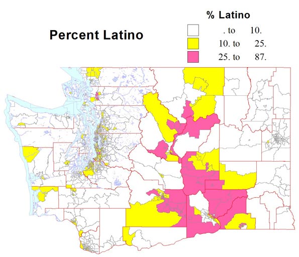
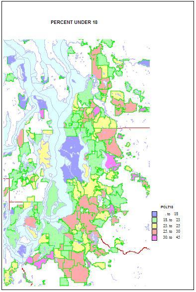
    Higher shares of persons under 5 reveal areas of young families. The highest shares are in military bases and Latino towns in eastern Washington, but are quite high, over 12 percent, in the farthest suburban and exurban places around Seattle such as Duvall and Snoqualmie. They are lowest in retirement towns, on islands such as Vashon and Bainbridge, and in some college towns such as Pullman.

    Shares of persons under 18 show a similar but not identical pattern. Again they are highest in military and Latino places, and in suburban and exurban places in the metropolitan area, and lowest in university towns and in Seattle itself. This implies that while still low Seattle is not as deficient in the very youngest as it is in older children.

    The story is very different for young adults. Not surprisingly, shares 20-25 are very high in university towns, on military bases, and Seattle, and quite low in suburban, mainly residential communities, especially more affluent areas, and on islands. Middle-aged adults, aged 45-64 (the baby boomers and thus the largest age group) are high in some older residential suburbs where younger adults are less common, and low in college towns, Latino areas, and in some areas of very recent growth, as in Snoqualmie and Monroe.

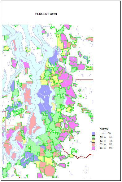
    Home ownership is related to both age and household types. Rates of home ownership are extremely high, in the 90s in newer and more affluent suburbs, with mainly single family homes; the rates are lowest on military bases, college towns, and in a few less affluent suburbs, such as Tukwila. As for the city of Seattle — which has indeed changed its character in a fundamental way — home ownership has dropped to a low of 48 percent. This shift helps us understand the cleavages in Seattle’s body politic, as a formerly very middle class city adjusts to an influx of singles, renters, and young people.

    Finally, as to types of households. Married couple families with children are the historic norm. They remain traditionally high on military bases, and in the farther newer suburbs, such as Snoqualmie, Sammamish, and Maple Valley; they are low as expected in college towns, in retirement communities, and (no surprise) in Seattle—13 percent, which is really low.

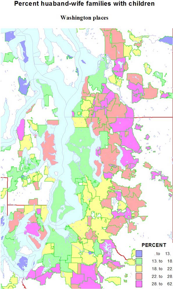
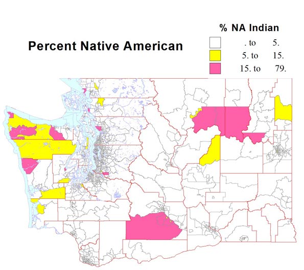
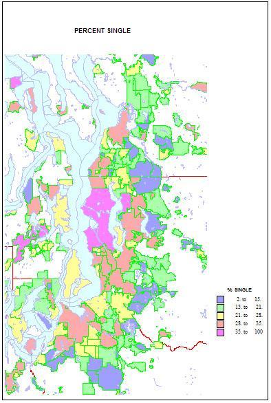
    Conversely, singles are highest in two island towns, Friday Harbor and Langley, but Seattle is an extremely high 41 percent. Shares are lowest in the same new suburbs rich in families, as in Sammamish, at 11 percent. Shares of unmarried partners are a high 10 percent of households in Seattle, but are higher on Indian reservations and the cities of Hoquiam and Aberdeen. The share of single-parent households is also high on Indian reservations, in less affluent and more ethnic suburbs like Parkland and Bryn Mawr and Tukwila. It is lowest in the newer, family-filled far suburbs.

    This piece originally ran at Crosscut.com and was edited by David Brewster.

    Richard Morrill is Professor Emeritus of Geography and Environmental Studies, University of Washington. His research interests include: political geography (voting behavior, redistricting, local governance), population/demography/settlement/migration, urban geography and planning, urban transportation (i.e., old fashioned generalist).

  • Listing the Best Places Lists: Perception Versus Reality

    Often best places lists reflect as much on what’s being measured, and who is being measured as on the inherent advantages of any locale.  Some cities that have grown rapidly in jobs, for example, often do not do as well if the indicator has more to do with perceived “quality” of employment.

    Take places like Denver and Seattle. Both do well on what may be considered high-tech measurements – bandwidth, educated migration, entrepreneurial start ups – but have trailed other places in terms of creating jobs. Others, such as Oklahoma City and Raleigh, do better in terms of overall job creation and cost competitiveness.

    There are effectively few truly objective criteria, and the Area Development list does tend to weigh a bit heavy on the factors that help more expensive – although not necessarily the most costly – cities. If cost of doing business, or regulatory environments were given more weight, some of the high fliers would not do as well.

    We prefer to focus less on atmospherics and more on how people, and businesses, are voting for their feet. San Francisco and New York have generally had slower job growth and greater outmigration, but do well on lists that focus on perceived qualitative factors.

    But then there is Austin. Here is one region that has it all, the low costs and favorable regulatory climate of Texas along with the amenities associated with a high-tech region. The area creates a large number of jobs of varying types and is still inexpensive enough to attract young, upwardly mobile families. This gives it a critical advantage over places like Silicon Valley, Los Angeles or New York.  Unlike those three centers, Austin performs extraordinarily well in quantitative measurements.

    The region that most closely matches Austin in these respects is not Seattle and Denver, but Raleigh Durham. Recently a group of leaders from Raleigh made a visit to Denver to learn what makes that city successful. Speaking to the group, we pointed out that by objective measurement – job growth, educated migration, population growth – Raleigh beat Denver by a long shot, yet it was to Denver the group was looking for inspiration. In fact, over the past three years, Americans have moved to Raleigh at a rate more than three times that of Denver.  Perception can be a funny thing which makes a winner feel inferior to a clear runner-up.

    Another strange result is that New York and Houston had the same number of mentions. Yet looking at numbers — from educated migration, job growth, population increase — Houston slaughters New York. People, from the college educated on down are flocking to Houston while fleeing, in rather large numbers, from New York. One has to wonder where the rankers live and where they are coming from. Houston triumphs on performance, while New York, to a large extent, wins on perception. 

    Looking simply at job growth over the past ten years for the Leading Locations mentioned on at least five surveys, the 14 regions separate themselves into three groups.  The top tier of places – Austin, Raleigh, San Antonio, and Houston – all have seen job growth of more than 12% and seem to be recovering from the recession faster than the others.  

    Salt Lake City and Charlotte were tracking with the top tier of places until 2007 but have since fallen to the second tier of cities.  The remainder of the second tier includes steady growers Dallas and Lincoln, along with Oklahoma City, a region that has seen a boom in jobs since bottoming out in 2003.

    The final job growth tier of places includes five regions that have fewer jobs than ten years ago.  Seattle drops just below the zero line after being hit particularly hard by the 2001 and 2008 recessions, while New York and Denver finish near the national rate.  Pittsburgh and Boston spent most of the decade below their 2000 employment levels, but each seem to be recovering from the recession faster than many of the other Leading Locations cities. 

    But perhaps the biggest problem with lists has to do with the size of regions. Much of the fastest growth in America, particularly in terms of jobs, has been in small metros, many with fewer than 1 million or 500,000 residents. Smaller dynamic areas such as Anchorage, Alaska; Bismarck, North Dakota; Dubuque, Iowa; or Elizabethtown, Kentucky – all in the top 25 of NewGeography’s Best Cities for Job Growth 2011 Rankings – are too small to show up on some lists yet may be a location of choice for expansion. This reflects not so much their relative desirability but the fact that, unlike larger regions, they simply are not included on many rankings.

    Ultimately, a list of lists does tell us much, but perhaps only so much for a specific individual or business. For someone interested in the movie business, for example, Los Angeles – and increasingly places like New Orleans or Albuquerque – are great draws, but perhaps not so much for financial services.  The lists of lists are useful to identify hotspots, but for most location decisions, it may be more imperative to drill down to more detailed industry sectors and workforce attributes. And most of all, take the perception factor into account and look instead at the real numbers to tell you where to go.

    This piece first appeared at AreaDevelopment.com, as part of its Leading Locations series discussing best cities rankings.

    Joel Kotkin is a Distinguished Presidential Fellow in Urban Futures at Chapman University in California, an adjunct fellow with the London-based Legatum Institute, and the author of The Next Hundred Million: America in 2050. Mark Schill is Vice President of Research at Praxis Strategy Group, an economic research and community strategy firm.  Both are editors at NewGeography.com, a provider of two surveys for Area Development’s Leading Locations list.

    Photo by mclcbooks

  • Is The Information Industry Reviving Economies?

    For nearly a generation, the information sector, which comprises everything from media and data processing to internet-related businesses, has been ballyhooed as a key driver for both national and regional economic growth. In the 1990s economist Michael Mandell predicted cutting-edge industries like high-tech would create 2.8 million new jobs over 10 years.  This turned out to be something of a pipe dream. According to a recent 2010 New America Foundation report, the information industry shed 68,000 jobs in the past decade.

    Yet this year, information-related employment finally appears to be on the upswing, according to statistics compiled by Pepperdine University economist Michael Shires. The impact of this growth is particularly marked in such long-time tech hot beds as Huntsville, Ala., Madison, Wis., and San Jose-Sunnyvale-Santa Clara, Calif., in the heart of Silicon Valley, all of which have relatively high concentrations of such jobs.

    The San Jose area, home of Silicon Valley, arguably has benefited the most from the  information job surge. Much of this gain can be traced to the increase in social networking sites such as Facebook, LinkedIn and Twitter, all of which have been incubated in the Valley. Good times among corporations  have led many to invest heavily in software productivity tools, while those marketing consumer goods have boosted spending for software and internet-related advertising.

    The 5,000 mostly well-paying information jobs added this year was enough to boost San Jose’s standing overall among all big metros 20 places to a healthy No. 27 in our ranking of the best cities for jobs.

    But as economists enthuse over the tech surge, we need to note the limitations of information jobs even in the Valley. Software and internet jobs, which have increased 40% over the past decade, have not come close to making up for the region’s large declines in other fields, notably manufacturing, construction, business and financial services. Overall, the region has lost 18% of its jobs in the past decade — about 190,000 — the second-worst performance, after Detroit, among the nation’s largest metros. It still suffers unemployment of close to 10%, well above the national average of 9.0%.

    This dual reality can also be seen in the local real estate industry. Office vacancies may be back in the low single digits in some markets popular with social networking firms, such as Mountain View, but they remain around 14 or higher throughout the region — 40% higher than in 2008. No matter how impressive reporters find a new headquarters for high-fliers like Facebook, the surplus of redundant space, particularly in the southern parts of the Valley, suggest we are still far from a 1990s style boom.

    Some observers also warn that the long-term prospects for the Valley may not be as good as local boosters assume.  Analyst Tamara Carleton cites many long-term factors — like the financial condition of local cities and diminishing prospects for less skilled workers — that make it tougher on those who live below the higher elevations of the information economy. She also says that a precipitous decline in foreign immigration could slow future innovation.

    This dichotomy is even more evident in the other big information gainer among our large cities, Los Angeles. Although it is little known by the media or pundit class, the Big Orange actually boasts the nation’s single largest number of information jobs. Its over 5% growth in information jobs translates to roughly 10,000 new positions over the past year. In LA, the big sector for information jobs is likely not social media but traditional entertainment, one of the area’s core industries.

    Yet information growth clearly is not bailing out the overall economy. Other much larger sectors, such as manufacturing and business services, continue to shrink. The area still suffers from an unemployment rate of roughly 12%.

    Other information winners among our large metros include Boston and Seattle, both traditional centers for software-related jobs. These areas have not been as hard-hit by the real estate and industrial declines as their California counterparts, so increasing information employment does not constitute the outlier that we see in the Golden State.

    Less expected gains were notched by some of our other big information sector winners. One big surprise was New Orleans-Metairie-Kenner, whose information sector, including a growing film and television industry, expanded almost 39% in past year. As is the case with its strong overall rankings in our best cities survey, the Big Easy’s comeback from the devastation of Katrina is heartening. But we must curb our enthusiasm by pointing out that total regional employment remains 100,000 less than it was before the hurricane.

    Equally intriguing has been the strong performance of Warren-Troy-Farmington, Hills, Mich., and Detroit-Livonia, each of which has benefited from the resurgence of the American auto industry. In these areas, information jobs tend to be tied to the needs of large industrial companies. The state has also waged a major campaign for film and television jobs, as part of an attempt to diversify its economy.

    Yet for all the hype that surrounds industries like media and software, it’s critical to point out that overall this is not a huge employment sector. Even in Seattle — home to Microsoft, Amazon and other software based companies — information jobs account for barely 6% of the total. In Los Angeles, it’s 5%, compared with 10% each for manufacturing and hospitality. In media-centric New York, information accounts for barely 4% of jobs, less than half that of financial services and one-third that of the huge business service sector.

    In most other areas, including those experiencing strong growth, information jobs constitute an even smaller part of the economy. In New Orleans, Warren, Mich., and Detroit, such jobs account for less than 2% of employment . Still, the growth of this sector is a promising one for  economies that have long been dominated, like New Orleans, by the generally low-paying hospitality industry, or in the case of the Michigan cities, the volatile and often chronically hurting manufacturing sector.

    The increase in information jobs, however welcome, should not be sold as a universal elixir for  creating widespread prosperity. Over time, strong regional economies are those that rely on diverse employment sources rather than one.  Growth in high-tech and media jobs can wow impressionable reporters and earn economic developers bragging reights, but they can do only so much to lessen the recession’s impact on the vast majority of workers and the broader regional economy.

    Top Cities for Information Job Growth, 2009-2010
    New Orleans-Metairie-Kenner, LA 38.86%
    Honolulu, HI 25.11%
    Shreveport-Bossier City, LA 18.85%
    Huntsville, AL 14.71%
    Leominster-Fitchburg-Gardner, MA  13.33%
    Redding, CA 10.53%
    Madison, WI 10.20%
    San Jose-Sunnyvale-Santa Clara, CA 10.01%
    Grand Rapids-Wyoming, MI 7.63%
    Providence-Fall River-Warwick, RI-MA 6.33%
    Top Big Cities for Information Job Growth, 2009-2010
    New Orleans-Metairie-Kenner, LA 38.86%
    San Jose-Sunnyvale-Santa Clara, CA 10.01%
    Providence-Fall River-Warwick, RI-MA 6.33%
    Los Angeles-Long Beach-Glendale, CA  5.08%
    Warren-Troy-Farmington Hills, MI  3.97%
    Boston-Cambridge-Quincy, MA  3.54%
    Riverside-San Bernardino-Ontario, CA 3.46%
    Charlotte-Gastonia-Rock Hill, NC-SC 3.02%
    Detroit-Livonia-Dearborn, MI  2.48%
    Seattle-Bellevue-Everett, WA  1.47%

    Joel Kotkin is executive editor of NewGeography.com and is a distinguished presidential fellow in urban futures at Chapman University, and an adjunct fellow of the Legatum Institute in London. He is author of The City: A Global History. His newest book is The Next Hundred Million: America in 2050, released in February, 2010.

    Photo by Angelo Amboldi

  • Stories from the 2010 Census: Race and Ethnic Change in Washington State

    The city of Seattle is an exceptional place. The 2010 census figures on race, ethnicity and age confirm this reputation. The main story from the census findings is the continued gentrification of Seattle, with displacement of minorities and the less affluent out of the center of the city, especially to south King county and Pierce county. The city core is becoming whiter, while the edges and suburbs, north and east as well as south are becoming far more diverse.

    A second part of the story is the overall increase in the minority population, both statewide and in central Puget Sound. I present six maps, the first four showing the census tracts with the highest shares of Black, Asian, Native American, Latino, and those with two or more races. The last two show change in the share of all minorities (or of whites, looking at it from that point of view) for the state and for the greater Seattle area, a remarkable summary of the new face of the metropolis.

    The Black share of the population, which did grow substantially in the decade, grew mainly in the very south end  of Seattle, south to Tukwila, a smaller area in south Tacoma, with belts over 10 percent Black covering much of central and south Seattle, south King county and much of Tacoma and Lakewood. Unlike the 1960s through 1980s, there is NO tract over half Black (the highest is 41 percent). Shares in most of the region remain well below 5 percent, rural small town areas below one percent.  Blacks and Asians are not well represented outside greater Seattle.

    The Asian population is much larger than the Black total, and higher shares are far more widespread. Unlike the concentration that has long existed on south Seattle’s Beacon Hill , the 2010 map shows equally high shares in many parts of the eastside, especially Bellevue and Redmond and Sammamish, and smaller areas in south King county and south Everett. The newer areas are also areas of high foreign born and immigration of professionals from Asia.

    Unlike the Black and Asian populations, the Native American and Latino populations are more prevalent outside the metropolitan Seattle core.  The Native American population resides mainly on official reservations, often dominating their census tracts. The largest area and population is associated with the Yakama nation in central Washington. The Latino population of the state increased 71 percent to 756,000 in 2010.  From the map, it’s clear that the Latino population follows the irrigated agriculture of the Columbia basin, including the small metropolitan areas of the Tri Cities (Kennewick-Richland-Pasco) and Yakima.

    The highest Latino shares in the metropolis are in south King county and Pierce county, rather similar to the pattern for African-Americans, but with a more westerly orientation in south Seattle  and Renton.  Native American populations remain quite concentrated in the recognized reservations, quite urban in Tacoma (Puyallup), suburban in Snohomish and King counties, and exurban in Kitsap county. About five percent of Washingtonians identify as of two or more races, a remarkable 47 percent increase. The main areas are most associated with the major military reservation , Ft. Lewis-Mc Chord in Pierce county, with lesser shares in highly diverse south Seattle and south King county.


    A map of all minorities would attest to the diversification of two parts of the state, the Columbia basin in eastern Washington, and the greater Seattle area, with up to half the urban footprint showing shares over 35 percent non-white, and with much of south King county and south Tacoma, and parts of Bellevue-Redmond now over 50 percent. This is a remarkable shift from an overwhelmingly white suburbia of 20 years earlier.

    Perhaps even more revealing has been the low share of minorities in professional, affluent, highly educated parts of Seattle— what analyst Aaron Renn has dubbed “the white city”.  Homogeneity also prevailed in far suburban, exurban and rural areas but these areas rarely lay much claim to be “multicultural.”

    The change in greater Seattle’s Black population reveals its continuing exodus/displacement from Seattle, and its continuing suburbanization.  Asians too experienced tremendous growth in the suburbs, especially in eastern King county and suburban Snohomish county. Change in the Latino population, like that of the Black population, is greatest in south King county, into south Tacoma, but also in the SR99 corridor in Snohomish county. Growth in both the Black and Latino populations follows that of less affluent housing markets than is evident in the areas with expanding Asian populations.

    The map of minority population change for the Seattle region highlights the exceptionalism of the city of Seattle.  Most observers would probably be drawn to the dramatic and obvious diversification of suburbia, in all directions, north, east and south of Seattle. But as a 55 year resident of Seattle, the most dramatic feature is that much of Seattle has become whiter or only slightly more diverse. In contrast  the bulk of the region has become more ethnically and racially complex . 

    The reasons for this redistribution are complex, but we know that the popularity of living in Seattle on the part of younger, less familial and more professional households, together with shifts in the housing stock away from family housing, was critical in making the central city less diverse and the rest of the region, and much of the state, more so.

    Diversity

    How can we measure diversity?. Usually it is  measured as the degree to which the shares of major racial and ethnic groups are equal. So maximum diversity for six groups (Blacks, Native Americans, Asians, Latinos, Whites, and those of two or more races, would be .167, if each group were one sixth. An area 100 percent of one race would have zero diversity or an index of 1.


    Viewed this way, the  2010 census may surprise the reader. Seattle has long been the most or among the few most diverse places in the state and many people probably believe it still is. But according to the 2010 census Seattle has been displaced by dozens of places in its own region! It has become slightly more diverse, as suburban cities, mainly but not only to the south have become markedly more diverse.  Many might also think eastern Washington, with its increasing Latino population, must be highly diverse. But no, the hotbed of diversity is from the southern part of Seattle, through south King County, to and beyond Tacoma.  Table 1 lists the most diverse places. The top six most diverse places are  just beyond the city of Seattle, and their diversity is amazingly high.  In Pierce County a belt of high diversity extends from Fife and the Puyallup reservation across south Tacoma to Lakewood, Parkland, Spanaway and Ft.Lewis-McChord.  This is truly a remarkable transformation.

    Most Diverse Urban Places in Washington
    Rank Place Diversity
    1 Tukwila 0.241
    2 Sea Tac 0.247
    3 BrynMawr-Skyway 0.249
    4 Boulevard Park 0.259
    5 White Center 0.264
    6 Riverton 0.273
    7 Fife 0.295
    8 Kent 0.312
    9 Renton 0.319
    10 Federal Way 0.324
    22 Tacoma 0.401
    40 Seattle 0.471

    Washington state and even greater Seattle are still much “whiter” than most other larger states. The exception has been a relatively high share of Asian people, due to our port of entry position from Asia.  But the last decade has been one of increasing diversity, especially in metropolitan suburbs and in eastern Washington.


    Richard Morrill is Professor Emeritus of Geography and Environmental Studies, University of Washington. His research interests include: political geography (voting behavior, redistricting, local governance), population/demography/settlement/migration, urban geography and planning, urban transportation (i.e., old fashioned generalist).

  • Washington State’s Evolving Demography

    Population change in the state of Washington has relevance to the nation and to other states because it tells us something about market preferences of households versus the orientation of planners (e.g., “smart growth”). It tells us much about gentrification and America’s changing racial and ethnic diversity.

    The summary will be in two parts. This piece will look at population growth and redistribution. A second article will review the growth of the minority population and its (surprising to some) redistribution and its relation to the gentrification of the city of Seattle, plus a look at the implications of ethnic change to Washington’s new 10th congressional district.

    Washington state and the greater Seattle region grew fairly vigorously 14% (838,000 new residents) in the decade, as they have most decades for over a century. This growth is unusually high for a “non Sunbelt” state. This growth is due not just the engine of Seattle, as eastern and western Washington also experienced substantial growth.

    Most smaller metropolitan areas across the state grew faster than the Seattle metropolitan core. Fast-growing counties are found in the east (Franklin 50%, the easy winner, Benton 23; Kittitas, 22; and Grant 20); all associated with Latino in-migration, as well as in the west (Clark, 23 %; suburban Portland, Mason, 23 percent; suburban Olympia, Thurston (Olympia) 22; Whatcom (Bellingham), 20; and Snohomish, finally, suburban Seattle, 18.

    There are two Washingtons: greater Seattle and the rest of the state, marked by a love and hate relationship. But the balance of power – and demography – is clearly changing in both. There were a few areas of slow growth or decline, as in the heart of the wheat country, but significant growth took place in other metropolitan areas, most notably the Tri-Cities, Vancouver (suburban Portland), Bellingham, Olympia (the state capitol) as well as Spokane, Yakima, and Wenatchee.

    There has been considerable population growth associated with the Columbia Basin project, fueled by heavy Latino in-migration and high birth rates. At the same time there has been population expansion in selected environmental amenity areas – often with retiree in-migration – in many counties across the state. Amenity fueled growth was dramatic in all directions beyond the metropolitan central Puget Sound core, but was also impressive in several areas in eastern Washington, as in Okanogan, Pend Oreille, and Stevens, the far north and northeast, and in Kittitas. Some of this growth comes from migration east from Seattle. Fourth, despite a growth management plan, metropolitan exurbs continue to expand, especially around Vancouver, Spokane, Bellingham and the Tri-Cities (black on the map, over 100% growth).

    Turning to central Puget Sound, the most dramatic growth (often over 100 percent), occurred at the far edge of the urban growth areas, and just beyond as exurban growth. This is true in absolute numbers as well as rates. Growth management and upzoning have been unable to stem this tide, for two main reasons rarely acknowledged by planners: the preference of families with children for single family houses and greater housing affordability, at least in some areas (for example, King county south and east of Seattle, and south into Pierce county). Growth was also impressive in most rural and exurban areas, especially in Pierce, Snohomish and Kitsap counties, but far less in King county, which has by far the strictest growth controls

    At the same time, there was concentrated growth in already urban areas, city and suburban, as higher density apartment sprang up across much of Seattle, Tacoma, south King county, in some Eastside cities, and in the SR 99 corridor of Snohomish county north from Seattle.

    In Pierce, Snohomish and south King, some single family and small apartment growth occurred in less affluent areas, attracting many people, including young families who cannot afford to live closer to Seattle. Areas of slower growth tended to be military areas, some urban non-residential tracts, and some more affluent, older settled single family home areas, with an aging population. Growth in downtown Seattle and Bellevue, even Tacoma, was substantial, if not quite as great as planners envisioned. The current shift from home ownership to renting is leading some to project a projected apartment boom in or near downtown Seattle.

    It’s also interesting to look at density as a measure of “urban-ness”. The third map for density is at a finer block group level. Moderate urban densities from 1000 to 5000 per square mile are dominated by single family homes, areas between 5000 and 7000, by a mix of single family homes and apartments, and over 7000 by apartments, essentially the density goal of urbanist smart growth planning. Seattle really has achieved a substantial degree of such urbanness, dominating central Seattle, but spreading to all corners of the city. Other areas of higher density include the SR99 corridor in Snohomish county, especially south Everett, high tech suburbs to the east, and in south King county the SR 99 corridor again, in some less affluent suburbs, and in Pierce county, downtown Tacoma, and some of South Tacoma toward Ft. Lewis.

    But still more than half the urban footprint resists the officially preferred urban densities. Even with densification, redevelopment and the opening of the first light rail line, these higher density areas housed only 34 percent of the population of King county (up from 32 % in 2000), and only 10 % of the population of the people of the three suburban counties. The city of Seattle is exceptional, containing 52 percent of the high density tracts on the metropolitan area, although it has only one-sixth of the population.

    As the late great UW economist Charlie Tiebout told a seminar 50 years ago, “People vote with their feet” This is certainly true about residential choices. While perhaps twenty percent at most of Americans may prefer higher density living, for reasons of age, family status or ideology, the large majority does not and likely will not.

    To a leftist like me, the tragedy is how smart growth transfers wealth and the vaunted “quality of life” to the rich and the professionals, at the expense of the poor and of minorities. Sadly the Democratic party seems totally blind to the fact that the fixation on new urbanism contributes to the rightward backlash. Folks do not want to be told how to live, especially, dare I assert, when those hectoring them have already cornered the nicest parts of the region for themselves. Middle and working class families are not likely to embrace policies – beloved by affluent professionals – that would deny them a chance to own their preferred kind of residence at a reasonable price.

    Richard Morrill is Professor Emeritus of Geography and Environmental Studies, University of Washington. His research interests include: political geography (voting behavior, redistricting, local governance), population/demography/settlement/migration, urban geography and planning, urban transportation (i.e., old fashioned generalist).