Tag: Transportation

  • A Visit to Kazan

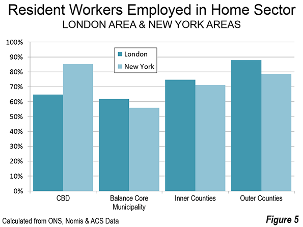
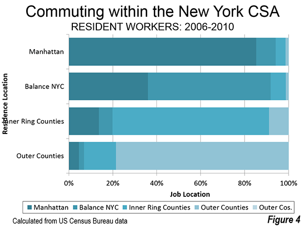
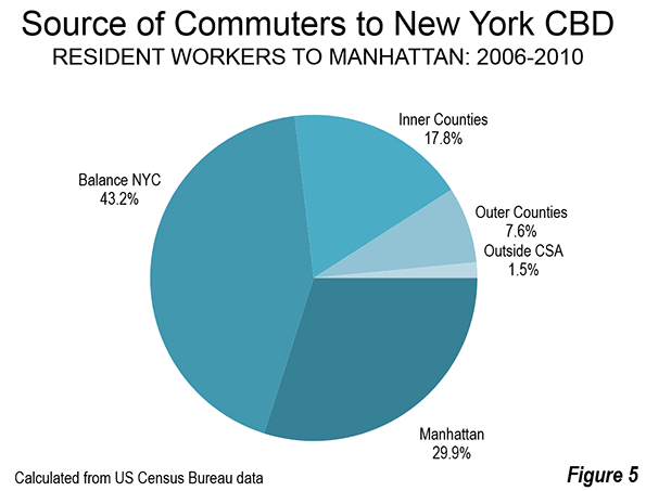
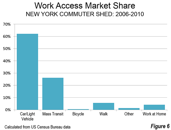
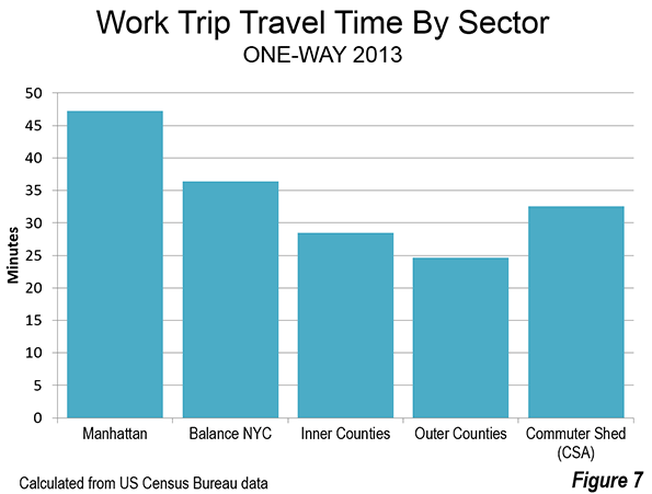
    St. Petersburg and Moscow are typical destinations in Russia, but if you’re looking for other places to visit, where do you go? I can’t claim to answer that question as I have not fully surveyed the realm, but I did visit the city of Kazan for a day, so want to share a few observations and photos.

    Kazan is a city of a bit over a million people about 450 miles east of Moscow (a flight of around 1:20). It’s the capital of the Tatar Republic of the Russian Federation. The Tatars were a nomads of Turkish ethnicity who established an independent kingdom in the region before being conquered by Ivan the Terrible. They are very proud of their unique ethnicity and history, and have obtained a great deal of autonomy (at least as much as exists in Russia). Originally the province was called Tatariya, but they renamed it Tataristan. To locals, the “-stan” suffix suggests strength and independence on par with other fully independent republics in the region. While they can certainly choose whatever name makes them feel most proud, names ending in “-stan” certainly don’t inspire confidence in America. I don’t think they fully understand the negative brand equity in that term, but don’t let the name scare you off. It’s a modern and as far as I can tell perfectly safe city.

    In fact, it’s extraordinarily modern and new. There’s been a vast amount of infrastructure investment, much of it done in conjunction with international sporting events. They hosted the 2013 Summer Universiade (an Olympics for students, I gather), and the 2015 World Aquatics Championship was underway while I visited. They’ve got a brand new airport, brand new freeway network, numerous new buildings, etc.

    Looking at Kazan in fact, you might get the impression it’s a boomtown. But it’s not a boom of the type you’d find in the US based on private sector growth. Though the region boasts oil and gas reserves and several manufacturing operations, most revenues go to the federal treasury in Moscow, so it would appear that Putin has showered the region was cash and that is the reason for the construction boom. The difference vs. St. Petersburg, which appeared to be starved for money, was evident. Everything in Russia is more or less state directed, and this is no exception.

    Having said that, the state could have invested in purely megalomaniacal projects as has happened in some other regional -stans. Instead a lot has gone into core infrastructure. Yes, some of it is tourist oriented, but the neighborhoods infrastructure I saw was in pretty good shape, and my cab driver said that the city had done a ton of upgrades to neighborhoods streets and such too. They also built a short metro system, though apparently it is under-patronized.

    Putin has been favoring the region with money in part to highlight and reward what Russians described to me as “good Muslims.” The Tatar region is about 55% Muslim and 45% Russian Orthodox. The split is basically along ethnic lines (though there’s a segment of Tatars that converted to Christianity). The Muslims in the area have long been known for their moderate brand of Sunni practice, and religious relations have been good, including a high degree of intermarriage (or so I’m told). Google tells me there were some extremist attacks in 2012, so I’m not sure what the status of that is, but I personally wouldn’t let it stop me from visiting there.

    The locals are really pushing the religious co-existence angle, which makes sense in a world that is looking for examples of Christianity and Islam getting along. That’s a shrewd marketing strategy.

    They also have gone beyond the modern and have pushed historic preservation. While no one is going to confuse Kazan for St. Petersburg, they have tried to restore what they have and have focused on obtaining UNESCO certifications. They are also pushing the Tatar cultural angle. There are plenty of elements of regional cuisine and I thought the food was excellent. Of course they would send me to their best places, but since I was only there one day, that didn’t matter. Kazan also has an important university, so has some attributes of a college town. Several famous Russians spent time living in Kazan, including Leo Tolstoy and Maxim Gorky.

    Is Kazan a must-see? No. But if you’re interested in checking out a Russian city other than the big two, it’s definitely worth a visit.

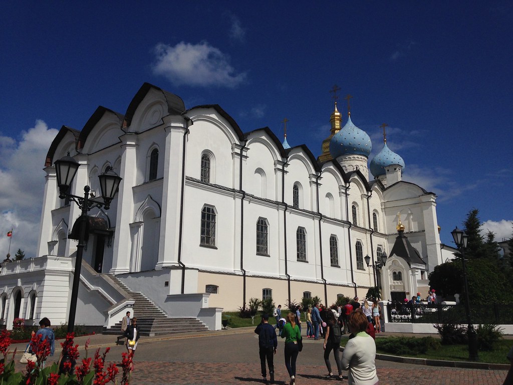
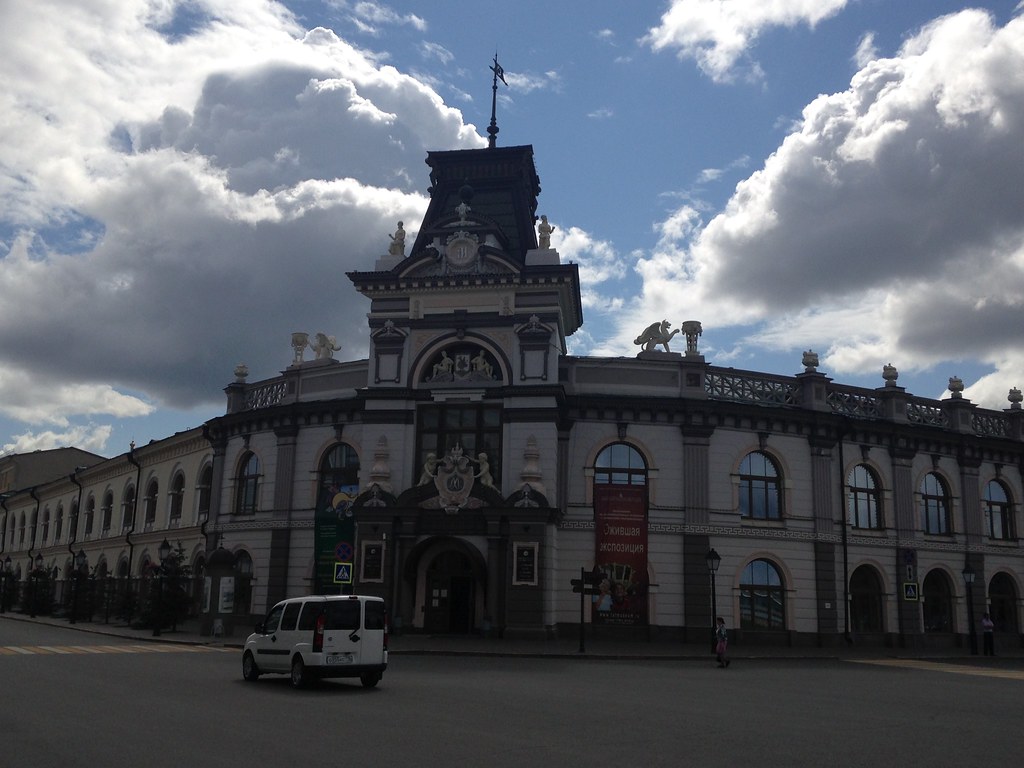
    I’ll share a few photos. The one at the top is the main entrance to the Kazan Kremlin. (The term kremlin is an old word meaning “fortress”). Here’s the Russian Orthodox cathedral there:

    Kazan, Russia - August 2015

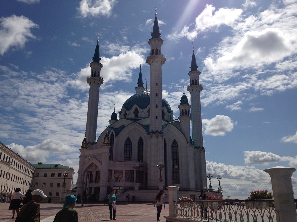
    There was originally a mosque in the kremlin that was destroyed when Russians conquered the area. Recently, a new mosque was built on the site to maintain the symbolic religious balance in the area. I think it’s a very nice building.

    Kazan, Russia - August 2015

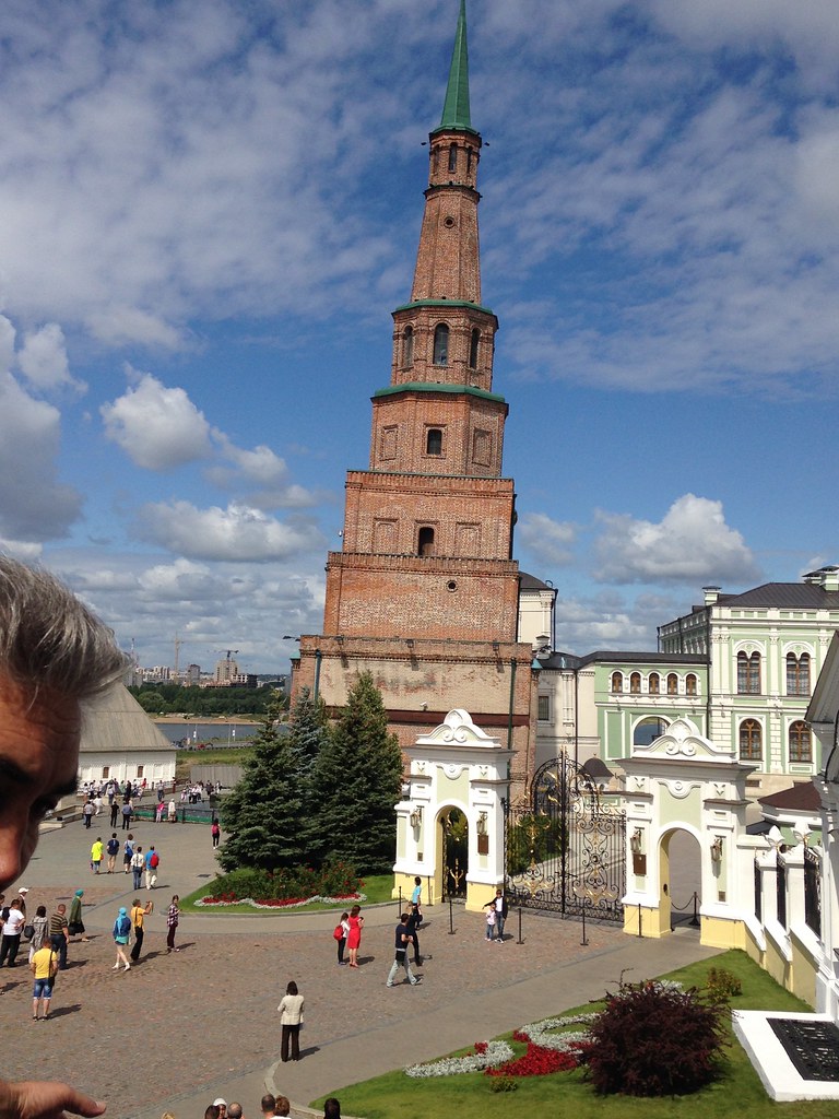
    They have their own leaning tower.

    Kazan, Russia - August 2015

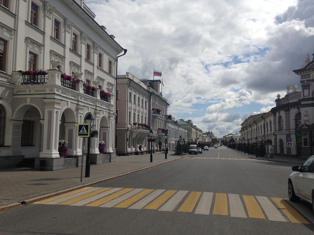
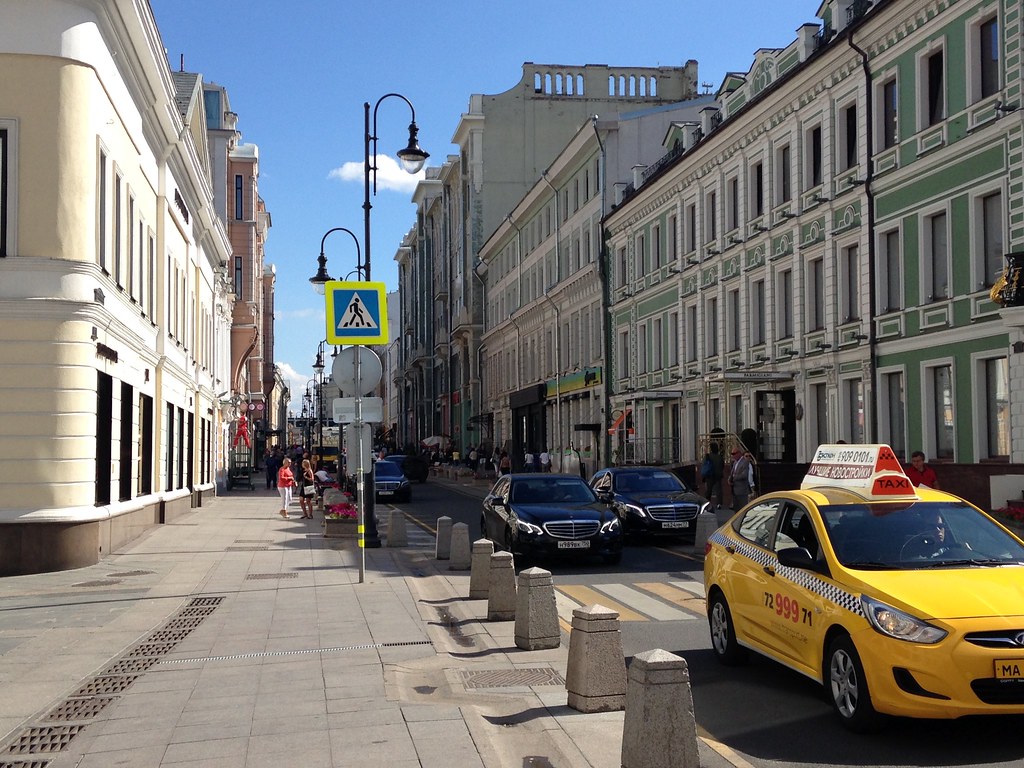
    The main street leading to the kremlin.

    Kazan, Russia - August 2015

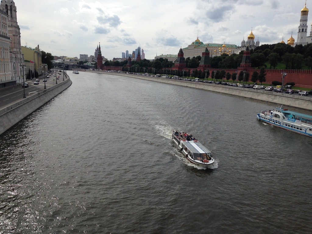
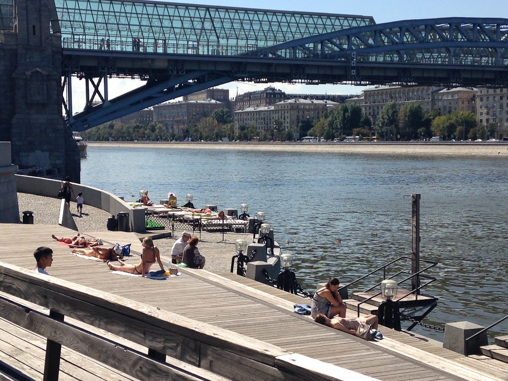
    The kremlin has nice views. There are several rivers and lakes in the area, including the Volga, and plenty of nice vistas.

    Kazan, Russia - August 2015

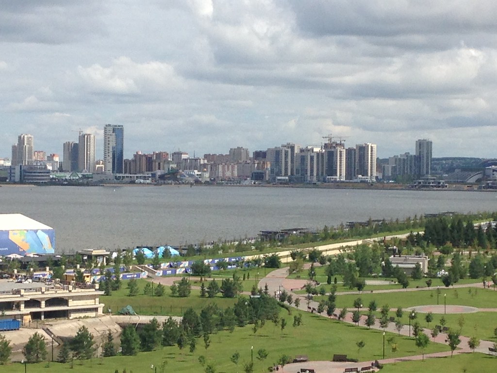
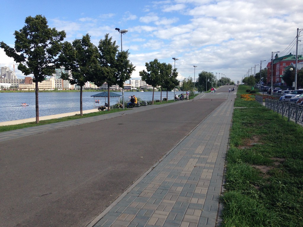
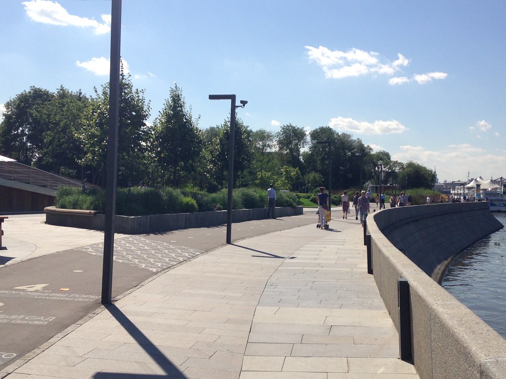
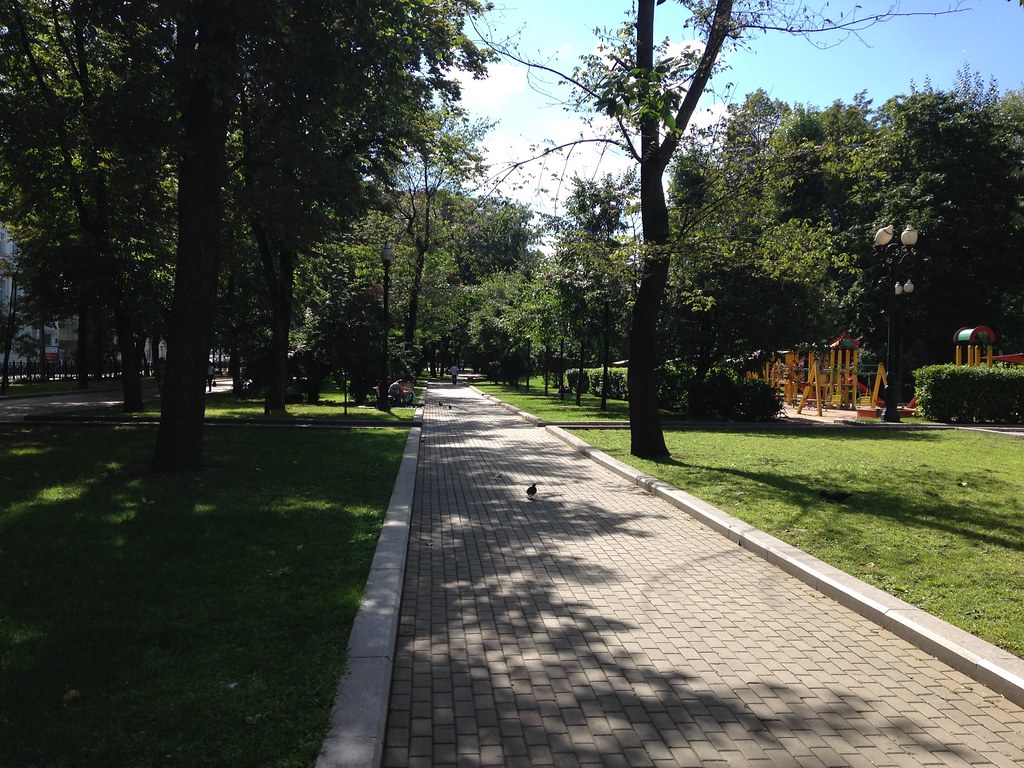
    Take a nice stroll along the lake.

    Kazan, Russia - August 2015

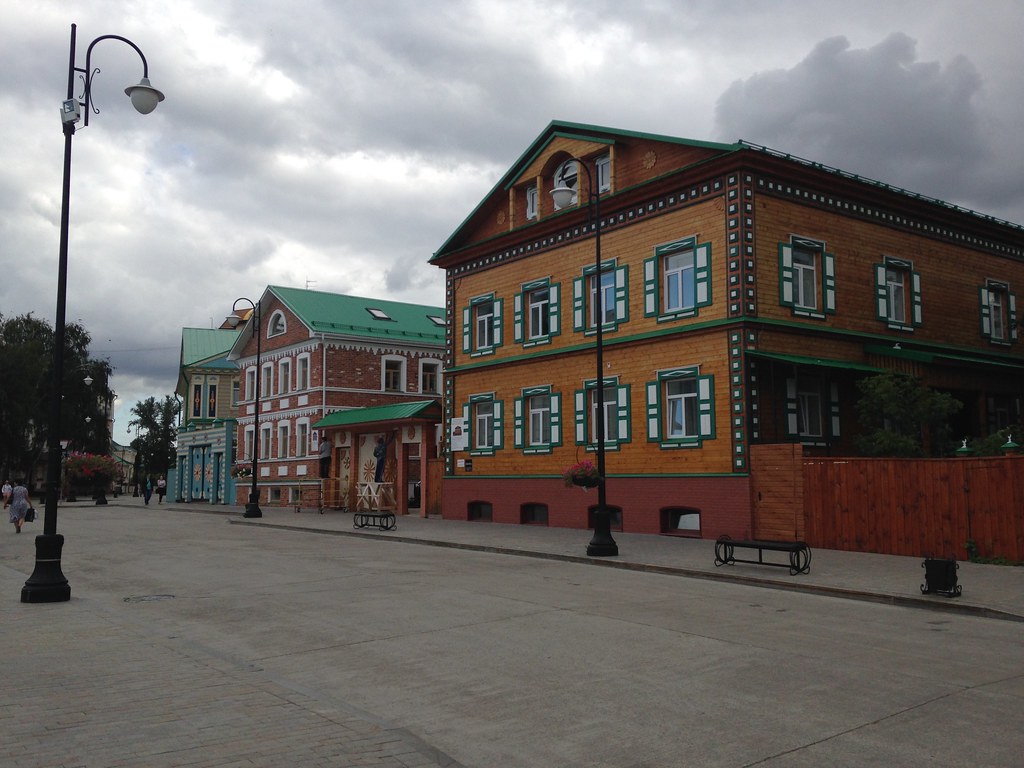
    Renovated buildings in the old Tatar Quarter

    Kazan, Russia - August 2015

    There’s a bit too much hardscape on that redone street for my taste. But it’s interesting because they took out a streetcar and pedestrianized the street. Apparently the vibrations were causing problems with the old buildings in the area, so they wanted to eliminate all vehicles.

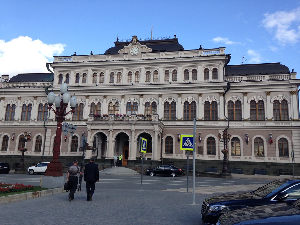
    Not sure what this is, but it’s in my Kazan file.

    Kazan, Russia - August 2015

    Dittos.

    Kazan, Russia - August 2015

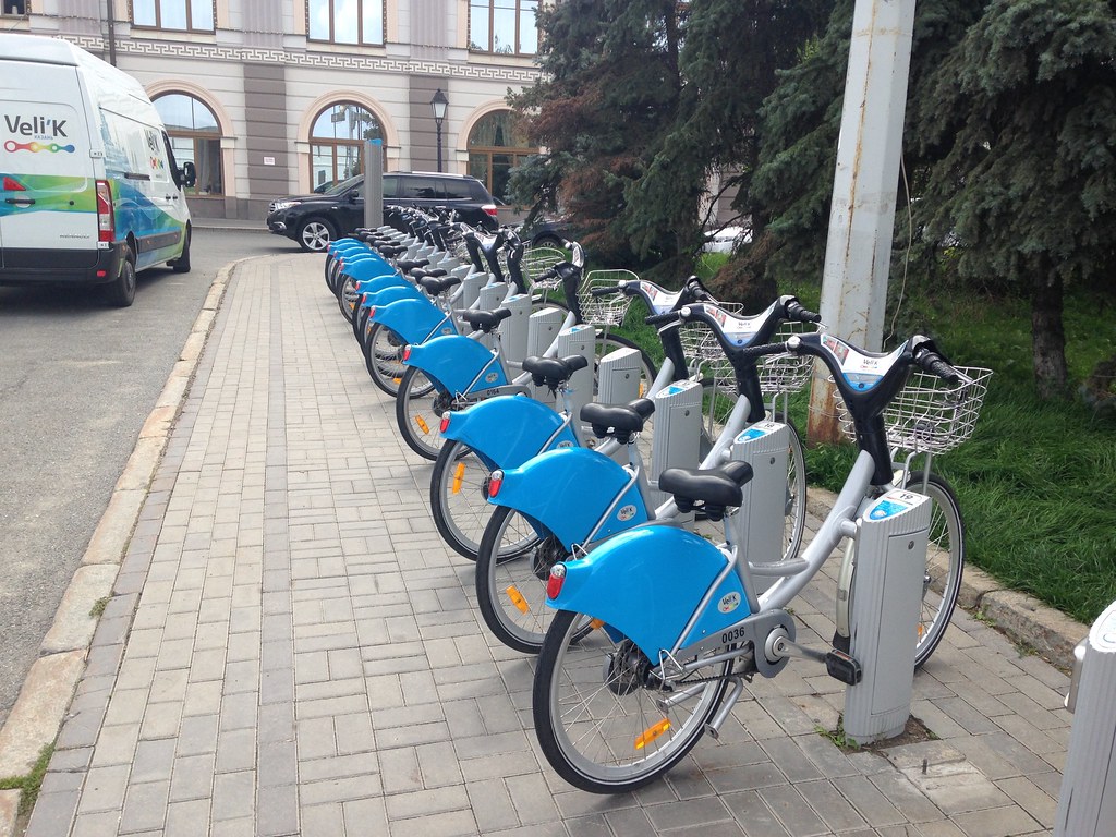
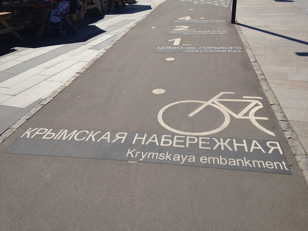
    I’ll wrap up with a bit of transport geekery. Yes, they have a bike share system.

    Kazan, Russia - August 2015

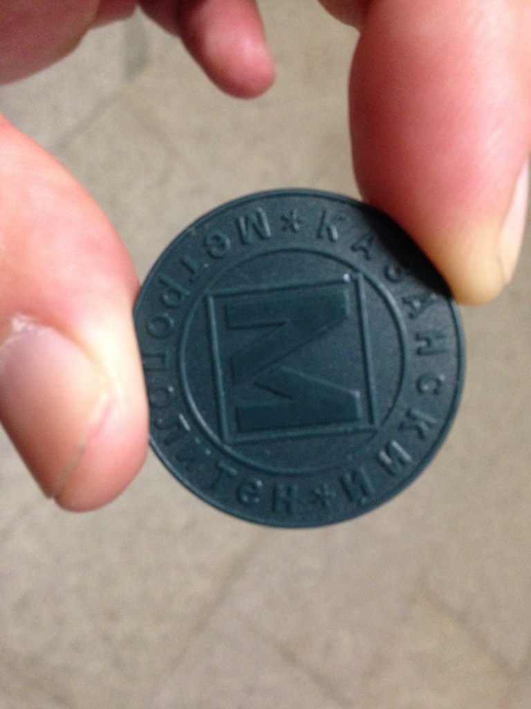
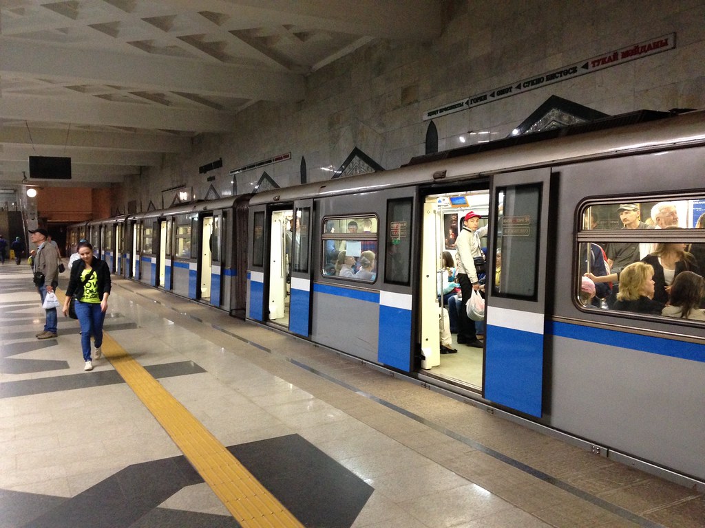
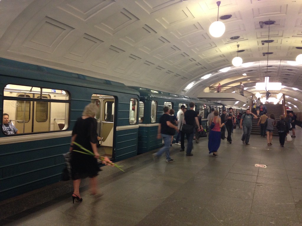
    Their new metro system is in the Russian style with lots of marble, etc. The system “M” logo is similar to Moscow but in green (the traditional color of Islam). Instead of Moscow style tap cards they are using plastic tokens.
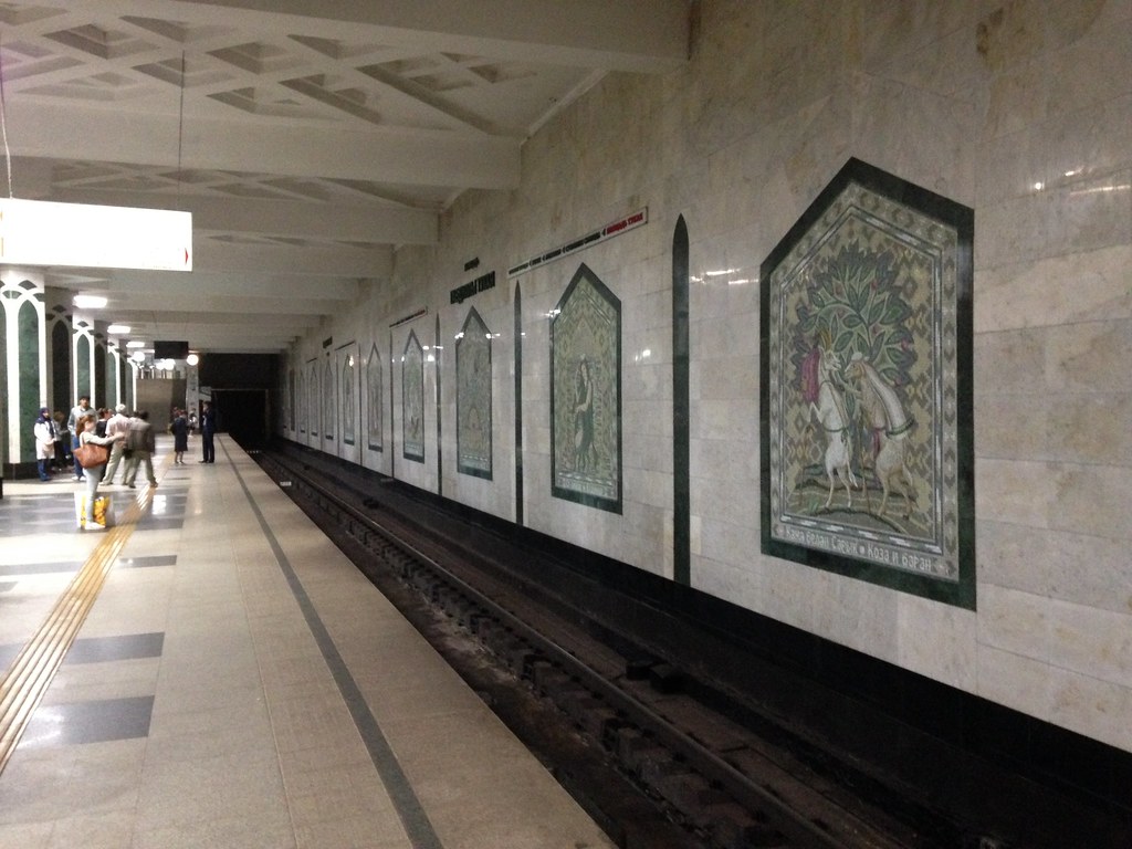
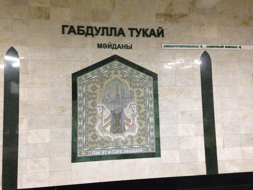
    Kazan, Russia - August 2015

    A metro station.

    Kazan, Russia - August 2015

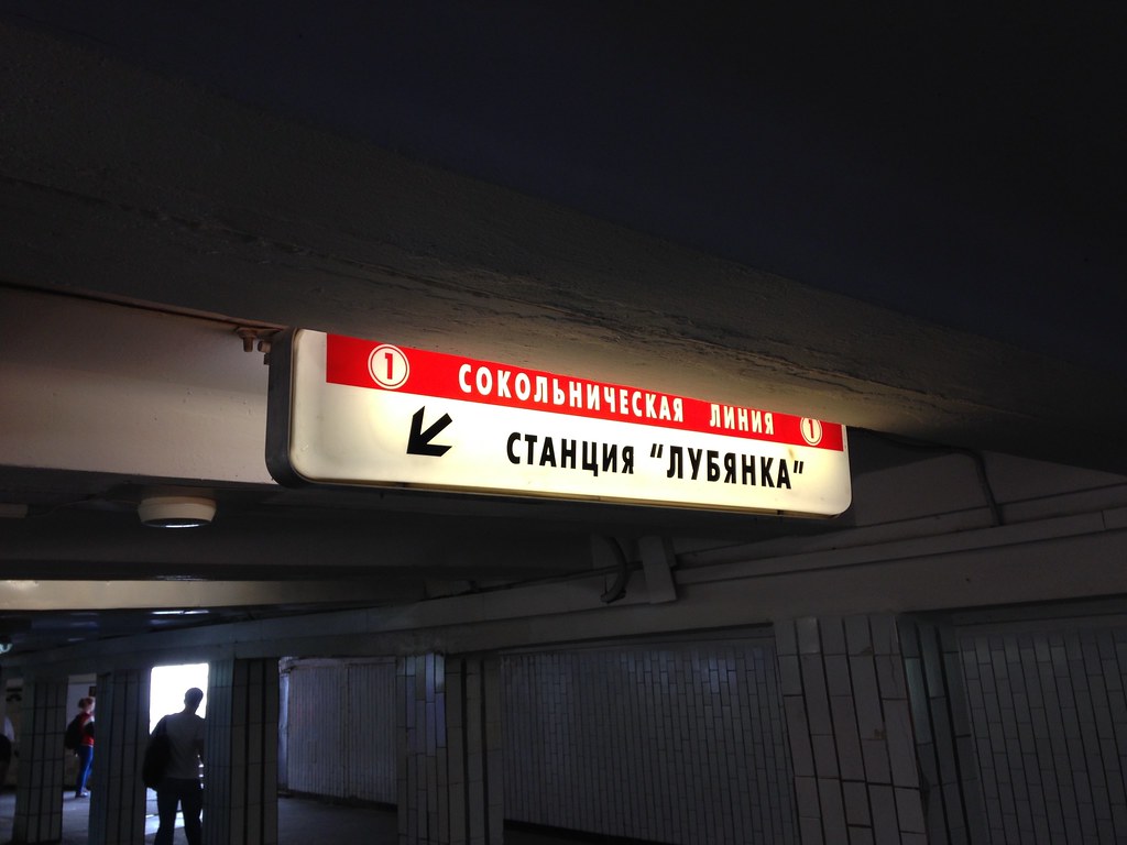
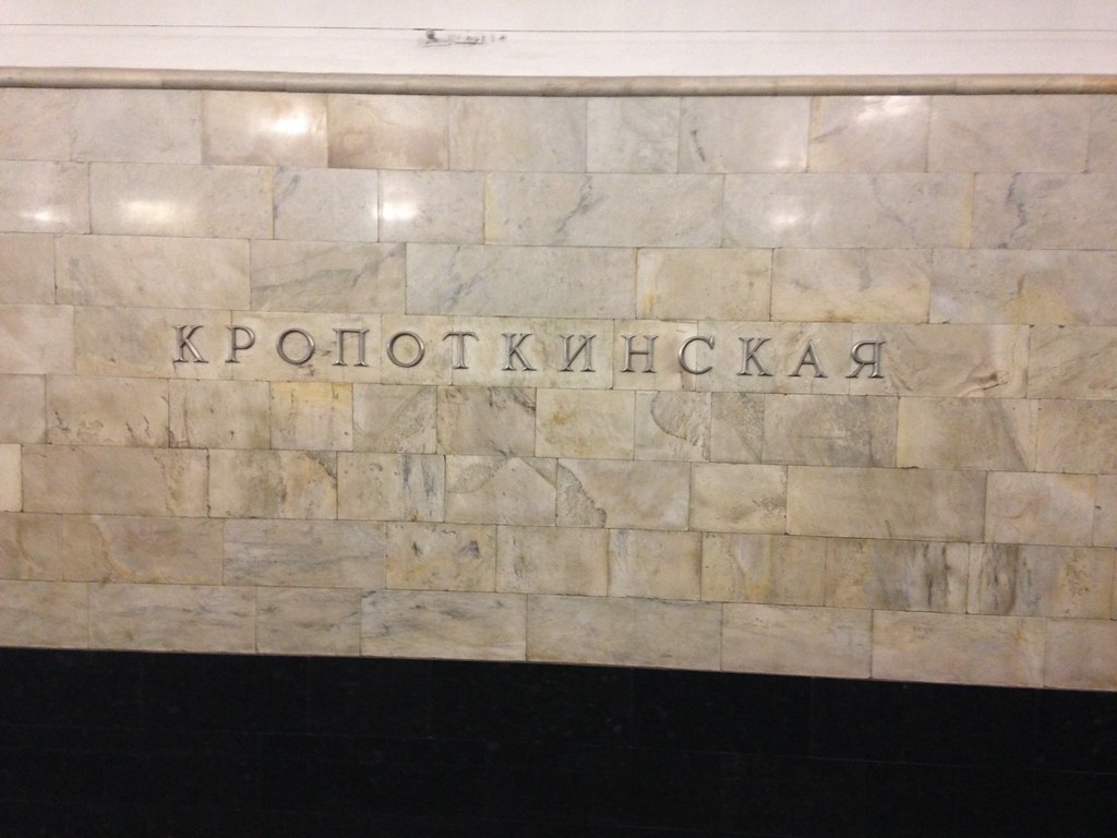
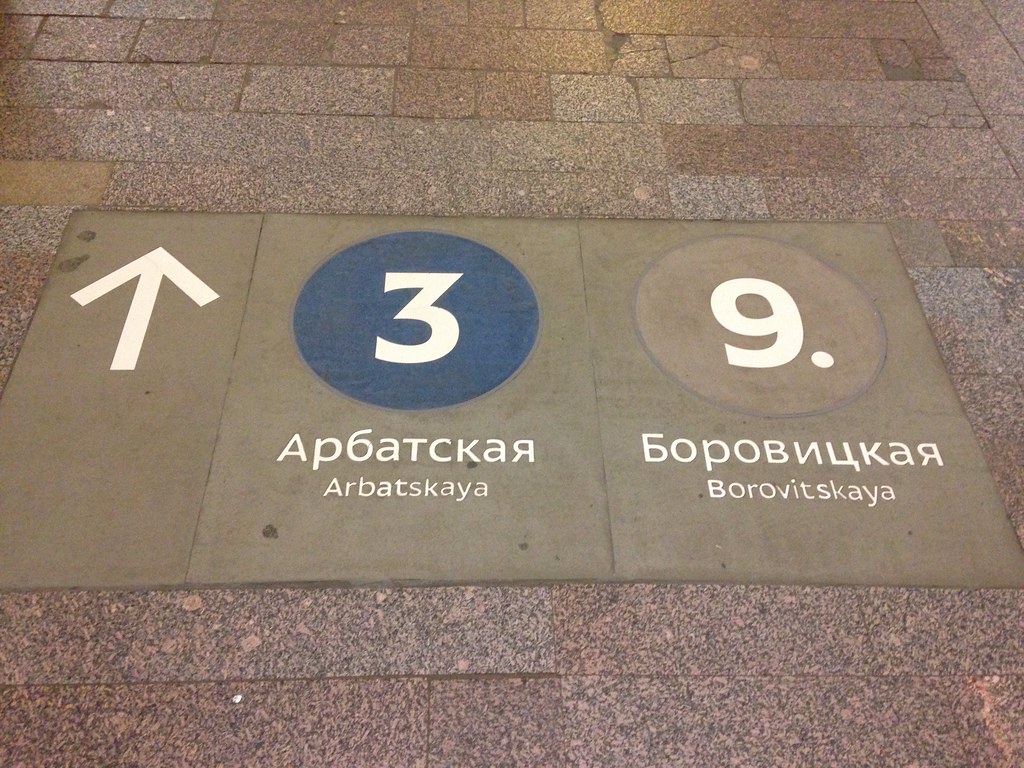
    Station name signage. I believe the top is Russian and the bottom is the Tatar language, which is also written using the Cyrillic script. Interestingly, for at least while into the Soviet period, Tatar was written using the Latin alphabet, but they were apparently forced to change.
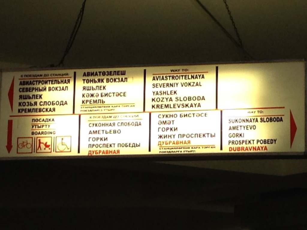
    Kazan, Russia - August 2015

    Signs.

    Kazan, Russia - August 2015

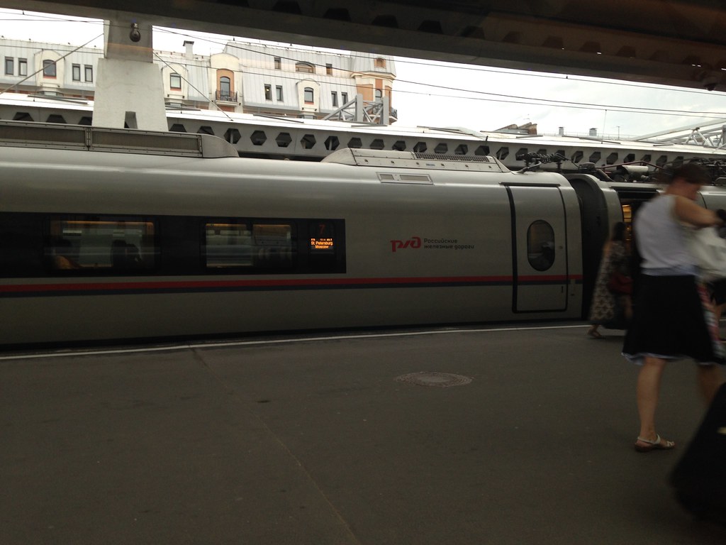
    Here’s a train in the station. These are the exact same trainsets as the new Moscow ones I mentioned by didn’t have a picture of.

    Kazan, Russia - August 2015

    As I said, I was only there a day but was glad I went. It was good to get to see a city further into the Russian interior. Lots of money is being spent there, so I’d expect many further developments in the future.

    Aaron M. Renn is a senior fellow at the Manhattan Institute and a Contributing Editor at City Journal. He writes at The Urbanophile, where this piece first appeared.

  • Preparing for the Impact of Driverless Cars

    The buzz has been building about driverless cars for a while now, and this week I want to talk about a couple of new articles on the topic followed by my own thoughts.  The first is a McKinsey article based on MIT research:

    Full speed ahead: How the driverless car could transform cities

    “By combining ride sharing with car sharing—particularly in a city such as New York—MIT research has shown that it would be possible to take every passenger to his or her destination at the time they need to be there, with 80 percent fewer cars

    Clearing the roads of four out of five cars has momentous consequences for cities, by measures such as environment, traffic, efficiency, and even parking. In most cities, for example, designated parking accounts for a huge amount of land, which ends up being useless for most of the day. With fewer cars, much of this space could be freed for other uses. Such reductions in car numbers would also dramatically lower the cost (and related energy consumption) of building and maintaining the roads. One engineering study found that automation could quadruple capacity on any given highway. And, of course, fewer cars also means less noise and a smaller environmental impact. 

    Driving patterns of individual cars can be algorithmically optimized as well. Because autonomous vehicles don’t get lost, they create less congestion and shorten travel times. More important, self-driving cars would also make for much safer roads; more than 30,000 people a year die in automobile-related deaths in the United States every year and 1.2 million worldwide.”

    I do have one quibble with the assertions above: yes, there will be fewer cars, but I suspect there will be a similar number of car *trips* (for example, one taxi providing 20 trips/day instead of 10 owned cars each providing two trips/day), and that means just as much wear and tear on the roads,unless a lot more car sharing happens (i.e. one vehicle carrying multiple people on separate trips at the same time).  More on that later…

    The second article is from The Economist and chock full of interesting facts:

    • Cars sit idle 96% of the time.
    • Google thinks self-driving taxis could have utilizations of 75%+.
    • Stanford estimates we’ll need 70% fewer cars to provide the same trips.
    • “The idea that autonomous vehicles will be owned and used much as cars are today is a “tenuous assumption”, says Luis Martinez of the International Transport Forum, a division of the OECD, a think-tank. Fleets of self-driving vehicles could, he says, replace all car, taxi and bus trips in a city, providing as much mobility with far fewer vehicles. An OECD study modelling the use of self-driving cars in Lisbon found that shared “taxibots” could reduce the number of cars needed by 80-90%. Similarly, research by Dan Fagnant of the University of Utah, drawing on traffic data for Austin, Texas, found that an autonomous taxi with dynamic ride-sharing could replace ten private vehicles. This is consistent with the finding that one extra car in a car-sharing service typically takes 9-13 cars off the road. Self-driving vehicles could, in short, reduce urban vehicle numbers by as much as 90%.”
    • 94% of accidents are from human error, and these could be eliminated.
    • “A study by the Eno Centre for Transportation, a non-profit group, estimates that if 90% of cars on American roads were autonomous, the number of accidents would fall from 5.5m a year to 1.3m, and road deaths from 32,400 to 11,300.”
    • “As well as being safer, self-driving vehicles would make traffic flow more smoothly, because they would not brake erratically, could be routed to avoid congestion and could travel close together to increase road capacity. A study by the University of Texas estimates that 90% penetration of self-driving cars in America would be equivalent to a doubling of road capacity and would cut delays by 60% on motorways and 15% on suburban roads. And riders in self-driving vehicles would be able to do other things. Morgan Stanley calculates that the resulting productivity gains would be worth $1.3 trillion a year in America and $5.6 trillion worldwide. Children, the elderly and the disabled could gain more independence.” 
    • “With cars in constant use, much less parking space would be needed. Parking accounts for as much as 24% of the area of American cities, and some urban areas have as many as 3.5 parking spaces per car; even so, people looking for parking account for 30% of miles driven in urban business districts. By liberating space wasted on parking, autonomous vehicles could allow more people to live in city centres; but they would also make it easier for workers to live farther out. If you can sleep on the journey a longer commute becomes feasible, notes Mr Fagnant, who foresees a “simultaneous densification of cities, and expansion of the exurbs”.

    Again, I think it’s worth noting that even though the number of vehicles drops, the amount of vehicle-miles probably stays pretty steady or maybe even increases as people can be productive on longer commutes.  In essence, there will be fewer vehicles, but they will get used up/worn out much more quickly from their high utilization (similar to buses today), so the car industry may be safe from complete collapse, although it will certainly be massively disruptive.

    A key question is how much car sharing will occur, which reduces prices and increases efficiency by picking up and dropping off multiple people along routes.  It can be a bit awkward sharing a vehicle with strangers.  I would not be surprised to see someone like Uber custom design a vehicle with individual personal compartments.  Imagine 5-6 private individual seating compartments in a 6-door SUV-sized vehicle.  When it pulls up, an indicator tells you which door to get into for your compartment, and then alerts you again when it’s time for you to get out, based on the destination you put into your smart phone.  Private ride, shared prices and efficiency – best of both worlds.  Mass adoption of shared rides would solve our traffic congestion problems almost overnight.

    A couple of additional thoughts: If most accidents get eliminated, do we still need shoulders? Maybe those could be converted to extra lanes?  The same for street parking if vehicles are continuously utilized – long-term those spaces might be convertible to additional lanes, adding surface street capacity.  Or in some cases, it might make sense to expand the sidewalk/public realm into that space instead.

    So what should cities be doing now to prepare for this future?

    1. Loosen up or even eliminate minimum parking requirementsnow so available parking starts shrinking naturally over the next few years.  This will also enable greater infill and density in cities as well as supply much-needed new housing stock.
    2. Stop investing in new rail transit – they’re not going to be able to achieve their payback before this revolution (if they ever could in any case).  Managed-lane networks are a better investment, as they can be used for buses, HOVs, and toll-payers now, and easily switched over to automated vehicles later.

    It’s going to be a brave, brave new world…

    Tory Gattis is a Founding Senior Fellow with the Center for Opportunity Urbanism, and co-authored the original Opportunity Urbanism studies. Tory writes the popular Houston Strategies blog and its twin blog at the Houston Chronicle, Opportunity Urbanist, where he discusses strategies for making Houston a better city. He is the founder of Coached Schooling, a startup to create a high-tech network of affordable private schools ($10/day) combining the best elements of eLearning, home and traditional schooling to reinvent the one-room schoolhouse for the 21st century. Tory is a McKinsey consulting alum, TEDx speaker, and holds both an MBA and BSEE from Rice University.

    By Driving_Google_Self-Driving_Car.jpg: Steve Jurvetsonderivative work: Mariordo [CC BY 2.0], via Wikimedia Commons.

  • Transport in Moscow

    I was in Russia last week and plan to share a few relevant notes from the trip. Since you can easily find better photos of places like the Kremlin than I’ll ever take online, when it comes to Moscow I’m going to focus on more planning and transport items. There’s a lot of other commentary I might make, and if you want to read it, be sure to sign up for my exclusive content by email if you haven’t already, because I may write up further observations on the political scene there.

    Writing anything positive about public space and transport in Moscow runs the risk of coming across as seeming to say that “at least Putin makes the trains run on time.” But as he is fully occupied with such critical tasks of state as destroying illicit supplies of Nutella and brie, I doubt he’s bothering himself with such prosaic concerns as transport. Should you be interested, the NYT just ran a good piece on the combination of urban improvement and authoritarianism in Russia’s capital city.

    Moscow reminded me a bit of an inverted Buenos Aires. Whereas in BA you get a clear sense that this was once the Paris of South America now well faded, Moscow comes across as a dilapidated city on the rise. You definitely see plenty of run down communist era architecture – the quantity of Corbusian nightmares evident from an aerial view of the city is astonishing – but there are new buildings on the rise and significant evidence of attempts to improve the lived experience of the city.

    Moscow is clearly a driving and transit city, not a walking city. Though there is some street life, it’s far lower than comparable high density megacities. But before knocking them too much, keep in mind that Moscow gets bitterly cold in the winter. Even in August the temperature in the afternoon was only the low 70s. Ideal to be sure, but that’s only for a narrow window of the year. Moscow is at 56 degrees north latitude compared to 41 in New York. Moscow is actually further north than every major Canadian city. The sky was already getting light before 4am.

    Nevertheless, the outdoor experience there is being enhanced through a number of projects.

    Moscow River

    The Moscow River flows through the city, passing alongside the Kremlin as you can see in his photograph.

    Moscow - August 2015

    You see that on both sides it is lined with roads and very narrow sidewalks. It’s not even clear how you would easily get to the riverside on the Kremlin side. A stroll along the bank across from the Kremlin, Cathedral of Christ the Savior, and other landmarks should be amazing, but it is not.

    There’s apparently a tender underway that would completely redo this for the better. In the meantime, one section of the river called the Krymskaya Embankment has been redone to a slick, albeit somewhat generic design. This has radically transformed the riverfront for the better, and if the rest of the Moscow River upgrade is similar, this will be a huge transformation for the city.

    Moscow - August 2015

    People enjoying the waterfront.

    Moscow - August 2015

    Here’s a closeup of the bike lane.

    Moscow - August 2015

    The numbers and the text in the background give distances to attractions such as Gorky Park.

    Neighborhood Streets

    In a way similar to the riverbank, there’s been an effort to upgrade neighborhood streets to improve the pedestrian experience. Traditionally, these have had fairly narrow, basic sidewalks. Here’s a typical example:

    Moscow - August 2015

    And here’s a street that’s been put on a road diet.

    Moscow - August 2015

    This program is ongoing, as this sign touting forthcoming improvements shows.

    Moscow - August 2015

    And a picture of the construction in progress.

    Moscow - August 2015

    There’s also a bike share system.

    Moscow - August 2015

    Arterial Streets

    While there are plenty of smaller, human scaled side streets in Moscow, the arterial roads are mega-wide thoroughfares (“prospekts” in the local parlance) that function as quasi-freeways. Here’s an example that isn’t a perfect photo, but let’s you get the gist of it.

    Moscow - August 2015

    You’ll see at least six lanes in a single direction. This building is actually decent, but illustrates what you also see along these high capacity arterials, namely a preponderance of horizontally oriented buildings. Even with broken up facades, these are buildings that are most legible at driving speeds, not walking.

    You might wonder how people cross these things, and the answer is that they mostly don’t. For these streets, there’s a heavy reliance on pedestrian underpasses for pedestrian safety. (This also reduces the number of stoplights, which allows for long distances of high speed travel even in the center city). Metro entrances also do double-duty as protected passageways through intersections. Here’s an entrance to one such pedestrian underpass along a one way street that appears to be ten lanes wide.

    Moscow - August 2015

    This might seem inhumane, and it is. But it also functions well. Though I’m told traffic is much lighter in the summer when many vacate the city, there is nothing like the gridlock of a New York, and these roads tended to move pretty good most of the time I was there.

    Where there were crosswalks, they featured countdown timers on both the walk and don’t walk cycle.

    Moscow - August 2015

    That’s not a misprint. Some of these lights have extremely long cycles.

    Some arterials have a nicer design. One is the so-called “boulevard ring,” which is one of the many ring roads in Moscow. I think (though can’t promise), this shot is from it. Even if not, it’s representative of its design.

    Moscow - August 2015

    Moscow Metro

    Moscow is famous for its metro system, which is one of the world’s busiest and has lavish station designs. I saw some of these and they are indeed pretty great, though this system should never be applauded without remembering that it was built with gulag labor. Again, I won’t show many pictures of the stations, since my iPhone isn’t the best at low light underground shots. Google is your friend on this.

    The metro fare is about a buck. Tap cards are sold at automated kiosks that have English available. Lines are numbered and color coded. Here’s an example of the system signage.

    Moscow - August 2015

    It’s one train right after the next more or less. Even at 11:30 pm there were three minute headways. The cars are older but function well, and there is wifi, which I’m told works even between stations.

    Moscow - August 2015

    There are some newer cars that appear to be married pairs with open gangway between the two linked carriages, but not between pairs.

    While you can buy a ticket in English, the bulk of the signage is in Russian only. This isn’t a problem for the most part, but I found the remembering station names in the Cyrillic alphabet was a challenge compared with Latin alphabet stations in other foreign countries. I would suggest that the station name be transliterated into Latin script to make the system more friendly to international users. (The rest of the signage is fine as is). Here’s an example:

    Moscow - August 2015

    If I translate that right, this station is Kropotkinskaya (Kropotkin was a Russian intellectual of the 19th and early 20th centuries). The name is certainly easier to recognize in Latin script for westerners (and probably most others who use English as their international lingua franca). But even in Russian only, you should be able to figure it out how to navigate the system if you pay close attention.

    Here’s an example of some transliterated signage. This probably goes above and beyond the call of duty as the numeric indicators suffice.

    Moscow - August 2015

    Air Travel

    Moscow has two main airports, I believe, both at a significant distance from the city center. I flew using Sheremetyevo, which is serviceable if not overly pleasant. You have to pass through security immediately upon entering the terminal, then again when going to the gate area. Even domestic transfers require re-screening and passport checks. (I was told by a local, “Russians love checking passports.”)

    The most depressing part of the trip was flying three domestic segments on Aeroflot. When I was younger they had an extremely bad reputation, and flew of a fleet of dodgy Soviet made jets. Today, the planes I flew on were newish A-320s and the service levels exceeded US domestic standards (though that’s a low hurdle to jump). They even still serve food on short haul flights. Quite a role reversal there. Red is still their flight attendant colors, and their hammer and sickle logo is still in use.

    High Speed Rail

    There are a number of rail routes throughout the country, and while I didn’t make a comprehensive survey, I did ride the high speed “Sapsan” service from St. Petersburg to Moscow. IIRC, the fare was around $55. Though using Siemens trainsets derived from the rolling stock used on Germany’s ICE trains, the max speed was 220 km/h (135 mph), comparable to the Acela. However, unlike the Acela, the Sapsan cruises at 200 km/h or higher most of the trip. The journey takes a bit less than four hours and is a pleasant way to travel.

    Here’s a picture of one of the trains I took in St. Petersburg’s Moscow Station.

    St. Petersburg - August 2015

    An interior shot.

    St. Petersburg - August 2015

    Conclusion

    I hope this gives a bit of a feel for transport in Moscow. The city is obviously spending to try to upgrade its urban environment. Whether physical improvements in Moscow or elsewhere will survive Putin’s authoritarian turn is to be seen, but as the examples of the Moscow subway and many of the historic ruins we visit around the world show, it’s certainly possible for the cruelest of dictatorships to produce magnificent physical artifacts in select places. The success of these regimes should not be judged by that measure.

    In closing, I’ll leave translating the following as an exercise for the reader.

    Moscow - August 2015

    If you are interested, there’s an album of iPhone photos I took available on my Flickr page.

    Aaron M. Renn is a senior fellow at the Manhattan Institute and a Contributing Editor at City Journal. He writes at The Urbanophile, where this piece first appeared.

  • Special Report: Maximizing Opportunity Urbanism with Robin Hood Planning

    This is the first section of a new report authored by Tory Gattis for the Center for Opportunity Urbanism titled Maximizing Opportunity Urbanism with Robin Hood Planning. Download the full report (pdf) here.

    Across America and the developed world, we face a well-reported crisis of income stagnation, rising inequality, a declining middle class, and a general lack of broad prosperity. Yet contemporary urban planning seems disconnected from this crisis, focusing instead on pedestrian aesthetics, environmentalism, and appealing to the supposed preferences of the wealthy and the “creative class.” This approach increasingly dominates urban thinking, expressed often as New Urbanism or Smart Growth. In this perspective, dense and usually older cities like New York, Portland, and San Francisco have been held up as models. For the most part, planners see their world through the perspective of an architect – an architect of the physical form of cities. But what if they tried the perspective of an economist – an architect of opportunities for people to have a better life?

    Cities matter far more than they used to as engines of opportunity and upward social mobility – the very essence of the American Dream. As the basis of the economy has shifted from industry to services, proximity to others now matters more than ever before. A factory can be anywhere and ship its products anywhere, but, generally speaking, most services need to be in-person. This is pushing more and more of the population to agglomerate around not so much cities, as defined by their political boundaries, but major metros, including numerous suburban rings, where the vast majority of the population resides. In many metros, limited housing supply has driven up home prices and rents to levels where much of the middle and working classes are either unable to buy or must pay a heavy portion of their incomes in mortgages or rents.

    This is occurring as economic and technological factors have directed ever more wealth to a relatively small population of elites, whose demand for specialized services – whether personal spending or that of the corporations they control – has become a major part of the economy. Economic opportunity is driven not just by proximity to others in general, but by proximity to the very small but critically influential super-affluent class – what Citigroup research calls the “Plutonomy”. iv In some markets, such as Miami, New York and San Francisco, the locational preferences of this class – who often have several residences and many are foreign buyers – has been yet another driver of major metro agglomeration and higher housing prices, particularly where there are strong land use regulations.

    Family sizes have shrunk and reduced fertility rates are leading towards destabilizing demographic implosions in Europe, Japan, and China – and the U.S. trend is moving in the same direction.vi As nations seek to improve fertility rates, one of the greatest challenges is a shortage of family-friendly housing with sufficient space. If that space is not affordable, then people do the next best alternative: shrink their family size. Whereas families used to be comfortable with multiple children per bedroom, the modern standard is one bedroom for every child – not to mention the “home office” for virtual work by the dual-income parents. With the large suburban house both regulatory out-of-favor and unaffordable in some metropolitan areas, families are forced to shrink to live in expensive density, or pay very high prices and rents for what used to be considered standard middle class homes.

    The planning community generally has few answers to these dilemmas, but in practice the steps they often advocate may actually be making it worse. A dominant tenet of Smart Growth actually seeks to restrict suburban development and encourage density to contain urban expansion. Draconian regulations – and ever higher costs – are piled on any new developments. On the other side, pressure from NIMBY homeowners often limits development of any kind – including high-density. In some areas, exclusionary zoning – such as tight restrictions on multi-family housing – is used to prevent minority, disadvantaged, or lower-income populations from moving in nearby.

    All in all, the net effect is a suffocating restriction on new housing supply even as demand increases, leading to skyrocketing home prices. This has the effect of making affluent NIMBY homeowners, who are disproportionately white and older, quite happy since their homes prices, sans new competition, are almost certain to increase. But the system works like a “Robin Hood in reverse” for younger, middle and working class families that lose out. This is a major driver of inequality – in fact, recent analysis indicates that homeownership completely accounts for the rise in inequality in recent decades. xii Planners have to take a hard look in the mirror and face an uncomfortable truth: whether they have been conscious of it or not, they have been direct accomplices in the rise of inequality and the decline of the middle and working class.

    Download the full report (pdf) from the Center for Opportunity Urbanism.

    Tory Gattis is a Founding Senior Fellow with the Center for Opportunity Urbanism, and co-authored the original Opportunity Urbanism studies. Tory writes the popular Houston Strategies blog and its twin blog at the Houston Chronicle, Opportunity Urbanist, where he discusses strategies for making Houston a better city. He is the founder of Coached Schooling, a startup to create a high-tech network of affordable private schools ($10/day) combining the best elements of eLearning, home and traditional schooling to reinvent the one-room schoolhouse for the 21st century. Tory is a McKinsey consulting alum, TEDx speaker, and holds both an MBA and BSEE from Rice University.

  • How To Justify Spending $8M On Something Nobody Wants

    The Minneapolis-St. Paul Metropolitan Council is gambling $8.7 million on a project to alleviate pedestrian congestion that might exist in 5 to 10 years if we’re somehow able to build two additional light rail lines and they are operating at full capacity for 10 days a year.

    That’s like buying flood insurance on the house you have yet to buy.

    The below $8.7 million piece of public infrastructure is intended to create a more safe passageway for travelers at the Downtown East station during Vikings home games. It’ll serve west and northbound train passengers and other pedestrians looking to enter a new football stadium. It is deemed this will be an important pedestrian overpass once all four major light rail lines completed.

    Download the Downtown East Plan Met Council PowerPoint here [PDF].

    Those reading this should have at least two questions:

    1. How did this come to be a thing?
    2. Why is it all of a sudden getting $8.7 million?

    I pay particularly close attention to local projects. I read blogs, forums and newspapers daily. I know and follow local decision-makers on social media, track development proposals, and pay attention to those boring committees few care about. I also work in the industry and talk to other people who work and follow the industry across related professions. It’s fair to say that I have a very good idea of what’s going on in the Twin Cities and the transportation and development needs of the community.

    Never once have I heard of this project until a few days ago. And now, out of the blue, we’re dropping $8.7 million on a bridge that’ll be needed 10 days a year starting in 2019.

    I wrote a blog post last year titled The Politics of Dumb Infrastructure. It was well received, and is even being used as required reading in an undergrad planning course in California. In the article I theorize as to why we make bad decisions when it comes to receiving other people’s money on transit projects;

    It’s the orderly, but dumb system that makes planners and politicians play to a bureaucratic equation that is supposed to guide officials towards the best alternative. Only it never actually works out that way and it usually forces smart people into making highly compromised and less-than-ideal decisions.

    The pedestrian bridge is different. It may deal with Federal grants, but is also come from local and regional coffers. Regardless, this project is being pushed forward. According to the Star Tribune,

    “The transit agency will likely devote $6 millon from its coffers for the project (this figure could be offset by federal grants), with the Minnesota Sports Facilities Authority (which oversees stadium construction) ponying up $2 million, and the rest coming from bonds issues by the Met Council.”

    Before we go any further, I think we need to ask a complex question.

    How Did We Get Here?

    The new $1 billion Green Line is done and the $1.1 billion Vikings Stadium is underway. They combine to represent over $2 billion of investment. Our local leaders are concerned, as they should be, that these pieces of infrastructure be as perfect as possible.

    To quote a former Governor (one who wasn’t a professional wrestler),

    “All too often, the human tendency is to compound one big mistake with a series of additional mistakes in the hope that somehow the results will improve. This appears to be the case with the Vikings stadium.”

    Politicians are attracted to big, transformitive projects, so it seems only natural that our leaders, who have expelled a great amount of political capital, want to see every inch of it succeed. Even if that means throwing good money after bad.

    How We Justify It All

    An engineer at the Met Council, likely under much political pressure, noticed something: based on 2019 projections, during peak hours on Minnesota Vikings game days, there will be only a 120 second headway between trains. This will likely not be enough time to manage safe pedestrian crossings. The proposed solution is the bridge.

    TopView

    Please note the skyway attached to the State-mandated parking structure.

    The pedestrian bridge makes some sense. Based on the projections, there will be long lines and delays during this period; and building a bridge for pedestrians certainly isn’t an unreasonable response. The Met Council’s Transportation Committee appears to be interested in the idea.

    Let’s look at these assumptions: they assume that there will be two additional light rail lines in full operation, both of which have not yet even been either fully allocated money or constructed. Basically, the Met Council is gambling $8.7 million that there might be a problem in 5 years if we’re somehow able to build two additional light rail lines and they are operating at full capacity for 10 days a year.

    To reiterate: Four (4) LRT lines being in operation (Blue, Green, SW & Bottentieu) and that Vikings game attendees hitting a 40% transit mode share. All of things don’t currently exist. It also assumes, more importantly, that if there is congestion people will not find an alternative route or change their travel behavior. This isn’t to say we can’t plan ahead. We should. But, we should be more realistic in our projections and our priorities.

    Where Are Our Priorities?

    Why did this project get fast-tracked while other smaller, more “everyday” projects never see the light of day? And, when smaller projects get the public’s attention, why do they struggle to find funding? These are merely a question of priorities.

    As Nick Magrino (at streets.mn) has asked so often, “why are we embarrassed by the bus?” He writes,

    “… I can’t shake the feeling that many of the expensive transit improvements we get in the Twin Cities are thought up by people who don’t actually use transit. Which is why we end up with Northstar, the Red Line, and so on.”

    A bridge like this seems like such a low priority, especially when we have legitimate transportation needs. For example, THIS is a bus stop on a heavily used transit line near the center of Minneapolis.

    It’s not that a pedestrian bridge is a terrible idea. Under the projections, at some point in the future, it seems maybe reasonable. But, why is the Met Council prioritizing and fast-tracking this, whereas things like bike lanes, bus shelters, and potholes get ignored? I say this because you could build 40 miles of protected bike lanes for the same price tag.

    Projects can take on a life of their own. There is no traditional process to getting things done. In this pedestrian overpass, you have the right person with the right slideshow presenting it to the right people at the right time. From here, you have the Met Council employees and political-appointed representatives who have monies at their disposal. The proposal, while not perfect, seems reasonable enough. And, we’ve just spent $2 billion on infrastructure, so we need to make it right. The presentation looks good, so why not go for it?

    What Would Your City Do With $8.7 Million?

    Imagine if the City of Minneapolis was given $8.7 million that could only be used on downtown pedestrian and/or transit projects. What would they do? The answer is: not a pedestrian bridge to be used during 10 sports games a year.

    So, why are we doing it?

    The answer is that we can get money from elsewhere to do the things we don’t need to do. But, when it comes to doing the simple things that we need to do, well, that money isn’t available from elsewhere. The pedestrian bridge is a bad idea (right now) that’s made worse when you think of the countless thousands of more useful public investments we could be making.

    The truth is that the people and the City of Minneapolis don’t even care about it. It’s not on their radar. It’s the people who control infrastructure and transportation dollars who care about this. If given the opportunity to allocate these dollars elsewhere, it’s fair to say thatliterally everyone locally would divert them elsewhere.

    Our priorities get skewed and we misallocate resources most when our funding comes from elsewhere. In fact, it is precisely why Minneapolis has the below. All of which the City of Minneapolis will be tearing down in 30 years …

    vikingsblahugh

    Note: This is also next to a proposed park called “The Yard” that neither the City of Minneapolis nor it’s Park Board want to maintain. Yet, somehow it’s still a thing.

    This post originally appeared in Strong Towns on September 9, 2014. Content licensed under a Creative Commons Attribution-Share Alike 3.0 Unported License.

    Find more from Nathaniel M. Hood at his blog: nathanielhood.com

  • Comparisons: Commuting in London and New York

    The world’s two leading Global Cities, London and New York are, according to most indicators, remarkably similar in their patterns of regional commuting. This is the conclusion from our recent review of commuting in London and commuting in New York. This analysis contrasts the results between the London Area (Greater London Authority, East and Southeast regions) and the New York combined statistical area, which stretches from New York state, to New Jersey, Connecticut and Pennsylvania. (A unique animated graphic illustrates the London commuting pattern, at "undertheraeder.com." The map is here and illustrates the size of the greenbelt in the London area).

    Population and Area

    The London and New York areas had almost identical populations in 2014. New York had 23.663 million residents and London had 23.431 million residents, just one percent less. London, however, is growing more rapidly, adding 1.1 percent per year since the 2011 census, while New York’s increase has been 0.8 percent annually since the 2010 census (Figure 1).

    The land areas are also similar (Figure 2). The London commute shed covers 15,400 square miles (39,800 square kilometers). The New York area is about 10 percent smaller, covering 13,900 square miles (36,000 square kilometers).

    Broadly, the two cities can be divided into similar sectors. Both have among the largest central business districts (downtowns or CBDs) in the world. The two central municipalities, the Greater London Authority and the city of New York both have somewhat over 8 million population. There is a first ring of counties located outside the Greater London Authority and the city of New York. Finally there are outer counties in both areas. The geographic areas are described in the "Geographical Note" below.

    Distribution of Employment

    In the distribution of employment between the two cities is remarkably similar (Figure 3). In each case, the suburban counties account for 60% of employment. In both London and New York, the outer counties have slightly more employment than the inner counties, though in both cases the inner counties and outer counties have approximately 30% of employment.

    This leaves approximately 40% of the employment for the central cities. In New York, 22% of the employment is in Manhattan, which contains the central business district. In London, a somewhat smaller 16% of the employment is in the five local authority areas that include the central business district (Camden, Lambeth, city of London, Southwark and the city of Westminster). The balance of the city of New York — the outer boroughs of the Bronx, Brooklyn, Queens and Staten Island, has just 18% of the area’s employment, while the balance of the Greater London Authority — outer London and the balance of inner London — has 25% of the area’s employment.

    Where People Live and Work

    The distribution of the jobs are relative to resident workers is also similar between London and New York. In both cities, the inner counties and the outer counties have nearly the same number of jobs as resident workers. In the case of London, there are 99 jobs per 100 resident workers in the inner counties and a somewhat smaller 92 in the outer counties. In New York, there are 97 jobs per resident worker in the inner counties and 87 in the outer counties. The largest imbalances in both areas occur in the core municipalities. There are approximately 330 jobs per 100 resident workers in the local authority areas containing London’s central business district. Manhattan, with New York’s central business district has a somewhat smaller 280 jobs per 100 resident workers. Indicating the draw of the central business district for workers living in the balance of both core municipalities, there are only 83 jobs for each 100 workers in the balance of the Greater London Authority and 68 in the balance of the city of New York (Figure 4).

    In the two cities, most resident workers are employed in their home sector, 68% in New York and 67% in London. This is also the case in each of the sectors of the two cities. In New York, the largest percentage of resident workers (85%) is employed in Manhattan, with the central business district. The number is considerably smaller (64%) in the jurisdictions containing London’s central business district. In London, the largest share of resident workers employed in their own sector is 88% in the outer counties. In both cities, the inner counties also have a relatively strong balance of local residents, with 71% working in their home sector in New York and 75% in London. In both cities, the smallest number of resident workers employed in their home sectors are in the balance of the core municipality, 62% in London and 55% in New York (Figure 5).

    Commuting to the Central Business Districts

    The data indicates a surprisingly limited draw for the two central business districts. Often media articles and even academics presume that cities are monocentric — that most employees work in the central business district. This isn’t even close to being the case. In fact, the analysis of commuting in the New York and London areas shows that only in the sectors containing the central business districts does the central business district attract most of the resident workers. Even in the relatively jobs-poor balance of the two core municipalities, only 36% in New York and 30% in London work in the jurisdictions containing the CBDs. In the inner counties, the numbers are much smaller. Only 14% of New York inner county resident workers have employment in Manhattan, with an even smaller number, 8% of London’s inner county resident workers commuting to CBD jurisdictions. The numbers are even smaller in the outer counties, where only 4.6% of New Yorkers commute to Manhattan and 2.4% of Londoners commute to the CBD jurisdictions (Figure 6). 

    In both cases, approximately 75% of CBD employees are drawn from the core municipality. In New York, approximately 30% of the central business district employees are from Manhattan, while 43% are from the outer boroughs. In London, 19% of the central business district employees are from the five CBD jurisdictions and 57% are from the balance of the Greater London Authority.

    Manhattan is a somewhat stronger draw to the suburban counties, with 18% of employees from the inner counties and 8% from the outer counties. The London CBD draws 17% of its workers from the inner counties and 5% from the outer counties. Despite the comprehensive suburban rail system in New York and both suburban and national rail system in London, comparatively few workers commute from beyond the outer counties — 2.6% in London in 1.5% and New York (Figure 7).

    How Commuters Travel

    There are also similarities between the commuting methods in the London and New York areas. In both cases, cars, vans and other light vehicles carry the majority of commuters, 53% in London and 62% in New York (Figure 8). Mass transit carries virtually the same share of commuters in both cities, at 26%. Many more Londoners walk to work the New Yorkers, at 10%, compared to less than 6%. Approximately 5.8% of London workers report working at home, somewhat more than New York’s 4.1% (Since the two nations use different census survey instruments, the data may not be completely comparable).

    Widely Dispersed Global Cities

    Ultimately the key finding is that the world’s two greatest Global Cities are widely dispersed. Despite the strength of their cores, the overwhelming majority of employment is in the suburbs. Only a small percentage of resident employees in the suburban areas work in the central business districts. A majority of resident workers is attracted to the CBDs only from the jurisdictions containing the CBDs themselves.

    —–

    Geographical Note: The geographical sectors are as follows:

    London (Greater London Authority, Southeast England and East England): The central business district is situated in a wide corridor on both sides of the Thames River. It is contained in local authority areas, including the city of London, the city of Westminster and the boroughs of Camden, Southwark and Lambeth. The inner counties border on the metropolitan greenbelt, which surrounds the Greater London Authority. They are Berkshire Buckinghamshire, Essex, Hertfordshire, Kent and Surrey. The outer counties are Cambridgeshire, East Sussex, Hampshire, Isle of Wight, Norfolk, Oxfordshire, Suffolk and West Sussex.

    New York (New York Combined Statistical Area): The area includes 35 counties, in eight metropolitan areas, including New York (NY-NJ-PA), Allentown-Bethlehem (PA-NJ),  Bridgeport-Stamford (CT), East Stroudsburg (PA), Kingston (NY), New Haven (CT), Torrington (CT) and Trenton (NJ). 

    —–

    Wendell Cox is Chair, Housing Affordability and Municipal Policy for the Frontier Centre for Public Policy (Canada), is a Senior Fellow of the Center for Opportunity Urbanism (US), a member of the Board of Advisors of the Center for Demographics and Policy at Chapman University (California) and principal of Demographia, an international public policy and demographics firm.

    He is co-author of the “Demographia International Housing Affordability Survey” and author of “Demographia World Urban Areas” and “War on the Dream: How Anti-Sprawl Policy Threatens the Quality of Life.” He was appointed to three terms on the Los Angeles County Transportation Commission, where he served with the leading city and county leadership as the only non-elected member. He served as a visiting professor at theConservatoire National des Arts et Metiers,a national university in Paris. 

    Photograph: Traffic in Bergen County, New Jersey (a  New York inner suburban county), by author.

  • Commuting in London

    According to the 2011 census, the London commuter shed — defined here as the of London (the Greater London Authority, or GLA) and the East and Southeast regions of England — had a 2013 population of 23.2 million, spread over an area of 15,400 square miles (39,800 square kilometers).

    For this analysis, the area is divided into five parts, including the central business district (CBD), the balance of Inner London, Outer London, the inner counties, which are largely adjacent to London and the outer counties. Counties are largely only ceremonial at this point and used for geographical convenience. In many counties, unitary local authorities have been established that replace part or all of the previous county geographic authority.

    The central business district is situated in a wide corridor on both sides of the Thames River. It is contained in five local authority areas, including the city of London, the city of Westminster and the boroughs of Camden, Southwark and Lambeth. All of central London’s eight largest rail stations are in these five areas, and central business district commuters rely to a substantial degree on its suburban rail system.

    Inner London roughly corresponds to the London County Council area as it existed before creation of the Greater London Council (GLC) in 1965. Outer London includes the boroughs that were added in the establishment of the GLC which was abolished in 1986. A new, London authority (the GLC) was created  in 2000, with a considerably scaled back portfolio of responsibilities, principally transport, police, fire, emergency services and planning. GLA has 33 local authorities, 32 of which are popularly referred to as boroughs, plus the City of London (the one square mile historic core). The local authorities which are responsible for a many local public services, and constituted London’s only local government between 1986 and 2000.

    The inner counties border on the metropolitan greenbelt, which surrounds London (Note). They are Berkshire Buckinghamshire, Essex, Hertfordshire, Kent and Surrey. The outer counties are Cambridgeshire, East Sussex, Hampshire, Isle of Wight, Norfolk, Oxfordshire, Suffolk and West Sussex.

    Distribution of Employment

    As of the 2011 census, the local authority areas containing the central business district had approximately 1.4 million jobs, or approximately 15 percent of the jobs in the London area. The rest of GLA, including the balance of inner London and Outer London has 25 percent of the employment. The outer counties have the largest number of jobs, at 2.7 million, comprising 30 percent of London area employment. The inner counties have nearly as many jobs, at 2.6 million, or 29 percent of employment. Thus, the suburban areas outside the Greenbelt have nearly 60 percent of the London area employment (Figure 1).

    Where People Live and Work

    The local authority areas containing the CBD have the greatest imbalance between resident workers and jobs. There are 3.35 jobs for each resident worker in these areas. The ratio of jobs to resident workers is much closer in the balance of Inner London, with a ratio of 1.04 jobs per employee. The least balanced is Outer London, with only 0.73 jobs per employee. The inner counties have the second highest ratio, at 0.93 jobs per employee. Surprisingly, the outer counties have the ratio closest to 1.00, at 0.99 jobs per employee (Figure 2). This parallels our findings of America’s only city with anything like London’s pedigree, New York.

    Most employees work in the sector of their residence. About 65 percent of CBD local authority area residents work in the CBD area (Figure 3). Outside-the-greenbelt commuters work in their own sector to a greater degree. In the outer counties 88 percent work in their home sectors, while 75 percent of inner counties commuters work in their own sectors. The balance of Inner London has the lowest percentage of employees working in their own sectors (41 percent), while Outer London is somewhat higher, at 50 percent.

    Commuting to Central London

    Despite its strong CBD, the London area is anything but monocentric. Approximately 85 percent of London area jobs are outside the central business district. Yet London comparative data from nearly two decades ago placed London’s CBD at fourth largest in the world, trailing Tokyo, New York and slightly behind Osaka. With London’s strong economic growth since that time, London has probably passed Osaka, which has faced more difficult economic times.

    The overwhelming majority of jobs in the London CBD are filled by GLA residents, with more than 75 percent of commuters living in the balance of Inner London or Outer London (Figure 4). This leaves only a quarter living in the exurban areas beyond the greenbelt. Approximately 17 percent of CBD commuters travel from the inner counties, adjacent to the Greenbelt. Only 5 percent travel from the outer counties. Less than three percent of CBD commuters travel from beyond the London area, which may be surprising given the plentiful higher speed (as opposed to genuine high speed) rail services.

    How Commuters Travel

    More than half of Londoners commute to work by car or other light vehicles (including car pools). Transit accounts for about a quarter of commuting, while about 10 percent of commuters walk to work. Approximately six percent usually labor mainly at or from home (Figure 5).

    Among mass transit commuters, suburban rail systems account for the largest share, at 37 percent, underground (metro) and light rail 33 percent and buses 30 percent. Over the past three decades there has been a substantial increase in bus ridership, principally from expanded services financed with savings from competitive tendering (also called competitive contracting) and additional services added later in conjunction with London’s inner congestion pricing zone. Competitive contracting involves use of competitively selected private companies to operate services. London’s "red bus" system — which is fully integrated in its fare, route structure and vehicle livery with its many double deck buses is virtually all operated by the private sector through competitive tendering.

    Minicentric London?

    In some ways, London is one of the world’s most dispersed cities, largely due to the discontinuous development encouraged by the greenbelt. The greenbelt imposes a substantial distance penalty for commuters from the inner and outer counties to the CBD, whether by car or train. This is in considerable contrast to Western Europe’s other megacity, Paris, which is far more compact in its metropolitan development, despite having a considerably weaker CBD. London also demonstrates that the age of the monocentric metropolitan area is largely a thing of the past in high income world cities. With less than one-sixth of metropolitan employment in the CBD, "minicentric" might be a more accurate characterization.

    Note: Housing development is prohibited on the metropolitan greenbelt, which surrounds London (GLA). The metropolitan greenbelt covers three times the land area of the GLA. Virtually all population growth over the past 85 years in the London area has occurred outside the greenbelt. The inner and outer counties have added more than 7 million residents over the since the 1931 census, while London itself has added approximately 500,000 residents.

    The metropolitan is a cornerstone of London’s urban containment policy, which also applies throughout the United Kingdom. Housing development is banned on the greenbelt and the U.K.’s urban containment policy has been associated with a substantial rise in house prices relative to incomes (see: The Barker Review of Housing Supply, the Barker Review of Land Use Planning and The Costs of Smart Growth: A 40 Year Perspective).

    Wendell Cox is Chair, Housing Affordability and Municipal Policy for the Frontier Centre for Public Policy (Canada), is a Senior Fellow of the Center for Opportunity Urbanism (US), a member of the Board of Advisors of the Center for Demographics and Policy at Chapman University (California) and principal of Demographia, an international public policy and demographics firm.

    He is co-author of the "Demographia International Housing Affordability Survey" and author of "Demographia World Urban Areas" and "War on the Dream: How Anti-Sprawl Policy Threatens the Quality of Life." He was appointed to three terms on the Los Angeles County Transportation Commission, where he served with the leading city and county leadership as the only non-elected member. He served as a visiting professor at the Conservatoire National des Arts et Metiers, a national university in Paris. 

    Photo: Traffic in London (by author)

  • Commuting in New York

    The New York commuter shed (combined statistical area) is the largest in the United States, with 23.6 million residents spread across 13,900 square miles in New York, New Jersey, Connecticut and Pennsylvania. It includes 35 counties, in eight metropolitan areas, including New York (NY-NJ-PA), Allentown-Bethlehem (PA-NJ), Bridgeport-Stamford (CT), East Stroudsburg (PA), Kingston (NY), New Haven (CT), Torrington (CT) and Trenton (NJ). The criteria for designation of combined statistical areas is here and Figure 1 is a map of the New York CSA.

    This article examines employment and commuting in the New York area by broad geographic sector. The core sector, of course, is Manhattan (New York County). The second sector is the balance of the city of New York, the outer boroughs of the Bronx, Brooklyn, Queens and Staten Island. The inner counties are Westchester and Nassau in New York as well as Bergen, Essex, Hudson, Middlesex, Passaic and Union in New Jersey. The balance of the CSA is in the outer counties.

    Distribution of Employment

    The New York CSA is home to the world’s second largest central business district (CBD). Only Tokyo’s Yamanote Loop has more employment. Overall, Manhattan (New York County) has 2.4 million jobs, with approximately 2.0 million jobs in the CBD, which covers virtually all of the area to the south of 59th Street. Yet, despite this impressive statistic, unmatched anywhere in the country, Manhattan contains only 22 percent of the employment in the New York area. The largest portion of employment is in the outer counties, with 32 percent (Figure 2). Combined, the inner and outer county suburbs represent 60 percent of the jobs in the New York commuting shed.

    Where People Live and Work

    The distribution of employee residences contrasts sharply with that of employment. Manhattan displays the most extreme imbalance between jobs and where people live. (Figure 3). There are nearly three times as many jobs as resident employees in Manhattan (2.8 jobs per resident employee). The most evenly balanced sector is the outer counties, which are at near parity, with 0.97 jobs for every resident employee. The outer counties are relatively balanced, with 0.87 jobs per resident employee. The balance of New York City has 2.7 million resident workers and only 1.9 million jobs. There are only 0.68 jobs per resident employee. When the entire city is considered, including Manhattan, there is a much closer balance, with 1.16 jobs per resident worker.

    Most employees work in their sector of residence. About 85 percent of Manhattan residents work in Manhattan. Nearly 79 percent of outer county residents work in the outer counties, while 71 percent of inner county residents work in the inner counties. Perhaps surprisingly, nearly two-thirds as many inner county residents work in the outer counties as work in Manhattan. Only 55 percent of resident workers in the four outer boroughs of New York City work in the outer boroughs (Figure 4)

    Commuting to Manhattan

    One of the most enduring urban myths is built around the idea of the monocentric city. This is the conception that most people work downtown (the CBD). This has been an inaccurate characterization for decades, even in New York. In New York, as noted above, the CBD accounts for little more than 20 percent of employment. By comparison, however, this is a substantial number compared to other large North American commuter sheds. The Chicago CSA, for example (the Loop) has about 11 percent of its employment downtown (the Loop), Toronto has less than 15 percent and Los Angeles is under two percent.

    The overwhelming majority of jobs in Manhattan are filled by local residents or nearby commuters. According to American Community Survey "flow" data for 2006-2010, 73 percent of Manhattan commuters live in Manhattan or in the balance of New York City. Another 18 percent of commuters travel from the inner counties. This leaves less than eight percent of commuters traveling from the outer counties. Less than two percent of commuters travel to Manhattan from outside the CSA (Figure 5).

    How Commuters Travel

    New York relies on transit far more than any other US commuter shed. Overall approximately 27 percent of work trip travel is on transit. However, the extent of transit use varies widely by sector. Transit accounts for 75 percent of work trip travel to Manhattan employment. Transit also has a significant market share to jobs in the outer boroughs (38 percent). Jobs in the city of New York account for 88 percent of the transit commuting in the CSA. Outside the city, transit carries a much smaller share. In the inner counties, transit captures nine percent of commuters, while accounting for a much smaller 2.6 percent in the outer counties. In the outer counties, transit’s market share is slightly more than one-half the national average (Table).

    Cars have the largest work trip market share in every commuter shed in the nation, including the New York area, where they provide 61 percent of trips. Again, however, there is a very wide variation between the sectors. Cars provide less than 15 percent of commute trips to jobs in Manhattan. They provide a larger 44 percent share in the outer boroughs. In the inner counties and outer counties, cars are strongly dominant, providing for 80 percent and 88 percent of the commutes respectively.

    The walking commuter share is lower than might be expected in famously pedestrian oriented Manhattan. Manhattan has by far the densest urbanization in the United States. With more than 70,000 residents per square mile (28,000 per square kilometer), Manhattan is nearly four times as dense as San Francisco, which has the highest density of any large municipality in the US outside New York. With such a high density, and a job density of more than 100,000 per square mile (nearly 40,000 per square kilometer), it may be surprising that workers in the outer boroughs rely on walking to work to a greater extent. Walking has a 7.4 percent commuting share in Manhattan, and a 9.6 percent share in the outer boroughs, despite their much lower population and employment densities.

    Table
    New York CSA Means of Transportation: Work Location: 2013
    Area Drive Alone Car Pool Transit Bicycle Walk Other Work at Home
    Manhattan 10.0% 2.7% 74.7% 1.0% 7.4% 1.8% 2.4%
    Balance: NYC 37.0% 7.3% 38.7% 1.1% 9.6% 1.4% 4.8%
    Inner Counties 71.6% 8.6% 9.4% 0.3% 4.2% 1.7% 4.2%
    Outer Counties 79.6% 8.6% 2.6% 0.3% 2.8% 1.1% 5.0%
    New York CSA 54.3% 7.1% 26.9% 0.6% 5.4% 1.5% 4.2%
    Exhibit: United States 76.4% 9.4% 5.2% 0.6% 2.8% 1.3% 4.4%
    Calculated from American Community Survey


    The faster work commute trips of cars is illustrated in the sectoral analysis. Automobile commuting is most dominant in the outer county suburbs, which have the largest number of resident workers and jobs. The average one-way work trip travel time is 24.7 minutes in the outer counties, little more than one half the 49.7 minute one way trip to jobs in Manhattan. The inner counties have the second shortest travel time, at 28.5 minutes. Jobs in the outer boroughs of New York City have an average work trip travel time of 36.4 minutes (Figure 7).

    A Dispersed Commuter Shed

    Despite its reputation for monocentricity, and its primacy in terms of the sheer numbers of core area employees, the New York combined statistical area remains surprisingly dispersed when it comes to jobs, contrary to popular accounts, although less so than others.

    —–

    Wendell Cox is Chair, Housing Affordability and Municipal Policy for the Frontier Centre for Public Policy (Canada), is a Senior Fellow of the Center for Opportunity Urbanism (US), a member of the Board of Advisors of the Center for Demographics and Policy at Chapman University (California) and principal of Demographia, an international public policy and demographics firm.
    He is co-author of the "Demographia International Housing Affordability Survey" and author of "Demographia World Urban Areas" and "War on the Dream: How Anti-Sprawl Policy Threatens the Quality of Life." He was appointed to three terms on the Los Angeles County Transportation Commission, where he served with the leading city and county leadership as the only non-elected member. He served as a visiting professor at the Conservatoire National des Arts et Metiers, a national university in Paris. 

    Photograph: Inner County New York CSA: City of Elizabeth, seat of Union County, New Jersey (by author)

  • America’s Largest Commuter Sheds (CBSAs)

    Core Based Statistical Area (CBSA) is the Office of Management and Budget’s (OMB) way of defining metropolitan regions.  The OMB (not the Census Bureau) defines criteria for delineating its three metropolitan concepts, combined statistical areas, metropolitan statistical areas, and micropolitan statistical areas. The CBSA has obtained little use since this adoption for the 2000 census. According to OMB:

    "A CBSA is a geographic entity associated with at least one core of 10,000 or more population, plus adjacent territory that has a high degree of social and economic integration with the core as measured by commuting ties."

    In this context, core means urban area. If an urban area has 50,000 or more population, OMB defines a metropolitan area around it. If an urban area has 10,000 or more population but fewer than 50,000 residents, OMB defines a micropolitan area around it.

    It is also important to understand that CBSAs, whether CSAs, metropolitan areas, or micropolitan areas are not urban areas. In fact, 94% of the area in CBSAs is rural — only 6% is urban (built-up urban cores and suburbs).

    Combined statistical areas (CSAs) are made up of adjacent CBSAs that have a significant amount of commuting between them, but less than required for a metropolitan area or a micropolitan area. In some cases the CSAs seem so obvious as to make the smaller metropolitan area definitions seem ludicrous. One keen observer, Michael Barone of the Washington Examiner, put San Francisco and San Jose, as well as Los Angeles and Riverside-San Bernardino together in his recent analysis of population growth, because, as he rightly pointed out, they seem to "flow together."

    Some CSAs are very large. For example the New York CSA is composed of 8 metropolitan areas (New York (NY-NJ-PA), Bridgeport (CT), New Haven (CT), Trenton (NJ), Allentown (PA-NJ), Kingston (NY). Torrington (CT) and East Stroudsburg (PA). On the other hand, many major metropolitan areas are not a part of a CSA, such as Phoenix and San Diego.

    Since the term CBSA seems unlikely to achieve popular usage, this article uses the term "commuter shed" to denote the highest local level of metropolitan definition.  The highest level for the largest regions are is the combined statistical area (CSA). In others they are defined as a metropolitan area or micropolitan area. The result is a consistent standard of economic geography defined by commuting. Yet such lists are rare or non-existent. A table of all 569 commuter sheds (over 1,000,000 population) is posted to demographia.com.

    10 Largest Commuter Sheds

    As a 2014, there were 60 commuter sheds in the United States with more than 1 million population (Table).

    Not surprisingly, the nation’s largest commuter shed is New York. New York stretches from New Haven and Bridgeport, and Connecticut which are separate metropolitan areas out to Allentown which is principally in Pennsylvania and Trenton in New Jersey. The New York commuter shed has a population of 23.6 million. In fact, given the extensive suburban rail transit service between Southwestern Connecticut and New York City, it may be surprising that New Haven and Bridgeport are separate metropolitan areas, both with nearly 1,000,000 population. Moreover, there is virtually no break in the continuously built-up area between New York and southwestern Connecticut (Fairfield and New Haven counties) — they "flow together" to use Barone’s term. Since 2010, the Allentown metropolitan area, with nearly 1,000,000 population, was added to the New York CSA.

    The second largest commuter shed is Los Angeles-Inland Empire, with 18.6 million residents. This includes the Los Angeles metropolitan area (Los Angeles and Orange Counties, Ventura County and the Riverside San Bernardino metropolitan area (Inland Empire, including Riverside and San Bernardino County), which is one of the largest in the nation, with more than 4 million population. Here, as in New York, there is virtually no break in the built-up urbanization between the two urban areas, Los Angeles and Riverside-San Bernardino.

    Chicago is the third largest commuter shed, though its adjacent metropolitan areas are far smaller than in New York and Los Angeles. Chicago is also growing very slowly, with its population increase over the last year so small that it will take nearly to 2020 to reach 10 million, even though it only has 72,000 to go.

    Just below Chicago, Washington and Baltimore combine to form nation’s fourth largest commuter shed. Already with more than 9.5 million residents and strong growth this decade, Washington-Baltimore could pass 10 million population and Chicago by 2020. Washington-Baltimore is unique in combining two of the nation’s historically largest and most intensely developed core municipalities along with the much more extensive suburbs (which contain 85% of the population). Washington-Baltimore now extends to Franklin County, Pennsylvania.

    The fifth largest metropolitan complex is the San Francisco Bay Area with a population of 8.6 million. This includes the San Francisco, San Jose, Vallejo, Santa Rosa, Santa Cruz metropolitan areas and the recently added Stockton metropolitan area.. There is no break in the urbanization between San Francisco and San Jose.  

    The Boston CBSA was enlarged during the last decade to include Providence, a major metropolitan area in its own right. Boston also includes the Worcester metropolitan area, which is nearing 1,000,000 population. Boston-Providence has a population of 8.1 million.

    The top 10 is rounded out by Dallas-Fort Worth (7.4 million), Philadelphia (7.2 million), Houston (6.7 million), and Miami (6.6 million).

    The largest metropolitan complex in the nation that is not a part of a CSA is Phoenix, which is ranked 14th. Only one other commuter sheds in the top 20 is not a CSA (San Diego) and only six of the 60 commuter sheds with more than 1,000,000 population is not a CSA.

    Fastest Growing Commuter Sheds

    The fastest commuter shed growth rates are in the South, which accounts for eight of the ten fastest growing commuter shed’s. Austin ranks number one in annual percentage growth between 2010 and 2014, a position it also holds among major metropolitan areas. Cape Coral (Florida) ranks second. Cape Coral also ranks as the fastest growing among the midsized metropolitan areas (from 500,000 to 1,000,000 population). Houston ranks third in growth rate. Houston and Dallas-Fort Worth are the only commuter sheds with more than 5 million population that are among the top 10 in growth. The two non-Southern top 10 entries are from the West: Denver and Phoenix (Figure 2).

    Slowest Growing Commuter Sheds

    All of the 10 slowest growing major commuter sheds are in the old industrial heartland of the Northeast and Midwest. Cleveland-Akron is the slowest growing, having lost approximately 0.1 percent of its population annually. Pittsburgh, Dayton, Buffalo and Detroit have also lost population.

    Continuing Dispersion

    The dispersion of US metropolitan areas continues, with perhaps the ultimate example of Portland (Oregon), which was recently combined with four other metropolitan areas (see: Driving Farther to Quality in Portland). The "flowing together" suggest that the combined statistical area may be an increasingly important in assessing regional trends.

    Core Based Statistical Areas (Commuter Sheds): United States
    Over 1,000,000 Population in 2014
    2014 Population Rank Metropolitan Area 2010 2014 Annual % Change: 2010-2014 Growth Rank
    1 New York-New Haven, NY-NJ-CT-PA CSA 23.077 23.633 0.56% 41
    2 Los Angeles-Inland Empire, CA CSA 17.877 18.550 0.87% 30
    3 Chicago, IL-IN-WI CSA 9.841 9.928 0.21% 50
    4 Washington-Baltimore, DC-MD-VA-WV-PA CSA 9.052 9.547 1.26% 18
    5 San Fransicsco-San Jose, CA CSA 8.154 8.607 1.28% 17
    6 Boston-Providence, MA-RI-NH-CT CSA 7.894 8.100 0.61% 38
    7 Dallas-Fort Worth, TX-OK CSA 6.818 7.353 1.79% 8
    8 Philadelphia, PA-NJ-DE-MD CSA 7.068 7.165 0.32% 47
    9 Houston, TX CSA 6.115 6.686 2.13% 3
    10 Miami-West Palm Beach, FL CSA 6.168 6.558 1.46% 14
    11 Atlanta, GA CSA 5.910 6.259 1.36% 16
    12 Detroit, MI CSA 5.319 5.315 -0.02% 56
    13 Seattle, WA CSA 4.275 4.527 1.36% 15
    14 Phoenix, AZ MSA 4.193 4.489 1.62% 9
    15 Minneapolis-St. Paul, MN-WI CSA 3.685 3.835 0.94% 26
    16 Cleveland-Akron, OH CSA 3.516 3.498 -0.12% 60
    17 Denver, CO CSA 3.091 3.345 1.88% 6
    18 San Diego, CA MSA 3.095 3.263 1.25% 20
    19 Portland-Salem, OR-WA CSA 2.921 3.060 1.10% 23
    20 Orlando-Daytona Beach, FL CSA 2.818 3.046 1.84% 7
    21 Tampa-St. Petersburg, FL MSA 2.784 2.916 1.10% 22
    22 St. Louis, MO-IL CSA 2.893 2.911 0.15% 52
    23 Pittsburgh, PA-OH-WV CSA 2.661 2.654 -0.06% 59
    24 Charlotte, NC-SC CSA 2.376 2.538 1.57% 11
    25 Sacramento, CA CSA 2.415 2.513 0.94% 27
    26 Salt Lake City-Ogden, UT CSA 2.272 2.424 1.54% 12
    27 Kansas City, MO-KS CSA 2.343 2.412 0.68% 36
    28 Columbus, OH CSA 2.309 2.398 0.90% 28
    29 Indianapolis, IN CSA 2.267 2.354 0.89% 29
    30 San Antonio, TX MSA 2.143 2.329 1.98% 4
    31 Las Vegas, NV-AZ CSA 2.195 2.315 1.26% 19
    32 Cincinnati, OH-KY-IN CSA 2.174 2.208 0.37% 46
    33 Raleigh-Durham, NC CSA 1.913 2.075 1.94% 5
    34 Milwaukee, WI CSA 2.026 2.044 0.21% 51
    35 Austin, TX MSA 1.716 1.943 2.97% 1
    36 Nashville, TN CSA 1.788 1.913 1.59% 10
    37 Norfolk-Virginia Beach, VA-NC CSA 1.779 1.819 0.53% 43
    38 Greensboro-Winston-Salem, NC CSA 1.589 1.630 0.60% 39
    39 Jacksonville, FL-GA CSA 1.470 1.543 1.14% 21
    40 Louisville, KY-IN CSA 1.460 1.499 0.62% 37
    41 Hartford, CT CSA 1.486 1.488 0.02% 55
    42 New Orleans, LA-MS CSA 1.414 1.480 1.09% 24
    43 Grand Rapids, MI CSA 1.379 1.421 0.71% 34
    44 Greenville, SC CSA 1.362 1.410 0.81% 33
    45 Oklahoma City, OK CSA 1.322 1.409 1.50% 13
    46 Memphis, TN-MS-AR CSA 1.353 1.370 0.29% 48
    47 Birmingham, AL CSA 1.303 1.317 0.27% 49
    48 Richmond, VA MSA 1.208 1.260 1.00% 25
    49 Harrisburg, PA CSA 1.219 1.240 0.39% 45
    50 Buffalo, NY CSA 1.216 1.215 -0.02% 57
    51 Rochester, NY CSA 1.175 1.177 0.05% 54
    52 Albany, NY CSA 1.169 1.174 0.10% 53
    53 Albuquerque, NM CSA 1.146 1.166 0.40% 44
    54 Tulsa, OK CSA 1.106 1.139 0.69% 35
    55 Fresno, CA CSA 1.081 1.121 0.84% 32
    56 Knoxville, TN CSA 1.077 1.104 0.58% 40
    57 Dayton, OH CSA 1.080 1.078 -0.05% 58
    58 Tucson, AZ CSA 1.028 1.051 0.53% 42
    59 El Paso, TX-NM CSA 1.013 1.050 0.85% 31
    60 Cape Coral, FL CSA 0.940 1.028 2.13% 2
    In millions
    Data from US Census Bureau
    Metropolitan Statistical Areas shown only if not in a Combined Statistical Area.


    Wendell Cox is Chair, Housing Affordability and Municipal Policy for the Frontier Centre for Public Policy (Canada), is a Senior Fellow of the Center for Opportunity Urbanism (US), a member of the Board of Advisors of the Center for Demographics and Policy at Chapman University (California) and principal of Demographia, an international public policy and demographics firm.

    He is co-author of the "Demographia International Housing Affordability Survey" and author of "Demographia World Urban Areas" and "War on the Dream: How Anti-Sprawl Policy Threatens the Quality of Life." He was appointed to three terms on the Los Angeles County Transportation Commission, where he served with the leading city and county leadership as the only non-elected member. He served as a visiting professor at the Conservatoire National des Arts et Metiers, a national university in Paris. 

    Photo: Albany (NY) City Hall (by author)

  • Who Benefits From Other People’s Transit Use?

    In the May 11 issue of Finance and Commerce, Matt Kramer, a local Chamber of Commerce representative lobbying for additional public transit and transportation spending (currently being debated at the Minnesota Legislature) is quoted as saying “Every person who is riding transit is one less person in the car in front of us.”

    This is a fascinating quote. First is the use of “us.” So the Chamber of Commerce (probably correctly) identifies riding transit as something someone else does (since “we” are still in the car) and goes on to imply that it benefits us because there will be fewer cars. (Actually he says fewer people per car, but I think he meant fewer cars, not that it would reduce carpooling.) And I suppose he could mean he rides the bus, and the car in front has fewer people (or there were fewer cars in front), but I don’t think that’s what he meant, since the arguments in the legislature are mostly about building and operating new facilities — such as LRT lines or freeway BRT, rather than supporting existing buses driving in traffic.

    This evokes the famous Onion article: Report: 98 Percent Of U.S. Commuters Favor Public Transportation For Others.

    But it also suggests transit reduces auto travel. The converse is almost equally true, building roads reduces transit crowding. But that is not an argument road-builders make. (It is an argument urbanists make against roads.)

    Of course, some transit users would have otherwise driven, but many would have been passengers in cars, walked, ridden bikes, or telecommuted. No one really knows what the alternative untaken mode would be. We have models, but the form of those models dictates the answer. Logit models, which are widely used by travel demand forecasters to predict mode choice (and whose development resulted in a Nobel Prize in Economics for University of Minnesota graduate Daniel McFadden), have the property called “IIA”, which is short for Independence of Irrelevant Alternatives. In short, if you take away a mode, IIA means people choose the other modes in proportion to their current use. So let’s say there are 3 modes: walk 25%, transit 25%, drive 50%, and there is a transit shutdown (like in 2004). IIA implies the 25% of former transit users would split 1/3 (25%/75%) for walk and 2/3 (50%/75%) for driving. We all know that is not true (and there are various techniques to try to fix the models and use more complicated functional forms), but the question of what istrue is not at all clear.

    While there are surveys that have answered those questions, they are all context specific. For instance, Googling turns up a Managed Lanes Case Study report:

    95 Express bus riders were asked how long they have been traveling by bus and what was their previous mode of travel before using the bus service. 92 percent of respondents (307 out of 334) mentioned they have been traveling the 95 Express bus before the Express Lanes started. Only, 8 percent of respondents (27 out of 334) began using the bus after the Express Lanes opened. Among them, 50 percent (13 out of 27) had their previous mode as drive alone and none of them carpooled previously. Therefore, 95 Express bus ridership consisted primarily of those who have been using the service prior to Express Lanes implementation and the small mode shift from highway to transit was mostly from SOVs. Note that the number of respondents is too small to make any conclusions (Cain, 2009).

    Undoubtedly other services would have different numbers, but transit lines are not generally a direct substitute for driving.

    The line of reasoning in the opening quote suggests the primary purpose of transit is reducing auto travel, rather than serving people who want to or must use transit. In other words, building transit is good because it reduces traffic congestion (and almost no one argues building roads is good because it reduces transit crowding).

    That is at best a secondary benefit, a benefit which could be achieved must more simply and less expensively through the use of prices as we do with almost all other scarce goods in society, even necessities like water.

    Transit today is, in almost all US markets, slower than driving. People who depend on transit can reach fewer jobs than those who have automobiles available. Some people use transit by choice, for instance to save money (if they need to pay for parking), and the rest without choice. In my opinion, it is more important to spend scarce public dollars to improve options for those without choices than to improve the choices for those who already have alternatives. Perhaps ideally we could do both, in practice, one comes at the expense of other.

    The idea that transit is for the other person is true for the 95.5% of people who don’t use transit regularly. But it warps thinking that the aim of public transit funding is to benefit those non-transit users.

    This post was written by David Levinson and originally published on streets.mn. Follow streets.mn on Twitter: @streetsmn.

    David Levinson is a Professor in the Department of Civil Engineering at the University of Minnesota and Director of the Networks, Economics, and Urban Systems (NEXUS) research group. He also blogs at The Transportationist and can be found [@trnsprttnst]. Levinson has authored or edited several books, including Planning for Place and Plexus: Metropolitan Land Use and Transport and numerous peer reviewed articles. He is the editor of the Journal of Transport and Land Use.

    Photo Metro Transit Stop at Coffman Memorial Union by Runner1928 (Own work) [CC BY-SA 3.0], via Wikimedia Commons