Tag: Transportation

  • California Environmental Quality Act, Greenhouse Gas Regulation and Climate Change

    This is the introduction to a new report, California’s Social Priorties, from Chapman University’s Center for Demographics and Policy. The report is authored by David Friedman and Jennifer Hernandez. Read the full report (pdf).

    California has adopted the most significant climate change policies in the United States, including landmark legislation (AB 32)2 to lower state green- house gas (GHG) emissions to 1990 levels by 2020. Proposed new laws, and recent judicial decisions concerning the analysis of GHG impacts under the California Environmental Quality Act (CEQA), may soon increase the state’s legally mandat- ed GHG reduction target to 80% below 1990 levels by 2050.3 The purpose of California’s GHG policies is to reduce the concentration of human-generated GHGs in the atmosphere. The United Nations Intergovernmental Panel on Climate Change (IPCC) and many other scient.c organizations have predicted that higher GHG atmospheric concentra- tions generated by human activity could cause catastrophic climate changes.

    This paper demonstrates that even the complete elimination of state GHG emissions will have no measurable effect on climate change risks unless Cali- fornia-style policies are widely adopted throughout the United States, and particularly in other countries that now generate much larger GHG emissions. As California Governor Jerry Brown, a staunch proponent of climate change policies, recently observed, “We can do things in California, but if others don’t follow, it will be futile.”4 Similarly, the California legislature recognized at the time that AB 32 was enacted that at- mospheric GHG concentrations could only be stabilized through national and international actions, and that the state’s “far-reaching effects” would result from “encouraging other states, the federal government, and other countries to act.”5 Nevertheless, the extent to which California’s GHG policies have and may be likely to inspire similar measures in
    other locations, is rarely, if ever seri- ously evaluated by state lawmakers or the California judiciary. Absent such considerations, imposing much more substantial GHG mandates may not only fail to inspire complementary actions in other locations, but could even result in a net increase in GHG emissions should population and economic activity move to locations with much higher GHG emission rates than California.

    Key findings include the following:

    1. Most scientists agree that climate change risks are associated with the atmospheric accumulation of gases with high global warming potential includ- ing carbon dioxide and other gases attributed to human activity (collectively “carbon dioxide equivalent” or “CO2e” emissions). In 2011 California accounted for less than 1% of global CO2e emissions, and less than 0.065% of the worldwide annual CO2e emissions increase that occurred during 1990-2011. The state’s per capita CO2e emissions are much lower than in the rest of the United States, and comparable with relatively efficient advanced industrial countries like Germany and Japan.

    2. Despite its sizable population and economy, California generates a relatively minute, and falling, share of global CO2e emissions. The amount of global CO2e emissions and atmospheric concentrations would have been virtually unchanged, even if California’s GHG emissions were zero from 1990-2011, and remained at that level and assuming cur- rent emission trends in other locations continued through 2050.

    3. As recognized in AB 32 and by other state leaders, California’s ability to reduce climate change risks is not primarily a function of reducing state emissions. To have any measurable effect on global CO2e levels, the state must show that CO2e emissions can be reduced in a manner that also allows societies, such  as China and India, to improve the prospects for the vast majority of the population now living in or near poverty conditions. Over the last several decades, and especially since the mid-2000s, when climate change emerged as the state’s dominant environmental policy focus, California has failed to demonstrate that it can sustain a thriving middle and working class in addition to its most affluent  population.

    4. As sharply illustrated by Tesla’s recent decision to locate a $5 billion electric car facility, and 6,500 green jobs, in Nevada, California continues to suffer from a relatively poor global economic reputation as a place to do businesses outside high-end services and technology development. This drives even green energy manufacturing, let alone more traditional industries, from the state. State policies also reduce middle and working class employment opportunities, and increase housing and other key living expenses, such as energy costs.

    5. Ironically this has resulted in a mas- sive displacement of former state businesses and residents to other locations with higher per-capita CO2e emission levels. Since 1990, 3.8 million former residents, approximately the population of Oregon or Oklahoma, relocated to other states. Billions of dollars of  economic activity which might have remained in California have now been relocated to states and foreign countries with much higher emissions and weaker regulations. The cumulative net CO2e emission increases generated by the unprecedented movement of the state’s former residents and continuing loss of economic activity to higher GHG generating locations nearly offsets the GHG reductions that would  be achieved in California under AB 32.

    Section I of this paper provides background information about historical CO2e atmospheric concentrations, the extent of global CO2e emissions over time, climate change risks associated with these trends, and California’s relative contribution to worldwide CO2e emissions. This section demonstrates that California accounts for a minute and falling share of global GHG emissions.

    Section II discusses the development of California’s current climate change policies and shows that, in the past, California consistently recognized that CO2e emission reduction goals must be adopted in a measured, balanced man- ner to facilitate the concurrent need for economic growth and other important social objectives. Despite recent increases in corporate earnings by Silicon Valley corporations, increased home prices to pre-recession levels, and a decrease in reported unemployment rates, California also includes the nation’s largest number and highest percentage of people living in poverty. Nearly 24% of the state’s population is impoverished according to recently released U.S. Census Bureau statistics and faces enormous economic and social challenges.

    The state’s ability to meet its pressing social and economic challenges could be worsened by proposed legislation and judicial interpretations of CEQA mandating much more substantial GHG reductions than even sympathetic scientific assessments have found to be unachievable using any current technology.

    Sections III and IV show that, even assuming that California had zero CO2e emissions during 1990-2011, and for an additional four decades projected to 2050, global CO2e emission levels and atmospheric CO2e concentration would be virtually unaffected. In fact, unrealistic unilateral GHG reduction mandates can actually increase global CO2e levels and associated climate change risks by discouraging states and countries from adopting similar policies, and by displacing people and industries to locations with higher emissions.

    The achievement of significant, but more realistic GHG objectives and broad-based economic and social growth would have an immeasurably greater effect on atmospheric CO2e concentration levels if the state’s economic vitality proved a workable model that also allows for the achievement of critical social aims, such as reducing poverty and improving the standard of living for the middle class and those aspiring to join the middle class.

    Read the full report (pdf).

  • More Privatization Pain For the Public in North Carolina

    Privatization done right can be a great boon. Done poorly, it can harm the public for decades. We see another example of the latter ongoing in North Carolina (h/t @mihirpshah). The Charlotte Observer reports:

    The N.C. Department of Transportation’s contract with a private developer to build toll lanes on Interstate 77 includes a controversial noncompete clause that could hinder plans to build new free lanes on the highway for 50 years.

    The clause has long been part of the proposed contract. But it was changed in late 2013 or early 2014 to also include two new free lanes around Lake Norman – an important $431 million project supported by local transportation planners.

    Some area officials were surprised that under the contract with I-77 Mobility Partners, the developer would likely collect damages if the state added two new general-purpose lanes from Exit 28 to Exit 36 at the lake.

    Many of these long term privatization contracts are loaded with “submarine” clauses like non-competes that lurk underwater ready to rise up torpedo the public without warning. Did the people of North Carolina know that they were signing away their right to make public policy for the next 50 years when they did this deal?

    What raises serious a red flag is that the clause that incorporated the I-77 added lanes project was added late in the game, which suggests that the current impact were not an accident:

    Bill Coxe, a transportation planner with Huntersville, said he doesn’t know who lobbied for the revision. The new language wasn’t part of the draft contract from 2013, but it was added before the final deal was signed in June. “We saw that late in the game,” he said. “We aren’t sure who modified that.”

    Mooresville’s representative on an advisory committee that helps make transportation recommendations said she didn’t know about the change to the contract with the developer. Neither did Andrew Grant, a Cornelius assistant town manager who helps shape regional transportation policy.

    So many of these deals have less to do with bringing in private capital to finance infrastructure improvements than they do contractually creating a decades long stream of monopoly rents for the contractor.

    Chicago got burned when an arbitrator ruled it owed $58 million to the group that leased the city’s lakefront parking garages. The city had promised it would not allow anyone else to build a garage open to the public to compete with the lessee. But it did anyway and they had to pay damages.

    Contra the claim in the article that these clauses are necessary to attract investment, simply look around and see that businesses take huge investment risks every single day in markets with no barriers to entry for competitors. You don’t see Walgreens going to city governments and telling them they won’t open a store unless the city promises not to approve a CVS within a two mile radius, for example. We often see retail competitors right across the street from each other

    But why invest in the actual marketplace when you can sign a sweetheart deal that grants you a five decade monopoly?

    In this case, it appears to be free lanes and toll lanes side by side on the same facility. So there’s some justification for some sort of agreement on the state’s plans for the free lanes. But given that the free lane expansion was already on the books and supported by transportation planners, to have the project de facto killed through a clause slipped into a private contract in a way that does not appear to have been vetted by the public is dubious. If the residents of the area had known the free lane project they were banking on would be basically taken off the table for 50 years, it might have created protests that could potentially derail the contract. So by simply adding a non-compete clause, the state and contractor could do the same thing without stirring up the public until it was too late. It’s all the more reason why there needs to be much, much more scrutiny on the terms of these deals.

    Aaron M. Renn is a senior fellow at theManhattan Instituteand a Contributing Editor atCity Journal. He writes at The Urbanophile, where this piece first appeared.

    Interstate 77 map by Nick Nolte (Own work) [Public domain], via Wikimedia Commons

  • Building a New California

    The Golden State has historically led the United States and the world in technology, quality of life, social innovation, entertainment, and public policy. But in recent decades its lead has ebbed. The reasons for this are various. But there is one area of decay whose story is a parable for California’s other plights—that area is infrastructure.

    California’s infrastructure, like California, has had a golden past full of larger-than-life personalities and heroic deeds. But in recent decades the state has lost its innovative edge, resting on the laurels of its past successes without adequately preparing for any such bold endeavors in the future. California’s infrastructure imperative, then, is this: to accomplish bold, ambitious projects that promise a transformed and vibrant future for California, yet are still practical and sensible, and have proven viability.

    Should California manage to get its act together and embark upon a course of infrastructure renewal, it will be taking one of several steps necessary to transform itself into an opportunity society again. Systemic reforms beyond infrastructure will be necessary to renew Californian society and lower the cost of living, raise the quality of life, and create opportunities for entrepreneurs and middle-class families. But infrastructure is a fantastic place to start.

    Aside from basic infrastructure renewal like fixing up roads and bridges, expanding our water storage capacity, and reforming public policy and internet regulation to provide a world-class infostructure, there are three main physical infrastructure projects California should be focusing on to bring the state forward into the 21st Century. These are driverless car networks, a new nuclear energy grid, and an archipelago of desalination plants.

    The current strategy for the future of California’s transportation system is wildly unrealistic. Passenger rail is simply too ineffective to justify building an expensive new High Speed Rail system that wouldn’t even be able to pay for itself. Commuter rail usage rates have been on the decline. A better way forward would be to embrace the power of computerization in the transport sector, and put our population on a path towards using self-driving cars.

    The benefits of a driverless car network are numerous. They include greater safety, optimized traffic flow, reduced congestion, higher productivity, and cheaper, more effective travel for those unable to afford a car. The possibilities are endless. Already a test range at the University of Michigan is exploring what a driverless car system would look like. One could expect such a system to seriously reduce traffic congestion, improve transport speeds, conserve energy, nearly eliminate accidents, increase worker productivity, and generally revolutionize driving.

    So how could California go about transitioning to a driverless car system? In the short run, there wouldn’t be much in the way of new construction to worry about. It’s mostly a question of technological investment and regulatory reform.

    First, the state of California should partner with major universities and tech firms currently working on driverless car systems, and fund research and innovation projects geared towards enhancing the vehicles.

    Once driverless cars are tested, California should work to lower the barriers to their deployment. This might include reforming insurance and licensing laws, to make it easier for people to purchase one. It would also help to offer incentives for middle-class individuals to purchase these new vehicles, too, such as tax deductions.

    As with all public goods and services, government policy towards transportation ought to be designed with providing the widest array of convenient options for consumers, rather than forcing people into a single system or expecting them to use costly, uneconomical, heavily subsidized services. The call for a driverless car system is not to rid the roads of traditional vehicles. Nor is this a call to abandon rail or buses or cease investing in bike paths and walkways. This plan, rather, would seek to make one particularly middle-class-convenient option more available.

    The next area California should focus on is its energy generation system, through a new nuclear generator fleet. Currently California generates energy with a combination of coal, oil, natural gas, and renewable power. Governor Brown has launched ambitious initiatives to have as much as 50% of the state’s electricity generated by renewables within a few decades (which doesn’t do anything to make energy cheaper for working and middle-class citizens and families, much less businesses.) Meanwhile the state’s use of fossil fuels for energy generation for backup continues to grow as unstable renewable energy sources go online.

    We need an ambitious energy infrastructure plan if we are to both provide cheap, readily-available energy to the masses of California’s citizens (and thus provide them with a lower cost of living and higher quality of life) and to continue the state’s commitment to combatting climate change. Incidentally, there is a way to achieve both of these goals, while growing the state’s economy at the same time. California should open its fossil fuel fields to exploitation, levy a carbon tax on the profits, and use that revenue from the carbon tax to fund an ambitious nuclear program that could generate a majority of the state’s electricity within a few decades.

    California’s antipathy toward fossil fuels has led it to impose onerous regulations that hurt growth and provide little environmental reward; the deposits of oil and gas off the coast and in the interior have been made even more accessible by the fracking revolution, and if it wanted to, California could become an energy giant. So California could open its fields for drilling, fighting off regulations and lawsuits by various anti-oil interest groups, and begin reaping huge revenues through the imposition of a light carbon tax.

    This light carbon tax would go towards funding research in advanced nuclear energy, and towards a fund for establishing a fleet of a dozen or so advanced nuclear plants across the state. This would signify California’s continued commitment to reducing carbon emissions and adopting advanced energy.

    These new nuclear reactors are not the hulking behemoths of Three Mile Island. Some new reactors have been designed to be as small as a car and power a small city. They are extremely safe. And, far more importantly, nuclear energy is the gift that keeps on giving. In civilizational terms, nuclear energy can power our society forever. And it provides far more bang for the buck than solar or wind, the current green fetish power sources.

    Finally, California seriously needs to confront the water scarcity challenge that has perennially afflicted it throughout its history, and seek a permanent solution for providing cheap and plentiful water to the residents of this parched coastal strip. Desalination is the best way to secure that.

    We are currently in the midst of what appears to be the worst drought California has faced in its entire history as a state, and this does not bode well for the future growth of California. Adequate water is one of those resources that every civilization has depended on. Although California is not literally “down to one year of water” as a recent LA Times article misleadingly claims, we are in a shortage that is economically catastrophic, environmentally devastating, and entirely unnecessary- for it is man-made. Better water policy in past years, allowing Californians to use more of their river water, could have staved it off, as could better storage infrastructure construction. But these projects and policies were never put in place to the degree necessary to stop this drought from happening.

    Rationing and conservation may indeed be the short-term solution, but we need to look to a longer-term solution- and buying more water from other states doesn’t solve the problem.

    Many arid coastal countries – including Australia, Israel, and some of the Persian Gulf states – use desalination plants to water their burgeoning populations, and it is something of a miracle that Southern California has gotten by without such systems. We have a long coastline on which we could build numerous desalination plants, powered by the aforementioned fleet of nuclear reactors. This system could more than satisfy the needs of California residents, farmers, and industries, while simultaneously reducing the pressure on our streams, rivers, and reservoirs.  It would be incredibly capital-intensive and costly, and would perhaps lead to some unforeseen environmental consequences. But it is a better water policy than what we are doing now.

    This infrastructure program would likely require budget, tax and regulatory reform, as well as the broad support of the majority of Californians. It would represent a reasonable response to the now excessive power of the environmental lobby.

    But more than fiscal reform and public support, it would require a newfound political moxie in both the private sector and the public sector. We need a new generation of visionary William Mullhollands, Henry Huntingtons,  and Pat Browns to pursue these and other reforms to turn our Golden State golden again.

    Can it be done? With some political maneuvering and engineering ingenuity, sure. Will it be done? That’s a choice that our next generation of political leaders will have to make for themselves.

    Luke Phillips is a student studying International Relations at the University of Southern California. He is an editorial intern for the magazine The American Interest and a research associate at the Center for Opportunity Urbanism.

  • Southern California Housing Figures to Get Tighter, Pricier

    What kind of urban future is in the offing for Southern California? Well, if you look at both what planners want and current market trends, here’s the best forecast: congested, with higher prices and an ever more degraded quality of life. As the acerbic author of the “Dr. Housing Bubble” blog puts it, we are looking at becoming “los sardines” with a future marked by both relentless cramming and out-of-sight prices.

    This can be seen in the recent surge of housing prices, particularly in the areas of the region dominated by single-family homes. You can get a house in San Francisco – a shack, really – for what it costs to buy a mansion outside Houston, or even a nice home in Irvine or Villa Park. Choice single-family locations like Irvine, Manhattan Beach and Santa Monica have also experienced soaring prices.

    Market forces – overseas investment, a strong buyer preference for single-family homes and a limited number of well-performing school districts – are part of, but hardly all, the story. More important may be the increasingly heavy hand of California’s planning regime, which favors ever-denser development at the expense of single-family housing in the state’s interior.

    Read the entire piece at The Orange County Register.

    Joel Kotkin is executive editor of NewGeography.com and Roger Hobbs Distinguished Fellow in Urban Studies at Chapman University, and a member of the editorial board of the Orange County Register. He is also executive director of the Houston-based Center for Opportunity Urbanism. His newest book, The New Class Conflict is now available at Amazon and Telos Press. He is also author of The City: A Global History and The Next Hundred Million: America in 2050.  He lives in Los Angeles, CA.

    Photo by Downtowngal (Own work) [CC BY-SA 3.0 or GFDL], via Wikimedia Commons

  • In NYC, Throwing Good Infrastructure Money After Bad

    Ten billion dollars — for a bus station. And if other projects are any guide, this price tag for a Port Authority Bus Terminal replacement is only going up from there.

    That’s after we’ve committed: $4.2 billion at the PATH World Trade Center station; $1.4 billion for the Fulton St. subway station; $11 billion for the East Side Access project; $4.5 billion for just two miles of the Second Ave. Subway, and $2.3 billion for a single station extension of the 7-train.

    Having grown numb to multi-billion price tags for building almost anything, New Yorkers might not know just how messed up all this is. In any other American city, even just one of these fiascoes might well have sunk the entire town.

    Read the entire piece at the New York Daily News.

    Photo by Metropolitan Transportation Authority of the State of New York (East Side Access: January 13, 2014) [CC BY 2.0], via Wikimedia Commons

  • Transit Ridership Increases: No Escape from New York

    Transit ridership is increasing in the United States. The American Public Transportation Association (APTA) has reported that 10.8 billion trips were taken on transit in 2014, the largest number since 1956. With a more than 80% increase in gasoline prices since 2004, higher transit ridership was to be expected. However, it would be wrong to suggest the transit ridership is anywhere near its historic peak, nor that the increases have been broadly spread around the nation.

    Highest Ridership Since 1956 (Which was the Lowest Since 1912)

    Total transit ridership in 2014 was the highest since 1956. That’s just the beginning. The 2014 modern record ridership was lower than every year from 1956 all the way back to at least 1912, the last year of William Howard Taft’s presidency, when transit carried 13.2 billion riders.

    Transit ridership has virtually collapsed since that time in relative terms. In 1912, the average man, woman and child rode transit at least 170 times a year. Today, the figure is about 35, down 80% from 1912. During the intervening century, non-farm employment increased by more than five times and the urban population, transit’s principal market, also increased more than five times. Ridership was elevated to its peak by gasoline rationing during World War II. Before that, transit ridership had peaked in 1926, as car ownership and suburbs rose before the Great Depression.

    The Continuing Dominance of New York

    Further, contrary to some media accounts, recent transit increases have not really been national in scope. Nearly all of it was on transit systems that serve local mobility in the City of New York as well as the rail systems serving the City from the suburbs. In the City, most of the service is provided by the Transit Authority. Additional services are provided by the New York City Department of Transportation and the Staten Island Railway. The suburban rail systems are the Long Island Railroad, the Metro North Railroad, New Jersey Transit Rail and PATH Rail. On these systems, nearly 90% of national work trip travel was to the city of New York and nearly three-quarters of those were to Manhattan.

    Transit and New York: The Last Decade

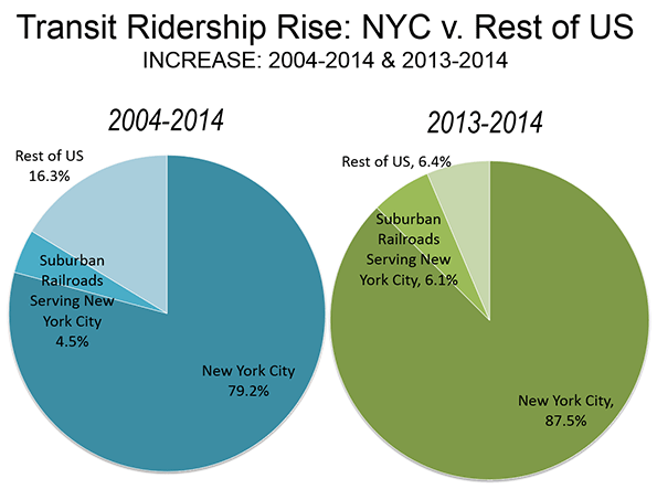
    Overall, the enormous system of buses and subways of New York City alone accounted for 88 percent of the national ridership increase from 2013 to 2014. If the ridership on the four large suburban rail systems that serve New York City (the Long Island Railroad, the Metro-North Railroad, New Jersey transit commuter rail, and the PATH trains) is added, City related transit accounts for 94 percent of the increase. A great achievement for the City, but not one that is being repeated in the rest of the nation.

    This is nothing new. National transit ridership has increased about 10 percent over the decade since 2004. Much of the increase — 79 percent — has been on New York City’s buses and subways. The suburban rail systems raise that total to 84 percent. This does not include the many commuter buses that enter the city especially from New Jersey and other suburbs, which cannot extracted from the data because it is not separately reported (Figure).

    New York’s transit turnaround has been nothing short of impressive. Nearly all of the nation’s progress in transit has been on a bus and subway system that carries one third of the national rides.

    The results have not been nearly so positive in the rest of urban America, where 30 times as many people live. While New York City related transit services experienced a ridership increase of 33% in the last decade, in the rest of the nation, the increase was less than three percent. Even huge ridership increases in New York City cannot make much of a difference nationally. In 2004, transit accounted for approximately 1.6% of urban travel. By 2014, it had risen to only 1.7%. Without taking anything from New York City’s impressive transit record, these results are not likely to be replicated elsewhere. New York City is a very unique place. It is home to the world’s second largest business district, after Tokyo, the area south of Central Park in Manhattan. Approximately 2 million peoplework in this small area, a number approximately four times the next largest central business districts, in Chicago and Washington.

    Approximately three quarters of Manhattan employees reach work by transit. This is 15 times the national average, New York City’s population density (excluding Staten Island, with its postwar suburbanization) is by far the highest and most extensive in the nation. The city of San Francisco comes the closest to New York City, with little more than half the population density and only 1/10 the total population.

    Transit is often suggested as a substitute for the car. The reality is that transit can compete with the car only to the largest downtowns. Destinations within the six transit "legacy cities," (not metropolitan areas) of New York, Chicago, Philadelphia, San Francisco, Boston, and Washington account for most of the nation’s transit work trips. And, 60% of these trips are to downtown.

    Transit cannot compete elsewhere, because travel times tend to be double those of the automobile (according to the American Community Survey) and it provides little practical access to most jobs.  University of Minnesota research indicates the average employee can reach fewer than 10 percent of jobs in less than one hour by transit in 46 major metropolitan areas. By contrast, approximately 65% of people who drive reach their jobs in less than 30 minutesby car in the major metropolitan areas. Building new rail systems doesn’t change the equation. At least 20 new urban rail systems have been built in the last four decades, though transit’s percentage of work trips has generally not improved, despite representations about reducing traffic congestion to the contrary. For example, in Portland, Washington, Los Angeles, Dallas-Fort Worth, and Atlanta, which have among the most extensive new rail systems, a smaller percentage of commuters use transit than before rail opened, when there were only buses.

    Even low income workers, who are often portrayed as "transit dependent," use cars much more than transit, and at a rate nearly equal to that of others in the labor force.

    Yet, transit funding advocates continue to seek even more money, claiming that transit can attract drivers from their cars and reduce traffic congestion. That may be true in New York City’s uniquely transit-friendly environment, but not elsewhere.

    Wendell Cox was a three-term member of the Los Angeles County Transportation Commission and chaired two APTA national committees. He is a public policy consultant in St. Louis and is a senior fellow at the Center for Opportunity Urbanism.

    Photo: Bart A car Oakland Coliseum Station

  • Is Suburbia Crashing? Suburban Traffic Myths Refuted

    Traffic crashes are a cause of ill health, impaired living or curtailed lifespan. Does city growth, in its sprawl-type outward expansion, increase the incidence of fatal and injurious crashes? This factor is the latest addition to numerous attempts to pin a correlation or causality linking traffic accidents with any number of causes.

    The twentieth century is not the only time in city evolution at which traffic accidents became a concern. Around the end of nineteenth century, when all in-city transportation was hoof and foot-dependent, accidents in cities were common.

    In New York, for example, 200 persons died in accidents in the year 1900, which, when transposed, means a 75 percent higher per capita rate than today. In Chicago the rate per horse-drawn vehicle in 1916 would be almost seven times the per auto rate in 1997.

    These are surprising, counter-intuitive statistics: the two cities, as all others at the time, were not just walkable, they were predominantly foot-based cities; exemplars of urbanism. No person had to cross six-lane arterials or dodge high-speed vehicles. Distances were short, city blocks small, densities high, and personal daily routine took place mostly on foot. It seems paradoxical that a walkable, dense, mixed-use city would generate high fatality rates; and more so because the speed of traffic ranged between 3 and 9 m/hr : half or less the 20 m/hr threshold beyond which fatalities increase. Without sidetracking for explanations, we can draw at least one simple idea from this past: a dense, foot-based city can generate high rates of fatalities.

    Soon after motorized transport entered city streets, fatal crashes rose. In the face of appalling and rising death figures, many adjustments occurred over a 30-year period. None of these changes involved urban form; they were inevitably operational and regulatory (e.g. lane markers, stop signs, driving rules, etc).

    In the U.S. during the first decades of the automobile’s presence on city streets, car accident rates fell rapidly even though car travel tripled between 1920 and 1955.

    During the same period the urban form characteristics remained fairly stable. The modest suburban expansion of cities at that time was light-rail dependent; “motopia” had yet to emerge . Most urban form of the ’30s and ’40s was generally similar to the early twentieth century prototypes: medium to high density compact development around a rail line or station with a core of amenities and services. It is nearly impossible to determine whether or not this form played a role in the drop in fatalities, due to the absence of concurrent alternative forms. When new “motopia” forms emerged, trends in fatalities did not bear out their influence.

    When automobile dominance was firmly established and new highways opened vast tracts of land for city growth, urban form at the city periphery changed decisively from compact, mixed use, walkable and transit-centered to typical “motopia” or “sprawl.”

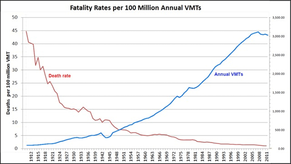
    Despite a Smart Growth America recent claim of a correlation between sprawl and an increase in fatal accidents and a small decrease in injuries, the traffic fatality rate actually decreased as U.S. cities sprawled and total VMTs increased.

    The current level of traffic fatalities stands at about one third of the 1955 level and less than 1/20 of the 1925 rate. Intriguingly, sprawl at the national scale did not produce an increase in fatal or total crashes as analysts predicted. If the sprawl paradigm did play its negative role, then other countervailing factors must have had a greater influence that overshadowed its effect.

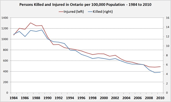
    The national trends in Canada mirror those of the U.S. Notably, fatal crashes fell at a faster rate than injuries, increasing the uncertainty about the correlation that links a substantial rise in fatalities with a rise in “sprawl-ness”. Provincial statistics show similar trends. The chart below shows the trends in Ontario, the most populous Canadian province:

    During a quarter century of more suburban expansion, fatalities and injuries followed a similar decline for a respective drop of around 70 percent in fatalities and about 60 percent in injuries; a substantial change. Like the national level statistics, provincial ones reinforce the uncertainty about a correlation between urban form and traffic fatality rates; instead of upward climb, we see an unmistakable decline.

    But what do statistics show at the finer, city scale?

    We turn to two – Toronto and Calgary – of six Canadian cities whose sprawl has been documented in detail. In spite of their anti-sprawl policies, in most the movement was retrograde, toward more sprawl.

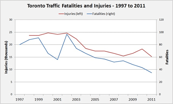
    The graph above shows Toronto’s trend in fatal crashes and injuries for the period of 1997 to 2011. Toronto during these 15 years can be characterized as a suburbanized region (with a few exurban appendices) that continues to expand using the conventional development model.

    In addition, Calgary, Alberta, the “car capital of Canada”, according to a Smart Growth report, has Canada’s lowest overall density; it remains a sprawled city. As with the national and provincial trends, the two cities’ traffic safety trends show a persistent overall drop in fatal and injurious accidents. Once more, the city-level fatalities and injuries trends contradict the correlation that links sprawl-type urban form with an increase in fatal accidents and a decrease in injuries. Whatever the countervailing factors are, they mask and overwhelm an expected rise in fatalities. As for the decrease in injuries, the actual drop is far greater than what the postulated correlation would predict and cannot be explained by it alone.

    If at the national, provincial and city levels the trends are positive in spite of the negative direction of urban form, the health concerns that would justify planning interventions appear to have been alleviated on this front, at least for the first century of automobility and for the half century of uninterrupted sprawl.

    One might speculate that had growth been in a compact, walkable, diverse use, transit-centered form, fatalities could have declined even faster. This could well be true but cannot be deduced from the above statistics. Regardless, the current trends could not be seen as a cause for concern and urgent action on the urban form front. On strictly health grounds, cities and provinces are progressing in the right direction. There is no apparent imminent or growing threat.

    So far we have seen the difficulty of explaining the persistent drop in traffic fatalities via a correlation with “sprawl-ness” and we hypothesized that other factors may be at work. Indeed they are. We find several in overlapping lists of international, national, provincial and city documents: some linked to the causes of fatal crashes, others as government directives. Here is a collection in no particular order of importance:

    Speed limit range/control
    Drinking and driving laws
    Young driver restrictions
    Intersection geometry
    Car crash-worthiness rating
    Car fitness regulations
    Road condition care
    Driving fitness/age
    Speeding penalties
    Vulnerable user protection
    Motorcycle helmets
    Seat belt use/air-bags
    Child restraints usage
    Pre-hospital, on-spot care
    Distraction prohibitions

    As one example of the potential effect of safety measures, NHTSA in 2005 estimated that 5,839 lives would have been saved in 2004 (or 14 percent of total car-related fatalities) if all passengers wore seat belts.

    Planning interventions can have multiple beneficial effects. On at least one front there is no cause for alarm or a rationale for a call to arms; the battle against traffic fatalities is being won, without urban form change. This does not suggest that a correlation between sprawl and the reduction in fatal and injurious crashes exists, or imply that sprawl is a desirable urban form. It simply means that the effect of urban form on crashes cannot be established unequivocally and therefore cannot be a lead driver for action.

    Fanis Grammenos heads Urban Pattern Associates (UPA), a planning consultancy. UPA researches and promotes sustainable planning practices including the implementation of the Fused Grid, a new urban network model. He is a regular columnist for the Canadian Home Builder magazine, and author of Remaking the City Street Grid: A model for urban and suburban development. Reach him at fanis.grammenos@gmail.com.

    After twenty-four years at Canada Mortgage and Housing Corporation, Tom Kerwin now leads an active volunteer life, including being the Science and Environment Coordinator for the Calgary Association of Lifelong Learners. He holds a Master’s degree in Environmental Studies from York University.

    A different version of this article appeared at SustainableCitiesCollective.

    Flickr photo by 7mary3: a car accident due to an unsafe lane change.

  • Behind the Driving Increase

    The Federal Highway Administration reported that driving increased 1.7 percent between 2013 and 2014 in the United States. This compares to virtually no increase over the period from 2004 to 2013. The 2014 increase will come as a disappointment to those who have perceived that the flat driving volumes of recent years signaled a shift in preferences away from driving. It had even been suggested that America had reached "peak car."

    Despite the congruity of such sentiments with urban planning orthodoxy, it’s somewhat risky to divine future economic trends from the perspective of a weak economy. It is rather like predicting future employment trends from realities of the late 1930s, when the world had still not climbed out of the Great Depression

    The problem for those who seek to replace the car is that the current form of cities, from Phoenix to Paris, requires cars to support the millions with middle-class standard of living. Of course, with a sufficient decline in the standard of living, cars could become less essential. After all, you don’t need a car to not go to work when you are unemployed.

    Nor is “peak oil” coming to rescue; we now live in something more like an oil glut. Even when prices were soaring, the amount of driving barely changed. People may have shifted to more efficient cars, they didn’t give up their cars, they just drove a little bit less.  

    The latest driving data may indicate that even the somewhat tepid recovery is speeding up in the United States. This combined with falling gasoline prices is likely to be why driving is increasing again.

    Employment Exceeds 2008 Level

    Employment is probably the most important factor in the recent recovery of car use

    According to data at the St. Louis Federal Reserve Bank "FRED" website, national employment peaked at 138.3 million in January 2008. By early 2010, employment had dropped to under 130 million. It took until April 2014 to restore the employment level that had been previously achieved more than six years earlier. This was the longest employment trough since before World War I, except for the period of 1929 to 1936, during the Great Depression.

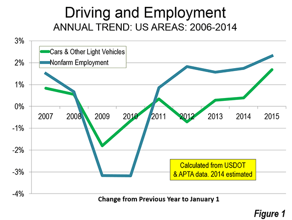
    As more people return to employment and incomes rise, driving can be expected to increase. During 2014, the nation’s nonfarm employment rose to the highest level in history. As the year progressed and employment increased, so did driving (Figure 1).

    But there is still a long way to go for the economy. The civilian labor force participation rate continues depressed. If early 2008 levels of labor participation were restored, there would be at least 10 million additional jobs.

    Falling Gasoline Prices

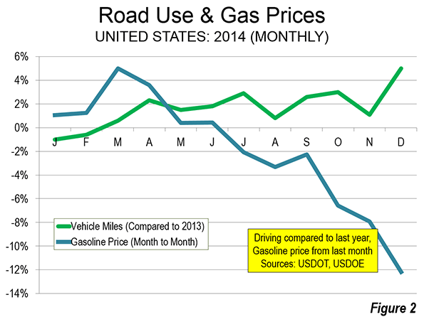
    US Department of Energy data indicates that the average price per gallon of gasoline rose by more than one half between 2005 and 2011. Until the middle for 2014, gasoline prices fluctuated around this level until early summer of 2014. Then the gas price reductions began. By the end of 2014, gasoline prices had dropped to near 2005 levels, which they actually reached in early 2015. Much of the 2014 increase in driving was concentrated since the decline in gasoline prices started in the last half of the year (Figure 2).

    Driving and Transit

    Ridership and road travel data also shows that there has been little relationship between the annual changes in driving and transit use over the period of the gas price increases and the subsequent decrease. Advocates of greater transit funding have claimed for decades that transit can be effective in attracting drivers from their cars. This was transit’s time.

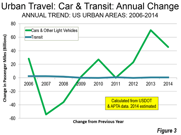
    However, the highly publicized transit ridership increases have been small in context and have shown virtually no relationship to the changes in automobile use in urban areas. This is illustrated in Figure 3. Driving volumes have risen and fallen, with little response in transit ridership. If there were a significant relationship between transit ridership and travel by car, the two lines on the chart would nearly follow one another. However, the lines show virtually no relationship. In relation to the actual changes in travel by car and light vehicle, the changes in transit are imperceivable. Transit ridership remains relatively small, at approximately two percent of all trips and five percent of work trips. An American Public Transportation Association (APTA) press release confirms the weak nexus between driving trends and transit for the most recent period. APTA notes that transit ridership late in the year increased despite the significant reduction in gasoline prices.

    Transit does not provide rapid mobility for most urban trips, which is why it has so little potential to attract people from cars. As higher prices force people to cut back on driving, they simply travel less, rather than getting on transit that cannot take them where they need to go in a reasonable time. That would be different if transit provided mobility competitive throughout the metropolitan area. Indeed, transit’s percentage of urban travel would be far above its current two percent. But to build out a system that reaches most jobs, of course, that would be financially prohibitive.

    Transit’s strength is downtown (the central business district, or CBD). The largest CBDs have employment densities are 100 times the urban average, and are well served by rapid, radial transit routes. In four of the nation’s largest CBDs — New York, Chicago, Boston and San Francisco — transit carries more than half of workers to their job, 77 percent in Manhattan alone. Americans use transit where it is competitive or superior to travel by car, which should dispel any notion that there is a national aversion to transit.

    But the city is much more than downtown. According to research by Lee and Gordon only eight percent of employment in the 48 largest metropolitan areas was in CBDs. This is despite the presence of impressive office towers that convey a sense of CBD dominance.

    Lee and Gordon also show that about 13 percent of jobs are in employment centers centers outside the CBDs, which are often called "edge cities." Because these centers do not have the radial networks of direct transit, even their high densities produce little in transit ridership.  My analysis of more than 80 post-World War II form suburban employment centers (mainly edge cities) indicated a transit work trip percentage of only 4.9 percent, which is approximately the national average for all areas. Transit’s share to the remaining nearly 80 percent of jobs dispersed throughout the metropolitan areas is just 4.6 percent.

    The basic problem is access. Outside of downtowns, few jobs can be conveniently reached by transit. This means transit takes about twice as long as driving alone and often is either not within walking distance of home or does not drop the passenger off within walking distance of work. This is illustrated by research at the University of Minnesota Accessibility Laboratory, which has shown that in 45 large metropolitan areas, only 10 percent of jobs can be reached by the average employee in 60 minutes by transit. By comparison, American Community Survey data indicates that nearly 65 percent of employees who drive alone in the same metropolitan areas actually reach work — and in half the time (30 minutes).

    Even low income workers, whose constrained budgets should make transit more attractive largely use cars to get to work.

    Driving and a Middle-Income Lifestyles

    I have referred before to the research that equates better economic performance with better mobility for people throughout the labor market (metropolitan area).

    Driving is not based on the shallow, arbitrary preference expressed in the threadbare cliché of a "love affair with the automobile." Cars are essential to realizing the aspirations of a majority of people, not only in the United States but in Europe and beyond.

    Wendell Cox is an international public policy consultant. He was appointed to three terms on the Los Angeles County Transportation Commission and chaired two American Public Transit Association (APTA) national committees (Policy & Planning and Governing Boards). Full biography is here.

  • Is Jakarta the World’s Most Congested City?

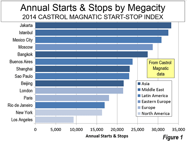
    The world’s second-largest city, Jakarta, is its most congested according to the Castrol Magnatec Stop-Start Index. The Start-Stop Index estimates the average number of starts and stops per vehicle in 78 cities around the world. Jakarta drivers had 33,240 starts and stops annually according to the survey. A higher number of starts and stops is associated with more intense traffic congestion and more intense greenhouse gas emissions per mile traveled. This is an indication of a roadway system that provides insufficient capacity for the travel demand (including commercial truck traffic). The Start-Stop Index did not include the world’s largest city, Tokyo–Yokohama.

    Measuring Traffic Congestion

    The Castrol Magnatic is one of three international traffic congestion measures that provide information over broad geographical areas. The other two indexes, the Tom Tom Traffic Congestion Index and the INRIX Traffic Scorecard provide measures of traffic congestion by travel time losses. These indexes generally follow the method pioneered by the Texas A&M Transportation Institute, the results of which are reported annually in its Urban Mobility Report.

    The Castrol Magnatic Start-Stop Index measures congestion by the number of starts and stops experienced by drivers. The three traffic congestion indexes also measure different geographies. The Tom Tom Traffic Congestion Index provides scores for cities in the United States, Canada, China, Australia, New Zealand, Europe, South Africa and Latin America. The INRIX Traffic Scorecard provides information on cities in the United States, Canada and Europe. The Castrol Magnatic Start-Stop Index provides by far the greatest geographical coverage, with data from the United States, Canada, China, Australia, New Zealand, Europe, South Africa, Latin America and Southeast Asia. However, over its larger geography, fewer cities are evaluated in this survey than in the Tom Tom and INRIX indexes.

    The state of traffic congestion reporting is has improved and it seems likely that the remaining portions of the world not yet reported upon will soon be added.

    Rating Starts and Stops

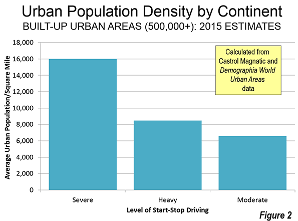
    The Castrol Magnatic Start-Stop Index relies on data automatically collected from its subscribers by traffic index publisher and vehicle navigation company, Tom Tom. Castrol Magnatic rates each city on a "three color" matrix. Cities with an average of more than 18,000 starts and stops annually are rated "red." This indicates a "severe" level of start-stop driving. The second level is "amber," with annual starts and stops between 8000 and 18,000. This is considered "heavy" level of start-stop driving. The least critical level is "green," which indicates a "moderate" level of start-stop driving.

    Megacities and Start-Stop Driving

    Fourteen of the worlds 34 megacities were included in the Start-Stop Index. The Start-Stop Index provides the first information for Jakarta, which has often been cited anecdotally for the worst traffic congestion, a title is now bestowed by Castrol Magntic. Some, but not all of the megacities have been previously rated with high levels of traffic congestion in the other indexes.

    Istanbul ranked second among the megacities with 32,520 starts and stops annually. This Istanbul was also second worst in the Tom Tom Congestion Index in 2013. Mexico City had 30,840 starts and stops annually. Mexico City was also among the most congested cities in the 2013 Tom Tom Congestion Index, ranking fifth.

    Moscow was the fourth most congested megacity in the Start-Stop Index, with nearly 29,000. Last year, Tom Tom ranked Moscow as having the worst traffic congestion.

    Like Jakarta, Bangkok has often been anecdotally cited for having the worst traffic congestion in the world. Traffic is bad in Bangkok, but ranks only fourth worst in the world in according to the Start-Stop Index, with approximately 27,500 stops and starts annually.

    Buenos Aires had the six the worst traffic congestion at nearly 24,000 stops and starts annually. Shanghai was rated seventh among the megacities with approximately 23,000 starts and stops, but did not make Tom Tom’s most congested 10.

    São Paulo was the eighth ranked megacity in nearly a tie with Shanghai. Sao Paulo was ranked seventh by Tom Tom.

    Beijing, London and Paris rounded out the 11 cities with severe start-stop driving levels ("red"), with at least 18,000. Beijing ranked as the ninth most congested megacity, the same as its Tom Tom ranking. London’s was ranked 10th among the megacities, compared to its the current "London Commute Zone" ranking of third worst in the INRIX Traffic Scorecard. Paris was not ranked in the worst 10 by either INRIX or Tom Tom.

    Three of the megacities had heavy start-stop driving levels ("amber"). Megacity Rio de Janeiro ranked 12th, compared to its third worst ranking by Tom Tom.

    It may come as a surprise to harried commuters, but the two American megacities were ranked least congested. New York ranked 13th. By far the lowest number of annual starts and stops registered for a megacity were in Los Angeles, at approximately 9,400. This is more than 40% better than for New York and is less than one third of the annual starts and stops in Jakarta (Figure 1). Los Angeles is currently rated as having the fourth worst congestion by INRIX, following Honolulu, Milan and the London Commute Zone, though is not ranked in the worst 10 by Tom Tom. The least congested ranking among the megacities for Los Angeles is at considerable odds with the near domination worst rankings for the three decades of the Texas A&M Transportation Center Urban Mobility Report  (which includes only US cities).

    The Developing World and the New World

    The developing world dominated the most congested rankings among all cities. Among the 10 most congested cities, only one high income city was included, Rome.

    Most of the other cities of the New World (Canada, Australia and New Zealand) had fewer than 10,000 starts and stops per year. This included Toronto, Melbourne, Sydney, Auckland and Wellington. The exceptions were Vancouver and Sydney, both with approximately 13,000 starts and stops per year. A number of smaller cities (below 500,000 population) also had fewer than 10,000 starts and stops per year, such as Tampere, Finland and Brno in the Czech Republic.

    Environmental and Economic Costs of High Density

    Generally, the worst start-stop congestion ratings are associated with cities that have higher urban population densities (Figure 2). This is consistent with the association of greater traffic congestion analysis with higher urban population densities,   also found in the Tom Tom Traffic Congestion Index and the INRIX Traffic Scorecard.

    More starts and stops impairs fuel economy, which also materially increases greenhouse gas emissions. Moreover, greater traffic congestion lengthens travel times. Economic growth is greater in where there is rapid mobility throughout the entire metropolitan area (labor market). Yet, urban plans often seek higher densities in their quest for reduced greenhouse gas emissions. The Castrol Magnatic Start-Stop Index results underscore the need for rational urban planning that takes into full account both the economic and environmental consequences of strategies that lead to greater traffic congestion.

    Wendell Cox is principal of Demographia, an international public policy and demographics firm. He is co-author of the “Demographia International Housing Affordability Survey” and author of “Demographia World Urban Areas” and “War on the Dream: How Anti-Sprawl Policy Threatens the Quality of Life.” He was appointed to three terms on the Los Angeles County Transportation Commission, where he served with the leading city and county leadership as the only non-elected member. He was appointed to the Amtrak Reform Council to fill the unexpired term of Governor Christine Todd Whitman and has served as a visiting professor at the Conservatoire National des Arts et Metiers, a national university in Paris.

    Photo: Jakarta: low capacity main artery from busway station (by author)

  • The Emerging New Aspirational Suburb

    Urban form in American cities is in a constant state of evolution. Until recent years, American suburbia was often built without an appreciation for future evolution. This has left many older suburbs in a deteriorated state, and has accelerated claims of a more generalized suburban decline.

    The Indianapolis suburb of Carmel represents a response to this historic pattern. While responding to today’s market demands with a new aspiration level designed to make it nationally competitive, it’s also trying to position itself for success tomorrow and over the longer term.

    This is a critical issue for many suburbs. Like big cities before them, many older suburbs have now aged, and no longer necessarily meet the requirements of the marketplace.  

    There are many reasons for this.  The early, usually small-scale Cape Cod-style housing common to many 50s vintage suburbs is not what today’s market is demanding. It’s the same for older enclosed malls – today “lifestyle centers” and other formats are preferred – many of which are now vacant, their grim remains featured on web sites such as DeadMalls.com. Many suburban areas were also built out with “infrastructure light” without upgraded streets, sidewalks, etc. leaving a big backlog of infrastructure need.

    Across the country many of these older districts have fallen into decay and become increasingly poor, taking on many of the characteristics of the inner city. As the Brookings Institution noted  over a decade ago, they “are experiencing some signs of distress—aging infrastructure, deteriorating schools and commercial corridors, and inadequate housing stock.”1 Today, the public is more aware of the trend, and events in Ferguson, MO recently gave a wakeup call to newer and still-thriving suburbs that they too may be troubled at some point.

    Like other American cities, Indianapolis has many of these older, struggling suburban areas. In its case, many of them are within the core city limits due to a 1970 city-county merger. As regional growth continues to expand outside the central urban county, newer generation suburbs have a chance to learn from the struggles of many of their predecessors.

    Carmel – pronounced like the Biblical Carmel – is the first suburb directly north of the city of Indianapolis. It is an upscale residential and business suburb similar to many others around the country such as Dublin, OH; Naperville, IL; and the Cool Springs, TN area.  Its 2013 population of 83,573 made it the 5th largest municipality in the state. While not monolithically wealthy, its 2013 median household income of $100,358 is the 14th highest in the United States among communities of 65,000 people or more.2 It’s a preferred area for the estate homes of wealthy Indianapolis area residents, such as Indianapolis Colts owner Jim Irsay. But it’s not just a bedroom suburb; real estate brokerage Cassidy Turley reports that the Carmel submarket has over six million square feet of office space.3

    Being located in the center of the favored quarter of the Indianapolis region, Carmel grew as an upscale area. This gives it a leg up in long term sustainability out of the gate.  

    Yet Carmel has not relied just on its wealth to insure against decline. Rather, it has embarked on a transformation program now nearly 20 years old from which three major themes emerge:

    1. Responding to current market forces to build a “state of the art” community that is competitive globally, not just within the Indianapolis region.

    2. Building a full spectrum of amenities and infrastructure to create a “complete city” with a high quality of life and intrinsic appeal that is a) not based solely on newness or low costs, and b) which has broad demographic appeal.

    3. Attempting to create unique cultural and regional attractions  to turn Carmel into a destination in its own right, as much city as suburb.

    The primary driver of this transformation has been Mayor Jim Brainard, a Republican currently in his fifth term.  Carmel long had top performing schools – it’s the top rated district in the state   – houses with generous yards, low taxes, and other standard attractors of suburbia. Previous administrations had put in place key policies such as reserving the Meridian St. corridor for high end office space and banning billboards. But Brainard brought numerous changes in Carmel during his tenure including:

    Annexation. Carmel has undertaken a series of annexations – nearly 20,000 acres since 2001 alone.4 With over 47 square miles of territory, Carmel has now largely achieved its desired geographic scale.

    Parks. Carmel’s park acreage increased from 50 to 1000 acres and it has spent heavily on building out its parks. This includes building a $55 million Central Park, which includes a showplace community and fitness facility called the Monon Center.5 And the popular Monon Trail, a rail-trail through the length of the city that extended a previous project built by the City of Indianapolis.
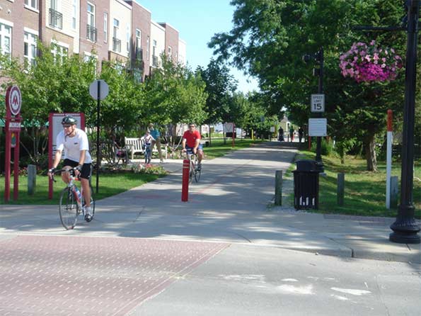

    Monon Trail at Main St.

    Road Infrastructure. Carmel has invested heavily in upgrading the legacy network of county roads that it overgrew. This includes an aggressive deployment of modern roundabouts. Carmel now has over 80 of these, more than any community in the United States.6 It has upgraded miles of collector roads to urban standards with enclosed drainage, curbs, extra-wide travel lanes, landscaped medians, eight foot multi-use side paths on both sides of the street protected by a landscaped buffer zone, and decorative street signs and other detailing.
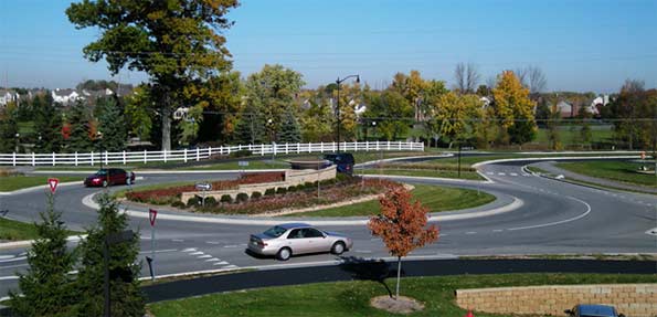
    Roundabout at Main St. and Illinois St. in the fall
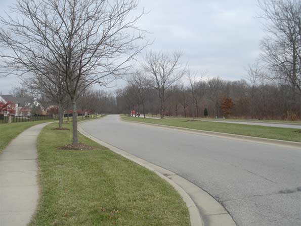

    An upgraded segment of River Rd. in early winter

    Two major state highways passed through the town, Meridian St. (US 31) and Keystone Ave. (SR 431). These were designed as rural style divided surface highways as is common in Indiana. Carmel convinced the state to relinquish Keystone Ave. to the city and give it $90 million for upgrades and future maintenance. Carmel converted this into a mostly free flowing parkway by spending $108 million to replace stoplight intersections with roundabout interchanges. These not only dramatically improved traffic flow, the bridges over the busy highway provided a high quality, safe connection – especially for pedestrians and bicyclists – connecting eastern and central Carmel, which had previously been separated by this “great wall” of a road. The state is currently performing a similar freeway upgrade on Meridian St., the principal office corridor.
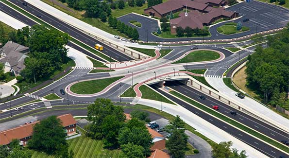

    Roundabout interchange at 126th St. and Keystone Parkway.

    Water and Sewer Upgrades. Part of Carmel previously received water from the Indianapolis water utility. The City of Indianapolis had privatized this utility but sought to repurchase it. Carmel intervened in the process to pressure Indianapolis into selling it the water lines inside Carmel. Carmel has since undertaken significant infrastructure upgrades such as new wells and pumping stations. During a recent summer drought, Carmel, unlike Indianapolis, did not put in place a mandatory restriction on lawn watering.7

    New Urbanism. Beyond core infrastructure, Carmel under Brainard has sought to change its style of development to embrace some of the more positive aspects of New Urbanism such as creating more urban nodes and walkability.

    Unlike some traditional railroad suburbs or county seats, the historic center of Carmel was very tiny, and its Main Street populated mostly with one story buildings and empty lots. This was the first focus area, and started with fixing the physical infrastructure.  

    The city rebranded the area as the “Arts and Design District” and utilized Tax Increment Financing to promote multi-story, mixed use development. The result is a mostly occupied and often well-patronized Main Street district. The surrounding historic residential blocks have seen significant redevelopment activity as well.
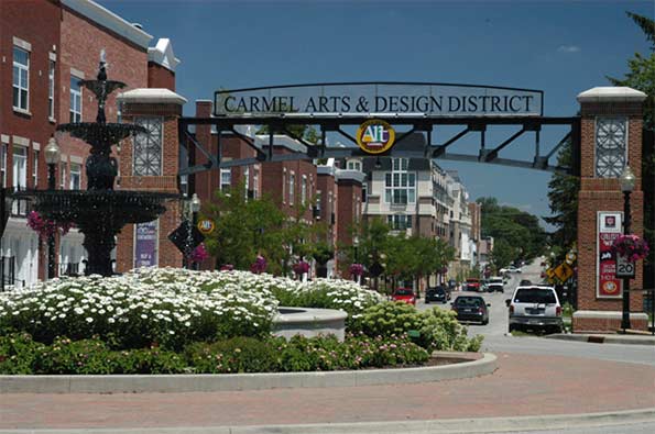

    Main St. at western fountain and gateway arch entryway to rebranded “Arts and Design Distrct.”

    Beyond the historic downtown, Carmel has also implemented multiple New Urbanist style zoning overlays, including on Old Meridian St. and Range Line Rd. (the city’s original suburban commercial strip). These promote mixed use development, buildings that front the street, and multi-story structures. Infrastructure improvements and TIF have been used in these areas as well. There’s also a major New Urbanist type subdivision in western Carmel called the Village of West Clay.
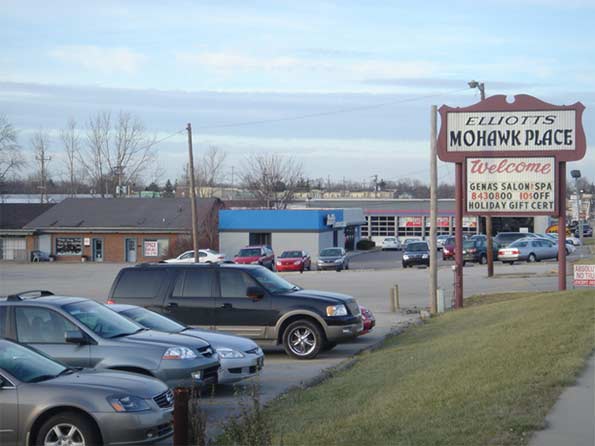
    Strip mall and traditional suburban development along Range Line Rd.
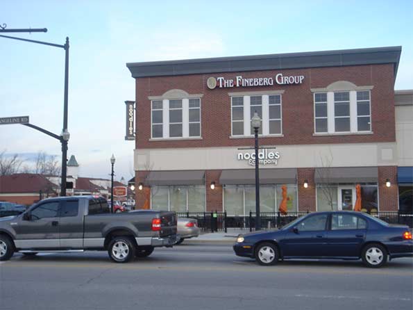

    New Urbanist style development along Range Line Rd.
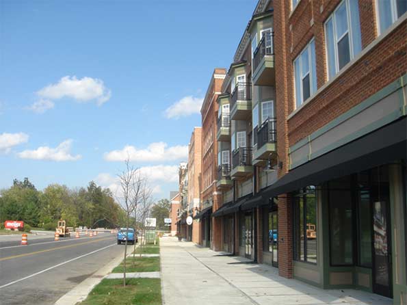

    New Urbanist development and street improvements under construction on Old Meridian St.

    The historic downtown was deemed too small to function effectively as the downtown of a city the size of Carmel today. The city thus decided to create a new downtown area called City Center. The location for this is an area south of the historic downtown area in an older suburban industrial zone that had fallen into a blight pattern. Much of it was vacant and what’s now the principal City Center development was built on the site of a failed strip mall. TIF was aggressively used here as well to redevelop the area.

    The City Center development is only partially complete. A veterans memorial and other civic spaces are complete, as are several small office buildings, apartments, and a large mixed use complex. The anchor is a publicly funded $175 million concert hall called the Palladium and an associated theater complex with three stages.8 While these are complete, significant development remains to complete the City Center vision. The city also wants to redevelop the area between City Center and the old downtown, which they now label Midtown, but very little has been done to date.
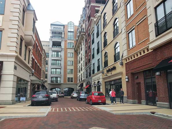

    Interior street of City Center development.

    The goal of all this development is not the full urbanization of Carmel; this city does not aspire to be dense metropolis, or even Indianapolis. It’s rather about creating more town center type districts with the walkable feel that’s increasingly in favor, but without compromising the fundamental suburban character of the city. It’s also designed to create a city with options. Having a diversity of development styles within the city is part of a strategy of appealing to a more diverse demographic base, including singles and retirees, not just the stereotypical younger family with kids. Traffic flow has been improved, but short trips are now easier to undertake by foot or bicycle, not just by car.

    Retro Architecture. Carmel has de facto mandated traditional architectural styles. There’s no one consistent style. Major buildings have been done in Georgian, Second Empire, and Neoclassical type designs. But modernism has been rejected, further differentiating suburban Carmel from urban areas that frequently elect for starchitecture that is unapologetically “of the now.”

    The city has also attempted to prevent large corporations from building their standard architectural templates. Brick is effectively mandated, even for big box retailers like Lowes. Retailers like CVS and Kentucky Fried Chicken were forced to build second stories on their structures to locate in certain areas. Another Carmel CVS has an art deco façade.

    The city wants high quality aesthetics and a unique sense of place. They also want “timeless” design, though like much New Urbanism architecture it can sometimes come across as pastiche.

    Arts and Culture. As part of the attempt to appeal to more arts minded middle aged consumers, as well as members of the  so-called “Creative Class,” Carmel has heavily invested in the arts. The City Center performing arts center was paid for almost entirely with public funds (TIF), an investment in the arts dwarfing even that of Indianapolis. The city has also paid for an extensive public art program, mostly statues by Seward Johnson. And it makes operating grants to local arts organizations such as the Carmel Symphony Orchestra.
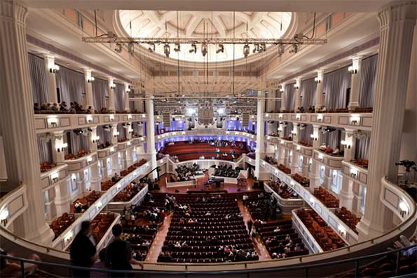

    Interior of the Palladium concert hall. Photo by Zach Dobson.

    Seward Johnson is not a favorite of urban sophisticates. His statutes illustrate the type of play it safe art generally featured by Carmel. More sophisticated or cutting edge fare is not as prevalent. And there have even been some complaints by a limited number of citizens about items such as the classical nudes featured on the door handles of the Evan Lurie Gallery.

    Brainard is thinking about the long term when Carmel is no longer the shiny new thing. As he put it, “Because we are designing a new city that will be in place for hundreds of years, the responsibility of doing it right falls to this generation…Carmel is a young city – we are still building our parks, trails, roads and sanitary sewer and water systems that will be here for centuries.”9

    He’s also keenly aware of global economic competition and the fact that Indiana lacks the type of geographic and weather amenities of other places. He frequently uses slides to illustrate this point. In one talk he said, “Now this picture, guess what, that’s not Carmel; but this picture is the picture of some of our competition. Mountains – that’s San Diego of course, mountains, beautiful weather, you know I think they have sunshine what, 362 days out of the 365…. What we’ve tried to do is to design a city that can compete with the most beautiful places on earth. We’ve tried to do it through the built environment because we don’t have the natural amenities.”10  While the claims to want to equal the most beautiful places in the world may be grandiose, the key is that mayor believes Carmel’s undistinguished natural setting and climate requires a focus on creating aesthetics through the built environment.

    What have the results been to date?  Economically and demographically, the city has performed well. It has managed to create an environment that is proving competitive for business opportunities that might have previously bypassed Indiana. For example, American Specialty Health relocated its headquarters to Carmel from San Diego, with the CEO of the company personally making the move from La Jolla to Carmel.11 Geico also recently expanded. Numerous other corporations are either based in Carmel or have major white collar facilities there. The income levels are very strong, as noted above.

    The city’s demographics have also expanded to become much more diverse. The minority population grew 295% between 2000 and 2010, adding 9,630 people and growing minority population share from 8.7% to 16.3%.12 12% of the city’s households speak a language other than English at home.13 Many of these are highly skilled Chinese and Indian immigrants working for companies like pharmaceutical giant Lilly. Even black professionals are increasingly moving to Carmel, with the black population growing 324% in the 2000s and black population share doubling to 3%.14 Carmel is not a polyglot city today, but it’s far more diverse than in the past.

    Carmel has also attracted both national press and national awards. Money magazine ranked Carmel as the #1 best small city to live in 201215, and it’s scored highly in other surveys as well. Drew Klacik of the Indiana University Public Policy Institute notes that in an echo of the transformation of the city of Indianapolis since the 1970s, “Carmel has transformed itself from a desirable community within Indiana to a desirable and competitive community nationally.”16

    However, it’s hard to argue that Carmel’s results materially outperform peer cities in other regions. Places like Dublin, OH and Cool Springs, TN have significantly more office space, for example. Many of those places are, however, implementing policies similar to those in Carmel . Most Carmel New Urbanist development continues to require TIF subsidies and is not yet sustainable at market rates. The city has obtained better financial terms in some recent deals, however.  And despite major public investment and construction in the central city, many central area census tracts lost population during the 2000s.

    The changes have also attracted significant criticism and opposition in some quarters.  While the public remains largely positive on the results, there have been many critiques of the way they were done, some of them legitimate.  A number of the projects had significant cost overruns. The mayor originally said that the Keystone project could be completed for the $90 million the state gave it. The actual cost was nearly $20 million higher.17 The Palladium was originally sold as an $80 million facility, but ended up costing $175 million. The city also said it planned to pay for ongoing operations by raising a $40 million endowment, but was unable to raise the funds, leaving it on the hook for $2 million in annual operating costs. These are not small misses.

    Critics also pointed to state figures showing Carmel with nearly $900 million in total debt.18 While it is a wealthy community that can afford the payments, in a conservative state like Indiana, a suburb accumulating nearly a billion dollars in debt raises eyebrows. Carmel’s tax rates remain among the lowest the state, however.

    The way the debt was accumulated has been criticized as well. The Palladium was paid for with TIF funds. Rather than bonds, the Carmel Redevelopment Commission – the authority that manages the TIF program and which was controlled by mayoral appointees – structured the Palladium debt as Certificates of Participation to circumvented the need for city council approval, incurring higher interest rates in the process. The city council later refinanced the debt at a lower rate using a general taxing power guarantee in what some called a bailout. In return for the refinancing, the council obtained more oversight over TIF activity.19

    Though some controversy is inevitable and some criticisms are legitimate, ultimately the change program in Carmel has proven popular with the public and the city is booming, a boom that’s lending an increasingly bitter tone to the longstanding hostility Carmel has enjoyed from the region due to its status as the highest profile “rich suburb” in the region.

    Yet for all the controversy, many regional suburbs are copying some aspects of Carmel’s approach, with roundabouts now a regular feature in area communities and major park programs and New Urbanist style town center developments as well. This includes the massive sports-oriented Grand Park in Westfield and the Nickel Plate District in next door Fishers’ town center.20

    It’s also clear that peer type suburbs around the country are adopting similar strategies, such as Dubin, OH’s Bridge Street Corridor proposal21 or Sugar Land, TX’s $84 million performing arts center.22 Imitation, they say, is the sincerest form of flattery. Carmel represents the leading edge of the emergence of a new type of post-Edge City aspirational suburb. It’s something we may be seeing a lot more of in the future.

    Aaron M. Renn is a senior fellow at the Manhattan Institute and a Contributing Editor at City Journal. He writes at The Urbanophile.

    ————————————-

    1 Robert Puentes and Myron Orfield. “Valuing America’s First Suburbs: A Policy Agenda For Older Suburbs in the Midwest,” Brookings Institution, 2002.

    2 U.S. Census Bureau, “American Community Survey 2013 1-yr”, Table B19013.

    3 Cassidy Turley, Indianapolis Office Market Snapshot (Third Quarter 2014), 3.

    4 Ellen Cutter. “Explaining the annexation process,” Greater Fort Wayne Business Weekly, June 12, 2014. Accessed January 8, 2015. http://www.fwbusiness.com/opinions/columnist/businessweekly/article_f42da036-6182-575a-8445-274cd82ca296.html

    5 Matthew VanTryon. “Carmel then and now: World’s Apart,” IndianapolisNewsBeat.com, December 16, 2014. Accessed January 8, 2015. http://blogs.butler.edu/multimedia-journalism/2014/12/16/carmel-worlds/

    6 James Brainard, transcript of speech at 2014 International Making Cities Livable Conference, June 23-27, 2013.

    7 “Why no watering ban in Carmel,” WISH-TV News, July 12, 2012. Accessed January 8, 2015. https://www.youtube.com/watch?v=y51BJYM4Fgc

    8 David Hoppe. “The Palladium’s boffo budget,” Nuvo Newsweekly, June 20, 2011. Accessed on January 8, 2015. http://www.nuvo.net/indianapolis/the-palladiums-boffo-budget/Content?oid=2275080

    9 James Brainard, notes for 2014 State of the City Address.

    10 James Brainard, transcript of speech at 2014 International Making Cities Livable Conference, June 23-27, 2013.

    11 Andrea Muirragui Davis. “Wellness provider beefing up new Carmel office,” Indianapolis Business Journal, October 29, 2014. Accessed on January 8, 2015. http://www.ibj.com/blogs/11-north-of-96th/post/50241-wellness-provider-beefing-up-new-carmel-office?id=11-north-of-96th

    12 U.S. Census Bureau, calculations by author from Census 2000 and Census 2010.

    13 U.S. Census Bureau, “American Community Survey 2013 1-yr”, Table B05007.

    14 U.S. Census Bureau, calculations by author from Census 2000 and Census 2010.

    15 “CNNMoney Ranks Americas Best Places to Live,” Daily Finance, August 20, 2012. Accessed January 8, 2015. http://www.dailyfinance.com/2012/08/20/cnn-money-ranks-americas-20-best-places-to-live/

    16 Drew Klacik, telephone interview with author, December 29, 2014.

    17 “Brainard seeks bonds to finish Keystone,” The Indianapolis Star, October 18, 2009. Accessed January 8, 2015. http://archive.indystar.com/article/20091018/LOCAL/910180409/Brainard-seeks-bond-finish-Keystone

    18 Indiana Department of Local Government Finance. “Local Government Debt Report,” September 21, 2012, 15.

    19 Kathleen McLaughlin. “Brainard seeks deal on maxed-out TIF,” Indianapolis Business Journal, March 31, 2012. Accessed January 8, 2015. http://www.ibj.com/articles/33569-brainard-seeks-deal-on-maxed-out-tif

    20 Cara Anthony. “New look for the Nickel Plate District in Fishers,” The Indianapolis Star, June 28, 2014. Accessed January 16, 2015. http://www.indystar.com/story/news/local/hamilton-county/fishers/2014/06/27/new-look-nickel-plate-district-fishers/11537251/

    21 Brent Warren. “Dublin Moves Ahead With Bridge Street Corridor Plans, Connecting Across River,” Columbus Underground, March 23, 2013. Accessed January 8, 2015. http://www.columbusunderground.com/dublin-moves-ahead-with-bridge-street-corridor-plans-looks-to-connect-across-river-bw1

    22 Rebecca Elliott. “Sugar Land breaks ground on $84 million performing arts center,” Houston Chronicle, December 9, 2014. Accessed January 12, 2015. http://www.houstonchronicle.com/neighborhood/fortbend/news/article/Sugar-Land-breaks-ground-on-84M-performing-arts-5946247.php