Tag: Transportation

  • Why Do We Care About Transportation Mode Share?

    The New York Times ran an op-ed piece that helpfully demonstrated the pitfalls of lifestyle arguments in favor of urbanism, namely that they are annoying to everyone but the people making the argument.

    The boys, like their father, are lean, strong and healthy. Their parents chose to live in New York, where their legs and public transit enable them to go from place to place efficiently, at low cost and with little stress (usually). They own a car but use it almost exclusively for vacations.

    “Green” commuting is a priority in my family. I use a bicycle for most shopping and errands in the neighborhood, and I just bought my grandsons new bicycles for their trips to and from soccer games, accompanied by their cycling father.

    These arguments – whether they’re about physical health, or “diverse” or “vibrant” or “creative” communities, or whatever else – are, at bottom, about telling people that they are lacking, and that in order to improve themselves they should become more like the author. In the 1970s, when city dwellers felt superior mainly because of their supposed cultural capital and were telling middle-class suburbanites to loosen up a little, that might have been obnoxious but harmless. In our current situation – when the city dwellers making these arguments are the economic elite (the author of this particular piece, Jane Brody, lives in gentrified brownstone Brooklyn, I believe) – it’s a lot more sinister. Brody talks about commutes as if their length and form were something that most people could freely choose, rather than something imposed upon them by their wages and the price of housing and form of development of their metropolitan area. She makes this a story about personal morality, rather than the constraints we choose to put on people through public policy.

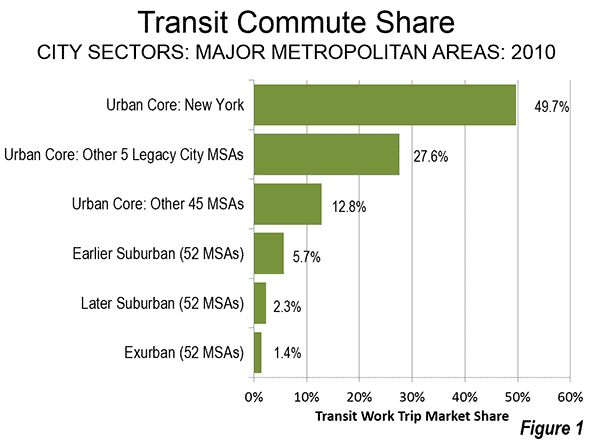
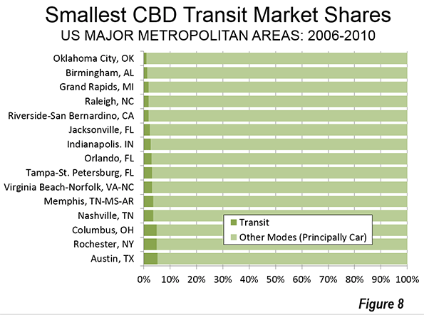
    This is related, I think, to the study about mode share in U.S. cities that got passed around the urbanist blogosphere recently. In virtually every instance, the study was presented like a sports power ranking, with the winning cities being those with the least travel by car (“city of Chicago ranks sixth among large U.S. cities for percentage of people either biking, walking, or riding transit,” is a typical formulation of the lede).

    But why, exactly, do we care about mode share? The pettiest possible answer is that we doconceive of cars v. transit/biking as a sort of culture war, just like many committed drivers have alleged, and what percentage of people choose to drive or do something else is how we measure whether or not we are winning. This, clearly, is not a particularly edifying possibility. A better answer might be that we really do want everyone else to be more like us – to reap the benefits of non-car commuting, from being healthier (although, contra Brody, I spent my subway commute today scarfing down a pound of spaghetti) to polluting less – and this tells us how many people are enjoying those perks.

    That’s much more reasonable, but still problematic in that, like the Times piece, it strongly implies that the issue is individual choice, rather than the circumstances that constrain that choice. The people who write for places like Streetsblog know that circumstances matter, but for the casual reader, articles about mode share makes those issues a sort of specialists’ background.

    That’s too bad, because mode share does convey some important information about constraints. If we assume that, allowing for some cultural margin of error, most people will choose to get to work via whatever method they find most efficient and comfortable, then we can determine roughly what percentage of people in any given city have decent access to transit – access that’s at least in the same ballpark of convenience as driving – just by looking at what percentage of people actually use it. Obviously there are complications to this: since one major inconvenience of driving is cost, cities with high poverty rates may have mode shares that exaggerate their transit’s effectiveness, for example. And since transportation choice is basically zero-sum on an individual basis – that is, all that matters is the relative efficiency of each mode – you could get a lot of people on transit by making driving truly hellish, without providing decent service. (Although in the American context, I think there are vanishingly few places where that would be an issue.)

    Moreover, if we care about mode share as a proxy for service effectiveness, then beyond a certain point – say, a quarter, a third, whatever, of commuters – you’re kind of done. It doesn’t really matter. If New York City, with one of the most comprehensive transit systems in the world, can only get 50% of its commuters on buses and trains, then surely most of the distinction between it and, say, Asian cities with much higher transit mode shares isn’t the quality of their systems (although they may be of higher quality), but the increased misery of driving in ever-denser places. The issue stops being whether we can get from 40% to 45%, but whether subregions of the metropolitan area have strongly varying mode shares, suggesting that you can only get decent access to transit if you live in the right place. And, of course, that is in fact the case.

    But if what really matters is service levels and access – if what we’re trying to accomplish is giving everyone a level of service where transit is a viable option, for reasons outlined here– then why not just measure that directly? Why not have widely-disseminated statistics about the percentage of people in every metropolitan region who can walk to a transit stop? Or make a bigger deal about the number of people who can reach some given percentage of metro area jobs via transit in a reasonable time frame? I almost never see those numbers in urbanist conversations, and to the extent that I do, they’re sort of ghettoized into the “social justice” urbanist subculture.

    But these seem like relevant numbers for “mainstream” urbanists, too. In fact, they seem a lot better than mode share. Generalized public arguments in favor of transit projects are more likely to benefit from language that suggests they’ll provide options, rather than language that suggests the ultimate goal of the policy is to force people out of their cars. Because, in fact, that’s what public policy should be about: making transportation easier for more people, rather than moralizing about the perfectly legitimate choices that people make, given their circumstances.

    This post originally appeared in City Notes on November 11, 2013. Daniel Hertz is a masters student at the Harris School of Public Policy at the University of Chicago.

    Image from BigStockPhoto.com: A metro bus in Madison, Wisconsin.

  • Germany Also Having Big Problems Building Infrastructure

    Der Spiegel had an interesting article recently called “Angry Germans: Big Projects Face Growing Resistance.” The article (linked version is English) talks about how it is increasingly difficult to get infrastructure projects built in Germany.

    Wherever ambitious construction ventures loom on the horizon in Germany — from the cities to the countryside, from the coastlines in the north to the Black Forest in the south — opponents are taking to the streets…. As the public’s enthusiasm for constant innovation has lessened, so has the appeal of these sorts of projects, and, as a result, they now inevitably come accompanied by picketers. Germany’s graying society, it seems, is so cozy and settled that it resists anything threatening to upset the status quo. In the process, it has lost sight of the bigger picture.

    There are a lot of key points in this article that immediately raised parallels to the United States, where infrastructure projects are also under increasing siege. In fact, some of this reminded me of elements of the Tea Party movement. The protestors are uninterested in compromise. They are devoted, full time activists who are unrelentingly opposed to the projects in question:

    [Hartmut] Binner’s form of protest has a radical undercurrent: Well-informed, confrontational and devoid of respect for authority, he is typical of the new grassroots activism spreading across Germany.
    ….
    Binner’s entire life revolves around the campaign. He monitors the routes of departing and landing planes. He plays his self-designed noise simulator on market squares. He kicks off his court appearances by singing the Bavarian national anthem. “If you want to be heard as a member of the public, you need to push the envelope,” he shrugs.

    These days, he sees grassroots protests, activism and political responsibility from a different perspective. “The typical protesters are gray-haired, know-it-alls and very networked,” [Freiburg Mayor Dieter Salomon] says. “But they’re not remotely interested in consensus-building, political processes and pluralism.”

    Grassroots groups have become so livid, intransigent and single-minded that even the most respected politician in the country, Angela Merkel, is feeling their sting. In early May, hundreds of furious residents had gathered in central Ingolstadt to protest against the construction of a power line from Bad Lauchstädt in Sachsen-Anhalt to Meitingen in Bavaria.

    This certainly reminds me of the no-compromises view of the Tea Party. Also, a number of early American Tea Party activists were unemployed, and thus able to basically be full time activists. Even the singing of national anthem has echoes of the Tea Party and their tricorn hats. I don’t want to claim there’s a philosophical or other link between the Tea Partiers and Germany, however.

    Not everything lines up with the Tea Party, however. In Germany it seems to be disproportionately retirees who are the most engaged and militant:

    Germany’s graying society, it seems, is so cozy and settled that it resists anything threatening to upset the status quo. In the process, it has lost sight of the bigger picture.

    Many of the protestors are pensioners with no vested interest in Germany’s future. “It’s striking that the leader of the protests against the Munich runway is a 75-year-old and not someone in the middle of his working life,” [Munich Airport CEO Michael Kerkloh] points out.

    Salomon’s nemesis is Gerlinde Schrempp, a determined and argumentative 67-year-old retired teacher with attitude to spare. She’s the leader of the Freiburg Lebenswert movement, which translates roughly to “make Freiburg worth living in. The movement just got elected on to the district council and is first and foremost opposed to any new building in the city.

    There’s a stereotype out there of the average Republican voter as an old white guy. But the average Tea Party activist I’ve seen tends to be working age. I look at this one a bit differently. We need to see these types of controversies against the substrate of an aging population. Aging populations are not noted for dynamism, and older people’s self-interest is better served by starving investment for the future in order to save money and avoid uncomfortable change in the present. As a country whose population is projected to decline into the future thanks to this demographic inversion, we are seeing in Germany what’s likely a preview of coming attractions elsewhere around the world.

    Indeed, I’m reminded of what one analyst friend of mine in Indiana has said about the property tax caps there. He sees the push to cap property taxes as driven by an aging population in a stagnant state. Old people generally aren’t earning a lot of taxable income nor are they buying huge amounts of stuff, so they are disproportionately less affected by income and sales tax hikes, whereas they often own homes and are hit hard by property taxes. Thus property tax caps serve as another income transfer mechanism from young to old, holding revenue constant. They are in part an artifact of an aging society. Disinvestment in infrastructure can be seen in the same light.

    But there’s another part of this that shines a light on yet another group of opponents, namely the intelligentsia.

    The term “Wutbürger” (“enraged citizen”) was coined during the Stuttgart 21 fiasco to describe people like Hartmut Binner, and much has been written about them since. They often aren’t the “common man.” According to the Göttingen Institute for Democracy Studies, they tend to be highly educated people with steady incomes and white collar jobs. And while protests movements of the past were often steered by sociologists, today their leaders are more likely to stem from the technical professions, the researchers found.

    When we look at opposition to infrastructure in the United States, at least certain types of infrastructure, we see a similar profile of people (though not necessarily technical) behind it. It’s the leftist intelligentsia that oppose the Keystone Pipeline, suburban highway projects, fracking, and many other types of things, often with a militant unwillingness to compromise similar to the Tea Party.

    As with Germany, this opposition is enabled by environmental reviews and public participation laws that, while they serve important public purposes, make it easy to delay projects for years through repeated objections and scorched earth litigation. Traditionally environmental lawsuits were associated with the left, but conservatives have started saying, why not us too? Hence litigation against San Francisco’s regional plan. The Hollywood densification plan was recently overturned by lawsuits, and lawsuits have plagued California’s proposed high speed rail line as well.

    Whatever the project, it’s sure that somebody on the left and/or the right hates it, and thus will do everything in their power to kill it, which probably means years of delays and untold millions in increased costs.

    Also as with the United States, German governments have shot themselves in the foot with a series of financial debacles:

    Political and bureaucratic bodies are partly to blame for their own diminished authority. Every major venture seems to entail spiraling costs. Berlin’s new airport was supposed to cost €1.7 billion, a price tag that has shot up to well over €5 billion. Meanwhile, the €187 million earmarked for the Elbphilharmonie concert hall under construction in Hamburg is expected to exceed €865 million by the time the project is completed. Albig is well aware how bad this looks. “People see us as financially incompetent,” he says.

    Until politicians can convince the public they have a handle on this, the taxpayer will remain rightly skeptical of many major megaprojects. This is doubly true since it’s very clear, as has been documented by folks like Oxford professor Bent Flyvbjerg, that in many of these cases the politicians were simply lying all along about the real costs.

    I’m not sure what all the takeaways are, but there are clearly many forces operating on a global basis to inhibit the development of infrastructure in the West.

    Aaron M. Renn is an independent writer on urban affairs and the founder of Telestrian, a data analysis and mapping tool. He writes at The Urbanophile, where this piece originally appeared.

    MittlererSchlossgartenKundgebung 2010-10-01” by MussklprozzOwn work. Licensed under CC BY-SA 3.0 via Wikimedia Commons.

  • Showing the Flag: The Transit Policy Failure

    David King has a point. In an article entitled "Why Public Transit Is Not Living Up to Its Social Contract: Too many agencies favor suburban commuters over inner-city riders," King, an assistant professor of urban planning in the Graduate School of Architecture, Planning and Preservation at Columbia University notes that transit spends an inordinate share of its resources on suburban riders, short changing the core city riders who cost transit agencies far less to serve and are also far more numerous. He rightly attributes this to reliance on regional (metropolitan area) funding initiatives. Many in transit think it is necessary to run near empty buses in the suburbs to justify the use of transit taxes to suburban voters (what I would refer to as "showing the transit flag")

    King asks: "So does public transit serve its social obligations?" He answers: "Increasingly the answer is no." King is rightly concerned about the disproportionate growth in spending on commuter rail lines that carry transit’s most affluent riders from deep in the suburbs to downtown. Transit policy has long been skewed in favor of the more affluent suburban dwellers in the United States.

    My Experience in Los Angeles

    I saw this first-hand as a member of the Los Angeles County Transportation Commission (LACTC). When we placed what was to become the first regional transit tax on the ballot (Proposition A in 1980), the shortage of transit service was critical in the highest demand, largely low-income areas of Los Angeles such as Los Angeles and East Los Angeles. I described the situation in a presentation to the annual conference of the American Public Transportation Association: "Often waiting passengers are passed at bus stops by full buses" Approximately 40 percent of the local bus services between the Santa Monica Mountains, Inglewood, Compton, Montebello and Santa Monica reached peak loads of 70 passengers, well above seating capacity

    At the same time, suburban area buses were usually less than half-full. In connection with this concern, I produced a policy paper, Distribution of Public Transit Subsidies in Los Angeles County, which was published in by the Transportation Research Board. The abstract follows: 

    "Public transit today is faced with the challenge of serving its clientele while subsidies are failing to keep pace with increasing operating costs. In Los Angeles County, there are service distribution inequalities–overcrowding and unmet demand in some areas and, at the same time, surplus capacity in other areas. To use subsidy resources efficiently requires that the effects of present subsidy allocation practices be understood–that is, how subsidies are translated into consumed service, both by type of service and by geographic sector within the urban area. An attempt is made to provide a preliminary understanding of that distribution in Los Angeles County. It is postulated that significantly more passengers are carried per dollar of subsidy in the central Los Angeles area than in other areas and local services require a lower subsidy per passenger than do express services. A number of policy issues are raised, the most important being the very purpose of public transit subsidies."

    Generally, transit operating subsidies per passenger were far higher in the suburbs than in the central area (where incomes are the lowest, and poverty rates the highest), and subsidies were much higher for commuter express services than for local bus services.

    I attempted to address this problem by proposing a "Mobility Policy" that would have reallocated service based on customer needs, giving precedence to areas where mobility was restricted due to limited automobile availability and lower incomes. Some colleagues whose constituents were disadvantaged by this inequity objected,  feeling compelled, it appeared, to rally about the “transit flag”

    On a Siding: Transit Policy in Recent Decades

    Since that time, Los Angeles and other major metropolitan areas have built expensive rail and busway systems. Despite the promises of attracting people out of their cars (routinely invoked during election campaigns for higher taxes), the reality is that single occupant commuting has risen from 64 percent in  1980 to 76 percent in 2012. Over the same period, transit’s share of urban travel has fallen, though stabilized in recent years at very low levels in most metropolitan areas. Indeed, when New York, Chicago, Philadelphia, Washington, Boston, and San Francisco are excluded (with their "transit legacy cities"), the 46 major metropolitan areas have a transit commute share of just three percent. Overall, more people work at home than commute by transit in 38 of these metropolitan areas and more people walk or cycle to work in 27, according to American Community Survey 2012 data.

    Yet the politically driven inequality in transit spending continues. Transit subsidies continue to be far higher for services that are patronized by more affluent riders. For example, subsidies (operating and capital expenditures minus fares) are three times as high for the commuter rail services, with their higher income riders, than for buses, with their lower income riders (Figure).

    The difference can be stark, as an example from the New York area indicates. A Fairfield County, Connecticut commuter rail rider with the median family income of $102,000 would be subsidized to the extent of $4,500 per year (assuming the national subsidy figure). By comparison a worker from the Bronx or Hudson County, New Jersey, with a poverty level family income of $18,500 per year (or less) would be subsidized only $1,500 per year. In fact, the bus subsidy would likely be even lower, because transit in lower income areas is much better patronized and thus less costly for the public. My Los Angeles research found inner city services to be subsidized approximately half below the average of all bus services (Note).

    Where Transit Works

    The functional urban cores contain the nation’s largest downtowns (central business districts). Their population densities are nearly five times that of the older suburbs and nine times that of the newer suburbs. The functional urban cores have transit market shares six times that of the older suburbs and 15 times that of the newer suburbs. Yet, it is in these poorer, denser areas where overcrowding is most acute and the need for more service is most acute. In Los Angeles, for example, the greatest potential for increasing transit ridership is where ridership is already highest.

    The vast majority of suburban drivers are not plausible candidates for transit, simply because it cannot compete well with automobiles, except, for example, for some trips to the downtowns of the six transit legacy cities (which account only one of seven jobs in their respective metropolitan areas).

    Where transit makes sense, people ride. Where it doesn’t, they don’t. Allocating resources inconsistent with this reality impairs the mobility of lower income residents, wastes resources and relegates transit to an inferior role in the city. Charging the affluent fares well below the cost of service compromises opportunities to serve more people in the community.

    Better allocation of transit resources would likely improve core area unemployment rates by increasing the number of jobs that can be accessed by lower income workers. Further, because the better used services would require lower subsidies, there would be funding available for additional service expansions.

    The principal fault is not that of transit management. It’s the politics.

    —–

    Note: These data (expenditures per boarding) are estimated from Federal Transit Administration and American Public Transportation Association data for 2012. Commercial revenues other than fares are excluded (the most important such source is advertising). Debt service is also excluded because it is not reported in the annual reports of either organization. The subsidy ratios between lower income and more affluent riders would be changed by including transfers (though the subsidies would still be considerably higher for the more affluent). Some low income riders use more than one bus or rail vehicle for their trip, while some commuter rail riders transfer to bus or rail services at one or both ends of their trips. No readily available data is available to make such an adjustment. The New York area example assumes 225 round trips per year.

    —–

    Wendell Cox is principal of Demographia, an international public policy and demographics firm. He is co-author of the “Demographia International Housing Affordability Survey” and author of “Demographia World Urban Areas” and “War on the Dream: How Anti-Sprawl Policy Threatens the Quality of Life.” He was appointed to three terms on the Los Angeles County Transportation Commission, where he served with the leading city and county leadership as the only non-elected member. He was appointed to the Amtrak Reform Council to fill the unexpired term of Governor Christine Todd Whitman and has served as a visiting professor at the Conservatoire National des Arts et Metiers, a national university in Paris.

    Photo: Bart A car Oakland Coliseum Station

  • The Evolving Urban Form: Chongqing

    No city in the world is so misunderstood by analysts and the press. It is commonly asserted Chongqing is the largest city in the world. In reality it barely makes the top 50, ranking 47th.

    Cities (Shi) in China are Regions and Mostly Rural

    It is fundamentally a problem of semantics and a failure to comprehend the nuances of urban geography in China. The country is divided into provinces and their equivalents, which are in turn, divided into prefectures, most of which are "shi," "Shi" translates into English as "city." However, shi are completely different from any English conception of a city as "an inhabited place of greater size, population, or importance than or village" (per Merriam Webster).

    There approximately 300 shis and other prefectures (sub-provincial jurisdictions) in China. In contrast, there are approximately 10 times as many sub-state jurisdictions (counties) in United States, which has a land area slightly larger than that of China. China’s shi and other prefectures are thus very large. They are really more like regions in English. Virtually all shi are predominantly rural, rather than urban in their land use.

    Reporters often marvel at the many cities in China of more than 1,000,000 population. Yet many of these are nothing more than broad expanses of rural areas without large urban settlements. Take, for example, Bazhong, a "shi" of 3.3 million residents in Sichuan province. The largest urban settlement occupies just 5 square miles (13 square kilometers), roughly the same land area as Goodland, Kansas (a city of fewer than 5,000 residents). Bazhong shi’s population is spread across a virtually 100 percent rural landscape of 4,700 square miles (12,300 square kilometers).

    Chongqing in Context

    Chongqing is a shi, and is administered as a province by the national government, as also are Shanghai, Beijing and Tianjin. The province of Chongqing covers 32,000 square miles (82,500 square kilometers). This is nearly equal to the land area of Austria and more than the area of the state of Maine. No city in the world is as large as Austria.. The New York urban area comes the closest to Chongqing’s size at 4,500 square miles (11,600 square kilometers), one-seventh the land area of Chongqing.

    Not a Metropolitan Area

    Nor is it appropriate to consider the province of Chongqing as a metropolitan area (labor market). It is simply too large for that. Commuters from the Chongqing’s "Southeast Wing" would have to travel up to 5 hours, mainly on the China’s 75 mile per hour (120 kilometer per hour) freeway system to reach work in the Chongqing urban area. From the outer reaches of Chongqing’s "Northeast Wing," travel times could exceed 8 hours, again largely by 75 mile per hour freeway.

    A Largely Rural, Not Urban Province

    The province of Chongqing is predominantly rural yet The Guardian persists in telling us that "Chongqing is the fastest-growing urban centre on the planet. Its population is already bigger than that of Peru or Iraq." Not so. The 2010 Census of China placed the province of Chongqing’s population at 28.8 million, smaller than both Peru and Iraq and with fewer people than in 1990. The urban center (genuine city) of Chongqing does not reach a quarter the size of either Peru or Iraq.

    The Guardian is by no means alone. Time magazine cluelessly fawned "Virtually overnight, Chongqing has become the largest city not only in China, but in the world," Wired similarly misfired with indicating in a 2008 article that Chongqing (at 32 million population) was the "fastest-growing urban center on Earth." For all the supposed growth, not a soul was added to Chongqing province during the 2000s, as is described below.

    Not all media outlets, however, have been captured by the same fallacy as The Guardian, Time, Wired and many others. To its credit, the BBC went to considerable lengths to correct this and similar errors about the population of Chongqing. An Atlanticarticle also parsed the issue well.

    Losing Population

    In reality Chongqing lost 1.7 million people between 2000 and 2010, 5.5 percent of its population. This is significant. By contrast, the municipality of Chicago lost 6.9 percent over the same period, a loss that was considered devastating. It is not surprising that Chongqing is losing population, given its principally rural nature. Much of rural China is emptying out, as people migrate to the cities for economic opportunity (which is the very purpose of cities), just as they have done in previous decades and the last two century throughout higher income nations. Every year over the past decade, the province experienced an annual decline of 170,000, not the half-million increase reported by The Guardian. The actual urban center (not the imaginary urban center reported on by The Guardian) is gaining in population, but nothing like "half a million" per year.

    The Genuine City of Chongqing

    There is, however, a genuine city of Chongqing. Surprisingly reminiscent of Pittsburgh, Chongqing is it nestled among elongated folded mountains that are near duplicates of those near the Pennsylvania city. The city is at the confluence to two rivers, the Yangtze and the Jialing. Like the Pittsburgh’s Golden Triangle where the Allegheny and Monongahela Rivers meet, Chongqing’s has an attractive open space at Chaotianmin where the two rivers meet. Finally, as in Pittsburgh, there is an impressive, high rise central business district behind the open space. This is the best example in China of a monocentric central business district typical of many US cities (downtown Shanghai and Nanjing are similar, but more spread out).

    The Chongqing urban area covers little more than 1/100th of the province’s land area (Figure 1) and contains less than one-quarter of the population (Figure 2). Yet the Chongqing urban area is still large. According to the 10th Annual Edition of Demographia Urban Areas, Chongqing has a 2014 population of 6.8 million living in a land area of 340 square miles (890 square kilometers). The urban population density is 19,600 per square mile (7,700 per square kilometer), which is about one third higher than the larger urban area average of 14,900 per square mile (5.700 per square kilometer) found across China. This is more than double the density of the Paris urban area, triple the density of the Los Angeles urban area and six times that of Portland.

    The "One Hour Economic Circle:" The Future Metropolitan Area

    Chongqing’s administration has a vision of a much larger city. The urban plan is concentrated on the "One Hour Economic Circle," defined as within "one hour’s driving distance." This area includes 23 of Chongqing’s 40 divisions (counties and urban districts, or qu’s), with a land area of 11,000 square miles (28,600 square kilometers), more than 1.5 times the size of the Paris metropolitan area (aire urbaine) and slightly larger than New York. The 2010 census counted a population of 17.6 million in the One Hour Economic Circle, but most of it still rural. Outside the One Hour Economic Circle, in what is called the "Northeast Wing" and the "Southeast Wing," the rural influence is even greater.

    The intent of the urban plan is to broaden the economic influence of the urban area. This would involve substantial increases in economic interchange (principally commuting) with the balance of the One Hour Economic Circle, now decidedly rural.

    Within the One Hour Economic Circle, the large rural population suggests the potential for in-situ urbanization could also contribute to economic growth as migration, as rural residents are afforded opportunities to adopt urban lifestyles (as has occurred in Quanzhou and other urban areas, especially in the province of Fuzhou).

    Population Trends 2000-2010

    The divisions (qu) that encompass the urban area are growing, even though the core is losing (Yuzhong qu). In contrast, the metropolitan area had a population of 8.0 million in 2010, up 19 percent from 2000. This is not particularly rapid growth for China. Nearly 20 metropolitan areas grew twice as fast from 2000 to 2010. Nearby Chengdu, the capital of Sichuan, grew 2.5 times as fast as Chongqing.

    Outside the metropolitan area, the One Hour Economic Circle experienced a population loss of 12 percent. As a result of this loss, the One Hour Economic Circle had only a negligible population increase of 0.1 percent between 2000 and 2010 (Figure 3).

    The Future

    At the presently projected United Nations growth rate, the Chongqing urban area would add nearly one quarter to its population by 2025. But under this pattern Chongqing will barely hold its own, but remain in the top 50 world urban areas. Yet, the city has grand plans. There are nationally and locally designated economic zones, and lower business costs encouraging commerce to move west in China. As a province and urban area directly administered by Beijing, Chongqing could be positioned for both strong population and economic growth. Yet, it remains an open question whether Chongqing will emerge as one of China’s major growth centers.

    —————-

    Note: Shi are divided into county level jurisdictions, such as qu (urban districts), counties (rural districts) and count level shi.

    ——-

    Wendell Cox is principal of Demographia, an international public policy and demographics firm. He is co-author of the “Demographia International Housing Affordability Survey” and author of “Demographia World Urban Areas” and “War on the Dream: How Anti-Sprawl Policy Threatens the Quality of Life.” He was appointed to three terms on the Los Angeles County Transportation Commission, where he served with the leading city and county leadership as the only non-elected member. He was appointed to the Amtrak Reform Council to fill the unexpired term of Governor Christine Todd Whitman and has served as a visiting professor at the Conservatoire National des Arts et Metiers, a national university in Paris.

    Photo: Downtown Chongqing (by author)

  • New York, Legacy Cities Dominate Transit Urban Core Gains

    Much attention has been given the increase in transit use in America. In context, the gains have been small, and very concentrated (see: No Fundamental Shift to Transit, Not Even a Shift). Much of the gain has been in the urban cores, which house only 14 percent of metropolitan area population. Virtually all of the urban core gain (99 percent) has been in the six metropolitan areas with transit legacy cities (New York, Chicago, Philadelphia, San Francisco, Boston, and Washington).

    In recent articles, I have detailed a finer grained, more representative picture of urban cores, suburbs and exurbs than is possible with conventional jurisdictional (core city versus suburban) analysis. The articles published so far are indicated in the "City Sector Articles Note," below.

    Transit Commuting in the Urban Core

    As is so often the case with transit statistics, recent urban cores trends are largely a New York story. New York accounted for nearly 80 percent of the increase in urban core transit commuting. New York and the other five metropolitan areas with "transit legacy cities" represented more than 99 percent of the increase in urban core transit commuting (Figure 1). This is not surprising, because the urban cores of these metropolitan areas developed during the heyday of transit dominance, and before broad automobile availability. Indeed, urban core transit commuting became even more concentrated over the past decade. The 99 percent of new commuting (600,000 one-way trips) by transit in the legacy city metropolitan areas was as well above their 88 percent of urban core transit commuting in 2000.

    New York’s transit commute share was 49.7 percent in 2010, well above the 27.6 percent posted by the other five metropolitan areas with transit legacy cities. The urban cores of the remaining 45 major metropolitan areas (those over 1,000,000 population) had a much lower combined transit work trip market share, at 12.8 percent.

    The suburban and exurban areas, with 86 percent of the major metropolitan area population, had much lower transit commute shares. The Earlier Suburban areas (generally median house construction dates of 1946 to 1979, with significant automobile orientation) had a transit market share of 5.7 percent, the Later Suburban areas 2.3 percent and the Exurban areas 1.4 percent (Figure 2).

    The 2000s were indeed a relatively good decade for transit, after nearly 50 years that saw its ridership (passenger miles) drop by nearly three-quarters to its 1992 nadir. Since that time, transit has recovered 20 percent of its loss. Transit commuting has always been the strongest in urban cores, because the intense concentration of destinations in the larger downtown areas (central business districts) that can be effectively served by transit, unlike the dispersed patterns that exist in the much larger parts of metropolitan areas that are suburban or exurban. Transit’s share of work trips by urban core residents rose a full 10 percent, from 29.7 percent to 32.7 percent (Figure 3).

    There were also transit commuting gains in the suburbs and exurbs. However, similar gains over the next quarter century would leave transit’s share at below 5 percent in the suburbs and exurbs, because of its small base or ridership in these areas.

    Walking and Cycling

    The share of commuters walking and cycling (referred to as "active transportation" in the Queen’s University research on Canada’s metropolitan areas) rose 12 percent in the urban core (from 9.2 percent to 10.3 percent), even more than transit. This is considerably higher than in suburban and exurban areas, where walking and cycling remained at a 1.9 percent market share from 2000 to 2010.

    Working at Home

    Working at home (including telecommuting) continues to grow faster than any work access mode, though like transit, from a small base. Working at home experienced strong increases in each of the four metropolitan sectors, rising a full percentage point or more in each. At the beginning of the decade, working at home accounted for less work commutes than walking and cycling, and by 2010 was nearly 30 percent larger.

    The working at home largest gain was in the Earlier Suburban Areas, with a nearly 500,000 person increase. Unlike transit, working at home does not require concentrated destinations, effectively accessing employment throughout the metropolitan area, the nation and the world. As a result, working at home’s growth is fairly constant across the urban core, suburbs and exurbs (Figure 4). Working at home has a number of advantages. For example, working at home (1) eliminates the work trip, freeing additional leisure or work time for the employee, (2) eliminates greenhouse gas emissions from the work trip, (3) expands the geographical area and the efficiency of the labor market (important because larger labor markets tend to have greater economic growth and job creation, and it does all this without (4) requiring government expenditure.

    Driving Alone

    Despite empty premises about transit’s potential, driving remains the only mode of transport capable of comprehensively serving the modern metropolitan area. Driving alone has continued its domination, rising from 73.4 percent to 73.5 percent of major metropolitan area commuting and accounting for three quarters of new work trips. In the past decade, driving alone added 6.1 million commuters, nearly equal to the total of 6.3 million major metropolitan area transit commuters and more than the working at home figure of 3.5 million. To be sure, driving alone added commuters in the urban core, but lost share to transit, dropping from 45.2 percent to 43.4 percent. In suburban and exurban areas, driving alone continued to increase, from 78.2 percent to 78.5 percent of all commuting.).

    Density of Cars

    The urban cores have by far the highest car densities, despite their strong transit market shares. With a 4,200 household vehicles available per square mile (1,600 per square kilometer), the concentration of cars in urban cores was nearly three times that of the Earlier Suburban areas (1,550 per square mile or  600 per square kilometer) and five times that of the Later Suburban areas (950 per square kilometer). Exurban areas, with their largely rural densities had a car density of 100 per square mile (40 per square kilometer).

    Work Trip Travel Times

    Despite largely anecdotal stories about the super-long commutes of those living in suburbs and exurbs, the longest work trip travel times were in the urban cores, at 31.8 minutes one-way. The shortest travel times were in the Earlier Suburbs (26.3 minutes) and slightly longer in the Later Suburbs (27.7 minutes). Exurban travel times were 29.2 minutes. Work trip travel times declined slightly between 2000 and 2010, except in exurban areas, where they stayed the same. The shorter travel times are to be expected with the continuing evolution from monocentric to polycentric and even "non-centric" employment patterns and a stagnant job market (Figure 5).

    Contrasting Transportation in the City Sectors

    The examination of metropolitan transportation data by city sector highlights the huge differences that exist between urban cores and the much more extensive suburbs and exurbs. Overall the transit market share in the urban core approaches nine times the share in the suburbs and exurbs. The walking and cycling commute share in the urban core is more than five times that of the suburbs and exurbs. Moreover, the trends of the past 10 years indicate virtually no retrenchment in automobile orientation, as major metropolitan areas rose from 84 percent suburban and exurban in 2000 to 86 percent in 2010. This is despite unprecedented increases is gasoline prices and the disruption of the housing market during worst economic downturn since the Great Depression.

    —————————-

    Wendell Cox is principal of Demographia, an international public policy and demographics firm. He is co-author of the "Demographia International Housing Affordability Survey" and author of "Demographia World Urban Areas" and "War on the Dream: How Anti-Sprawl Policy Threatens the Quality of Life." He was appointed to three terms on the Los Angeles County Transportation Commission, where he served with the leading city and county leadership as the only non-elected member. He was appointed to the Amtrak Reform Council to fill the unexpired term of Governor Christine Todd Whitman and has served as a visiting professor at the Conservatoire National des Arts et Metiers, a national university in Paris.

    Photograph: DART light rail train in downtown Dallas (by author)

    —————————-

    City Sector Note: Previous articles in this series are listed below:
    From Jurisdictional to Functional Analyses of Urban Cores & Suburbs
    The Long Term: Metro American Goes from 82 percent to 86 percent Suburban Since 1990
    Functional v. Jurisdictional Analysis of Metropolitan Areas
    City Sector Model Small Area Criteria

  • Composite Traffic Congestion Index Shows Richmond Best

    It is important that traffic congestion be controlled sufficiently to facilitate a more competitive metropolitan economy. Each year, three organizations produce traffic congestion reports, Tom Tom, INRIX and the Texas Transportation Institute of Texas A&M University (TTI). These reports use  different methods to estimate the excess time lost in traffic congestion during peak travel periods (morning and evening week day "rush hours").   

    The excess travel time is estimated relative to the travel time that would be expected if there were no congestion (if all traffic were free flowing). Economists caution that achieving free flow conditions at all times would require excessive investment. Yet, the standard metric used by the three indexes are useful for comparing the intensity of traffic congestion between metropolitan areas even without knowing the level at which economic efficiency is optimized.

    There is generally strong correlation between the three indexes, though there are important differences. For example, the TTI report uses data from INRIX, yet agrees with INRIX on only six of the most congested 11 US major metropolitan areas (over 1 million population). The most substantial difference is in San Francisco, which INRIX (and Tom Tom) ranked as the second most congested major metropolitan area, far worse than the TTI ranking of 20th.

    The findings from the three traffic congestion indexes are synthesized into a composite congestion index in this article. Because the TTI’s latest index is 2011, composite index covers 2011 through 2013 (for methodology, see Note 1).

    Worst Traffic Congestion in 2011-2013

    The "10 worst traffic congestion" list includes some of the largest metropolitan areas, those with the highest urban population densities and a few smaller metropolitan areas with special traffic congestion inducing conditions (Figure 1).

    Los Angeles has the worst traffic congestion in each of the three indexes (44.4% excess travel time). This is consistent with the now 30 year history of TTI, which has typically shown Los Angeles to have the worst traffic congestion. This is not surprising, since Los Angeles is the densest urban area in the nation, ahead of second place San Francisco by 10 percent and New York by 30 percent. Traffic congestion has been made worse by cancellation of planned freeways and freeway segments in the Los Angeles area, such as the Beverly Hills Freeway, the Slauson Freeway, the Reseda Freeway, the La Cienega Route 170 freeway, the South Pasadena "missing link" and others (Note 2).

    Austin ranked second in traffic congestion (34.5%). This may be surprising, since Austin is not among the largest major metropolitan areas, though it is among the fastest growing. In the middle 1950s, when the final plans for the interstate freeway system were completed, Austin was much smaller and only a single interstate route was justified. Later, opposition to freeway development led to increased congestion. In more recent years the Austin freeway system has been augmented by new toll roads, though roadway improvements have not been sufficient to deal with the rapidly rising demand.

    Not surprisingly, San Francisco (34.4%), with the second highest urban density among major metropolitan areas, ranked third in traffic congestion. New York (33.4%), with its higher than average density and dense core area ranked fourth in traffic congestion. Seattle ranked fifth (32.4%), despite its somewhat lower urban density. Seattle’s long and relatively narrow north-south urban form and modest north-south freeway capacity is an important contributor to its intense traffic congestion. As in the case of Los Angeles, some planned freeways were canceled, which has also exacerbated traffic congestion.

    San Jose is a smaller major metropolitan area, yet has the sixth worst traffic congestion in the nation (32.2%). There are two principal contributing factors, its proximity to much larger San Francisco and the third highest urban density of the major metropolitan areas, 10 percent above New York.

    Washington (31.3%) and Boston (29.7%) have the seventh and eighth worst traffic congestion respectively. In each case, core areas have little freeway capacity (in part because of freeway cancellations in both cities).

    Houston, which had the worst traffic congestion the nation during the middle 1980s, now ranks much better, at ninth (28.3%). Houston’s improvement has occurred because of the roadway expansions opened concurrent with some of the fastest population growth in the high income world over the past three decades.

    Portland, like San Jose and Austin is not among the larger major metropolitan areas. Yet Portland ranked 10th in traffic congestion (28.2%). Portland’s policies, such as densification, have contributed to this; these include a cancelled freeway and a preference for light rail over highway capacity expansion. According to the TTI index, Portland has seen its peak period congestion ranking rise from 47th worst (out of 100) in the middle 1980s to 6th worst in 2011.

    Least Traffic Congestion in 2011-2013

    The major metropolitan areas with lower levels of congestion tend generally to be smaller and to have lower urban population densities (Figure 2).

    Richmond is the least congested major metropolitan area in the nation (8.7%), and has experienced growth since 2000 that is greater than average. Kansas City had the second least traffic congestion (10.9%), while nearly stagnant growth Rochester (11.5%) and Cleveland (12.9%) ranked third and fourth. Faster growing Salt Lake City ranked fifth (13.3%). Population losing Buffalo ranked sixth (13.5%) edged out seventh ranked and slow growing St. Louis (13.5%). Faster growing Oklahoma City ranked eighth (13.7%), while slower growing Memphis ranked ninth (14.1%). Indianapolis (14.4%), one of the few Midwestern metropolitan areas growing faster than average, has the 10th lowest traffic congestion level.

    Traffic Congestion and Density

    The connection between higher levels of traffic congestion and higher urban population densities has been documented in various analyses (also here). The traffic congestion index confirms that metropolitan areas with higher urban densities generally have more intense traffic congestion (Figure 3). Obviously, there are other factors that contribute to traffic congestion, not least the insufficient provision of highway capacity. This is evidenced by growing Dallas-Fort Worth and Phoenix, where state and local officials have provided substantial increases in highway capacity. Traffic congestion index shows Dallas-Fort Worth to have only the 16th worst traffic congestion and Phoenix to have the 33rd worst traffic congestion (out of the 52 major metropolitan areas). Greater employment dispersion can also be an important factor. The data for each of the major metropolitan areas is in the Table.

    Composite Traffic Congestion Index: 2011-2013
    Excess Travel Time: Peak Periods
    Rank Metropolitan Areas Index
    1 Los Angeles 44.4
    2 Austin 34.5
    3 San Francisco 34.4
    4 New York 33.4
    5 Seattle 32.4
    6 San Jose 32.2
    7 Washington 31.3
    8 Boston 29.7
    9 Houston 28.3
    10 Portland 28.2
    11 Miami 27.8
    12 Chicago 26.9
    13 Philadelphia 25.8
    14 Atlanta 25.7
    15 Denver 25.3
    16 Dallas-Fort Worth 23.7
    17 San Diego 23.3
    18 Baltimore 23.1
    19 Nashville 22.9
    20 Minneapolis & St. Paul 22.7
    21 Tampa-St. Petersburg 22.6
    22 Charlotte 20.9
    23 New Orleans 20.5
    24 Orlando 20.3
    24 Virginia Beach 20.3
    24 Riverside-San Bernardino 20.3
    27 Pittsburgh 20.2
    28 Sacramento 19.4
    29 San Antonio 19.0
    30 Hartford 18.7
    31 Cincinnati 17.9
    32 Las Vegas 17.7
    33 Phoenix 17.2
    33 Detroit 17.2
    35 Providence 17.1
    36 Columbus 16.8
    37 Milwaukee 16.3
    38 Jacksonville 15.7
    39 Birmingham 15.2
    40 Raleigh 14.9
    41 Louisville 14.6
    42 Indianapolis 14.4
    43 Memphis 14.1
    44 Oklahoma City 13.7
    45 St. Louis 13.5
    45 Buffalo 13.5
    47 Salt Lake City 13.3
    48 Cleveland 12.9
    49 Rochester 11.5
    50 Kansas City 10.9
    51 Richmond 8.7
    Derived from Tom Tom, INRIX and Texas Transportation Institute data


    Traffic Congestion and Economic Growth

    While there are different interpretations of the appropriate standard for traffic congestion, there is no question but that less traffic congestion benefits a metropolitan area’s competitiveness. Because traffic congestion increases travel times, it necessarily reduces the share of a metropolitan area’s (labor market) jobs that can be reached by the average employee. A considerable body of research associates greater access (measured in time) with improved economic performance and job creation.

    —–

    Note 1: The 2011 – 2013 index represents the average excess travel time estimate of the three sources. For each source, each metropolitan area’s excess travel time is converted to a percentage of the metropolitan area with the worst excess travel time. These percentages are then averaged and the final excess travel time estimate is calculated by applying this percentage to the average worst excess travel time for the three sources. But these estimates are based on the TTI travel time index, and the peak hour excess travel time percentages from INRIX and Tom Tom (the Tom Tom figure is obtained by averaging data from the morning and evening peak period).

    Note 2: I have a personal attachment to the Long Beach Freeway "missing link" in South Pasadena. In the early 1960s my great aunt and her husband were forced to sell their home taken to the California Highway Department for the imminent construction of the roadway. This was the beginning of a decades-long fight to keep the freeway from splitting the city of South Pasadena. In the early 1980s, as a member of the Los Angeles County Transportation Commission I was appointed to a special committee chaired by County Supervisor Peter F. Schabarum to make a final route selection between the Caltrans "Meridian" route and the South Pasadena preferred "Westerly Route." Our decision, the result of submittals and hearings, confirmed the Caltrans route, but did nothing to alleviate the South Pasadena opposition. Now, there is the possibility of building a tunnel, which would minimize surface disruption.

    —-

    Wendell Cox is principal of Demographia, an international public policy and demographics firm. He is co-author of the "Demographia International Housing Affordability Survey" and author of "Demographia World Urban Areas" and "War on the Dream: How Anti-Sprawl Policy Threatens the Quality of Life." He was appointed to three terms on the Los Angeles County Transportation Commission, where he served with the leading city and county leadership as the only non-elected member. He was appointed to the Amtrak Reform Council to fill the unexpired term of Governor Christine Todd Whitman and has served as a visiting professor at the Conservatoire National des Arts et Metiers, a national university in Paris.

    Photo: Richmond (major metropolitan area with the least traffic congestion) by CoredestayChiKai

  • China’s Ascent in World Transport

    After years of closing the gap with the United States, China built enough freeways in 2013 to amass the greatest length of freeways in the world. Between 2003 and 2013, China expanded its national expressway system, with interstate (motorway in Europe) standard roadways from 30,000 to 105,000 kilometers (18,000 to 65,000 miles). This compares to the 101,000 kilometers (63,000 miles) in the United States in 2012. China’s freeway system is also longer than that of the European Union, which was 70,000 kilometers in 2010 (43,000 miles) and Japan (8,000 kilometers or 5,000 miles) as is indicated in Figure 1 (Note 1). The ascent of China is evident across the spectrum of transport data, both passenger and freight.

    A review of transport statistics in the four largest world economies (nominal gross domestic product) shows considerable variation in both passenger and freight flows. It also reflects the rapid growth of China. Generally comparable and complete data is available for the European Union, the United States, China and Japan.

    Passenger Travel

    All four of the world’s largest economies rely principally on roads for their passenger transport. The United States continues to lead in road volume (in passenger kilometers, see Note 2) by a substantial margin, followed by the European Union. In the United States, automobiles account for 83 percent of domestic passenger travel, which compares to 76 percent in the European Union and 58 percent in Japan. China’s combines automobile and bus data, which makes it impossible to obtain automobile comparisons with the other three economies.

    Road travel increased more than 150 percent between 2003 and 2013 in China. Yet roads have barely held their market share as China has built new world-class airports, such as Capital City in Beijing, Baiyun in Guangzhou and many others. Over the same 10 years air travel has increased 350 percent. Meanwhile, China has built the world’s most extensive high-speed rail system and has experienced healthy rail travel growth. Yet, despite this, passenger rail’s market share has dropped from 35 percent to 29 percent over the period (Figure 2).

    China is dominant among the four economies in passenger rail volumes, with its 1.05 trillion annual passenger kilometers (0.65 trillion passenger miles) accounting for more than 2.5 times the rail travel in both the European Union and Japan. US rail travel is no more than 1/20th that of China (equal to the road travel volume in the state of Arkansas).

    The United States continues to lead in a domestic airline travel, with a volume approximately 60 percent greater than those of the European Union and China. China trails the European Union by only two percent and with its growth rate seems likely to assume the second position before long (Figure 3).

    Passenger travel market shares are indicated in Figure 4.

    Freight Transport

    After having led the world in rail freight volumes in recent decades, the United States has recently yielded the title to China. In 2013, China moved nearly 3 trillion tonne kilometers (Note 3) of freight by rail, compared to the US total of 2.5 trillion (2012). It may be surprising to find out that Europe, with its extensive passenger train system moves so little of its freight by rail. However, the European Union moved approximately 60 percent less of its freight by rail. However, much of the capacity of the EU’s rail system is consumed by passenger trains, leaving little for freight.  This is despite a policy commitment in the EU to substantially increase the rail freight market share relative to trucks. As a result, in Europe, the freight trains are "on the highway" (see Photo below). China has been uniquely successful among the world’s economies in developing both a world class freight rail system and a world class passenger rail system. One of China’s early objectives in developing its high speed rail program was to free space for its large freight train volumes.


    Caption: Trucks on the A7, north of Barcelona (by author)

    Among other nations, only Russia can compete with China and the United States in rail freight, having moved approximately 2.2 trillion tonne kilometers in 2012.

    Rail freight remains by far the most important in the United States compared to the other three largest economies. Rail freight continues to carry more tonne kilometers in the United States than trucks. The situation is much different in Europe, where trucks carried four times the volume of freight rail. Rail freight is even less significant in Japan, where trucks carry more than 15 times the volume of rail freight.

    One possibly surprising fact lies with the substantial increase in China’s truck volumes over the last decade. China now has a volume of truck traffic that is four times that of trucks in either the European Union or the United States.

    In 2003, trucks carried 60 percent less of the nation’s metric tonne mileage than freight rail. By 2013, that had been reversed with tracks carrying 130 percent more volume than freight rail.

    However China’s dominance is even greater in water borne freight, at nearly 6 times the European Union volume and more than 10 times the volume of the United States (Figure 5). Even so, China’s largest freight volumes are carried on waterways, such as the Yangtze River. Over the past 10 years waterway volumes tripled. It is even expected that there will be a significant increase in shipping on the ancient Grand Canal (Figure 6).

    Freight market shares among the major modes are shown in Figure 7.

    India

    Another of the world’s largest economies, India, also relies heavily on roads. According to the World Bank 65 percent of the freight and nearly 90 percent of passengers are carried by roads in India, though late detailed data is not available. Yet India also has the largest passenger rail usage in the world. Only China is close, and the two nations have been near equal, at least over the last decade. In 2003, China trailed India by seven percent in passenger kilometers by train. Complete Indian Railway data for 2013 is not yet available. However, if the average trip length in 2013 was the same as in 2012, China will have moved to within two percent of India’s passenger rail volume. Both nations are far above Japan and the European Union, ranked third and fourth, and almost 90 percent above Russia, which has a reputation for high passenger rail volumes.

    The Future

    With economic growth in China slowing (though still at rates that would satisfy virtually any other nation) its transport growth of the past decade seems likely to moderate. On the other hand, the other large emerging economy, India, which has substantially trailed China, could assume a Chinese trajectory. The newly elected Bharatiya Janata Party (BJP) government is committed to economic advance and infrastructure development. Market facilitating policies like those that have propelled China (see the late Noble Laureate Ronald Coase and Ning Wang, How China Became Capitalist), could lead to a similar story about India in a decade or two.

    ——

    Note 1: The latest data on international transport varies by year, even within nations (such as the United States). This analysis compares the latest data, which is 2012 (Europe and Japan), 2013 (China) and the United States (2011, with some 2009). This latest years available permit comparing the general scale of differences and, particularly in the United States, changes from the earlier data are likely to have been modest, as a result of the Great Financial Crisis and the great economic malaise that has followed. The principal data sources are the Bureau of Transportation Statistics in the United States, the National Bureau of Statistics in China and Eurostat for the European Union and Japan.

    Note 2: A passenger kilometer (or passenger mile) is the distance traveled times the number of passengers. Thus, a car going 5 kilometers with one passenger produces 5 passenger kilometers. With two passengers, there are 10 passenger kilometers.

    Note 3: A tonne kilometer is a metric tonne (2.204 pounds or 1,000 kilograms) of freight times the number of kilometers traveled. The US ton (short ton) has 2,000 pounds or 907 kilograms.

    —-

    Wendell Cox is principal of Demographia, an international public policy and demographics firm. He is co-author of the "Demographia International Housing Affordability Survey" and author of "Demographia World Urban Areas" and "War on the Dream: How Anti-Sprawl Policy Threatens the Quality of Life." He was appointed to three terms on the Los Angeles County Transportation Commission, where he served with the leading city and county leadership as the only non-elected member. He was appointed to the Amtrak Reform Council to fill the unexpired term of Governor Christine Todd Whitman and has served as a visiting professor at the Conservatoire National des Arts et Metiers, a national university in Paris.

    Photograph: Grand Canal in Suzhou (by author)

  • The Evolving Urban Form: Philadelphia

    Philadelphia was America’s first large city and served as the nation’s capital for all but nine months between the inauguration of George Washington is the first president in 1789 and the capital transferred to Washington, DC in 1800.

    Before the early 1900s, the United States Census Bureau had not developed a metropolitan area (labor market area) concept. However, the website peakbagger.com has attempted to define earlier metropolitan areas based on concepts similar to those used today. In the case of Philadelphia, this is important, because it was somewhat unique in having virtually adjacent, highly populated suburbs that make comparisons of municipal populations (the only population data available) misleading.

    The Nation’s Largest City

    According to municipal population data, New York had become the largest municipality in the United States by the time of the first census, in 1790. Philadelphia was ranked second. However, a list of the top 24 urban places in 1790 shows two Philadelphia suburbs, Northern Liberties and the Southwark district. When peakbagger.com includes these suburbs, Philadelphia rises as the largest city (metropolitan area) in the nation in the 1790 and 1800 censuses. The New York metropolitan area is shown as rising to number one in 1810, a position it is held for 200 years and may last for much longer in light of the much slower growth rate recently for Los Angeles.

    Soon the Nation’s 9th Largest City?

    Those were the glory days. In the years since 1800, Philadelphia has been falling in population rank. The Philadelphia metropolitan area was displaced first by Chicago in 1900, according to the metropolitan district estimates of the US Census Bureau. In 1940, Philadelphia was demoted to fourth place by Los Angeles. Philadelphia held fourth position until 2006, when Dallas-Fort Worth raced past it. Then just a few years later (2010), Houston knocked Philadelphia down to 6th place. The downward trend could accelerate rather quickly. At current growth rates (2010 to 2013), Philadelphia would be passed by Washington and Miami by the time of the 2020 census. The Atlanta metropolitan area would also pass Philadelphia if its population growth rate is restored to pre-Great Recession rates. Philadelphia should start the next decade as either the 9th or 10th largest metropolitan area in the nation.

    Population Growth in the Philadelphia Metropolitan Area

    The Philadelphia metropolitan area is unusual in being divided between four states. The core city of Philadelphia is located in Pennsylvania. Directly across the Delaware River are the suburban counties of New Jersey. Wilmington, formerly the largest metropolitan area in Delaware has been incorporated into the Philadelphia metropolitan area (New Castle County). Maryland’s Cecil County is also included in the metropolitan area.

    All of Philadelphia’s population growth since 1950 has been in the suburbs. In that year, the city of Philadelphia peaked at 2,072,000 residents. This was a healthy increase from the 1,930,000 in the 1940 census. However, this represented a decline from 1,951,000 in 1930 and shadowed massive population losses that would follow after 1950 (Cleveland and St. Louis also lost population between 1930 and 1940).

    By 2000, the city’s population had dropped 27 percent to 1,518,000. This could prove its modern low, as the population recovered to 1,526,000 in the 2010 census and was estimated by the Census Bureau at 1,553,000 in 2013.

    The suburbs of the metropolitan area as presently defined added nearly 2.6 million residents between 1950 and 2013. However, the metropolitan area only grew by 2.1 million residents because of the more than 500,000 loss in the city of Philadelphia. The inner ring suburbs, counties abutting Philadelphia County in Pennsylvania and New Jersey gained 1.8 million residents, while the outer suburbs gained nearly 800,000 residents (Figure 1).

    Domestic Migration

    Philadelphia has continued to lose domestic migrants to other areas of the country. Between 2010 and 2013, approximately 50,000 net domestic migrants left the Philadelphia area. Of this, 22,000 left the city of Philadelphia and 28,000 left the suburbs. The rate of domestic migration loss was 0.8 percent in the metropolitan area, 1.4 percent in the city of Philadelphia and 0.6 percent in the suburbs (Figure 2).

    Employment

    Within the metropolitan area, the commercial primacy of the core city of Philadelphia also has been reduced. Philadelphia has long been known for having one of the largest central business districts in the United States. The most recent census tract data from the CTPP indicates that Philadelphia has the sixth largest business district in the United States, with approximately 240,000 jobs. This represents only 8.7 percent of the metropolitan area employment, a figure slightly above the 8.4 percent average of the 52 major metropolitan areas (those with more than 1 million residents).

    The development of Philadelphia’s "center city" business district may have been stunted by city regulations that prohibited buildings to exceed the height of City Hall, topped off by a statue of city founder William Penn. At nine floors and approximately 550 feet (165 meters), City Hall was briefly the tallest building in the world in the early 1900s. City Hall remained a dominant feature of the skyline until the late 1980s, when One Liberty Place, with its 61 floors rose to 945 feet (290 meters). There are now 8 buildings taller than City Hall. Construction will soon begin on a new office and hotel tower , which at 1,120 foot tall (340 meters), 59 floor building would be the tallest building in the United States outside New York and Chicago (and taller, by 20 feet than Wilshire Grand now under construction in Los Angeles).

    Transportation

    I have described the city of Philadelphia as a "transit legacy city," which along with New York, Chicago, San Francisco, Boston, and Washington account for 55 percent of all the transit commuting destinations in the United States. This is nearly 10 times the share of jobs that are located in these six municipalities (not metropolitan areas).

    Philadelphia, like the other five other transit legacy cities has an extensive urban rail system. Philadelphia has commuter rail lines extending outward to suburban locations in Pennsylvania, New Jersey and Delaware. There are also two Metro lines (subway lines) and electric trolley lines. This transit system delivers 44 percent of commuters to "center city" jobs. This represents more than 40 percent of the transit commuting in the Philadelphia metropolitan area. Transit’s market share to work locations outside downtown is relatively small at 6.0 percent.

    The nation’s first long intercity tollway (the Pennsylvania Turnpike) passes through the Philadelphia metropolitan area. This route, in connection with the New Jersey Turnpike, the Ohio Turnpike, the Indiana Toll Road and the Chicago Skyway provided freeway equivalent access between the New York, Philadelphia, Pittsburgh, Cleveland and Chicago metropolitan areas in the middle 1950s, before the interstate highway system was authorized.

    Philadelphia’s stagnant population growth is typical for the Northeast, which continues to lose domestic migrants to the rest of the nation. It seems likely to continue. In the two decades following 2020, Phoenix and Riverside-San Bernardino are projected by the US Conference of Mayors to pass Philadelphia. This would push Philadelphia down to 12th place, compared to the 4th ranking it had at the beginning of the 21st century. Quite a ride down for the City of Brotherly Love, and its surrounding region.

    Wendell Cox is principal of Demographia, an international public policy and demographics firm. He is co-author of the "Demographia International Housing Affordability Survey" and author of "Demographia World Urban Areas" and "War on the Dream: How Anti-Sprawl Policy Threatens the Quality of Life." He was appointed to three terms on the Los Angeles County Transportation Commission, where he served with the leading city and county leadership as the only non-elected member. He was appointed to the Amtrak Reform Council to fill the unexpired term of Governor Christine Todd Whitman and has served as a visiting professor at the Conservatoire National des Arts et Metiers, a national university in Paris.

    Photo: Philadelphia City Hall by Max Binder

  • New Central Business District Employment and Transit Commuting Data

    Photographs of downtown skylines are often the "signature" of major metropolitan areas, as my former Amtrak Reform Council colleague and then Mayor of Milwaukee (later President and CEO of the Congress of New Urbanism) John Norquist has rightly said. The cluster of high rise office towers in the central business district (CBD) is often so spectacular – certainly compared with an edge city development or suburban strip center – as to give the impression of virtual dominance. I have often asked audiences to guess how much of a metropolitan area’s employment is in the CBD. Answers of 50 percent to 80 percent are not unusual. In fact, the average is 7 percent in the major metropolitan areas (over 1,000,000) and reaches its peak at only 22 percent in New York (Figure 1), which sports the second largest business district in the world (after Tokyo).

    Only seven of the 52 major metropolitan areas have CBDs with 10 percent or more of employment. Some are much lower. For example, Los Angeles and Dallas have had some of the nation’s tallest skyscrapers outside New York or Chicago for decades, yet these downtowns have only 2.4 percent and 2.3 percent of their metropolitan area employment respectively (Figure 2).

    This and similar information has been summarized in the third edition of Demographia Central Business Districts, which is based on the 2006-2010 Census Transportation Planning Package, a joint venture of the Census Bureau and the American Association of State Highway and Transportation Officials (AASHTO). The two previous editions of the report summarized data from the 1990 and 2000 censuses.

    The Declining Role of Downtown

    Downtowns have become far less important than before World War II, when a large share of American households did not have access to automobiles and when employment was far more concentrated than today. Indeed, the highly concentrated American downtown area is "unique," as Robert Fogelson indicates in Downtown: Its Rise and Fall: 1880-1950, and could be easily located as the destination of the "street railways." Downtown was a product of transit and remains transit’s principal destination today. The concentrated US style CBD form is really quite rare outside other new world nations, such as Canada, Australia, South Africa and New Zealand. Some, but only a few Asian cities have also followed the example, most notably Shanghai, Hong Kong, Nanjing, Chongqing, Singapore, and Seoul.

    The US, however, for all its role as originator of the downtown paradigm has also led the world in employment dispersion. This reflects the dominance in the US of automobiles. Dispersion is more amenable to mobility by the car, which dominates motorized mobility in virtually all major metropolitan areas of North America and Western Europe. This has led in the US to generally shorter work trip travel times and less traffic congestion, according to Tom Tom and Inrix. The continuing expansion of working at home could improve the situation even more.

    New York has the largest CBD in the nation by far, with nearly 2,000,000 jobs. Chicago’s CBD (the Loop and North Michigan Avenue) has about one-quarter as many jobs (500,000) and Washington approximately 375,000. San Francisco, Boston and Philadelphia, also ranked among the nation’s transit "legacy cities," have between 200,000 and 300,000 jobs. Automobile oriented Houston and Atlanta are the largest otherwise, with Houston’s downtown being much more compact than Atlanta’s. Atlanta’s downtown has expanded strongly (and less densely) to the north and includes "Midtown" (Figure 3)

    Transit is About Downtown

    Transit is about downtown. Approximately 55 percent of transit commuting in the United States is to jobs in just six municipalities (not to be confused with metropolitan areas), which I have called transit’s "legacy cities." Most of that commuting is to the six downtown areas. Of course, the city of New York is dominant, which alone accounts for 55 percent of the country’s CBD transit commuting (Figure 4), with much of the balance in the other five legacy cities (Figure 4). Only 14 percent of the CBD commuting is to the other 46 smaller downtowns.

    More than 1.5 million transit commuters converge on jobs in Manhattan every day. In the other five legacy cities, the figure ranges from 100,000 to 300,000 daily. All of the other central business districts draw fewer than 100,000 daily commuters. Seattle ranks 7th, at 60,000, and has double or more the CBD transit commuters of any of the other 44 CBDs (Figure 5). 

    New York has by far the highest transit commuting share of any downtown in the nation. Approximately 77 percent of people who work in the New York central business district commute by transit. The other legacy cities post impressive market shares as well, though well below those of New York. The CBDs in Chicago, Boston, and San Francisco draw between 50 percent and 60 percent of their commuters by transit. Downtown Philadelphia and Washington attract more than 40 percent of their commuters by transit (Figure 6).

    Transit is About Downtown II

    The importance of downtown to transit is also indicated by its predominance in transit commuting destinations. In the New York metropolitan area, with a transit market share of approximately 30 percent, 57 percent of all transit commuting is to downtown jobs. Chicago’s transit commuting is concentrated in downtown to a slightly greater degree than in New York. One half of all the transit commuting in the San Francisco metropolitan area is to downtown. The CBDs of Boston, Philadelphia, and Washington account for between 40 percent and 50 percent of all transit commuting in their downtown areas. Seattle and Pittsburgh also are in this range (Figure 7). Seven of the eight metropolitan areas with the largest transit market shares have a CBD commuting dominance of 40 percent or more (Pittsburgh is the exception).

    The 52 major metropolitan area CBDs combined have less than five percent of the nation’s jobs. Elsewhere, downtowns and otherwise, the other 95 percent of American commuters use transit at only a three percent rate.

    Other Employment Centers

    In a new feature, Demographia Central Business Districts also provides data for selected employment centers other than the principal central business districts. These also include some surprises. For example, downtown Brooklyn, long since engulfed by the expansion of New York, has the second highest transit market share of any employment center identified other than New York, at 60 percent. Across the river, the Jersey City Waterfront area achieves a transit market share of more than 50 percent, greater than the downtowns of legacy cities Philadelphia and Washington.

    Data on supplemental employment center and corridor data is selected and therefore not representative. It is notable that some employment corridors and centers have employment totals that dwarf those of the principal downtown areas in their respective metropolitan areas, such as Los Angeles, Portland, Dallas, and Kansas City.

    With a few exceptions, the transit commuting shares for most of these selected centers and corridors is modest. Many are served by new rail systems, which are simply not up to the task of providing mobility to these dispersed centers. Nor can they provide the radial, high quality service that makes transit such a success in the six legacy city downtowns. For example, the Dallas light rail system provides service along virtually the entire US-75 corridor from north of downtown to Plano. Transit’s share of commutes in this corridor is only 2 percent, far below the downtown Dallas share of 14 percent and the legacy city downtown average of 65 percent.

    Wendell Cox is principal of Demographia, an international public policy and demographics firm. He is co-author of the "Demographia International Housing Affordability Survey" and author of "Demographia World Urban Areas" and "War on the Dream: How Anti-Sprawl Policy Threatens the Quality of Life." He was appointed to three terms on the Los Angeles County Transportation Commission, where he served with the leading city and county leadership as the only non-elected member. He was appointed to the Amtrak Reform Council to fill the unexpired term of Governor Christine Todd Whitman and has served as a visiting professor at the Conservatoire National des Arts et Metiers, a national university in Paris.

  • More Criticism of the Mythical Shift to Transit

    There has been additional attention to the exaggeration of transit ridership trends claimed by the American Public Transit Association. Writing in The Washington Post, David King of Columbia University. Michael Manville of Cornell University and Michael Smart of Rutgers University said that the "association’s numbers are deceptive" and that the "interpretation is wrong.” Noting their strong support of public transportation, King, Manville and Smart said that "misguided optimism about transit’s resurgence helps neither transit users nor the larger traveling public." They further say that "there is no national transit boom."

    They examine the data by metropolitan area and find that "transit use outside New York declined in absolute terms last year, and conclude that this "fact shows how crucial public transportation is to our largest city and how small a role it plays in most other Americans’ lives.

    Also see: No Fundamental Shift, Not Even a Shift.