Tag: Transportation

  • UberPool & LyftLine: How the New Carpools Will Change Travel

    How will new carpool options like LyftLine and UberPool affect the marketplace of transit services? When mobility conversations turn to Lyft, Uber and other ridesourcing — or ridesharing — companies, the discussion typically centers on their effects on the taxicab business. Here in Chicago, Lyft and Uber recently survived a turbo-charged regulatory battle with cabbies that could have forced them to entirely withdraw from our city.

    Ridesharing carpools add a new dimension to the extraordinary rise of these companies. Many users have not until recently begun experimenting with carpooling options, but by all indications their popularity is accelerating. Both LyftLine and UberPool were unveiled in summer of 2014, and then rolled out gradually.

    To use LyftLine or UberPool, a rider inputs his or her location and destination on a smartphone, which then displays two options — a traditional rate, and a discounted rate for those who choose to ‘pool’. The driver of a pool may make other pickups and drop-offs. A four-mile trip on UberPool may cost around $6, whereas on UberX (the standard Uber service) it might cost $10; a taxi ride would run much higher.

    In communities with lackluster public transit, carpooling fills an enormous void by giving millions without a private vehicle a new, lower cost travel option. Even in areas saturated with public transit, however, this new option promises to reshuffle how people move about.

    The opportunity raises critical questions. Will significant numbers of time-sensitive travelers, including commuters, opt to use public transit less, in favor of rideshare service carpools? How much time can they expect to save? To what extent do the additional stops negate the benefits of this option, compared to using transit?

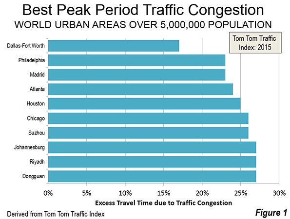
    I created a controlled experiment involving 50 one-way trips between various urban locations in a transit-rich part of Chicago. Data collectors measured the differing costs, time, and conveniences associated with UberPool, trains, and buses. One person used Chicago Transit Authority (CTA) services while the other hailed an UberPool (Figure 1).

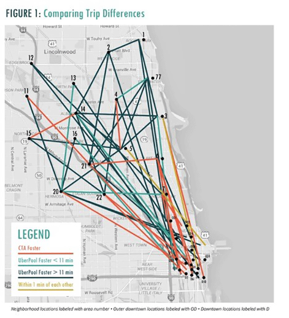
    We evaluated only weekday trips during daytime hours to and from the north and northwest sides of the city, in order to focus on a transit-rich environment. Our trips, which linked the centroids of community areas, averaged about six miles long.

    UberPool did not disappoint. Regardless of the type of trip involved, our study found that carpooling tended to get you there faster than public transit, although often not by enough for to justify — for many passengers — the cost difference. The average elapsed time for all UberPool trips was about 36 minutes, besting transit by about 12 minutes. UberPool was faster on 39 trips, while the CTA was faster on 11 (Table 1). The carpooling costs averaged $9.66, compared to transit’s $2.29.

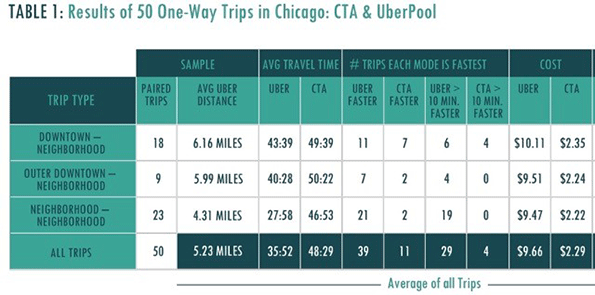
    Stops to pick up other passengers were not as prevalent as many might expect, with UberPool trips averaging just under one extra stop. Still, one fifth of all trips made at least two extra stops, while two out of the 50 trips involved three extra stops

    The appeal of carpooling may depend on the type of travel involved. On downtown-oriented trips, the time savings averaged a mere six minutes. UberPool was faster on eleven of these, and the CTA on seven.

    Moreover, UberPool can be challenging during rush hour, when it is slowed by traffic congestion and taking rapid transit is often faster due to the heightened schedule frequency.

    We suspect that primarily people in a hurry, those carrying heavy or bulky items, or those uncomfortable with transit would be inclined to regularly carpool to work downtown. The level of exertion is also greater on public transit. Our transit passengers were unable to find seats on about one-fifth of trips, and walked more often. UberPool involves minimal walking, whereas the average transit trip involved about a half-mile trek. Eleven transit trips required passengers to hoof it for at least two-thirds of a mile, while three involved doing so for more than a mile.

    On trips from the peripheral ‘outer downtown’ to the neighborhoods, though, UberPool outpaced transit by ten minutes. Carpooling starts to look more tempting to the transit rider in this scenario.

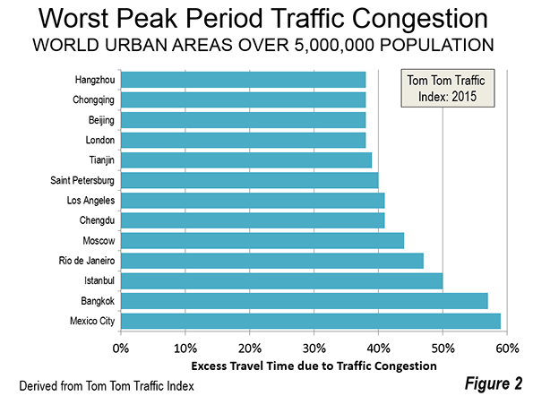
    The most dramatic benefits from carpooling, however, involve neighborhood-to-neighborhood travel (Figure 2). Such trips can be painful to transit users in Chicago, in part due to our slow pace of getting bus rapid transit off the ground and our ‘legacy’ rail system, with its radial design that focuses primarily on travel to and from downtown. And busses on some routes stop every few blocks.

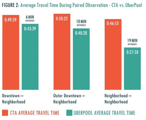
    On these trips, UberPool dominates, averaging 28 minutes per trip, almost 19 minutes faster (about 40 percent) than transit. Carpooling was more than 10 minutes faster on all but four of our 23 trips, and more than an hour faster on one.

    A notable negative aspect of using UberPool is, of course, the variability in pricing. Six of the 50 trips involved ‘surge’ pricing (premium fares due to heavy demand), resulting in prices as much as 60 percent above the normal fare. We did not study the price and speed of UberPool during the evening and late-night hours, when demand is reportedly heaviest, and when surge pricing appears to be more prevalent.

    The inescapable conclusion is that carpooling services are appealing to far more than transit-averse and extremely time-conscious travelers, although perhaps not as an option that many commuters would use daily. UberPool tends to perform best precisely where transit is at its worst, e.g., on trips between the neighborhoods, especially during the off-peak periods when traffic is lighter.

    On one level, our results support the conclusions of a new Shared Use Mobility Center/American Public Transit Association report showing that such mobility innovations tend to be complementary to public transit. Shared-use services like Lyft and Uber fill the gaps that exist in urban bus and rail operations, and encourage people to pursue lifestyles that do not center on private cars.

    Still, carpooling should also be regarded as a potential game-changer. Federal guidelines recommend that analysts assume the average urban traveler values time savings at $24 per hour. An average traveler on an UberPool making a neighborhood-to-neighborhood trip may, therefore, by arriving about 20 minute earlier than a transit rider, derive a benefit from carpooling of around $8 per trip, which would be a far greater amount than the extra cost. The most time-sensitive travelers and groups of travellers would derive an even higher benefit.

    Even though rideshare carpools represent a mobility breakthrough, it unfortunately continues to take a backseat in the taxi-centric debate over Lyft and Uber. It is certainly going to pose an increasing challenge to public transit agencies. Heightened competition in urban transit markets appears here to stay, and is now poised to bring dramatic changes to the way we travel.

    Joseph P. Schwieterman is director of the Chaddick Institute for Metropolitan Development and Professor of Public Service at DePaul University in Chicago.

    Flickr photo of the S2 smartwatch from Samsung Newsroom: Travel NYC with the Gear S2 and Uber

  • Expo Line Expansion Fails to Stem L.A. Transit Loss

    The long awaited and highly touted Santa Monica extension brought an approximately 50 percent increase in ridership of the Los Angeles Expo light rail line between June 2016 and June 2015. The extension opened in mid May 2016. In its first full month of operation, June 2016, the line carried approximately 45,900 weekday boardings (Note), up from 30,600 in June 2015, according to Los Angeles Metropolitan Transportation Authority (MTA) ridership statistics.

    However MTA ridership continued to decline, with a 51,900 loss overall. Bus and rail services other than the Expo line experienced a reduction of 67,300 boardings (Figure).

    Between June 2015 and June 2016, rail boardings rose 30,500, while bus boardings declined 82,400. In other words there was a loss of 2.7 bus riders for every new rail rider over the past year. Los Angeles transit riders have considerably lower median earnings than in the cities with higher ridership, and lower than the major metropolitan average (see the analysis by former Southern California Rapid Transit District Chief Financial Officer Tom Rubin and "Just How Much has Los Angeles Transit Ridership Fallen?" and ) here and here).

    Note: A passenger is counted as a boarding each time a transit vehicle is entered. Thus, if more than one transit vehicle is required to make a trip, there can be multiple boardings between the trip origin and destination. Because the addition of rail services, as in Los Angeles, can result in forcing bus riders to transfer because their services can be truncated at rail stations, the use of boardings as an indicator of ridership can result in exaggeration, as the number of boardings per passenger trip is increased. This may have produced a decline of as much as 30 percent in actual passenger trips since 1985, as a number of rail lines have been opened in Los Angeles. 

  • The Shorter Commutes in American Suburbs and Exurbs

    An examination of American Community Survey (ACS) data in the major metropolitan areas of the United States shows that suburbs and exurbs have the shortest one-way work trip travel times for the largest number of people. The analysis covers metropolitan areas with more than 1,000,000 population in 2012, from the 2010-2014 ACS (2012 average data) using the City Sector Model.

    The City Sector Model

    The City Sector Model classifies small areas (zip codes) of major metropolitan areas by their urban function (lifestyle). The City Sector Model includes five sectors (Figure 1). The first two are labeled as “urban core,” (Urban Core: CBD and Urban Core: Ring) replicating the urban densities and travel patterns of pre-World War II US cities, although these likely fall short of densities and travel behavior changes sought by contemporary urban planning (such as Plan Bay Area). There are two suburban sectors, the Earlier Suburbs and Later Suburbs. The fifth sector is the Exurbs, which is outside the built-up urban area. The principle purpose of the City Sector Model is to categorize metropolitan neighborhoods based on their intensity of urbanization, regardless of whether they are located within or outside the boundaries of the historical core municipality (Note 1).

    One Way Commute Times by Urban Sector

    The commuting data excludes employees who work at home, whose commute times would be zero.

    The shortest one-way commute times are experienced by residents of the Earlier Suburbs, with a 26.6 minute travel time. This is nearly equalled for residents of the central business districts (Urban Core: CBD), with an average commute of 26.7 minutes. Commuters living in the Later Suburbs had a somewhat longer commute, at 28.0 minutes, while commuters living in the Exurbs had an average one-way commute of 29.5 minutes. The longest commute times were experienced by residents of the Urban Core: Ring (32.5 minutes), which is the part of the urban core that excludes the central business district, (Figure 2) and is characterized by high densities and lower levels of automobile use than in the suburbs and exurbs.

    The functional city sectors with the shortest commutes had more jobs than resident workers. The Earlier Suburbs possess 1.08 jobs for every resident worker (Note 2). The ratio was much higher in the Urban Core: CBD, where there were nearly 5.99 jobs for every resident worker. Such an imbalance could not be replicated throughout a metropolitan area, because by definition, a labor market has a ratio of jobs to resident workers of approximately 1.00. To replicate the national CBD ratio throughout the metropolitan area would require, for example, that the New York metropolitan area have  54 million jobs for its 9 million workers.   

    Not surprisingly, with such a surplus jobs relative to workers, the Urban Core: CBD, the chances of finding suitable employment nearby is far greater. However, this advantage can, by definition, be available only to a very few, as is indicated by the fact that the Urban Core: CBD’s are home to only 1.5 percent of the resident workers in the major metropolitan areas. In the broader context of the urban core (including both the CBD and the Ring), this advantage is offset and average travel times are greater (below).

    In the Later Suburbs, there were 0.90 jobs per resident worker, which matches that sector’s ranking in work trip travel time (third). The  ring around the urban core (Urban Core: Ring) , had the longest average work trip travel time. The Exurbs had the lowest ratio of jobs to resident workers, at 0.71, yet had an average travel time that was shorter than that of the Urban Core: Ring (Figure 3).

    Pre-World War II and Post-War Urban Form

    The two combined urban core sectors are defined in the City Sector Model to replicate what remains of the pre-World War II city that was characterized by far higher densities and less reliance on automobile transportation, as opposed to the suburban and exurban sectors that have dominated urban growth for seven decades. If the two urban core sectors are combined (Urban Core: CBD and Urban Core: Ring), the number of jobs per resident worker is 1.28. This healthy ratio, however, is not sufficient to preserve any travel time advantage for residents of the combined urban core. In the combined urban core sectors, the average one-way travel time of 31.9 minutes, well above each of the other three functional sectors (Figures 4 and 5). The Urban Core: Ring has nearly nine times as many resident workers as the Urban Core: CBD.

    The Pre-War urban form has considerably higher population densities than those of the post-war urban form. For example, the Urban Core: CBD has a population density exceeding 23,000 per square mile (9,000 per square kilometer), more than 80 percent of the New York City population density level. The Urban Core: Ring has a population density exceeding 11,000 per square mile. The combined area population density of the two Urban Core sectors is 11,500 per square mile, or 4,400 per square kilometer (Figure 6).

    The two Urban Core sectors largely rely on commuting modes currently favored by urban planning policy, transit, cycling and walking. In contrast, the suburban and exurban sectors rely on commuting modes discouraged by urban planning policy, automobiles and car and van pools (Figure 7).

    The combined urban core sectors have more than four times the density of the Earlier Suburbs and nearly nine times the density of the Later Suburbs. With these much higher densities and their reliance on the favored transport strategies, it might be expected that they would enjoy the best commute times. However, as noted above, when the two urban core sectors are combined, their average travel time is longer than the suburban and exurban sectors. This is despite the far lower densities of the two suburban sectors and the often world densities of the exurban sector.

    The Key: Lower Densities & Job Dispersion

    These results are likely to be surprising to many in the press as well as planners who often equate residential distance from central business districts as resulting in longer commutes. The reality, however, is that central business districts account for only 8 percent of employment in major US metropolitan areas, and reach the highest at 22 percent in New York, 50 percent above second place San Francisco (14.4 percent) and nearly 10 times that of Los Angeles (2.4 percent).

    Generally speaking, employment is dispersed throughout the metropolitan area. When combined with the generally lower density urbanization within metropolitan areas, the result is shorter commutes for residents  in the suburbs and exurbs. As it turns out the data shows that higher employment densities in the urban core are associated with longer, not shorter commutes, as is commonly assumed.

    Note 1: In some cases the functional urban core extends beyond the boundaries of the historical core municipality (such as in New York and Boston). In other cases, there is virtually no functional urban core (such as in San Jose or Phoenix). Functional urban cores accounted for 14.7 percent of the major metropolitan area population in 2012. By comparison, the jurisdictional urban cores (historical core municipalities) had 26.6 percent of the major metropolitan population, many of which have large tracts of functional suburban development.

    Note 2: Estimated by dividing the percentage of jobs in each sector by the percentage of resident workers. Working at home is excluded.

    Wendell Cox is principal of Demographia, an international pubilc policy and demographics firm. He is a Senior Fellow of the Center for Opportunity Urbanism (US), Senior Fellow for Housing Affordability and Municipal Policy for the Frontier Centre for Public Policy (Canada), and a member of the Board of Advisors of the Center for Demographics and Policy at Chapman University (California). He is co-author of the "Demographia International Housing Affordability Survey" and author of "Demographia World Urban Areas" and "War on the Dream: How Anti-Sprawl Policy Threatens the Quality of Life." He was appointed to three terms on the Los Angeles County Transportation Commission, where he served with the leading city and county leadership as the only non-elected member. He served as a visiting professor at the Conservatoire National des Arts et Metiers, a national university in Paris.

  • Compactness and Canadians

    The May, 2016 New Geography feature, Are Compact Cities More Affordable? questioned whether the Vancouver region supplies evidence that Housing-Plus-Transportation (H+T) creates affordable living climates. Todd Litman responded with a critique; here’s a partial response to Todd Litman’s comments, which are rich in assertions and advice but poor on science. Our full response can be viewed in the attached pdf. The central issue of whether there is evidence that the Vancouver Region as a whole offers the advantage of H+T affordability to its residents is bypassed. Hence, there is no research news.

    Litman’s criticism centers on issues that undermine his thesis or on speculative data that would prove a point, if available, for example, bias in our data. Almost certainly, the data is “managed,” incomplete, erroneous and biased — but at the source: the Metro Vancouver report that advocates H+T affordability. A missed observation? The absence of figures on compactness makes it impossible to draw the sought-after correlation between affordability and density, the indispensable evidence for H+T. Yet the critique ventures to do exactly that.

    Attempts to “prove” an association rest entirely on incidental observations of certain sub-regional districts based on personal “knowledge” of them without including density numbers, and by dismissing some as outliers or “special cases,” an unproductive attempt at science.

    A track to demonstrate how alternative data could show that homeowners are not as well off as they seem leads to the unusual idea of limiting the sample to an improbable and undefinable set. Curiously, the source data is arbitrarily curtailed in a similar manner. Another missed observation?

    Litman has previously cited as evidence the subject correlation for US metro-regions produced by scholars, a clear, scientific result. The sub-regional level correlation remains an open research task; incidental observations cannot fill that gap. New research windows open in our full response, which can be viewed in the attached pdf

  • Downtowns Dominate New Zealand Transit Commuting

    The statistical authorities of various nations survey commuting behavior of their citizens in periodic population censuses and related surveys. Most of this data relates to the residential location of workers, but not to the work location. Both sets of data are important for understanding the dynamics of mobility within urban areas. However, in some countries, like Canada and the United States work location is not readily available. As a result, items of analysis such as how people get to work and the density of employment in parts of urban areas can be difficult, if not impossible to obtain. For example, based on the last two censuses, we have produced reports estimating the shares of employment in the downtown areas of major metropolitan areas.

    New Zealand has a model program that provides detailed information both on residential location and work location. The work location data is not only important as a model for other statistical authorities, but also reveals trends which the more limited data in other countries suggest. This article will describe the commuting data in the three largest metropolitan areas in New Zealand (Note). The analysis focuses on the 2013 census, which was postponed from 2011 as a result of the disastrous Christchurch earthquakes. As will be shown below, these events had major implications in the commuting data for New Zealand’s second largest metropolitan area.

    Auckland

    Auckland has by far the largest metropolitan area in New Zealand, with approximately 1.6 million residents. As a result of the recent local government consolidation, Auckland has emerged as the only entire metropolitan area in the high income world of more than 1 million population that is administered by a single local government. It will soon be followed by Honolulu, which has a single local government, and which is soon to pass 1 million population.

    Auckland houses about one third of New Zealand’s population. As a result, Auckland is dominates New Zealand. By comparison, the New York metropolitan area, in its most liberal definition (combined statistical area) represents only seven percent of the US population.

    The Statistics New Zealand data indicates that the Auckland central business district (CBD or downtown area) has approximately 13.6 percent of the jobs (Figure 1) in the metropolitan area (the city of Auckland, or the Auckland Regional Council). This is nearly double the US average for major metropolitan areas (over 1 million population), which is 7.0 percent, but well below New York’s 22.0 percent. It is about the same as that of Canada’s major metropolitan area average, and that of Canada’s largest metropolitan area, Toronto. It also duplicates the Sydney CBD share of metropolitan employment.

    As is typical of large, more centrally oriented metropolitan areas, transit commuting is focused on the CBD in Auckland. In 2013, approximately 47 percent of all job locations accessed by transit in the metropolitan area   were in the CBD. This was up from 45 percent in 2001 (Figure 2). More than one-half of the new transit commuters between 2001 and 2013 work in the CBD. This is despite the fact that the CBD represents only one percent of the built-up urban area.

    Between the 2001 and 2013 censuses, Auckland experienced an increase in its transit work trip market share from 6.1 percent to 7.7 percent. However, as is typical of transit market shares, there was considerable variation. Transit carried 26.7 percent of the work trips to the CBD as designated by Statistics New Zealand. In the rest of the metropolitan area only 4.7 percent of the jobs were accessed by transit. Overall, transit carries 7,7 percent of work trips in Auckland (among commuters providing information), which is up from 6,1 percent in 2001. While this is a modest work trip market share, it is at least a full percentage point above that of urban planning model Portland.

    Wellington

    Wellington is the national capital and third largest metropolitan area with nearly 500,000 residents. But despite its smaller population, Wellington has the nation’s largest CBD, by a whisker and by far the largest transit commute share in the nation.

    In 2013, Wellington’s Statistics New Zealand designated CBD had approximately 80,000 jobs. This represents a very high 37 percent of the employment in the metropolitan area (Figure 3). While there are no comprehensive international CBD employment data, the anecdotal information indicates that this level of CBD employment is well above that of all major metropolitan areas in the United States, Canada and Australia, and two-thirds above New York, which has the highest CBD share of any major metropolitan area in these nations.

    The dominance of the CBD in transit destinations is even more apparent in Wellington than in Auckland. In 2001, the CBD accounted for 66 percent of the transit commuting locations in the metropolitan area. By 2013 this increased to 74 percent. In fact all of the increase in transit work trips was to CBD locations, as commuting to other locations declined (Figure 4).

    In 2013, transit carried 33.6 percent of employees to the CBD, up from 28.6 percent in 2001. Transit carried 6.2 percent of the travel to jobs outside the CBD. Overall, transit carried 15.7 percent of work trips in the metropolitan area, up from 14.7 percent in 2001. This is a sizeable transit market share, which would place Wellington ahead of all US metropolitan areas in the United States except New York and San Francisco.

    Christchurch

    Christchurch is New Zealand’s second largest metropolitan area, with nearly 600,000 residents.

    Christchurch is a special case, due to the devastating earthquakes that hit the area in 2010 and 2011. Because of the disruption, the New Zealand government postponed the 2011 census to 2013.

    The core of Christchurch, Cathedral Square suffered particular damage, ruining the city’s historic cathedral, the remains of which were demolished. The Statistics New Zealand designated CBD experienced a more than 50 percent loss in employment from the previous census (2006). In 2001, a very respectable 16.1 percent of employment was in the CBD. By 2013, that figure had declined to 7.3 percent (Figure 5).

    Christchurch has not had the strength of transit ridership of Wellington or Auckland. In 2013, only 5.9 percent of CBD commuters used transit. Overall, transit carries approximately 2.3 percent of work trips in the Christchurch metropolitan area in 2013.

    Transit is About Downtown

    New Zealand’s strongest CBD and transit markets provide further evidence that "transit is about downtown." Both Auckland and Wellington experienced comparatively strong increases in transit work trip ridership between 2001 and 2013. Yet most of the additional work transit work trip destinations were concentrated in the CBD in Auckland, and all of the new trips had CBD destinations in Wellington.

    This is similar to the situation in the United States. In the US, 55 percent of transit commuting destinations are in the six municipalities (as opposed to metropolitan areas) that have the largest CBDs, measured by employment. Transit commuting is also heavily skewed toward the CBDs in Canada and Australia.

    Wendell Cox is principal of Demographia, an international pubilc policy and demographics firm. He is a Senior Fellow of the Center for Opportunity Urbanism (US), Senior Fellow for Housing Affordability and Municipal Policy for the Frontier Centre for Public Policy (Canada), and a member of the Board of Advisors of the Center for Demographics and Policy at Chapman University (California). He is co-author of the “Demographia International Housing Affordability Survey” and author of “Demographia World Urban Areas” and “War on the Dream: How Anti-Sprawl Policy Threatens the Quality of Life.” He was appointed to three terms on the Los Angeles County Transportation Commission, where he served with the leading city and county leadership as the only non-elected member. He served as a visiting professor at the Conservatoire National des Arts et Metiers, a national university in Paris.

    Photograph: Downtown Auckland (by author)

  • Cars or Trains: Which Will Win the Commuting Future?

    Infrastructure investment is a hot topic and the focus of that discussion tends to lean towards transport infrastructure over other categories (like energy or water for example). When it comes to transport, trains seem to feature prominently on the wish lists of big investment or ‘nation building’ projects. But how far could billions of dollars in new rail infrastructure actually go in improving congestion across our cities?  Will cars inevitably win? If so, why?

    ‘We need more public transport’ is the silver bullet catch cry often heard in conjunction with debates about congestion in major cities. It has become so common that its validity is rarely tested. Even large scale commuter rail projects like Brisbane’s proposed $5billion (or $8billion – what a few billion amongst friends?) cross river rail can still maintain preferred project status – despite no business case after several years of discussion and now being in the hands of the project’s third state government.

    As technology reshapes the nature of work – and with it where we work – and as Australia faces cities policy with renewed national interest – led primarily by our Prime Minister – it is timely to ask how infrastructure priorities might be shaped by evolving metropolitan form and the fast changing habits of urban inhabitants. Will old ways serve new days? Do we need more passenger rail, or will cars find a new purpose in decongesting our cities and serving a new economic model?

    Some recent figures through Macroplan serve to highlight the role played by rail in urban life. In 2013–14, there were 178.5 billion passenger kilometres travelled on capital city roads in Australia and 12.6 billion passenger kilometres travelled on urban rail networks. I’ve written before that this share is unlikely to change for the simple fact that only around 10% of metropolitan wide jobs are based in central business districts of our major cities. Agreed, it’s an important 10% for public transport because PT best serves a highly centralized workforce as you find in CBDs. Commuter rail in particular relies on a ‘hub and spoke’ model, mainly designed to ferry people from into and out of CBDs.

    For people who work in CBDs, a high proportion will use public transport – rail included. But that’s a high proportion of the 10% minority of people in a metro wide area. Even if every single person who worked in a CBD caught PT, the mode share can never rise very high because around 90% of the workforce work in suburban areas, for which rail is not well suited. There has been a lot of talk about Transit Oriented Development (TODs) particularly around suburban rail nodes but despite decades of discussion, we are yet to see many (any?) genuine examples.

    And the reality is that the economy is fast suburbanizing. New employment engines in sectors like personal services or health and caring are not beneficiaries of industry proximity. Being close to others in the same industry might have been good for finance, property and business service industries in traditional CBDs but the fastest growing sector of our economy at present is health care related, where being close to the people being served is important. This is not the CBD. There is even evidence that technology startups in the US have tended to prefer suburban or high street locations, offering high amenity, ample low cost or free parking, and cheap (or free) premises. Steve Jobs and Steve Wozniak of Apple fame started in a suburban garage after all. And Mark Zuckerberg got started at a desk in his college dorm.

    As this shift of the economy moves from centralized to increasingly decentralized models – aided by new and fast evolving digital technology which makes connectivity over larger geographic areas so much easier – do the foundations of commuter rail feasibility begin to crumble?

    This graph, which shows the dramatic long term decline of the CBD as the dominant employer region in Sydney, could apply equally to other capitals:

    Source: The Polycentric Metropolis – Sydney’s Centres Policy in 2051, Bob Meyer, Director of Planning, COX Richardson Architects and Planners

    This shift is directly related to how public transport versus private has fared over a similar long term scale, as evidenced by this chart:


    Source: Mode share of motorised travel (passenger kms) 1945-2014 for five largest Australian cities, public transport vs private transport (source data: BITRE), taken from Alan Davies writing in Crikey.

    Adding to this shift has been the enabling factor of falling car prices. According to COMMSEC, in 1976 the cost of a new Holden sedan (back then it was Holden or Ford and that was about it) was $4,336 and the average male full time wage was $182 a week – meaning it took 24 weeks income to pay for a new car. Today, the average full time weekly wage is around $1,440 and there are plenty of good quality brand new sedans you can buy for $19,000 on road. In just over three months, you can own one. New cars are fuel efficient, emissions efficient, reliable, technologically enabled and comfortable.

    Rubbing salt into the commuter rail wound is that travel by car – even across larger distances – tends to be quicker than rail. Here’s the picture in Melbourne:


    Source: Average journey to work trip duration by mode and ring, Melbourne (source data: VISTA 2012-13). Taken from Alan Davies in Crikey.

    In Sydney, according to their Household Travel Survey 2013-14, only 13% of car drivers took longer than 45 minutes to get to work, while 79% of train passengers took more than 45 minutes. 

    So, given that commuter rail is best designed to serve an increasing minority of the workforce with jobs in traditional CBDs, how will spending extra billions on commuter rail infrastructure expansion solve congestion? How will it translate into more rail passengers, given the way the economy is changing?

    Is there an alternative?

    For me it’s actually not a case of one or the other. Sensible investment in commuter rail, given the existing investment in rail networks, makes sense provided there’s a valid business case and the alternative options for that investment have been measured.

    It also strikes me that we may have a forgotten the massive sunken investment in metropolitan road networks which do most of the transport work in our cities. Some (not all) of these roads are congested for maybe 4 to 6 hours out of every 24. Our cars which move us around our cities spend maybe only 3 or 4 hours a day going anywhere. For more than 20 out of 24 hours, they are parked.

    Talk about driverless cars is not just about a fictional scene from ‘Total Recall’ – it’s also about computer aided traffic management on a city wide scale. Squeezing more efficiency from the road network and from motor vehicles seems to make a lot of sense. Ride sharing apps like Uber provide an early insight into how disruptive technologies can impact on traditional, cumbersome and market protected transport thinking. There are also car sharing Apps like Goget and more are on their way. Technology is changing the way we do everything, from entertainment to where we work and how we get around. Would it not make sense for cities to be exploring how this wide scale urban economic shift can best served, rather than stubbornly sticking to mantras about public transport systems designed for traditional urban employment models?

    And what about buses? Their great virtue is that they can use the metrowide road networks. It is easy to change a bus route to adapt to demand. You can’t do that with rail. Think how technology might soon morph public transport buses and private transport cars into a hybrid of some sort? Driverless buses are not new. Perth is already about to trial them. This is just a baby step. Think about where this could lead.

    There’s no such thing, in my view, as a bad infrastructure investment. But there’s only so much money to go around. The decisions on infrastructure investment, when it comes to issues like urban economic productivity and reducing congestion, should focus on how to get the best bang for the buck. That can mean thinking more about the future and how patterns of work will shape what we need from transit systems, and working back from that to identify the best solutions.

    Ross Elliott has more than 20 years experience in property and public policy. His past roles have included stints in urban economics, national and state roles with the Property Council, and in destination marketing. He has written extensively on a range of public policy issues centering around urban issues, and continues to maintain his recreational interest in public policy through ongoing contributions such as this or via his monthly blog The Pulse.

    Flickr photo by Curtis Perry: Another perfect day for highway drivers in LA.

  • Best World Cities for Traffic: Dallas-Fort Worth, Kansas City, Indianapolis and Richmond

    The 2015 Tom Tom Traffic Index shows that Dallas-Fort Worth has the least overall congestion among world (urban areas) with more than 5,000,000 population. The Tom Tom Traffic Index for Dallas-Fort Worth is 17, which means that, on average, it takes 17 percent longer to travel in the urban area because of traffic congestion.

    The Tom Tom Traffic Index rates traffic congestion in nearly 300 world cities. This article examines overall traffic congestion levels in two categories of cities, those with more than 5,000,000 population and those with between 1,000,000 and 5,000,000 population.

    Over 5,000,000 Population

    Tom Tom rated traffic congestion in 38 urban areas with more than 5,000,000 population. Five of the 10 least congested cities are in the United States, including five of the top seven. China placed two cities in the top 10 (Figure 1).

    With its Tom Tom Traffic Index of 17, Dallas-Fort Worth was far ahead of Philadelphia and Madrid, which tied for second at 23. This gap of six points is the largest among the 38 cities except for the seven that separate number 36 Istanbul and number 37 Bangkok.

    Atlanta ranked fourth, with a Traffic Index of 24, followed by Houston at 25. Suzhou achieved China’s best traffic congestion, with a Traffic Index of 26 and was tied for sixth best with Chicago. There was a three way tie for eighth.

    Because of a four way tie for 10th place, the bottom 10 in traffic congestion among the more than 5 million population included 13 cities (Figure 2). The greatest traffic congestion was in Mexico City, with a Travel Index of 59. This means that a 30 minute trip can generally be expected to take 48 minutes, 18 minutes more than without congestion. Bangkok, which is often suggested as one of the most congested cities in the world, ranked second worst with a Traffic Index of 57.

    Rio de Janeiro had the fifth worst traffic congestion with a Traffic Index of 47, while Moscow’s legendary traffic congestion rated a 44. Los Angeles, long the most congested city in the United States, had a Traffic Index of 41, and ranked seventh worst. Chengdu in China tied Los Angeles. The eighth and ninth most congested cities were St. Petersburg, at 40 and Tianjin at 39. London and three cities in China, Beijing, Chongqing, and Hangzhou tied for 10th worst traffic, at 38.

    1,000,000 to 5,000,000

    Generally traffic congestion is less severe in smaller cities, all things being equal. This is illustrated among the cities with between 1 million and 5 million population (Figure 3). Three United States cities tied for the best traffic congestion, Kansas City, Indianapolis and Richmond, Virginia, each possessed  a Traffic Index of 10. Because of a four way tie for 10th place, 13 cities are included in the top 10 and only one of these 13 cities is outside the United States.

    Cleveland ranks fourth, with a Traffic Index of 13, followed by St. Louis, Milwaukee, which are tied at fifth with a traffic index of 14. The conurbation (urban areas that have grown together, in this case Katowice, Gliwice and Tychy) Katowice, Poland had a Traffic Index of 14 and   Salt Lake City and Cincinnati for the seventh best traffic congestion.

    The three cities tying for 10th best traffic congestion all had a Traffic Index of 15 and were Minneapolis-St. Paul, Phoenix, Detroit and Columbus.

    Four other cities ranked above much larger Dallas-Fort Worth, with a Traffic Index of 16. These included Charlotte, Jacksonville, Memphis and Raleigh. Louisville tied Dallas-Fort Worth, at 17. Dallas-Fort Worth is approximately twice the population of the largest cities in the 1 million to 5 million classification, Detroit and Minneapolis-St. Paul and more than three times the population of Katowice.

    Three cities were tied for the worst traffic congestion in the 1 million to 5 million category with a Traffic Index of 43, Recife and Salvador in Brazil and Bucharest in Romania. Five of the bottom ten cities were in Europe, with Dublin, one of the smaller cities having a particularly high Traffic Index 40, nearly as bad as much larger Los Angeles (Figure 4).

    Overall Rankings

    Confirming the ratings above, the United States had the overall best traffic conditions (Figure 5), in all three population categories (under 1 million, 1 million to 5 million and over 5 million), though South Africa tied the United States in the over 5 million category.

    Progress

    Every year, it seems like more cities are added to the international traffic comparisons. This year’s addition of Bangkok, with its dreadful reputation for traffic was a huge step in the right direction. Bangkok, of course has bad traffic for decades, but was edged out by Mexico City. I still wonder whether the prize does not belong to Jakarta (as it did for the “start-stop” index a few years ago), and I hope that data on India’s huge cities and the cities of Japan will soon be available.

    Wendell Cox is principal of Demographia, an international pubilc policy and demographics firm. He is a Senior Fellow of the Center for Opportunity Urbanism (US), Senior Fellow for Housing Affordability and Municipal Policy for the Frontier Centre for Public Policy (Canada), and a member of the Board of Advisors of the Center for Demographics and Policy at Chapman University (California). He is co-author of the “Demographia International Housing Affordability Survey” and author of “Demographia World Urban Areas” and “War on the Dream: How Anti-Sprawl Policy Threatens the Quality of Life.” He was appointed to three terms on the Los Angeles County Transportation Commission, where he served with the leading city and county leadership as the only non-elected member. He served as a visiting professor at the Conservatoire National des Arts et Metiers, a national university in Paris.

    Photo: Bangkok: not the worst traffic congestion (photo by author)

  • A ‘Diet’ to Give California Drivers Indigestion

    In the past, it was other people’s governments that would seek to make your life more difficult. But increasingly in California, the most effective war being waged is one the state has aimed at ourselves.

    The Jerry Brown administration’s obsession with becoming a global model for reducing greenhouse gases is leading to an unprecedented drive to completely reshape how Californians live. Rather than focus on more pragmatic, affordable steps to reduce greenhouse gases – more efficient cars, rooftop solar systems and promoting home-based work – the goal increasingly seems like social engineering designed to force Californians to adopt the high-density, transit-oriented future preferred by Brown’s green priesthood.

    The newest outrage comes from the Governor’s Office of Planning and Research in the form of a proposed “road diet.” This would essentially halt attempts to expand or improve our roads, even when improvements have been approved by voters. This strategy can only make life worse for most Californians, since nearly 85 percent of us use a car to get to work. This in a state that already has among the worst-maintained roads in the country, with two-thirds of them in poor or mediocre condition.

    The OPR move reflects the increasingly self-righteous extremism animating the former Jesuit’s underlings. Ironically, the governor’s proposals to impose this road diet rest partly on expanding the California Environmental Quality Act, which Brown, in a more insightful moment, described as a “vampire” that needs a “stake through the heart.” Now, instead, the inquisitors seize on vague legislative language and push it to what the Southern California Leadership Council has dubbed “an undesirable and unmanageable extreme.”

    In essence, the notion animating the “road diet” is to make congestion so terrible that people will be forced out of their cars and onto transit. It’s not planning for how to make the ways people live today more sustainable. It has, in fact, more in common with Soviet-style social engineering, which was based similarly on a particular notion of “science” and progressive values.

    Read the entire piece at The Orange County Register.

    Joel Kotkin is executive editor of NewGeography.com. He is the Roger Hobbs Distinguished Fellow in Urban Studies at Chapman University and executive director of the Houston-based Center for Opportunity Urbanism. His newest book, The Human City: Urbanism for the rest of us, will be published in April by Agate. He is also author of The New Class ConflictThe City: A Global History, and The Next Hundred Million: America in 2050. He lives in Orange County, CA.

  • Problems in the Orange County Grand Jury Light Rail Report

    Earlier this month (May 9, 2016) the Orange County (California) Grand Jury issued a report entitled: “Light Rail: Is Orange County on the Right Track,” which is on the Grand Jury website here. The report largely concludes that it is not and that there is a need for a light rail system in Orange County. On page 7, the 2016 Grand Jury report says: “No Grand Jury has reported on development of light rail systems in Orange County.”

    In fact, there was a previous report, at: http://www.ocgrandjury.org/pdfs/GJLtRail.pdf, which is a 1999 report of the Orange County Grand Jury entitled: “Orange County Transportation Authority and Light Rail Planning.” Both the 1999 and 2016 reports are on the Orange County Grand Jury website as of May 25, 2016. The 1999 report reached fundamentally different conclusions than the 2016 report. Obviously, the 2016 report makes no attempt to reconcile its findings or analysis with the 1999 report.

    Inappropriate Density Comparison

    There are additional problems with the 2016 Grand Jury Report. In making the case for light rail in Orange County, the 2016 Grand Jury put considerable emphasis on the fact that Orange County’s population density is higher than that of Los Angeles County. The reason for Orange County’s population density advantage is the fact that much of Los Angeles County is in the largely undevelopable Transverse Ranges (including the San Gabriel Mountains), with a considerable amount of rural (not urban) desert. The difference is that Orange County’s land area is approximately two-thirds urban, while Los Angeles County’s land area is about one-third urban. This renders the overall density comparison for urban transportation planning meaningless.

    Indeed, the urban density of Los Angeles County is substantially higher than that of Orange County. According to the United States Census Bureau, the population density of the urban areas in Los Angeles County was 6,859 per square mile in 2010, well above Orange County’s 5,738. Los Angeles County’s densest census tract is nearly 2.5 times the density of any census tract in Orange County.

    Transit is About Downtown

    Even so, urban rail ridership bears little relationship to overall urban population density (otherwise the San Jose urban area would be a better environment for rail than the New York urban area). In 2010, San Jose’s density was about 5,820, while New York’s was 5,319 (Los Angeles was 6,999, including the most dense parts of Los Angeles and Orange County and part of San Bernardino County).

    One of the most important keys to transit ridership is the concentration of work destinations in a dense central business district (CBD), to which nearly all high capacity and frequent transit services converge. In the United States, 55 percent of all transit commuting destinations are in the six largest municipalities (such as the city of New York or the city of San Francisco, as opposed to metropolitan areas) with the largest central business districts. This is dominated by New York with about 2,000,000 employees in its CBD. On the other hand, San Jose has one of the smallest central business districts of any major metropolitan area and a correspondingly smaller transit market share than the national average. Orange County, with an urban form far more like San Jose than New York or San Francisco, has little potential to materially increase transit ridership with light rail.

    The record of new urban rail in the United States is less than stellar, evaluated on the most important metric. Generally, new urban rail has resulted in only minor increases in transit’s miniscule market share and in some cases there have been declines.

    In the case of Los Angeles, on which the Grand Jury relies for its conclusion favoring light rail development, three one-half cent sales taxes and spending that has amounted to more than $16 billion on development of new rail lines. Yet, transit ridership has fallen, as reported in the Los Angeles Times (see: “Just How Much has Los Angeles Transit Ridership Fallen”). Former SCRTD (predecessor to the MTA) Chief Financial Officer Thomas A. Rubin has also suggested that the MTA ridership decline may be greater if adjusted for the increased number of transfers that have occurred in the bus-rail system compared to the previous bus system (For example, a person traveling from home to work who starts on a bus, transfers to rail and finished the trip on a bus, counts as three, not one).

    Required Responses:

    The Grand Jury report notes:

    “The California Penal Code Section 933 requires the governing body of any public agency which the Grand Jury has reviewed, and about which it has issued a final report, to comment to the Presiding Judge of the Superior Court on the findings and recommendations pertaining to matters under the control of the governing body. Such comment shall be made no later than 90 days after the Grand Jury publishes its report (filed with the Clerk of the Court).”

    This would apparently require a response by August 9, 2016

    Permission Granted to Cite or Quote this Article or the Linked Documents

    Any respondent is hereby granted permission to cite or quote from this article or the linked documents.

  • So Much for Peak Driving (VMT)

    So much for peak VMT. The planners and analysts who watched vehicle miles traveled (VMT) trends seemingly peak are no doubt anxious as the preliminary 2015 VMT numbers produced by the U.S. Department of Transportation showed new record total VMT well ahead of the 2007 number that many had hoped signaled peak U.S. VMT. Perhaps even more disconcerting was the sharp increase in per capita VMT, up approximately 2.6 percent for 2015. While not surpassing the prior peak per capita travel levels of the past decade of over 10,000 miles per year per person, per capita VMT nonetheless showed substantial growth during a time when the economy was far from robust. Figure 1 shows the upward sloping total and per capita VMT trends.

    While individuals, perhaps someone who bought one of those 17.34 million autos sold in the U.S. 2015 (also a new record) and had a reliable vehicle to travel cross country to visit grandma, celebrate the sub $2.00 gas and the chance to travel more, others, anxious about the congestion, energy use, or emissions of more travel, may be rethinking premature obituaries for auto travel.

    Source: Federal Reserve Bank of St. Louis

    After exhaustive speculation, one can compile a list of causal factors for the upward spike:

    • The millennial who bought many of those new cars and the used ones they replaced must be accumulating mileage as they hunt for affordable homes in the suburbs.
    • That army of Uber drivers must be racking up the miles as their predatory rates attract bike, walk, transit, and taxi travelers to the car—say nothing of the deadhead miles between rides.
    • Amazon Prime shoppers with their quick delivery preferences are filling the roads with delivery vehicles.
    • The flood of illegal immigrants undocumented aliens, many of whom get driver licenses, must be the cause.
    • Google and the myriad of driverless vehicle developers must be tripping traffic counters as they test driverless vehicles.

    Or maybe not. While current data on individual travel behavior changes is not available, even the aggregate data can shed some light on the trends. The change in VMT in rural areas increased 3.86 percent versus 3.37 percent for urban roads suggesting long distance and freight travel growth. Urban travel constitutes 69 percent of total VMT. Truck VMT data will be available later and data on VMT for commercial vehicles, public vehicles, and utility vehicles can only be guesstimated. Freight and these uses of non-household vehicles collectively constitute 24 percent of all roadway travel, hence deserve attention when interpreting trends.

    The reduction in fuel price is reasonably hypothesized as a contributor to VMT growth. Historically travel elasticity to fuel cost has been estimated to be around -0.02 to -0.04 in the short term and considerably larger in the long term. The pronounced decline in fuel prices, with average 2015 prices 30 percent below the 2013 average and with current prices 47 percent below the 2013 average price, could explain part of the VMT increase. 

    Another way to think about the impact of lower fuel prices is to consider that the average household has an estimated $1000-$1500 more in discretionary income annually as a result of the lower gas prices relative to 2013. Data from the National Household Travel Survey show travel goes up approximately 100 miles per capita annually per $1000 in household income for low and moderate income households (see Figure 2). Coupled with 2.5 million additional persons in the workforce and some wage growth, the VMT growth is understandable. 

    Perhaps most important will be understanding how VMT will trend going forward. Many of the considerations that contributed to the slowdown in VMT growth in the early part of this century are still relevant as argued in The Case for Moderate Growth in Vehicle Miles of Travel: A Critical Juncture in U.S. Travel Behavior Trends, Center for Urban Transportation Research, University of South Florida, April 2006). The role of technology in moderating travel demand is still at work with e-commerce, distance learning, telecommuting, and improved travel logistics dampening demand. And those urban millennials may be contributing to moderated demand even if not to the extent hyped by advocates of declining VMT. But the desire to travel to pursue personal opportunity and pleasure remains potent. For a large share of the population, total travel demand is governed by resource constraints, both time and money, not a diminished desire to participate in activities – many that require travel. While few desire to commute farther and may not relish accumulating VMT for routine errands, the always present and growing interest in accumulating life experiences rather than possessions may create more VMT for personal experiences and longer distance social and recreational travel counteracting the savings from greater urbanization, communications substitution for travel, or taking advantage of alternatives to personal vehicles for daily household serving travel. 

    In any case the verdict is still out. It will be interesting to watch as trends in the economy, demographics, technology, culture, values, and maybe even urban and transportation planning and investments influence future vehicle travel demand.

    The opinions are those of the author—or maybe not—but are intended to provoke reflection and do not reflect the policy positions of any associated entities or clients.

    This piece first appeared at Planetizen.

    Dr. Polzin is the director of mobility policy research at the Center for Urban Transportation Research at the University of South Florida and is responsible for coordinating the Center’s involvement in the University’s educational program. Dr. Polzin carries out research in mobility analysis, public transportation, travel behavior, planning process development, and transportation decision-making. Dr. Polzin is on the editorial board of the Journal of Public Transportation and serves on several Transportation Research Board and APTA Committees. The opinions are those of the author—or maybe not—but are intended to provoke reflection and do not reflect the policy positions of any associated entities or clients.