Tag: Washington DC

  • The Overdue Debate: Smart Growth Versus Housing Affordability

    American households face daunting financial challenges. Even those lucky enough not to have suffered huge savings and retirement fund losses in the Great Recession seem likely to pay more of their incomes in taxes in the years to come, as governments attempt pay bills beyond their reasonable financial ability. Beyond that, America’s declining international competitiveness and the easy money policies of the Federal Reserve Board could well set off inflation that could discount further the wealth of households.

    In this environment, the last thing governments need do is to raise the cost of anything. It is bad enough that taxes may have to rise and that a dollar will probably buy less. America’s standard of living could stagnate or it could even decline.

    The Choice: Smart Growth or Affordability

    The Washington Examiner, however, succinctly put the choices that face the nation, states and localities with respect to the largest element of household expenditure — housing. In an editorial entitled “Take Your Pick: Smart Growth or Affordable Housing,” the Examiner noted:

    “No matter how much local politicians yammer about how much they support affordable housing, they are the principal cause of the problem via their land use restrictions, such as the urban growth boundary in Montgomery County and large-lot zoning in Loudoun County.”

    The editorial was in response to our Demographia Residential Land & Regulation Cost Index, which estimated the extent to which the land to construction ratio had risen in metropolitan regions. The principal finding was that the share of land and regulatory costs to new house prices had risen only with the impostion of more restrictive land use policies. This is principally because strategies such as urban growth boundaries, suburban large lot zoning and geographical growth steering (such as allowing state financial assistance only in areas meeting smart growth criteria) makes land for housing unnecessarily scarce, raising its price just as surely as OPEC’s oil rationing raises the price of gasoline.

    Urban planner and mayor of Ventura, California Bill Fulton objected to our attributing these increases to land and regulation, instead suggesting that smart growth increases homes prices much less than we claimed although, he admits, “at least a little“ . The pro-smart growth study Costs of Sprawl — 2000 concedes that a number of smart growth strategies can increase house prices (See Table 15-4). Thus, the debate is not about whether more restrictive land use policies raise the price of housing, but rather by how much.

    More often, however, proponents of more restrictive land use regulations have avoided and even denied that the inconvenient truth linking their policies with higher housing costs. Rarely, if ever, have proponents of such policies fully disclosed to elected or appointed officials that more restrictive land use policies would lead to higher house prices. It is doubtful that any urban planning department ever sent representatives to an NAACP chapter to explain how fewer African-Americans would be able to own their own homes, despite already having a one-third lower home ownership rate than non-Hispanic whites. Similarly, the planners probably never told La Raza chapters that Hispanic households, also with a one third less home ownership rate, would find home ownership more costly. Nor was the message delivered to the religious organizations concerned with improving the standard of living for lower income households.

    Pervasive Evidence

    Yet the evidence that smart growth boost prices substantially seems incontrovertible. An early 1970s research effort led by renowned urbanologist Peter Hall quantified the impacts of the restrictive Town and Country Planning Act of 1947, which brought smart growth measures to England. The result, The Containment of Urban England revealed how strict regulations on development had driven the price of land for development from five to ten times the value of comparable on which development was not permitted, but might be permitted in the future. More recently, Bank of England Monetary Policy Committee member Kate Barker, was commissioned by the Blair Labour government to review housing affordability and land regulation. She attributed England’s more steeply rising house prices relative to continental Europe to its more restrictive land use regulations.

    The same effect is evident in the United States. Dartmouth’s William Fischel noted that California house prices were similar to those in the rest of the nation as late as 1970. By 1990, however, California house prices had escalated well ahead of the nation. Fischel found that the higher prices could not be explained by higher construction cost increases, demand, the quality of life, amenities, the property tax reform initiative (Proposition 13), land supply or water issues. His conclusion was that the expansion of land use restrictions were the culprit.

    Let Them Eat Cake?

    The disregard at least some smart growth proponents show about house prices may be characterized, for example, in a comment on the Planetizen website:

    “… smart growth can lead to more expensive housing. So what? At least it’s REAL value, generated by a higher quality of life, easier commutes, more transit options, walkability and a more enriched cultural experience…” (emphasis in original)

    Perhaps it never occurred to the proponents of more restrictive land use policies that not all households have the benefit of incomes typical of urban planners or new urbanist architects. One has to question the “REAL values” of smart growth since most housing consumers place their highest emphasis on things like privacy, security and good schools, not always available at a decent price in urban areas.

    In fact, higher priced housing reduces the discretionary income that is crucial to an acceptable standard of living to many households. Millions of households will not be in the market for “a more enriched cultural experience” until they can afford the housing they desire.

    Housing Affordability and the Cost of Living

    It is not accidental that the cost of living is higher (both in nominal terms and relative to incomes) in metropolitan regions where land use regulation is the strongest, such as San Diego, Washington-Baltimore, Seattle or Boston. Nor is it accidental that house prices have escalated to 40 percent above historic norms in Portland, Oregon, where planners have skimped on geographical urban growth boundary expansions, choosing instead to look skyward, seeking higher densities. California’s aspiration under Senate Bill 375 for new housing at 20 units to the acre offers a more than Jakarta level of density (residential densities above 30,000 per square mile) that could escalate the unprecedented exodus of people and businesses.

    Higher Housing Costs: The Poverty Connection

    The acknowledged relationship between more restrictive land use regulation and higher house prices also applies to standards of living, which are sent lower, and poverty rates, which must inevitably be pushed higher. This constitutes a second inconvenient truth: as discretionary income drops, more households fall into poverty. This creates a difficulty for proponents of more restrictive land use regulation, because there is no constituency for increasing poverty. It is no wonder they have generally discounted, ignored or even denied the nexus between smart growth and higher housing costs.

    Considering the financial uncertainty American households face, it is long past time that the choice between smart growth and housing affordability be seriously debated.

    —-

    Photograph: “Low density” smart growth development adjacent to the urban growth boundary (Hillsboro) in suburban Portland (by author)

    Wendell Cox is a Visiting Professor, Conservatoire National des Arts et Metiers, Paris and the author of “War on the Dream: How Anti-Sprawl Policy Threatens the Quality of Life

  • Decade of the Telecommute

    The rise in telecommuting is the unmistakable message of the just released 2009 American Community Survey data. The technical term is working at home, however the strong growth in this market is likely driven by telecommuting, as people use information technology and communications technology to perform jobs that used to require being in the office.

    In 2009, 1.7 million more employees worked at home than in 2000. This represents a 31% increases in market share, from 3.3 percent to 4.3 percent of all employment. Transit also rose, from 4.6% to 5.0%, an increase of 9% (Note). Even so, single occupant automobile commuting also rose, from 75.7% to 76.1%, despite the huge increase in gasoline prices. The one means of transport that continued to decline was car pooling, which saw its share decline from 12.1% in 2000 to 10.0% in 2009.

    The increase in working at home was pervasive in scope. The share of employees working at home rose in every major metropolitan area (over 1,000,000 population), with an average increase of 38%. The largest increase was in Charlotte – ironically a metropolitan area with large scale office development in its urban core – with an 88% increase in the work at home market share. In five metropolitan areas, the increase was between 70% and 80% (Richmond, Tampa-St. Petersburg, Raleigh, Jacksonville and Orlando). Only five metropolitan areas experienced market share increases less than 20% (New Orleans, Salt Lake City, Rochester, Buffalo and Oklahoma City). Nonetheless, the rate of increase in the work at home market share exceeded that of transit in 49 of the 52 major metropolitan areas. Transit’s increase was greater only in Washington, Seattle and Nashville (where the transit market share is miniscule).

    The working at home market share increase was also strong outside the major metropolitan areas, rising 23%.

    Working at home is fast closing the gap with transit. In part driven by the surge in energy prices since earlier in the decade, transit experienced its first increase since data was first collected by the Bureau of the Census in 1960. Yet working at home is growing more rapidly, and closing the gap, from 1.7 million fewer workers than transit in 2000 to only 1.0 million fewer in 2009. At the current rate, more people could be working at home than riding transit by 2017. This is already the case in much of the country outside the New York metropolitan area, which represents a remarkable 39 percent of the nation’s transit commuters. Taking New York out of the picture, 31% more people (1.35 million) worked at home than traveled by transit, more than 4 times the 7% difference in 2000 (Table 1, click for additional information).

    Table 1
    Transit & Work at Home Share of Commuting
    Major Metropolitan Areas: 2000 & 2009
      Transit Work at Home
    Metropolitan Area 2000 2009 2000-2009 2000 2009 2000-2009
    New York 27.4% 30.5% 11.4% 2.9% 3.9% 32.6%
    Los Angeles 5.6% 6.2% 11.6% 3.5% 4.8% 35.3%
    Chicago 11.3% 11.5% 2.0% 2.9% 4.0% 37.1%
    Dallas-Fort Worth 1.8% 1.5% -13.3% 3.0% 4.1% 37.0%
    Philadelphia 8.9% 9.3% 3.7% 2.9% 3.9% 35.0%
    Houston 3.2% 2.2% -29.2% 2.5% 3.4% 37.4%
    Miami-West Palm Beach 3.2% 3.5% 9.7% 3.1% 4.5% 48.0%
    Atlanta 3.4% 3.7% 8.7% 3.5% 5.6% 59.9%
    Washington 11.2% 14.1% 26.6% 3.7% 4.5% 22.7%
    Boston 11.2% 12.2% 9.8% 3.3% 4.3% 31.9%
    Detroit 1.7% 1.6% -4.7% 2.2% 3.1% 40.1%
    Phoenix 1.9% 2.3% 17.5% 3.7% 5.3% 44.3%
    San Francisco-Oakland 13.8% 14.6% 6.0% 4.3% 6.0% 40.5%
    Riverside 1.6% 1.8% 9.0% 3.5% 4.6% 32.6%
    Seattle 7.0% 8.7% 25.0% 4.2% 5.1% 23.6%
    Minneapolis-St. Paul 4.4% 4.7% 6.4% 3.8% 4.6% 20.6%
    San Diego 3.3% 3.1% -7.0% 4.4% 6.6% 50.2%
    St. Louis 2.2% 2.5% 14.2% 2.9% 3.5% 22.5%
    Tampa-St. Petersburg 1.3% 1.4% 11.0% 3.1% 5.5% 75.7%
    Baltimore 5.9% 6.2% 5.8% 3.2% 3.9% 23.2%
    Denver 4.4% 4.6% 4.3% 4.6% 6.2% 36.4%
    Pittsburgh 5.9% 5.8% -2.9% 2.5% 3.2% 28.5%
    Portland 6.3% 6.1% -3.0% 4.6% 6.1% 32.9%
    Cincinnati 2.8% 2.4% -13.4% 2.7% 3.8% 40.3%
    Sacramento 2.7% 2.7% 0.8% 4.0% 5.4% 33.1%
    Cleveland 4.1% 3.8% -8.1% 2.7% 3.4% 25.0%
    Orlando 1.6% 1.8% 15.4% 2.9% 4.9% 71.4%
    San Antonio 2.7% 2.3% -12.5% 2.6% 3.4% 29.0%
    Kansas City 1.2% 1.2% 4.6% 3.5% 4.3% 24.7%
    Las Vegas 4.4% 3.2% -26.8% 2.3% 3.3% 45.1%
    San Jose 3.4% 3.1% -9.6% 3.1% 4.5% 44.4%
    Columbus 2.1% 1.4% -35.0% 3.0% 4.1% 36.7%
    Charlotte 1.4% 1.9% 32.2% 2.9% 5.4% 88.1%
    Indianapolis 1.3% 1.0% -22.2% 3.0% 3.7% 24.7%
    Austin 2.5% 2.8% 11.7% 3.6% 5.9% 64.6%
    Norfolk 1.7% 1.4% -17.7% 2.7% 3.4% 27.9%
    Providence 2.4% 2.7% 12.8% 2.2% 3.6% 64.5%
    Nashville 0.8% 1.2% 38.5% 3.2% 4.3% 34.6%
    Milwaukee 4.2% 3.7% -12.5% 2.6% 3.2% 25.3%
    Jacksonville 1.3% 1.2% -9.1% 2.3% 4.0% 73.8%
    Memphis 1.6% 1.5% -8.1% 2.2% 3.1% 41.3%
    Louisville 2.0% 2.4% 20.2% 2.5% 3.1% 22.9%
    Richmond 1.9% 2.0% 6.5% 2.7% 4.7% 76.8%
    Oklahoma City 0.5% 0.4% -13.0% 2.9% 3.1% 4.7%
    Hartford 2.8% 2.8% -1.3% 2.6% 4.0% 53.6%
    New Orleans 5.4% 2.7% -50.3% 2.4% 2.9% 19.2%
    Birmingham 0.7% 0.7% -2.3% 2.1% 2.7% 29.5%
    Salt Lake City 3.3% 3.0% -10.1% 4.0% 4.7% 17.8%
    Raleigh 0.9% 1.0% 10.7% 3.5% 6.0% 74.4%
    Buffalo 3.3% 3.6% 7.9% 2.1% 2.3% 8.3%
    Rochester 2.0% 1.9% -4.3% 2.9% 3.3% 13.7%
    Tucson 2.5% 2.5% 1.8% 3.6% 5.0% 36.3%
    Total 7.5% 8.0% 6.4% 3.2% 4.4% 37.7%
    Other 1.0% 1.2% 12.3% 3.4% 4.2% 23.0%
    National Total 4.6% 5.0% 9.2% 3.3% 4.3% 30.9%
    Major metropolitan areas: Over 1,000,000 population in 2009
    Metropolitan Area definitions as of 2009
    Data from 2000 Census and 2009 American Community Survey

    The rise of working at home is illustrated by the number of major metropolitan areas in which it now leads transit in market share. In 2000, working at home had a larger market share than transit in 28 of the present 52 major metropolitan areas. By 2009, working at home led transit in 38 major metropolitan areas, up 10 from 2000. Between 2000 and 2009, the working at home market share increased nearly 6 times as much as the transit share in the major metropolitan areas (38.4% compared to 6.4%).

    Working at Home Leaps Above Transit In Portland and Elsewhere: Perhaps most surprising is the fact that Portland now has more people working at home than riding transit to work. This is a significant development. Portland is a model “smart growth” having spent at least $5 billion additional on light rail and bus expansions over the last 25 years. Portland was joined by other metropolitan areas Houston, Miami-West Palm Beach, New Orleans and San Jose, all of which have spent heavily on urban rail systems. Working at home also passed transit in Cincinnati, Hartford, Las Vegas, Raleigh and San Antonio (Table 2).

    Table 2
    Work at Home Share Greater than Transit
    Major Metropolitan Areas
    Atlanta Houston Norfolk Sacramento
    Austin Indianapolis Oklahoma City Salt Lake City
    Birmingham Jacksonville Orlando San Antonio
    Charlotte Kansas City Phoenix San Digo
    Cincinnati Las Vegas Portland San Jose
    Columbus Louisville Providence St. Louis
    Dallas-Fort Worth Memphis Raleigh Tampa-St. Petersburg
    Denver Miami-West Palm Beach Richmond Tucson
    Detroit Nashville Riverside
    Hartford New Orleans Rochester
    Indicates working at home passed transit between 2000 and 2009

    Further, the shares are close enough at this point that working at home could surpass n transit in Milwaukee, Cleveland and Minneapolis-St. Paul in the next few years.

    Transit: About New York and Downtown

    As noted above, transit also has gained during this decade. However, the gains have not been pervasive. Out of the 52 major metropolitan areas, transit gained market share in 29 and lost in 23. As usual, transit was a New York story, as the New York metropolitan area saw its transit work trip market share rise from 27.4% to 30.5%. New York accounted for 47% of the increase in transit use, despite representing only 37% in 2000. New York added nearly 500,000 new transit commuters. This is nearly five times the increase in working at home (106,000). Washington also did well, adding 125,000 transit commuters, followed by Los Angeles at 73,000 and Seattle at 41,000.

    Transit’s downtown orientation was evident again. This is illustrated by the fact that more than 90% of the increased use in the major metropolitan areas occurred in those metropolitan areas with the 10 largest downtown areas (New York, Los Angeles, Chicago, Philadelphia, Houston, Atlanta, Washington, Boston, San Francisco and Seattle). Among these, only Houston experienced a decline in transit commuting.

    Implications

    Working at home has been the fastest growing component of commuting for nearly three decades. In 1980, working at home accounted for just 2.3% of commuting, a figure that has nearly doubled to 4.3% in 2009. This has been accomplished with virtually no public investment. Moreover, this seems to have happened without any loss of productivity. Companies like IBM, Jet Blue and many others have switched large numbers of their employees to working at home. These firms, which necessarily seek to provide the best return on their investment for stockholders and owners would not have made these changes if it had interfered with their productivity.

    Over the same period, and despite the recent increases, transit’s market share has fallen from 6.4% of commuting in 1980 to 5.0% in 2009. At the same time, gross spending over the period rose more than $325 billion (inflation and ridership adjusted) from 1980 levels. Inflation adjusted expenditures per passenger mile have more than doubled since that time.

    Given the remarkable rise of telecommuting, its low cost and effectiveness as a means to reduce energy use, perhaps it’s time to apply at least some of our public policy attention to working in cyberspace. It presents a great opportunity, perhaps far greater and far more cost-effective than the current emphasis on new rail transit systems.

    ———-

    Note: Work trip market share reflects transit in its strongest market, trips to and from work. Transit’s overall impact, measured by total roadway and transit travel (passenger miles) is approximately 1%, compared to the national work trip market share of 5%.

    Wendell Cox is a Visiting Professor, Conservatoire National des Arts et Metiers, Paris and the author of “War on the Dream: How Anti-Sprawl Policy Threatens the Quality of Life

    Photograph: DDFic

  • Where’s Next: November May Determine Regional Winners

    As the recovery begins, albeit fitfully, where can we expect growth in jobs, incomes and, most importantly, middle class opportunities? In the US there are two emerging “new” economies, one largely promoted by the Administration and the other more grounded in longer-term market and demographic forces.

    The November election and its subsequent massive expansion of federal power may have determined which regions win the post-bust economy, but the stakes in November are particularly acute for some prime beneficiaries of what could be called the Obama economy: the education lobby, Silicon Valley venture firms, Wall Street, urban land interests and the public sector. All backers of his 2008 campaign, these groups have either reaped significant benefits from the stimulus or have used it to bolster themselves from the worst impact of the recession.

    In a sense the Obama policies are designed to overturn the pattern of economic dispersion –towards the exurbs, the south, the intermountain West, and more recently the Plains – that has defined the last half century. The biggest winner, in regional terms, is the Washington area. Even as local governments cut back, the federal establishment continues to swell. Federal employment, excluding the postal service, remains roughly 200,000 larger than in 2008.

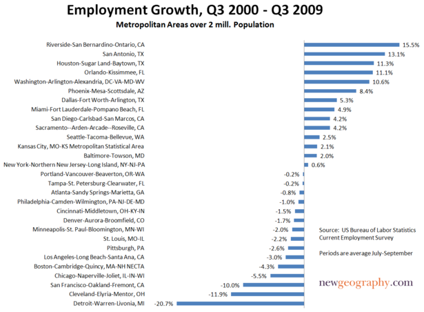
    It is not surprising then that the capital district enjoys the highest job growth since December 2009 of any region. Indeed, the Great Recession barely even hit the imperial center. Given its current trajectory, it’s likely to remain the primary boom town along the east coast.

    There are other less obvious regional winners from Obamanomics. Wall Street, despite its recent wailing, has fattened itself on the Fed’s cheap money. It may benefit further from highly complex new financial regulations that will drive smaller, regional competitors either out of business or into mergers with the megabanks.

    Manhattan – a liberal bastion dependent on arguably the greediest, most venal purveyors of capitalism – enjoyed a revived high end consumer economy of high fashion, fancy restaurants and art galleries. Silicon Valley’s financial community also is seeing a surfeit of grants and subsidies for the latest venture schemes, keeping Palo Alto and its environs relatively prosperous. Perhaps this is the positive “change” that Time recently credited in its paen to the stimulus.

    Other regional winners from the Obama economy generally can be found in state capitals and University towns, particularly those with the Ivy or elite college pedigrees that resonate with this most academic Administration. One illustration can be seen in the relatively strong recovery of Massachusetts – home to many prestigious Universities and hospitals – which has seen jobs grow by 2.2 percent since the Obama ascension.

    Similar, albeit less dramatic recoveries can be found in Columbus, Madison and Minneapolis-St.Paul, with their large university communities and regional federal employment centers. Yet the political benefits of this growth may be limited. Many other parts of these same states, including the outer boroughs of New York are not doing well; aside from Columbus, Ohio has continued to skid as its industrial and corporate base dwindles, often moving to more business friendly states.

    At the same time, the strongest growth clusters in those regions that stick to the basics: relatively low taxes, pro-business regulations and continued infrastructure investment. Some regions – particularly in Texas, Alaska, Wyoming and the Great Plains – also have benefited from the growth in such basic industries as agriculture, oil and mining.

    Like resource-producing Canada and Australia, which barely felt the great recession, these economies have been boosted by continued growth in demand from countries like India and China. The current rise in food commodity prices, in part due to poor conditions in Russia and other former Soviet Republics, may further intensify this trend. Beyond the current food crisis, changing consumer tastes in boom markets like China seem certain to boost demand for such products as corn, used to help meet that country’s soaring demand for pork and other meat products.

    But perhaps even more important, once the economy recovers these areas – with their business friendly regimes and lower costs – may continue to siphon much of the next wave of industrial and even tech growth from the more expensive, largely Obama-friendly regions. Caterpillar, for example, one of the likely beneficiaries of expanded exports, recently announced plans to open a new assembly plant not in its Midwestern base but in Victoria, outside Houston.

    This trend has been building for at least a generation and seems likely to intensify under today’s highly competitive global business environment. If we start seeing a recovery in such things as auto sales, one can expect much of the new demand to be meant in efficient, largely foreign owned factories that have been gearing up across the Southeast. Unless powerful federal intervention forces Americans to buy General Motors products like the Volt, consumer preference is likely to be strongest for smart, fuel efficient brands built largely in towns from southern Ohio down to Texas.

    Perhaps even more significantly, these areas are also challenging the Obama regions in such fields as high-technology. Tech hiring has picked up in places like Silicon Valley, New York and DC, but consistently the fastest growth in science, engineering and technical jobs has been in low-cost states such as North Dakota, Virginia, New Mexico, Utah and Texas. Just recently, several major Silicon Valley powerhouses – Adobe, Twitter, Electronic Arts and eBay – announced major new expansions in Utah, a state that is among a brood seeking to move prized businesses, including even entertainment, from the Golden State.

    To a distressingly large extent, the fate of these two distinct economies may hinge on the outcome in November. If the Republicans gain an effective blocking majority – perhaps with a handful of centrist Democrats from growth-oriented states – many favored programs of the Obama economy may be cut or eliminated entirely. These include high-speed rail, increased subsidies for new light rail lines, massive investments in University research and investment breaks for renewable fuels.

    On the other hand, if the Democratic majority persists the tilt towards the Obama economy may even become stronger, as the Democrats will be the ones primarily losing their seats in many growth states. Many policies inimical to the growth states – support for government satrapies like General Motors, tougher restrictions on domestic fossil fuel development and policies designed to curb suburban single family housing – might even intensify.

    In this sense, we need to see November as much as a conflict between growth economies as an ideological contest. The results could determine what regions are next to boom, and whose economy will slow or even decline. What might be best – a compromise recognizing the need to boost growth in all regions – may be a too far a stretch of logic in this political climate.

    This article originally appeared at Forbes.com.

    Joel Kotkin is executive editor of NewGeography.com and is a distinguished presidential fellow in urban futures at Chapman University. He is author of The City: A Global History. His newest book is The Next Hundred Million: America in 2050, released in February, 2010.

    Photo by bcbeatty

  • Despite Transit’s 2008 Peak, Longer Term Market Trend is Down: A 25 Year Report on Transit Ridership

    In 2008, US transit posted its highest ridership since 1950, a development widely noted and celebrated in the media. Ridership had been increasing for about a decade, however, 2008 coincided with the highest gasoline prices in history, which gave transit a boost.

    Less reported was the fact that despite higher ridership, transit’s market share (of transit and motor vehicles) has fallen since the 1950s. In 1955, transit’s market share was over 10%. By 2005, transit’s share had dropped to 1.5%, but recovered only to 1.6% in 2008. Transit’s all time peak ridership was in 1945, driven up by World War II and gas rationing. It is thus not surprising that national transit ridership (boardings) declined 3.8% in 2009 as gasoline prices moderated.

    Market Share by Major Urban Area

    Demographia has released urban area roadway and transit market share estimates for 2008, based upon Federal Transit Administration and Federal Highway Administration data. The table below compares 2008 with 1983 market share data for 56 urban areas with a corresponding metropolitan area population of more than 900,000 (complete data).

    Urban Areas: Roadway & Transit Market Share: 2008
    Ranked by 2008 Transit Market Share
    With 25 Year (1983) Comparison
        2008 1983 Roadway Share % Change
    Rank Urban Area Roadway Share Transit Share:  Roadway Share Transit Share: 
    1 New York 89.0% 11.0% 87.7% 12.3% 1.5%
    2 San Francisco 95.0% 5.0% 93.7% 6.3% 1.4%
    3 Washington 95.5% 4.5% 96.1% 3.9% -0.6%
    4 Chicago 96.1% 3.9% 94.2% 5.8% 2.0%
    5 Honolulu 96.2% 3.8% 93.2% 6.8% 3.2%
    6 Boston 96.7% 3.3% 97.5% 2.5% -0.8%
    7 Seattle 97.2% 2.8% 97.6% 2.4% -0.4%
    8 Philadelphia 97.3% 2.7% 96.0% 4.0% 1.4%
    9 Portland 97.7% 2.3% 97.6% 2.4% 0.1%
    10 Salt Lake City 97.8% 2.2% 99.1% 0.9% -1.3%
    11 Los Angeles 98.1% 1.9% 98.1% 1.9% 0.0%
    12 Denver 98.2% 1.8% 98.5% 1.5% -0.3%
    13 Baltimore 98.3% 1.7% 97.7% 2.3% 0.6%
    14 Pittsburgh 98.6% 1.4% 97.3% 2.7% 1.3%
    15 Miami-West Palm Beach 98.7% 1.3% 98.8% 1.2% -0.1%
    16 Atlanta 98.8% 1.2% 98.0% 2.0% 0.8%
    16 Cleveland 98.8% 1.2% 98.0% 2.0% 0.8%
    16 Las Vegas 98.8% 1.2% 99.6% 0.4% -0.8%
    16 Minneapolis-St. Paul 98.8% 1.2% 98.8% 1.2% 0.0%
    16 San Diego 98.8% 1.2% 99.3% 0.7% -0.5%
    21 San Jose 99.0% 1.0% 99.0% 1.0% 0.0%
    22 Austin 99.1% 0.9% 99.7% 0.3% -0.6%
    22 Houston 99.1% 0.9% 99.0% 1.0% 0.1%
    22 Milwaukee 99.1% 0.9% 98.3% 1.7% 0.8%
    22 Sacramento 99.1% 0.9% 99.0% 1.0% 0.1%
    22 San Antonio 99.1% 0.9% 98.7% 1.3% 0.4%
    27 St. Louis 99.2% 0.8% 99.0% 1.0% 0.2%
    28 Buffalo 99.3% 0.7% 98.5% 1.5% 0.8%
    28 Providence 99.3% 0.7% 98.9% 1.1% 0.4%
    30 Charlotte 99.4% 0.6% 99.3% 0.7% 0.1%
    30 Cincinnati 99.4% 0.6% 98.7% 1.3% 0.7%
    30 Dallas-Fort Worth 99.4% 0.6% 99.4% 0.6% 0.0%
    30 Hartford 99.4% 0.6% 98.7% 1.3% 0.7%
    30 Orlando 99.4% 0.6% 99.7% 0.3% -0.3%
    30 Phoenix 99.4% 0.6% 99.4% 0.6% 0.0%
    30 Rochester 99.4% 0.6% 98.9% 1.1% 0.5%
    30 Tucson 99.4% 0.6% 98.9% 1.1% 0.5%
    38 Detroit 99.5% 0.5% 98.8% 1.2% 0.7%
    38 Fresno 99.5% 0.5% 99.3% 0.7% 0.2%
    38 New Orleans 99.5% 0.5% 97.4% 2.6% 2.2%
    38 Norfolk-Virginia Beach 99.5% 0.5% 99.2% 0.8% 0.3%
    38 Riverside-San Bernardino 99.5% 0.5% 99.6% 0.4% -0.1%
    43 Columbus 99.6% 0.4% 98.6% 1.4% 1.0%
    43 Louisville 99.6% 0.4% 98.9% 1.1% 0.7%
    43 Memphis 99.6% 0.4% 99.4% 0.6% 0.2%
    43 Tampa-St. Petersburg 99.6% 0.4% 99.5% 0.5% 0.1%
    47 Bridgeport 99.7% 0.3% 99.8% 0.2% -0.1%
    47 Jacksonville 99.7% 0.3% 99.4% 0.6% 0.3%
    47 Kansas City 99.7% 0.3% 99.4% 0.6% 0.3%
    47 Nashville 99.7% 0.3% 99.4% 0.6% 0.3%
    47 Raleigh 99.7% 0.3% 99.9% 0.1% -0.2%
    47 Richmond 99.7% 0.3% 99.1% 0.9% 0.6%
    53 Indianapolis 99.8% 0.2% 99.3% 0.7% 0.5%
    54 Birmingham 99.9% 0.1% 99.5% 0.5% 0.4%
    54 Oklahoma City 99.9% 0.1% 99.9% 0.1% 0.0%
    54 Tulsa 99.9% 0.1% 99.6% 0.4% 0.3%
    Unweighted Average 98.7% 1.3% 98.3% 1.7% 0.4%
    All Urban Areas Combined 98.4% 1.6% 97.5% 2.5% 0.9%
    Based upon passenger miles
    Core urban areas in metropolitan areas with more than 900,000 population in 2009.
    Derived from Federal Transit Administration and Federal Highway Administration data
    Los Angeles and Mission Viejo urban areas combined
    San Francisco, Concord and Livermore urban areas combined
    Historic transit market share data at http://www.publicpurpose.com/ut-usptshare45.pdf
    Maryland commuter rail (MARC) assigned to Washington, DC

    In 1983, transit systems started receiving support from federal taxes on gasoline. This was also the first year that the National Transit Database reported on the same annual basis as it does today. One justification for using funds from road users was the hope of attracting people from cars to transit. The national data above and the urban area below show that the overwhelming share of new travel has, nonetheless, continued to be captured by motor vehicles rather than transit. Among the 56 urban areas, 13 experienced gains in transit market share from 1983 to the peak year of 2008, while 37 posted losses and six had no change. Transit was able to capture only 0.9% of new urban travel between 1983 and 2008, while roadways captured 99.1%. (Note 1).

    The Top 10: Still a New York Story

    #1: New York: The nation’s predominant urban area remains New York, with an 11.0% transit market share. In 2008, 41% of the national transit ridership (passenger miles) was in New York, with much of it either in or focused upon New York City. The New York City Transit Authority, and a host of local public and private systems, principally serve New York City destinations and account for a remarkable 38% of the nation’s transit ridership. Even so, transit’s market share dropped from 12.3% in 1983. As a result, the roadway market share in New York increased 1.5% between 1983 and 2008, the fourth largest gain in the nation. Transit attracted 8.7% of the new demand between 1983 and 2008, while roadways attracted 91.3%.

    #2: San Francisco: San Francisco had the nation’s second highest transit market share in 2008, at 5.0%. This is a decline from 6.3% in 1983. Nonetheless, San Francisco moved up from 6th place in 1983. This produced a 1.4% increase in the roadway market share between 1983 and 2008, the fifth largest gain in the nation. Transit accounted for 2.2% of the new demand, while roadways attracted 97.8%.

    #3: Washington: Washington placed third in transit market share in 2008, at 4.5%. This represents a gain from 3.9% in 1983 and an improvement from 6th place. Washington was the only urban area among the top five to experience an increase in transit market share. Much of Washington’s transit increase was on its expanding Metrorail system and the MARC commuter rail system (most of the ridership on this Maryland based system commutes to Washington. Overall, transit in Washington has attracted 5.1% of new travel over the past 25 years, while roadways attracted 94.9% of new demand.

    #4: Chicago: Chicago ranked fourth in transit market share, at 3.9%. In 1983, Chicago had ranked 3rd, with a market share of 5.8. The roadway market share in Chicago increased 2.0% from 1983 to 2008, the third largest road travel gain in the nation. Transit attracted 1.3% of new demand over the period in Chicago, while roadways attracted 98.7%.

    #5: Honolulu: Honolulu ranked fifth in transit market share, at 3.8%. This is a significant drop from 1983, when Honolulu ranked 2nd in the nation, with a transit market share of 6.8%. Honolulu’s roadway market share gain was the largest in the nation between 1983 and 2005, at 3.8%. Transit ridership also dropped in Honolulu from 1983 to 2008, so that roadways accounted for all new travel.

    #6: Boston: Boston ranked sixth in transit market share in 2008, at 3.3%. This is a gain from 2.5% in 1983, when Boston ranked 9th. Much of Boston’s increase is attributable to its commuter rail expansion. Transit captured 4.1% of new demand, while roadways attracted 95.9%.

    #7: Seattle: Seattle’s principally all bus transit system ranked 7th in 2008 with a market share of 2.8%. This is an increase from 2.4% in 1983, when Seattle ranked 10th. Transit captured 3.1% of new travel over the past 25 years, while roadways accounted for 96.9%.

    #8: Philadelphia: Philadelphia slipped from the 5th largest transit market share in 1983 (4.0%) to 8th in 2008, at 2.7%. Philadelphia’s transit system, one of the most comprehensive in the nation, captured just 1.4% of new travel over the last quarter century, while roadways captured 98.6%.

    #9: Portland: Portland ranked 9th in transit market share in 2008, at 2.3%. This is a decline from 2.4% in 1983 and occurred despite opening the most extensive new light rail system in the nation over the period. Transit attracted 2.2% of new travel over the period, while roadways attracted 97.8%.

    #10: Salt Lake City: Salt Lake City, at 10th, is a new entrant to the top 10 transit market share urban areas, with a share of 2.2%. In 1983, Salt Lake City ranked 34th, with a transit market share of 0.9%. Even with this increase, however, roadways captured the bulk of new travel, at 96.2%, while transit attracted 3.8%, due to transit’s small 1983 base.

    Other Urban Areas: There were also notable developments among the urban areas that did not place in the top 10 in 2008 transit market share.

    Las Vegas: Las Vegas improved its ranking more than any other urban area, moving from 49th in 1983 to 16th in 2008 (in a tie with Atlanta, San Diego, Cleveland and Minneapolis-St. Paul). In 1983, Las Vegas had a transit market share of 0.4%, which improved to 1.2% in 2008. This was an especially notable achievement, because Las Vegas experienced substantial population growth over the period. During the period, Las Vegas established a 100% competitively contracted transit system, the only such transit system in the nation and has seen ridership expand by more than 10 times. Nonetheless, as in other gaining urban areas, such as Salt Lake City and Washington, the transit ridership base was so small that roadways captured nearly all the new demand, at 98.6% (transit obtained 1.4%).

    Atlanta: Atlanta both (1) was the fastest growing larger urban area in the developed world between 1983 and 2008 and (2) built the second most new rail capacity in the nation, in its expansion of the MARTA Metro (trailing only Washington’s Metro). Yet, Atlanta’s transit market share fell from 2.0% to 1.2% between 1983 and 2008, with transit attracting only 0.9% of new travel.

    New Rail Urban Areas: Transit market shares generally failed to increase in urban areas opening new light rail or metro systems over the period (excludes urban areas with new rail systems that were not open at the beginning of fiscal year 2008).

    • Six urban areas with new rail systems experienced market share declines, including Portland, Baltimore, Houston, Sacramento, St. Louis and Buffalo.
    • Four urban areas with new rail systems had static transit market shares, including Los Angeles, Minneapolis-St. Paul, San Jose and Dallas-Fort Worth.
    • Three urban areas with new rail systems experienced transit market share increases. The largest increase was in Salt Lake City (and the largest of any urban area). Denver and Miami-West Palm Beach also experienced increases.

    Where from Here? It might have been expected that transit would have attracted far higher ridership numbers when gasoline prices achieved such heights. Yet, nationally, transit market share increase was only from 1.5% to 1.6%, even as roadway demand was declining modestly.

    Transit’s principal marketing problem lies in its problem serving destinations outside downtown. Downtowns typically account for only 10% of urban area employment. Some trips in an urban cannot even be made on transit. For example, Portland’s extensive transit system connects only about two-thirds of the jobs and residences within the (Tri-Met) service area (Note 2). Further Tri-Met’s award deserving internet trip planner shows that some trips to outside downtown destinations can require more than two hours, even when light rail is used.


    Note 1: This data relates only to passenger transportation. Urban roadways, unlike transit, also carry a substantial amount of local and intercity freight, which is not reflected in this data.

    Note 2: According to Metro’s 2004 Regional Transportation Plan, 78% of the residences and 86% of the jobs in the Tri-Met service area were within walking distance (1/4 mile) of a transit stop. This means that approximately 67% of residences and jobs are within 1/4 mile of a transit stop (0.78 * 0.86). Metro’s plans envision this figure dropping to 59% by 2020 (this data does not include Clark County in Washington, part of which is in the urban area).

    Wendell Cox is a Visiting Professor, Conservatoire National des Arts et Metiers, Paris. He was born in Los Angeles and was appointed to three terms on the Los Angeles County Transportation Commission by Mayor Tom Bradley. He is the author of “War on the Dream: How Anti-Sprawl Policy Threatens the Quality of Life.

  • SPECIAL REPORT: Metropolitan Area Migration Mirrors Housing Affordability

    On schedule, the annual ritual occurred last week in which the Census Bureau releases population and migration estimates and the press announces that people are no longer moving to the Sun Belt. The coverage by The Wall Street Journal was typical of the media bias, with a headline “Sun Belt Loses its Shine.” In fact, the story is more complicated – and more revealing about future trends.

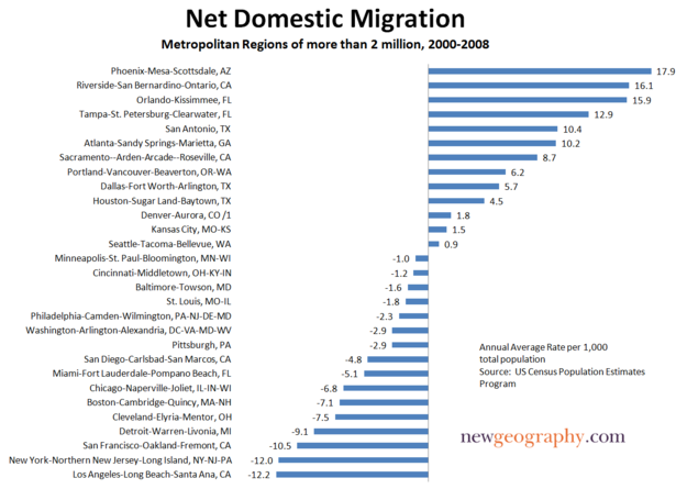
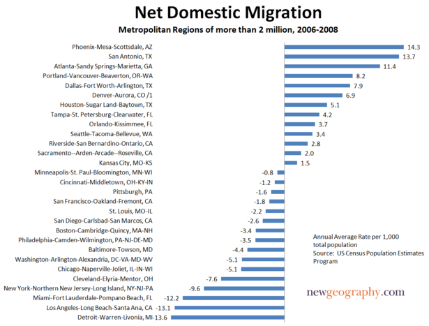
    Domestic Migration Tracks Housing Affordability: There have been changes in domestic migration (people moving from one part of the country to another) trends in the last few years, but the principal association is with housing affordability.

    Severe and Not-Severe Bubble Markets: Overall, the major metropolitan markets with severe housing bubbles (a Median Multiple rising to at least 4.5, see note) lost nearly 3.2 million domestic migrants (all of these markets have restrictive land use regulation, such as smart growth or growth management) from 2000 to 2009. However, not all markets with severe housing bubbles lost domestic migrants. “Safety valve” bubble markets drew migration from the extreme bubble markets of coastal California, Miami and the Northeast. These “safety valve” markets (including Phoenix, Las Vegas, Portland, Seattle, Riverside-San Bernardino, Orlando, Tucson and Tampa-St. Petersburg), gained a net 2.2 million from 2000 to 2009, while the other bubble markets lost 5.3 million domestic migrants from 2000 to 2009 (See Table below, metropolitan area details in Demographia US Metropolitan Areas Table 8). At the same time, the markets that did not experience a severe housing bubble (those in which the Median Multiple did not reach 4.5) gained a net 1.5 million domestic migrants.

    The burst of the housing bubble explains the changes in domestic migration trends. Housing affordability has improved markedly in the extreme bubble markets, so that there was less incentive to move. Then there was the housing bust-induced Great Recession, which also slowed migration since people had more trouble selling their homes or finding anew job. As a result, the migration to the “safety valve” markets and to the smaller markets dropped substantially.

    • During 2009, the “safety valve” markets gained only 51,000 net domestic migrants, one-fifth of the annual average from 2000 to 2008.
    • At the same time, the other severe housing bubble markets lost 236,000 domestic migrants in 2009, compared to the average loss of 638,000 from 2000 to 2008.
    • Areas outside the major metropolitan areas also experienced a significant drop in domestic migration, dropping from an annual average of 203,000 between 2000 and 2008 to 23,000 in 2009.
    • The major metropolitan markets that did not experience a severe housing bubble gained 161,000 domestic migrants in 2009, little changed from the 169,000 average from 2000 to 2008. These markets are concentrated in the South and Midwest. Indianapolis, Kansas City, Nashville, Louisville and Columbus as well as the Texas metropolitan areas continued their positive migration trends.
    Domestic Migration by Severity of the Housing Bubble
    Metropolitan Areas over 1,000,000 Population
    2000-2008
    Metropolitan Areas 2000-2009 2009 2000-2008 Average
    Withouth Severe Housing Bubbles     1,509,870         160,514      168,670
    With Severe Housing Bubbles    (3,161,514)        (184,486)     (372,129)
       Not "Safety Valve" Markets    (5,347,211)        (235,838)     (638,922)
       "Safety Valve" Markets     2,185,697           51,352      266,793
    Outside Largest Metropolitan Areas     1,651,644           23,972      203,459
    Severe housing bubbles: Housing costs rose to a Median Multiple of 4.5 or more (50% above the historic norm of 3.0). 
    Median Multiple: Median House Price/Median Household Income
    "Safety Valve" refers to markets with severe housing bubbles that received substantial migration from more expensive markets (coastal California, Miami and the Northeast). These markets include Las Vegas, Phoenix, Riverside-San Bernardino, Sacramento, Portland, Seattle, Orlando, Tucson and Tampa-St. Petersburg.

    Moreover, the Census Bureau revised its previous domestic migration figures for 2000 to 2008 to add more than 110,000 from the markets without severe housing bubbles, while taking away more than 150,000 domestic migrants from the markets with severe housing bubbles. This adjustment alone rivals the 2009 domestic migration loss of 183,000 in these markets

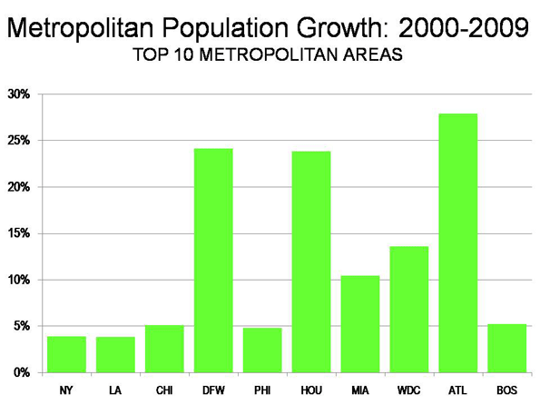
    Population Growth: The Top 10 Metropolitan Areas: Sun Belt metropolitan areas continued to experience the greatest population growth. Between 2000 and 2009, the fastest growing metropolitan areas were Atlanta, Dallas-Fort Worth and Houston, In 2009, Washington, DC was added to the list (Details in Demographia US Metropolitan Areas, Table 2).

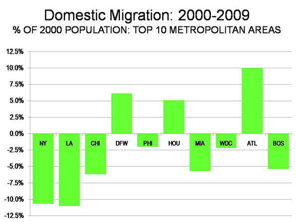
    New York: The New York metropolitan area remains the nation’s largest, now reaching a population of over 19 million. More than 700,000 new residents have been added since 2000. However, New York’s population growth has been the second slowest of the 10 largest metropolitan areas since 2000 (Figure 1). Moreover, New York’s net domestic out-migration has been huge. New York has lost 1,960,000 domestic migrants, which is more people than live in the boroughs of The Bronx and Richmond combined. Overall, 10.7% of the New York metropolitan area’s 2000 population left the metropolitan area between 2000 and 2009. More than 1,200,000 of this domestic migration was from the city of New York. Between 2008 and 2009, New York’s net domestic out-migration slowed from the minus 1.32% 2000-2008 annual rate to minus 0.58%., reflecting the smaller migration figures that have been typical of the Great Recession.

    Los Angeles: For decades, Los Angeles has been one of the world’s fastest growing metropolitan areas. Growth had ebbed somewhat by the 1990s, when Los Angeles added 1.1 million people. The California Department of Finance had projected that Los Angeles would add another 1.35 million people between 2000 and 2010. Yet, the Los Angeles growth rate fell drastically. From 2000 to 2009, Los Angeles added barely one-third the projected amount (476,000) and grew only 3.8%. Unbelievably, fast growing Los Angeles became the slowest growing metropolitan area among the 10 largest. In 2009, Los Angeles had 12.9 million people. Los Angeles lost 1.365 million domestic migrants, which is of 11.0% of its 2000 population, and the most severe outmigration among the top 10 metropolitan areas (Figure 2).

    Chicago: Chicago continues to be the nation’s third largest metropolitan area, at 9.6 million population, a position it has held since being displaced by Los Angeles in 1960. Chicago has experienced decades of slow growth and continues to grow less than the national average, at 5.1% between 2000 and 2009 (the national average was 8.8%). Yet, Chicago grew faster than both New York and Los Angeles. Chicago also lost a large number of domestic migrants (561,000), though at a much lower rate than New York and Chicago (6.2%). Even so, Chicago is growing fast enough that it could exceed 10 million population in little more than a decade, by the 2020 census.

    Dallas-Fort Worth: Dallas-Fort Worth has emerged as the nation’s fourth largest metropolitan area, at 6.4 million, having added 1,250,000 since 2000. In 2000, Dallas-Fort Worth ranked fifth, with 500,000 fewer people than Philadelphia, which it now leads by nearly 500,000. Dallas-Fort Worth added more population than any metropolitan area in the nation between 2008 and 2009 and has been the fastest growing of the 10 top metropolitan areas since 2006. As a result, Dallas-Fort Worth has replaced Atlanta as the high-income world’s fastest growing metropolitan area with more than 5,000,000 population. Dallas-Fort Worth added a net 317,000 domestic migrants between 2000 and 2009.

    Philadelphia: Philadelphia is the nation’s fifth largest metropolitan area, at just below 6,000,000 population. Like Chicago, Philadelphia has had decades of slow growth, yet has grown faster in this decade than both New York and Los Angeles (4.8%). Philadelphia has lost a net 115,000 domestic migrants since 2000, for a loss rate of 2.2%, well below that of New York, Los Angeles and Chicago.

    Houston: Houston ranks sixth, with 5.9 million people and is giving Dallas-Fort Worth a “run for its money.” Like Dallas-Fort Worth, Houston has added more than 1,000,000 people since 2000. Over the same period, Houston has passed Miami and Washington (DC) in population. Houston has added a net 244,000 domestic migrants since 2000, and added 50,000 in 2008-2009, the largest number in the country. Like Dallas-Fort Worth, Houston accelerated its annual domestic migration growth rate in 2008-2009. At the current growth rate, Houston seems likely to pass Philadelphia in population shortly after the 2010 census.

    Miami: Miami (stretching from Miami through Fort Lauderdale to West Palm Beach) is the seventh largest metropolitan area, with 5.6 million people. Miami has added more than 500,000 people, for a growth rate of 10.4%. However, Miami has suffered substantial domestic migration losses, at 287,000, a loss rate of, 5.7% relative to its 2000 population.

    Washington (DC): Washington recaptured 8th place, moving ahead of Atlanta, which had temporarily replaced it. Washington’s population is 5.5 million and added 655,000 between 2000 and 2009, for a growth rate of 13.6%. However, Washington lost a net 110,000 domestic migrants, 2.2% of its 2000 population. That trend was reversed in 2008-2009, when a net 18,000 domestic migrants moved to Washington, perhaps reflecting the increased concentration of economic power in the nation’s capital.

    Atlanta: Atlanta is the real surprise this year. For more than 30 years, Atlanta has had strong growth, however, this year it slowed. Atlanta is the 9th largest metropolitan area in the nation, at 5.5 million. Since 2000, Atlanta has added 1.2 million people, though added only 90,000 last year. Atlanta has added a net 429,000 domestic migrants since 2000, though the rate slowed to only 17,000 in 2008-2009.

    Boston: Boston is the nation’s 10th largest metropolitan area, with 4.6 million people. During the 2000s, Boston has added nearly 200,000, growing by 4.2%. Yet, Boston has also experienced a net domestic migration loss of 236,000, or 5.4% of its 2000 population. In 2008-2009, Boston, like Washington, reversed its domestic migration losses, adding 7,000.

    Trends by Size of Metropolitan Area: As throughout the decade, the slowest growing areas of the nation have been metropolitan areas over 10,000,000 population (New York and Los Angeles), which grew 3.9% and non-metropolitan areas, which grew 2.6% during the decade Metropolitan areas that had between 2.5 and 5.0 million population in 2000 boasted the biggest jump (these include fast growing Houston and Atlanta, which are now more than 5 million), at 13.4% for the decade. All of the other size classifications grew between 8.9% and 11.3% over the decade (see Demographia US Metropolitan Areas, Table 1). Metropolitan areas that began the decade with between 5,000,000 and 10,000,000 population gained 10.0%. Those with 250,000 to 500,000 grew 10.4%, those with 500,000 to 1,000,000 grew 10.2% and the smallest metropolitan areas, those from 50,000 to 250,000 grew 8.9%

    Metropolitan areas over 1,000,000 population lost 2.19 million domestic migrants during the decade, but smaller metropolitan areas added 2.24 million domestic migrants. Non-metropolitan areas lost 50,000 domestic migrants. In 2009, the smaller metropolitan areas gained 125,000 domestic migrants, while the larger metropolitan areas lost 30,000. Non-metropolitan areas lost more than 90,000 domestic migrants. As noted above, these smaller figures for 2009 reflect the more stable housing market and the extent to which the Great Recession has reduced geographic mobility (See Demographia US Metropolitan Areas, Tables 1 and 3).


    Note: The Median Multiple is the median house price divided by the median household income. The historic standard has been 3.0.

    Photograph: Dallas

    Wendell Cox is a Visiting Professor, Conservatoire National des Arts et Metiers, Paris. He was born in Los Angeles and was appointed to three terms on the Los Angeles County Transportation Commission by Mayor Tom Bradley. He is the author of “War on the Dream: How Anti-Sprawl Policy Threatens the Quality of Life.

  • Forced March To The Cities

    California is in trouble: Unemployment is over 13%, the state is broke and hundreds of thousands of people, many of them middle-class families, are streaming for the exits. But to some politicians, like Sen. Alan Lowenthal, the real challenge for California “progressives” is not to fix the economy but to reengineer the way people live.

    In Lowenthal’s case the clarion call is to take steps to ban free parking. This way, the Long Beach Democrat reasons, Californians would have to give up their cars and either take the bus or walk to their local shops. “Free parking has significant social, economic and environmental costs,” Lowenthal told the Los Angeles Times. “It increases congestion and greenhouse gas emissions.”

    Scarily, his proposal actually passed the State Senate.

    One would hope that the mania for changing how people live and work could be dismissed as just local Californian lunacy. Yet across the country, and within the Obama Administration, there is a growing predilection to endorse policies that steer the bulk of new development into our already most-crowded urban areas.

    One influential document called “Moving Cooler”, cooked up by the Environmental Protection Agency, the Urban Land Institute, the Environmental Defense Fund, Natural Resources Defense Council, the Environmental Protection Agency and others, lays out a strategy that would essentially force the vast majority of new development into dense city cores.

    Over the next 40 years this could result in something like 60 million to 80 million people being crammed into existing central cities. These policies work hard to make suburban life as miserable as possible by shifting infrastructure spending to dense areas. One proposal, “Moving Cooler,” outdoes even Lowenthal by calling for charges of upwards of $400 for people to park in front of their own houses.

    The ostensible justification for this policy lies in the dynamics of slowing climate change. Forcing people to live in dense cities, the reasoning goes, would make people give up all those free parking opportunities and and even their private vehicles, which would reduce their dreaded “carbon imprint.”

    Yet there are a few little problems with this “cramming” policy. Its environmental implications are far from assured. According to some recent studies in Australia, the carbon footprint of high-rise urban residents is higher than that of medium- and low-density suburban homes, due to such things as the cost of heating common areas, including parking garages, and the highly consumptive lifestyles of more affluent urbanites.

    Moreover, it appears that even those who live in dense places may be loath to give up their cars. Over 90% of all jobs in American metropolitan regions are located outside the central business districts, which tend to be the only places well suited for mass transit.

    Indeed, despite the massive expansion of transit systems in the past 30 years, the percentage of people taking public transportation in major metropolitan regions has dropped from roughly 8% to closer to 5%. Even in Portland, Ore.–the mecca for new wave transit consciousness–the share of people using transit to get to work is now considerably less than it was in 1980. In recent months overall transit ridership nationwide has actually dropped.

    These realities suggest that densification of most cities–with the exceptions of New York, Washington and perhaps a few others–cannot be supported by transit. Furthermore, drivers in dense cities will be confronted with not less congestion, but more, which will likely also boost pollution. The most congested cities in the country tend to be the densest, such as Los Angeles, Sen. Lowenthal’s bailiwick, which is in an unenviable first place.

    Then there is the little issue of people’s preferences. Urban boosters have been correct in saying that until recently there have been too few opportunities for middle-class residents to live in and around city cores. But over the past decade many cities have gone for broke with dense condo and rental housing and have produced far more product, often at very high cost, than the market can reasonably bear.

    Initially, when the mortgage crisis broke, the density advocates built much of their case on the fact that the biggest hits took place in suburban areas, particularly on the fringe. Yet as suburban construction ended, cities continued building high-density urban housing–sometimes encouraged by city subsidies. As a result, in the last two years massive foreclosures have plagued many cities, and many condominiums have been converted to rentals. This is true in bubble towns like Las Vegas and Miami; “smart-growth” bastions like Portland and Seattle; and even relatively sane places such as Kansas City, Mo. All these places have a massive amount of high-density condos that are either vacant or converted into lower-cost rentals.

    Take Portland. The city’s condo prices are down 30% from their original list price. The 177-unit Encore, one of the fanciest new towers, has closed sales on 12 of its units as of March, while another goes to auction. Meanwhile in New York half-completed structures dot Brooklyn’s once-thriving Williamsburg neighborhood, while the massive Stuyvesant Town apartment complex in Manhattan teeters at the edge of bankruptcy.

    Finally, it is unlikely that cities would be able to accommodate the massive growth promoted by urban boosters, land speculators and policy mavens. Aaron Renn, who writes the influential Urbanophile blog, says that most American cities today struggle to maintain their current infrastructure. They also have limited options to zone land for high-density construction, due in part to grassroots opposition to existing residential neighborhoods. Overall they would be hard-pressed to accommodate much more than 10% of their region’s growth, much less 50% or 60%.

    Given these realities, and the depth of the current recession, one might think that governments would focus more on basics like jobs and fixing the infrastructure–in suburbs as well as cities–than reengineering how people live. Yet it is increasingly clear that for many “progressives” the real agenda is not enabling people to achieve their dreams–especially in the form of a suburban single-family house. It is, instead, forcing them to live in what is viewed as more ecologically and socially preferable density.

    In the next few months we may see more of the kind of hyperregulation proposed by the likes of Sen. Lowenthal. It is entirely possible that a hoary coalition of HUD, Department of Transportation and EPA bureaucrats could start trying to restrict future housing development along the lines suggested in “Moving Cooler.”

    Yet over time one has to wonder about the political efficacy of this approach. Right now Americans are focused primarily on simply economic growth–and perhaps a touch less on the intellectual niceties of the “smart” form. In addition they are increasingly skeptical about climate change, which serves as the primary raison d’etre behind the new regulatory schema.

    Given the zealousness of the density advocates, perhaps the only thing that will slow, and even reverse, this process will be the political equivalent of a sharp slap across the face. Unless the ruling party begins to reacquaint itself with the preferences and aspirations of the vast majority of Americans, they may find themselves experiencing repeats of their recent humiliating defeat–manufactured largely in the Boston suburbs–in true-blue Massachusetts.

    Americans–suburban or urban–may resist a return to unbridled and extreme Republicanism, whether on social issues or in economic policy. But forced to choose between Neanderthals, who at least might leave them alone in their daily lives, and higher-order intellects determined to reengineer their lives, they might end up supporting bipeds lower down the evolutionary chain, at least until the progressive vanguard regains a grip on common sense.

    This article originally appeared at Forbes.com.

    Joel Kotkin is executive editor of NewGeography.com and is a distinguished presidential fellow in urban futures at Chapman University. He is author of The City: A Global History. His newest book is The Next Hundred Million: America in 2050, released in Febuary, 2010.

    Photo: Creativity+ Timothy K Hamilton

  • Who’s Dependent on Cars? Try Mass Transit

    The Smart Growth movement has long demonstrated a keen understanding of the importance of rhetoric. Terms like livability, transportation choice, and even “smart growth” enable advocates to argue by assertion rather than by evidence. Smart Growth rhetoric thrives in a political culture that rewards the clever catchphrase over drab data analysis, but often fails to identify the risks for cities inherent in their war against “auto-dependency” and promotion of large-scale mass transit to boost the “sustainability” of communities.

    Yet in pursuing this transit-friendly future political leaders rarely confront this inescapable reality: public transportation is fiscally unsustainable and utterly dependent on the very car-drivers transit boosters so often excoriate. For example, a major source of funding for transit comes from taxes paid by motorists, which include principally fuel taxes but also sales taxes, registration fees and transportation grants. The amount of tax diversion varies from place to place, but whether the metro region is small or large the subsidies are significant. In Gainesville, Florida – a college town of 120,000 – the regional transit system received 80 percent of the city’s local option gas tax in 2008. In New York City, the Triborough Bridge and Tunnel Authority diverts 68 percent of its toll revenues to subways and buses.

    In addition to local subsidies, state and federal agencies fund transit operations with revenue from gas taxes and other motorist user fees. In 2007 transit agencies received $10.7 billion from the federal Highway Trust Fund, and that is a conservative figure since another $11.7 billion was diverted for vaguely phrased “non-highway purposes.”

    In contrast, fare box recovery doesn’t come close to covering operating expenses. Nor can transit pay for its own capital outlay. Last year the Metropolitan Washington Airports Authority moved to dedicate toll revenue and toll bonds to cover half the cost of the $5.26 billion Dulles Metrorail project.

    The implications of transit’s auto-dependency are serious. Americans drove 11 billion fewer miles between 2008 and 2009, and for each mile not traveled local, state, and federal taxes were not collected. Without these anticipated revenues, transit systems across the country have suffered and, ironically, those hit hardest are the people who are dependent on public transportation ,that is in most cities, the poor and the young.

    In D.C., transit riders are being warned by Metro officials to expect half-hour waits for buses and trains and more crowded rides as they cut services and lay off positions to close a $40 million budget shortfall. Santa Clara County’s Valley Transit Authority has announced plans to reduce bus service by 8 percent and light rail service by 6.5 percent. In Arizona, both Tempe and Phoenix face major cuts that will lengthen wait times and eliminate routes. Even as demand for transit increases in states like Minnesota, the decline in funding is leading to major readjustments in service.

    The situation is so dire in New York City – with by far the most extensive transit system in the country – that advocates used students as props to protest service cuts caused by a $400 million budget shortfall. Though transit receives funding from other sources, there can be no mistaking the key role played by motorists.

    The decline in driving can be attributed largely to the economic downturn and increased unemployment, but even when the recession ends transit agencies will face an uncertain funding future. New technologies are making automobiles cleaner and more fuel efficient, which will allow people to drive more while paying and polluting less. If auto makers meet new federal standards, cars will soon be achieving 35.5 miles per gallon instead of today’s 27.5 mpg average. Economic growth continues to disperse and there has been a strong uptick in telecommuting.

    But perhaps the biggest threat to the future of auto-dependent transit is the very “cause” that seeks to establish it as the preferred travel mode. The planning doctrine called Smart Growth with its rationale of sustainable development is growing in popularity in urban areas across the country. Local officials are enamored with visions of auto-light cities where the buses are full, sidewalks are crowded and there are more bicycles on the road than cars.

    Beneath the appealing rhetoric of Smart Growth rests the assumption that automobiles are intrinsically bad and that public policy should be directed at restricting their use. Rarely do policymakers weigh the automobile’s many benefits and the improving technologies that are mitigating its negative environmental impact. Even rarer is discussion of whether transit can realistically match the convenience and flexibility of the automobile for both individuals and families.

    Distracted perhaps by pictures of ornate transit hubs and shiny rail cars, many policy makers fail to focus on developing a fiscally sustainable plan for public transportation. They miss the fundamental problem that anything heavily subsidized –particularly in a budget constrained atmosphere – is, by definition, unsustainable. (To the extent roads are subsidized, it breaks down to about a half-penny per passenger mile; transit subsidies are 100 times more than driving subsidies.) Ideally, user fees would cover all expenses of all transportation modes, including driving.

    A responsible policy goal should be for transit users to put their fair share in the fare box. However, given the current tax diversion imbalance, local officials should at least target a near-term goal for fare box recovery of 85 percent of costs instead of its current one-third average. This will reduce both their fatal auto-dependency and the instability that comes when external revenue sources are impacted by external factors like an economic downturn.

    Transit agencies should also right-size their bus fleets. Despite visions of large 55-passenger vehicles filled to capacity with contented commuters, only a small portion of routes in any urban area can fill these big box buses even during certain peak times. A smaller sized fleet would be not only less expensive but also more flexible, allowing cities to adjust routes and increase headways for greater service. It would also have a smaller carbon footprint.

    Finally, responsible policymakers should suspend most of their plans to build rail transit. In addition to routinely running over-budget, rail transit- outside of a few cities such as Washington DC and New York- simply does not carry many passengers relative to automobiles to justify its enormous operating expenses . The Santa Clara Valley Transportation Authority, for example, spent $55.5 million in operating expenses in 2008, recovering just $8.6 million from passenger fares and costing taxpayers an average of $5.88 per trip.

    Rubber tire transit is more efficient compared to rail as a service to those needing public transportation. Santa Clara’s operating expenses per vehicle revenue mile were 25 percent less for bus than for light rail. Additionally, bus transit is far more flexible, easier to expand and less disruptive in the construction phase.

    Essentially, policymakers need to see transit as a service with an important but limited role to play in most urban regions. With jobs and more activities spreading to the suburbs and exurbs – a process often accelerated by economically disruptive urban policies, cities should focus transit on a limited number of central core commuters as well as those people who cannot drive. Unfortunately, such goals are too modest for planners who envision transit as the catalyst for large scale social engineering and who have little concern for their regions’ economic bottom line.

    The dirty little secret remains that public transportation would collapse without the automobile. It will remain unsustainable as long as it remains dependent on that which public policy is trying to discourage. Smart Growth rhetoric makes for great campaign literature but not for smart decision-making. Responsible officials should question the underlying assumptions about automobiles and begin reconsidering the fiscal calculus that underlies transit policy.

    Ed Braddy is the executive director of the American Dream Coalition, a non-profit public policy organization that examines transportation and land-use policies at the local level. The ADC’s annual conference will be held this year on June 10-12 in Orlando, Florida.

    Photo: ahockley

  • New Geography Top Stories of 2009

    As we bring to a close our first full calendar year at NewGeography.com, we thought readers may be interested in which articles out of more than 350 published enjoyed the widest readership. It’s been a solid year of growth for the site; visits to the site over the past six months have more than tripled over last year and subscribers have increased by a factor of six. The list of popular articles is based both on.readership online and via RSS.

    15. Joel Kotkin’s piece, Numbers Don’t Support Migration Exodus to “Cool Cities”, makes the case that places considered “cool” by many in media and economic development circles are actually losing net migrants to other U.S. regions. In almost every case, he argues, your local resources are better spent focused on skills upgrades for your local residents or hard and soft infrastructure upgrades for industries already successful in your region. This article originally appeared on Forbes.com

    14. The British Labour Party is no example for American Progressives. Legatum Institute Senior Fellow Ryan Streeter’s piece just in time for the 4th of July, View from the UK: The Progressive’s Dilemma, dissects Britain’s high social spending, increasing debt load. Streeter contends that the UK is danger of mortgaging its future.

    13. Breaking down Obama’s first year and looking forward. In two equally popular pieces from this fall, Joel Kotkin outlines a five point plan to improve Obama’s presidency (Obama Still Can Save His Presidency which originally appeared in Forbes.com. In the second piece he takes encouragement from signs that the President may be retuning his policy back towards America – “a big, amazingly diverse country with an expanding population” – and away from the “Scandinavian Consensus” model (Is Obama Separating from His Scandinavian Muse?) . This article originally appeared on Politico.com.

    12. State of the economy June 2009. Susanne Trimbath says it may be a while before the average citizen will actually see tangible improvements in the economy. As is often the case, Susanne’s predictions have turned out so far to be all too accurate.

    11. Questioning the stimulus plan. In February’sStimulus Plan Caters to the Privileged Public Sector, Joel Kotkin calls the stimulus plan “a massive bailout and expansion of the public-sector workforce as well as quasi-government workers in fields like health and education” yet “as little as 5% of the money is going toward making the country more productive in the longer run – toward such things as new roads, bridges, improved rail and significant new electrical generation.” This article originally appeared in Forbes.com

    10. Is California’s economic malaise leaking into Oregon? After years of strong migration flows of former Californians heading to Oregon, Joel Kotkin and California Lutheran University economist Bill Watkins point out that the state’s oppressive tax policies and red tape may be leaking into Oregon as well in California Disease: Oregon at Risk of Economic Malady. The article originally appeared in The Portland Oregonian.

    9. Tracking housing decline. Wendell Cox broke down the comparative national housing market in two widely read pieces. In the first he points out that the downturn can be broken into two phases, one mirroring the explosive growth in many overvalued markets, and another second phase were markets are declining across the board: Housing Downturn Moves Into Phase II. In the second, Wendell uses his median multiple calculation for the 49 largest metropolitan regions to show that prices in many place still have much farther to fall to reach historic norms: Housing Downturn Update: We May Have Reached Bottom, But Not Everywhere.

    8. Public debt is looming. Susanne Trimbath lists public debt levels of the most highly leveraged sovereign nations and explains why this debt and the credit default swaps purchased against it could create a looming public catastrophe: The Next Global Financial Crisis: Public Debt.

    7. Washington, DC is flourishing in the recession. NYU Professor and urban commentator Mitchell Moss explains how Washington is the one city benefiting from the government stimulus. He argues this is stimulating the DC economy, from increased lobbyist activity to web designers benefiting from the government’s new interest in digital communications: Washington, DC: The Real Winner in this Recession.

    6. Californa’s Decline. Three equally widely read pieces track the drastic shift in California from economic vibrancy to stagnancy: Kotkin’s “Death of the California Dream which ran first in Newsweek and The Decline of Los Angeles from February on Forbes.com. The third piece by economist Bill Watkins examines California’s domestic migration net losses using an old coal mining metaphor: In California, the Canary is Dead.

    5. Housing Affordability Rankings. The most read housing piece this year was Wendell Cox’s release of his annual housing affordability rankings based on median multiple calculations (ratio of median housing price to median household income in a given market). “Housing Prices Will Continue to Fall, Especially in California” lists median multiple calculations for each metropolitan region in the U.S. of more than 1,000,000 population.

    4. Detroit as a model for urban renewal. In a widely linked piece across the blogosphere, Aaron Renn points out that the decline in Detroit could be a platform for residents to get creative with urban re-development. This piece is full of stunning imagery of formerly dense neighborhoods now full of greenspace that sent me on a two hour Google Earth binge exploring the area. Detroit: Urban Laboratory and the New American Frontier.

    3. ”Alternative” Geography. New Geography publisher Delore Zimmerman’s run down of odd and quirky maps that redefine borders of the U.S. proved very popular on social bookmarking sites. “Borderline Reality”: “Sometimes maps can inspire and motivate us by helping to more fully understand the geography of our economic and demographic challenges and opportunities. Perhaps most importantly thematic maps tell a story about places.”

    2. Portland isn’t a model for every community. Easily our most widely discussed, shared, and linked piece this year was Aaron Renn’s “The White City.” The piece sparked a fair amount of criticism with some looking to poke holes in the racial breakdowns and others taking the piece as an affront to liberal politics instead of an examination of urban planning policy. Many of the most vehement critics failed to address the central point of the piece: Portland is a unique place with a unique disposition and composition, yet it is held up by many community leaders in other regions as the ultimate in public policy. Instead of holding up Portland as a model, cities and regions need to do a better job of looking at themselves and defining policy based upon local community identity. Be who you are.

    1. Best Cities Rankings. Overall, our most read content at New Geography this year was the Best Cities Rankings, released in April with Forbes. Our rankings are purposefully focused just on a combination of measures of one metric, employment change. We leave out all of the more qualitative measures thinking that all contribute to the output of a shifting employment landscape.

    Where are the Best Cities for Job Growth? (Summary Piece)
    2009 How We Pick the Best Cities for Job Growth
    All Cities Rankings – 2009 New Geography Best Cities for Job Growth

    It’s been a good year at New Geography, one of steady growth and, we believe, increased influence. We welcome your comments, participation, and submissions. Thanks for reading.

  • A Return to the City or a New Divide in the Nation’s Capital Region?

    Census data continue to suggest that fringe areas still grow faster than cities, but some have continued to argue that the flight to the suburbs has ended, or at least slowed, and that we are experiencing a resurgence of urban living. In a 2005 article for the Journal of the American Planning Association, Robert Fishman predicts a new pattern of migration – a so-called Fifth Migration – that will revitalize inner core neighborhoods that were depopulated through decades of suburbanization. In a 2004 study of the New York region, James W. Hughes and Joseph J. Seneca contemplate the beginning of a “third transformation,” or a post-suburban regional geography, characterized by the end of population dispersion and the beginning of recentralization.

    Anecdotes, rather than hard data, have tended to drive the back to the city case. Data brought to bear on the issue usually shows the suburbs are still going strong. Yet it also appears that all suburbs are not created equal and population data may be missing subtle population shifts within a metropolitan area. The flow of households within a metropolitan area can show early signs of a change in a region.

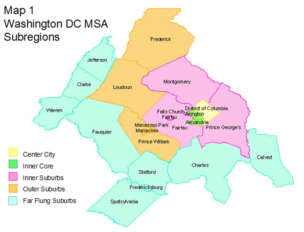
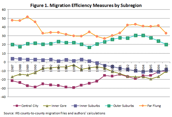
    This analysis considers the extent to which there is the beginning of a back to the city movement in the Washington DC metropolitan area using county-to-county migration data from the Internal Revenue Service. We must start with the assumption that the Washington area is unique among American metropolitan areas. The presence of the national government largely shapes the structure and geography of the regional economy. A large share of the region’s jobs is concentrated in the core, due to the role of the Federal government in the region. However, in addition to being the seat of the Federal government, the Washington DC metropolitan area also serves a varied set of private sector employers, and is home to a diverse population with growing suburban and city neighborhoods.

    The metro area is defined by 22 counties and cities in the states of Maryland, Virginia and West Virginia and has at its center city the District of Columbia. For this analysis, the Washington DC metropolitan area is divided into five sub regions: Center City, Inner Core, Inner Suburbs, Outer Suburbs and Far Flung Suburbs (see Map 1). According to Census Bureau population estimates, between 1987 and 2007 the population of the Washington DC metropolitan area grew from 3.92 million to 5.31 million people, an increase of about 35.5 percent. The population growth rates over this period varied considerably within the metropolitan area. The Center City experienced a 7.6 percent population decline between 1987 and 2007 while all of the other subregions in the metropolitan area grew. The fastest growing subregion was the Outer Suburbs, where the population grew by 109.6 percent over the 20-year period, followed by the Far Flung Suburbs (80.0%), Inner Suburbs (27.4%) and Inner Core (23.7%).

    Figure 1 shows that the subregions furthest from the region’s core, the Outer Suburbs and Far Flung Suburbs, consistently have the highest rates of net migration, which indicate that they have been net gainers of households from other parts of the metropolitan area over the past 20 years. For the Inner Suburbs, net migration is positive (but small) until 1998 when it becomes negative. Both the Inner Core and Center City have negative net migration over the entire period, reflecting losses of households to the rest (i.e. the suburban portions) of the metropolitan area.

    Looking at the entire 20-year period suggests that the suburbs of the Washington DC metropolitan area have gained population at the expense of the closer-in jurisdictions. However, in the last few years, since 2005, the net migration rates for the Outer Suburbs and Far Flung Suburbs have declined while the rates for the Inner Core and Center City have become less negative. These three years of data suggest that the more distant suburbs have started gaining households more slowly while the closer-in jurisdictions have lost households more slowly with net migration rates moving towards zero. While three years do not necessarily constitute a trend, this analysis suggests the possible beginning of a modest back to the city movement in the Washington DC area.

    However, household gains (or a slowdown in losses) in the inner jurisdictions may be coming more at the expense of the Inner Suburbs as opposed to the more distant suburban jurisdictions. The Inner Suburbs subregion is continuing the downward trend in net migration rates that began in the late 1990s, losing households to both the outer suburban and core jurisdictions. If this trend continues, the Washington DC metropolitan area may experience a relative population decline of its Inner Suburbs, while the more far flung suburbs continue to grow (albeit more slowly) and the population of the inner jurisdictions stabilizes or even grows slowly.

    Despite the beginning of a small back to the core movement, the suburbs of the national capital region will continue to gather most future growth, and that suburban growth will be even further out. Over the last three decades, jobs have followed people into suburban communities; a place like Tyson’s Corner in Fairfax County now has almost as many jobs as Washington’s downtown business district. Workers can live in the Outer Suburbs and Far Flung Suburbs, benefiting from the relatively lower housing costs and commute with relative ease to jobs in these suburban employment centers. Some share of the population will choose to move back to the city, but there will always be demand for suburban life.

    The Inner Suburbs are caught in the middle of population moving in and moving out. The Inner Suburbs have become more urban and congested, as well as more racially and ethnically diverse. These changes may cause some households – including both native born persons and upwardly mobile immigrants — to look even further out for a traditional suburban lifestyle. A younger metropolitan area, the result of the large millennial or “echo boom” generation, may lead to more people moving out of the congested Inner Suburbs to a “real” urban neighborhood in the core, which is also crowded, but has public transit and walkable communities. This trend, however, may well be short-lived if, when this generation hits their mid-30s by 2015, it acts like previous generations, starting to raise families and move again to suburbs, most likely in the further periphery.

    All this suggests, for the short run at least, a possibility that this new pattern of household redistribution could create a new divide in the national capital region. Different from the well-documented east-west divide, the emerging divide will be between the “urbanites” and the “far flungs.” The divide will be demographic, economic and political and will characterize the future challenges to forming transportation, housing and other regional policies.

    Lisa Sturtevant is an Assistant Research Professor at George Mason University School of Public Policy, Center for Regional Analysis.

  • Numbers Don’t Support Migration Exodus to “Cool Cities”

    For the past decade a large coterie of pundits, prognosticators and their media camp followers have insisted that growth in America would be concentrated in places hip and cool, largely the bluish regions of the country.

    Since the onset of the recession, which has hit many once-thriving Sun Belt hot spots, this chorus has grown bolder. The Wall Street Journal, for example, recently identified the “Next Youth-Magnet Cities” as drawn from the old “hip and cool” collection of yore: Seattle, Portland, Washington, New York and Austin, Texas.

    It’s not just the young who will flock to the blue meccas, but money and business as well, according to the narrative. The future, the Atlantic assured its readers, did not belong to the rubes in the suburbs or Sun Belt, but to high-density, high-end places like New York, San Francisco and Boston.

    This narrative, which has not changed much over the past decade, is misleading and largely misstated. Net migration, both before and after the Great Recession, according to analysis by the Praxis Strategy Group, has continued to be strongest to the predominately red states of the South and Intermountain West.

    This seems true even for those seeking high-end jobs. Between 2006 and 2008, the metropolitan areas that enjoyed the fastest percentage shift toward educated and professional workers and industries included nominally “unhip” places like Indianapolis, Charlotte, N.C., Memphis, Tenn., Salt Lake City, Jacksonville, Fla., Tampa, Fla., and Kansas City, Mo.

    The overall migration numbers are even more revealing. As was the case for much of the past decade, the biggest gainers continue to include cities such as San Antonio, Dallas and Houston. Rather than being oases for migrants, some oft-cited magnets such as New York, Boston, Los Angeles and Chicago have all suffered considerable loss of population to other regions over the past year.

    Much the same pattern emerges when you look at longer-term state demographic patterns. A recent survey by the Empire Center for New York State Policy found that the biggest net losers in terms of per capita outmigration between 2000 and 2008 were, with the exception of Louisiana, all blue state bastions. New York residents lead in terms of rate of exodus, closely followed by the District of Columbia, Michigan, Pennsylvania, Massachusetts and California.

    An even greater shock to the sensibilities of the insular, Manhattan-centric media, the report found that most of the movement from the Empire State was not from the much-dissed suburbia, but from that hip and cool paragon, New York City. This can not be ascribed as a loss of the unwanted: According to the report, those leaving the city had 13% higher incomes than those coming in.

    How can this be, when everyone who’s smart and hip is headed to the Big Apple? This question was addressed in a report by the center-left, New York-based Center for an Urban Future. True, considerable numbers of young, educated people come to New York, but it turns out that many of them leave for the suburbs or other states as they reach their peak earning years.

    Indeed, it’s astonishing given the many clear improvements in New York that more residents left the five boroughs for other locales in 2006, the peak of the last boom, than in 1993, when the city was in demonstrably worse shape. In 2006, the city had a net loss of 153,828 residents through domestic out-migration, compared to a decline of 141,047 in 1993, with every borough except Brooklyn experiencing a higher number of out-migrants in 2006.

    Of course, blue state boosters can point out that the exodus has slowed with the recession, as opportunities have dried up elsewhere. True, the flood of migration has slowed across the nation. Yet it has only slowed, not dried up. When the economy revives, it’s likely to start flowing heavily again.

    More important, the key group leaving New York and other so-called “youth-magnets” comprises the middle class, particularly families, critical to any long-term urban revival. This year’s Census shows that the number of single households in New York has reached record levels; in Manhattan, more than half of all households are singles. And the Urban Future report’s analysis found that even well-heeled Manhattanites with children tend to leave once they reach the age of 5 or above.

    The key factor here may well be economic opportunity. Virtually all the supposedly top-ranked cities cited in this media narrative have suffered below-average job growth throughout the decade. Some, like Portland and New York, have added almost no new jobs; others like San Francisco, Boston and Chicago have actually lost positions over the past decade.

    In contrast, even after the current doldrums, San Antonio, Orlando, Houston, Dallas and Phoenix all boast at least 5% more jobs now than a decade ago. Among the large-narrative magnet regions only one–government-bloated greater Washington–has enjoyed strong employment growth.

    The impact of job growth on the middle class has been profound. New York City, for example, has the smallest share of middle-income families in the nation, according to a recent Brookings Institution study; its proportion of middle-income neighborhoods was smaller than that of any metropolitan area except Los Angeles.The same pattern has also emerged in what has become widely touted as America’s “model city”–President Obama’s adopted hometown of Chicago.

    The likely reasons behind these troubling trends are things rarely discussed in “the narrative”–concerns like high costs, taxes and regulations making it tough on industries that employ the middle class. One clear culprit: out of control state spending. State spending in New York is second per capita in the nation (anomalous Alaska is first); California stands fourth and New Jersey seventh. Illinois is down the list but coming up fast. Over the past decade, while its population grew by only 7%, Illinois’ spending grew by an inflation-adjusted 39%.

    The problem here is more than just too-large government; it lies in how states spend their money. Massive public spending increases over the past decade in California, New Jersey, Illinois and New York have gone overwhelmingly into the pockets and pensions of public employees. It certainly has not flowed into such basic infrastructure as roads, bridges and ports that are needed to keep key industries competitive.

    The American Association of State Highway Transportation, for example, ranked New York 43rd in the country and New Jersey dead last in terms of quality of roads. Some 46% of the Garden State’s roads were rated in poor condition, compared with the national average of 13%, even as the state’s spending reached new highs. The typical New Jersey driver spends almost $600 a year in auto repairs necessitated by the poor conditions of the roads.

    In contrast, states in the South and parts of the Plains tend to pour their public resources into productive uses. Cities like Mobile, Ala., Houston, Charleston, S.C., and Savannah, Ga., have been investing in port facilities to take advantage of the planned widening of the Panama Canal. The primary goal is to take business away from the increasingly expensive, overregulated and under-invested ports of the Northeast and West Coast. Similarly, places like Kansas City and the Dakotas are looking to boost their basic rail and road networks to support export-heavy industries.

    Even in the face of the Obama administration’s strongly urban-centric, blue state-oriented economic policy, these generally less than hip places appear poised to grow as the economy recovers. Virtually all the top 10 economies that have withstood the recession come from outside the “youth-magnet” field: San Antonio; Oklahoma City; Little Rock, Ark.; Dallas, Baton Rouge, La.; Tulsa, Okla., Omaha, Neb.; Houston and El Paso, Texas. The one exception to this rule, Austin, also benefits from being located in solvent, generally low-tax Texas.

    This continued erosion of jobs and the middle class from the blue states and cities is not inevitable. Many of these places enjoy enormous assets in terms of universities, strategic location, concentrations of talented workers and entrenched high-wage industries. But short of a massive and continuing bailout from Washington, the only way to reverse their decline will be a thorough reformation of their governmental structure and policies. No narrative, no matter how well spun, can make up for that reality.

    This article originally appeared at Forbes.com.

    Joel Kotkin is executive editor of NewGeography.com and is a distinguished presidential fellow in urban futures at Chapman University. He is author of The City: A Global History. His next book, The Next Hundred Million: America in 2050, will be published by Penguin Press early next year.